給組件綁定popup彈窗,并設置彈窗內容,交互邏輯和顯示狀態。
說明:
從API Version 7開始支持。后續版本如有新增內容,則采用上角標單獨標記該內容的起始版本。
popup彈窗的顯示狀態在onStateChange事件回調中反饋,其顯隱與組件的創建或銷毀無強對應關系。
bindPopup
bindPopup(show: boolean, popup: PopupOptions | CustomPopupOptions)
給組件綁定Popup彈窗。
系統能力:?SystemCapability.ArkUI.ArkUI.Full
參數:
| 參數名 | 類型 | 必填 | 說明 |
|---|---|---|---|
| show | boolean | 是 | 彈窗顯示狀態,默認值為false,隱藏彈窗。 show:?彈窗顯示狀態,默認值為false,隱藏彈窗。popup彈窗必須等待頁面全部構建完成才能展示,因此show不能在頁面構建中設置為true,否則會導致popup彈窗顯示位置及形狀錯誤。 popup:?配置當前彈窗提示的參數。 |
| popup | PopupOptions?|?CustomPopupOptions8+ | 是 | 配置彈出彈窗的參數。 |
PopupOptions類型說明
| 名稱 | 類型 | 必填 | 描述 |
|---|---|---|---|
| message | string | 是 | 彈窗信息內容。 |
| placementOnTop(deprecated) | boolean | 否 | 是否在組件上方顯示,默認值為false。 說明: 從 API version 10 開始廢棄,建議使用 placement替代。 |
| primaryButton | { value:?string, action:?()?=>?void } | 否 | 第一個按鈕。 value:?彈窗里主按鈕的文本。 action:?點擊主按鈕的回調函數。 |
| secondaryButton | { value:?string, action:?()?=>?void } | 否 | 第二個按鈕。 value:?彈窗里輔助按鈕的文本。 action:?點擊輔助按鈕的回調函數。 |
| onStateChange | (event:?{?isVisible:?boolean?})?=>?void | 否 | 彈窗狀態變化事件回調,參數isVisible為彈窗當前的顯示狀態。 |
| arrowOffset9+ | Length | 否 | popup箭頭在彈窗處的偏移。箭頭在氣泡上下方時,數值為0表示箭頭居最左側,偏移量為箭頭至最左側的距離,默認居中。箭頭在氣泡左右側時,偏移量為箭頭至最上側的距離,默認居中。如果顯示在屏幕邊緣,氣泡會自動左右偏移,數值為0時箭頭始終指向綁定組件。 |
| showInSubWindow9+ | boolean | 否 | 是否在子窗口顯示氣泡,默認值為false。 |
| mask10+ | boolean?|?ResourceColor | 否 | 設置氣泡是否有遮罩層及遮罩顏色。如果設置為false,則沒有遮罩層;如果設置為true,則設置有遮罩層并且顏色為透明色;如果設置為Color,則為遮罩層的顏色。 |
| messageOptions10+ | PopupMessageOptions | 否 | 設置彈窗信息文本參數。 |
| targetSpace10+ | Length | 否 | 設置popup與目標的間隙。 |
| placement10+ | Placement | 否 | 設置popup組件相對于目標的顯示位置,默認值為Placement.Bottom。 如果同時設置了 placementOnTop和placement,則以placement的設置生效。 |
| offset10+ | Position | 否 | 設置popup組件相對于placement設置的顯示位置的偏移。 說明: 不支持設置百分比。 |
| enableArrow10+ | boolean | 否 | 設置是否顯示箭頭。 默認值:true |
| popupColor11+ | Color?|?string?|?number?| ?Resource | 否 | 提示氣泡的顏色。 默認值:透明色TRANSPARENT加模糊背景填充效果COMPONENT_ULTRA_THICK。 |
| autoCancel11+ | boolean | 否 | 頁面有操作時,是否自動關閉氣泡。 默認值:true |
| width11+ | Dimension | 否 | 彈窗寬度。 |
| arrowPointPosition11+ | ArrowPointPosition | 否 | 氣泡尖角相對于父組件顯示位置,氣泡尖角在垂直和水平方向上有 ”Start“、”Center“、”End“三個位置點可選。以上所有位置點均位于父組件區域的范圍內,不會超出父組件的邊界范圍。 |
PopupMessageOptions10+類型說明
| 名稱 | 類型 | 必填 | 描述 |
|---|---|---|---|
| textColor | ResourceColor | 否 | 設置彈窗信息文本顏色。 |
| font | Font | 否 | 設置彈窗信息字體屬性。 |
CustomPopupOptions8+類型說明
| 名稱 | 類型 | 必填 | 描述 |
|---|---|---|---|
| builder | CustomBuilder | 是 | 提示氣泡內容的構造器。 說明: popup為通用屬性,自定義popup中不支持再次彈出popup。對builder下的第一層容器組件不支持使用position屬性,如果使用將導致氣泡不顯示。builder中若使用自定義組件,自定義組件的aboutToAppear和aboutToDisappear生命周期與popup彈窗的顯隱無關,不能使用其生命周期判斷popup彈窗的顯隱。 |
| placement | Placement | 否 | 氣泡組件優先顯示的位置,當前位置顯示不下時,會自動調整位置。 默認值:Placement.Bottom |
| popupColor | ResourceColor | 否 | 提示氣泡的顏色。 API version 10,默認值:'#4d4d4d' API version 11及以后,默認值:透明色TRANSPARENT加模糊背景填充效果COMPONENT_ULTRA_THICK |
| enableArrow | boolean | 否 | 是否顯示箭頭。 從API Version 9開始,如果箭頭所在方位側的氣泡長度不足以顯示下箭頭,則會默認不顯示箭頭。比如:placement設置為Left,此時如果氣泡高度小于箭頭的寬度(32vp)與氣泡圓角兩倍(48vp)之和(80vp),則實際不會顯示箭頭。 默認值:true |
| autoCancel | boolean | 否 | 頁面有操作時,是否自動關閉氣泡。 默認值:true 說明: 如果要實現點擊氣泡內消失需要在builder中先放一個布局組件,然后再將Popup高級組件放在布局組件里面,再在布局組件的onClick事件中修改的傳入bindPopup的變量(show:?boolean)值。 |
| onStateChange | (event:?{?isVisible:?boolean?})?=>?void | 否 | 彈窗狀態變化事件回調,參數為彈窗當前的顯示狀態。 |
| arrowOffset9+ | Length | 否 | popup箭頭在彈窗處的偏移。箭頭在氣泡上下方時,數值為0表示箭頭居最左側,偏移量為箭頭至最左側的距離,默認居中。箭頭在氣泡左右側時,偏移量為箭頭至最上側的距離,默認居中。如果顯示在屏幕邊緣,氣泡會自動左右偏移,數值為0時箭頭始終指向綁定組件。 |
| showInSubWindow9+ | boolean | 否 | 是否在子窗口顯示氣泡,默認值為false。 |
| maskColor(deprecated) | ResourceColor | 否 | 設置氣泡遮罩層顏色。 說明: 從 API version 10 開始廢棄,建議使用 mask替代。 |
| mask10+ | boolean?|?ResourceColor | 否 | 設置氣泡是否有遮罩層及遮罩顏色。如果設置為false,則沒有遮罩層;如果設置為true,則設置有遮罩層并且顏色為透明色;如果設置為Color,則為遮罩層的顏色。 |
| targetSpace10+ | Length | 否 | 設置popup與目標的間隙。 |
| offset10+ | Position | 否 | 設置popup組件相對于placement設置的顯示位置的偏移。 說明: 不支持設置百分比。 |
| width11+ | Dimension | 否 | 彈窗寬度。 |
| arrowPointPosition11+ | ArrowPointPosition | 否 | 氣泡尖角相對于父組件顯示位置,氣泡尖角在垂直和水平方向上有 ”Start“、”Center“、”End“三個位置點可選。以上所有位置點均位于父組件區域的范圍內,不會超出父組件的邊界范圍。 |
示例
示例1
// xxx.ets
@Entry
@Component
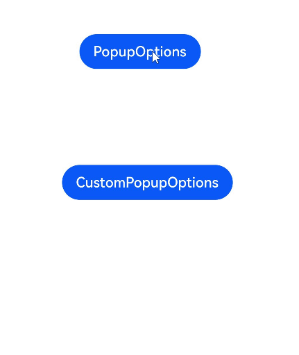
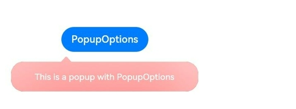
struct PopupExample {@State handlePopup: boolean = false@State customPopup: boolean = false// popup構造器定義彈框內容@Builder popupBuilder() {Row({ space: 2 }) {Image($r("app.media.image")).width(24).height(24).margin({ left: -5 })Text('Custom Popup').fontSize(10)}.width(100).height(50).padding(5)}build() {Flex({ direction: FlexDirection.Column }) {// PopupOptions 類型設置彈框內容Button('PopupOptions').onClick(() => {this.handlePopup = !this.handlePopup}).bindPopup(this.handlePopup, {message: 'This is a popup with PopupOptions',placementOnTop: true,showInSubWindow:false,primaryButton: {value: 'confirm',action: () => {this.handlePopup = !this.handlePopupconsole.info('confirm Button click')}},// 第二個按鈕secondaryButton: {value: 'cancel',action: () => {this.handlePopup = !this.handlePopupconsole.info('cancel Button click')}},onStateChange: (e) => {console.info(JSON.stringify(e.isVisible))if (!e.isVisible) {this.handlePopup = false}}}).position({ x: 100, y: 50 })// CustomPopupOptions 類型設置彈框內容Button('CustomPopupOptions').onClick(() => {this.customPopup = !this.customPopup}).bindPopup(this.customPopup, {builder: this.popupBuilder,placement: Placement.Top,mask: {color:'0x33000000'},popupColor: Color.Yellow,enableArrow: true,showInSubWindow: false,onStateChange: (e) => {if (!e.isVisible) {this.customPopup = false}}}).position({ x: 80, y: 200 })}.width('100%').padding({ top: 5 })}
}
示例2
// xxx.ets
@Entry
@Component
struct PopupExample {@State handlePopup: boolean = falsebuild() {Column() {Button('PopupOptions').onClick(() => {this.handlePopup = !this.handlePopup}).bindPopup(this.handlePopup, {message: 'This is a popup with PopupOptions',messageOptions: {textColor: Color.Red,font: {size: '14vp',style: FontStyle.Italic,weight: FontWeight.Bolder}},placement: Placement.Bottom,enableArrow: false,targetSpace: '15vp',onStateChange: (e) => {console.info(JSON.stringify(e.isVisible))if (!e.isVisible) {this.handlePopup = false}}})}.margin(20)}
}
示例3
// xxx.ets
@Entry
@Component
struct PopupExample {@State customPopup: boolean = false// popup構造器定義彈框內容@Builder popupBuilder() {Row() {Text('Custom Popup Message').fontSize(10)}.height(50).padding(5)}build() {Column() {// CustomPopupOptions 類型設置彈框內容Button('CustomPopupOptions').onClick(() => {this.customPopup = !this.customPopup}).bindPopup(this.customPopup, {builder: this.popupBuilder,targetSpace: '15vp',enableArrow: false,onStateChange: (e) => {if (!e.isVisible) {this.customPopup = false}}})}.margin(20)}
}
示例4
// xxx.ets
@Entry
@Component
struct PopupExample {@State handlePopup: boolean = falsebuild() {Column() {Button('PopupOptions').position({ x: 100, y: 50 }).onClick(() => {this.handlePopup = !this.handlePopup}).bindPopup(this.handlePopup, {width: 300,message: 'This is a popup with PopupOptions',arrowPointPosition: ArrowPointPosition.START,popupColor: Color.Red,autoCancel: true,})}.width('100%').height('100%')}
}
示例5
// xxx.ets
import { Popup , PopupOptions,PopupTextOptions, PopupButtonOptions, PopupIconOptions } from '@ohos.arkui.advanced.Popup';@Entry
@Component
struct PopupExample {@State customPopup: boolean = false@BuilderpopupBuilder() {// popup 自定義高級組件Popup({//PopupIconOptions 類型設置圖標內容icon: {image: $r('app.media.icon'),width:32,height:32,fillColor:Color.White,borderRadius: 16,} as PopupIconOptions,// PopupTextOptions 類型設置文字內容title: {text: 'This is a popup with CustomPopupOptions',fontSize: 20,fontColor: Color.Black,fontWeight: FontWeight.Normal,} as PopupTextOptions,//PopupTextOptions 類型設置文字內容message: {text: 'This is the message',fontSize: 15,fontColor: Color.Black,fontWeight: FontWeight.Normal,} as PopupTextOptions,showClose: false,onClose: () => {console.info('close Button click')this.customPopup = false},// PopupButtonOptions 類型設置按鈕內容buttons: [{text: 'confirm',action: () => {console.info('confirm button click')this.customPopup = false},fontSize: 15,fontColor: Color.Black,},{text: 'cancel',action: () => {console.info('cancel button click')this.customPopup = false},fontSize: 15,fontColor: Color.Black,},] as [PopupButtonOptions?, PopupButtonOptions?],})}build() {Column() {Button('CustomPopupOptions').onClick(() => {this.customPopup = !this.customPopup}).position({ x: 80, y: 200 }).bindPopup(this.customPopup, {builder: this.popupBuilder,width: 300,arrowPointPosition: ArrowPointPosition.END,})}.width('100%').height('100%')}
}
示例6
// xxx.ets@Entry
@Component
struct PopupExample {@State cursorPopup: boolean = falsebuild() {Column() {TextInput({placeholder:'我是提示文本',text:'我是當前文本內容'}).position({ x: 0, y: 350 }).onFocus(() => {this.cursorPopup = !this.cursorPopup}).selectionMenuHidden(true).bindPopup(this.cursorPopup, {width: 300,message: 'This is a pop-up window that appears with the cursor',arrowPointPosition: ArrowPointPosition.CENTER,popupColor: Color.Green,autoCancel: true,})}.width('100%').height('100%')}
}
最后,有很多小伙伴不知道學習哪些鴻蒙開發技術?不知道需要重點掌握哪些鴻蒙應用開發知識點?而且學習時頻繁踩坑,最終浪費大量時間。所以有一份實用的鴻蒙(Harmony NEXT)資料用來跟著學習是非常有必要的。?
這份鴻蒙(Harmony NEXT)資料包含了鴻蒙開發必掌握的核心知識要點,內容包含了(ArkTS、ArkUI開發組件、Stage模型、多端部署、分布式應用開發、音頻、視頻、WebGL、OpenHarmony多媒體技術、Napi組件、OpenHarmony內核、Harmony南向開發、鴻蒙項目實戰等等)鴻蒙(Harmony NEXT)技術知識點。
希望這一份鴻蒙學習資料能夠給大家帶來幫助,有需要的小伙伴自行領取,限時開源,先到先得~無套路領取!!
?獲取這份完整版高清學習路線,請點擊→純血版全套鴻蒙HarmonyOS學習資料
鴻蒙(Harmony NEXT)最新學習路線
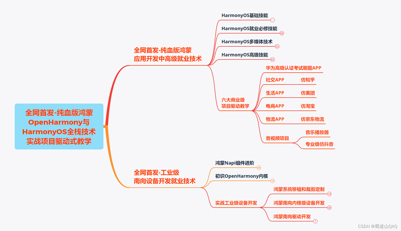
-
?HarmonOS基礎技能
- HarmonOS就業必備技能?
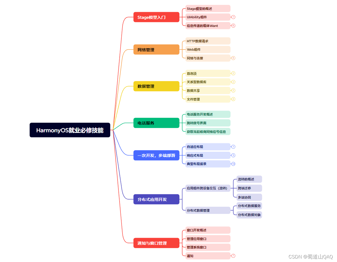
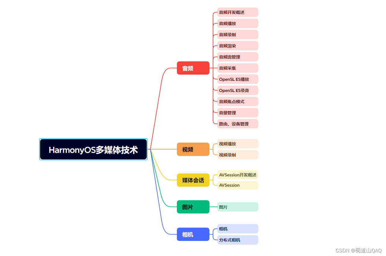
- ?HarmonOS多媒體技術
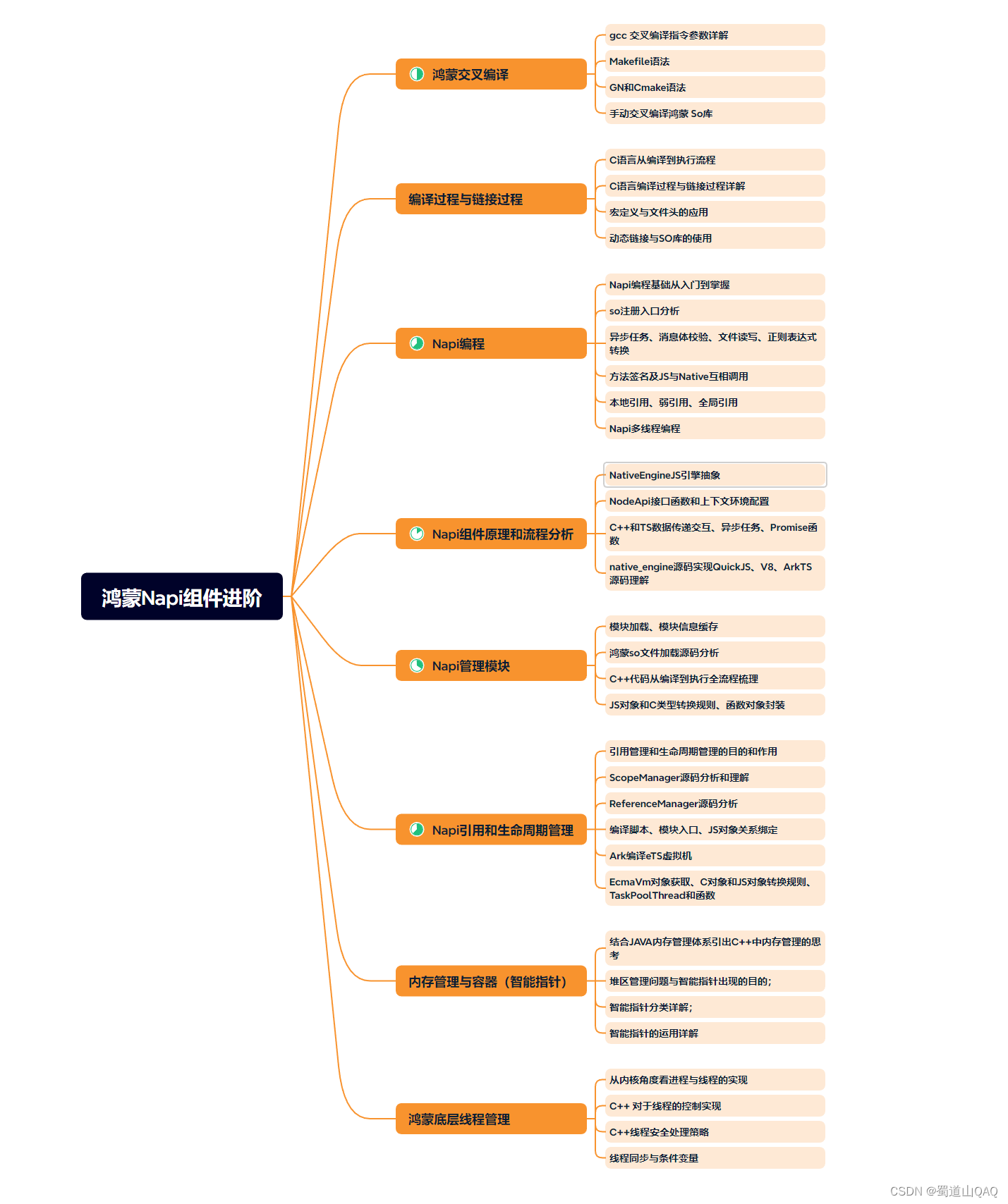
- 鴻蒙NaPi組件進階
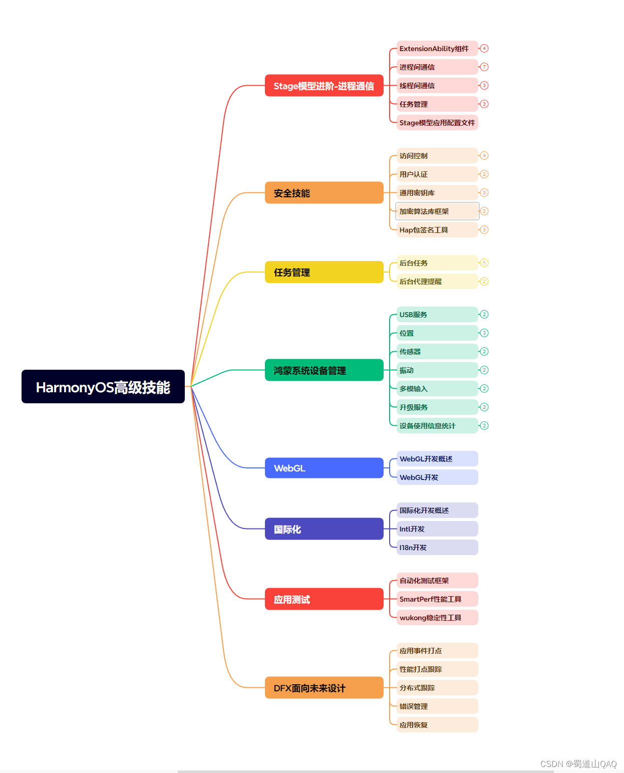
- HarmonOS高級技能
- 初識HarmonOS內核?
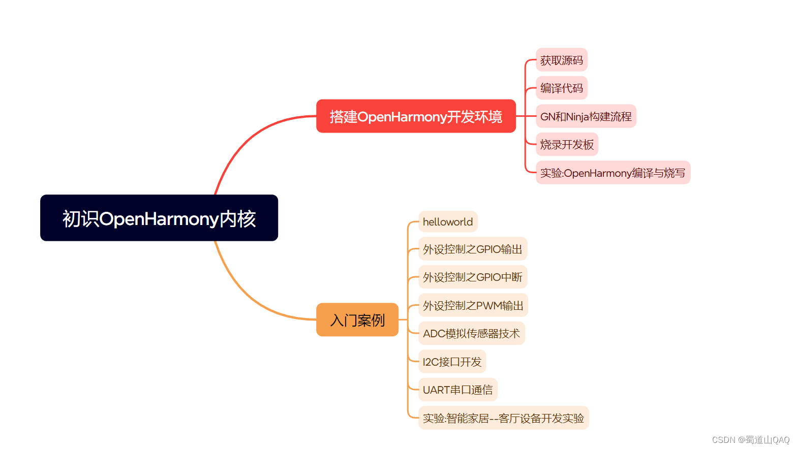
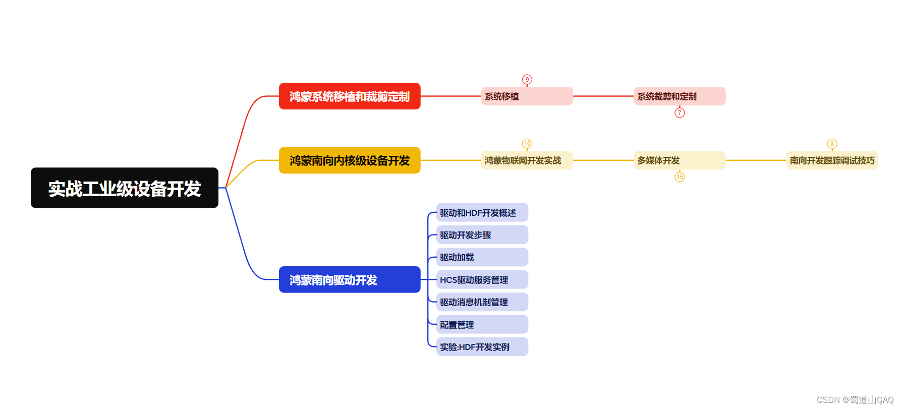
- 實戰就業級設備開發
有了路線圖,怎么能沒有學習資料呢,小編也準備了一份聯合鴻蒙官方發布筆記整理收納的一套系統性的鴻蒙(OpenHarmony )學習手冊(共計1236頁)與鴻蒙(OpenHarmony )開發入門教學視頻,內容包含:ArkTS、ArkUI、Web開發、應用模型、資源分類…等知識點。
獲取以上完整版高清學習路線,請點擊→純血版全套鴻蒙HarmonyOS學習資料
《鴻蒙 (OpenHarmony)開發入門教學視頻》
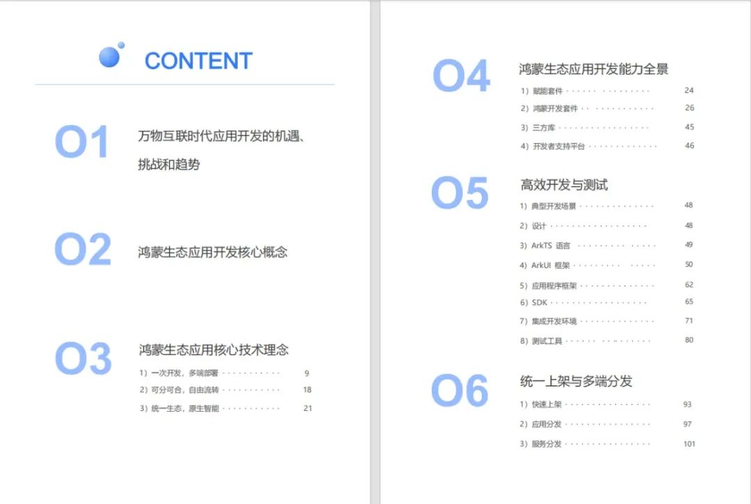
《鴻蒙生態應用開發V2.0白皮書》
《鴻蒙 (OpenHarmony)開發基礎到實戰手冊》
OpenHarmony北向、南向開發環境搭建
?《鴻蒙開發基礎》
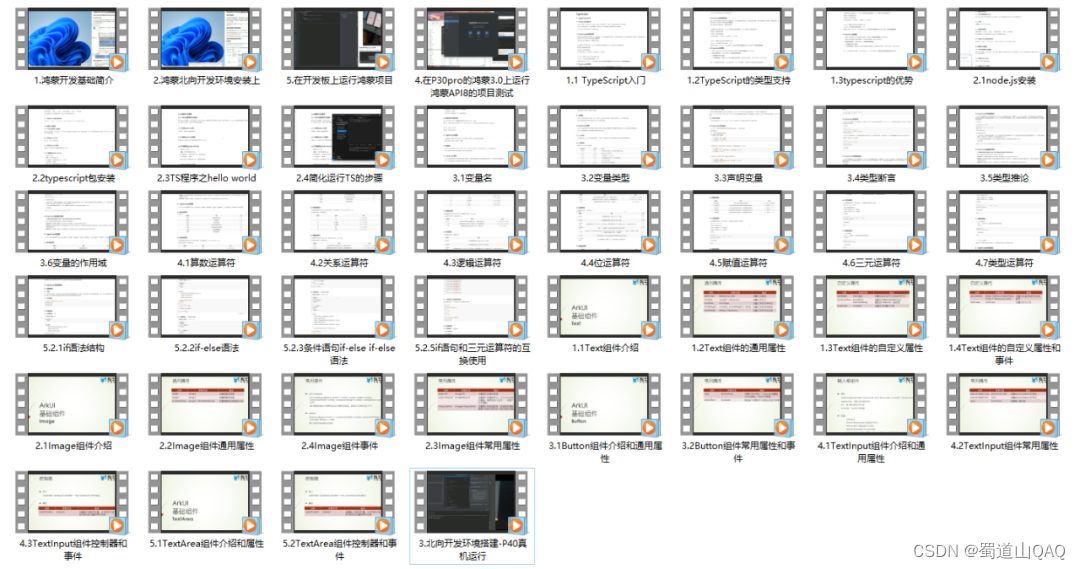
- ArkTS語言
- 安裝DevEco Studio
- 運用你的第一個ArkTS應用
- ArkUI聲明式UI開發
- .……
?《鴻蒙開發進階》
- Stage模型入門
- 網絡管理
- 數據管理
- 電話服務
- 分布式應用開發
- 通知與窗口管理
- 多媒體技術
- 安全技能
- 任務管理
- WebGL
- 國際化開發
- 應用測試
- DFX面向未來設計
- 鴻蒙系統移植和裁剪定制
- ……
《鴻蒙進階實戰》
- ArkTS實踐
- UIAbility應用
- 網絡案例
- ……
?獲取以上完整鴻蒙HarmonyOS學習資料,請點擊→純血版全套鴻蒙HarmonyOS學習資料
總結
總的來說,華為鴻蒙不再兼容安卓,對中年程序員來說是一個挑戰,也是一個機會。只有積極應對變化,不斷學習和提升自己,他們才能在這個變革的時代中立于不敗之地。?

)


)
(std::tuple)(三))


)
)
Python數據分析體系--九五小龐)


Qt窗口)
求解23個基準函數)

