Any data science or data analytics project can be generally described with the following steps:
通常可以通過以下步驟來描述任何數據科學或數據分析項目:
- Acquiring a business understanding & defining the goal of a project 獲得業務理解并定義項目目標
- Getting data 獲取數據
- Preprocessing and exploring data 預處理和探索數據
- Improving data, e.g., by feature engineering 改善數據,例如通過特征工程
- Visualizing data 可視化數據
- Building a model 建立模型
- Deploying the model 部署模型
- Scoring its performance 對其表現進行評分
This time, I would like to bring your attention to the data cleaning and exploration phase since it’s a step which value is hard to measure, but the impact it brings is difficult to overestimate. Insights gained during this stage can affect all further work.
這次,我想提請您注意數據清理和探索階段,因為這是一個難以衡量的步驟,但很難估量其帶來的影響。 在此階段獲得的見解會影響所有進一步的工作。
There are multiple ways you can start exploratory data analysis with:
您可以通過多種方式開始探索性數據分析:
- Load data and preprocess it: clean it from unnecessary artifacts, deal with missing values. Make your dataset comfortable to work with. 加載數據并進行預處理:清除不必要的工件,處理缺失值。 使數據集易于使用。
- Visualize as much data as possible using different kinds of plots & a pivot table. 使用不同種類的繪圖和數據透視表,可視化盡可能多的數據。
目的 (Purpose)
In this tutorial, I would like to show how to prepare your data with Python and explore it using a JavaScript library for data visualization. To get the most value out of exploration, I recommend using interactive visualizations since they make exploring your data faster and more comfortable.
在本教程中,我想展示如何使用Python 準備數據并使用JavaScript庫進行數據可視化探索。 為了從探索中獲得最大價值,我建議使用交互式可視化,因為它們可以使您更快,更舒適地瀏覽數據。
Hence, we will present data in an interactive pivot table and pivot charts.
因此,我們將在交互式數據透視表和數據透視圖中顯示數據。
Hopefully, this approach will help you facilitate the data analysis and visualization process in Jupyter Notebook.
希望這種方法將幫助您促進Jupyter Notebook中的數據分析和可視化過程。
設置環境 (Set up your environment)
Run your Jupyter Notebook and let’s start. If Jupyter is not installed on your machine, choose the way to get it.
運行Jupyter Notebook,開始吧。 如果您的計算機上未安裝Jupyter,請選擇獲取方式 。
獲取數據 (Get your data)
Choosing the data set to work with is the number one step.
選擇要使用的數據集是第一步。
If your data is already cleaned and ready to be visualized, jump to the Visualization section.
如果您的數據已被清理并準備可視化,請跳至“ 可視化”部分。
For demonstration purposes, I’ve chosen the data for the prediction of Bike Sharing Demand. It’s provided as data for the Kaggle’s competition.
出于演示目的,我選擇了用于預測“ 自行車共享需求”的數據 。 作為Kaggle比賽數據提供。
本教程的導入 (Imports for this tutorial)
Classically, we will use the “pandas” library to read data into a dataframe.
傳統上,我們將使用“ pandas”庫將數據讀入數據框。
Additionally, we will need json and IPython.display modules. The former will help us serialize/deserialize data and the latter — render HTML in the cells.
此外,我們將需要json和IPython.display模塊。 前者將幫助我們對數據進行序列化/反序列化,而后者將在單元格中呈現HTML。
Here’s the full code sample with imports we need:
這是我們需要導入的完整代碼示例:
from IPython.display import HTMLimport jsonimport pandas as pd讀取數據 (Read data)
df = pd.read_csv('train.csv')
df = pd.read_csv('train.csv')
清理和預處理數據 (Clean & preprocess data)
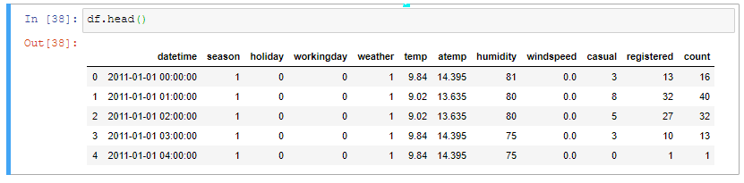
Before starting data visualization, it’s a good practice to see what’s going on in the data.
在開始數據可視化之前,最好先查看數據中發生了什么。
df.head()
df.head()
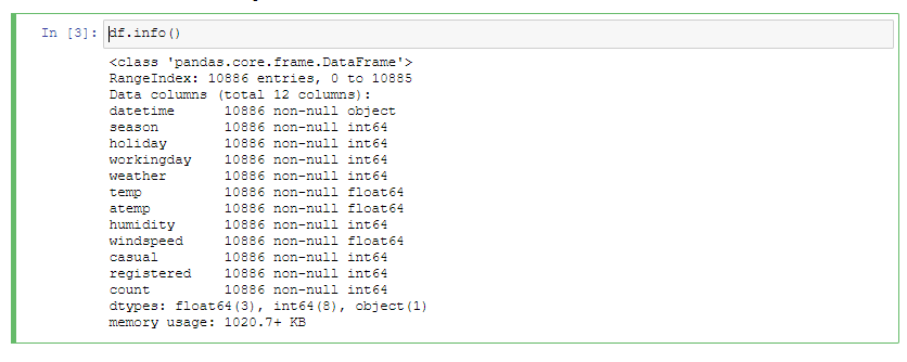
df.info()
df.info()
First, we should check the percentage of missing values.
首先,我們應該檢查缺失值的百分比。
missing_percentage = df.isnull().sum() * 100 / len(df)
missing_percentage = df.isnull().sum() * 100 / len(df)
There are a lot of strategies to follow when dealing with missing data. Let me mention the main ones:
處理丟失的數據時,有許多策略可以遵循。 讓我提到主要的:
- Dropping missing values. The only reason to follow this approach is when you need to quickly remove all NaNs from the data. 刪除缺失值。 遵循這種方法的唯一原因是當您需要快速從數據中刪除所有NaN時。
Replacing NaNs with values. This is called imputation. A common decision is to replace missing values with zeros or with a mean value.
用值替換NaN。 這稱為歸因 。 常見的決定是用零或平均值替換缺失值。
Luckily, we don’t have any missing values in the dataset. But if your data has, I suggest you look into a quick guide with the pros and cons of different imputation techniques.
幸運的是,我們在數據集中沒有任何缺失值。 但是,如果您有數據,建議您快速了解各種插補技術的優缺點 。
管理要素數據類型 (Manage features data types)
Let’s convert the type of “datetime”’ column from object to datetime:
讓我們將“ datetime”列的類型從對象轉換為datetime:
df['datetime'] = pd.to_datetime(df['datetime'])
df['datetime'] = pd.to_datetime(df['datetime'])
Now we are able to engineer new features based on this column, for example:
現在,我們可以根據此專欄設計新功能,例如:
- a day of the week 一周中的一天
- a month 一個月
- an hour 一小時
df['weekday'] = df['datetime'].dt.dayofweekdf['hour'] = df['datetime'].dt.hourdf['month'] = df['datetime'].dt.monthThese features can be used further to figure out trends in rent.
這些功能可以進一步用于確定租金趨勢。
Next, let’s convert string types to categorical:
接下來,讓我們將字符串類型轉換為分類類型:
categories = ['season', 'workingday', 'weekday', 'hour', 'month', 'weather', 'holiday']for category in categories: df[category] = df[category].astype('category')Read more about when to use the categorical data type here.
在此處閱讀有關何時使用分類數據類型的更多信息。
Now, let’s make values of categorical more meaningful by replacing numbers with their categorical equivalents:
現在,通過將數字替換為對應的類別,使分類的值更有意義:
df['season'] = df['season'].replace([1, 2, 3, 4], ['spring', 'summer', 'fall', 'winter'])df['holiday'] = df['holiday'].replace([0, 1],['No', 'Yes'])By doing so, it will be easier for us to interpret data visualization later on. We won’t need to look up the meaning of a category each time we need it.
這樣,以后我們將更容易解釋數據可視化。 我們不需要每次都需要查找類別的含義。
使用數據透視表和圖表可視化數據 (Visualize data with a pivot table and charts)
Now that you cleaned the data, let’s visualize it.
現在您已經清理了數據,讓我們對其可視化。
The data visualization type depends on the question you are asking.
數據可視化類型取決于您要詢問的問題。
In this tutorial, we’ll be using:
在本教程中,我們將使用:
- a pivot table for tabular data visualization 用于表格數據可視化的數據透視表
- a bar chart 條形圖
為數據透視表準備數據 (Prepare data for the pivot table)
Before loading data to the pivot table, convert the dataframe to an array of JSON objects. For this, use the to_json() function from the json module.
在將數據加載到數據透視表之前,將數據幀轉換為JSON對象數組。 為此,請使用json模塊中的to_json()函數。
The records orientation is needed to make sure the data is aligned according to the format the pivot table requires.
需要records方向,以確保數據根據數據透視表所需的格式對齊。
json_data = df.to_json(orient=”records”)
json_data = df.to_json(orient=”records”)
創建數據透視表 (Create a pivot table)
Next, define a pivot table object and feed it with the data. Note that the data has to be deserialized using the loads() function that decodes JSON:
接下來,定義數據透視表對象并向其提供數據。 請注意,必須使用可解碼JSON的loads()函數對數據進行反序列化:
pivot_table = {
        "container": "#pivot-container",
        "componentFolder": "https://cdn.flexmonster.com/",
        "toolbar": True,
        "report": {
            "dataSource": {
                "type": "json",
                "data": json.loads(json_data)
            },
            "slice": {
                "rows": [{
                    "uniqueName": "weekday"
                }],
                "columns": [{
                    "uniqueName": "[Measures]"
                }],
                "measures": [{
                    "uniqueName": "count",
                    "aggregation": "median"
                }],
                "sorting": {
                    "column": {
                        "type": "desc",
                        "tuple": [],
                        "measure": {
                            "uniqueName": "count",
                            "aggregation": "median"
                        }
                    }
                }
            }
        }
    }
In the above pivot table initialization, we specified a simple report that consists of a slice (a set of fields visible on the grid), data source, options, formats, etc. We also specified a container where the pivot table should be rendered. The container will be defined a bit later.
在上述數據透視表初始化中,我們指定了一個簡單的報告,該報告由一個切片(網格上可見的一組字段),數據源,選項,格式等組成。我們還指定了一個應在其中呈現數據透視表的容器。 稍后將定義容器。
Plus, here we can add a mapping object to prettify the field captions or set their data types. Using this object eliminates the need in modifying the data source.
另外,在這里我們可以添加一個映射對象來美化字段標題或設置其數據類型。 使用此對象消除了修改數據源的需要。
Next, convert the pivot table object to a JSON-formatted string to be able to pass it for rendering in the HTML layout:
接下來,將數據透視表對象轉換為JSON格式的字符串,以便能夠將其傳遞以在HTML布局中呈現:
pivot_json_object = json.dumps(pivot_table)
pivot_json_object = json.dumps(pivot_table)
定義儀表板布局 (Define a dashboard layout)
Define a function that renders the pivot table in the cell:
定義一個在單元格中呈現數據透視表的函數:
In this function, we call HTML() from the IPython.display module — it will render the layout enclosed into a multi-line string.
在此函數中,我們從IPython.display模塊調用HTML() - 它會 將布局呈現為多行字符串。
Next, let’s call this function and pass to it the pivot table previously encoded into JSON:
接下來,讓我們調用此函數并將之前編碼為JSON的數據透視表傳遞給它:
render_pivot_table(pivot_json_object)
render_pivot_table(pivot_json_object)
Likewise, you can create and render as many data visualization components as you need. For example, interactive pivot charts that visualize aggregated data:
同樣,您可以根據需要創建和呈現任意數量的數據可視化組件 。 例如,可視化聚合數據的交互式數據透視圖 :

下一步是什么 (What’s next)
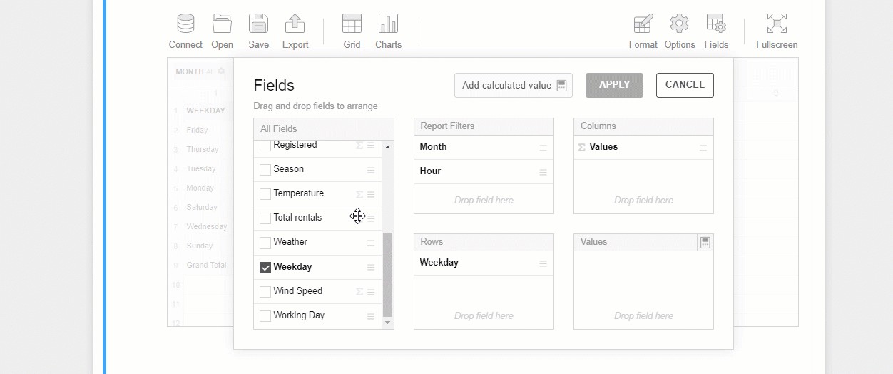
Now that you embedded the pivot table into Jupyter, it’s time to start exploring your data:
現在,您已將數據透視表嵌入Jupyter中,是時候開始探索數據了:
drag and drop fields to rows, columns, and measures of the pivot table
將字段拖放到數據透視表的行,列和度量
set Excel-like filtering
設置類似Excel的過濾
highlight important values with conditional formatting
使用條件格式突出顯示重要的值
At any moment, you can save your results to a JSON or PDF/Excel/HTML report.
您隨時可以將結果保存到JSON或PDF / Excel / HTML報告中。
例子 (Examples)
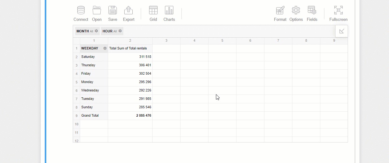
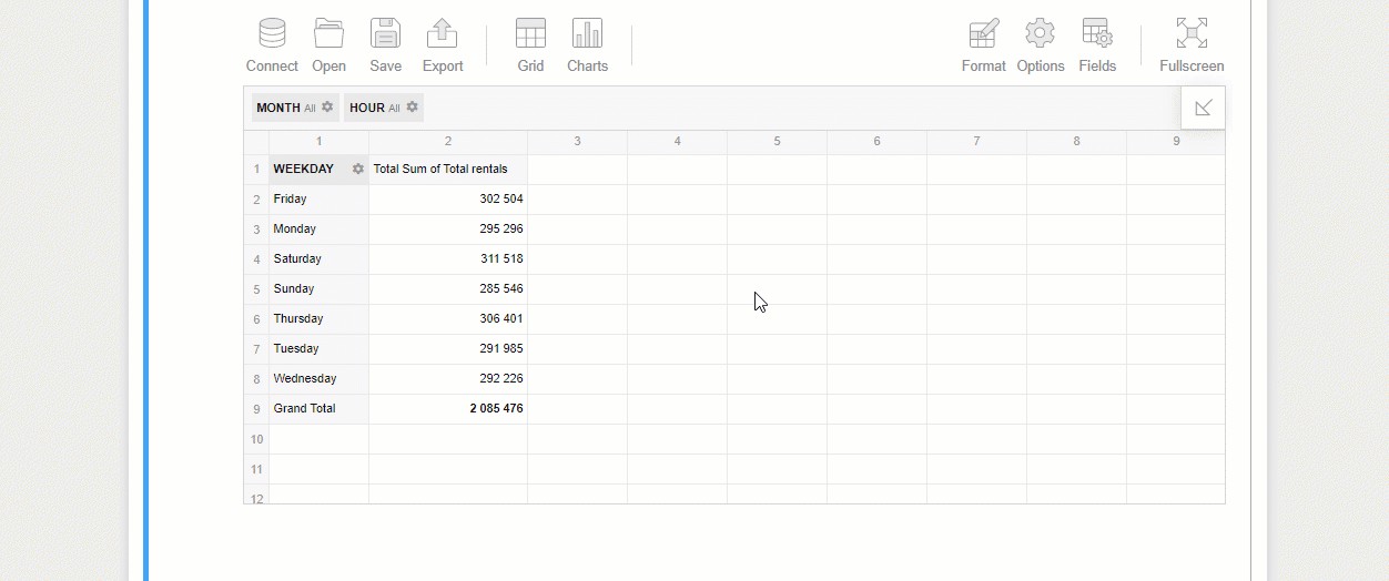
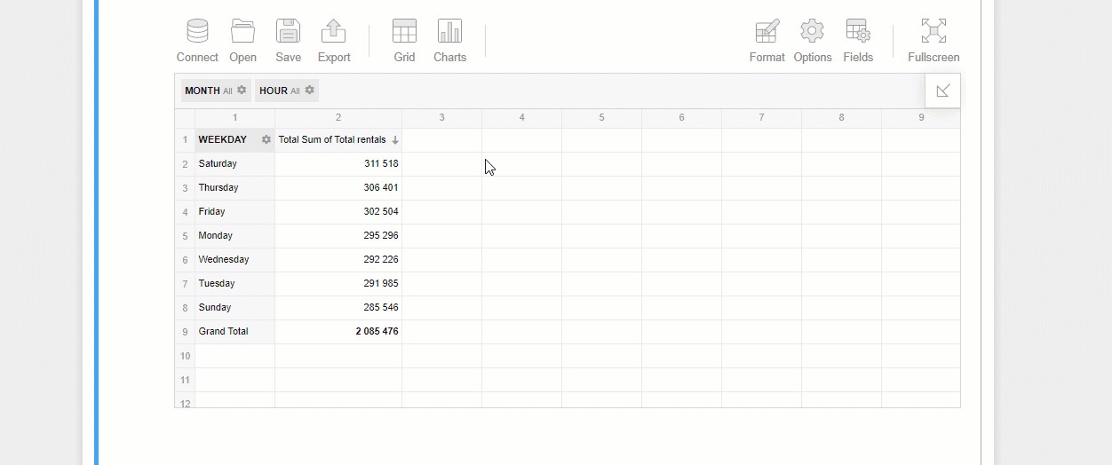
Here is how you can try identifying trends on bikes usage depending on the day of the week:
您可以按照以下方式嘗試確定自行車使用情況的趨勢,具體取決于星期幾:
You can also figure out if any weather conditions affect the number of rents by registered and unregistered users:
您還可以確定是否有任何天氣情況影響注冊和未注冊用戶的租金數量:
To dig deeper into the data, drill through aggregated values by double-clicking and see the raw records they are composed of:
要通過雙擊深入挖掘數據, 追溯匯總值,看看它們是由原始的記錄:
Or simply switch to the pivot charts mode and give your data an even more comprehensible look:
或者,只需切換到數據透視圖模式,即可使您的數據看起來更清晰:
匯集全部 (Bringing it all together)
By completing this tutorial, you learned a new way to interactively explore your multi-dimensional data in Jupyter Notebook using Python and the JavaScript data visualization library. I hope this will make your exploration process more insightful than before.
通過完成本教程,您學習了一種使用Python和JavaScript數據可視化庫在Jupyter Notebook中交互式瀏覽多維數據的新方法。 我希望這將使您的探索過程比以往更有見識。
有用的鏈接 (Useful links)
Jupyter Notebook dashboard sample
Jupyter Notebook儀表板示例
Web pivot table live demo
Web數據透視表實時演示
Pythonic Data Cleaning With Pandas and NumPy
使用Pandas和NumPy進行Pythonic數據清理
Exploratory Data Analysis With Python and Pandas on Coursera
在Coursera上使用Python和Pandas進行探索性數據分析
翻譯自: https://medium.com/python-in-plain-english/data-visualization-with-python-and-javascript-c1c28a7212b2
本文來自互聯網用戶投稿,該文觀點僅代表作者本人,不代表本站立場。本站僅提供信息存儲空間服務,不擁有所有權,不承擔相關法律責任。 如若轉載,請注明出處:http://www.pswp.cn/news/389446.shtml 繁體地址,請注明出處:http://hk.pswp.cn/news/389446.shtml 英文地址,請注明出處:http://en.pswp.cn/news/389446.shtml
如若內容造成侵權/違法違規/事實不符,請聯系多彩編程網進行投訴反饋email:809451989@qq.com,一經查實,立即刪除!相關文章

Android 事件處理

莫煩Pytorch神經網絡第三章代碼修改

)
New Distinct Substrings(后綴數組)

Android dependency 'com.android.support:support-v4' has different version for the compile (26.1.0...

先知模型 facebook_使用Facebook先知進行犯罪率預測

莫煩Pytorch神經網絡第四章代碼修改

github gists 101使代碼共享漂亮

loj #6278. 數列分塊入門 2

基于Netty的百萬級推送服務設計要點

莫煩Pytorch神經網絡第五章代碼修改

鮮為人知的6個黑科技網站_6種鮮為人知的熊貓繪圖工具

)
網頁JS獲取當前地理位置(省市區)

大熊貓卸妝后_您不應錯過的6大熊貓行動

數據eda_關于分類和有序數據的EDA

PyTorch官方教程中文版:PYTORCH之60MIN入門教程代碼學習

Flexbox 最簡單的表單

