介紹 (Introduction)
It seems as if people are split on pie charts: either you passionately hate them, or you are indifferent. In this article, I am going to explain why pie charts are problematic and, if you fall into the latter category, what you can do when creating pie charts to avoid upsetting those in the former.
似乎人們在餅圖上是分裂的:要么熱情地恨他們,要么冷漠。 在本文中,我將解釋為什么餅圖會出現問題,如果您屬于后者,那么創建餅圖時可以做些什么,以避免使前者煩惱。
餅圖為什么有問題? (Why are pie charts problematic?)
他們用大小來傳達信息 (They use size to convey information)
A pie chart uses the size of a portion (slice) of a circle (pie) to display a numerical variable. This factor is not an issue in and of itself, as many chart types use size to convey information, including bubble charts and bar charts; however, while bubble charts and bar charts use diameter and height, respectively, to convey information, pie charts rely on the angle describing a slice — -and the human eye is not very good at recognizing differences in angles.
餅圖使用圓(餅圖)的一部分(切片)的大小來顯示數字變量。 這個因素本身不是問題,因為許多圖表類型都使用大小來傳達信息,包括氣泡圖和條形圖。 但是,雖然氣泡圖和條形圖分別使用直徑和高度來傳達信息,但餅圖依賴于描述切片的角度-人眼在識別角度差異方面并不十分擅長。
Suppose I took a survey on people’s favorite kinds of pie. In the chart below, it is difficult to see how the categories relate to each other; individually, Cherry and Rhubarb seem to comprise a smaller portion of the pie than either Apple or Pumpkin, but it may not be obvious (without looking at the data) which is the smaller slice.
假設我對人們喜歡的派進行了調查。 在下面的圖表中,很難看到類別之間的相互關系。 分別看來,櫻桃和大黃在餡餅中所占的份額似乎比蘋果或南瓜要小,但不明顯(不查看數據)是較小的份額。
#Adjusting plot size and margins
options(repr.plot.width=8, repr.plot.height=4)
par(mfrow=c(1,1), mai = c(0.5, 0, 0.75, 0))#Data for pie chart
x = c(18, 15, 13, 25, 29)
labels = c("Key Lime", "Cherry", "Rhubarb", "Pumpkin", "Apple")
cols = c("greenyellow", "red", "mediumvioletred", "darkorange",
         "cornsilk")#Build the pie chart
pie(x, labels, radius = 1, col=cols)
他們不能很好地顯示許多類別 (They cannot display many categories well)
This issue of conveying size via angle is even more pronounced when many categories are shown in a single pie chart. Furthermore, unlike some charts that are used to display several categories at once, such as bar charts, pie charts depend on differences in color to denote category; therefore, a large palette of colors is necessary, and without proper selection of the palette, the results could be either garish or ambiguous.
當在單個餅圖中顯示許多類別時,通過角度傳送尺寸的問題更加明顯。 此外,與某些條形圖等用于一次顯示多個類別的圖表不同,餅形圖依靠顏色的不同來表示類別。 因此,必須使用大的調色板,并且如果不正確選擇調色板,結果可能是亂碼或模棱兩可的。
#Adjusting plot size and margins
options(repr.plot.width=8, repr.plot.height=4)
par(mfrow=c(1,1), mai = c(0.55, 0, 0.8, 0))#Data for pie chart
x = c(2, 4, 5, 10, 13, 15, 15, 17, 19)
labels = c("Key Lime", "Pecan", "Cherry", "Blueberry", "Rhubarb",
           "Lemon Meringue", "Blackberry", "Pumpkin", "Apple")
cols = c("greenyellow", "tan4", "red", "darkblue",
         "mediumvioletred", "yellow", "black", "darkorange",
         "cornsilk2")#Build the pie chart
pie(x, labels, radius = 1, col=cols)
它們顯示了整體的一部分 (They show parts of a whole)
Pie charts represent a whole as its components. Therefore, if your dataset is a subset of a larger dataset (and thus does not represent the whole) or if your dataset consists of independent categories (and thus represents multiple wholes), then a pie chart may not be appropriate.
餅圖將整體表示為其組成部分。 因此,如果您的數據集是較大數據集的子集(因此不表示整體),或者如果您的數據集由獨立的類別組成(并因此表示多個整體),則餅形圖可能不合適。
熱門套餐中的餅圖 (Pie charts in popular packages)
I wouldn’t want to assume anyone’s opinion on as divisive a topic as the pie chart, but perhaps the disdain for this chart type is best exhibited by the lack of built-in functions for creating them in two very popular data visualization packages: ggplot2 (R) and seaborn (Python). With both packages, a pie chart can be created only through trickery.
我不想假設任何人都對餅圖這個具有爭議性的話題發表意見,但是對于這種圖表類型的鄙視最好表現為缺乏在兩個非常流行的數據可視化軟件包中創建內置圖表的內置功能:ggplot2 (R)和seaborn(Python)。 使用這兩個軟件包,只能通過欺騙來創建餅圖。
詭計 (Trickery)
It is convenient — -perhaps a little too convenient — -that a pie chart is no more than a single stacked bar displayed in polar coordinates. The code below builds the pie chart shown above, but using ggplot2.
餅圖只不過是極坐標中顯示的單個堆積條,這很方便-也許有點太方便了。 下面的代碼使用ggplot2構建上面顯示的餅圖。
#Adjusting plot size and margins
options(repr.plot.width=8, repr.plot.height=4)
par(mfrow=c(1,1), mai = c(0.55, 0, 0.8, 0))#Data for the pie chart
values = c(9, 2, 5, 10, 13, 15, 10, 17, 19)
labels = c("Key \nLime", "Pecan", "Cherry", "Blueberry", "Rhubarb",
           "Lemon \nMeringue", "Blackberry", "Pumpkin", "Apple")
cols = c("Key \nLime"="greenyellow", "Pecan"="tan4",
         "Cherry"="red", "Blueberry"="darkblue",
         "Rhubarb"="mediumvioletred", "Lemon \nMeringue"="yellow",
         "Blackberry"="black", "Pumpkin"="darkorange",
         "Apple"="cornsilk2")data = data.frame(labels, values)#Build the pie chart
ggplot(data, aes(x="", y=values, fill=labels))+
    geom_bar(width = 1, stat = "identity") +
    scale_fill_manual(values=cols) +
    coord_polar("y", start=0) +  #Use polar coordinates
    theme(axis.title=element_blank(),
          axis.text=element_blank(),
          legend.title=element_blank())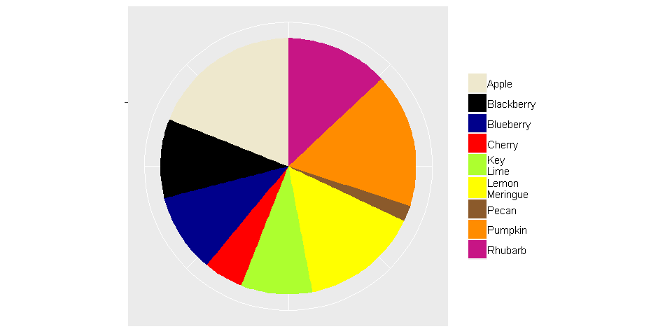
哪些圖表類型可用于替換餅圖? (What chart types can be used to replace pie charts?)
條形圖 (Bar charts)
Similar to pie charts, bar charts use size to convey information; however, for bar charts, the height of a rectangle varies, and differences between the heights of bars are easier to recognize than the differences between the angles of portions of a circle. Furthermore, bar charts can be configured to show absolute numbers, percentages, or both!
類似于餅圖,條形圖使用大小來傳達信息。 但是,對于條形圖,矩形的高度是變化的,并且條形的高度之間的差異比圓的各個部分的角度之間的差異更容易識別。 此外,可以將條形圖配置為顯示絕對數字,百分比或同時顯示兩者!
#Adjusting plot size and margins
options(repr.plot.width=8, repr.plot.height=4)
par(mfrow=c(1,1), mai = c(0.5, 1, 0.2, 1))#Data for bar chart
values = c(9, 2, 5, 10, 13, 15, 10, 17, 19)
labels = c("Key \nLime", "Pecan", "Cherry", "Blueberry", "Rhubarb",
           "Lemon \nMeringue", "Blackberry", "Pumpkin", "Apple")data = data.frame(labels, values)
data = data[order(-values),]#Build the bar chart
barplot(height=data$values,
        names.arg=data$labels,
        ylab="Votes",
        ylim = c(0, 20),
        cex.names=0.7)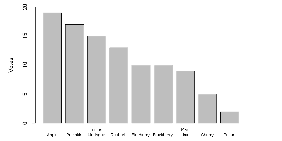
華夫餅圖 (Waffle Charts)
Waffle charts, which are growing in popularity, use number rather than size to visualize a numerical dimension. The resulting graph is similar to a stacked bar or tree map; however, because each square is a unit, compared to alternatives that rely solely on size, it is easier for a person to confirm if a perceived difference between categories is real without relying on text.
華夫餅圖越來越流行,它使用數字而不是大小來可視化數字維度。 生成的圖形類似于堆積的條形圖或樹形圖。 但是,由于每個正方形都是一個單位,與僅依賴于大小的替代方案相比,一個人可以更容易地在不依賴文本的情況下確認類別之間的感知差異是否是真實的。
#Adjusting plot size and margins
options(repr.plot.width=8, repr.plot.height=4)
par(mfrow=c(1,1), mai = c(0.5, 1, 0.2, 1))#Create data
pies = c("Pecan"=2, "Cherry"=5, "Key Lime"=9, "Blueberry"=10,
         "Blackberry"=10, "Rhubarb"=13, "Lemon Meringue"=15,
         "Pumpkin"=17, "Apple"=19)waffle(pies, rows=5, size=1.5,
       colors=c("tan4", "red", "greenyellow", "darkblue", "black",
                "mediumvioletred", "yellow", "darkorange",
                "cornsilk2"),
       xlab="1 square = 1 vote", legend_pos = "bottom")
但是,如果我不喜歡其他選擇,該怎么辦? (But what if I don’t like the alternatives?)
Even though there are many alternatives (e.g., bar charts, stacked bars, waffle charts, lollipop charts, tree maps), pie charts are a familiar chart type to most people, and depending on the audience, familiarity may be an important factor that affects interpretability. So if you want to stick with pie charts, consider taking the following advice.
即使有很多選擇(例如條形圖,堆積的條形圖,華夫餅圖,棒棒糖圖,樹形圖),餅圖也是大多數人熟悉的圖表類型,并且取決于受眾,熟悉度可能是影響可解釋性。 因此,如果您要堅持餅圖,請考慮采取以下建議。
通過分組限制類別數 (Limit the number of categories via grouping)
To avoid visual clutter and to ensure your pie chart is readable, the number of categories should be small. Therefore, it may be useful to group categories that individually comprise a small proportion of the pie into a single category. Note that, when using this approach, it may be helpful to list the items contained in the derived category. Furthermore, it is best to ensure that the new category does not form the majority of the resulting pie.
為避免視覺混亂,并確保餅圖可讀,類別的數量應少。 因此,將單獨包含一小部分餡餅的類別歸為一個類別可能很有用。 請注意,使用這種方法時,列出派生類別中包含的項目可能會有所幫助。 此外,最好確保新類別不構成結果派的大部分。
將百分比或絕對數字(或兩者)顯示為文本 (Show percentages or absolute numbers (or both) as text)
Text can be used to prevent misunderstandings due to ambiguity. By including text information, a person can see if there are differences among the categories. However, if it is necessary to include text, then one can argue that the visualization itself is ineffective (so be prepared to defend your choice of chart type).
文本可用于防止由于歧義而引起的誤解。 通過包含文本信息,人們可以查看類別之間是否存在差異。 但是,如果有必要包含文本,則可以認為可視化本身是無效的(因此請準備好捍衛您選擇的圖表類型)。
#Adjusting plot size and margins
options(repr.plot.width=8, repr.plot.height=4)
par(mfrow=c(1,1), mai = c(0.55, 0, 0.8, 0))#Data for pie chart
x = c(15, 20, 35, 30)
labels = c("Other (15%)", "Cherry (20%)", "Pumpkin (35%)",
           "Apple (30%)")
cols = c("black", "red", "darkorange", "cornsilk2")#Build the pie chart
pie(x, labels, radius = 1, col=cols)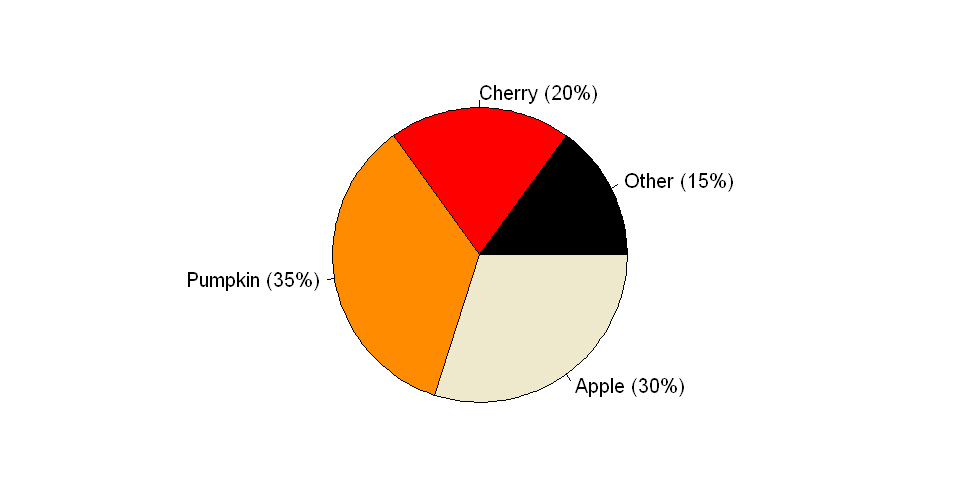
結論 (Conclusions)
I hope you found this discussion of pie charts informative. While pie charts can be avoided in most cases, they remain a pithy little chart on which many, many people have little to no opinion. However, to avoid a mass uptake of pitchforks and torches, please remember to employ pie charts responsibly and to use caution when including any controversial chart type in your next presentation.
我希望您發現對餅形圖的討論能提供更多信息。 盡管在大多數情況下都可以避免餅圖,但它們仍然是一個精巧的小圖表,很多人對此幾乎沒有意見。 但是,為避免大量吸收干草叉和火炬,請記住要負責任地使用餅形圖,并在下次演示中包括任何有爭議的圖表類型時保持謹慎。
所需的庫 (Required libraries)
library(repr)
library(dplyr)
library(plotly)
library(waffle)
library(ggplot2)
library(RColorBrewer)
翻譯自: https://medium.com/analytics-vidhya/why-pie-charts-are-problematic-1075ce7d0270
本文來自互聯網用戶投稿,該文觀點僅代表作者本人,不代表本站立場。本站僅提供信息存儲空間服務,不擁有所有權,不承擔相關法律責任。 如若轉載,請注明出處:http://www.pswp.cn/news/389443.shtml 繁體地址,請注明出處:http://hk.pswp.cn/news/389443.shtml 英文地址,請注明出處:http://en.pswp.cn/news/389443.shtml
如若內容造成侵權/違法違規/事實不符,請聯系多彩編程網進行投訴反饋email:809451989@qq.com,一經查實,立即刪除!相關文章
)
New Distinct Substrings(后綴數組)

Android dependency 'com.android.support:support-v4' has different version for the compile (26.1.0...

先知模型 facebook_使用Facebook先知進行犯罪率預測

莫煩Pytorch神經網絡第四章代碼修改

github gists 101使代碼共享漂亮

loj #6278. 數列分塊入門 2

基于Netty的百萬級推送服務設計要點

莫煩Pytorch神經網絡第五章代碼修改

鮮為人知的6個黑科技網站_6種鮮為人知的熊貓繪圖工具

)
網頁JS獲取當前地理位置(省市區)

大熊貓卸妝后_您不應錯過的6大熊貓行動

數據eda_關于分類和有序數據的EDA

PyTorch官方教程中文版:PYTORCH之60MIN入門教程代碼學習

Flexbox 最簡單的表單


jdk重啟后步行_向后介紹步行以一種新穎的方式來預測未來

PyTorch官方教程中文版:入門強化教程代碼學習

css3-2 CSS3選擇器和文本字體樣式
