背景故事 (Backstory)
I stumbled upon an interesting task while doing a data exercise for a company. It was about cohort analysis based on user activity data, I got really interested so thought of writing this post.
在為公司進行數據練習時,我偶然發現了一項有趣的任務。 這是關于基于用戶活動數據的隊列分析,我真的很感興趣,因此想到了寫這篇文章。
This article provides an insight into what cohort analysis is and how to analyze data for plotting cohorts. There are various ways to do this, I have discussed a specific approach that uses pandas and python to track user retention. And further provided some analysis into figuring out the best traffic sources (organic/ inorganic) for an organization.
本文提供了關于什么是隊列分析以及如何分析數據以繪制隊列的見解。 有多種方法可以做到這一點,我已經討論了一種使用pandas和python跟蹤用戶保留率的特定方法。 并進一步提供了一些分析,以找出組織的最佳流量來源(有機/無機)。
隊列分析 (Cohort Analysis)
Let’s start by introducing the concept of cohorts. Dictionary definition of a cohort is a group of people with some common characteristics. Examples of cohort include birth cohorts (a group of people born during the same period, like 90’s kids) and academic cohorts (a group of people who started working towards the same curriculum to finish a degree together).
讓我們開始介紹同類群組的概念。 同類詞典的定義是一群具有某些共同特征的人。 同類人群的例子包括出生人群 (在同一時期出生的一群人,例如90年代的孩子)和學術人群 (一群開始朝著相同的課程努力以完成學位的人們)。
Cohort analysis is specifically useful in analyzing user growth patterns for products. In terms of a product, a cohort can be a group of people with the same sign-up date, the same usage starts month/date, or the same traffic source.
同類群組分析在分析產品的用戶增長模式時特別有用。 就產品而言,同類群組可以是一群具有相同注冊日期,相同使用開始月份/日期或相同流量來源的人。
Cohort analysis is an analytics method by which these groups can be tracked over time for finding key insights. This analysis can further be used to do customer segmentation and track metrics like retention, churn, and lifetime value. There are two types of cohorts — acquisitional and behavioral.
同類群組分析是一種分析方法,可以隨著時間的推移跟蹤這些組以查找關鍵見解。 該分析還可以用于進行客戶細分,并跟蹤諸如保留率,客戶流失率和生命周期價值之類的指標。 隊列有兩種類型:獲取型和行為型。
Acquisitional cohorts — groups of users on the basis of there signup date or first use date etc.
獲取群組-根據注冊日期或首次使用日期等確定的用戶組。
Behavioral cohorts — groups of users on the basis of there activities in a given period of time. Examples could be when they install the app, uninstall the app, delete the app, etc.
行為群組-基于給定時間段內的活動的用戶組。 例如當他們安裝應用程序,卸載應用程序,刪除應用程序等時。
In this article, I will be demonstrating the acquisition cohort creation and analysis using a dataset. Let’s dive into it:
在本文中,我將演示使用數據集進行的采集隊列創建和分析。 讓我們深入了解一下:
建立 (Setup)
I am using pandas, NumPy, seaborn, and matplotlib for this analysis. So let’s start by importing the required libraries.
我正在使用熊貓,NumPy,seaborn和matplotlib進行此分析。 因此,讓我們從導入所需的庫開始。
import pandas as pdimport numpy as npimport seaborn as snsimport matplotlib.pyplot as plt
%matplotlib inline
數據 (The Data)
This dataset consists of usage data from customers for the month of February. Some of the users in the dataset started using the app in February (if ‘isFirst’ is true) and some are pre-February users.
此數據集包含2月份來自客戶的使用情況數據。 數據集中的某些用戶從2月開始使用該應用程序(如果'isFirst'為true),另一些則是2月之前的用戶。
df=pd.read_json(“data.json”)
df.head()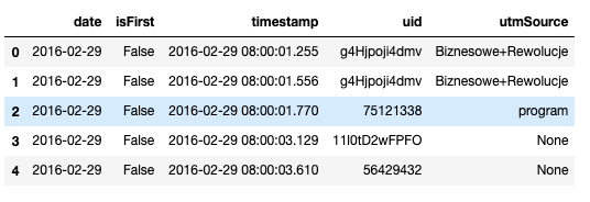
The data has 5 columns:
數據有5列:
date: date of the use (for the month of February)timestamp: usage timestampuid: unique id assigned to usersisFirst: true if this is the user’s first use everSource: traffic source from which the user cameWe can compute the shape and info of the dataframe as follows
我們可以如下計算數據框的形狀和信息
df.shape(4823567, 5)df.info()<class 'pandas.core.frame.DataFrame'>
RangeIndex: 4823567 entries, 0 to 4823566
Data columns (total 5 columns):
date         datetime64[ns]
isFirst      bool
timestamp    datetime64[ns]
uid          object
utmSource    object
dtypes: bool(1), datetime64[ns](2), object(2)
memory usage: 151.8+ MB
Below is a table of contents for the data analysis. I will first show the data cleaning that I did for this dataset, followed by the questions that this exercise will answer. The most important part of any analysis based project is what questions are going to be answered by the end of it. I will be answering 3 questions (listed below) followed by some more analysis, summary, and conclusions.
以下是用于數據分析的目錄。 我將首先顯示我對此數據集所做的數據清理,然后顯示此練習將回答的問題。 在任何基于分析的項目中,最重要的部分是在項目結束時將要回答什么問題。 我將回答3個問題(在下面列出),然后提供更多分析,總結和結論。
目錄 (Table of Contents)
Data Cleaning
數據清理
Question 1: Show the daily active users over the month.
問題1:顯示當月的每日活躍用戶。
Question 2: Calculate the daily retention curve for users who used the app for the first time on specific dates. Also, show the number of users from each cohort.
問題2:計算在特定日期首次使用該應用程序的用戶的每日保留曲線。 另外,顯示每個群組的用戶數 。
Question 3: Determine if there are any differences in usage based on where the users came from. From which traffic source does the app get its best users? Its worst users?
問題3:根據用戶來自何方來確定用法上是否存在差異。 該應用程序從哪個流量來源獲得最佳用戶? 它最糟糕的用戶?
Conclusions
結論
數據清理 (Data Cleaning)
Here are some of the tasks I performed for cleaning my data.
這是我執行的一些清理數據任務。
空值: (Null values:)
- Found out the null values in the dataframe: Source had 1,674,386 null values 在數據框中找到空值:源具有1,674,386個空值
- Created a new column ‘trafficSource’ where null values are marked as ‘undefined’ 創建了一個新列“ trafficSource”,其中空值被標記為“未定義”
合并流量來源: (Merge Traffic Sources:)
- Merged traffic Sources using regular expression: facebook.* to facebook, gplus.* to google, twitter.* to twitter 使用正則表達式合并流量來源:facebook。*到facebook,gplus。*到google,twitter。*到twitter
- Merged the traffic sources with < than 500 unique users to ‘others’. This was done because 11 sources had only 1 unique user, another 11 sources had less than 10 unique users, and another 11 sources had less than 500 unique users. 將少于500個唯一身份用戶的流量來源合并為“其他”用戶。 這樣做是因為11個來源只有1個唯一用戶,另外11個來源只有10個以下唯一用戶,另外11個來源只有500個以下唯一用戶。
- Finally reduced the number of traffic sources from 52 to 11. 最終將流量來源從52個減少到11個。
df.describe()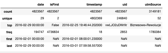
#Let’s check for null values
df.isnull().sum()date               0
isFirst            0
timestamp          0
uid                0
utmSource    1674386
dtype: int64
Looks like Source has a lot of null values. Almost ~34% of the values are null. Created a new column ‘trafficSource’ where null values are marked as ‘undefined’
看起來Source有很多空值。 幾乎?34%的值為空。 創建了一個新列“ trafficSource”,其中空值被標記為“未定義”
Next, I took care of similar traffic sources like facebook, facebookapp, src_facebook, etc by merging them.
接下來,我通過合并來處理類似的流量來源,例如facebook,facebookapp,src_facebook等。
Found out the unique users from each traffic source. This was done to figure out — if some of the traffic sources have very few unique users as compared to others then they all can be merged. This reduces the number of data sources that we have to analyze without any significant loss in the accuracy of the analysis. And so I merged the traffic sources with less than 500 (0.2% of the total) unique users to ‘others’. Finally reducing the number of traffic sources from 52 to 11.
從每個流量來源中找出唯一的用戶。 這樣做是為了弄清楚-如果某些流量源與其他流量相比具有很少的唯一用戶,則可以將它們全部合并。 這減少了我們必須分析的數據源的數量,而不會導致分析準確性的任何重大損失。 因此,我將流量來源與少于500個唯一用戶( 占總數的0.2% )合并為“其他”用戶。 最后,將流量來源的數量從52個減少到11個 。
Now let’s answer the questions.
現在讓我們回答問題。
問題1: (Question 1:)
顯示一個月的每日活躍用戶(DAU)。 (Show the daily active users (DAU) over the month.)
A user is considered active for the day if they used the app at least once on a given day. Tasks performed to answer this question:
如果用戶在給定的一天中至少使用過一次該應用程序,則該用戶被視為當天處于活動狀態。 為回答該問題而執行的任務:
- Segregated the users who started using the app in February from all the users. 將2月份開始使用該應用程序的用戶與所有用戶隔離開來。
Calculated the DAU for
計算的DAU
- users who started in the month of February
-2月開始的用戶
- total number of active users
-活動用戶總數
- plotted this on a graph. 將此繪制在圖形上。
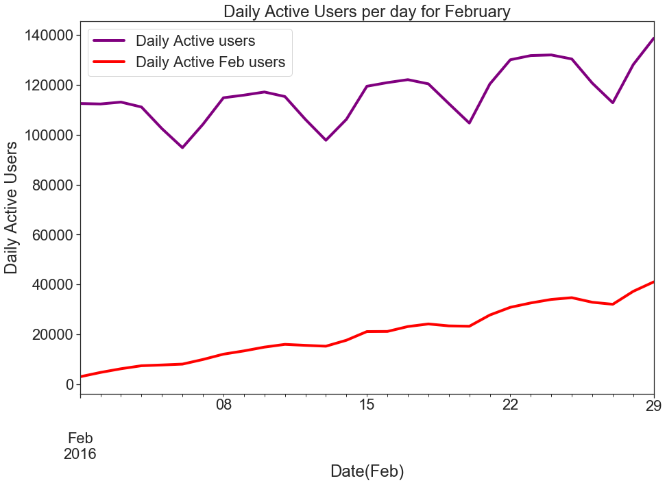
Figure 1 shows the daily active users (DAU) for the month of February. I have plotted 2 graphs; one is the DAU plot for all the users and the other is the DAU plot for those users who started using the app in February. As we can see from the graph, the daily active count for Feb users is increasing in number but the DAU plot for all users has significant periodic dips (which could be attributed to less usage during the weekends) with slower net growth as compared to just the users for February.
圖1顯示了2月份的每日活動用戶(DAU)。 我已經繪制了2張圖; 一個是所有用戶的DAU圖,另一個是2月份開始使用該應用程序的用戶的DAU圖。 從圖表中可以看出,2月份用戶的每日活動數量正在增加,但是所有用戶的DAU圖都有明顯的周期性下降(這可能是由于周末期間的使用減少),與2月份的用戶。
問題2 (Question 2)
計算在特定日期首次使用該應用程序的用戶的每日保留曲線。 另外,顯示每個同類群組的用戶數。 (Calculate the daily retention curve for users who used the app for the first time on specific dates. Also, show the number of users from each cohort.)
The dates which were considered for creating cohorts are Feb 4th, Feb 10th, and Feb 14th. Tasks done to answer this question are:
創建隊列的日期考慮為2月4日,2月10日和2月14日。 為回答該問題而完成的任務是:
- Created cohorts for all the users who started on the above dates. 為在上述日期開始的所有用戶創建了同類群組。
- Calculated daily retention for the above dates as starting dates; for each day of February. The daily retention curve is defined as the % of users from the cohort, who used the product that day. 計算上述日期的每日保留時間作為開始日期; 2月的每一天。 每日保留曲線定義為當天使用該產品的同類用戶的百分比。
The function dailyRetention takes a dataframe and a date (of cohort creation) as input and creates a cohort for all the users who started using the app on date ‘date’. It outputs the total number of unique users in that cohort and the retention in percentage from the starting date for each day of February.
函數dailyRetention將數據框和日期(創建群組的日期)作為輸入,并為所有在日期“ date”開始使用該應用程序的用戶創建一個群組。 它輸出該同類群組中的唯一身份用戶總數,以及從2月的每一天開始日期起的保留百分比。
Figure 2 shows the total number of unique users from each cohort.
圖2顯示了每個隊列的唯一身份用戶總數。

The below code makes the data ready for creating a heatmap by adding a cohort index and then pivoting the data with index as Cohort start dates, columns as days of February, and values as a percentage of unique users who used the app on that day. And then the code further plots a heatmap.
下面的代碼通過添加同類群組索引,然后將數據與索引一起作為同類群組開始日期,列作為2月的天以及列值作為當天使用該應用的唯一身份用戶的百分比來使數據準備好創建熱圖。 然后代碼進一步繪制熱圖。
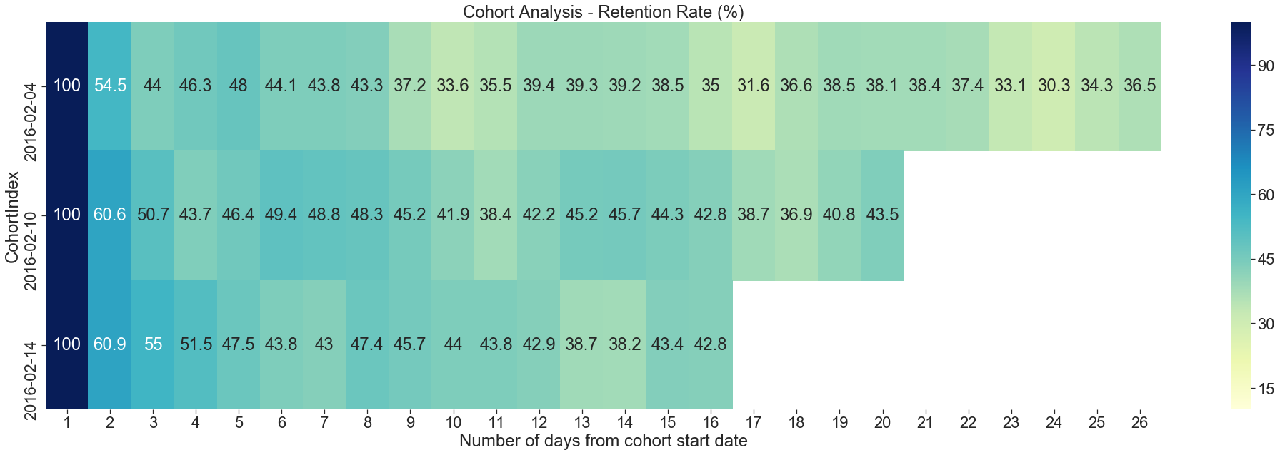
Figure 3 shows a heatmap for the daily retention for users who used the app for the first time on Feb 4th, Feb 10th, and Feb 14th. From the heatmap, we can see 100% retention on the first day of usage. And retention decreases to as low as ~31% for some of the days.
圖3顯示了2月4日,2月10日和2月14日首次使用該應用程序的用戶每日保留的熱圖。 從熱圖中,我們可以看到使用第一天的保留率是100%。 在某些日子里,保留率降低至?31%。
Figure 4 shows the Daily retention curve for the month of February. Initially the retention is 100% but it keeps on decreasing and becomes stable after a week.
圖4顯示了2月份的每日保留曲線。 最初的保留率為100%,但持續下降,并在一周后變得穩定。
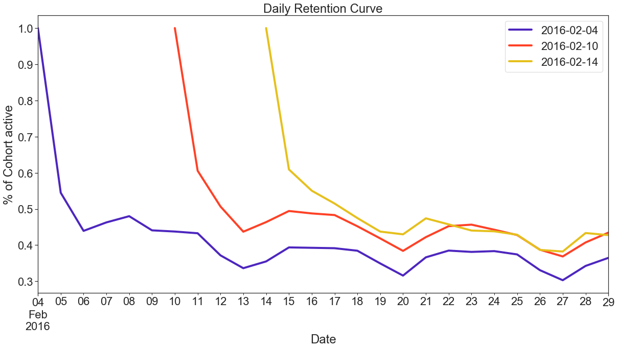
This retention curve immediately reflects an important insight — about 40–50% of the users stop using the app after the 1st day. After that initial large drop, a second brisk drop occurs after the 10th day — to under 35–45%, before the curve starts to level off after the 13th day, leaving about 37–43% of original users still active in the app at the last day of February.
此保留曲線立即反映出重要的見解-大約40%至50%的用戶在第一天后停止使用該應用程序。 在最初的大幅下降之后,在第10天之后又發生了第二次快速下降-低于35–45%,在第13天之后曲線開始趨于平穩之前,大約有37–43%的原始用戶仍在該應用中處于活動狀態2月的最后一天。
The above retention curve indicates that a lot of users are not experiencing the value of the app, resulting in drop-offs. Hence, one way to fix that is to improve the onboarding experience which can help the users in experiencing the core value as quickly as possible, thereby boosting retention.
上面的保留曲線表明,很多用戶沒有體驗到該應用程序的價值,從而導致該應用程序的流失。 因此,一種解決方法是改善入職體驗,這可以幫助用戶盡快體驗核心價值,從而提高保留率。
問題3 (Question 3)
根據用戶來自何方來確定用法上是否存在差異。 該應用程序從哪個流量來源獲得最佳用戶? 它最糟糕的用戶? (Determine if there are any differences in usage based on where the users came from. From which traffic source does the app get its best users? Its worst users?)
The tasks performed to answer this question are:
為回答該問題而執行的任務是:
- Data Cleaning: To clean user ids with duplicate sources. 數據清除:清除具有重復來源的用戶ID。
- Feature Engineering: Feature engineered new features to find out the best and worst sources. 功能工程:功能工程的新功能可以找出最佳和最差的來源。
Data Cleaning:Identifying the best or the worse sources required some data cleaning. There are some users who had more than one traffic source. I did some data cleaning to remove/merge these multiple sources.
數據清除:確定最佳或較差的來源需要一些數據清除。 有些用戶擁有多個流量來源。 我進行了一些數據清理,以刪除/合并這些多個源。
- 1.64% of user ids i.e. 4058 unique uids had more than 1 source. 1.64%的用戶ID(即4058個唯一uid)具有多個來源。
- Since the duplicate traffic source uid count is not significant and there was no reliable way to attribute a single source to these uids, I simply removed these uids from my analysis. 由于重復的流量源uid計數并不重要,并且沒有可靠的方法將單個源歸因于這些uid,因此我只是從分析中刪除了這些uid。
1.64% of user ids have more than 1 source.
1.64%的用戶ID具有多個來源。
The below code creates a group of all users with multiple sources and drops those users from our dataframe and creates a new dataframe ‘dfa’.
以下代碼創建了一組具有多個來源的所有用戶,并將這些用戶從我們的數據框中刪除,并創建了一個新的數據框'dfa'。
Feature Engineering: In this section, I have feature engineered 2 different metrics to find out the differences in usage based on the traffic source. Here are the metrics:
功能工程:在本節中,我對2個不同的功能進行了工程設計,以根據流量來源找出用法上的差異。 以下是指標:
Total number of unique active users per source per day The first metric is a purely quantitative metric calculated on the basis of how many users we are getting from each source and their activity per day throughout the month. The below code calculates this metric and plots a graph to visualize the results.
每天每個來源的唯一活動用戶總數第一個指標是一個純粹的定量指標,該指標是根據我們每個月從每個來源獲得的用戶數量及其每天的活動量計算得出的。 以下代碼計算該指標并繪制圖形以可視化結果。
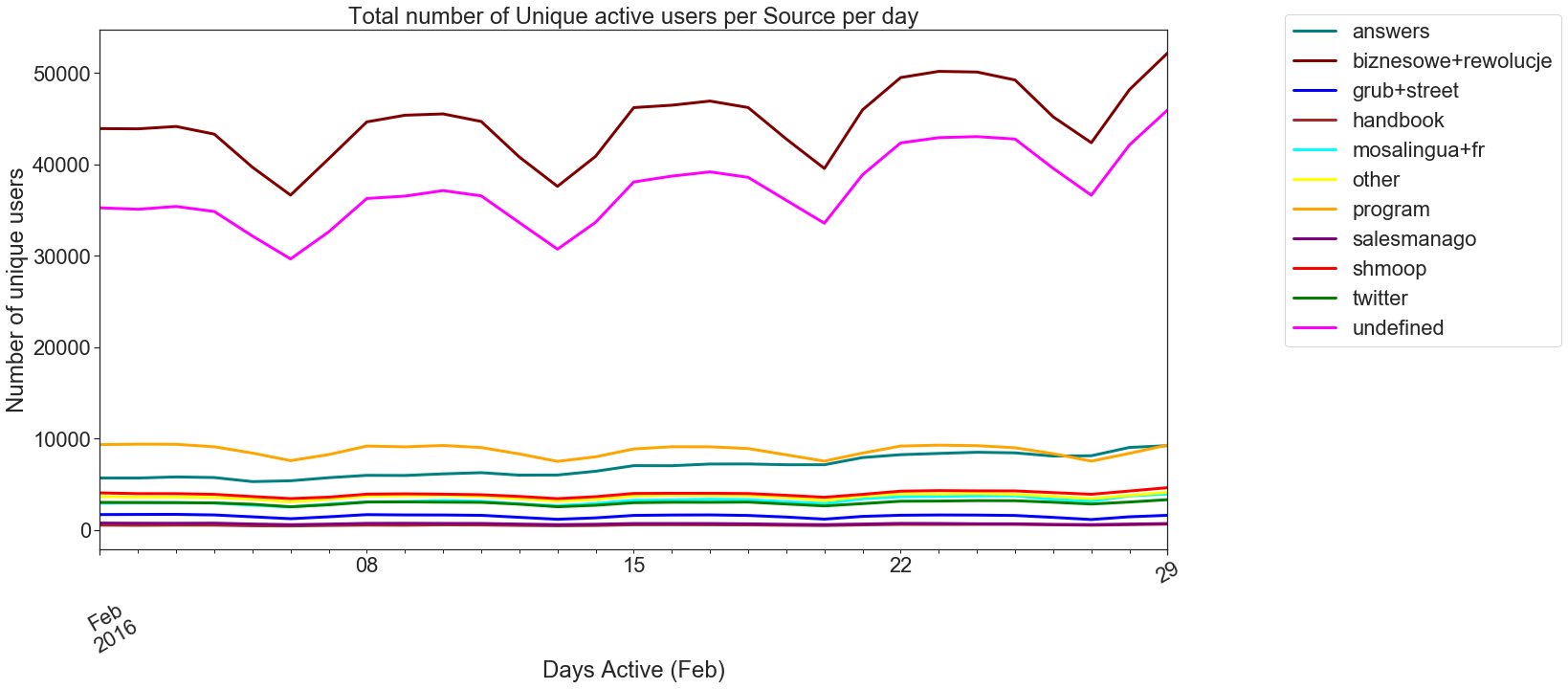
Figure 6 plots this information using a line plot. From the plot, one can see that biznesowe+rewolucje and undefined sources are getting the most users but there is a dip in the usage on weekends. And sources like program, answers, shmoop, twitter, grub+street, and handbook have constant usage throughout the month but the unique users contributed are low.
圖6使用線圖繪制了這些信息。 從該圖可以看出,biznesowe + rewolucje和未定義來源正在吸引最多的用戶,但周末使用量有所下降。 諸如程序,答案,smoop,twitter,grub + street和手冊之類的資源在整個月中都有固定使用量,但唯一用戶貢獻卻很少。
2) Number of days active/source The second metric I calculated is the number of days active/source. For this, I have grouped the data per traffic source and uid and counted the number of unique dates. So this gives us the number of days for each traffic source when each uid was active. I have plotted this information on a KDE graph and on analyzing the graph it’s evident that the distribution for all sources is bimodal with peaks near 0 and 29 days. The best traffic sources can be defined as ones with a peak at 29 and the worst ones with a peak at 0.
2)活動/源天數我計算的第二個指標是活動/源天數。 為此,我對每個流量來源和uid的數據進行了分組,并計算了唯一日期的數量。 因此,這為我們提供了每個uid處于活動狀態時每個流量來源的天數。 我已經在KDE圖上繪制了這些信息,并且在分析圖時很明顯,所有源的分布都是雙峰的,峰值接近0和??29天。 最佳流量源可以定義為峰值為29的流量來源,最差流量為0的峰值流量。
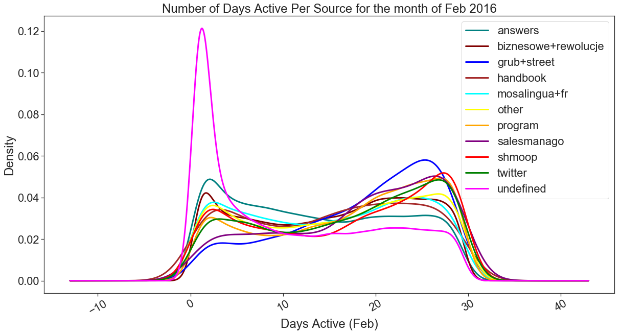
Figure 7 shows us a KDE graph for the number of days active per source for the month of Feb. From the graph, it can be seen that the best sources with a mode at 29 (most of the users from these sources used the app for 29 days) are shmoop and twitter closely followed by program, salesmanago, and grub+street with peaks at 29, 28 and 27 respectively. The worst source is the undefined with a mode of 0 despite getting the most users, followed by answers and biznesowe+rewolucje. If I were to define the traffic sources from best to worst based on this graph above, this would be my sequence: shmoop, twitter, program, salesmanago, grub+street, other, handbook, mosalingua+fr, biznesowe+rewolucje, answers, and undefined.
圖7為我們顯示了2月每個來源的活動天數的KDE圖。從該圖可以看出,最佳模式為29的最佳來源(這些來源中的大多數用戶使用該應用29天)是shmoop和twitter,緊隨其后的是節目,銷售經理和grub + street,其峰值分別在29、28和27。 盡管獲得最多的用戶,但最差的來源是undefined,其模式為0,其次是答案和biznesowe + rewolucje。 如果我要根據上面的這張圖來定義從最佳到最壞的流量來源,那么這就是我的順序:shmoop,twitter,程序,salesmanago,grub + street,其他,手冊,mosalingua + fr,biznesowe + rewolucje,答案,和未定義。
分析 (Analysis)
User behavior depends on the kind of metric that is important for a business. For some businesses daily activity(pings) can be an important metric and for some businesses, more activity (pings) on certain days of the month has more weight than the daily activity. One would define the worst users and best users based on what is important for the product/organization.
用戶行為取決于對業務很重要的度量標準類型。 對于某些企業來說,每日活動(ping)可能是一個重要的指標,對于某些企業來說,每月某些天的更多活動(ping)的權重要大于日常活動。 可以根據對產品/組織重要的信息來定義最差的用戶和最佳的用戶。
摘要 (Summary)
If the total number of unique active users is an important metric for the product than the first graph can be used to see which sources are best/worst — more number of users indicate better traffic source.
如果唯一活動用戶總數是該產品的重要指標,則可以使用第一個圖表來查看哪個來源是最佳/最差來源-更多的用戶表示更好的流量來源。
But if we want to see their activity over the month and analyze how many days the users from a particular source were active for the month then the second metric becomes important. In this case, we found out that even if the source (eg Shmoop, twitter) is giving a lesser number of unique active users per day, the users which are coming are using the app for a longer period of time.
但是,如果我們想查看他們一個月的活動并分析來自特定來源的用戶在該月中活躍了多少天,那么第二個指標就變得很重要。 在這種情況下,我們發現即使源(例如Shmoop,twitter)每天提供的唯一身份活躍用戶數量較少,即將到來的用戶使用該應用程序的時間也更長。
結論 (Conclusions)
In this article, I showed how to carry out Cohort Analysis using Python’s pandas, matplotlib, and seaborn. During the analysis, I have made some simplifying assumptions, but that was mostly due to the nature of the dataset. While working on real data, we would have more understanding of the business and can draw better and more meaningful conclusions from the analysis.
在本文中,我展示了如何使用Python的pandas,matplotlib和seaborn進行同類群組分析。 在分析過程中,我做了一些簡化的假設,但這主要是由于數據集的性質。 在處理真實數據時,我們將對業務有更多的了解,并可以從分析中得出更好,更有意義的結論。
You can find the code used for this article on my GitHub. As always, any constructive feedback is welcome. You can reach out to me in the comments.
您可以在我的GitHub上找到用于本文的代碼。 一如既往,歡迎任何建設性的反饋。 您可以在評論中與我聯系。
翻譯自: https://medium.com/swlh/cohort-analysis-using-python-and-pandas-d2a60f4d0a4d
本文來自互聯網用戶投稿,該文觀點僅代表作者本人,不代表本站立場。本站僅提供信息存儲空間服務,不擁有所有權,不承擔相關法律責任。 如若轉載,請注明出處:http://www.pswp.cn/news/389263.shtml 繁體地址,請注明出處:http://hk.pswp.cn/news/389263.shtml 英文地址,請注明出處:http://en.pswp.cn/news/389263.shtml
如若內容造成侵權/違法違規/事實不符,請聯系多彩編程網進行投訴反饋email:809451989@qq.com,一經查實,立即刪除!相關文章
模式—精讀《JavaScript 設計模式》Addy Osmani著)
3.Contructor(構造器)模式—精讀《JavaScript 設計模式》Addy Osmani著
)
BZOJ 3653: 談笑風生(離線, 長鏈剖分, 后綴和)

搜索引擎優化學習原理_如何使用數據科學原理來改善您的搜索引擎優化工作
詳解)
Siamese網絡(孿生神經網絡)詳解

Dubbo 源碼分析 - 服務引用

期權價格的上限和下限

一件登錄facebook_我從Facebook的R教學中學到的6件事

SiameseFC超詳解

)
Python全棧工程師(字符串/序列)


FCN全卷積網絡隨筆

熊貓在線壓縮圖_回歸圖與熊貓和脾氣暴躁

敏捷數據科學pdf_敏捷數據科學數據科學可以并且應該是敏捷的

oracle的連接字符串

SiameseRPN詳解

數據可視化 信息可視化_可視化數據操作數據可視化與紀錄片的共同點

python 圖表_使用Streamlit-Python將動畫圖表添加到儀表板

