熊貓在線壓縮圖
數據可視化 (Data Visualization)
I like the plotting facilities that come with Pandas. Yes, there are many other plotting libraries such as Seaborn, Bokeh and Plotly but for most purposes, I am very happy with the simplicity of Pandas plotting.
我喜歡熊貓隨附的繪圖設備。 是的,還有許多其他的繪圖庫,例如Seaborn,Bokeh和Plotly,但對于大多數用途,我對Pandas繪圖的簡單性感到非常滿意。
But there is one thing missing that I would like and that is the ability to plot a regression line over a complex line or scatter plot.
但是我想缺少一件事,那就是能夠在復雜線或散點圖上繪制回歸線。
But, as I have discovered, this is very easily solved. With the Numpy library you can generate regression data in a couple of lines of code and plot it in the same figure as your original line or scatter plot.
但是,正如我發現的那樣,這很容易解決。 使用Numpy庫,您可以在幾行代碼中生成回歸數據,并將其繪制在與原始線圖或散點圖相同的圖中。
So that is what we are going to do in this article.
這就是我們在本文中要做的。
First, let’s get some data. If you’ve read any of my previous articles on data visualization, you know what’s coming next. I’m going to use a set of weather data that you can download from my Github account. It records the temperatures, sunshine levels and rainfall over several decades for London in the UK and is stored as a CSV file. This file has been created from public domain data recorded by the UK Met Office.
首先,讓我們獲取一些數據。 如果您閱讀過我以前有關數據可視化的任何文章,那么您將了解接下來的內容。 我將使用一組可以從我的Github帳戶下載的天氣數據。 它記錄了英國倫敦數十年來的溫度,日照水平和降雨量,并以CSV文件存儲。 該文件是根據UK Met Office記錄的公共領域數據創建的。
倫敦夏天變熱嗎 (Are London summers getting hotter)
We are going to check whether the temperatures in London are rising over time. It’s not obvious from the raw data but by plotting a regression line over that data we will be better able to see the trend.
我們將檢查倫敦的溫度是否隨著時間升高。 從原始數據來看并不明顯,但是通過在該數據上繪制一條回歸線,我們將能夠更好地看到趨勢。
So to begin we need to import the libraries that we will need.
因此,我們首先需要導入所需的庫。
import pandas as pd
import numpy as np
import matplotlib.pyplot as plt
Nothing very unusual there, we are importing Pandas to help with data analysis and visualization, Numpy will give us the routines we need to create the regression data and Matplotlib is used by Pandas to create the plots.
那里沒有什么異常的,我們正在導入Pandas以幫助進行數據分析和可視化,Numpy將為我們提供創建回歸數據所需的例程,而Matplotlib被Pandas用于創建圖。
Next, we download the data.
接下來,我們下載數據。
weather = pd.read_csv(‘https://raw.githubusercontent.com/alanjones2/dataviz/master/londonweather.csv')(As you probably guessed, that’s all supposed to be on one line.)
(您可能已經猜到了,這些都應該放在一行上。)
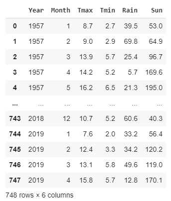
We have read the CSV file into a Pandas DataFrame and this is what it looks like — a table containing monthly data that records the maximum and minimum temperatures, the rainfall and the number of hours of sunshine, starting in 1957 and ending part way through 2019.
我們已經將CSV文件讀入了Pandas DataFrame,它的樣子是這樣的-該表包含每月數據,記錄最高和最低溫度,降雨量和日照小時數,始于1957年,直到2019年結束。
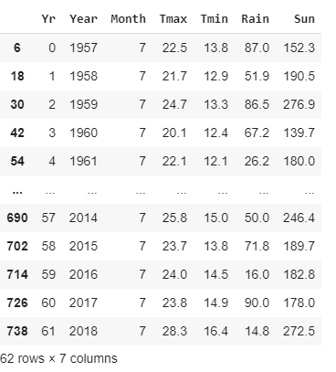
I posed the question about whether summers were getting hotter, so I’m going to filter the data to give me only the data for the month of July when the hottest temperatures are normally recorded. And, for convenience, I’m going to add a column that numbers the years starting at year 0 (you’ll see how this is used later).
我提出了一個關于夏天是否變熱的問題,所以我將過濾數據以僅提供通常記錄最熱溫度的7月的數據。 并且,為方便起見,我將添加一列以數字表示從0年開始的年份(您將在稍后看到如何使用它)。
july = weather.query(‘Month == 7’)
july.insert(0,’Yr’,range(0,len(july)))
The code above applies a query to the weather dataframe which returns only the rows where the Month is equal to 7 (i.e.July) and creates a new dataframe called july from the result.
上面的代碼對天氣數據框應用查詢,該查詢僅返回Month等于7(即7月)的行,并從結果中創建一個稱為july的新數據框。
Next, we insert a new column called Yr which numbers the rows from 0 to the length of the table.
接下來,我們插入一個稱為Yr的新列,該列對從0到表的長度的行進行編號。
july looks like this:
七月看起來像這樣:
Now we can plot the maximum temperatures for July since 1957.
現在,我們可以繪制1957年以來7月份的最高溫度。
july.plot(y=’Tmax’,x=’Yr’)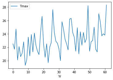
There is a lot of variation there and high temperatures are not limited to recent years. But there does seem to be a trend, temperatures do seem to be rising a little, over time.
那里有很多變化,高溫不僅限于近年來。 但似乎確實存在趨勢,隨著時間的流逝,溫度似乎確實有所上升。
We can try and make this a bit more obvious by doing a linear regression where we attempt to find a straight line graph that represents the trend in the rise in temperature. To do this we use the polyfit function from Numpy. Polyfit does a least squares polynomial fit over the data that it is given. We want a linear regression over the data in columns Yr and Tmax so we pass these as parameters. The final parameter is the degree of the polynomial. For linear regression the degree is 1.
我們可以通過進行線性回歸來嘗試使這一點更加明顯,在線性回歸中我們試圖找到一個代表溫度上升趨勢的直線圖。 為此,我們使用Numpy中的polyfit函數。 Polyfit對給出的數據進行最小二乘多項式擬合。 我們希望對Yr和Tmax列中的數據進行線性回歸,因此我們將它們作為參數傳遞。 最終參數是多項式的次數。 對于線性回歸,度為1。
We then use the convenience function poly1d to provide us with a function that will do the fitting.
然后,我們使用便利函數poly1d為我們提供將進行擬合的函數。
d = np.polyfit(july[‘Yr’],july[‘Tmax’],1)
f = np.poly1d(d)
We now use the function f to produce our linear regression data and inserting that into a new column called Treg.
現在,我們使用函數f生成線性回歸數據,并將其插入到名為Treg的新列中。
july.insert(6,’Treg’,f(july[‘Yr’]))Next, we create a line plot of Yr against Tmax (the wiggly plot we saw above) and another of Yr against Treg which will be our straight line regression plot. We combine the two plot by assigning the first plot to the variable ax and then passing that to the second plot as an additional axis.
接下來,我們創建一個Yr對Tmax的折線圖(我們在上面看到的擺動曲線),以及另一個Yr對Treg的折線圖,這將是我們的直線回歸圖。 我們通過將第一個圖分配給變量ax ,然后將其作為附加軸傳遞給第二個圖,來組合這兩個圖。
ax = july.plot(x = ‘Yr’,y=’Tmax’)
july.plot(x=’Yr’, y=’Treg’,color=’Red’,ax=ax)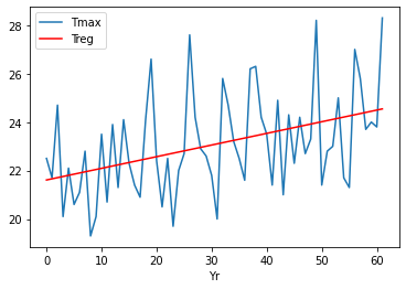
That’s it, done!
就這樣,完成了!
We can now see much more clearly the upward trend of temperature over the years.
現在,我們可以更清楚地看到多年來溫度的上升趨勢。
And here is the same thing done with a scatter chart.
這就是散點圖所做的相同的事情。
ax=july.plot.scatter(x=’Yr’, y=’Tmax’)
july.plot(x=’Yr’,y=’Treg’,color=’Red’,legend=False,ax=ax)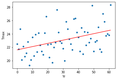
That was fairly straightforward, I think, and I hope you found it useful.
我認為那非常簡單,希望您發現它有用。
For an introduction to plotting with Pandas see this:
有關使用Pandas進行繪圖的介紹,請參見:
翻譯自: https://towardsdatascience.com/regression-plots-with-pandas-and-numpy-faf2edbfad4f
熊貓在線壓縮圖
本文來自互聯網用戶投稿,該文觀點僅代表作者本人,不代表本站立場。本站僅提供信息存儲空間服務,不擁有所有權,不承擔相關法律責任。 如若轉載,請注明出處:http://www.pswp.cn/news/389250.shtml 繁體地址,請注明出處:http://hk.pswp.cn/news/389250.shtml 英文地址,請注明出處:http://en.pswp.cn/news/389250.shtml
如若內容造成侵權/違法違規/事實不符,請聯系多彩編程網進行投訴反饋email:809451989@qq.com,一經查實,立即刪除!相關文章

敏捷數據科學pdf_敏捷數據科學數據科學可以并且應該是敏捷的

oracle的連接字符串

SiameseRPN詳解

數據可視化 信息可視化_可視化數據操作數據可視化與紀錄片的共同點

python 圖表_使用Streamlit-Python將動畫圖表添加到儀表板


sockets C#

667. Beautiful Arrangement II

SiameseRPN++分析
 :解析)
MySQL:Innodb page clean 線程 (二) :解析

Lockdown Wheelie項目

api地理編碼_通過地理編碼API使您的數據更有意義

js進階 12-5 jquery中表單事件如何使用

SiamBAN論文學習

簡單入門Javascript正則表達式

實現klib_使用klib加速數據清理和預處理

MMDetection修改代碼無效

docker etcd

SpringBoot簡要
