漸變是設置一種顏色或者多種顏色之間的過度變化。
兩種漸變類型:
-
線性漸變(向下/向上/向左/向右/對角線)
-
徑向漸變(由其中心定義)
1、線性漸變
語法:background-image: linear-gradient(direction, color-stop1, color-stop2, ...);
其中direction是方向,值可以有bottom、right、top、left 。如果該參數參數值前面添加了to,則是漸變沿著相應的方向移動。如果省略了to,則為兩個參數組合的方向,比如bottom right:右下角方向。
其中從上到下是默認的方向,可以不用添加direction參數。
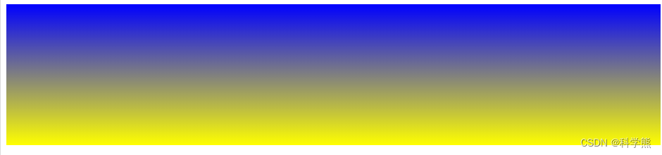
1.1 默認方向
代碼:
<head>
<style>
#grad1 {height: 200px;background-color: blue; /* 針對不支持漸變的瀏覽器 */background-image: linear-gradient(blue, yellow);
}
</style>
</head>
<body><div id="grad1"></div></body>
渲染效果:
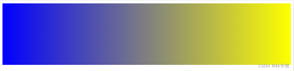
1.2、從左到右
代碼:
<head>
<style>
#grad1 {height: 200px;background-color: blue; /* 針對不支持漸變的瀏覽器 */background-image: linear-gradient(to right,blue, yellow);
}
</style>
</head>
<body><div id="grad1"></div></body>
渲染效果:
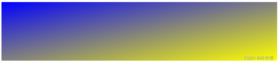
1.3 右下角
代碼:
<style>
#grad1 {height: 200px;background-color: blue; /* 針對不支持漸變的瀏覽器 */background-image: linear-gradient(to bottom right,blue, yellow);
}
</style>
</head>
<body><div id="grad1"></div></body>
渲染效果:
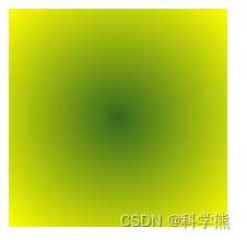
2、徑向漸變
徑是指圓形的直徑的徑,以圓心為出發點,沿著徑向漸變,和箭靶的效果差不多。
語法:
/* 在容器中心的漸變,從紅色開始,變成藍色,最后變成綠色 */
radial-gradient(circle at center, red 0, blue, green 100%)
邊緣形狀可以是圓形(circle)或橢圓形(ellipse)
形式語法
<radial-gradient()> = radial-gradient( [ <ending-shape> || <size> ]? [ at <position> ]? , <color-stop-list> ) <size> = <extent-keyword> |<length [0,∞]> |<length-percentage [0,∞]>{2} <position> = [ left | center | right ] || [ top | center | bottom ] |[ left | center | right | <length-percentage> ] [ top | center | bottom | <length-percentage> ]? |[ [ left | right ] <length-percentage> ] && [ [ top | bottom ] <length-percentage> ] <color-stop-list> = <linear-color-stop> , [ <linear-color-hint>? , <linear-color-stop> ]# <extent-keyword> = closest-corner |closest-side |farthest-corner |farthest-side <length-percentage> = <length> |<percentage> <linear-color-stop> = <color> &&<length-percentage>? <linear-color-hint> = <length-percentage>
代碼:
<style>
#grad1 {height: 200px;width:200px;background-color: blue; /* 針對不支持漸變的瀏覽器 */background-image: radial-gradient(circle at center,#33691e, yellow);
}
</style>
</head>
<body><div id="grad1"></div></body>
渲染效果:
關于徑向漸變的詳細介紹可以參考MDN Web Docs社區


自定義ErrorController)

中文亂碼)

![NLP文本匹配任務Text Matching [無監督訓練]:SimCSE、ESimCSE、DiffCSE 項目實踐](http://pic.xiahunao.cn/NLP文本匹配任務Text Matching [無監督訓練]:SimCSE、ESimCSE、DiffCSE 項目實踐)
)
)


)
