鋒哥原創的Matplotlib3 Python數據可視化視頻教程:
2026版 Matplotlib3 Python 數據可視化 視頻教程(無廢話版) 玩命更新中~_嗶哩嗶哩_bilibili
課程介紹
本課程講解利用python進行數據可視化 科研繪圖-Matplotlib,學習Matplotlib圖形參數基本設置,繪圖參數及主要函數,以及Matplotlib基礎繪圖,和Matplotlib高級繪圖。
繪制條形圖(Bar)
Matplotlib 的條形圖是展示分類數據最常用的圖表之一,特別適合比較不同類別的數值大小。以下是條形圖的全面介紹及示例代碼:
一、核心功能與適用場景
條形圖類型:
-
垂直條形圖:
plt.bar() -
水平條形圖:
plt.barh() -
分組條形圖:多組數據并列比較
-
堆疊條形圖:顯示部分與整體關系
適用場景:
-
不同類別數據的比較(產品銷量、地區收入)
-
時間序列數據對比(月度銷售額)
-
部分與整體關系可視化(堆疊條形圖)
plt.bar() 是 Matplotlib 中用于繪制垂直條形圖的核心函數。以下是詳細解析及示例:
基本語法:
plt.bar(x, height, width=0.8, bottom=None, align='center', **kwargs)| 參數 | 說明 |
|---|---|
x | 條形的橫坐標位置(標量或數組) |
height | 條形的高度(y 軸值,標量或數組) |
width | 條形的寬度(默認 0.8) |
bottom | 條形的起始基線高度(用于堆疊條形圖,默認從 0 開始) |
align | 對齊方式:'center'(居中,默認)或 'edge'(左對齊) |
**kwargs | 其他樣式參數(顏色、邊框等) |
常用 kwargs 參數
| 參數 | 說明 |
|---|---|
color / c | 條形填充顏色 |
edgecolor/ec | 邊框顏色 |
linewidth/lw | 邊框寬度 |
alpha | 透明度 |
label | 圖例標簽 |
hatch | 填充圖案(如 '///') |
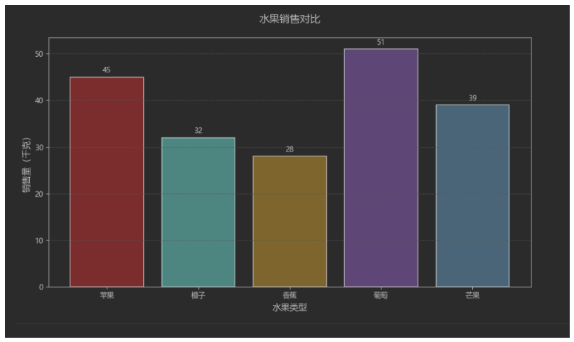
我們先看一個垂直條形圖示例:
import matplotlib
import matplotlib.pyplot as plt
?
# 設置matplotlib使用黑體顯示中文
matplotlib.rcParams['font.family'] = 'Microsoft YaHei'
?
# 數據準備
categories = ['蘋果', '橙子', '香蕉', '葡萄', '芒果']
sales = [45, 32, 28, 51, 39]
?
# 創建圖形
plt.figure(figsize=(10, 6))
?
# 繪制條形圖
bars = plt.bar(categories,sales,color=['#FF6B6B', '#4ECDC4', '#FFD166', '#A06CD5', '#6CA6CD'],edgecolor='black',linewidth=1.2
)
?
# 添加數據標簽
for bar in bars:height = bar.get_height()plt.text(bar.get_x() + bar.get_width() / 2.,height + 0.5,f'{height}',ha='center',va='bottom',fontsize=10)
?
# 設置標題和標簽
plt.title('水果銷售對比', fontsize=14, pad=20)
plt.xlabel('水果類型', fontsize=12)
plt.ylabel('銷售量(千克)', fontsize=12)
plt.grid(axis='y', linestyle='--', alpha=0.7)
?
# 調整布局
plt.tight_layout()
plt.show()
運行效果:
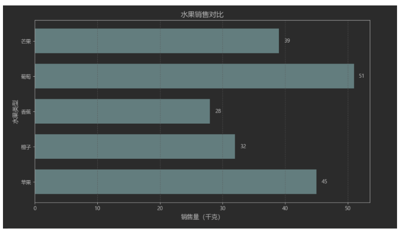
我們再看一個水平條形圖示例:
import matplotlib
import matplotlib.pyplot as plt
?
# 設置matplotlib使用黑體顯示中文
matplotlib.rcParams['font.family'] = 'Microsoft YaHei'
?
# 數據準備
categories = ['蘋果', '橙子', '香蕉', '葡萄', '芒果']
sales = [45, 32, 28, 51, 39]
?
plt.figure(figsize=(10, 6))
?
# 繪制水平條形圖
bars = plt.barh(categories,sales,color='#5F9EA0',height=0.7
)
?
# 添加數據標簽
for bar in bars:width = bar.get_width()plt.text(width + 0.8,bar.get_y() + bar.get_height() / 2,f'{width}',va='center',fontsize=10)
?
plt.title('水果銷售對比', fontsize=14)
plt.xlabel('銷售量(千克)', fontsize=12)
plt.ylabel('水果類型', fontsize=12)
plt.grid(axis='x', linestyle='--', alpha=0.7)
plt.tight_layout()
plt.show()
運行效果:


)


 vs LINQ to SQL vs SqlSugar 全方位對比分析)


![[AI React Web] E2B沙箱 | WebGPU | 組件樹 | 智能重構 | 架構異味檢測](http://pic.xiahunao.cn/[AI React Web] E2B沙箱 | WebGPU | 組件樹 | 智能重構 | 架構異味檢測)


