Element Plus 表單組件樣式統一 & CSS 文字特效實現指南
前言
在使用 Element Plus 組件庫開發表單頁面時,我們遇到了一個看似簡單卻很有趣的問題:el-input、el-select 和 el-textarea 在禁用狀態下的文字顏色不一致。通過深入研究,我們發現了 -webkit-text-fill-color 這個強大的 CSS 屬性,并借此機會探索了它的各種創意用法。
問題背景
遇到的問題
在項目中,我們有一個表單詳情頁面,所有表單控件都設置為禁用狀態:
<el-form :model="formData" label-width="140px" :disabled="true"><el-form-item label="標題:" required><el-input v-model="formData.title" placeholder="請輸入標題內容" /></el-form-item><el-form-item label="狀態:" required><el-select v-model="formData.status" placeholder="請選擇狀態" style="width: 100%"><el-option label="選項一" value="option1" /><el-option label="選項二" value="option2" /><el-option label="選項三" value="option3" /></el-select></el-form-item><el-form-item label="備注:" required><el-input v-model="formData.remark" type="textarea" :rows="4"placeholder="請輸入備注信息"/></el-form-item>
</el-form>
問題現象:雖然我們為所有組件設置了相同的 CSS 樣式,但在瀏覽器中顯示時,input、select 和 textarea 的文字顏色卻不一致!
初始的樣式設置
:deep(.el-input.is-disabled .el-input__inner) {background-color: #f5f5f5;border-color: #d9d9d9;color: #333;
}:deep(.el-select.is-disabled .el-input__inner) {background-color: #f5f5f5;border-color: #d9d9d9;color: #333;
}:deep(.el-textarea.is-disabled .el-textarea__inner) {background-color: #f5f5f5;border-color: #d9d9d9;color: #333;
}
看起來樣式完全一樣,但實際顯示效果卻不同,這是為什么?
問題分析與發現
關鍵發現
通過瀏覽器開發者工具檢查,我們發現了一個重要線索:
el-input元素具有:-webkit-text-fill-color: var(--el-disabled-text-color)el-textarea和el-select沒有這個屬性設置
深入理解 -webkit-text-fill-color
這個屬性的關鍵特性:
- 優先級高于 color:
-webkit-text-fill-color會完全覆蓋color屬性 - WebKit 私有屬性:主要用于 Chrome、Safari 等 WebKit 內核瀏覽器
- Element Plus 的不一致處理:不同組件在禁用狀態下的樣式處理方式不同
為什么會出現這種不一致?
可能的原因:
- 瀏覽器默認行為差異:不同表單元素在 WebKit 瀏覽器中的默認樣式處理不同
- Element Plus 開發歷史:不同組件可能由不同開發者在不同時期開發,處理方式不統一
- 組件復雜度差異:
select組件比input更復雜,樣式處理更困難
解決方案
最終的統一樣式
/* 統一禁用狀態樣式 - 使用 Element Plus 的標準變量 */
:deep(.el-input.is-disabled .el-input__inner),
:deep(.el-select__wrapper.is-disabled),
:deep(.el-textarea.is-disabled .el-textarea__inner) {background-color: #f5f5f5 !important;border-color: #d9d9d9 !important;-webkit-text-fill-color: var(--el-disabled-text-color) !important;
}
關鍵要點
- 使用正確的選擇器:
el-select__wrapper.is-disabled而不是el-select.is-disabled .el-input__inner - 統一使用 Element Plus 變量:
var(--el-disabled-text-color)保證主題一致性 - 添加 !important:確保優先級足夠高,覆蓋默認樣式
-webkit-text-fill-color 詳解
屬性的歷史背景
-webkit-text-fill-color 最初是為了支持復雜的文字效果而設計的,特別是:
- 漸變文字:讓文字顯示漸變色彩
- 描邊文字:創建空心字效果
- 圖案文字:讓文字顯示背景圖案
- 精確顏色控制:在某些場景下比
color更可靠
基本語法
-webkit-text-fill-color: <color> | transparent | inherit;
與 color 屬性的區別
.example {color: #999;                    /* 標準CSS屬性 */-webkit-text-fill-color: #333;  /* WebKit私有屬性,優先級更高 *//* 最終顯示:#333 */
}
創意文字效果實現
既然深入了解了這個屬性,讓我們看看它的各種創意用法:
完整的 HTML 結構
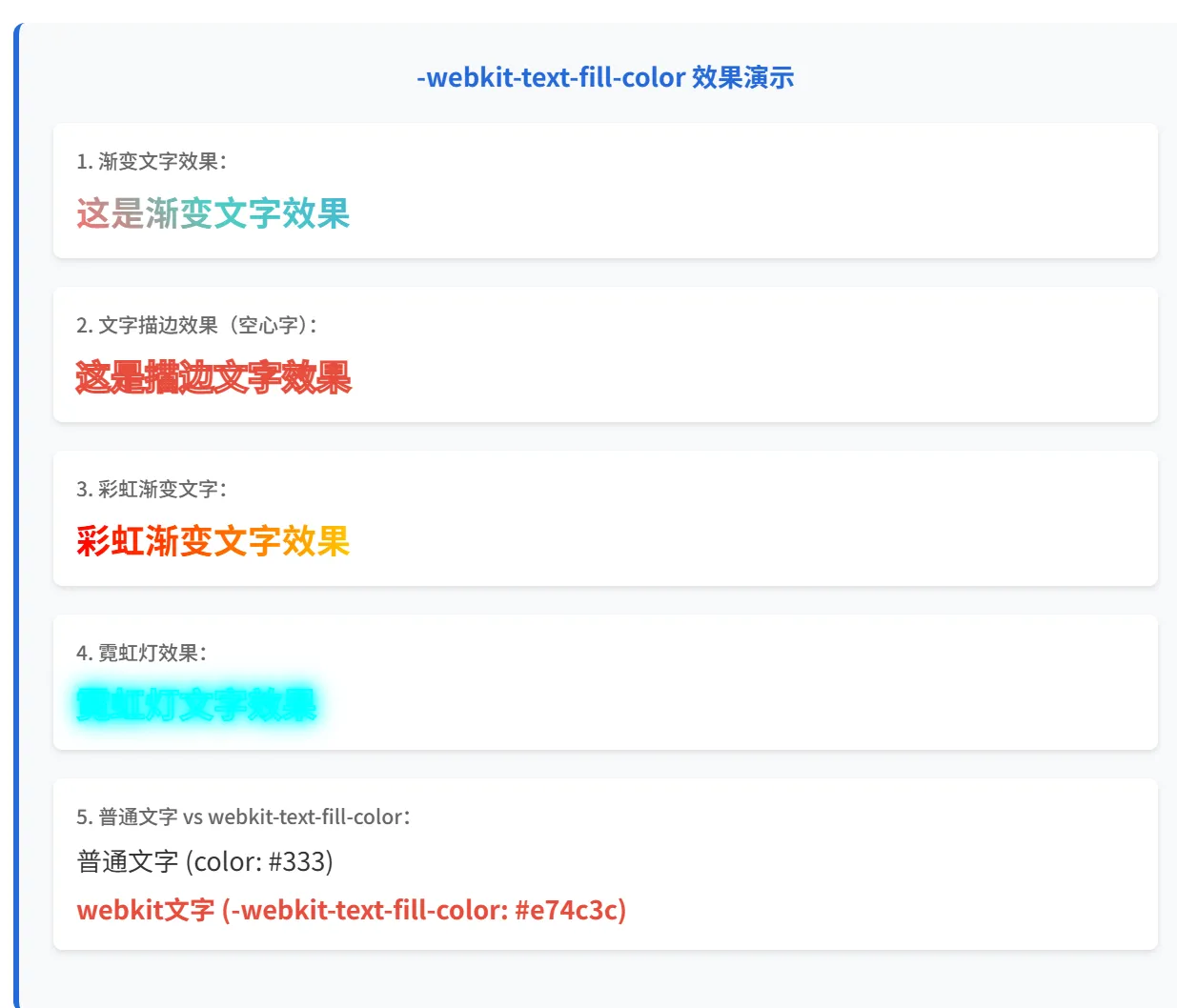
<template><div class="demo-container"><h2>-webkit-text-fill-color 效果演示</h2><!-- 1. 漸變文字效果 --><div class="demo-item"><h3>1. 漸變文字效果</h3><div class="gradient-text">這是漸變文字效果</div></div><!-- 2. 文字描邊效果 --><div class="demo-item"><h3>2. 文字描邊效果(空心字)</h3><div class="stroke-text">這是描邊文字效果</div></div><!-- 3. 彩虹漸變文字 --><div class="demo-item"><h3>3. 彩虹漸變文字</h3><div class="rainbow-text">彩虹漸變文字效果</div></div><!-- 4. 霓虹燈效果 --><div class="demo-item"><h3>4. 霓虹燈效果</h3><div class="neon-text">霓虹燈文字效果</div></div><!-- 5. 優先級對比 --><div class="demo-item"><h3>5. 普通文字 vs webkit-text-fill-color</h3><div class="normal-text">普通文字 (color: #333)</div><div class="webkit-text">webkit文字 (-webkit-text-fill-color: #e74c3c)</div></div></div>
</template>
完整的 CSS 樣式
<style scoped>
.demo-container {padding: 20px;background: #f8f9fa;max-width: 800px;margin: 0 auto;
}.demo-item {margin-bottom: 30px;padding: 20px;background: white;border-radius: 8px;box-shadow: 0 2px 8px rgba(0,0,0,0.1);
}.demo-item h3 {margin-bottom: 15px;color: #2569D8;font-size: 16px;
}/* 1. 漸變文字效果 */
.gradient-text {font-size: 32px;font-weight: bold;background: linear-gradient(45deg, #ff6b6b, #4ecdc4, #45b7d1);-webkit-background-clip: text;background-clip: text;-webkit-text-fill-color: transparent;display: inline-block;
}/* 2. 文字描邊效果(空心字) */
.stroke-text {font-size: 32px;font-weight: bold;-webkit-text-stroke: 3px #e74c3c;        /* 描邊:3px寬度,紅色 */-webkit-text-fill-color: transparent;     /* 內部透明,只顯示描邊 */color: #e74c3c; /* 兜底顏色,用于不支持webkit的瀏覽器 */
}/* 3. 彩虹漸變文字 */
.rainbow-text {font-size: 32px;font-weight: bold;background: linear-gradient(90deg,#ff0000,  /* 紅 */#ff7f00,  /* 橙 */#ffff00,  /* 黃 */#00ff00,  /* 綠 */#0000ff,  /* 藍 */#4b0082,  /* 靛 */#9400d3,  /* 紫 */#ff0000   /* 回到紅色,形成循環 */);background-size: 200% 100%;  /* 關鍵:讓背景比文字寬2倍 */-webkit-background-clip: text;background-clip: text;-webkit-text-fill-color: transparent;animation: rainbow-move 3s linear infinite;
}@keyframes rainbow-move {0% { background-position: 0% 50%; }100% { background-position: 200% 50%; }
}/* 4. 霓虹燈效果 */
.neon-text {font-size: 32px;font-weight: bold;color: #fff;-webkit-text-stroke: 1px #00ffff;-webkit-text-fill-color: transparent;text-shadow: 0 0 5px #00ffff,0 0 10px #00ffff,0 0 15px #00ffff,0 0 20px #00ffff;animation: neon-flicker 2s ease-in-out infinite alternate;
}@keyframes neon-flicker {0%, 100% {text-shadow: 0 0 5px #00ffff,0 0 10px #00ffff,0 0 15px #00ffff,0 0 20px #00ffff;}50% {text-shadow: 0 0 2px #00ffff,0 0 5px #00ffff,0 0 8px #00ffff,0 0 12px #00ffff;}
}/* 5. 對比效果 */
.normal-text {font-size: 20px;color: #333;margin-bottom: 10px;
}.webkit-text {font-size: 20px;color: #999; /* 這個顏色會被 webkit-text-fill-color 覆蓋 */-webkit-text-fill-color: #e74c3c;font-weight: bold;
}
</style>
效果說明
1. 漸變文字效果
原理:
- 創建一個線性漸變背景
- 使用
background-clip: text將背景裁剪為文字形狀 - 設置
-webkit-text-fill-color: transparent讓文字透明,顯示背景
2. 文字描邊效果(空心字)
原理:
- 使用
-webkit-text-stroke創建文字邊框 - 設置
-webkit-text-fill-color: transparent讓內部透明 - 效果:只看到文字的輪廓,內部是空心的
3. 彩虹漸變文字
原理:
- 創建彩虹色的線性漸變
- 設置
background-size: 200% 100%讓背景比文字寬2倍 - 通過動畫移動
background-position實現顏色流動效果
關鍵技巧:
background-size: 200% 100%是動畫成功的關鍵- 漸變的起始和結束顏色相同,形成無縫循環
4. 霓虹燈效果
原理:
- 結合
-webkit-text-stroke和text-shadow - 使用多層陰影創建發光效果
- 通過動畫改變陰影強度實現閃爍
5. 優先級對比
演示:
- 同時設置
color和-webkit-text-fill-color - 證明
-webkit-text-fill-color優先級更高
瀏覽器兼容性
支持情況
| 屬性 | Chrome | Safari | Firefox | Edge |
|---|---|---|---|---|
-webkit-text-fill-color | ? | ? | ?? | ? |
-webkit-text-stroke | ? | ? | ?? | ? |
background-clip: text | ? | ? | ? | ? |
漸進增強寫法
.fancy-text {/* 兜底方案 */color: #333;/* 現代瀏覽器支持 */background: linear-gradient(45deg, #f00, #00f);background-clip: text;-webkit-background-clip: text;/* WebKit 支持 */-webkit-text-fill-color: transparent;/* 不支持時的降級 */@supports not (-webkit-text-fill-color: transparent) {color: #333;}
}
實際應用場景
1. 品牌標題
.brand-title {font-size: 48px;font-weight: bold;background: linear-gradient(135deg, #667eea 0%, #764ba2 100%);-webkit-background-clip: text;-webkit-text-fill-color: transparent;text-align: center;
}
2. 按鈕文字效果
.gradient-button {background: #333;padding: 12px 24px;border: none;border-radius: 6px;
}.gradient-button-text {background: linear-gradient(45deg, #ff6b6b, #4ecdc4);-webkit-background-clip: text;-webkit-text-fill-color: transparent;font-weight: bold;
}
3. 強調文字
.highlight-text {background: linear-gradient(120deg, #a8edea 0%, #fed6e3 100%);-webkit-background-clip: text;-webkit-text-fill-color: transparent;font-weight: 600;
}
background-position 詳解與性能優化
background-position 基礎概念
background-position 控制背景圖片或漸變在元素中的位置,是實現動畫效果的關鍵屬性。
基本語法
/* 關鍵詞 */
background-position: left top;
background-position: center center;
background-position: right bottom;/* 百分比 */
background-position: 0% 0%;    /* 左上角 */
background-position: 50% 50%;  /* 居中 */
background-position: 100% 100%; /* 右下角 *//* 像素值 */
background-position: 10px 20px;
工作原理
當背景大小 > 元素大小時,可以產生移動效果:
.moving-bg {background: linear-gradient(90deg, red, blue);background-size: 200% 100%;     /* 背景比元素寬2倍 */background-position: 0% 50%;    /* 顯示左半部分 */
}/* 通過改變 position 實現移動 */
.moving-bg:hover {background-position: 100% 50%;  /* 顯示右半部分 */
}
彩虹文字動畫的實現原理
.rainbow-text {/* 1. 創建彩虹漸變 */background: linear-gradient(90deg, #ff0000, #ff7f00, #ffff00, #00ff00, #0000ff, #4b0082, #9400d3, #ff0000);/* 2. 讓背景比文字大 - 這是關鍵! */background-size: 200% 100%;/* 3. 裁剪為文字形狀 */-webkit-background-clip: text;-webkit-text-fill-color: transparent;/* 4. 移動背景位置創建動畫 */animation: rainbow-move 3s linear infinite;
}@keyframes rainbow-move {0%   { background-position: 0% 50%;   }  /* 顯示左側顏色 */100% { background-position: 200% 50%; }  /* 顯示右側顏色 */
}
其他應用場景
動畫效果視頻
1. 懸停效果
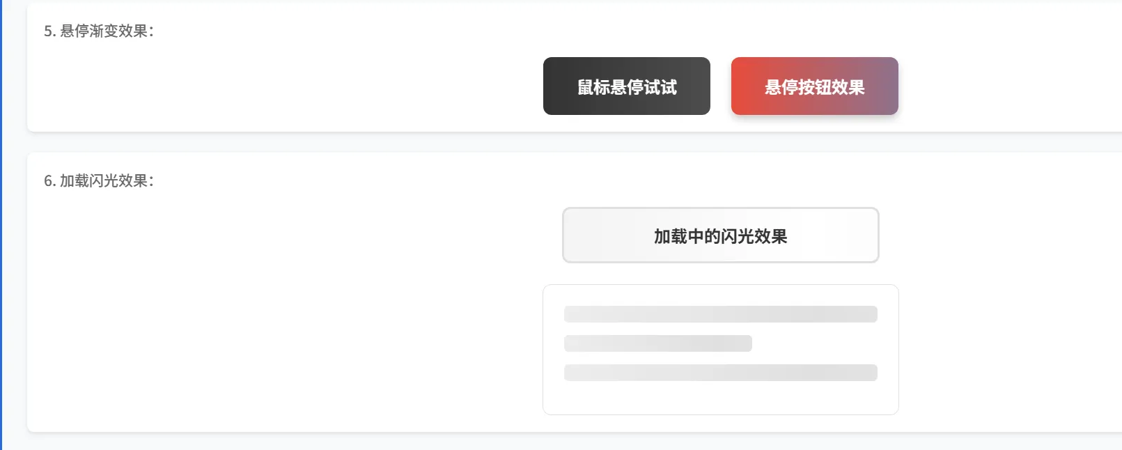
.hover-gradient {background: linear-gradient(90deg, #333, #666);background-size: 200% 100%;background-position: 0% 50%;transition: background-position 0.3s ease;
}.hover-gradient:hover {background-position: 100% 50%;
}
2. 加載動畫
.loading-shimmer {background: linear-gradient(90deg, transparent, rgba(255,255,255,0.4), transparent);background-size: 200% 100%;animation: shimmer 1.5s infinite;
}@keyframes shimmer {0%   { background-position: -200% 0; }100% { background-position: 200% 0; }
}
性能注意事項
1. background-position 動畫的性能問題
頻繁改變 background-position 可能導致性能問題,因為它會觸發重繪(repaint):
/* ?? 性能較差:頻繁的 background-position 變化 */
.heavy-animation {animation: heavy-bg-move 2s infinite;
}@keyframes heavy-bg-move {0%   { background-position: 0% 50%; }25%  { background-position: 25% 50%; }50%  { background-position: 50% 50%; }75%  { background-position: 75% 50%; }100% { background-position: 100% 50%; }
}
2. 性能優化方案
方案一:使用 transform(推薦)
/* ? 性能更好:使用 transform 替代 background-position */
.optimized-animation {background: linear-gradient(90deg, red, blue);background-size: 200% 100%;transform: translateX(0);will-change: transform; /* 提示瀏覽器優化 */animation: optimized-move 2s infinite;
}@keyframes optimized-move {0%   { transform: translateX(0); }100% { transform: translateX(-50%); }
}
方案二:開啟硬件加速
.gpu-accelerated {transform: translateZ(0); /* 強制開啟硬件加速 *//* 或者使用 */will-change: background-position;
}
方案三:減少動畫頻率
/* 使用較長的動畫時間,減少計算頻率 */
.smooth-animation {animation: smooth-move 3s ease-in-out infinite;
}
3. 性能對比
| 方法 | 性能 | 兼容性 | 使用場景 |
|---|---|---|---|
background-position | 中等 | 優秀 | 簡單背景移動 |
transform: translateX() | 優秀 | 優秀 | 復雜動畫優化 |
will-change | 優秀 | 較好 | 預告瀏覽器優化 |
4. 實際優化建議
/* 完整的性能優化版本 */
.performance-optimized {/* 基礎樣式 */background: linear-gradient(90deg, #e74c3c, #3498db);background-size: 200% 100%;/* 性能優化 */will-change: transform;transform: translateZ(0);backface-visibility: hidden;/* 使用 transform 動畫 */animation: optimized-rainbow 3s linear infinite;
}@keyframes optimized-rainbow {0%   { transform: translateX(0); }100% { transform: translateX(-50%); }
}/* 動畫結束后清理 will-change */
.performance-optimized:not(:hover) {will-change: auto;
}
5. 移動端兼容
/* 移動端優化 */
.mobile-friendly {-webkit-text-fill-color: transparent;/* 為移動設備提供降級方案 */@media (max-width: 768px) {-webkit-text-fill-color: initial;color: #333;}
}
調試技巧
1. 檢查樣式應用
/* 臨時添加背景色檢查文字區域 */
.debug-text {background: rgba(255, 0, 0, 0.1) !important;
}
2. 漸變調試
/* 臨時移除 text-fill-color 查看完整漸變 */
.debug-gradient {/* -webkit-text-fill-color: transparent; */
}
總結
通過解決 Element Plus 組件樣式不一致的問題,我們深入了解了 -webkit-text-fill-color 這個強大的 CSS 屬性。它不僅能幫我們解決實際的兼容性問題,還能創造出各種炫酷的文字效果。
關鍵收獲
- 問題診斷:使用瀏覽器開發者工具深入分析樣式差異
- 屬性理解:掌握
-webkit-text-fill-color的優先級和用法 - 創意應用:學會了多種文字特效的實現方法
- 最佳實踐:統一組件樣式,使用設計系統變量
最佳實踐建議
- 優先使用標準屬性:能用
color解決的不要用私有屬性 - 提供降級方案:考慮不支持的瀏覽器
- 性能優化:復雜動畫使用
transform而非background-position - 保持一致性:在項目中統一樣式處理方式
延伸思考
這次的探索讓我們認識到,很多看似簡單的樣式問題背后都有深層的技術原理。在日常開發中,我們應該:
- 保持好奇心,深入挖掘問題本質
- 活用開發者工具進行調試
- 在解決問題的同時,探索更多可能性
- 將學到的知識整理成文檔,方便團隊共享
本文記錄了一次從解決實際問題到深入探索技術原理的完整過程,希望對遇到類似問題的開發者有所幫助。
參考資源
- MDN: -webkit-text-fill-color
- Element Plus 官方文檔
- CSS Tricks: Background Clip
- Can I Use: CSS text-stroke


)


:Table類型高效用法與數據處理實戰)

)
![[CISCN2019 總決賽 Day2 Web1]Easyweb](http://pic.xiahunao.cn/[CISCN2019 總決賽 Day2 Web1]Easyweb)
詳解)


![【python實用小腳本-205】[HR揭秘]手工黨逐行查Bug的終結者|Python版代碼質量“CT機”加速器(建議收藏)](http://pic.xiahunao.cn/【python實用小腳本-205】[HR揭秘]手工黨逐行查Bug的終結者|Python版代碼質量“CT機”加速器(建議收藏))


——網絡連接場景的 C++ 實戰)