一、說明
在這份快速指南中,我們將介紹最重要的分布——從始終公平的均勻分布,到鐘形的正態分布,計數點擊的泊松分布,以及二元選擇的二項分布。
沒有復雜的數學,只有清晰的概念、真實的例子,以及為什么它們重要。
二、均勻分布
2.1 理論和實驗
想象一下,你在一個自助餐上,有十盤完全相同的食品:意大利面、米飯、雞肉、豆腐、沙拉等。每盤食物的量相同,份量也一樣。沒有哪一盤看起來更誘人,也沒有哪道菜更豐富。你閉上眼睛隨機指向一盤,那就是你的餐點。
關鍵要點:每道菜被選中的概率是相等的。沒有偏見,沒有口味優勢。純粹是均勻的機會。這就是概率論中均勻分布的概念。
均勻分布的圖形是一個矩形:
? X軸:值從aaa到b
? Y軸:恒定高度[1/(b-a)]
在a和b之間的每個值具有相同的概率密度。
均勻分布的參數:
? a:下界(最小值)
? b:上界(最大值)
概率密度函數(PDF):
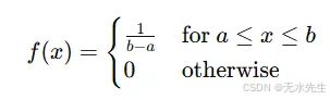
這表示在均勻分布圖中平直線的高度,例如一塊長度上厚度一致的巧克力棒。

# Import necessary libraries
import numpy as np
import matplotlib.pyplot as plt
from scipy.stats import uniform# Step 1: Define the parameters of the Uniform distribution
a = 2       # Lower bound of the distribution (start of the interval)
b = 8       # Upper bound of the distribution (end of the interval)# Step 2: Generate a range of x values to evaluate the PDF over
# We're adding a buffer of 1 unit on each side for better visualization
x = np.linspace(a - 1, b + 1, 1000)# Step 3: Compute the PDF values using scipy's uniform distribution
# The 'loc' parameter shifts the distribution to start at 'a'
# The 'scale' parameter is the width of the interval, i.e., (b - a)
pdf_values = uniform.pdf(x, loc=a, scale=b - a)# Step 4: Plotting the PDF
plt.figure(figsize=(10, 5))  # Set the size of the figure
plt.plot(x, pdf_values, label='PDF of Uniform({},{})'.format(a, b), color='darkblue', linewidth=2)# Step 5: Fill the area under the curve for visual clarity
plt.fill_between(x, pdf_values, alpha=0.3, color='skyblue')# Step 6: Add plot titles and axis labels
plt.title('Continuous Uniform Distribution: U({}, {})'.format(a, b), fontsize=14)
plt.xlabel('x (Random Variable)', fontsize=12)
plt.ylabel('Probability Density f(x)', fontsize=12)# Step 7: Display key features
plt.axvline(a, color='gray', linestyle='--', label='Lower Bound (a)')
plt.axvline(b, color='gray', linestyle='--', label='Upper Bound (b)')
plt.legend()
plt.grid(True)
plt.tight_layout()# Step 8: Show the plot
plt.show()
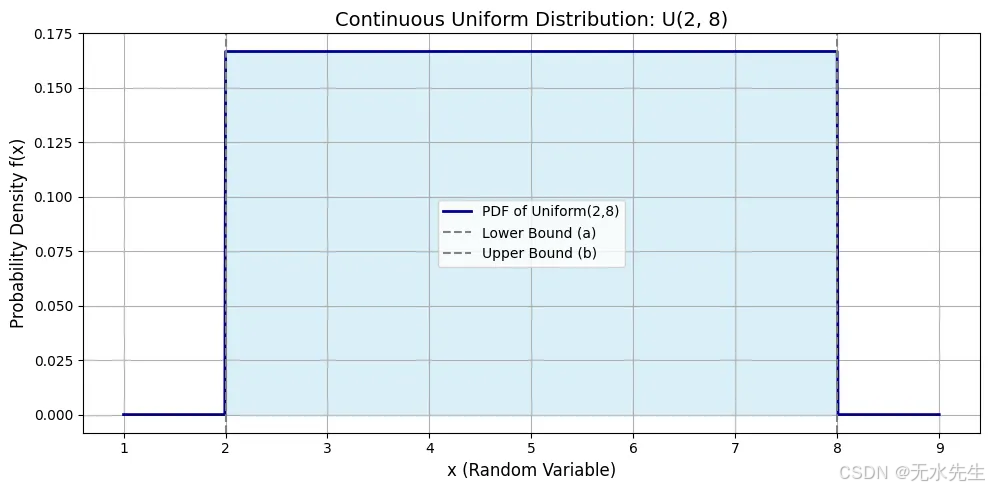
在a=2和b=8之間的曲線平坦頂部表明該范圍內每個值的密度相同。平坦線的高度為0.1667。從2到8的曲線下陰影區域代表總概率等于1。
為什么均勻分布重要
? 隨機性的基準:大多數隨機數生成器從均勻分布開始。
? 模擬輸入:在沒有其他信息的情況下,假設均勻分布是最安全的方法。
? 公平性建模:在游戲、彩票和公平資源分配中。
2.2 應用在機器學習中
均勻分布就像我們呼吸的空氣:無形但至關重要。它不作任何假設,因此在學習旅程的開始階段以及希望實現公平性、中立性和探索性時,它是完美的選擇。
- 神經網絡中的權重初始化
在訓練神經網絡時,我們首先為模型的權重分配隨機值。但是,選擇這些隨機值的方式很重要。
均勻初始化通常被使用:
確保每個權重從無偏開始,但保持在受控范圍內。像TensorFlow、Keras和PyTorch這樣的庫提供了這一功能:
為什么重要:
? 避免權重更新中的對稱性
? 防止激活函數飽和
? 在反向傳播過程中保持梯度流動
torch.nn.init.uniform_(tensor, a=-0.05, b=0.05)
在進行交叉驗證和實驗時的隨機抽樣:當我們隨機抽樣時,
? 訓練數據與測試數據
? 超參數值
? 自助重采樣
如果沒有先驗知識,我們使用:
這確保了每個樣本具有相同的概率,從而導致無偏實驗。例如:
np.random.uniform(low=0, high=1, size=1000)
超參數調優和網格搜索:如果你不知道最佳的學習率、dropout率或正則化因子,均勻分布提供了一種中立且公平的方式來探索連續的超參數空間。
learning_rate = np.random.uniform(0.0001, 0.1)
#0.00677831298
三、正態分布:自然界的鐘形曲線
3.1 理論和實驗
按Enter鍵或點擊以查看完整大小的圖片
正態分布是建模不確定性和噪聲以及自然和機器學習系統中平衡的黃金標準。它提醒我們,雖然異常值存在,但生活和數據中的大部分傾向于圍繞“正常”軌道運行。想象一下你在一個紙杯蛋糕比賽中,1000名烘焙師提交他們的作品。大多數紙杯蛋糕都處于“平均”范圍內,既不太甜也不太淡。有些太甜了,有些幾乎沒有味道。但大多數呢?剛剛好。
這就是正態分布——自然界平衡極端值與強烈中心的方式。在正態分布中,接近均值的值最為常見,而極端值(過高或過低)則較為罕見。它是對稱的、鐘形的,并且在統計學和機器學習中具有基礎性地位。
為什么正態分布很重要?
正態分布的形狀
? 它是一條鐘形曲線。
? X軸:值的范圍(例如,身高、體重、考試分數)
? Y軸:概率密度——該值出現的可能性。
大多數值集中在均值(μ)周圍,隨著遠離均值,曲線對稱地逐漸變窄。
正態分布的參數:
? μ:均值(曲線中心)
? σ:標準差(鐘形曲線的擴展或寬度)
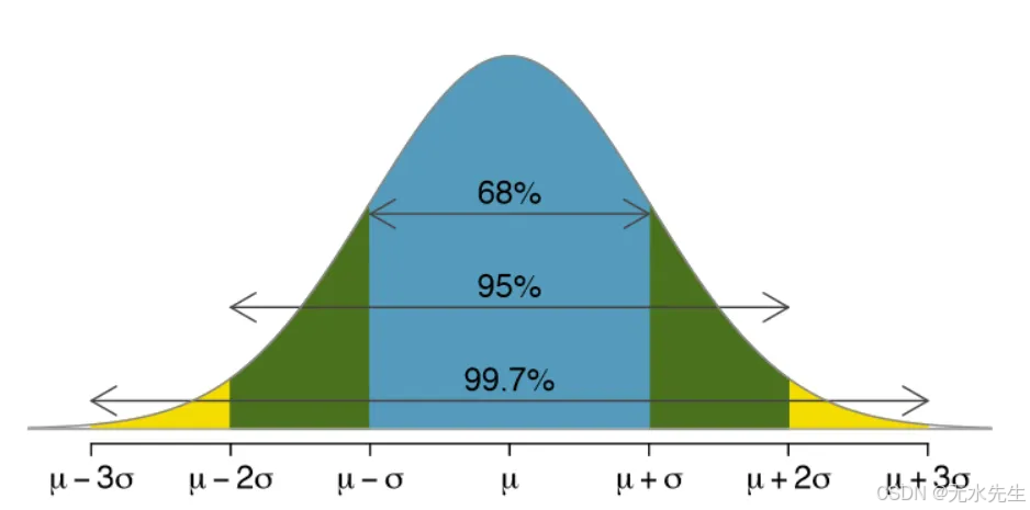
圖表告訴我們什么?
? 最高點在均值處(這里,μ=0)。
? 68%的值位于一個標準差范圍內(μ±σ)。
? 95%的值位于兩個標準差范圍內,99.7%的值位于三個標準差范圍內(這被稱為經驗法則)。
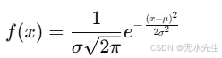
概率密度函數(PDF)。
這是著名的鐘形公式。指數項隨著我們遠離均值而降低曲線的高度。
# Import necessary libraries
import numpy as np
import matplotlib.pyplot as plt
from scipy.stats import norm# Define parameters for multiple distributions
# List of tuples, each containing (mu, sigma) for a distribution
distributions_params = [(0, 1), # Standard Normal(2, 0.5), # Shifted mean, smaller std dev(-1, 2), # Shifted mean, larger std dev(0, 0.8) # Same mean, slightly smaller std dev
]# Define a list of colors for plotting each distribution
colors = ['darkred', 'darkblue', 'darkgreen', 'purple']# Step 1: Generate a range of x values that covers all distributions
# Find the min and max bounds considering all mu and sigma values
min_mu = min([p[0] for p in distributions_params])
max_mu = max([p[0] for p in distributions_params])
max_sigma = max([p[1] for p in distributions_params])# Generate x values based on the most extreme mu and sigma to ensure coverage
x = np.linspace(min_mu - 4*max_sigma, max_mu + 4*max_sigma, 1000)# Step 2: Plot each distribution
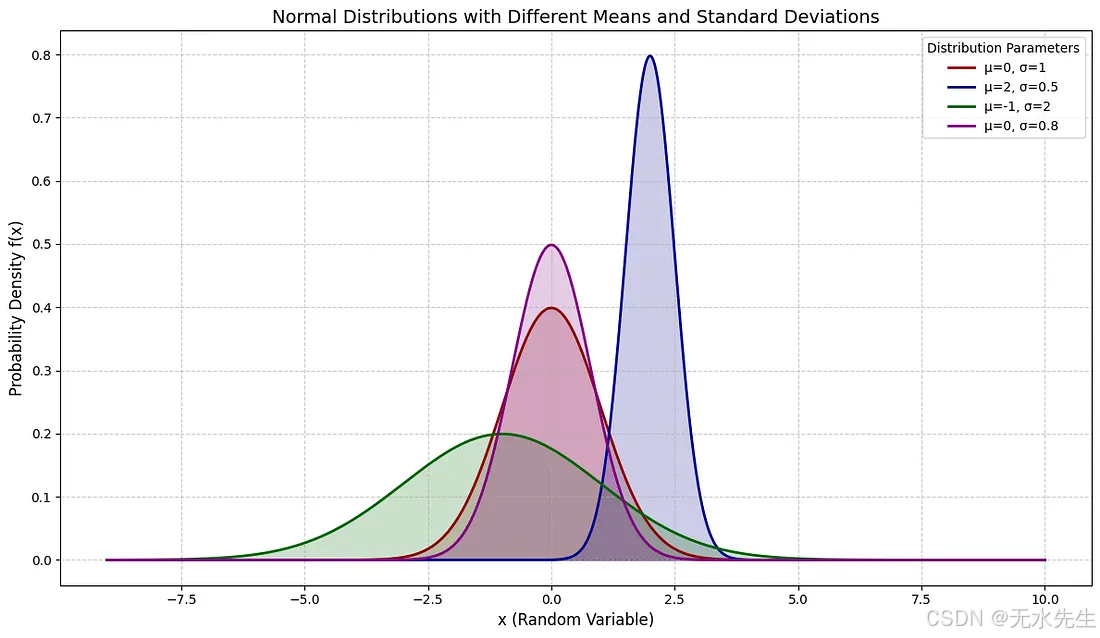
plt.figure(figsize=(12, 7)) # Increased figure sizefor i, (mu, sigma) in enumerate(distributions_params):# Compute the PDF valuespdf_values = norm.pdf(x, loc=mu, scale=sigma)# Plot the PDF with a specific color and labelplt.plot(x, pdf_values, label=f'μ={mu}, σ={sigma}', color=colors[i], linewidth=2)# Optional: Fill the area under the curveplt.fill_between(x, pdf_values, alpha=0.2, color=colors[i])# Step 3: Annotate plot
plt.title('Normal Distributions with Different Means and Standard Deviations', fontsize=14)
plt.xlabel('x (Random Variable)', fontsize=12)
plt.ylabel('Probability Density f(x)', fontsize=12)
plt.legend(title="Distribution Parameters")
plt.grid(True, linestyle='--', alpha=0.6)
plt.tight_layout()# Step 4: Show the plot
plt.show()
3.2 正態分布的機器學習應用
- 特征分布假設
許多機器學習算法假定輸入特征服從正態分布:
? 線性回歸
? 高斯樸素貝葉斯
? 線性判別分析(LDA)
如果數據不服從正態分布,性能可能會下降,這就是為什么我們要進行標準化或應用對數變換、Box-Cox變換等。
在這個例子中,我們模擬了代表客戶行為的偏斜數據,并擬合了一個線性回歸模型來預測結果。原始數據遵循指數分布,這違反了許多模型的正態性假設。在對特征應用Yeo-Johnson變換使其正態化后,模型的表現顯著提高,R2從0.85增加到0.91。這表明將偏斜數據轉換為更接近正態分布的數據可以導致更準確的預測和更可靠的模型。
import numpy as np
import pandas as pd
import matplotlib.pyplot as plt
from sklearn.linear_model import LinearRegression
from sklearn.metrics import r2_score
from sklearn.preprocessing import PowerTransformer
from scipy.stats import norm# Simulate non-normal data (skewed exponential)
np.random.seed(42)
n_samples = 200
X = np.random.exponential(scale=2.0, size=(n_samples, 1))
y = 3 * np.log(X + 1).flatten() + np.random.normal(0, 0.5, size=n_samples)# Fit Linear Regression to original (non-normal) data
model_raw = LinearRegression().fit(X, y)
y_pred_raw = model_raw.predict(X)
r2_raw = r2_score(y, y_pred_raw)# Apply a Box-Cox-like transformation to normalize the feature
pt = PowerTransformer(method='yeo-johnson')
X_transformed = pt.fit_transform(X)# Fit Linear Regression to transformed data
model_trans = LinearRegression().fit(X_transformed, y)
y_pred_trans = model_trans.predict(X_transformed)
r2_trans = r2_score(y, y_pred_trans)# Plotting original vs transformed feature distribution
fig, axes = plt.subplots(1, 2, figsize=(12, 5))axes[0].hist(X, bins=30, color='skyblue', edgecolor='black', density=True)
x_vals = np.linspace(0, X.max(), 100)
axes[0].set_title('Original Feature Distribution (Skewed)')axes[1].hist(X_transformed, bins=30, color='salmon', edgecolor='black', density=True)
axes[1].set_title('Transformed Feature Distribution (Normalized)')plt.tight_layout()
plt.show()# Return R^2 scores to show performance difference
(r2_raw, r2_trans)
Press enter or click to view image in full size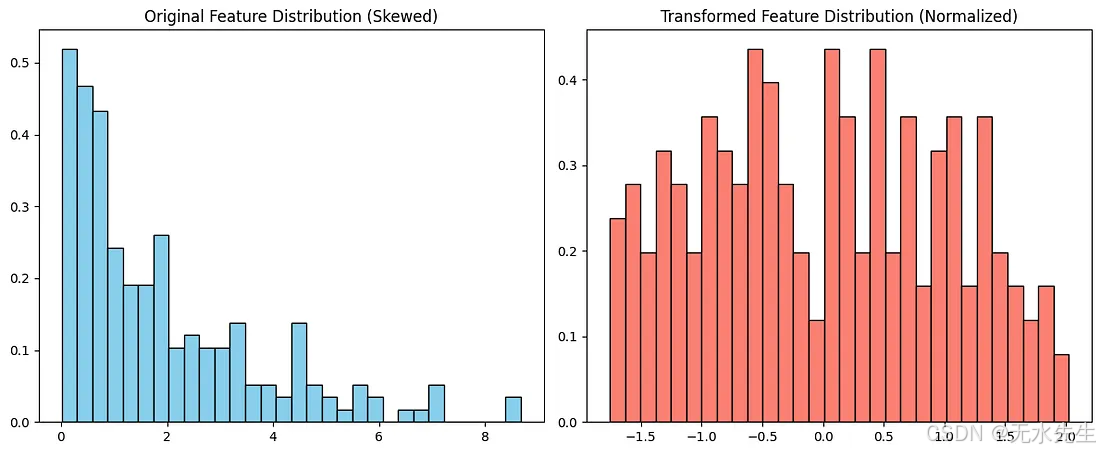
output (r2_raw, r2_trans): (0.85087454878016, 0.9124403892942448)
深度學習中的權重初始化
雖然均勻分布是標準選擇,但正態(或高斯)初始化也被廣泛使用:為什么?
? 保持激活值和梯度在合理范圍內
? 幫助網絡更高效、更穩定地訓練。概率模型與推斷
貝葉斯機器學習通常假設正態先驗和正態似然。
示例:
? 高斯混合模型(GMMs)
? 變分自編碼器(VAEs)
在VAEs中,潛在空間使用正態分布建模,允許平滑且可微的采樣。
在高流量系統中,正常行為遵循鐘形曲線,異常值則位于尾部。這非常適合用于:
? 信用卡欺詐檢測
? 網絡入侵檢測
? 制造缺陷檢測
在本示例中,我們模擬了1000筆圍繞50美元的正常交易,標準差為5美元,這符合日常購買的情況。然后我們注入了幾筆異常交易:80美元、85美元和90美元,代表潛在的欺詐行為。
我們使用三倍標準差規則:任何超過平均值三倍標準差的數據都會被標記為異常。在這種情況下,檢測算法成功識別了注入的異常值以及一些自然但罕見的交易,如69美元或33美元。
import numpy as np
import matplotlib.pyplot as plt
from scipy.stats import norm# Step 1: Simulate normal behavior (e.g., transaction amounts)
np.random.seed(42)
normal_data = np.random.normal(loc=50, scale=5, size=1000)  # average amount: $50# Step 2: Inject a few anomalies (fraudulent transactions)
anomalies = np.array([80, 85, 90])  # unusually high transaction amounts# Combine data
all_data = np.concatenate([normal_data, anomalies])# Step 3: Compute mean and standard deviation
mu = np.mean(normal_data)
sigma = np.std(normal_data)# Step 4: Identify anomalies using 3-sigma rule
threshold_high = mu + 3 * sigma
threshold_low = mu - 3 * sigma
detected_anomalies = all_data[(all_data > threshold_high) | (all_data < threshold_low)]# Step 5: Plot
plt.figure(figsize=(10, 5))
plt.hist(normal_data, bins=40, alpha=0.6, color='skyblue', edgecolor='black', label='Normal Transactions')
plt.axvline(threshold_high, color='red', linestyle='--', label='Upper Threshold (3σ)')
plt.axvline(threshold_low, color='red', linestyle='--', label='Lower Threshold (3σ)')
plt.scatter(anomalies, [0.5]*len(anomalies), color='black', label='Injected Anomalies', zorder=5)
plt.title('Anomaly Detection Using Normal Distribution')
plt.xlabel('Transaction Amount ($)')
plt.ylabel('Frequency')
plt.legend()
plt.tight_layout()
plt.show()# Output detected anomalies
detected_anomalies
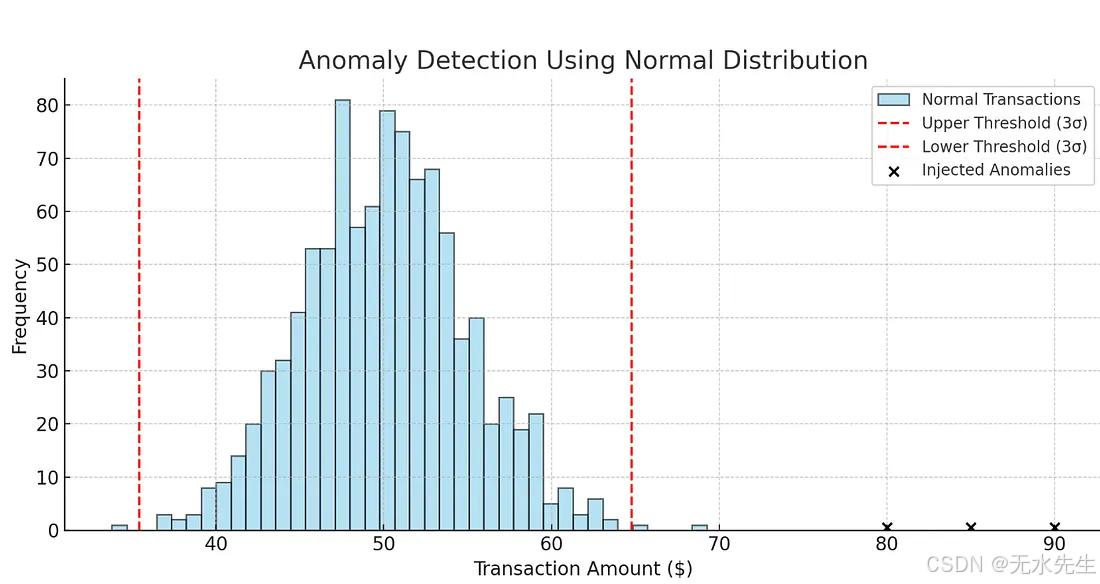
output detected_anomalies: array([69.26365745, 33.7936633 , 65.39440404, 80. , 85. , 90. ])
四、二項分布:反復拋同一枚硬幣
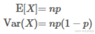
想象一下你正在拋硬幣——不是一次,而是10次。你押注正面。有時你會得到5個正面,有時是7個,有時是3個。但如果你拋100次呢?或者1000次?得到恰好60個正面的可能性有多大?
這就是二項分布的世界——在這里,你計算在固定次數的試驗中成功(如正面)的數量。
二項分布的使用時機
? 固定的試驗次數n
? 只有兩種可能的結果:成功(1)或失敗(0)
? 每次試驗成功的概率p是恒定的
? 試驗是獨立的
如果你對所有四個問題都回答“是”,你就進入了二項分布領域。
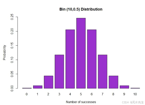
二項分布的視覺形狀
? X軸:成功次數(從0到n)
? Y軸:觀察到該數量成功事件的概率
? 形狀取決于n和p:
? 當p=0.5時對稱
? 當p遠離0.5時偏斜
二項分布的參數
? n:試驗次數
? p:每次試驗成功的概率
? x:成功次數(離散結果)
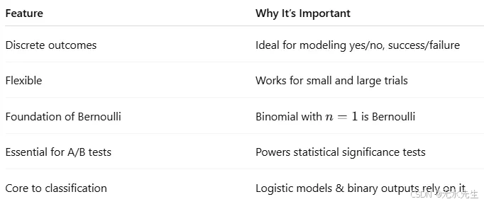
為什么二項分布重要
概率質量函數(PMF)
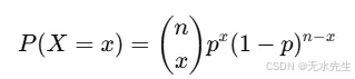
(n x) 表示從 n 次試驗中選擇 x 次成功的不同方法的數量。
import numpy as np
import matplotlib.pyplot as plt
from scipy.stats import binom
# Step 1: Define parameters
n = 20          # number of trials
p = 0.5         # probability of success
x = np.arange(0, n + 1)  # possible outcomes: 0 to n
# Step 2: Calculate the PMF
pmf = binom.pmf(x, n, p)
# Step 3: Plot the PMF
plt.figure(figsize=(10, 5))
plt.bar(x, pmf, color='teal', alpha=0.7)
plt.title(f'Binomial Distribution: n = {n}, p = {p}', fontsize=14)
plt.xlabel('Number of Successes', fontsize=12)
plt.ylabel('Probability Mass', fontsize=12)
plt.grid(axis='y')
plt.tight_layout()
plt.show()
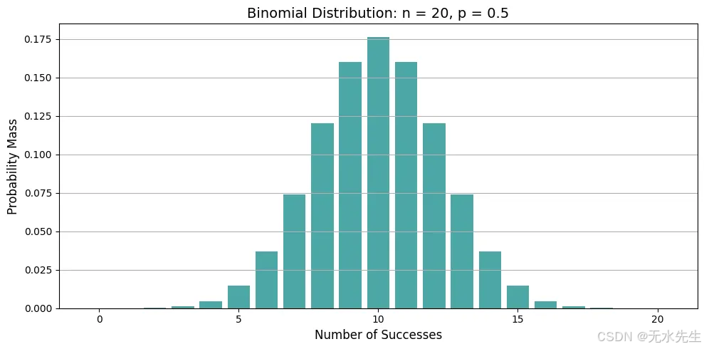
情節告訴我們什么?
? 極值接近n×p。這里,20×0.5=10,最可能的正面次數是10。
? 當p=0.5時,分布是對稱的;當p<0.5時,向左偏斜;當p>0.5時,向右偏斜。
二項分布的機器學習應用
二項分布在統計建模和人工智能中有著深遠的影響:
- 分類可能性建模
在二元分類(例如垃圾郵件與非垃圾郵件)中,預測類別為0或1。二項分布將其建模為:
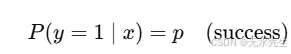
它是邏輯回歸的基礎,在成本函數中使用伯努利似然(n=1的二項式情況)。
模型評估:準確性和成功率至關重要。在評估模型時:
? 準確性可以建模為二項分布
? 假設您的模型在100次預測中正確預測了90次 → 您可以使用二項檢驗來建模和測試這一點
from scipy.stats import binom_test
binom_test(x=90, n=100, p=0.5, alternative='greater')
# is 90/100 significantly better than chance?
3 A/B測試和假設檢驗
假設你在測試兩個版本的網站:
? 版本A:1000訪客→120次點擊
? 版本B:1000訪客→150次點擊
使用二項分布來檢驗改進是否具有統計顯著性。
零假設(H0):兩個版本的點擊率(CTR)相同,p = 0.12,基于版本A。備擇假設(H1):版本B的點擊率高于版本A。我們使用二項分布來建模版本B上的點擊數:n=1000(試驗次數=訪客數),p=0.12(在H0下的預期成功率),觀察到x=150次點擊。現在我們進行測試:如果實際點擊率為12%,獲得150次或更多點擊的概率是多少?
from scipy.stats import binomtest # Changed from binom_test# Parameters
n_B = 1000         # Number of visitors to version B
x_B = 150          # Number of clicks on version B
p_null = 0.12      # Baseline CTR from version A# Perform one-sided binomial test using binomtest
# The binomtest function returns an object with a pvalue attribute
result = binomtest(k=x_B, n=n_B, p=p_null, alternative='greater') # Changed parameter name from x to k
p_value = result.pvalue # Access the p-value from the result object# Output result
print(f"P-value: {p_value:.4f}")
if p_value < 0.05:print("Result: Statistically significant — Version B likely performs better.")
else:print("Result: Not statistically significant — the difference may be due to chance.")
P-value: 0.0026
Result: Statistically significant — Version B likely performs better.
p值為0.0062,小于0.05。因此,我們拒絕原假設,并得出結論:版本B的轉化率可能高于版本A。二項式檢驗直接回答了:如果沒有任何變化,僅憑偶然性獲得150次或更多點擊的可能性有多大?答案是:不太可能。
4. 在集成方法中建模罕見事件(如隨機森林),如果每棵樹都有一個小錯誤的概率,你可以使用二項式模型來估計整個森林做出錯誤預測的概率。
想象一下,你正在使用一個隨機森林分類器來預測客戶是否會違約貸款。
關于隨機森林:
? 它們結合了許多決策樹(例如,100棵樹)。
? 每棵樹進行投票:是(違約)或否(不違約)。
? 最終預測基于多數投票。
現在,假設:
? 每個單獨的樹在未見數據上的準確率為95%(錯誤率=5%)。
? 樹是獨立且隨機訓練的(由于引導+特征隨機性)。
那么,超過一半的樹(即100棵樹中的51棵)在精確預測上出錯的概率是多少?
這意味著整個森林給出錯誤的答案,即使單個樹是準確的。
讓我們使用二項分布
? 試驗次數(樹的數量):n=100
? 每棵樹失敗的概率:p=0.05
? 隨機變量X:投票錯誤的樹的數量
? 我們

直覺:
? 每棵樹就像拋一枚有5%概率投錯票的加權硬幣。
? 整個森林只有在罕見事件發生時才會失敗:在100棵樹中有51棵或更多的樹投錯了票。
from scipy.stats import binom# Parameters
n = 100      # Number of trees
p = 0.05     # Probability that a single tree makes a mistake# Probability that 51 or more trees make a mistake
prob_majority_error = binom.sf(50, n, p)  # sf = 1 - cdfprint(f"Probability that the forest gives the wrong answer: {prob_majority_error:.10f}")
Probability that the forest gives the wrong answer: 0.0000000000
解釋
? 大多數樹木同時失敗的概率幾乎是零。
? 即使每棵樹稍微弱一些,整體仍然非常穩健。
? 這就是為什么集成方法,如隨機森林,非常強大。它們通過投票減少方差和錯誤,二項分布提供了數學證明。
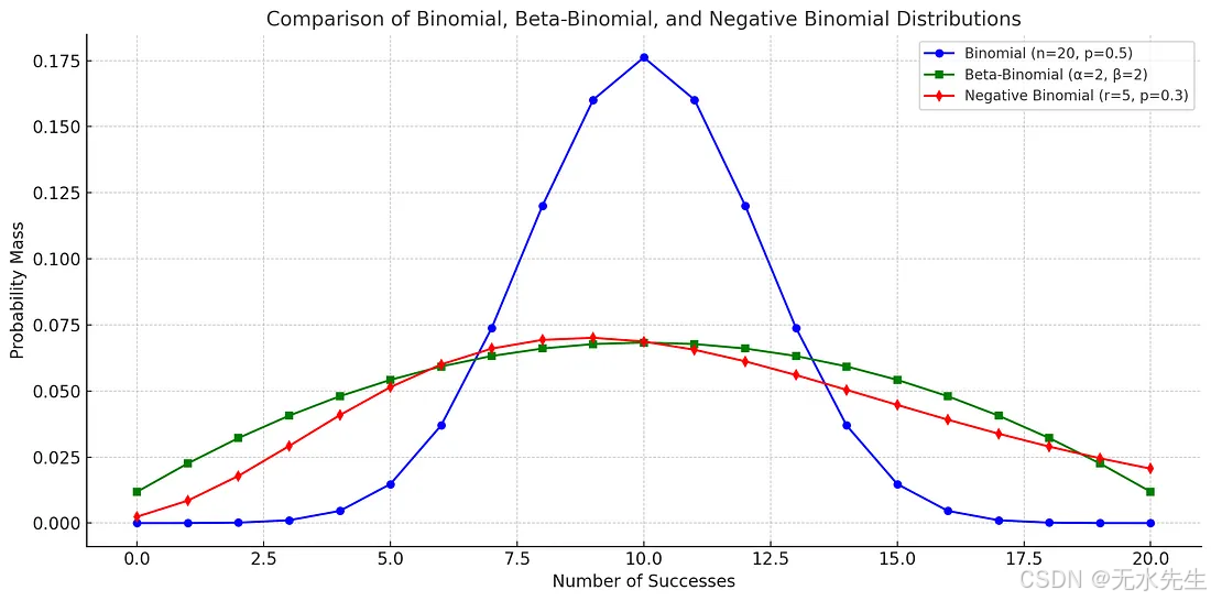
二項分布的變體
按Enter鍵或點擊以查看完整大小的圖片
三個二項分布的比較,都顯示了觀察到一定數量成功事件的概率。
# Recalculate all PMFs since the environment was reset# PMFs for each distribution (corrected)
binom_pmf = binom.pmf(x, n=n, p=p)
nbinom_pmf = nbinom.pmf(x, n=r, p=p_nb)
betabinom_pmf = betabinom.pmf(x, n=n, a=alpha, b=beta)# Plotting
plt.figure(figsize=(12, 6))plt.plot(x, binom_pmf, 'o-', label='Binomial (n=20, p=0.5)', color='blue')
plt.plot(x, betabinom_pmf, 's-', label='Beta-Binomial (α=2, β=2)', color='green')
plt.plot(x, nbinom_pmf[:n+1], 'd-', label='Negative Binomial (r=5, p=0.3)', color='red')plt.title('Comparison of Binomial, Beta-Binomial, and Negative Binomial Distributions', fontsize=14)
plt.xlabel('Number of Successes', fontsize=12)
plt.ylabel('Probability Mass', fontsize=12)
plt.grid(True)
plt.legend()
plt.tight_layout()
plt.show()
五、泊松分布:當事件隨機出現時
想象你在一家咖啡店工作。平均來說,每10分鐘有3位顧客到來。有時是2位,有時是4位,偶爾可能是0位甚至6位,但平均而言,大約是3位。你不知道他們確切的到達時間,但你關心的是他們的數量。
這就是泊松分布——它用于模擬在固定時間段內發生的事件數量,假設這些事件獨立發生且以恒定的平均速率發生。
泊松分布的視覺形狀
? X軸:事件數量(例如,客戶到達次數、點擊次數、電話次數)
? Y軸:該數量事件的概率
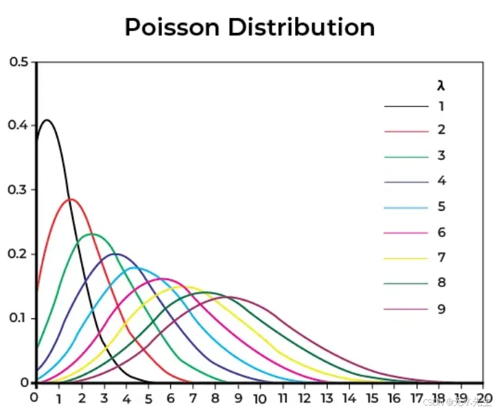
形狀是:
? 當λ較小時,右偏
? 隨著λ增加,更對稱
? 總是非負且離散的
泊松分布的參數
? λ:區間內的平均事件數(均值=方差)
概率質量函數(PMF)
Python代碼:模擬泊松過程
import numpy as np
import matplotlib.pyplot as plt
from scipy.stats import poisson
# Step 1: Set the expected number of events
lambda_ = 3  # average number of events per interval
# Step 2: Define the possible range of event counts
x = np.arange(0, 15)
# Step 3: Calculate Poisson probabilities
pmf = poisson.pmf(x, mu=lambda_)
# Step 4: Plot the distribution
plt.figure(figsize=(10, 5))
plt.bar(x, pmf, color='orchid', alpha=0.7)
plt.title(f'Poisson Distribution (λ = {lambda_})', fontsize=14)
plt.xlabel('Number of Events (k)', fontsize=12)
plt.ylabel('Probability P(X = k)', fontsize=12)
plt.grid(axis='y')
plt.tight_layout()
plt.show()
平均來說,每10分鐘有3位顧客到來。下一次10分鐘內正好有5位顧客到來的概率是多少?
poisson.pmf(5, mu=3)
Output:
≈ 0.1008
因此,在那個時間窗口內有5名客戶到達的概率是10%。泊松分布在機器學習中的應用泊松分布是許多機器學習和數據應用中的隱藏引擎:
1 在廣義線性模型(GLM)中,當目標變量是計數數據時,使用泊松回歸:
? 每個廣告的點擊次數
? 支持中心接收到的電話數量
? 產品線中的缺陷數量
在statsmodels、sklearn(通過Tweedie)和PyTorch GLMs中使用。
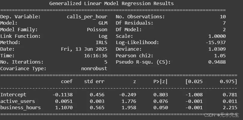
示例:你管理一個客戶服務中心,你想根據兩個特征預測每小時的來電數量。
- 應用程序上的活躍用戶數量(active_users)
- 是否在營業時間內(business_hours = 1 表示是,0 表示否)
你懷疑隨著更多用戶活躍以及在營業時間內,支持電話的數量會增加。由于目標是計數數據(每小時的電話數量),因此使用泊松回歸模型。
import pandas as pd
import statsmodels.api as sm
import statsmodels.formula.api as smf# Step 1: Create a sample dataset
data = pd.DataFrame({'active_users': [150, 80, 230, 100, 300, 60, 200, 110, 180, 90],'business_hours': [1, 0, 1, 0, 1, 0, 1, 0, 1, 0],'calls_per_hour': [5, 1, 8, 2, 12, 1, 9, 2, 7, 1]
})# Step 2: Fit a Poisson regression modelmodel = smf.glm(formula='calls_per_hour ~ active_users + business_hours',data=data, family=sm.families.Poisson()).fit()# Step 3: Print the summary
print(model.summary())
import numpy as np# Get coefficients
intercept = model.params['Intercept']
coef_users = model.params['active_users']
coef_hours = model.params['business_hours']# Compute predicted mean (λ)
log_lambda = intercept + coef_users * 200 + coef_hours * 1
lambda_ = np.exp(log_lambda)print(f"Expected calls per hour: {lambda_:.2f}")
Expected calls per hour: 7.45
2 在自然語言處理中,文本中的詞頻(例如,在短文檔中)通常遵循類似泊松分布的模式:
? 文檔中“the”或“data”的出現次數
? 推文的長度
? 每篇帖子中的標簽出現次數
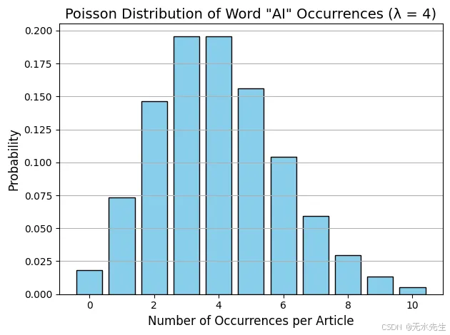
示例:你正在分析一組簡短的新聞文章。你想建模特定關鍵詞在文檔中出現的頻率,例如單詞“AI”。
根據你的數據,你觀察到平均每個文章中“AI”出現4次。現在,你想計算:“AI”在給定的文章中恰好出現6次的概率是多少?這時泊松分布正好適用。
from scipy.stats import poisson# Average number of times "AI" appears in an article
lambda_ = 4  # Probability that "AI" appears exactly 6 times
k = 6
prob_6_occurrences = poisson.pmf(k, mu=lambda_)print(f"Probability that 'AI' appears exactly 6 times: {prob_6_occurrences:.4f}")
AI’出現恰好6次的概率:0.1042,因此,在平均出現4次的情況下,文章中“AI”一詞恰好出現6次的概率約為10.42%。
import numpy as np
import matplotlib.pyplot as pltx = np.arange(0, 11)
pmf = poisson.pmf(x, mu=4)plt.bar(x, pmf, color='skyblue', edgecolor='black')
plt.title('Poisson Distribution of Word "AI" Occurrences (λ = 4)', fontsize=14)
plt.xlabel('Number of Occurrences per Article', fontsize=12)
plt.ylabel('Probability', fontsize=12)
plt.grid(axis='y')
plt.tight_layout()
plt.show()
3 流量分析與異常檢測
· 模型化服務器每分鐘的請求數量。
· 當實際請求數遠超預期時檢測異常(例如,DDoS攻擊)。
如果λ=100請求/分鐘,然后突然有300個到達?
這是泊松分布中的低概率尾部事件,需要通知您的運營團隊。
4 時間序列模擬用于事件預測。泊松分布常作為模擬的起點,
例如:
? 客流量
? 點擊事件
? 客服中心通話量
特別是在事件獨立且以固定平均速率發生的情況下。
示例:你管理一家零售店,想要模擬一天(10小時)內每小時到達的顧客數量。
根據歷史數據,你知道:
? 平均每小時有10位顧客到達。
? 到達是隨機的,但速率一致(適合使用泊松分布)。
? 每個小時都是獨立的。
import numpy as np
import matplotlib.pyplot as plt# Step 1: Define simulation parameters
hours_open = 10               # Store is open for 10 hours
lambda_per_hour = 10          # Average of 10 customers per hour# Step 2: Simulate customer arrivals per hour
np.random.seed(42)  # for reproducibility
customer_arrivals = np.random.poisson(lam=lambda_per_hour, size=hours_open)# Step 3: Plot the time-series
hours = np.arange(1, hours_open + 1)plt.figure(figsize=(10, 5))
plt.plot(hours, customer_arrivals, marker='o', linestyle='-', color='steelblue')
plt.title('Simulated Hourly Customer Arrivals (Poisson Process)', fontsize=14)
plt.xlabel('Hour of the Day', fontsize=12)
plt.ylabel('Number of Customers', fontsize=12)
plt.grid(True)
plt.xticks(hours)
plt.tight_layout()
plt.show()# Optional: Show raw numbers
for hr, cust in zip(hours, customer_arrivals):print(f"Hour {hr}: {cust} customers")
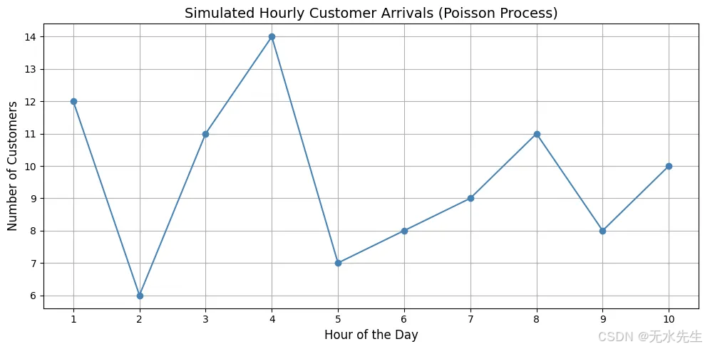
泊松過程在均值(10)周圍提供自然波動。有時它會激增(13),有時它會下降(8),但始終保持中心位置。非常適合用于預測和規劃(例如,確定需要安排的員工數量)。
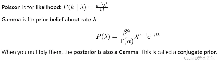
5 在貝葉斯建模中:
? 泊松似然和伽馬先驗形成共軛對。
? 用于實時更新關于速率(λ)的信念。
示例:
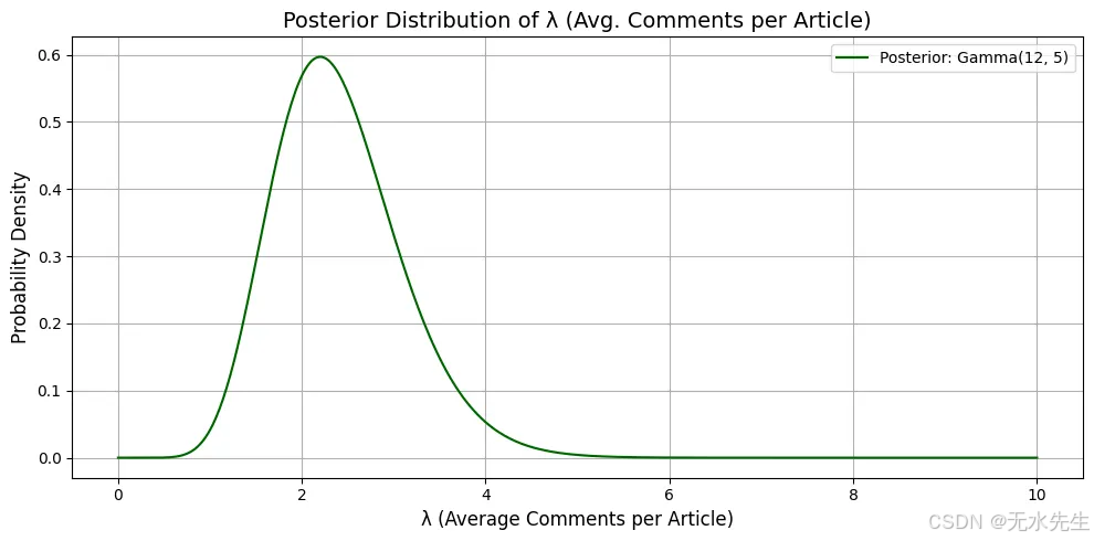
你運營一個新聞網站,想估計每篇文章平均用戶評論數,用λ表示。
你觀察到:
- 每篇文章的評論數量遵循泊松分布(離散計數數據)。
- 但是你不知道λ的真實值,所以你在其上放置一個伽馬先驗來表達你的不確定性。你從一個信念(先驗)開始,觀察數據,然后更新你的信念——這就是貝葉斯推斷的實際應用。
你假設:- λ~Gamma(α=2,β=1):先驗信念——你認為大多數文章大約有2條評論。你觀察到4篇文章,評論數分別為[3, 2, 4, 1]。
- 你對每篇文章平均評論數λ的更新信念(后驗)是什么?
import numpy as np
import matplotlib.pyplot as plt
from scipy.stats import gamma# Prior parameters
alpha_prior = 2
beta_prior = 1# Observed data (comments per article)
data = np.array([3, 2, 4, 1])
total_comments = np.sum(data)
n_observations = len(data)# Posterior parameters
alpha_post = alpha_prior + total_comments
beta_post = beta_prior + n_observations# Define range of lambda values
lambdas = np.linspace(0, 10, 500)
posterior_pdf = gamma.pdf(lambdas, a=alpha_post, scale=1 / beta_post)# Plotting
plt.figure(figsize=(10, 5))
plt.plot(lambdas, posterior_pdf, label=f'Posterior: Gamma({alpha_post}, {beta_post})', color='darkgreen')
plt.title('Posterior Distribution of λ (Avg. Comments per Article)', fontsize=14)
plt.xlabel('λ (Average Comments per Article)', fontsize=12)
plt.ylabel('Probability Density', fontsize=12)
plt.grid(True)
plt.legend()
plt.tight_layout()
plt.show()
解釋:
? 后驗峰值(眾數)大約在12?15=2.2,反映了你在看到數據后更新的信念,即每篇文章平均評論數約為2.2。
? Gamma分布反映了你的信心;它很窄,意味著在看到數據后,你的信念變得更加明確。
六、結論
總之,理解概率分布就像學習不確定性背后的秘密語言。從均勻分布的平衡公平到正態曲線的鐘形美麗,以及二項分布、泊松分布等現實世界的節奏,這些工具使我們能夠建模、預測并做出更明智的決策。無論你是構建機器學習模型還是僅僅試圖理解數據中的模式,掌握分布是邁向解鎖更深層次見解的重要一步。


)


)


