在現代 web 開發中,Tailwind CSS 作為一款實用優先的 CSS 框架,能讓開發者迅速搭建出具有良好視覺效果的頁面;Kooboo 則是一個強大的快速開發平臺,提供了便捷的頁面管理和數據處理功能。本文將詳細介紹如何結合 Tailwind CSS 和 Kooboo 構建個人博客模塊。
1. 創建布局
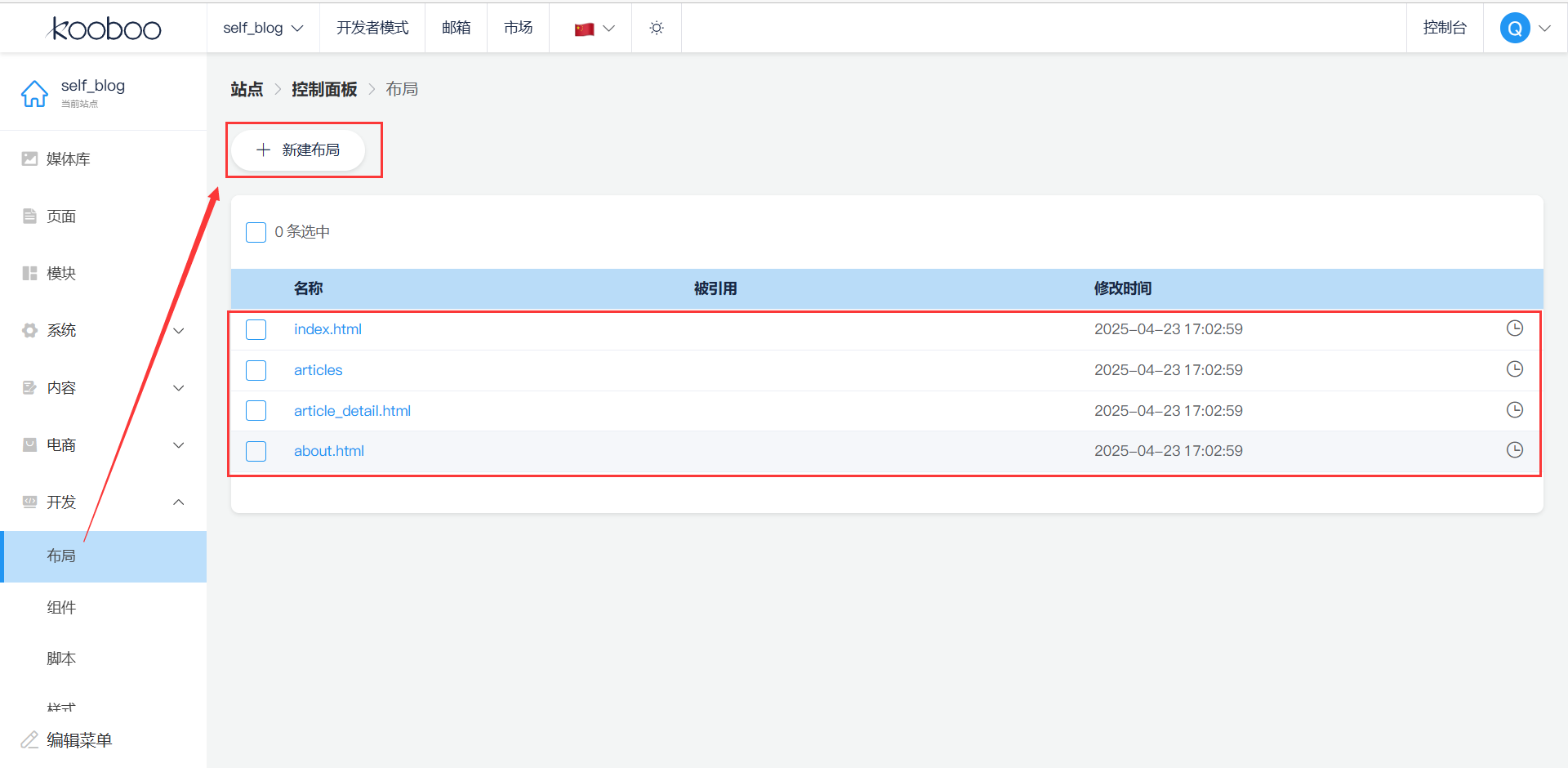
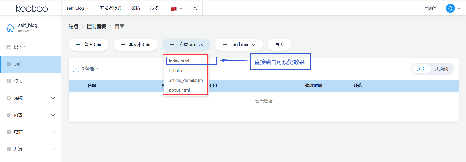
在?Kooboo 平臺?中,新建站點 ->??控制面板 -> 進入 “布局” 管理界面,點擊 “新建布局” 按鈕。創建以下幾個布局文件:首頁(index.html)、文章列表頁(articles?)、文章詳情頁(article_detail.html)、關于我們頁(about.html).【源碼看文章后半段】
2. 添加布局頁面
????每個頁面的代碼獨立,開發者能快速定位到對應頁面的 HTML、CSS 和 JavaScript 相關代碼。如:修改文章詳情頁的樣式,直接找到?article_detail.html?即可,無需在大量混合代碼中查找。
3. 頁面源碼
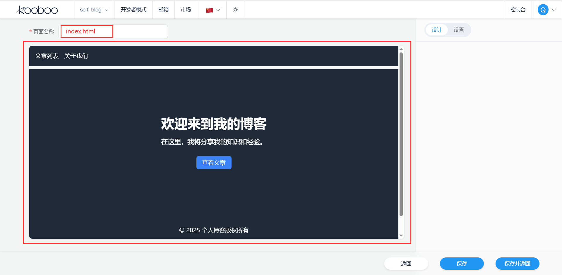
?3.1?index.html (首頁)
<!DOCTYPE html>
<html lang="zh-CN"><head><meta charset="UTF-8"><meta name="viewport" content="width=device-width, initial-scale=1.0"><title>個人博客 - 首頁</title><script src="https://cdn.tailwindcss.com"></script><link href="https://cdnjs.cloudflare.com/ajax/libs/font-awesome/6.7.2/css/all.min.css" rel="stylesheet">
</head><body class="bg-gray-100"><!-- 導航欄 --><nav class="bg-gray-800 text-white py-4 fixed top-0 left-0 right-0 z-50"><div class="container mx-auto px-4 flex justify-between items-center"><a href="index.html" class="text-2xl font-bold">個人博客</a><div class="space-x-4 hidden md:flex"><a href="index.html" class="hover:text-gray-300">首頁</a><a href="articles.html" class="hover:text-gray-300">文章列表</a><a href="about.html" class="hover:text-gray-300">關于我們</a></div><button id="mobile-menu-button" class="md:hidden focus:outline-none"><svg class="w-6 h-6" fill="none" stroke="currentColor" viewBox="0 0 24 24"><path stroke-linecap="round" stroke-linejoin="round" stroke-width="2" d="M4 6h16M4 12h16M4 18h16" /></svg></button></div><div id="mobile-menu" class="md:hidden bg-gray-800 absolute top-full left-0 right-0 py-4 hidden"><a href="index.html" class="block py-2 px-4 hover:bg-gray-700">首頁</a><a href="articles.html" class="block py-2 px-4 hover:bg-gray-700">文章列表</a><a href="about.html" class="block py-2 px-4 hover:bg-gray-700">關于我們</a></div></nav><!-- 英雄區域 --><section class="bg-gray-800 text-white py-32 mt-16"><div class="container mx-auto px-4 text-center"><h1 class="text-4xl font-bold mb-4">歡迎來到我的博客</h1><p class="text-lg mb-8">在這里,我將分享我的知識和經驗。</p><a href="articles.html" class="bg-blue-500 hover:bg-blue-600 text-white py-2 px-4 rounded-md">查看文章</a></div></section><!-- 頁腳 --><footer class="bg-gray-800 text-white py-8"><div class="container mx-auto px-4 text-center"><p>© 2025 個人博客版權所有</p><div class="mt-2 space-x-4"><a href="#" class="hover:text-gray-300"><i class="fab fa-facebook-f"></i></a><a href="#" class="hover:text-gray-300"><i class="fab fa-twitter"></i></a><a href="#" class="hover:text-gray-300"><i class="fab fa-instagram"></i></a></div></div></footer><script>const mobileMenuButton = document.getElementById('mobile-menu-button');const mobileMenu = document.getElementById('mobile-menu');mobileMenuButton.addEventListener('click', () => {mobileMenu.classList.toggle('hidden');});</script>
</body></html>代碼解釋:
-
頭部(
<head>):meta charset="UTF-8":規定了網頁的字符編碼為 UTF - 8,避免出現亂碼問題。meta name="viewport":確保網頁在不同設備上能正確顯示,width=device-width?讓頁面寬度與設備寬度一致,initial - scale = 1.0?則設置初始縮放比例為 1。title:設置網頁的標題,會顯示在瀏覽器的標簽欄上。script?標簽:引入 Tailwind CSS 的 CDN 鏈接,使得可以使用 Tailwind 的實用類來設計樣式。link?標簽:引入 Font Awesome 圖標庫,方便在頁面中使用各種圖標。
-
導航欄(
<nav>):- 采用?
bg-gray-800?類設置背景顏色為深灰色,text-white?類設置文字顏色為白色。 fixed?類讓導航欄固定在頁面頂部,z - 50?類確保導航欄處于較高的層級,不會被其他元素遮擋。- 借助?
hidden md:flex?和?md:hidden?類實現響應式設計,在小屏幕設備上隱藏桌面菜單,顯示移動端菜單按鈕。 - JavaScript 代碼實現了移動端菜單的展開和收起功能,點擊菜單按鈕時切換?
hidden?類來控制菜單的顯示狀態。
- 采用?
-
英雄區域(
<section>):- 同樣使用?
bg-gray-800?和?text-white?類設置背景和文字顏色。 py-32?和?mt-16?類分別設置垂直內邊距和頂部外邊距,讓英雄區域更加突出。- 包含標題、描述和一個 “查看文章” 的按鈕,按鈕點擊后會跳轉到文章列表頁。
- 同樣使用?
-
頁腳(
<footer>):- 背景和文字顏色與導航欄一致,營造統一的視覺效果。
- 包含版權信息和社交鏈接圖標,點擊圖標可跳轉到相應的社交頁面(這里?
#?為占位符)。
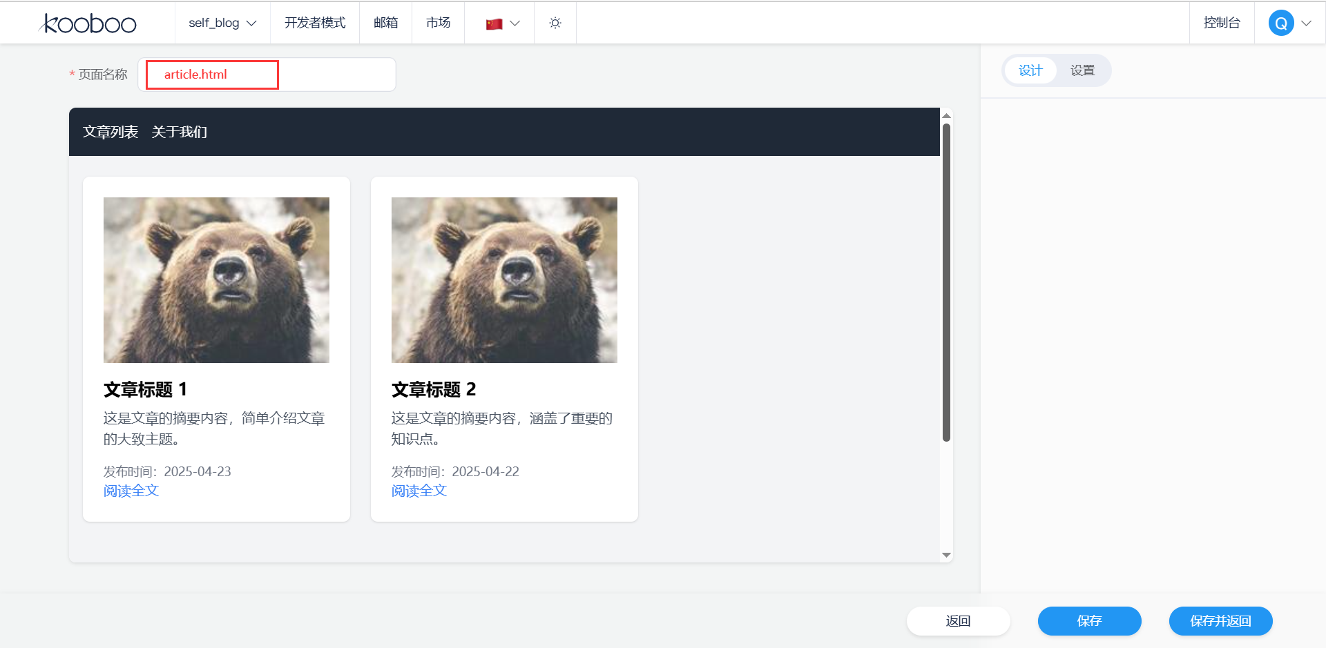
3.2?articles.html(文章列表頁)article-detail.html(文章詳情頁)
<!DOCTYPE html>
<html lang="zh-CN"><head><meta charset="UTF-8"><meta name="viewport" content="width=device-width, initial-scale=1.0"><title>個人博客 - 文章列表</title><script src="https://cdn.tailwindcss.com"></script><link href="https://cdnjs.cloudflare.com/ajax/libs/font-awesome/6.7.2/css/all.min.css" rel="stylesheet">
</head><body class="bg-gray-100"><!-- 導航欄 --><nav class="bg-gray-800 text-white py-4 fixed top-0 left-0 right-0 z-50"><!-- 導航欄內容與 index.html 相同 --></nav><!-- 文章列表 --><main class="container mx-auto px-4 py-8 pt-20"><div class="grid grid-cols-1 md:grid-cols-2 lg:grid-cols-3 gap-6"><!-- 文章卡片示例 --><div class="bg-white p-6 rounded-lg shadow hover:shadow-xl transition-shadow"><img src="https://picsum.photos/200/150" alt="文章配圖" class="w-full h-48 object-cover mb-4"><h2 class="text-xl font-bold mb-2">文章標題 1</h2><p class="text-gray-600 mb-4">這是文章的摘要內容,簡單介紹文章的大致主題。</p><p class="text-sm text-gray-500">發布時間:2025-04-23</p><a href="article-detail.html" class="text-blue-500 hover:underline">閱讀全文</a></div><div class="bg-white p-6 rounded-lg shadow hover:shadow-xl transition-shadow"><!-- 另一篇文章卡片 --></div><!-- 可添加更多文章卡片 --></div></main><!-- 分頁 --><div class="container mx-auto px-4 py-4 flex justify-center"><a href="#" class="bg-gray-300 text-gray-700 py-2 px-4 rounded-l-md">上一頁</a><a href="#" class="bg-gray-300 text-gray-700 py-2 px-4">1</a><a href="#" class="bg-gray-300 text-gray-700 py-2 px-4">2</a><a href="#" class="bg-gray-300 text-gray-700 py-2 px-4 rounded-r-md">下一頁</a></div><!-- 頁腳 --><footer class="bg-gray-800 text-white py-8"><!-- 頁腳內容與 index.html 相同 --></footer><script>const mobileMenuButton = document.getElementById('mobile-menu-button');const mobileMenu = document.getElementById('mobile-menu');mobileMenuButton.addEventListener('click', () => {mobileMenu.classList.toggle('hidden');});</script>
</body></html>
代碼解釋
-
導航欄和頁腳:與?
index.html?中的導航欄和頁腳代碼相同,實現了統一的頁面布局和導航功能。 -
文章列表(
<main>):grid?類創建了一個網格布局,grid - cols - 1 md:grid - cols - 2 lg:grid - cols - 3?類根據不同的屏幕尺寸調整列數,在小屏幕上顯示 1 列,中等屏幕顯示 2 列,大屏幕顯示 3 列。gap - 6?類設置網格項之間的間距為 6 個單位。- 每篇文章使用一個?
<div>?元素作為卡片,包含文章配圖、標題、摘要、發布時間和 “閱讀全文” 鏈接。 hover:shadow-xl?和?transition-shadow?類為文章卡片添加了鼠標懸停時的陰影效果,增強了交互性。
-
分頁(
<div>):- 使用?
flex?和?justify - center?類將分頁鏈接居中顯示。 - 包含 “上一頁”、頁碼和 “下一頁” 鏈接,點擊鏈接可切換文章頁面(這里?
#?為占位符)。
- 使用?
3.3?article-detail.html(文章詳情頁)?
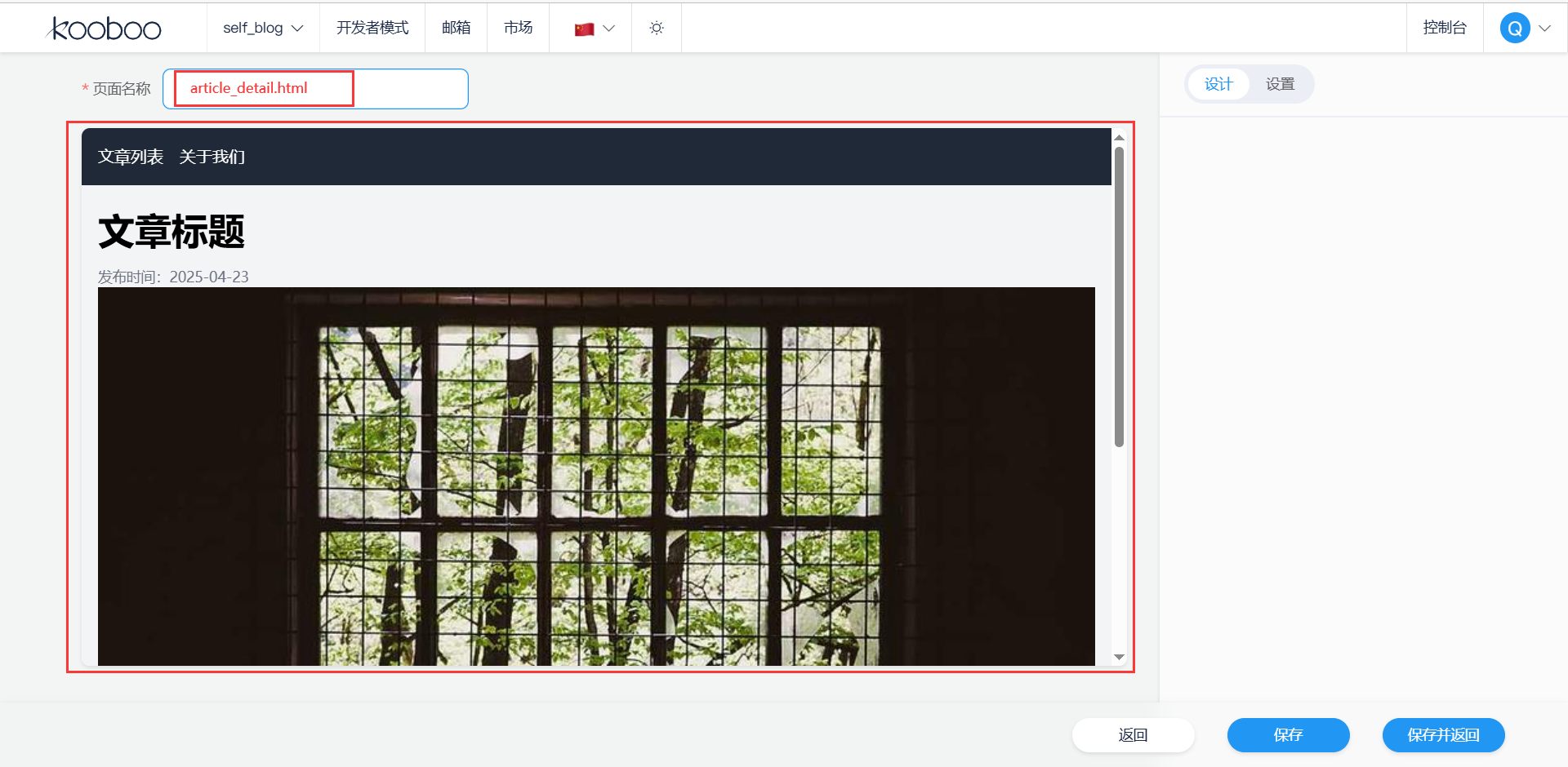
<!DOCTYPE html>
<html lang="zh-CN"><head><meta charset="UTF-8"><meta name="viewport" content="width=device-width, initial-scale=1.0"><title>個人博客 - 文章詳情</title><script src="https://cdn.tailwindcss.com"></script><link href="https://cdnjs.cloudflare.com/ajax/libs/font-awesome/6.7.2/css/all.min.css" rel="stylesheet">
</head><body class="bg-gray-100"><!-- 導航欄 --><nav class="bg-gray-800 text-white py-4 fixed top-0 left-0 right-0 z-50"><!-- 導航欄內容與 index.html 相同 --></nav><!-- 文章詳情 --><article class="container mx-auto px-4 py-8 pt-20"><h1 class="text-4xl font-bold mb-4">文章標題</h1><p class="text-sm text-gray-500">發布時間:2025-04-23</p><img src="https://picsum.photos/800/400" alt="文章大圖" class="w-full h-auto object-cover mb-4"><div class="mt-8 text-gray-700 leading-relaxed"><p>這是文章的詳細內容,你可以在這里分享更多的知識和經驗。</p><p>繼續詳細闡述文章的主題,提供更多的細節和分析。</p></div></article><!-- 頁腳 --><footer class="bg-gray-800 text-white py-8"><!-- 頁腳內容與 index.html 相同 --></footer><script>const mobileMenuButton = document.getElementById('mobile-menu-button');const mobileMenu = document.getElementById('mobile-menu');mobileMenuButton.addEventListener('click', () => {mobileMenu.classList.toggle('hidden');});</script>
</body></html>
?代碼解釋:
-
導航欄和頁腳:與其他頁面保持一致,提供統一的導航和頁腳信息。
-
文章詳情(
<article>):- 包含文章標題、發布時間、大圖和詳細內容。
text-4xl?和?font-bold?類設置標題的字體大小和加粗效果。text-sm?和?text-gray-500?類設置發布時間的字體大小和顏色。- 圖片使用?
w-full?和?h-auto?類確保圖片寬度自適應,高度按比例縮放。 - 文章內容使用?
text-gray-700?和?leading-relaxed?類設置文字顏色和行高,提高可讀性。
?3.4?about.html(關于我們頁)
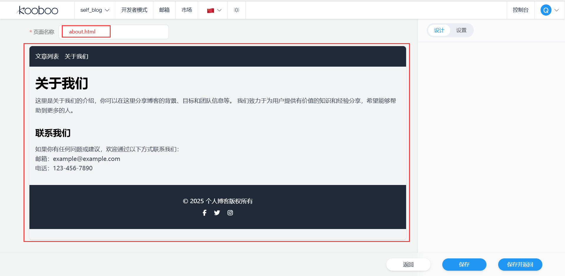
<!DOCTYPE html>
<html lang="zh-CN"><head><meta charset="UTF-8"><meta name="viewport" content="width=device-width, initial-scale=1.0"><title>個人博客 - 關于我們</title><script src="https://cdn.tailwindcss.com"></script><link href="https://cdnjs.cloudflare.com/ajax/libs/font-awesome/6.7.2/css/all.min.css" rel="stylesheet">
</head><body class="bg-gray-100"><!-- 導航欄 --><nav class="bg-gray-800 text-white py-4 fixed top-0 left-0 right-0 z-50"><!-- 導航欄內容與 index.html 相同 --></nav><!-- 關于我們內容 --><section class="container mx-auto px-4 py-8 pt-20"><h1 class="text-4xl font-bold mb-4">關于我們</h1><p class="text-gray-700 leading-relaxed">這里是關于我們的介紹,你可以在這里分享博客的背景、目標和團隊信息等。我們致力于為用戶提供有價值的知識和經驗分享,希望能夠幫助到更多的人。</p></section><!-- 頁腳 --><footer class="bg-gray-800 text-white py-8"><!-- 頁腳內容與 index.html 相同 --></footer><script>const mobileMenuButton = document.getElementById('mobile-menu-button');const mobileMenu = document.getElementById('mobile-menu');mobileMenuButton.addEventListener('click', () => {mobileMenu.classList.toggle('hidden');});</script>
</body></html>
?代碼解釋:
-
導航欄和頁腳:與其他頁面相同,保證了頁面的一致性。
-
關于我們內容(
<section>):- 包含一個標題和一段描述性文字,介紹博客的背景、目標和團隊信息等。
text-4xl?和?font-bold?類設置標題的樣式,text-gray-700?和?leading-relaxed?類設置文字的顏色和行高,使內容易于閱讀。
總結:
????????這 4 個 HTML 文件構成了一個簡單的個人博客系統,通過 Tailwind CSS 實現了響應式設計和美觀的界面效果。每個頁面都有統一的導航欄和頁腳,方便用戶在不同頁面之間切換。文章列表頁使用網格布局展示文章卡片,文章詳情頁顯示文章的詳細內容,關于我們頁介紹博客的相關信息。同時,通過 JavaScript 實現了移動端菜單的交互功能。


時,對Elasticsearch(ES)數據和算法數據進行測試(如何測試幾百萬條數據))

)


:雙核 AMP 通信實驗)

)


)


之Spark安裝和編程實踐)