一、代碼結構概覽
該代碼構建了一個包含經濟數據生成、可視化分析和政策模擬的交互式經濟系統仿真平臺,主要包括三大模塊:
-
多部門經濟數據生成:模擬包含產業關聯的復雜經濟數據
-
增強型可視化:提供多維度的經濟數據分析視圖
-
Dash交互應用:實現政策參數的動態模擬與效果展示
二、數據生成模塊 (generate_multi_sector_data)
1. 基礎設置
dates?= pd.date_range(start=datetime(2020,?1,?1), periods=years*12, freq='ME')t?= np.arange(len(dates))
-
生成每月末的日期序列(
freq='ME') -
創建時間索引數組
t用于周期函數計算
2. 波動生成函數???????
def?modulated_wave(base_freq, noise=0):? ??return?np.sin(base_freq*t)*(1+0.2*np.sin(0.3*t)) + noise*np.random.randn(len(t))
- 復合波動模型:包含:
-
基礎正弦波(
np.sin(base_freq*t)) -
振幅調制波(
0.2*np.sin(0.3*t)) -
高斯白噪聲(
noise參數控制強度)
3. 部門經濟模型
定義8個產業部門,每個部門采用不同的數學模型體現行業特性:
| 部門 | 模型特征 | 關鍵公式組件 |
|---|---|---|
| 農業 | 氣候周期性 | signal.square() 方波模擬季節影響 |
| 采礦業 | 資源衰減 | -0.005*(t**1.5) 模擬資源枯竭 |
| 制造業 | S型增長 | 1-1/(1+np.exp(...)) 邏輯斯蒂曲線 |
| 科技服務業 | 指數增長 | np.exp(0.005*t) 指數函數 |
| 金融地產 | 復合增長 | (1+0.01*t)**2 二次增長 |
4. 產業關聯計算???????
sector_links?= np.array([...]) ?#?8x8矩陣for?_ in range(2): ?# 兩輪交互? ??for?i in range(8):? ? ? ??impact?= (df @ sector_links[i])? ? ? ??df.iloc[:,i] +=?0.1?* impact.mean()
- 投入產出矩陣:8x8矩陣定義部門間供給關系
- 動態傳播:進行兩輪關聯計算,每個部門接收來自其他部門的加權影響
5. 宏觀指標???????
df['domestic_cycle'] = 0.4*df['manufacturing'] + ... ?# 國內周期df['external_cycle'] = 0.6*df['mining'] + ... ? ? ? ?# 外部周期
-
通過加權組合關鍵部門數據生成綜合指標
三、可視化模塊
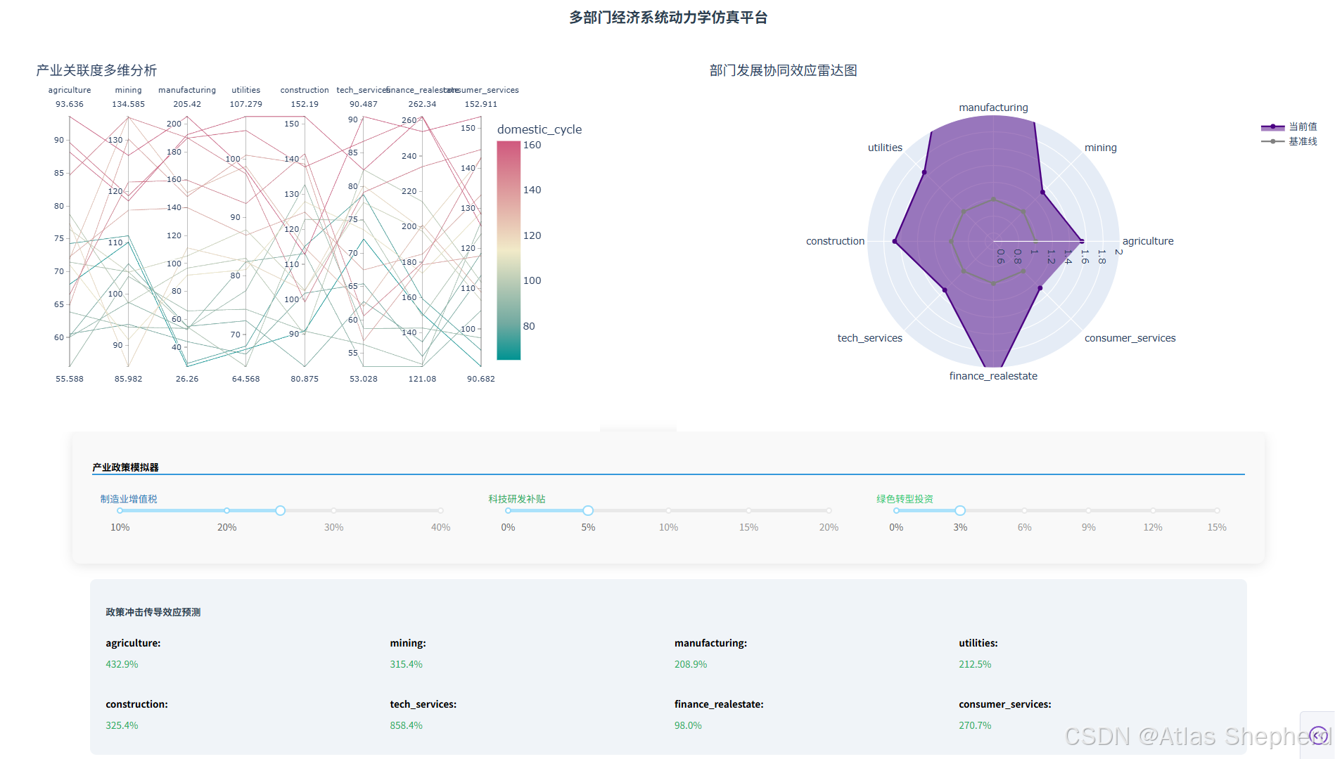
1. 平行坐標分析???????
px.parallel_coordinates(? ? df.resample('Q').mean(), ?# 季度平均? ? color='domestic_cycle', ??# 顏色映射? ? dimensions=df.columns[:8])
- 功能:展示多部門間的關聯關系
- 設計:
-
使用發散色系
Tealrose突出對比 -
季度降采樣避免過度波動
2. 雷達圖分析???????
go.Scatterpolar(? ? r=latest/(base+1e-6), ? ??# 相對增長率? ? theta=df.columns[:8] ? ??# 部門角度分布)
- 功能:可視化部門協同發展程度
- 設計:
-
顯示當前值相對于基期的倍數關系
-
灰色基準線標記1倍水平
四、Dash交互應用
1. 界面布局???????
app.layout = html.Div([? ? html.H1("仿真平臺", style={'textAlign':'center'}),? ? dcc.Graph(id='parallel-coords'), ?# 左側視圖? ? dcc.Graph(id='radar-chart'), ? ? ?# 右側視圖? ? dcc.Slider(id='manuf-tax', ...), ?# 政策滑塊? ? html.Div(id='sector-simulation') ?# 結果展示區])
- 響應式布局:使用CSS Grid實現雙列視圖
- 組件設計
-
政策滑塊帶有百分比刻度
-
陰影和圓角提升視覺層次
2. 政策模擬引擎???????
@callback(? ? Output('sector-simulation',?'children'),? ? [Input('manuf-tax',?'value'), ...])def?simulate_simpact(tax_rate, tech_sub, green_inv):? ??# 動態響應參數計算? ? tax_effect =?0.8/(1+np.exp(15*(tax_rate-0.25))) ?# S型曲線? ? tech_multiplier =?1?+?2.5*tech_sub*(1-0.3*tax_rate)? ??? ??# 構建8x8影響矩陣? ? impact_matrix = np.array([...])? ??? ??# 計算增長率? ? base_values = economy_df.iloc[-1].values[:8]? ? impact = base_values @ impact_matrix? ? growth_rates = (impact - base_values)/base_values
- 核心算法:
-
使用矩陣乘法模擬政策沖擊傳導
-
各政策參數非線性疊加(如
tech_sub與tax_rate的相互作用)
-
可視化反饋:
- 紅/綠色區分正負增長
網格布局展示8部門結果
import pandas as pd
import numpy as np
from datetime import datetime
from scipy import signal
import plotly.express as px
import plotly.graph_objects as go
from dash import Dash, html, dcc, Input, Output, callback# ========================
# 多部門經濟數據生成(8大產業部門)
# ========================
def generate_multi_sector_data(years=5):"""生成包含復雜產業關聯的經濟數據"""dates = pd.date_range(start=datetime(2020, 1, 1), periods=years * 12, freq='ME')t = np.arange(len(dates))# 基礎波動模型def modulated_wave(base_freq, noise=0):return np.sin(base_freq * t) * (1 + 0.2 * np.sin(0.3 * t)) + noise * np.random.randn(len(t))# 部門定義(8大產業)sectors = {# 農業:受氣候和政策影響'agriculture': 50 * (1 + 0.01 * t) + 10 * modulated_wave(2 * np.pi / 24) * (1 + 0.3 * signal.square(2 * np.pi * t / 36)),# 采礦業:資源依賴型'mining': 80 * (1 + 0.008 * t) - 0.005 * (t ** 1.5) + 15 * modulated_wave(2 * np.pi / 36, 0.2),# 制造業:核心生產部門'manufacturing': 100 * (1 + 0.015 * t) * (1 - 1 / (1 + np.exp(0.1 * (t - 30)))) + 20 * modulated_wave(2 * np.pi / 12),# 公用事業:穩定增長'utilities': 60 * (1 + 0.012 * t) + 5 * np.random.randn(len(t)),# 建筑業:周期性波動'construction': 70 * (1 + 0.01 * t) + 25 * modulated_wave(2 * np.pi / 18) + 0.2 * signal.sawtooth(2 * np.pi * t / 60),# 科技服務業:指數增長'tech_services': 40 * np.exp(0.005 * t) * (1 + 0.3 * modulated_wave(2 * np.pi / 24, 0.15)),# 金融地產:復合增長'finance_realestate': 90 * (1 + 0.01 * t) ** 2 + 30 * modulated_wave(2 * np.pi / 24, 0.2),# 消費服務業:需求驅動'consumer_services': 80 * (1 + 0.008 * t) + 20 * modulated_wave(2 * np.pi / 12) * (1 + 0.4 * np.random.beta(2, 5, len(t)))}df = pd.DataFrame(sectors, index=dates)# 部門間關聯投入產出關系sector_links = np.array([[0, 0.1, 0.2, 0, 0.05, 0, 0, 0],  # 農業[0.05, 0, 0.3, 0.1, 0.15, 0, 0, 0],  # 采礦業[0.1, 0.4, 0, 0.2, 0.25, 0.3, 0.1, 0.2],  # 制造業[0, 0, 0.1, 0.05, 0, 0.05, 0, 0],  # 公用事業[0, 0.1, 0.35, 0.05, 0, 0.1, 0.15, 0.3],  # 建筑業[0, 0, 0.2, 0.1, 0.1, 0, 0.3, 0.2],  # 科技服務[0, 0, 0.1, 0.05, 0.2, 0.4, 0, 0.5],  # 金融地產[0.2, 0, 0.15, 0, 0.1, 0.25, 0.3, 0]  # 消費服務])# 動態投入產出計算for _ in range(2):  # 兩輪交互for i in range(8):impact = (df @ sector_links[i])df.iloc[:, i] += 0.1 * impact.mean()# 宏觀指標計算df['domestic_cycle'] = 0.4 * df['manufacturing'] + 0.3 * df['consumer_services'] + 0.3 * df['construction']df['external_cycle'] = 0.6 * df['mining'] + 0.4 * df['tech_services'] - 0.2 * df['finance_realestate']return dfeconomy_df = generate_multi_sector_data()# ========================
# 增強型可視化(多維度分析)
# ========================
def create_parallel_coordinates(df):"""產業關聯平行坐標分析"""fig = px.parallel_coordinates(df.resample('Q').mean(),color='domestic_cycle',dimensions=df.columns[:8],color_continuous_scale=px.colors.diverging.Tealrose,title="產業關聯度多維分析")fig.update_layout(height=500)return figdef create_radar_chart(df):"""部門協同效應雷達圖"""latest = df.iloc[-1].values[:8]base = df.iloc[0].values[:8]fig = go.Figure()fig.add_trace(go.Scatterpolar(r=latest / (base + 1e-6),theta=df.columns[:8],fill='toself',name='當前值',line_color='indigo'))fig.add_trace(go.Scatterpolar(r=np.ones(8),theta=df.columns[:8],name='基準線',line_color='gray'))fig.update_layout(polar=dict(radialaxis=dict(visible=True, range=[0.5, 2])),showlegend=True,height=450,title="部門發展協同效應雷達圖")return fig# ========================
# 增強型Dash應用(多政策模擬)
# ========================
app = Dash(__name__)app.layout = html.Div([html.H1("多部門經濟系統動力學仿真平臺", style={'textAlign': 'center', 'color': '#2c3e50'}),html.Div([dcc.Graph(id='parallel-coords', figure=create_parallel_coordinates(economy_df)),dcc.Graph(id='radar-chart', figure=create_radar_chart(economy_df))], style={'display': 'grid', 'gridTemplateColumns': '1fr 1fr', 'gap': '20px'}),html.Div([html.Div([html.H3("產業政策模擬器", style={'borderBottom': '2px solid #3498db'}),html.Div([html.Div([html.Label("制造業增值稅", style={'color': '#2980b9'}),dcc.Slider(id='manuf-tax', min=0.1, max=0.4, value=0.25, step=0.05,marks={i: f"{int(i * 100)}%" for i in [0.1, 0.2, 0.3, 0.4]}),], style={'flex': 1, 'padding': 10}),html.Div([html.Label("科技研發補貼", style={'color': '#27ae60'}),dcc.Slider(id='tech-subsidy', min=0, max=0.2, value=0.05, step=0.02,marks={i: f"{int(i * 100)}%" for i in [0, 0.05, 0.1, 0.15, 0.2]}),], style={'flex': 1, 'padding': 10}),html.Div([html.Label("綠色轉型投資", style={'color': '#2ecc71'}),dcc.Slider(id='green-invest', min=0, max=0.15, value=0.03, step=0.03,marks={i: f"{int(i * 100)}%" for i in [0, 0.03, 0.06, 0.09, 0.12, 0.15]}),], style={'flex': 1, 'padding': 10})], style={'display': 'flex', 'gap': '15px'})], style={'padding': 25,'borderRadius': 10,'boxShadow': '0 2px 15px rgba(0,0,0,0.1)','background': '#f9f9f9','marginBottom': '20px'})], style={'width': '90%', 'margin': 'auto'}),html.Div(id='sector-simulation', style={'padding': 20,'margin': '20px auto','borderRadius': 8,'background': '#f0f4f8','width': '85%'})
])# ========================
# 產業政策模擬引擎
# ========================
@callback(Output('sector-simulation', 'children'),[Input('manuf-tax', 'value'),Input('tech-subsidy', 'value'),Input('green-invest', 'value')]
)
def simulate_simpact(tax_rate, tech_sub, green_inv):"""多政策協同作用模擬"""# 動態響應參數tax_effect = 0.8 / (1 + np.exp(15 * (tax_rate - 0.25)))  # S型稅收響應tech_multiplier = 1 + 2.5 * tech_sub * (1 - 0.3 * tax_rate)green_synergy = 0.6 * green_inv * (1 + 0.4 * tech_sub)# 部門間傳播矩陣impact_matrix = np.array([[1.0, 0.2, 0.5, 0.1, 0.3, 0.4, 0.1, 0.2],[0.3, 1.0, 0.6, 0.2, 0.4, 0.1, 0.3, 0.1],[0.7, 0.8, tax_effect, 0.5, 0.6, tech_multiplier, 0.4, 0.5],[0.1, 0.2, 0.3, 1.0, 0.2, 0.3, 0.1, 0.2],[0.4, 0.3, 0.7, 0.2, 1.0, 0.5, green_synergy, 0.6],[0.5, 0.1, 0.9, 0.3, 0.8, 1.0, 0.7, 0.4],[0.2, 0.4, 0.6, 0.1, 0.5, 0.8, 1.0, 0.3],[0.3, 0.1, 0.4, 0.2, 0.7, 0.6, 0.5, 1.0]])# 計算部門影響base_values = economy_df.iloc[-1].values[:8]impact = base_values @ impact_matrixgrowth_rates = (impact - base_values) / base_values# 生成可視化結果return html.Div([html.H4("政策沖擊傳導效應預測", style={'color': '#2c3e50'}),html.Div([html.Div([html.P(f"{sector}:", style={'fontWeight': 'bold'}),html.P(f"{100 * growth:.1f}%",style={'color': '#e74c3c' if growth < 0 else '#27ae60'})])for sector, growth in zip(economy_df.columns[:8], growth_rates)], style={'display': 'grid', 'gridTemplateColumns': 'repeat(4, 1fr)', 'gap': '15px'})])if __name__ == '__main__':app.run(debug=True, port=8050)

)

)


![信息學奧賽一本通 1498:Roadblocks | 洛谷 P2865 [USACO06NOV] Roadblocks G](http://pic.xiahunao.cn/信息學奧賽一本通 1498:Roadblocks | 洛谷 P2865 [USACO06NOV] Roadblocks G)


)


