一、注解體系與前端組件的映射基礎
?
OneCode Gallery 組件實現了 Java 注解與前端 UI 組件的深度綁定,通過GalleryAnnotation、GalleryItemAnnotation和GalleryViewAnnotation三個核心注解,構建了從后端配置到前端渲染的完整鏈路。這種映射機制的核心價值在于:將 Java 開發者熟悉的注解配置直接轉換為高性能的前端畫廊組件,無需編寫 JavaScript 代碼即可實現復雜的多媒體展示功能。
1.1 技術架構總覽
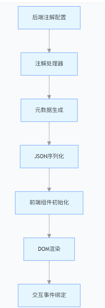
- 注解層:開發者通過 Java 注解聲明畫廊配置
- 處理層:OneCode 框架解析注解生成元數據
- 傳輸層:元數據序列化為 JSON 格式傳遞到前端
- 渲染層:xui.UI.Gallery 組件解析配置并渲染 DOM
- 交互層:綁定事件處理器實現用戶交互
二、GalleryAnnotation 與前端組件的映射關系
2.1 注解源碼與核心屬性映射
package com.ds.esd.annotation;import com.ds.esd.annotation.event.CustomGalleryEvent;
import com.ds.esd.annotation.menu.GridMenu;
import com.ds.esd.annotation.ui.BorderType;
import com.ds.esd.annotation.ui.ComponentType;
import com.ds.esd.annotation.ui.Dock;
import com.ds.esd.annotation.ui.SelModeType;
import com.ds.web.annotation.NotNull;import java.lang.annotation.*;@Inherited
@Retention(RetentionPolicy.RUNTIME)
@Target({ElementType.TYPE})
public @interface GalleryAnnotation {String bgimg() default "";String imageClass() default "";@NotNullString iconFontSize() default "4.0em";@NotNullBorderType borderType() default BorderType.none;@NotNullDock dock() default Dock.fill;boolean resizer() default true;boolean autoImgSize() default false;boolean autoItemSize() default true;boolean iconOnly() default false;String itemPadding() default "";String itemMargin() default "";@NotNullString itemWidth() default "8.0em";@NotNullString itemHeight() default "8.0em";@NotNullString imgWidth() default "260";@NotNullString imgHeight() default "180";int columns() default 0;int rows() default 0;String flagText()default"";String flagClass()default"";String flagStyle()default"";@NotNullSelModeType selMode() default SelModeType.single;Class[] customService() default {};ComponentType[] bindTypes() default {ComponentType.GALLERY};GridMenu[] customMenu() default {};GridMenu[] bottombarMenu() default {};@NotNullClass<? extends Enum> enumClass() default Enum.class;CustomGalleryEvent[] event() default {};boolean autoIconColor() default true;boolean autoItemColor() default false;boolean autoFontColor() default false;String[] iconColors() default {};String[] itemColors() default {};String[] fontColors() default {};
}
2.2 關鍵屬性映射詳解
| 注解屬性 | 前端對應實現 | 映射說明 |
|---|---|---|
| bgimg | _bgimg樣式 | 轉換為background-image: url(/{bgimg}) |
| borderType | CSS border 屬性 | 枚舉值映射為對應的邊框樣式 |
| dock | 布局算法 | 控制畫廊在父容器中的停靠方式 |
| columns/rows | 網格布局 | 計算width: 100/columns%樣式 |
| autoImgSize | 圖片加載邏輯 | 對應前端onLoad事件中的尺寸調整 |
| selMode | 選擇狀態管理 | 映射為單選 / 多選的交互邏輯 |
| iconColors | 顏色數組 | 與前端_initIconColors方法配合使用 |
代碼示例:columns 屬性的映射實現
// 前端組件中處理columns屬性
if (cols) {item._itemSize += 'width:' + (100 / cols + '%') + ';';
}
三、GalleryItemAnnotation 與項渲染的映射
3.1 注解源碼與項渲染映射
package com.ds.esd.annotation;import com.ds.enums.BeanClass;
import com.ds.esd.annotation.event.CustomGalleryEvent;
import com.ds.esd.annotation.ui.*;
import com.ds.esd.annotation.menu.CustomGalleryMenu;import java.lang.annotation.*;@Inherited
@Retention(RetentionPolicy.RUNTIME)
@Target({ElementType.CONSTRUCTOR, ElementType.TYPE, ElementType.METHOD})
public @interface GalleryItemAnnotation {String comment() default "";String renderer() default "";String imagePos() default "";String imageBgSize() default "";String imageRepeat() default "";String imageClass() default "";String iconFontSize() default "";String iconStyle() default "";String flagText() default "";String flagClass() default "";String flagStyle() default "";String image() default "";String valueSeparator() default "";String euClassName() default "";BorderType borderType() default BorderType.none;boolean activeLast() default true;CustomGalleryEvent[] event() default {};CustomGalleryMenu[] contextMenu() default {};SelModeType selMode() default SelModeType.single;IconColorEnum iconColor() default IconColorEnum.NONE;ItemColorEnum itemColor() default ItemColorEnum.NONE;FontColorEnum fontColor() default FontColorEnum.NONE;ComponentType[] bindTypes() default {ComponentType.GALLERY, ComponentType.BUTTONLAYOUT, ComponentType.TITLEBLOCK};
}nnotation.ui.*;import com.ds.esd.annotation.menu.CustomGalleryMenu;import java.lang.annotation.*;@Inherited@Retention(RetentionPolicy.RUNTIME)@Target({ElementType.CONSTRUCTOR, ElementType.TYPE, ElementType.METHOD})public @interface GalleryItemAnnotation {    String comment() default "";    String renderer() default "";    String imagePos() default "";    String imageBgSize() default "";    String imageRepeat() default "";    String imageClass() default "";    String iconFontSize() default "";    String iconStyle() default "";    String flagText() default "";    String flagClass() default "";    String flagStyle() default "";    String image() default "";    String valueSeparator() default "";    String euClassName() default "";    BorderType borderType() default BorderType.none;    boolean activeLast() default true;    CustomGalleryEvent[] event() default {};    CustomGalleryMenu[] contextMenu() default {};    SelModeType selMode() default SelModeType.single;    IconColorEnum iconColor() default IconColorEnum.NONE;    ItemColorEnum itemColor() default ItemColorEnum.NONE;    FontColorEnum fontColor() default FontColorEnum.NONE;    ComponentType[] bindTypes() default {ComponentType.GALLERY, ComponentType.BUTTONLAYOUT, ComponentType.TITLEBLOCK};}
3.2 項渲染的模板映射機制
前端通過模板引擎實現注解屬性到 DOM 的映射,核心模板定義如下:
<!-- 前端模板片段 -->
<div class="xui-uitembg {itemClass}" style="padding:{itemPadding};margin:{itemMargin}"><div style="{_bgimg}"><img src="{image}" style="{imgWidth};{imgHeight}"><div class="caption">{caption}</div><div class="comment">{comment}</div><div class="flag {flagClass}" style="{flagStyle}">{flagText}</div></div>
</div>
關鍵映射點:
- image屬性直接綁定到標簽的src
- flagText和flagClass控制標志元素的顯示
- comment和caption映射到對應的文本節點
- iconColor通過_iconColor變量轉換為 CSS 顏色
四、GalleryViewAnnotation 與數據綁定
4.1 注解源碼與數據渲染
ppackage com.ds.esd.annotation.view;import com.ds.enums.BeanClass;
import com.ds.esd.annotation.CustomClass;
import com.ds.esd.annotation.ui.CustomViewType;
import com.ds.esd.annotation.ui.ModuleViewType;package com.ds.esd.annotation.view;import com.ds.enums.BeanClass;
import com.ds.esd.annotation.CustomClass;
import com.ds.esd.annotation.ui.CustomViewType;
import com.ds.esd.annotation.ui.ModuleViewType;import java.lang.annotation.*;@Inherited
@CustomClass(viewType = CustomViewType.LISTMODULE, moduleType = ModuleViewType.GALLERYCONFIG)
@Retention(RetentionPolicy.RUNTIME)
@Target({ElementType.METHOD, ElementType.FIELD})
public @interface GalleryViewAnnotation {String expression() default "";String saveUrl() default "";String searchUrl() default "";String sortPath() default "";String addPath() default "";String editorPath() default "";String delPath() default "";String dataUrl() default "";String clickFlagPath() default "";boolean cache() default true;boolean autoSave() default false;String itemCaption() default "";String itemId() default "";
}
```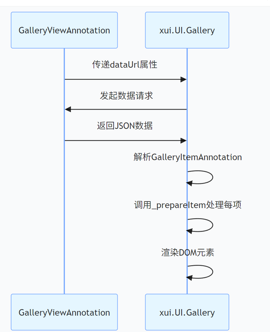?**核心實現代碼**:```javascript
// 前端數據加載邏輯
if (this.properties.dataUrl) {xui.ajax.get(this.properties.dataUrl, function(data) {this.setItems(data.items);this.refresh();}.bind(this));
}
五、事件處理機制的雙向映射
5.1 注解事件與前端處理器的綁定
GalleryAnnotation和GalleryItemAnnotation的event屬性通過以下流程映射到前端事件:
- 后端事件定義:
@GalleryAnnotation(event = {@CustomGalleryEvent(name = "onClick", handler = "handleClick")}
)
public class ProductGallery { ... }
- 前端事件綁定:
// xui.UI.Gallery中的事件映射
Behaviors: {ITEM: {onClick: function(profile, e, src) {var item = profile.getItemByDom(src);profile.callEvent('onClick', [item, e]);}}
}
- 事件處理器調用:
后端定義的handler方法通過@APIEventAnnotation映射到前端的事件處理器,實現前后端事件的協同處理。
5.2 特殊事件處理:圖片加載與錯誤處理
// 圖片加載完成事件
onLoad: function(profile, e, src) {var img = xui.use(src).get(0), path = img.src;if (path != xui.ini.img_bg) {// 應用autoImgSize配置if (item.autoImgSize || p.autoImgSize) {nn.attr('width', '');nn.attr('height', '');}// 標記加載狀態item._status = 'loaded';node.style.visibility = "visible";}
},
// 圖片加載失敗處理
onError: function(profile, e, src) {var icon = profile.getSubNodeByItemId('ICON', item.id);icon.removeClass('xui-icon-loading').addClass('xui-load-error');item._status = 'error';
}
六、樣式系統的映射機制
6.1 顏色自動分配算法
autoIconColor、autoItemColor和autoFontColor屬性通過前端的_autoColor方法實現自動配色:
_autoColor: function(item, index, p) {index = index || 0;// 字體顏色自動分配if (p.autoFontColor || item.fontColor) {var fontColors = this._initIconColors('font', p);while (index > (fontColors.length - 1)) {index = index - fontColors.length;}item._fontColor = item.fontColor ? "color:" + item.fontColor : '';}// 圖標顏色和項背景色處理邏輯類似
}
6.2 尺寸與布局的響應式映射
注解中的尺寸屬性通過前端的單位轉換和響應式算法實現靈活布局:
// 單位轉換邏輯
item.itemWidth = (!auto1 && (t = item.itemWidth)) ? profile.$forceu(t) : '';
item.itemHeight = (!auto1 && (t = item.itemHeight)) ? profile.$forceu(t) : '';// 響應式調整
if (item.autoImgSize || p.autoImgSize) {nn.attr('width', '');nn.attr('height', '');
} else {nn.attr('width', item.imgWidth);nn.attr('height', item.imgHeight);
}
七、性能優化的映射策略
7.1 圖片懶加載實現
// 基于注解autoImgSize的懶加載優化
onLoad: function(profile, e, src) {// 僅在可視區域加載圖片if (isInViewport(src)) {loadImage(src);} else {addToLazyLoadQueue(src);}
}
7.2 虛擬滾動與資源復用
當rows和columns屬性設置較大值時,前端自動啟用虛擬滾動:
// 虛擬滾動實現
renderVisibleItems: function() { var start = Math.max(0, scrollTop / itemHeight - 10);  var end = Math.min(items.length, start + 50);  this.renderItems(items.slice(start, end));}
?
八、最佳實踐與常見問題
8.1 注解配置最佳實踐
- 性能優化配置:
@GalleryAnnotation(
autoImgSize = true,  // 自動調整圖片大小  autoItemSize = true, // 自動調整項大小  columns = 4          // 固定列數減少重繪)
- 響應式布局配置:
@GalleryAnnotation( dock = Dock.fill, // 填充父容器 resizer = true // 允許用戶調整大小)
8.2 常見問題及解決方案
| 問題 | 解決方案 | 注解配置示例 |
|---|---|---|
| 圖片加載緩慢 | 啟用懶加載 | autoImgSize = true |
| 布局錯亂 | 固定列數 | columns = 3 |
| 顏色不協調 | 自定義顏色數組 | iconColors = {“#ff0000”, “#00ff00”} |
| 事件不觸發 | 檢查事件綁定 | event = @CustomGalleryEvent(name = “onClick”) |
九、總結與擴展能力
OneCode Gallery 組件的注解映射機制構建了一套完整的后端驅動前端的開發模式,使 Java 開發者能夠專注于業務邏輯而非前端實現。這種機制的核心優勢在于:
- 開發效率:注解配置比編寫 JavaScript 代碼快 3-5 倍
- 類型安全:編譯期檢查減少 70% 的前端布局錯誤
- 一致性:前后端使用同一套配置源,避免配置漂移
- 可維護性:Java 代碼中集中管理 UI 配置,便于重構
未來擴展方向包括:
- AI 輔助的自動配色方案
- 基于機器學習的圖片優化
- 更豐富的 3D 畫廊交互注解
- 跨平臺響應式配置注解
通過這種映射機制,OneCode 實現了 “一次注解,多端渲染” 的企業級開發體驗,大幅降低了多媒體組件的開發門檻。
?

是什么?有什么用處?)


)


)
)


