數據可視化圖表類型
In the current era of large amounts of information in the form of numbers available everywhere, it is a difficult task to understand and get insights from these dense piles of data.
在當今時代,到處都是數字形式的大量信息,要理解并從這些密集數據堆中獲得洞察力是一項艱巨的任務。
Data visualisation is the way which helps us in understanding what data tells us. It is more meaningful and appropriate when we use suitable charts to visualise data and get insights from it.
數據可視化是幫助我們了解數據告訴我們的方式。 當我們使用合適的圖表來可視化數據并從中獲得洞察力時,這將更有意義且更合適。
In this article, we will go through the common chart types and get to know about their applications scenarios. So by this, we can use appropriate chart types that will be helpful in getting characteristics of the data. To get an introduction about data visualisation in detail you can refer to the article- What and Why of Data Visualisation?
在本文中,我們將介紹常見的圖表類型,并了解它們的應用場景。 因此,通過這種方式,我們可以使用適當的圖表類型,這將有助于獲取數據的特征。 要獲得有關數據可視化的詳細介紹,您可以參考文章- 什么和為什么進行數據可視化?
Now, let us see the different chart types one by one.
現在,讓我們一一查看不同的圖表類型。
1.折線圖 (1. Line Chart)
Line chart or graph is used to illustrate trends in data over a time span or continuous time interval. The line chart tends to reflect different things as they change over time by connecting different plotted points.
折線圖或曲線圖用于說明一段時間或連續時間間隔內數據的趨勢。 折線圖往往會通過連接不同的繪制點來反映隨著時間變化的不同事物。
Multiple trends can also be displayed by plotting lines of different colours. It is advisable not to exceed 5 lines on the same graph for the clarity.
通過繪制不同顏色的線也可以顯示多個趨勢。 為了清楚起見,建議不要在同一圖形上超過5條線。
For e.g. the scenarios where we can use the line chart are monthly rainfall, annual sales of a company, month over month trends of stock prices, portal users, etc.
例如,我們可以使用折線圖的場景是每月降雨量,公司的年銷售額,股票價格逐月趨勢,門戶網站用戶等。

2.柱形圖 (2. Column Chart)
Column charts are the most basic charts which use columns to show the numerical values between categories. A column chart includes data labels along the horizontal axis with metrics or values along the vertical axis. It takes advantage of the height of the column to tell the difference in the values and the human eye is quite sensitive to the difference in heights.
柱形圖是最基本的圖表,它們使用柱形顯示類別之間的數值。 柱形圖包括沿水平軸的數據標簽,以及沿垂直軸的度量或值。 它利用列的高度來區分值的差異,而人眼對高度的差異非常敏感。
Column charts can also be used for the comparison between different types of categories. Clustered and Stacked column charts can be used for it.
柱形圖也可用于不同類型類別之間的比較。 可以使用群集和堆積柱形圖。
Some of the scenarios where column charts can be used are — sales by different region, product category, comparison of classified data.
可以使用柱形圖的一些方案是-按不同區域的銷售額,產品類別,分類數據的比較。

3.條形圖 (3. Bar Chart)
Bar charts are similar in use as column charts only the positions of its two axes are changes. Bar charts are generally used when there are a relatively large number of categories or they can be useful while displaying negative values.
條形圖的用法與柱形圖相似,只是條形圖的兩個軸的位置發生了變化。 條形圖通常在類別相對較多時使用,或者在顯示負值時很有用。
Bar charts can also be stacked or clustered while comparing different types of categories. The scenarios where bar charts are used are the same as column charts.
比較不同類型的類別時,也可以堆疊或群集條形圖。 使用條形圖的情況與柱形圖相同。

4.餅圖 (4. Pie Chart)
Pie charts are used to represent the proportions of different classifications in various fields. They are very useful in knowing how much portion of something is of a whole. But we should limit the numbers of classifications as the number of slices increases the chart become unhandy and we are not able to recognise the proportion of each slice as size distinction is not obvious.
餅圖用于表示各個領域中不同類別的比例。 它們對于了解某物有多少是整體非常有用。 但是,隨著切片數量的增加,我們應該限制分類的數量,圖表變得不便,并且由于大小差異不明顯,我們無法識別每個切片的比例。
There is a multi-layer pie chart also, which shows the proportion of different categorical data and also reflects the hierarchical relationships through it.
還有一個多層餅圖,它顯示了不同類別數據的比例,并通過它反映了層次關系。
The scenarios in which pie charts can be used are such as the comparison between population segments, budget allocations, the male-female ratio, online traffic sources, etc.
可以使用餅圖的場景包括人口細分之間的比較,預算分配,男女比例,在線流量來源等。

5.面積圖 (5. Area Chart)
Area chart represents the change in data(quantities) over time same as of the line chart. It is formed on the basis of the line chart in which the are between the trend-line and axis is filled with colour. As filling with colours better highlights the trend information.
面積圖表示與折線圖相同的數據(量)隨時間的變化。 它是根據折線圖形成的,在折線圖中,趨勢線和軸之間的顏色填充有顏色。 隨著顏色的填充更好地突出了趨勢信息。
The fill should be somewhat transparent or different so that the user can easily observe the overlapping relationship between different trends. Area charts can be used to depict time-series relationship, part-to-whole analysis, a simple comparison between the trend of each category, etc.
填充應該是透明的或不同的,以便用戶可以輕松觀察不同趨勢之間的重疊關系。 面積圖可用于描述時間序列關系,零件到整體分析,每個類別的趨勢之間的簡單比較等。

6.散點圖 (6. Scatter Chart)
Scatter plot is used to identify two relationships between two measures(quantities). In this, the two variables are plotted in the form of points on the points on the rectangular coordinate system. The relationship we identify between two variables is a correlation.
散點圖用于識別兩個度量(數量)之間的兩個關系。 在此,兩個變量以點的形式繪制在直角坐標系上的點上。 我們確定的兩個變量之間的關系是相關性。
Scatter plot is used mainly to identify how well we can infer the vertical values from the horizontal axis values. For scatter plot we need a lot of data otherwise we can’t assure that the identified relationship is obvious or not.
散點圖主要用于識別從水平軸值推斷垂直值的能力。 對于散點圖,我們需要大量數據,否則我們無法確保所識別的關系是顯而易見的。

7.氣泡圖 (7. Bubble Chart)
A bubble chart is the variant of the scatter plot. It is a multivariate chart that displays three-dimensional data. In the bubble chart, the x & y-axes are used to express two dimensions or measures and the size of the bubble determines the third value. The bubbles can be classified into different categories by using different colours.
氣泡圖是散點圖的變體。 它是顯示三維數據的多元圖表。 在氣泡圖中,x和y軸用于表示兩個維度或度量,氣泡的大小決定了第三個值。 可以使用不同的顏色將氣泡分為不同的類別。
Bubble charts are mainly used to compare and show the correlations between classified circles using positions and proportions.
氣泡圖主要用于比較和顯示使用位置和比例分類的圓之間的相關性。

8.量規表 (8. Gauge Chart)
Gauge Chart is used to display the progressive values. The scale represents a metric, in which the pointer angle represents the value of a dimension represented by the pointer.
儀表圖用于顯示漸進值。 標度表示度量,其中指針角度表示由指針表示的尺寸的值。
The gauge can be in the form of a ring, half ring or a tube bar, indicating the progress. The scenarios where gauge can be used are for comparison between intervals, achieved value versus targeted value.
量規可以是環,半環或管棒的形式,以指示進度。 可以使用量規的場景用于時間間隔,實現值與目標值之間的比較。

9. TreeMap (9. TreeMap)
A TreeMap is used to represent the hierarchical structure of the data in a space-efficient way. The visualisation is created using the method of nested rectangles and displaying the quantities via area for each category. We can drill down within a treemap to an unlimited number of levels.
TreeMap用于以節省空間的方式表示數據的層次結構。 可視化是使用嵌套矩形的方法創建的,并通過面積顯示每個類別的數量。 我們可以在樹狀圖中向下鉆取到無限數量的級別。
TreeMaps can be used when data needs to be studied with respect to two metric values, having a large amount of hierarchical data, to get a high-level view of similarities and differences within one category or between multiple categories.
當需要針對具有大量分層數據的兩個度量值來研究數據時,可以使用TreeMaps來獲得一個類別內或多個類別之間的相似點和不同點的高級視圖。

10.漏斗圖 (10. Funnel Chart)
A funnel chart is a type of area chart which helps in visualising the progressive reduction of data from one phase to another amounting 100 per cent in total. The size of the area is determined by the series of value as a percentage of the total of all values.
漏斗圖是一種面積圖,有助于直觀顯示數據從一個階段到另一個階段的逐步減少,總計總計100%。 區域的大小由一系列值(占所有值的總和)確定。
Funnel charts are suitable for comparing rankings. They can be used in visualising the sales conversion data, in analyzing data and managing order and sales cycles, evaluation of a particular process, and in standard value comparison.
漏斗圖適用于比較排名。 它們可用于可視化銷售轉換數據,分析數據以及管理訂單和銷售周期,評估特定流程以及進行標準值比較。

11.瀑布圖 (11. Waterfall Chart)
A waterfall chart is a modified type of column chart. A waterfall chart helps in understanding the cumulative effect on the initial value which is increased or decreased by a series of intermediate values leading to s final value.
瀑布圖是柱形圖的一種修改類型。 瀑布圖有助于理解對初始值的累積影響,該初始值通過一系列導致最終值的中間值增加或減少。
In the waterfall chart, the first column usually represents the initial value to total value, the last column represents the total value and the intermediate columns appear to float, and represent the negative or positive changes from one period of time to another.
在瀑布圖中,第一列通常代表初始值到總值,最后一列代表總值,中間列似乎是浮動的,代表從一個時間段到另一個時間段的負或正變化。
Waterfall charts are most widely used in the Finance sector to show net value transition, profit variation from the start of a year till the end, and it is also effective to use when to display gradual changes in the value measures over a period of time.
瀑布圖是金融領域中使用最廣泛的圖表,用于顯示凈值轉換,從年初到年底的利潤變化,并且在顯示一段時間內價值度量的逐漸變化時也很有效。

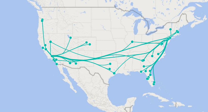
12.地圖 (12. Map Chart)
Map Charts are the visualisation which helps us to position our data in the geographical context to get the intuition about the regional distribution on the different levels such as world, countries, states, etc. We can show data on maps in different ways such as point map, flow map and heat map.
地圖圖是一種可視化視圖,可幫助我們在地理環境中定位數據,以直觀了解世界,國家,州等不同層次上的區域分布。我們可以以不同方式(例如點)在地圖上顯示數據圖,流圖和熱圖。
1. Point Map
1.點地圖
A Point map uses the method of plotting points on a geographical layer or map. The distribution in the form of points makes it easy to grasp the overall distribution of data. We can also use bubbles instead of points which have different colours and sizes based on values and categories.
點地圖使用在地理圖層或地圖上繪制點的方法。 點形式的分布可以輕松掌握數據的整體分布。 我們還可以使用氣泡代替根據值和類別具有不同顏色和大小的點。

2. Flow Map
2.流程圖
A Flow map allows the interaction between the outflow and inflow area. It is usually represented by the line connecting the geometric centres of the location. The direction of the line specifies the direction of flow. The width or colour of the line indicates the flow value. Flow Maps can be used to display the imports, exports, geographic migrations etc.
流圖允許流出和流入區域之間的相互作用。 它通常由連接位置的幾何中心的線表示。 線的方向指定流動的方向。 線條的寬度或顏色表示流量值。 流圖可用于顯示導入,導出,地理遷移等。
3. Heat Map
3.熱圖
A Heat Map uses the colour gradients range from light to dark based on the different values which are completely in the specified region. Heat Map can be used in specifying the temperature distribution, population density, etc.
熱圖根據完全在指定區域中的不同值使用從淺到深的顏色漸變范圍。 熱圖可用于指定溫度分布,人口密度等。

Conclusion
結論
All of the above 12 charts are the most frequently used charts in data visualisation. You can create these visualisations on various tools like Power BI, Tableau, Microsoft Excel, etc. These are the basic charts but most of the complex charts are derived from these charts. However, as simple the chart is, the easy it is to understand and get the right insight from data. So, keep this in mind, and try to get a grip over these common charts.
以上所有12個圖表都是數據可視化中最常用的圖表。 您可以在各種工具(例如Power BI,Tableau,Microsoft Excel等)上創建這些可視化效果。這些是基本圖表,但是大多數復雜圖表均來自這些圖表。 但是,圖表非常簡單,很容易理解并從數據中獲得正確的見解。 因此,請記住這一點,并嘗試掌握這些常見圖表。
翻譯自: https://medium.com/vlearn-together/12-most-common-types-of-charts-in-data-visualisation-36021bd2fef5
數據可視化圖表類型
本文來自互聯網用戶投稿,該文觀點僅代表作者本人,不代表本站立場。本站僅提供信息存儲空間服務,不擁有所有權,不承擔相關法律責任。 如若轉載,請注明出處:http://www.pswp.cn/news/390769.shtml 繁體地址,請注明出處:http://hk.pswp.cn/news/390769.shtml 英文地址,請注明出處:http://en.pswp.cn/news/390769.shtml
如若內容造成侵權/違法違規/事實不符,請聯系多彩編程網進行投訴反饋email:809451989@qq.com,一經查實,立即刪除!相關文章
)
三大紀律七項注意(Access數據庫)

CentOS下安裝JDK的三種方法

MapReduce編程

統計信息在數據庫中的作用_統計在行業中的作用

IOS手機關于音樂自動播放問題的解決辦法

svg標簽和svg文件區別_什么是SVG文件? SVG圖片和標簽說明

開發人員怎么看實施人員
)
怎么評價兩組數據是否接近_接近組數據(組間)

代碼審計之DocCms漏洞分析

你讓,勛爵? 使用Jenkins聲明性管道的Docker中的Docker
——Clustered Indexes: Stairway to SQL Server Indexes Level 3)
翻譯(九)——Clustered Indexes: Stairway to SQL Server Indexes Level 3

power bi 中計算_Power BI中的期間比較


CentOS 7 安裝 JDK

javascript 布爾_JavaScript布爾說明-如何在JavaScript中使用布爾

如何進行數據分析統計_對您不了解的數據集進行統計分析

經典:區間dp-合并石子

常見排序算法_解釋的算法-它們是什么以及常見的排序算法

020-Spring Boot 監控和度量
