r語言繪制雷達圖
I’ve tried several different types of NBA analytical articles within my readership who are a group of true fans of basketball. I found that the most popular articles are not those with state-of-the-art machine learning technologies, but those with straightforward and meaningful graphs.
我在讀者群中嘗試了幾種不同類型的NBA分析文章,這些文章是一群真正的籃球迷。 我發現最受歡迎的文章不是那些具有最新的機器學習技術的文章,而是那些具有簡單明了的圖表的文章。
At a certain stage of my career as a data scientist, I realized that delivering the information is more important than showing the fancy models. Perhaps that’s why linear regression is still one of the most popular models in the finance world.
在我作為數據科學家的職業生涯的某個階段,我意識到提供信息比展示精美的模型更為重要。 也許這就是為什么線性回歸仍然是金融界最受歡迎的模型之一的原因。
In this post, I am going to talk about a simple topic. It is how to draw the spider plot, or the radar plot, which is one of the most essential graphs in a comparative analysis. I am implementing the code in R.
在這篇文章中,我將討論一個簡單的話題。 這是繪制蜘蛛圖或雷達圖的方法 ,它是比較分析中最重要的圖之一。 我正在R中實現代碼。
數據 (Data)
NBA players’ basic statistics and advanced statistics per game in 2019–2020 NBA playoffs. (from basketball reference)
在2019–2020 NBA季后賽中,NBA球員的每場比賽的基本統計數據和高級統計數據。 ( 參考籃球 )
碼 (Code)
Let’s first visualize James Harden’s stats in a spider plot. We only focus on five stats: PTS (points), TRB (total rebounds), AST (assists), STL (steals), and BLK (blocks).
讓我們首先在蜘蛛圖中形象化詹姆斯·哈登的統計數據。 我們僅關注五項統計數據:PTS(得分),TRB(總籃板),AST(助攻),STL(搶斷)和BLK(蓋帽)。
df = read.csv("playoff_stats.csv")
maxxx = apply(df[,c("PTS.","TRB","AST","STL","BLK")],2,max)
minnn = apply(df[,c("PTS.","TRB","AST","STL","BLK")],2,min)
In the code of this block, the data was read to a data frame, “df”. And the maximum and minimum values of each column were calculated because these values are useful to define the boundary of the data in the spider plot.
在該塊的代碼中,數據被讀取到數據幀“ df”。 并計算每列的最大值和最小值,因為這些值可用于定義蜘蛛圖中數據的邊界。
For example, I extracted the stats of James Harden and LeBron James for our analysis.
例如,我提取了James Harden和LeBron James的統計數據進行分析。
df_sel = df[c(3,10),c("PTS.","TRB","AST","STL","BLK")]
rownames(df_sel) = c("Harden","Lebron")
To define the function of the spider plot, we need to load the fmsb package.
要定義蜘蛛圖的功能,我們需要加載fmsb包。
comp_plot = function(data,maxxx,minnn){
    library(fmsb)
    data = rbind(maxxx, minnn, data)
    colors_border=c( rgb(0.2,0.5,0.5,0.9), rgb(0.8,0.2,0.5,0.9) , rgb(0.7,0.5,0.1,0.9) )
    colors_in=c( rgb(0.2,0.5,0.5,0.4), rgb(0.8,0.2,0.5,0.4) , rgb(0.7,0.5,0.1,0.4) )
    radarchart( data, axistype=1 , pcol=colors_border , pfcol=colors_in , plwd=4 , plty=1, cglcol="grey", cglty=1, axislabcol="grey", caxislabels=rep("",5), cglwd=0.8, vlcex=0.8)
    legend(x=0.5, y=1.2, legend = rownames(data[-c(1,2),]), bty = "n", pch=20 , col=colors_in , text.col = "black", cex=1, pt.cex=3)
}
In the function, “radarchart” is to draw the spider plot, some arguments of which is explained below.
在函數中,“ radarchart”用于繪制蜘蛛圖,下面將解釋其中的一些參數。
pcol and pfcol define the color of lines and the color to fill, respectively. plwd and plty give the line width and type of the spider plot, respectively. The grid line (or the web) has the color and type defined by cglcol and cglty. I don’t want to put any label in the center of the spider plot, so the caxislabels is given null strings (rep(“”,5)).
pcol和pfcol分別定義線條的顏色和要填充的顏色。 plwd和plty分別給出了蜘蛛圖的線寬和類型。 網格線(或網絡)的顏色和類型由cglcol和cglty定義。 我不想在蜘蛛圖的中心放置任何標簽,因此caxislabels給出了空字符串(rep(“”,5))。
Let’s see how Harden’s stats look.
讓我們看看哈登的統計數據如何。
comp_plot(df_sel[1,],maxxx,minnn)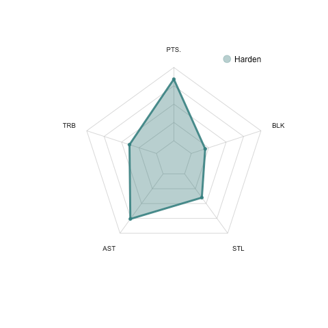
From the plot above, we can see that Harden is not only an excellent scorer (high points) but also a playmaker (high assists). These interpretations are perfectly consistent with the James Harden we know.
從上圖可以看出,哈登不僅是出色的得分手(高分),而且是組織者(高助攻)。 這些解釋與我們所知的詹姆斯·哈登完全吻合。
To compare the stats between James Harden and LeBron James, let’s input both players’ stats to the function.
為了比較詹姆斯·哈登和勒布朗·詹姆斯之間的數據,我們將兩個球員的數據輸入到該函數中。
comp_plot(df_sel,maxxx,minnn)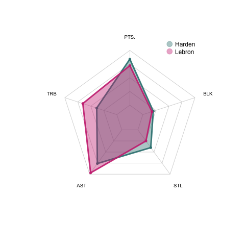
We can see that LeBron has got better rebound and assist numbers in the stats comparing to Harden even though his scoring is not as good as Harden.
我們可以看到,勒布朗的得分和助攻數據都比哈登更好,盡管他的得分不如哈登。
Pretty straight forward, right?
很簡單吧?
Let’s do a similar comparison between Giannis Antetokounmpo and Kawhi Leonard in their advanced statistics, which include offense box plus/minus (OBPM), defense box plus/minus (DBPM), offense win share (OWS), defense win share (DWS), and true shooting percentage (TS).
讓我們在Giannis Antetokounmpo和Kawhi Leonard的高級統計數據中進行類似的比較,其中包括進攻框正負(OBPM),防守框正負(DBPM),進攻贏率(OWS),防守贏率(DWS),和真實拍攝百分比(TS)。
df = read.csv("playoff_stats_adv.csv")
maxxx = apply(df[,c("OBPM","DBPM","OWS","DWS","TS.")],2,max)
minnn = apply(df[,c("OBPM","DBPM","OWS","DWS","TS.")],2,min)
df_sel = df[c(1,3),c("OBPM","DBPM","OWS","DWS","TS.")]
rownames(df_sel) = c("Giannis","Kawhi")
Let’s see Giannis’s stats first.
首先讓我們看看吉安尼斯的統計數據。
comp_plot(df_sel[1,],maxxx,minnn)
We can find that Giannis is an all-round star because he has good stats in almost every aspect. No wonder he won his second MVP for the 2019–2020 regular season.
我們可以發現吉安尼斯是全能明星,因為他幾乎在各個方面都有出色的數據。 難怪他贏得了2019–2020常規賽第二次MVP。
Next, let’s compare Giannis with Kawhi Leonard in their advanced statistics.
接下來,讓我們將Giannis和Kawhi Leonard的高級統計數據進行比較。
comp_plot(df_sel,maxxx,minnn)
We can see that Giannis outperformed Kawhi in all aspects of the advanced stats.
我們可以看到,吉安尼斯在所有高級統計數據方面都勝過了Kawhi。
You can compare any number of players with this simple function, however, I don’t recommend to use a spider plot for the comparison of more than 3 individuals.
您可以使用此簡單功能比較任意數量的玩家,但是,我不建議使用蜘蛛圖來比較3個以上的玩家。
If you do need to compare a large group of objects, a heatmap could be a better choice for visualization. Here is one of my previous posts of the best heatmap function in R.
如果確實需要比較大量對象,則熱圖可能是可視化的更好選擇。 這是我以前有關R中最佳熱圖函數的文章之一。
I hope this short article could contribute to your toolkit as a data scientist!
我希望這篇簡短的文章可以對您作為數據科學家的工具包有所幫助!
翻譯自: https://towardsdatascience.com/draw-a-radar-spider-plot-with-r-4af9693c3237
r語言繪制雷達圖
本文來自互聯網用戶投稿,該文觀點僅代表作者本人,不代表本站立場。本站僅提供信息存儲空間服務,不擁有所有權,不承擔相關法律責任。 如若轉載,請注明出處:http://www.pswp.cn/news/389393.shtml 繁體地址,請注明出處:http://hk.pswp.cn/news/389393.shtml 英文地址,請注明出處:http://en.pswp.cn/news/389393.shtml
如若內容造成侵權/違法違規/事實不符,請聯系多彩編程網進行投訴反饋email:809451989@qq.com,一經查實,立即刪除!相關文章

java 分裂數字_分裂的補充:超越數字,打印物理可視化

Java 集合 之 Vector

前端電子書單大分享~~~
)
結構化數據建模——titanic數據集的模型建立和訓練(Pytorch版)

比賽,幸福度_幸福與生活滿意度

帶有postgres和jupyter筆記本的Titanic數據集

Django學習--數據庫同步操作技巧

《20天吃透Pytorch》Pytorch自動微分機制學習

React 新 Context API 在前端狀態管理的實踐

機器學習模型 非線性模型_機器學習模型說明

5分鐘內完成胸部CT掃描機器學習

Pytorch高階API示范——線性回歸模型

vue 上傳圖片限制大小和格式

作業要求 20181023-3 每周例行報告

算命數據_未來的數據科學家或算命精神向導

openai-gpt_為什么到處都看到GPT-3?

Pytorch高階API示范——DNN二分類模型


puppet puppet模塊、file模塊
