比賽,幸福度
What is the purpose of life? Is that to be happy? Why people go through all the pain and hardship? Is it to achieve happiness in some way?
人生的目的是什么? 那是幸福嗎? 人們為什么要經歷所有的痛苦和磨難? 是通過某種方式獲得幸福嗎?
I’m not the only person who believed the purpose of life is happiness. If you look around, most people are pursuing happiness in their lives.
我不是唯一相信生活的目標是幸福的人。 如果環顧四周,大多數人都會在生活中追求幸福。
On March 20th, the world celebrates the International Day of Happiness. The 2020 report ranked 156 countries by how happy their citizens perceive themselves based on their evaluations of their own lives. The rankings of national happiness are based on a Cantril ladder survey. Nationally representative samples of respondents are asked to think of a ladder, the best possible life for them being a 10, and the worst possible experience is a 0. They are then asked to rate their own current lives on that 0 to 10 scale. The report correlates the results with various life factors. In the reports, experts in economics, psychology, survey analysis, and national statistics describe how well-being measurements can be used effectively to assess nations’ progress and other topics.
3月20日,世界慶祝國際幸福日。 2020年報告對 156個國家/地區進行了評估,根據其公民對自己生活的評價,他們對自己的快樂程度感到滿意。 國家幸福感的排名基于Cantril階梯調查。 在全國范圍內,具有代表性的受訪者樣本被要求考慮一個階梯,最適合他們的壽命是10,最糟糕的經歷是0。然后,他們被要求以0到10的等級對自己當前的生活進行評分。 該報告將結果與各種生活因素相關聯。 在報告中,經濟學,心理學,調查分析和國家統計方面的專家描述了如何有效地使用幸福感測度來評估國家的進步和其他主題。
So, how happy are people today? Were people more comfortable in the past? How satisfied with their lives are people in different societies? How do our living conditions affect all of this?
那么,今天的人們有多幸福? 過去的人們更加舒適嗎? 不同社會的人們對生活的滿意度如何? 我們的生活條件如何影響所有這些?
特征分析 (Features Analyzed)
GDP: GDP per capita is a measure of a country’s economic output that accounts for its number of people.
GDP :人均GDP是一國經濟產出的量度,該數字是其人口數量的一部分。
Support: Social support means having friends and other people, including family, turning to in times of need or crisis to give you a broader focus and positive self-image. Social support enhances the quality of life and provides a buffer against adverse life events.
支持 :社會支持意味著有朋友和其他人(包括家人)在有需要或遇到危機時求助于您,以給予您更廣泛的關注和積極的自我形象。 社會支持提高了生活質量,并為不良生活事件提供了緩沖。
Health: Healthy Life Expectancy is the average number of years that a newborn can expect to live in “full health” — in other words, not hampered by disabling illnesses or injuries.
健康 :健康預期壽命是指新生兒可以“完全健康”生活的平均年限,換句話說,不受疾病或傷害致殘的影響。
Freedom: Freedom of choice describes an individual’s opportunity and autonomy to perform an action selected from at least two available options, unconstrained by external parties.
自由:選擇自由描述了個人執行機會的自主權和自主權,該機會是從至少兩個不受外部團體約束的可用選項中選擇的。
Generosity: is defined as the residual of regressing the national average of responses to the question, “Have you donated money to a charity in past months?” on GDP capita.
慷慨 :定義為對問題“您在過去幾個月中向慈善機構捐款嗎?”的全國平均水平下降的殘差。 人均GDP。
Corruption: The Corruption Perceptions Index (CPI) is an index published annually by Transparency International since 1995, which ranks countries “by their perceived levels of public sector corruption, as determined by expert assessments and opinion surveys.”
腐敗 :腐敗感知指數(CPI)是透明國際自1995年以來每年發布的指數,該指數對國家“按專家評估和意見調查確定的對公共部門腐敗的感知程度進行排名”。
大綱: (Outline:)
- Import Modules, Read the Dataset and Define an Evaluation Table 導入模塊,讀取數據集并定義評估表
- Define a Function to Calculate the Adjusted R2 定義一個函數來計算調整后的R2
- How Happiness Score is distributed 幸福分數如何分配
- The relationship between different features with Happiness Score. 不同功能與幸福分數之間的關系。
- Visualize and Examine Data 可視化和檢查數據
- Multiple Linear Regression 多元線性回歸
- Conclusion 結論
Grab yourself a coffee, and join me on this journey towards predicting happiness!
喝杯咖啡,并加入我的幸福之旅吧!
1.導入模塊,讀取數據集并定義評估表 (1. Import Modules, Read the Dataset and Define an Evaluation Table)
To do some analysis, we need to set our environment up. First, we introduce some modules and read the data. The below output is the head of the data, but if you want to see more details, you might remove # signs in front of thedf_15.describe()and df_15.info()
要進行一些分析,我們需要設置環境。 首先,我們介紹一些模塊并讀取數據。 下面的輸出是數據的開頭,但是如果您想查看更多詳細信息,可以刪除df_15.describe()和df_15.info()前面的#號。
# FOR NUMERICAL ANALYTICS
import numpy as np# TO STORE AND PROCESS DATA IN DATAFRAME
import pandas as pd
import os# BASIC VISUALIZATION PACKAGE
import matplotlib.pyplot as plt# ADVANCED PLOTING
import seaborn as seabornInstance# TRAIN TEST SPLIT
from sklearn.model_selection import train_test_split# INTERACTIVE VISUALIZATION
import chart_studio.plotly as py
import plotly.graph_objs as go
import plotly.express as px
from plotly.offline import download_plotlyjs, init_notebook_mode, plot, iplot
init_notebook_mode(connected=True)import statsmodels.formula.api as stats
from statsmodels.formula.api import ols
from sklearn import datasets
from sklearn.linear_model import LinearRegression
from sklearn.metrics import mean_squared_error
from discover_feature_relationships import discover#2015 data
df_15 = pd.read_csv('2015.csv')
#df_15.describe()
#df_15.info()
usecols = ['Rank','Country','Score','GDP','Support',
                'Health','Freedom','Generosity','Corruption']
df_15.drop(['Region','Standard Error', 'Dystopia Residual'],axis=1,inplace=True)
df_15.columns = ['Country','Rank','Score','Support',
                'GDP','Health',
                'Freedom','Generosity','Corruption']
df_15['Year'] = 2015 #add year column
df_15.head()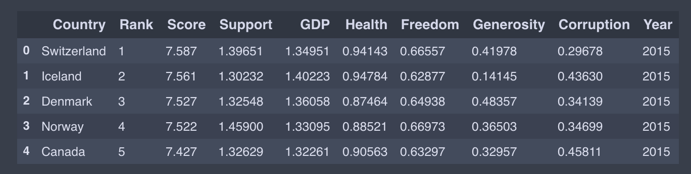
I only present the 2015 data code as an example; you could do similar for other years.Parts starting with Happiness, Whisker, and Dystopia. Residual are different targets. Dystopia Residual compares each countries scores to the theoretical unhappiest country in the world. Since the data from the years have a bit of a different naming convention, we will abstract them to a common name.
我僅以2015年數據代碼為例。 其他年份您可以做類似的事情。從Happiness , Whisker和Dystopia開始的零件。 Residual是不同的目標。 Dystopia Residual將每個國家的得分與世界上理論上最不幸的國家進行比較。 由于這些年份的數據有一些不同的命名約定,因此我們將它們抽象為一個通用名稱。
target = ['Top','Top-Mid', 'Low-Mid', 'Low' ]
target_n = [4, 3, 2, 1]df_15["target"] = pd.qcut(df_15['Rank'], len(target), labels=target)
df_15["target_n"] = pd.qcut(df_15['Rank'], len(target), labels=target_n)
We then combine all data file to finaldf
然后,我們將所有數據文件合并到finaldf
# APPENDING ALL TOGUETHER
finaldf = df_15.append([df_16,df_17,df_18,df_19])
# finaldf.dropna(inplace = True)#CHECKING FOR MISSING DATA
finaldf.isnull().any()# FILLING MISSING VALUES OF CORRUPTION PERCEPTION WITH ITS MEAN
finaldf.Corruption.fillna((finaldf.Corruption.mean()), inplace = True)
finaldf.head(10)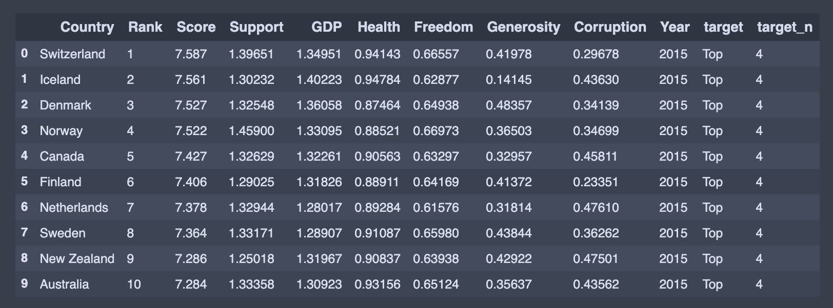
We can see the statistical detail of our dataset by using describe() function:
我們可以使用describe()函數查看數據集的統計細節:
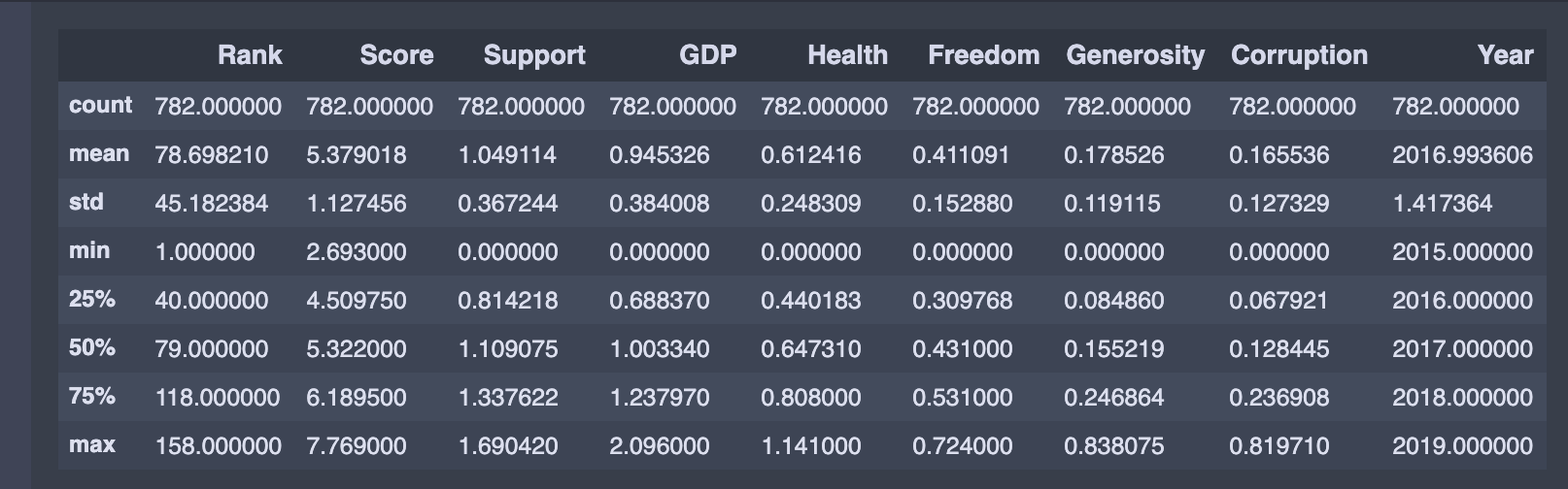
Further, we define an empty dataframe. This dataframeincludes Root Mean Squared Error (RMSE), R-squared, Adjusted R-squared, and mean of the R-squared values obtained by the k-Fold Cross-Validation, which are the essential metrics to compare different models. Having an R-squared value closer to one and smaller RMSE means a better fit. In the following sections, we will fill this dataframe with the results.
此外,我們定義了一個空的dataframe 。 此dataframe包括Root Mean Squared Error (RMSE) , R-squared , Adjusted R-squared和mean of the R-squared values obtained by the k-Fold Cross-Validation ,這是比較不同模型的基本指標。 R平方值更接近一個較小的RMSE意味著更合適。 在以下各節中,我們將用結果填充此dataframe 。
evaluation = pd.DataFrame({'Model':[],
                          'Details':[],
                          'Root Mean Squared Error (RMSE)': [],
                          'R-squared (training)': [],
                          'Adjusted R-squared (training)': [],
                          'R-squared (test)':[],
                          'Adjusted R-squared(test)':[],
                           '5-Fold Cross Validation':[]
                        })
2.定義一個函數來計算調整后的R2 (2. Define a Function to Calculate the Adjusted R2)
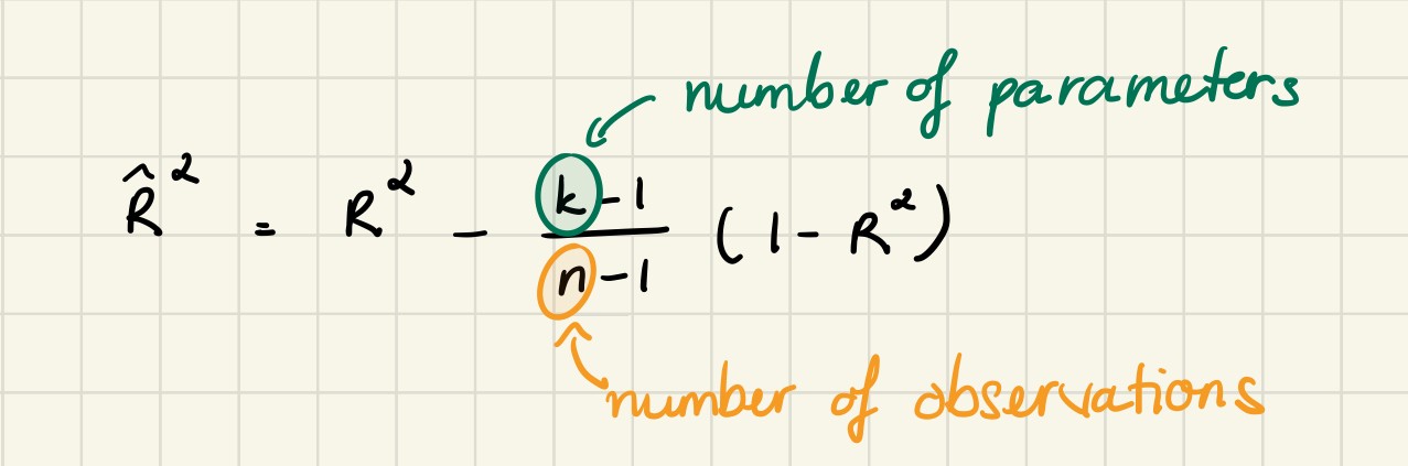
R-squared increases when the number of features increases. Sometimes a more robust evaluator is preferred to compare the performance between different models. This evaluator is called adjusted R-squared, and it only increases, if the addition of the variable reduces the MSE. The definition of the adjusted R2 is:
當特征數量增加時, R平方增加。 有時,最好使用功能更強大的評估器來比較不同模型之間的性能。 該評估器稱為調整后的R平方,并且僅在變量相加會降低MSE時才會增加。 調整后的R2的定義為:
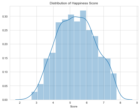
3.幸福分數如何分配 (3. How Happiness Score is distributed)
As we can see below, the Happiness Score has values above 2.85 and below 7.76. So there is no single country which has a Happiness Score above 8.
正如我們在下面看到的,“幸福感分數”的值高于2.85,低于7.76。 因此,沒有哪個國家的幸福分數高于8。
4.不同特征與幸福分數之間的關系 (4. The relationship between different features with Happiness Score)
We want to predict Happiness Score, so our dependent variable here is Score other features such as GPD Support Health, etc., are our independent variables.
我們要預測幸福分數,因此我們的因變量是Score其他功能(例如GPD Support Health等)是我們的自變量。
人均國內生產總值 (GDP per capita)
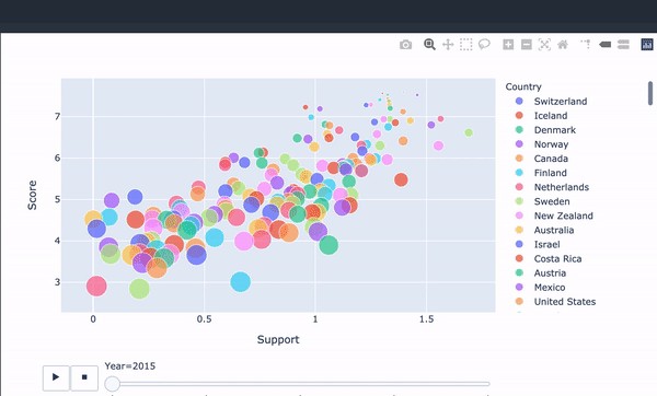
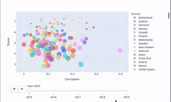
We first use scatter plots to observe relationships between variables.
我們首先使用散點圖來觀察變量之間的關系。
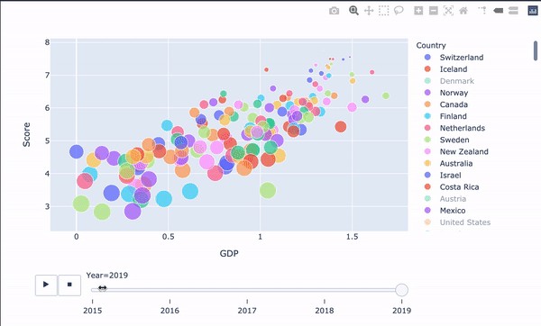
'''Happiness score vs gdp per capital'''
px.scatter(finaldf, x="GDP", y="Score", animation_frame="Year",
animation_group="Country",
size="Rank", color="Country", hover_name="Country",
trendline= "ols")train_data, test_data = train_test_split(finaldf, train_size = 0.8, random_state = 3)
lr = LinearRegression()
X_train = np.array(train_data['GDP'],
dtype = pd.Series).reshape(-1,1)
y_train = np.array(train_data['Score'], dtype = pd.Series)
lr.fit(X_train, y_train)X_test = np.array(test_data['GDP'],
dtype = pd.Series).reshape(-1,1)
y_test = np.array(test_data['Score'], dtype = pd.Series)pred = lr.predict(X_test)#ROOT MEAN SQUARED ERROR
rmsesm = float(format(np.sqrt(metrics.mean_squared_error(y_test,pred)),'.3f'))#R-SQUARED (TRAINING)
rtrsm = float(format(lr.score(X_train, y_train),'.3f'))#R-SQUARED (TEST)
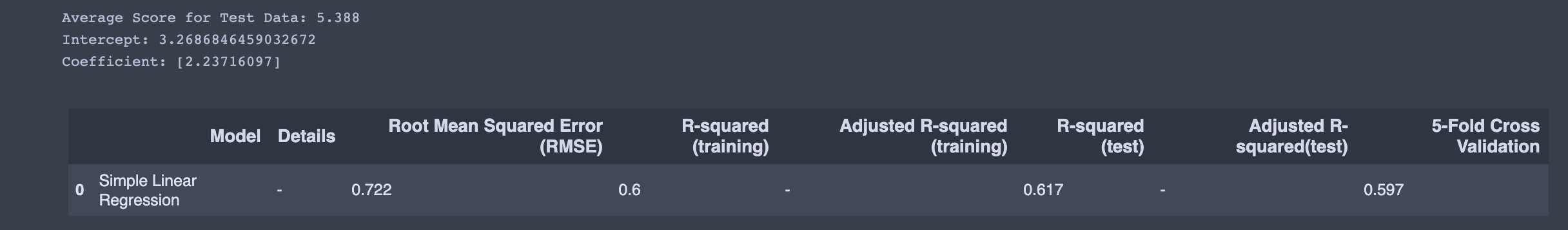
rtesm = float(format(lr.score(X_test, y_test),'.3f'))cv = float(format(cross_val_score(lr,finaldf[['GDP']],finaldf['Score'],cv=5).mean(),'.3f'))print ("Average Score for Test Data: {:.3f}".format(y_test.mean()))
print('Intercept: {}'.format(lr.intercept_))
print('Coefficient: {}'.format(lr.coef_))r = evaluation.shape[0]
evaluation.loc[r] = ['Simple Linear Regression','-',rmsesm,rtrsm,'-',rtesm,'-',cv]
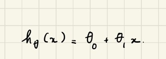
evaluationBy using these values and the below definition, we can estimate the Happiness Score manually. The equation we use for our estimations is called hypothesis function and defined as
通過使用這些值和以下定義,我們可以手動估算幸福度得分。 我們用于估計的方程稱為假設函數,定義為
We also printed the intercept and coefficient for the simple linear regression.
我們還為簡單的線性回歸打印了截距和系數。
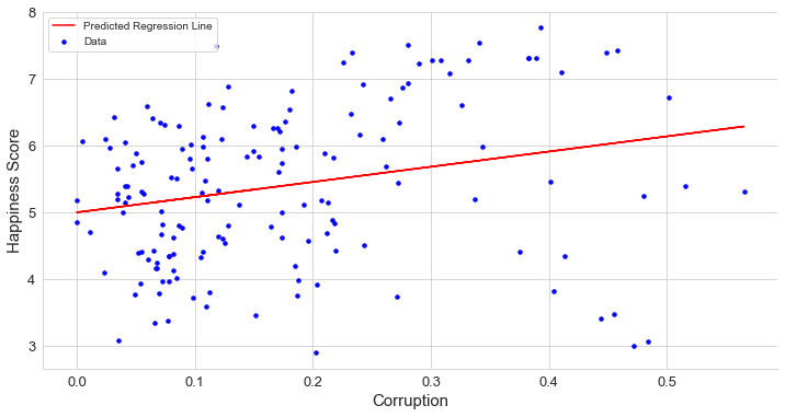
Let’s show the result, shall we?
讓我們顯示結果,好嗎?
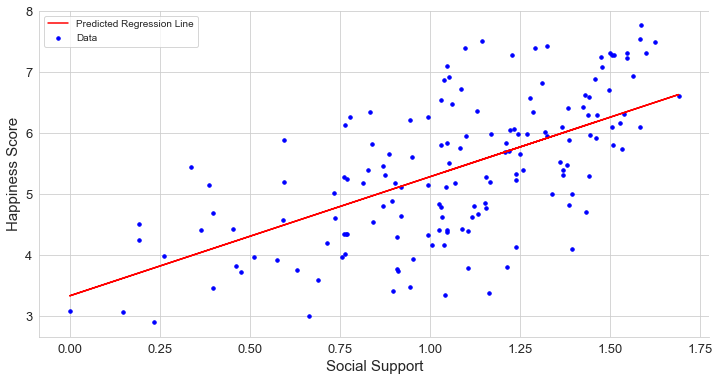
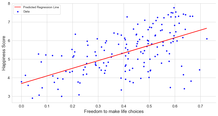
Since we have just two dimensions at the simple regression, it is easy to draw it. The below chart determines the result of the simple regression. It does not look like a perfect fit, but when we work with real-world datasets, having an ideal fit is not easy.
由于在簡單回歸中只有二維,因此繪制起來很容易。 下圖確定了簡單回歸的結果。 它看起來并不完美,但是當我們處理真實數據集時,要實現理想的擬合并不容易。
seabornInstance.set_style(style='whitegrid')plt.figure(figsize=(12,6))
plt.scatter(X_test,y_test,color='blue',label="Data", s = 12)
plt.plot(X_test,lr.predict(X_test),color="red",label="Predicted Regression Line")
plt.xlabel("GDP per Captita", fontsize=15)
plt.ylabel("Happiness Score", fontsize=15)
plt.xticks(fontsize=13)
plt.yticks(fontsize=13)
plt.legend()plt.gca().spines['right'].set_visible(False)
plt.gca().spines['top'].set_visible(False)
The relationship between GDP per capita(Economy of the country) has a strong positive correlation with Happiness Score, that is, if the GDP per capita of a country is higher than the Happiness Score of that country, it is also more likely to be high.
人均GDP(國家經濟)與幸福分數之間有很強的正相關關系,即,如果一個國家的人均GDP高于該國的幸福分數,則該可能性也較高。 。
支持 (Support)
To keep the article short, I won’t include the code in this part. The code is similar to the GDP feature above. I recommend you try to implement yourself. I will include the link at the end of this article for reference.
為了使文章簡短,我將不在此部分中包含代碼。 該代碼類似于上面的GDP功能。 我建議您嘗試實現自己。 我將在本文末尾包含鏈接以供參考。
Social Support of countries also has a strong and positive relationship with Happiness Score. So, it makes sense that we need social support to be happy. People are also wired for emotions, and we experience those emotions within a social context.
各國的社會支持與幸福分數也有密切而積極的關系。 因此,有意義的是我們需要社會支持才能幸福。 人們也渴望情感,我們在社交環境中體驗這些情感。
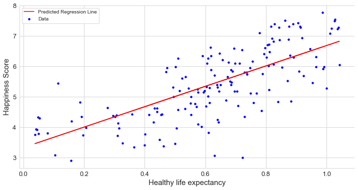
健康預期壽命 (Healthy life expectancy)
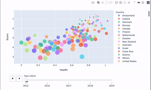
A healthy life expectancy has a strong and positive relationship with the Happiness Score, that is, if the country has a High Life Expectancy, it can also have a high Happiness Score. Being happy doesn’t just improve the quality of a person’s life. It may increase the quantity of our life as well. I will also be happy if I get a long healthy life. You?
健康的預期壽命與幸福指數有很強的正相關關系,也就是說,如果一個國家的預期壽命很高,那么幸福指數也可以很高。 快樂不僅會改善一個人的生活質量。 它也可能增加我們的生活量。 如果我長壽健康,我也會很高興。 您?
自由選擇生活 (Freedom to make life choices)
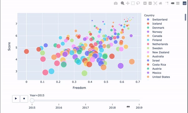
Freedom to make life choices has a positive relationship with Happiness Score. Choice and autonomy are more directly related to happiness than having lots of money. It gives us options to pursue meaning in our life, finding activities that stimulate and excite us. This is an essential aspect of feeling happy.
自由選擇生活與幸福分數有正相關關系。 與擁有大量金錢相比,選擇和自主與幸福更直接相關。 它為我們提供了在生活中追求意義,尋找刺激和激發我們活力的選擇。 這是感到快樂的重要方面。
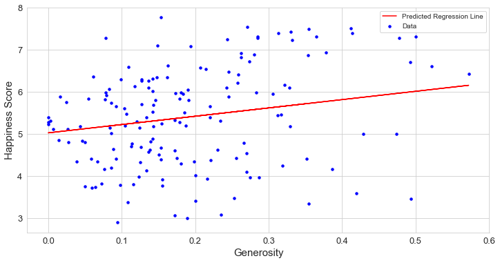
Generosity
慷慨大方
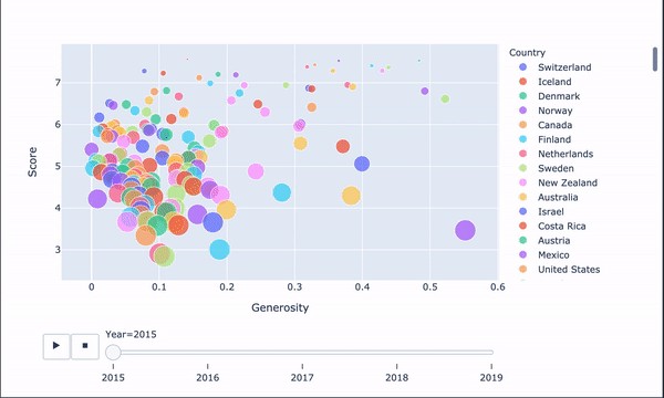
Generosity has a fragile linear relationship with the Happiness Score. Why the charity has no direct relationship with happiness score? Generosity scores are calculated based on the countries which give the most to nonprofits around the world. Countries that are not generous that does not mean they are not happy.
慷慨與幸福感評分之間存在線性關系。 為什么慈善與幸福分數沒有直接關系? 慷慨度分數是根據世界上向非營利組織提供最多捐助的國家/地區計算得出的。 不慷慨的國家并不意味著他們不高興。
Perceptions of corruption
腐敗感
Distribution of Perceptions of corruption rightly skewed that means very less number of the country has high perceptions of corruption. That means most of the country has corruption problems.
腐敗觀念的分布正確地歪曲,這意味著該國對腐敗觀念的高度了解的國家很少。 這意味著該國大部分地區都存在腐敗問題。
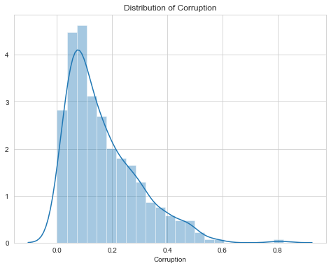
How corruption feature impact on the Happiness Score?
腐敗特征如何影響幸福感評分?
Perceptions of corruption data have highly skewed no wonder why the data has a weak linear relationship. Still, as we can see in the scatter plot, most of the data points are on the left side, and most of the countries with low perceptions of corruption have a Happiness Score between 4 to 6. Countries with high perception scores have a high Happiness Score above 7.
腐敗數據的認知高度偏斜,也難怪為什么數據具有弱線性關系。 但是,正如我們在散點圖中所看到的那樣,大多數數據點都位于左側,并且大多數對腐敗的認知度較低的國家的幸福分數在4到6之間。得分高于7。
5.可視化和檢查數據 (5. Visualize and Examine Data)
We do not have big data with too many features. Thus, we have a chance to plot most of them and reach some useful analytical results. Drawing charts and examining the data before applying a model is a good practice because we may detect some possible outliers or decide to do normalization. This step is not a must but gets to know the data is always useful. We start with the histograms of dataframe.
我們沒有功能太多的大數據。 因此,我們有機會繪制其中的大多數圖并獲得一些有用的分析結果。 在應用模型之前繪制圖表并檢查數據是一個好習慣,因為我們可能會發現一些可能的異常值或決定進行歸一化。 此步驟不是必須的,但要了解數據總是有用的。 我們從dataframe的直方圖開始。
# DISTRIBUTION OF ALL NUMERIC DATA
plt.rcParams['figure.figsize'] = (15, 15)
df1 = finaldf[['GDP', 'Health', 'Freedom',
              'Generosity','Corruption']]h = df1.hist(bins = 25, figsize = (16,16),
             xlabelsize = '10', ylabelsize = '10')
seabornInstance.despine(left = True, bottom = True)
[x.title.set_size(12) for x in h.ravel()];
[x.yaxis.tick_left() for x in h.ravel()]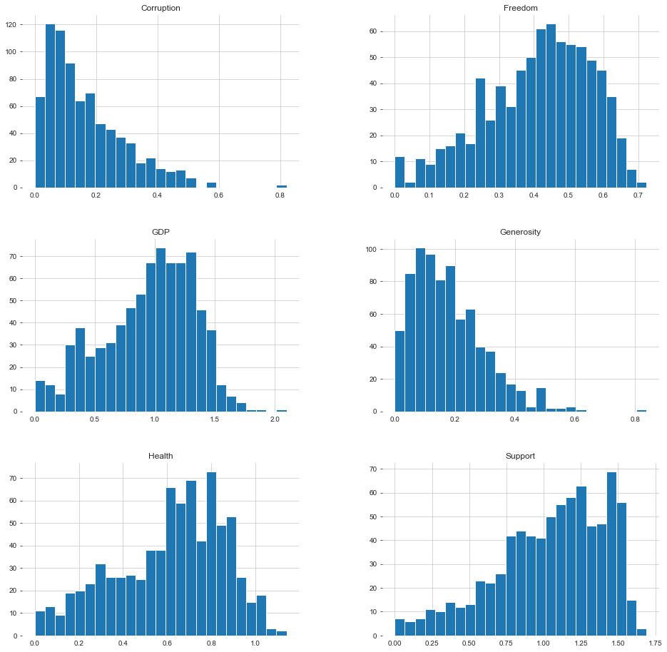
Next, to give us a more appealing view of where each country is placed in the World ranking report, we use darker blue for countries that have the highest rating on the report (i.e., are the “happiest”), while the lighter blue represents countries with a lower ranking. We can see that countries in the European and Americas regions have a reasonably high ranking than ones in the Asian and African areas.
接下來,為了讓我們對每個國家在世界排名報告中的位置更具吸引力,我們對報告中評分最高的國家(即最“幸福”的國家)使用深藍色,而淺藍色表示排名較低的國家。 我們可以看到,歐洲和美洲地區的國家比亞洲和非洲地區的國家具有較高的排名。
'''World Map
Happiness Rank Accross the World'''happiness_rank = dict(type = 'choropleth',
           locations = finaldf['Country'],
           locationmode = 'country names',
           z = finaldf['Rank'],
           text = finaldf['Country'],
           colorscale = 'Blues_',
           autocolorscale=False,
           reversescale=True,
           marker_line_color='darkgray',
           marker_line_width=0.5)
layout = dict(title = 'Happiness Rank Across the World',
             geo = dict(showframe = False,
                       projection = {'type': 'equirectangular'}))
world_map_1 = go.Figure(data = [happiness_rank], layout=layout)
iplot(world_map_1)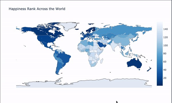
Let’s check which countries are better positioned in each of the aspects being analyzed.
讓我們檢查一下哪個國家在所分析的各個方面都處于更好的位置。
fig, axes = plt.subplots(nrows=3, ncols=2,constrained_layout=True,figsize=(10,10))seabornInstance.barplot(x='GDP',y='Country',
                        data=finaldf.nlargest(10,'GDP'),
                        ax=axes[0,0],palette="Blues_r")
seabornInstance.barplot(x='Health' ,y='Country',
                        data=finaldf.nlargest(10,'Health'),
                        ax=axes[0,1],palette='Blues_r')
seabornInstance.barplot(x='Score' ,y='Country',
                        data=finaldf.nlargest(10,'Score'),
                        ax=axes[1,0],palette='Blues_r')
seabornInstance.barplot(x='Generosity' ,y='Country',
                        data=finaldf.nlargest(10,'Generosity'),
                        ax=axes[1,1],palette='Blues_r')
seabornInstance.barplot(x='Freedom' ,y='Country',
                        data=finaldf.nlargest(10,'Freedom'),
                        ax=axes[2,0],palette='Blues_r')
seabornInstance.barplot(x='Corruption' ,y='Country',
                        data=finaldf.nlargest(10,'Corruption'),
                        ax=axes[2,1],palette='Blues_r')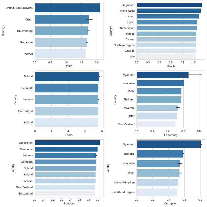
檢查解釋變量之間的相關性 (Checking Out the Correlation Among Explanatory Variables)
mask = np.zeros_like(finaldf[usecols].corr(), dtype=np.bool)
mask[np.triu_indices_from(mask)] = Truef, ax = plt.subplots(figsize=(16, 12))
plt.title('Pearson Correlation Matrix',fontsize=25)seabornInstance.heatmap(finaldf[usecols].corr(),
                        linewidths=0.25,vmax=0.7,square=True,cmap="Blues",
            linecolor='w',annot=True,annot_kws={"size":8},mask=mask,cbar_kws={"shrink": .9});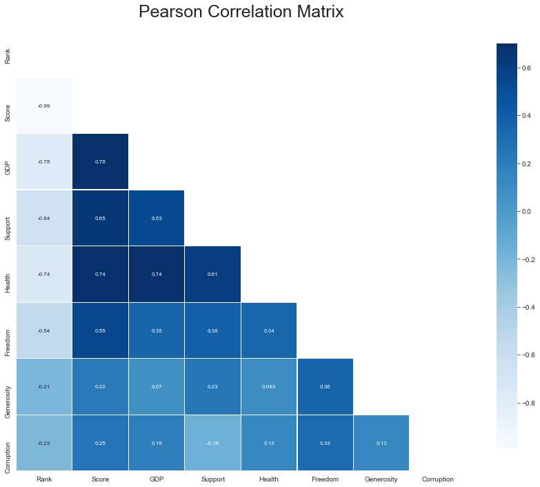
It looks like GDP, Health, and Support are strongly correlated with the Happiness score. Freedom correlates quite well with the Happiness score; however, Freedom connects quite well with all data. Corruption still has a mediocre correlation with the Happiness score.
看起來GDP , Health和Support與幸福分數密切相關。 Freedom與幸福分數有很好的相關性。 但是, Freedom與所有數據的連接都很好。 Corruption與幸福感得分之間仍存在中等程度的相關性。
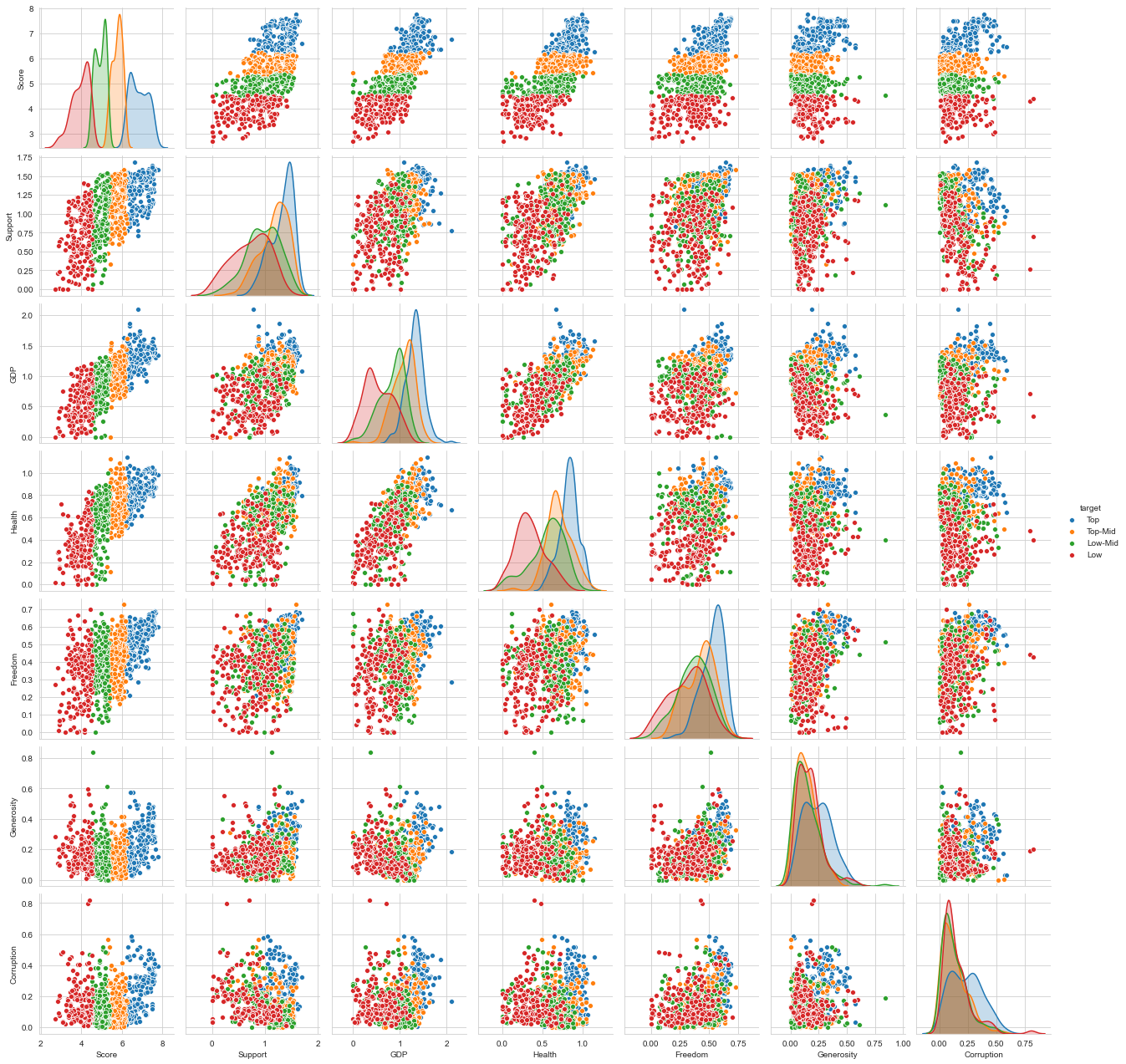
超越簡單相關 (Beyond Simple Correlation)
In the scatterplots, we see that GDP, Health, and Support are quite linearly correlated with some noise. We find the auto-correlation of Corruption fascinating here, where everything is terrible, but if the corruption is high, the distribution is all over the place. It seems to be just a negative indicator of a threshold.
在散點圖中,我們看到GDP , Health和Support與某些噪音線性相關。 我們發現這里的Corruption的自相關引人入勝,那里的一切都很糟糕,但是,如果腐敗程度很高,分布到處都是。 這似乎只是閾值的否定指標。
I found an exciting package by Ian Ozsvald that uses. It trains random forests to predict features from each other, going a bit beyond simple correlation.
我發現Ian Ozsvald使用了一個令人興奮的軟件包。 它訓練隨機森林來相互預測特征,這超出了簡單的相關性。
# visualize hidden relationships in data
classifier_overrides = set()
df_results = discover.discover(finaldf.drop(['target', 'target_n'],axis=1).sample(frac=1),
                               classifier_overrides)
We use heat maps here to visualize how our features are clustered or vary over space.
我們在此處使用熱圖來可視化我們的要素如何在空間上聚集或變化。
fig, ax = plt.subplots(ncols=2,figsize=(24, 8))
seabornInstance.heatmap(df_results.pivot(index = 'target',
                             columns = 'feature',
                             values = 'score').fillna(1).loc[finaldf.drop(
                            ['target', 'target_n'],axis = 1).columns,finaldf.drop(
                            ['target', 'target_n'],axis = 1).columns],
                            annot=True, center = 0, ax = ax[0], vmin = -1, vmax = 1, cmap = "Blues")
seabornInstance.heatmap(df_results.pivot(index = 'target',
                             columns = 'feature',
                             values = 'score').fillna(1).loc[finaldf.drop(
                             ['target', 'target_n'],axis=1).columns,finaldf.drop(
                             ['target', 'target_n'],axis=1).columns],
                             annot=True, center=0, ax=ax[1], vmin=-0.25, vmax=1, cmap="Blues_r")
plt.plot()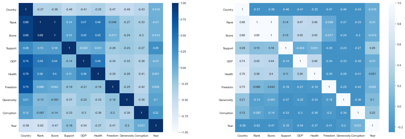
This gets more interesting. Corruption is a better predictor of the Happiness Score than Support. Possibly because of the ‘threshold’ we previously discovered?
這變得更加有趣。 與支持相比,腐敗是幸福分數更好的預測指標。 可能是因為我們先前發現了“閾值”?
Moreover, although Social Support correlated quite well, it does not have substantial predictive value. I guess this is because all the distributions of the quartiles are quite close in the scatterplot.
而且,盡管社會支持的相關性很好,但它沒有實質的預測價值。 我猜這是因為四分位數的所有分布在散點圖中都非常接近。
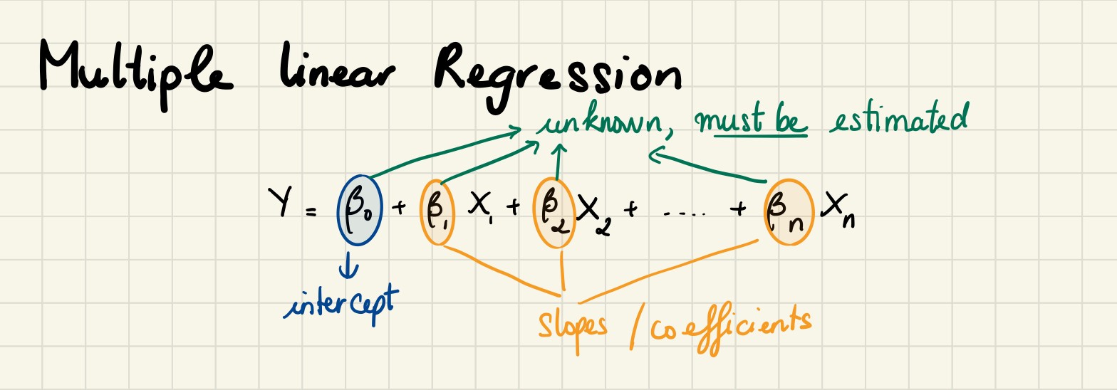
6.多元線性回歸 (6. Multiple Linear Regression)
In the thirst section of this article, we used a simple linear regression to examine the relationships between the Happiness Score and other features. We found a poor fit. To improve this model, we want to add more features. Now, it is time to create some complex models.
在本文的第三部分,我們使用了簡單的線性回歸來研究“幸福感評分”與其他功能之間的關系。 我們發現不合適。 為了改進此模型,我們想添加更多功能。 現在,該創建一些復雜的模型了。
We determined features at first sight by looking at the previous sections and used them in our first multiple linear regression. As in the simple regression, we printed the coefficients which the model uses for the predictions. However, this time we must use the below definition for our predictions if we want to make calculations manually.
我們通過查看前面的部分來乍一看確定特征,并將其用于我們的第一個多元線性回歸中。 與簡單回歸一樣,我們打印了模型用于預測的系數。 但是,這一次,如果我們要手動進行計算,則必須使用以下定義進行預測。
We create a model with all features.
我們創建具有所有功能的模型。
# MULTIPLE LINEAR REGRESSION 1
train_data_dm,test_data_dm = train_test_split(finaldf,train_size = 0.8,random_state=3)independent_var = ['GDP','Health','Freedom','Support','Generosity','Corruption']
complex_model_1 = LinearRegression()
complex_model_1.fit(train_data_dm[independent_var],train_data_dm['Score'])print('Intercept: {}'.format(complex_model_1.intercept_))
print('Coefficients: {}'.format(complex_model_1.coef_))
print('Happiness score = ',np.round(complex_model_1.intercept_,4),
      '+',np.round(complex_model_1.coef_[0],4),'? Support',
      '+',np.round(complex_model_1.coef_[1],4),'* GDP',
      '+',np.round(complex_model_1.coef_[2],4),'* Health',
      '+',np.round(complex_model_1.coef_[3],4),'* Freedom',
       '+',np.round(complex_model_1.coef_[4],4),'* Generosity',
      '+',np.round(complex_model_1.coef_[5],4),'* Corrption')pred = complex_model_1.predict(test_data_dm[independent_var])
rmsecm = float(format(np.sqrt(metrics.mean_squared_error(
                       test_data_dm['Score'],pred)),'.3f'))
rtrcm = float(format(complex_model_1.score(
                        train_data_dm[independent_var],
                        train_data_dm['Score']),'.3f'))
artrcm = float(format(adjustedR2(complex_model_1.score(
                            train_data_dm[independent_var],
                            train_data_dm['Score']),
                            train_data_dm.shape[0],
                            len(independent_var)),'.3f'))
rtecm = float(format(complex_model_1.score(
                        test_data_dm[independent_var],
                        test_data_dm['Score']),'.3f'))
artecm = float(format(adjustedR2(complex_model_1.score(
                        test_data_dm[independent_var],test_data['Score']),
                        test_data_dm.shape[0],
                        len(independent_var)),'.3f'))
cv = float(format(cross_val_score(complex_model_1,
                    finaldf[independent_var],
                    finaldf['Score'],cv=5).mean(),'.3f'))r = evaluation.shape[0]
evaluation.loc[r] = ['Multiple Linear Regression-1','selected features',rmsecm,rtrcm,artrcm,rtecm,artecm,cv]
evaluation.sort_values(by = '5-Fold Cross Validation', ascending=False)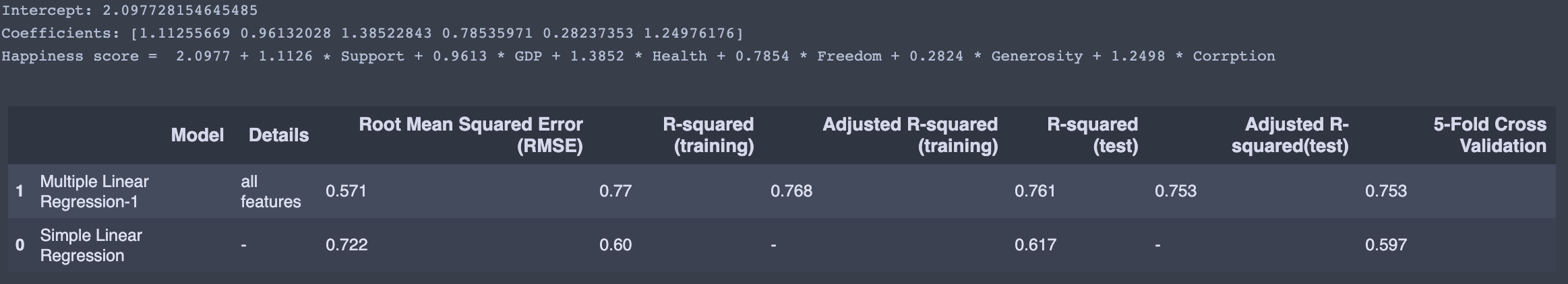
We knew that GDP, Support, and Health are quite linearly correlated. This time, we create a model with these three features.
我們知道GDP , Support和Health是線性相關的。 這次,我們創建具有這三個功能的模型。
# MULTIPLE LINEAR REGRESSION 2
train_data_dm,test_data_dm = train_test_split(finaldf,train_size = 0.8,random_state=3)independent_var = ['GDP','Health','Support']
complex_model_2 = LinearRegression()
complex_model_2.fit(train_data_dm[independent_var],train_data_dm['Score'])print('Intercept: {}'.format(complex_model_2.intercept_))
print('Coefficients: {}'.format(complex_model_2.coef_))
print('Happiness score = ',np.round(complex_model_2.intercept_,4),
      '+',np.round(complex_model_2.coef_[0],4),'? Support',
      '+',np.round(complex_model_2.coef_[1],4),'* GDP',
      '+',np.round(complex_model_2.coef_[2],4),'* Health')pred = complex_model_2.predict(test_data_dm[independent_var])
rmsecm = float(format(np.sqrt(metrics.mean_squared_error(
                       test_data_dm['Score'],pred)),'.3f'))
rtrcm = float(format(complex_model_2.score(
                        train_data_dm[independent_var],
                        train_data_dm['Score']),'.3f'))
artrcm = float(format(adjustedR2(complex_model_2.score(
                            train_data_dm[independent_var],
                            train_data_dm['Score']),
                            train_data_dm.shape[0],
                            len(independent_var)),'.3f'))
rtecm = float(format(complex_model_2.score(
                        test_data_dm[independent_var],
                        test_data_dm['Score']),'.3f'))
artecm = float(format(adjustedR2(complex_model_2.score(
                        test_data_dm[independent_var],test_data['Score']),
                        test_data_dm.shape[0],
                        len(independent_var)),'.3f'))
cv = float(format(cross_val_score(complex_model_2,
                    finaldf[independent_var],
                    finaldf['Score'],cv=5).mean(),'.3f'))r = evaluation.shape[0]
evaluation.loc[r] = ['Multiple Linear Regression-2','selected features',rmsecm,rtrcm,artrcm,rtecm,artecm,cv]
evaluation.sort_values(by = '5-Fold Cross Validation', ascending=False)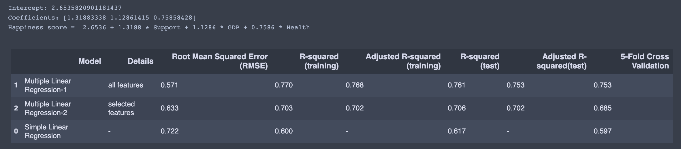
When we look at the evaluation table, multiple linear regression -2 (selected features) is the best. However, I have doubts about its reliability, and I would prefer the multiple linear regression with all elements.
當我們查看評估表時,多元線性回歸-2(選定要素)是最好的。 但是,我對它的可靠性感到懷疑,我更喜歡所有元素的多元線性回歸。
X = finaldf[[ 'GDP', 'Health', 'Support','Freedom','Generosity','Corruption']]
y = finaldf['Score']'''
 This function takes the features as input and
 returns the normalized values, the mean, as well
 as the standard deviation for each feature.
 '''
def featureNormalize(X):
    mu = np.mean(X) ## Define the mean
    sigma = np.std(X) ## Define the standard deviation.
    X_norm = (X - mu)/sigma ## Scaling function.
    return X_norm, mu, sigmam = len(y) ## length of the training data
X = np.hstack((np.ones([m,1]), X)) ## Append the bias term (field containing all ones) to X.
y = np.array(y).reshape(-1,1) ## reshape y to mx1 array
theta = np.zeros([7,1]) ## Initialize theta (the coefficient) to a 3x1 zero vector.'''
 This function takes in the values for
 the training set as well as initial values
 of theta and returns the cost(J).
 '''def cost_function(X,y, theta):
    h = X.dot(theta) ## The hypothesis
    J = 1/(2*m)*(np.sum((h-y)**2)) ## Implementing the cost function
    return J'''
    This function takes in the values of the set,
    as well the intial theta values(coefficients), the
    learning rate, and the number of iterations. The output
    will be the a new set of coefficeients(theta), optimized
    for making predictions, as well as the array of the cost
    as it depreciates on each iteration.
    '''num_iters = 2000 ## Initialize the iteration parameter.
alpha = 0.01 ## Initialize the learning rate.
def gradientDescentMulti(X, y, theta, alpha, iterations):
    m = len(y)
    J_history = []
    for _ in range(iterations):
        temp = np.dot(X, theta) - y
        temp = np.dot(X.T, temp)
        theta = theta - (alpha/m) * temp
        J_history.append(cost_function(X, y, theta)) ## Append the cost to the J_history array
    return theta, J_historyprint('Happiness score = ',np.round(theta[0],4),
        '+',np.round(theta[1],4),'? Support',
      '+',np.round(theta[2],4),'* GDP',
      '+',np.round(theta[3],4),'* Health',
      '+',np.round(theta[4],4),'* Freedom',
       '+',np.round(theta[5],4),'* Generosity',
      '+',np.round(theta[6],4),'* Corrption')
Print out the J_history; it’s approximately 0.147. We can conclude that using gradient descent gives us a best-fit model to predict the Happiness Score.
打印出J_history; 大約是0.147。 我們可以得出結論,使用梯度下降為我們提供了預測幸福分數的最佳擬合模型。
We can also use statsmodels to predict the Happiness Score.
我們還可以使用statsmodels來預測幸福分數。
# MULTIPLE LR
import statsmodels.api as smX_sm = X = sm.add_constant(X)
model = sm.OLS(y,X_sm)
model.fit().summary()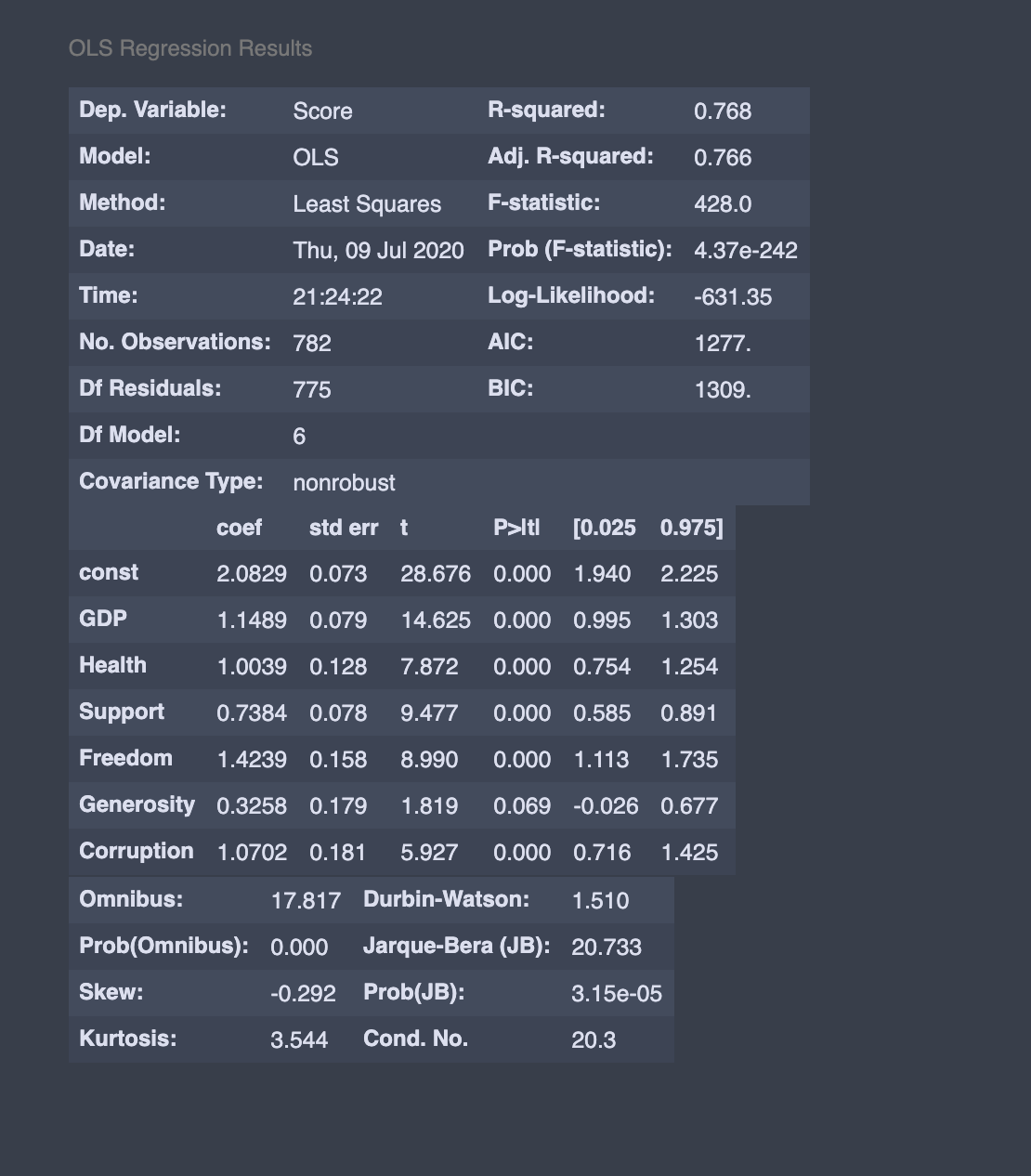
Our coefficient is very close to what we get here.
我們的系數非常接近我們在這里得到的系數。
The code in this note is available on Github.
該注釋中的代碼可在Github上獲得 。
7.結論 (7. Conclusion)
It seems like the common criticism for “The World Happiness Report” is quite valid. A high focus on GDP and strongly correlated features such as family and life expectancy.
似乎對“世界幸福報告”的普遍批評是完全正確的。 高度重視GDP以及與家庭和預期壽命等緊密相關的特征。
Do high GDP make you happy? In the end, we are who we are. I spend my July to analyze why people are not satisfied or don’t live fulfilling lives. I cared about the “why.” After finished analyzing the data, it raises a question: how can we chase happiness?
高GDP會讓您開心嗎? 最后,我們就是我們。 我花了七月的時間來分析人們為什么不滿意或過著充實的生活。 我關心“為什么”。 在完成數據分析之后,提出了一個問題:我們如何追逐幸福?

Just a few months ago, since the lock-down, I did everything to chase happiness.
就在幾個月前,自禁閉以來,我竭盡全力追求幸福。
- I define myself as a minimalist. But I started to purchase many things, and I thought that makes me happy. 我將自己定義為極簡主義者。 但是我開始購買很多東西,我認為這讓我很高興。
- I spent a lot of time on social media, I stayed connected with others, and I expected that makes me happy. 我在社交媒體上花費了很多時間,與其他人保持聯系,我希望這會讓我感到高興。
- I started writing on Medium; I got volunteer jobs that match my skills and interest, and I believed money and working make me happy. 我開始在Medium上寫作; 我得到了符合我的技能和興趣的志愿工作,并且我相信金錢和工作使我感到高興。
- I tried to go vegan, and I hoped that makes me happy. 我嘗試去素食主義者,希望這讓我感到高興。
At the end of the day, I am lying in my bed, alone, and thinking, “Is happiness achievable? What’s next in this endless pursuit of happiness?”
一天結束時,我獨自一人躺在床上,心想:“可以實現幸福嗎? 在對幸福的無盡追求中,下一步是什么?”
Well, I realize I am chasing something random that I- myself believe makes me happy.
好吧,我意識到我在追求隨機的東西,我自己相信這會讓我開心。
While writing this article, I ran into a quote by Ralph Waldo Emerson:
在撰寫本文時,我遇到了Ralph Waldo Emerson的一句話:
“The purpose of life is not to be happy. It is to be useful, to be honorable, to be compassionate, to have it make some difference that you have lived and lived well.”
“生活的目的不是幸福。 有益,光榮,富有同情心,對您的生活和生活有一定的影響。”
The dot is finally connected. Happiness can’t be a goal in itself. It is merely a byproduct of usefulness.
點終于連接好了。 幸福本身并不是目標。 它僅僅是有用性的副產品。
What makes me happy is when I’m useful. Ok, but how? One day I woke up and thought to myself: “What am I doing for this world?” And the answer was nothing. And that same day, I started writing on Medium. I turned my school notes to articles with hope people will learn a thing or two after reading them. For you, it can be anything, like painting, creating a product, supporting your family and friends, anything you feel like doing. Please don’t take it too seriously. And the most important, don’t overthink it. Just do something useful. Anything.
使我快樂的是當我有用時。 好的,但是如何? 有一天,我醒來對自己說:“我為這個世界做什么?” 答案是什么。 就在同一天,我開始在Medium上寫作。 我將我的學校筆記轉為文章,希望人們閱讀后能學到一兩個東西。 對您而言,您可以做任何事情,例如繪畫,創建產品,支持您的家人和朋友。 請不要太在意它。 最重要的是,不要想太多。 做一些有用的事情。 沒事
Stay safe and healthy!
保持安全健康!
World Happiness Report 2020.
2020年世界幸福報告 。
Kaggle World Happiness Report.
Kaggle世界幸福報告 。
The happiness countries in the world of 2020.
2020年世界幸福國家 。
Engineering a happiness prediction model.
設計幸福預測模型 。
翻譯自: https://towardsdatascience.com/happiness-and-life-satisfaction-ecdc7d0ab9a5
比賽,幸福度
本文來自互聯網用戶投稿,該文觀點僅代表作者本人,不代表本站立場。本站僅提供信息存儲空間服務,不擁有所有權,不承擔相關法律責任。 如若轉載,請注明出處:http://www.pswp.cn/news/389388.shtml 繁體地址,請注明出處:http://hk.pswp.cn/news/389388.shtml 英文地址,請注明出處:http://en.pswp.cn/news/389388.shtml
如若內容造成侵權/違法違規/事實不符,請聯系多彩編程網進行投訴反饋email:809451989@qq.com,一經查實,立即刪除!相關文章

帶有postgres和jupyter筆記本的Titanic數據集

Django學習--數據庫同步操作技巧

《20天吃透Pytorch》Pytorch自動微分機制學習

React 新 Context API 在前端狀態管理的實踐

機器學習模型 非線性模型_機器學習模型說明

5分鐘內完成胸部CT掃描機器學習

Pytorch高階API示范——線性回歸模型

vue 上傳圖片限制大小和格式

作業要求 20181023-3 每周例行報告

算命數據_未來的數據科學家或算命精神向導

openai-gpt_為什么到處都看到GPT-3?

Pytorch高階API示范——DNN二分類模型


puppet puppet模塊、file模塊

數據可視化及其重要性:Python

熊貓數據集_熊貓邁向數據科學的第三部分

Pytorch有關張量的各種操作
)
mongodb安裝失敗與解決方法(附安裝教程)
![【洛谷算法題】P1046-[NOIP2005 普及組] 陶陶摘蘋果【入門2分支結構】Java題解](http://pic.xiahunao.cn/【洛谷算法題】P1046-[NOIP2005 普及組] 陶陶摘蘋果【入門2分支結構】Java題解)
【洛谷算法題】P1046-[NOIP2005 普及組] 陶陶摘蘋果【入門2分支結構】Java題解
)