ux設計中的各種地圖
UX設計中的空白是什么? (What is white space in UX design?)
This article will help you learn about white space and why it so important in UX design.
本文將幫助您了解空白以及為什么空白在UX設計中如此重要。
White space is a very useful technique when you’re creating design layouts. It’s important when you’re putting together a design layout that you let elements on the page breathe. The best way to do that is by introducing what’s known as white space.
創建設計版面時,空白是一種非常有用的技術。 當您將頁面上的元素放在一起的設計布局放在一起時,這一點很重要。 最好的方法是引入所謂的空白 。
White space isn’t a difficult technique to learn. Basically all you need to do is create room around each of the elements whether they are text, images, or graphics. On the page, make sure to leave enough room around each element so that they can have their own visual focus. That way when someone is viewing your design they can get an easy feel for it and they can take on board what you are trying to say. Due to this, empty space is a legitimate design element that has a great influence on the user experience.
空白不是一個很難學習的技術。 基本上,您需要做的就是圍繞每個元素(無論是文本,圖像還是圖形)創建空間。 在頁面上,確保每個元素周圍留有足夠的空間,以便它們可以擁有自己的視覺焦點。 這樣,當有人查看您的設計時,他們可以輕松感受到它,并且可以接受您要說的內容。 因此,空白空間是對用戶體驗有很大影響的合法設計元素。

It is important to remember that the negative space in web design does not have to be only white — you can use any color, texture, even pattern or background image.
重要的是要記住,網頁設計中的負空間不必僅是白色-您可以使用任何顏色,紋理,甚至圖案或背景圖像。
空格的類型 (Types of white space)
In designing user interfaces for websites and mobile applications, the use of negative space is a significant factor in the high usability and navigation ability of the interface.
在設計網站和移動應用程序的用戶界面時,負空間的使用是界面的高可用性和導航能力的重要因素。
有兩種類型的空格: (There are two types of spaces:)
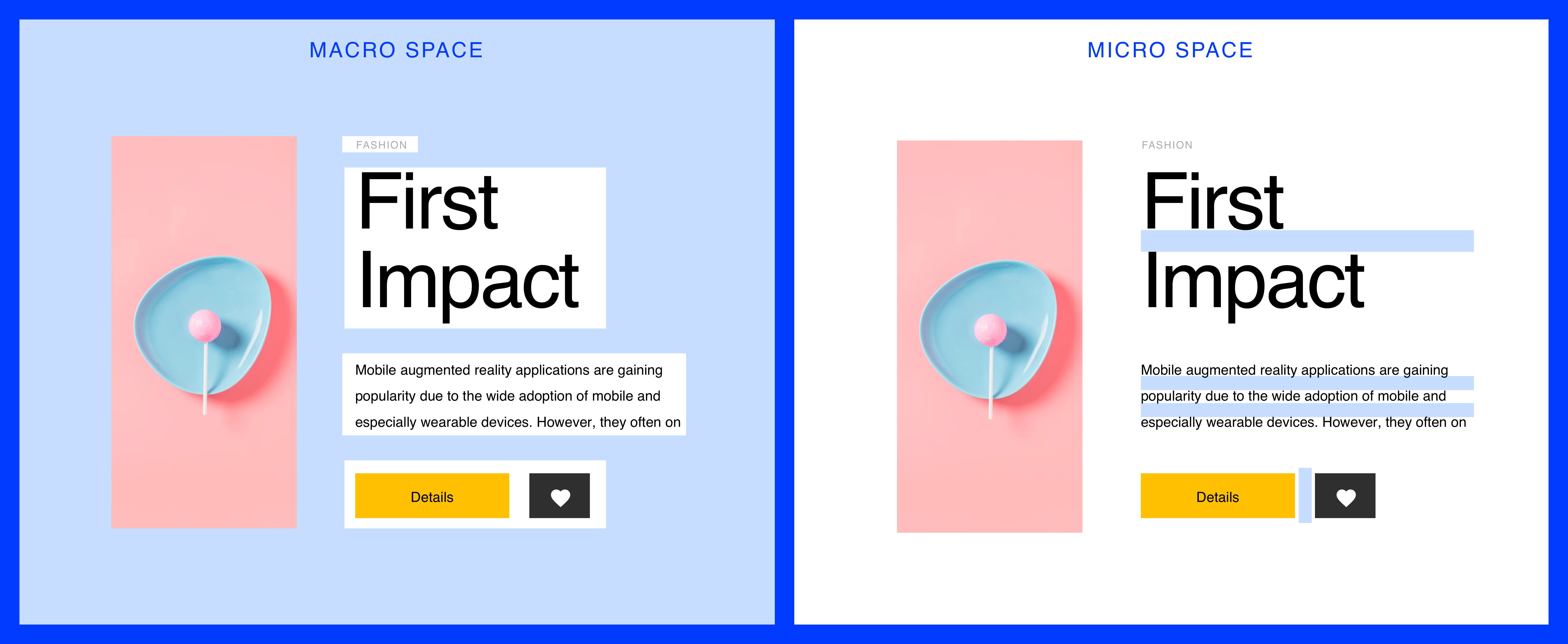
Macro space: This term refers to spaces between the main elements of a web page or mobile and the space around each part.
宏空間:該術語是指網頁或移動設備的主要元素之間以及每個部分周圍的空間。
Micro-space: These are small gaps within an element: line spacing in the text, gaps between pictures, separators, and more.
微小空間:這些是元素內的小間隙:文本中的行距,圖片之間的間隙,分隔符等等。
為什么負空間很重要? (Why is negative space important?)
Both customers and some designers may want to place as many elements and functions on the same page or screen, thinking that it will be useful for consumers. But this is a mistake: in fact, users do not need everything at once. Moreover, too many elements without enough air significantly increase the level of distraction: overloaded with information and interactive elements, and users have to make an effort to find what they need.
客戶和某些設計人員都可能希望在同一頁面或屏幕上放置盡可能多的元素和功能,以為這對消費者很有用。 但這是一個錯誤:實際上,用戶并不需要一次全部。 此外,太多的元素沒有足夠的空氣會顯著增加分心的程度:信息和交互性元素超載,用戶必須努力找到所需的東西。
White space leaves separation between the content, it makes the important things stand out, and it creates balance.
空白使內容之間保持分隔,它使重要的事物脫穎而出,并創造了平衡。
讓我們更深入地了解使用空白的優勢 (Let’s take a look deeper on the advantages of using whitespace)
Easy page readingIf there is not enough space between elements, they become difficult to read and require additional effort to discern. Balancing negative space, especially micro-space solves this problem and makes the reading process more natural.
易于閱讀的頁面如果元素之間沒有足夠的空間,則它們將變得難以閱讀,并且需要付出額外的努力才能識別出來。 平衡負空間(尤其是微空間)可以解決此問題,并使讀取過程更加自然。
Improves the visual hierarchyThe empty space helps the user to divide the content into easy-to-read pieces and focus on the details. This is similar to the pauses in artists’ performances on stage, which gives listeners time for comprehension and understanding.
改善視覺層次感空白空間可幫助用戶將內容分為易于閱讀的部分,并專注于細節。 這類似于藝術家在舞臺上的表演停頓,這使聽眾有時間進行理解和理解。
Gives visual communication between elementsWhitespace not only creates harmony, balance, and helps to brand a design, it can also be used to lead a reader from one element to another.
在元素之間提供視覺交流 Whitespace不僅可以創造和諧,平衡并有助于品牌設計,還可以用于將讀者從一個元素引導到另一個元素。
Design composition does not feel clutteredElements without enough air significantly increase the level of distraction. The key is to balance your designs and let whitespace act as a great tool to separate chunks of content for easy accessibility and improved user experience.
沒有足夠的空氣, 設計構圖就不會感到混亂。沒有足夠的空氣,元素會大大分散注意力。 關鍵是要平衡您的設計,讓空白充當分隔內容塊的好工具,以方便訪問和改善用戶體驗。
Focuses the user’s attention on the main elementsThe more empty space around a design element, the more attention it attracts. White space focuses the user’s eyes on the search bar and company logo. Thus, with the help of spaces, you can arrange semantic stresses on a web page and draw attention to important information.
將用戶的注意力集中在主要元素上 。設計元素周圍的空白空間越多,它吸引的注意力就越多。 空白區域將用戶的眼睛聚焦在搜索欄和公司徽標上。 因此,借助空格,您可以在網頁上安排語義壓力并吸引對重要信息的注意。
Adds style and elegance to the pageWhite space can become a design pillar for a company and make the design style unique. Such stylistic decisions are remembered by users and distinguish the site from competitors.
在頁面上增加樣式和優雅感空白空間可以成為公司的設計Struts,并使設計風格獨特。 這樣的風格決定會被用戶記住,并將站點與競爭對手區分開。
Empty space is not an empty canvas, it is a powerful design tool. The use of spaces is both art and science. Understanding how many spaces should be used to create a good layout requires practice. The more you create, the more you learn. Try and experiment with it. Good luck 😉
空的空間不是空的畫布,它是功能強大的設計工具。 空間的使用既是藝術又是科學。 了解應該使用多少空間來創建良好的布局需要實踐。 您創建的內容越多,您就會學到更多。 嘗試并嘗試一下。 祝你好運😉
翻譯自: https://medium.com/ringcentral-ux/white-space-in-ux-design-2b6b996c2b9c
ux設計中的各種地圖
本文來自互聯網用戶投稿,該文觀點僅代表作者本人,不代表本站立場。本站僅提供信息存儲空間服務,不擁有所有權,不承擔相關法律責任。 如若轉載,請注明出處:http://www.pswp.cn/news/274318.shtml 繁體地址,請注明出處:http://hk.pswp.cn/news/274318.shtml 英文地址,請注明出處:http://en.pswp.cn/news/274318.shtml
如若內容造成侵權/違法違規/事實不符,請聯系多彩編程網進行投訴反饋email:809451989@qq.com,一經查實,立即刪除!相關文章

花點時間了解消息,句柄和窗口

ux設計中的各種地圖_如何在UX設計中使用顏色
 - 交互式鍵盤輸入和屏幕輸出)
《Two Dozen Short Lessons in Haskell》學習(十八) - 交互式鍵盤輸入和屏幕輸出

figma設計_Figma中簡單,可重復使用的設計系統

WPF 關于鼠標事件和坐標

訪問25%無法訪問的人-如何設計可訪問性

DDD:實體如何處理外部依賴

架構師論壇 創業_我在早期創業時作為設計師學到的東西

HFileOutputFormat與TotalOrderPartitioner

qt按鈕禁用和激活禁用_為什么試探法只是經驗法則:禁用按鈕的情況

Teach Yourself Java 2 in 21 Days 書中樣例代碼實踐

好奇心機制_好奇心問題

20130328java基礎學習筆記-循環結構for以及for,while循環區別

小程序設計避免犯什么錯_新設計師犯下的5種印刷錯誤以及如何避免

移動設備web文字單位_移動設備如何塑造現代Web設計

hp-ux修改時區方法_UX研究人員可以倡導人類的6種方法

2013年3月百度之星A題

為什么張揚的人別人很討厭_為什么每個人總是討厭重新設計,即使他們很好

轉載--C語言:浮點數在內存中的表示
