TextInput、TextArea是輸入框組件,通常用于響應用戶的輸入操作,比如評論區的輸入、聊天框的輸入、表格的輸入等,也可以結合其它組件構建功能頁面,例如登錄注冊頁面。

圖片來源黑馬程序員
Text組件的使用:
文本顯示組件有兩種方式,一種是字符串string,一種是讀取指定的string格式的字符串!
可以實現,根據限定詞,切換指定的國家語言,從而實現設備走向國家化!
Textinput組件的使用:
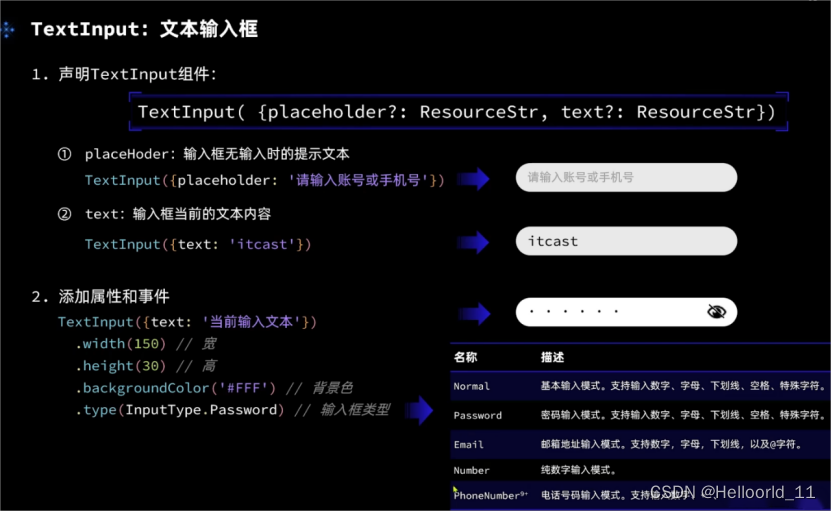
TextInput有5種可選類型,分別為Normal基本輸入模式、Password密碼輸入模式、Email郵箱地址輸入模式、Number純數字輸入模式、PhoneNumber電話號碼輸入模式。
設置無輸入時的提示文本。
TextInput({placeholder:'我是提示文本'})
設置輸入框當前的文本內容。
添加backgroundColor改變輸入框的背景顏色。
源碼部分如下:
@Entry
@Component
struct Index2 {@State imageWidth: number = 100build() {Column() {Row(){Image($r('app.media.icon')).width(this.imageWidth)//控制圖片的大小}.width('100').height("100").justifyContent(FlexAlign.Center)Row(){Text($r('app.string.width_label')).fontSize(20).fontWeight(FontWeight.Bold)TextInput({text: this.imageWidth.toFixed(0)}).width(150).backgroundColor('#FFF').type(InputType.Number).onChange( value => {    //獲取輸入this.imageWidth = parseInt(value)})}.width('100%').padding({left: 14, right: 14}).justifyContent(FlexAlign.SpaceBetween)Divider().width('91%')Row(){Button('縮小').width(80).fontSize(20).onClick(() => {if(this.imageWidth >= 10){this.imageWidth -= 10}})Button('放大').width(80).fontSize(20).onClick(() => {if(this.imageWidth < 300){this.imageWidth += 10}})}.width('100%').margin({ top: 35, bottom: 35 }).justifyContent(FlexAlign.SpaceEvenly)Slider({min: 100,max: 300,value: this.imageWidth,step: 10,}).width('100%').blockColor('#36D').trackThickness(5).showTips(true).onChange(value => {this.imageWidth = value})}.width('100%').height('100%')}
}
文本框主要用于獲取用戶輸入的信息,把信息處理成數據進行上傳,綁定onChange事件可以獲取輸入框內改變的內容。
場景示例
用于表單的提交,在用戶登錄/注冊頁面,用戶的登錄或注冊的輸入操作。
TextInput().onChange((value: string) => {console.info(value);}).onFocus(() => {console.info('獲取焦點');})TextArea(該組件從API Version 7開始支持。)
多行文本輸入框組件,當輸入的文本內容超過組件寬度時會自動換行顯示。
除支持通用事件外(通用事件包含:寬高,內外邊距。),還支持以下事件:
onCopy(callback:(value: string) => void)長按輸入框內部區域彈出剪貼板后,點擊剪切板復制按鈕,觸發該回調。當設置CopyOptions.None時,當前TextArea中的文字無法被復制或剪切,僅支持粘貼。
onCut(callback:(value: string) => void)長按輸入框內部區域彈出剪貼板后,點擊剪切板剪切按鈕,觸發該回調。
onPaste(callback:(value: string) => void)長按輸入框內部區域彈出剪貼板后,點擊剪切板粘貼按鈕,觸發該回調。
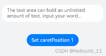
caretPosition(value: number): void? ? 可以設置光標的位置。
示例代碼如下:
// xxx.ets
@Entry
@Component
struct TextAreaExample {@State text: string = ''controller: TextAreaController = new TextAreaController()build() {Column() {TextArea({placeholder: 'The text area can hold an unlimited amount of text. input your word...',controller: this.controller}).placeholderFont({ size: 16, weight: 400 })//設置placeholder文本樣式,包括字體大小,字體粗細,字體族,字體風格。目前僅支持默認字體族。.width(336).height(56).margin(20).fontSize(16).fontColor('#182431').backgroundColor('#FFFFFF').onChange((value: string) => {this.text = value})Text(this.text)Button('Set caretPosition 1').backgroundColor('#007DFF')//背景顏色.margin(15)//邊距.onClick(() => {// 設置光標位置到第一個字符后this.controller.caretPosition(1)})}.width('100%').height('100%').backgroundColor('#F1F3F5')}
}
以上信息,來自官網手冊


![[MySQL] MySQL復合查詢(多表查詢、子查詢)](http://pic.xiahunao.cn/[MySQL] MySQL復合查詢(多表查詢、子查詢))


持有)


進行鏈接預測)
