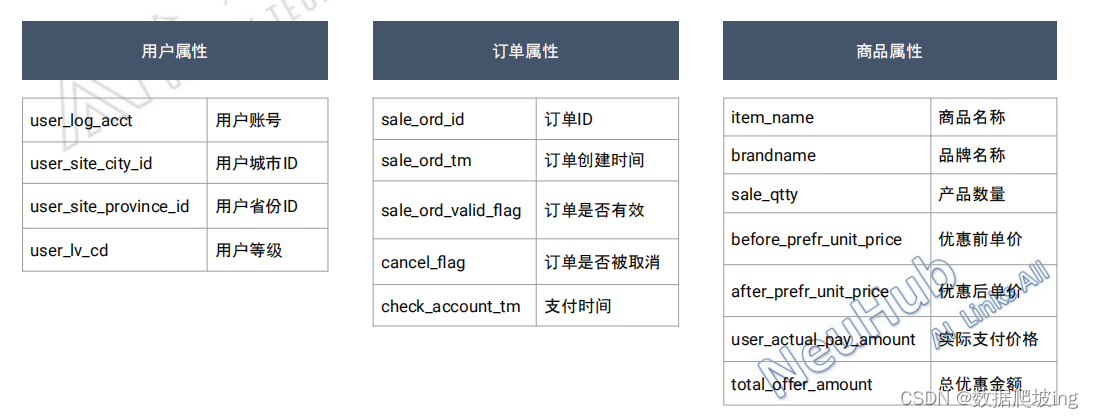
1,數據介紹,字段了解
盡可能熟悉業務,多知道字段的含義,字段字段間的邏輯關系,后期數據分析思路才能更清晰,結果才能更準確
2,訂單數據分析基本思路
維度下鉆

?
3,代碼實現全流程+思路
導包+繪圖報錯
import pandas as pd
import numpy as np
import matplotlib
import matplotlib.pyplot as plt
import seaborn as sns
from scipy import stats
#加上了繪圖-全局使用中文+解決中文報錯的代碼
from matplotlib.ticker import FuncFormatter
plt.rcParams['font.sans-serif']=['Arial Unicode MS']import warnings
warnings.filterwarnings('ignore')
讀取數據,觀察表格特點(間隔符)
#雖然直接打開的文件顯得很亂,需要去發現還是以/t作為分隔符的
order = 'course_order_d.csv'
df = pd.read_csv(order,sep='\t', encoding="utf-8", dtype=str)
數據簡單查看
df.head()#查看數據是否為空+數據類型
df.info()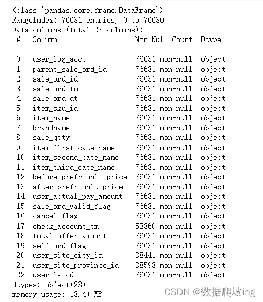
數據清洗+預處理
#說明都是2020-5-25下的訂單
df['sale_ord_tm'].unique()#都是object,所以先轉化類型,再進行數據預處理
df['sale_qtty'] = df['sale_qtty'].astype('int')
df['sale_ord_valid_flag'] = df['sale_ord_valid_flag'].astype('int')
df['cancel_flag'] = df['cancel_flag'].astype('int')
df['self_ord_flag'] = df['self_ord_flag'].astype('int')df['before_prefr_unit_price'] = df['before_prefr_unit_price'].astype('float')
df['after_prefr_unit_price'] = df['after_prefr_unit_price'].astype('float')
df['user_actual_pay_amount'] = df['user_actual_pay_amount'].astype('float')
df['total_offer_amount'] = df['total_offer_amount'].astype('float')#pd.to_datetime()它可以用于將字符串或數字轉換為日期時間對象,還可以用于自動識別和調整日期時間。如果原始數據包含非標準的日期時間表示形式,則這個函數會更加有用
df.loc[:,'check_account_tm '] = pd.to_datetime(df.loc[:,'check_account_tm'])
df.loc[:,'sale_ord_tm'] = pd.to_datetime(df.loc[:,'sale_ord_tm'])
df.loc[:,'sale_ord_dt'] = pd.to_datetime(df.loc[:,'sale_ord_dt'])#個數/類型檢查
df.info()df.head()#異常處理
#優惠前冰箱的最低價格是288,低于這個價格為異常值
(df.loc[:,'before_prefr_unit_price']<288).sum()#確認優惠后價格,實際支付價格,總優惠金額 不是小于0的
(df.loc[:,'after_prefr_unit_price']<0).sum()(df.loc[:,'user_actual_pay_amount']<0).sum()(df.loc[:,'total_offer_amount']<0).sum()print('刪除異常值前',df.shape)
#去掉異常值
df=df[df['before_prefr_unit_price']>=288]
print('刪除異常值后:',df.shape)#確保每個訂單都是唯一的
#唯一屬性訂單ID-去重
df.drop_duplicates(subset=['sale_ord_id'],keep='first',inplace=True)
df.info()df.head()df.isnull().sum().sort_values(ascending=False)
#空值處理-補值
df.user_site_city_id=df.user_site_city_id.fillna('Not Given')
df.user_site_province_id=df.user_site_province_id.fillna('Not Given')#查看數值型字段的數據特征
df.describe()#再次檢查空值/類型
df.info()#+字段=邏輯處理
df['total_actual_pay']=df['sale_qtty']*df['after_prefr_unit_price']
df#檢查,空值,字段,類型
df.info()
宏觀分析
#取消訂單數量
order_cancel=df[df.cancel_flag==1]['sale_ord_id'].count()
order_cancel#訂單數量
order_num=df['sale_ord_id'].count()
order_numorder_cancel/order_num# 解決matplotlib中文亂碼matplotlib.rcParams['font.sans-serif'] = ['SimHei']
matplotlib.rcParams['font.serif'] = ['SimHei']
matplotlib.rcParams['axes.unicode_minus'] = Falselabels=['取消','未取消']
X=[order_cancel,order_num-order_cancel]
fig=plt.figure()
plt.pie(X,labels=labels,autopct='%1.2f%%')
plt.title('訂單總數')
#取消未取消差不多3:7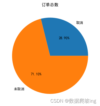
#求有效訂單中,支付,未支付
df2=df.copy()
#只包含有效訂單
df2=df2[(df2['sale_ord_valid_flag']==1)&(df2['cancel_flag']==0)&('before_prefr_unit_price'!=0)]#有效訂單數量
order_valid=df2['sale_ord_id'].count()
order_valid#支付訂單數量
order_payed=df2['sale_ord_id'][df2['user_actual_pay_amount']!=0].count()
order_payed#未支付訂單數量
order_unpay=df2['sale_ord_id'][df2['user_actual_pay_amount']==0].count()
order_unpayorder_unpay/order_payedlabels=['支付','未支付']
Y=[order_payed,order_unpay]
fig=plt.figure()
plt.pie(Y,labels=labels,autopct='%1.2f%%')
plt.title('有效訂單總數')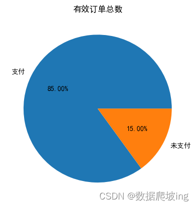
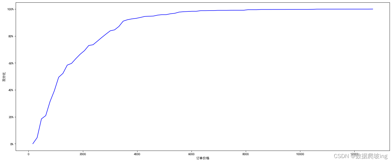
#訂單的價格分布
price_series=df2['after_prefr_unit_price']
price_seriesprice_series_num=price_series.count()
hist,bin_edges=np.histogram(price_series,bins=80)
hist_sum=np.cumsum(hist)
hist_per=hist_sum/price_series_numprint('hist:{}'.format(hist))
print('*'*100)
print('bin_edges:{}'.format(bin_edges))
print('*'*100)
print('hist_sum:{}'.format(hist_sum))hist_perbin_edges_plot=np.delete(bin_edges,0)plt.figure(figsize=(20,8),dpi=80)
plt.xlabel('訂單價格')
plt.ylabel('百分比')plt.style.use('ggplot')def to_percent(temp,position):return '%1.0f'%(100*temp)+'%'
plt.gca().yaxis.set_major_formatter(FuncFormatter(to_percent))
plt.plot(bin_edges_plot,hist_per,color='blue')
?
宏觀分析結束,到微觀分析啦
不同時間的有效訂單數
df3=df2.copy()
df3['order_time_hms']=df3['sale_ord_tm'].apply(lambda x:x.strftime('%H:00:00'))
df3pay_time_df=df3.groupby('order_time_hms')['sale_ord_id'].count()
pay_time_dfx = pay_time_df.index
y = pay_time_df.valuesplt.figure(figsize=(20,8),dpi=80)
plt.style.use('ggplot')
plt.xlabel('時間')
plt.ylabel("有效訂單量")
plt.xticks(range(len(x)), x, rotation=90)
rect = plt.bar(x, y, width=0.3, color=['#6699CC'])
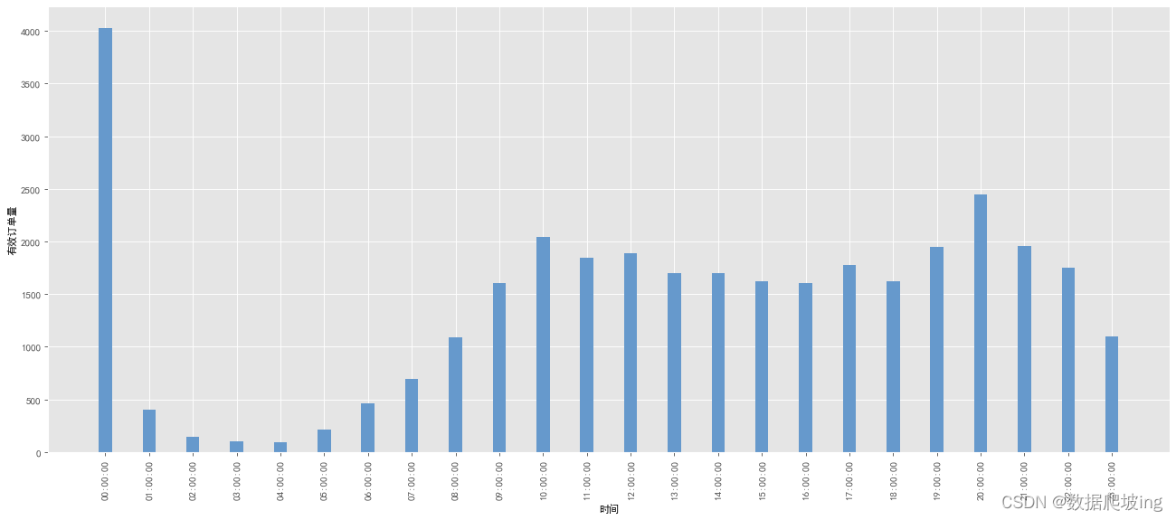
0點訂單量最多,懷疑是不是單人下單多,下一步人均訂單數
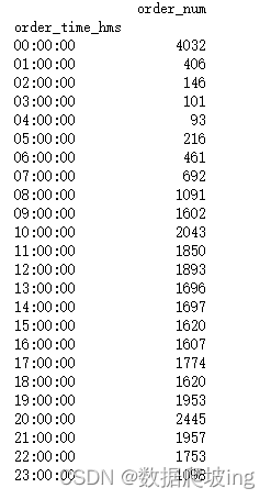
import pandas as pd# 假設 df3 是你的原始 DataFrame
# 對 sale_ord_id 列按 order_time_hms 分組并計算計數
grouped = df3.groupby('order_time_hms')['sale_ord_id']# 獲取分組后的計數結果,如果是 Series,則轉換為 DataFrame
result_series = grouped.agg('count')
if isinstance(result_series, pd.Series):result_df = result_series.to_frame()
else:result_df = result_series# 重命名列
order_time_df = result_df.rename(columns={'sale_ord_id': 'order_num'})# 打印結果
print(order_time_df)
import pandas as pd# 假設 df3 是你的原始 DataFrame
# 對 user_log_acct 列按 order_time_hms 分組并計算每個組中唯一用戶的數量
grouped = df3.groupby('order_time_hms')['user_log_acct']# 獲取分組后的唯一用戶數量結果,如果是 Series,則轉換為 DataFrame
result_series = grouped.agg('nunique')
if isinstance(result_series, pd.Series):user_time_df = result_series.to_frame()
else:user_time_df = result_series# 重命名列
user_time_df = user_time_df.rename(columns={'user_log_acct': 'user_num'})# 打印結果
print(user_time_df)
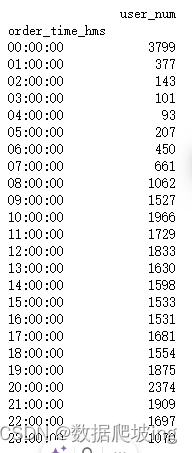
order_num_per_user = order_time_df['order_num'] / user_time_df['user_num']x = order_num_per_user.index
y = order_num_per_user.valuesplt.figure(figsize=(20,8),dpi=80)
plt.style.use('ggplot')
plt.xlabel('時間')
plt.ylabel("人均有效訂單量")
plt.xticks(range(len(x)),x,rotation=90)
plt.plot(x, y)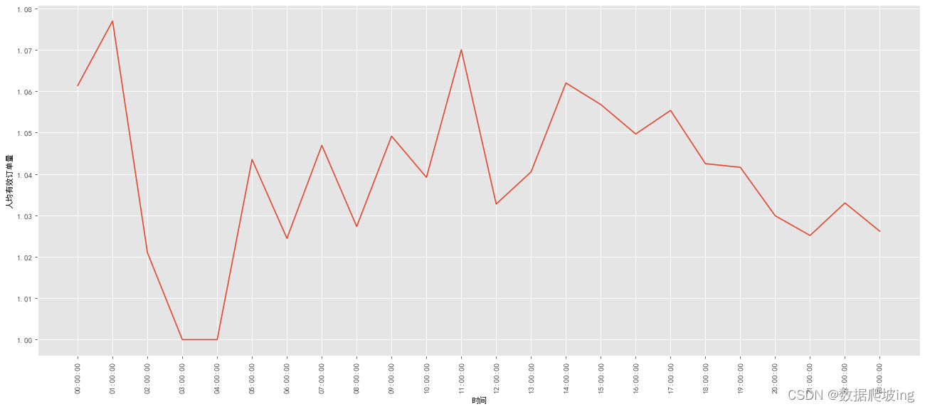
雖然0點訂單量還是最多,有些波動,繼續求客單價vs平均訂單價格
客單價(銷售額/顧客數)和平均訂單價格(銷售額/訂單數)
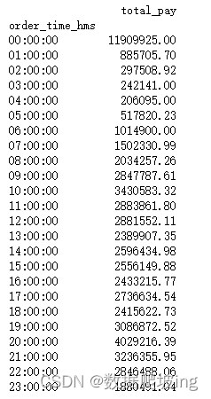
import pandas as pd# 假設 df3 是你的原始 DataFrame
# 對 total_actual_pay 列按 order_time_hms 分組并計算每個組的總和
grouped = df3.groupby('order_time_hms')['total_actual_pay']# 獲取分組后的總和結果
result_series = grouped.agg('sum')# 將結果轉換為 DataFrame
if isinstance(result_series, pd.Series):total_pay_time_df = result_series.to_frame()
else:total_pay_time_df = result_series# 重命名列
total_pay_time_df = total_pay_time_df.rename(columns={'total_actual_pay': 'total_pay'})# 打印結果
print(total_pay_time_df)
pay_per_user=total_pay_time_df['total_pay']/user_time_df['user_num']
pay_per_order=total_pay_time_df['total_pay']/order_time_df['order_num']x=pay_per_user.index
y=pay_per_user.values
y2=pay_per_order.valuesplt.figure(figsize=(20,8),dpi=80)
plt.style.use('ggplot')
plt.xlabel('時間')
plt.ylabel("價格")
plt.xticks(range(len(x)),x,rotation=90)plt.plot(x, y, color='red',linewidth=2.0,linestyle='--')
plt.plot(x, y2, color='blue',linewidth=3.0,linestyle='-.')
plt.legend(['客單價','平均訂單價'])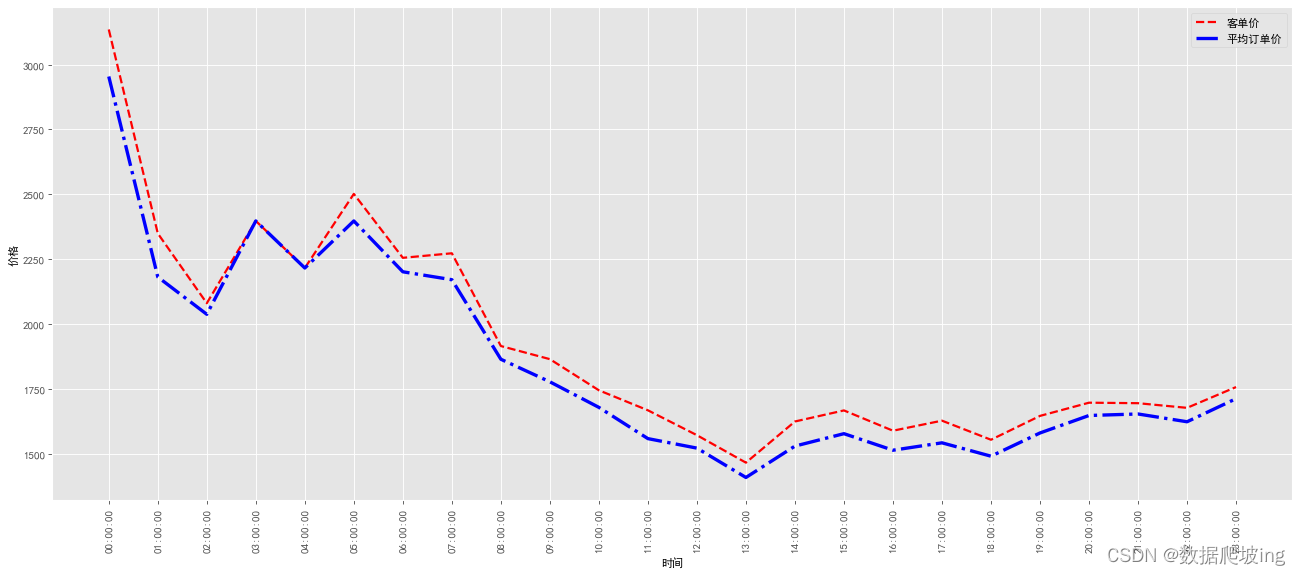
觀察發現0點訂單量最多,隨后波動下滑,20點后開始平穩,是什么原因,繼續研究是不是跟訂單價格相關
df4=df3.copy()
df5=df3.copy()df4 = df4[df4['order_time_hms'] == '00:00:00']
df5 = df5[df5['order_time_hms'] == '20:00:00']def plot_acc_line(price_series, bin_num):len = price_series.count()hist, bin_edges = np.histogram(price_series, bins=bin_num) #生成直方圖函數hist_sum = np.cumsum(hist)hist_per = hist_sum / len * 100hist_per_plot = np.insert(hist_per, 0, 0)plt.figure(figsize=(20,8), dpi=80)plt.xlabel('訂單價格')plt.ylabel('百分比')plt.plot(bin_edges, hist_per_plot, color='blue')# 0時價格累積分布折線圖price_series_0 = df4['after_prefr_unit_price']
plot_acc_line(price_series_0, 100)# 20時價格累積分布折線圖,說明價格不是很大影響price_series_20 = df5['after_prefr_unit_price']
plot_acc_line(price_series_0, 100)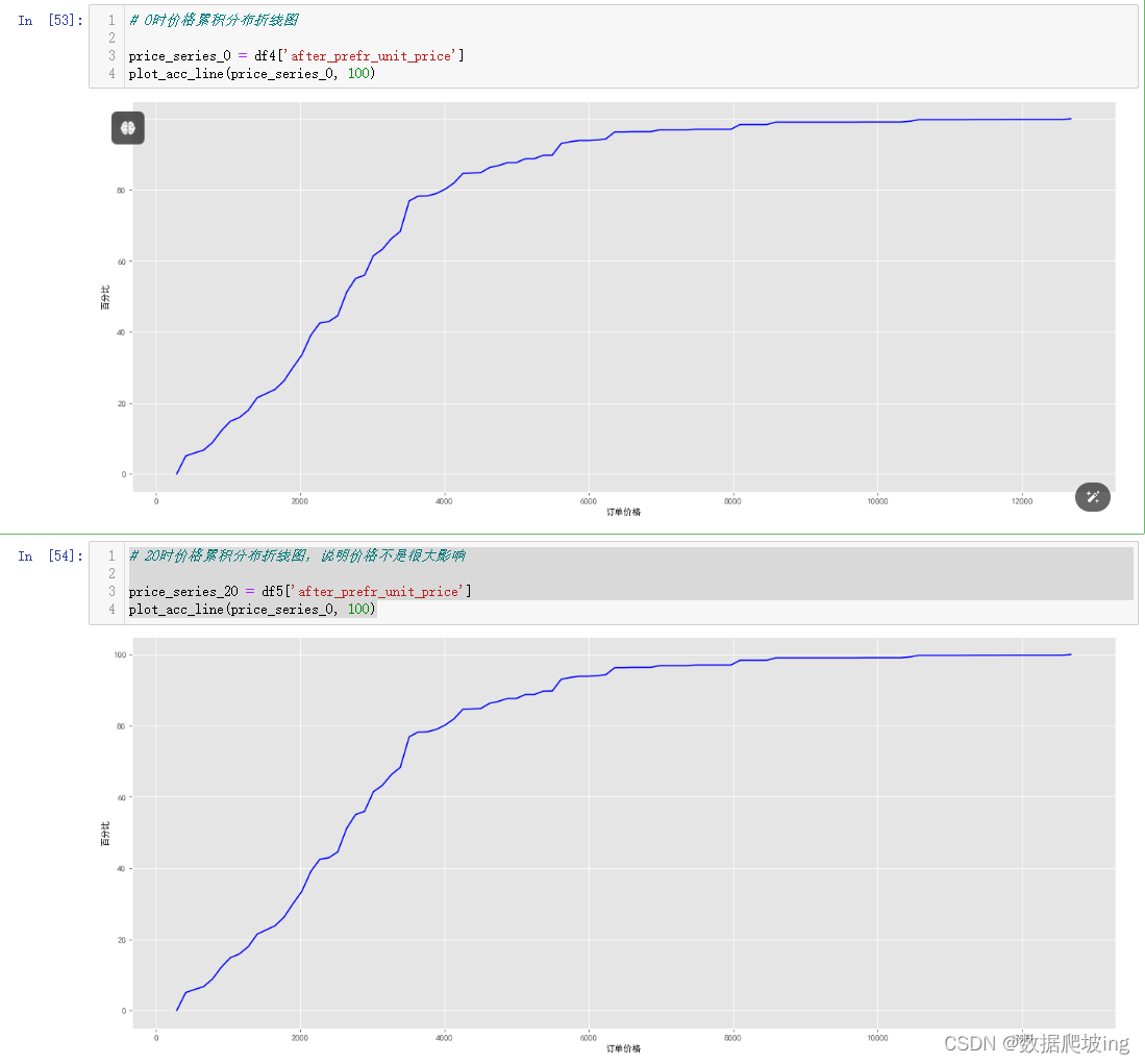
似乎和價格關聯不大,那會不會和優惠相關呢,繼續分析
0時和其他時間的優惠占比
#驗證是不是和優惠相關
#0時的優惠訂單數
offer_order_0=df4['sale_ord_id'][df4['total_offer_amount']>0].count()
#0時訂單數
order_num_0=df4['sale_ord_id'].count()
#0時優惠訂單比
offer_order_per_0=offer_order_0/order_num_0
print('0時的優惠訂單數:{}, 0時的訂單數:{}, 優惠訂單比例:{}'.format(offer_order_0, order_num_0, offer_order_per_0))#全部優惠訂單數
offer_order_all=df3['sale_ord_id'][df3['total_offer_amount']>0].count()
#全部訂單數
order_all=df3['sale_ord_id'].count()
#其他時間優惠訂單數
offer_order_other=offer_order_all - offer_order_0
#其他時間訂單數
order_num_other=order_all-order_num_0
offer_order_per_other=offer_order_other/order_num_other
print('其他時間的優惠訂單數:{}, 其他時間的訂單數:{}, 其他時間優惠訂單比例:{}'.format(offer_order_other, order_num_other, offer_order_per_other))#0時,和其他時間的優惠訂單占比對比
plt.figure(figsize=(8,6),dpi=80)
N=2
index=('0時','除了0時之外')
data=(offer_order_per_0,offer_order_per_other)
width=0.35
plt.ylabel("優惠訂單占比")def to_percent(temp, position):return '%1.0f'%(100*temp) + '%'
plt.gca().yaxis.set_major_formatter(FuncFormatter(to_percent))p2 = plt.bar(index, data, width, color='#6699CC')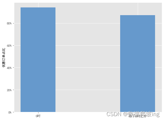
那會不會這個時間的某個優惠太多導致占比太大呢,繼續求0時平均優惠占比 vs 其他時間平均優惠占比
import pandas as pd# 假設 df3 是你的原始 DataFrame
# 對 user_log_acct 列按 order_time_hms 分組并計算每個組中唯一用戶的數量
grouped = df3.groupby('order_time_hms')['total_offer_amount']# 獲取分組后的唯一用戶數量結果,如果是 Series,則轉換為 DataFrame
result_series = grouped.agg('sum')
if isinstance(result_series, pd.Series):user_time_df = result_series.to_frame()
else:user_time_df = result_series# 重命名列
total_pay_time_df = user_time_df.rename(columns={'order_time_hms': 'total_offer_amount'})# 打印結果
print(total_pay_time_df)offer_amount_0=total_pay_time_df['total_offer_amount'][0]
offer_amount_other=total_pay_time_df[1:].apply(lambda x:x.sum())['total_offer_amount']offer_amount_0_avg=offer_amount_0/offer_order_0
offer_amount_other_avg=offer_amount_other/offer_order_other
print('0時平均優惠價格:{}, 其他時間平均優惠價格:{}'.format(offer_amount_0_avg, offer_amount_other_avg))#0時和其他時間的平均優惠價格對比:可視化
plt.figure(figsize=(8, 6), dpi=80)
N = 2
index = ('0時', '除了0時以外')values = (offer_amount_0_avg, offer_amount_other_avg)
width = 0.35plt.ylabel("平均優惠價格/元")p2 = plt.bar(index, values, width, color='#6699CC')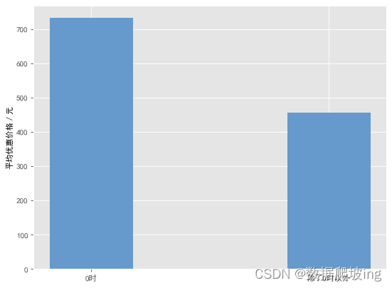
確認0時訂單量大與優惠金額相關,接下來從地區維度拆分
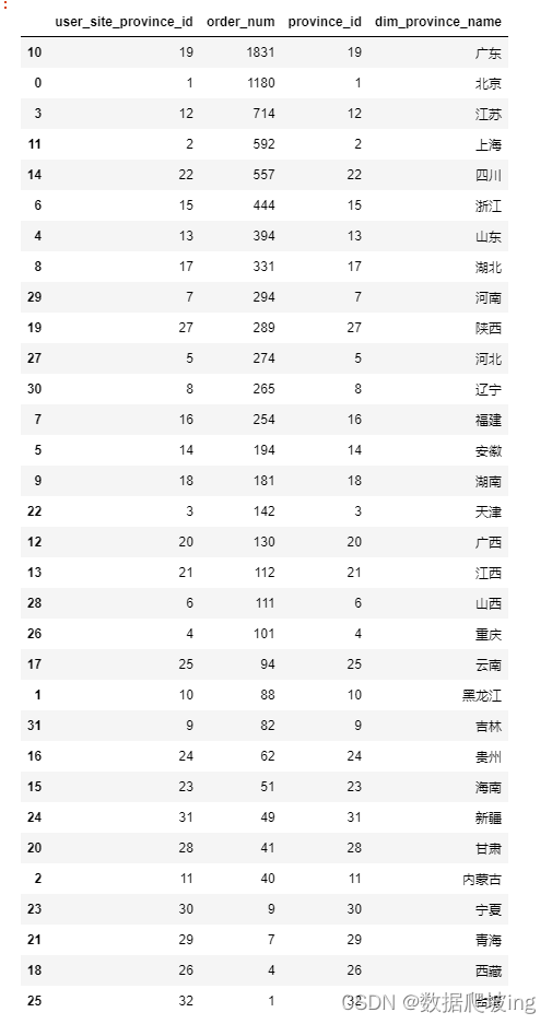
df6=df2.copy()order_area_df=df6.groupby('user_site_province_id',as_index=False)['sale_ord_id'].agg('count')
order_area_dfimport pandas as pd# 假設 df3 是你的原始 DataFrame
# 對 user_log_acct 列按 order_time_hms 分組并計算每個組中唯一用戶的數量
grouped = df6.groupby('user_site_province_id',as_index=False)['sale_ord_id']# 獲取分組后的唯一用戶數量結果,如果是 Series,則轉換為 DataFrame
result_series = grouped.agg('count')
if isinstance(result_series, pd.Series):user_time_df = result_series.to_frame()
else:user_time_df = result_series# 重命名列
order_area_df = user_time_df.rename(columns={'sale_ord_id': 'order_num'})# 打印結果
print(order_area_df)order_area_df.drop([34],inplace=True)
order_area_df['province_id']=order_area_df['user_site_province_id'].astype('int')
order_area_dfcity = 'city_level.csv'
df_city = pd.read_csv(city,sep = ',', encoding="gbk", dtype=str)
df_city['province_id'] = df_city['province_id'].astype('int')
df_city#省份去重
df_city=df_city.drop_duplicates(subset=['province_id'],keep='first')
df_citydf_city=df_city[['province_id','dim_province_name']].sort_values(by='province_id',ascending=True).reset_index()
df_city.drop(['index'],axis=1,inplace=True)
df_cityorder_province_df=pd.merge(order_area_df,df_city,on='province_id').sort_values(by='order_num',ascending=False)
order_province_df
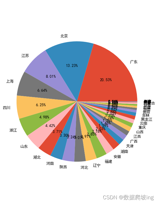
各個省份訂單量
#有效訂單量
plt.style.use('ggplot')x = order_province_df['dim_province_name']
y = order_province_df['order_num']plt.figure(figsize=(20,8),dpi=80)
plt.style.use('ggplot')
plt.xlabel('時間')
plt.ylabel("有效訂單量")
plt.xticks(range(len(x)), x, rotation=90)
rect = plt.bar(x, y, width=0.3, color=['#6699CC'])#有效訂單量-餅圖
plt.figure(figsize=(6,9))
labels = order_province_df['dim_province_name']plt.pie(order_province_df['order_num'], labels=labels,autopct='%1.2f%%') # autopct :控制餅圖內百分比設置, '%1.1f'指小數點前后位數(沒有用空格補齊);plt.axis('equal')
plt.show()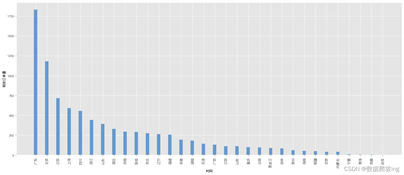
怕一個客訂單多,求各省份客單價對比
#各省份客單價對比cust_price_df = df6.groupby('user_site_province_id', as_index=False)['total_actual_pay'].agg({'total_pay':'sum'})
cust_price_df.columns = ['province_id','total_pay']
cust_price_df.drop([34], inplace=True)
cust_price_df['province_id'] = cust_price_df['province_id'].astype('int')
cust_price_df = pd.merge(cust_price_df, df_city, on='province_id').sort_values(by='total_pay', ascending=False)
cust_price_df['order_num'] = order_province_df['order_num']cust_df = df6.groupby('user_site_province_id', as_index=False)['user_log_acct'].agg({'user_num':'nunique'})
cust_df.columns = ['province_id','user_num']
cust_df.drop([34], inplace=True)
cust_df['province_id'] = cust_df['province_id'].astype('int')cust_price_df = pd.merge(cust_price_df, cust_df, on='province_id')
cust_price_df['cust_price'] = cust_price_df['total_pay'] / cust_price_df['user_num'] #計算客單價
cust_price_df = cust_price_df.sort_values(by='order_num', ascending=False)
cust_price_df = cust_price_df[:10]
cust_price_df = cust_price_df.sort_values(by='cust_price', ascending=False)cust_price_df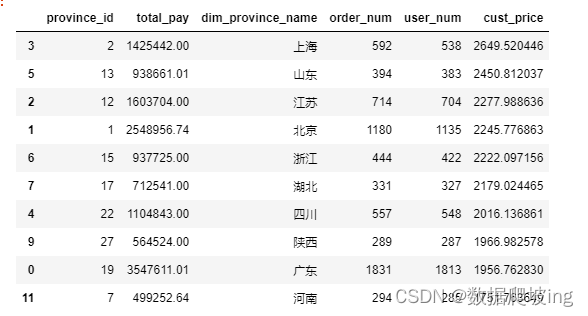
plt.style.use('ggplot')x = cust_price_df['dim_province_name']
y = cust_price_df['cust_price']plt.figure(figsize=(20,8),dpi=80)
plt.style.use('ggplot')
plt.xlabel('時間')
plt.ylabel("客單價")
rect = plt.bar(x, y, width=0.3, color=['#6699CC'])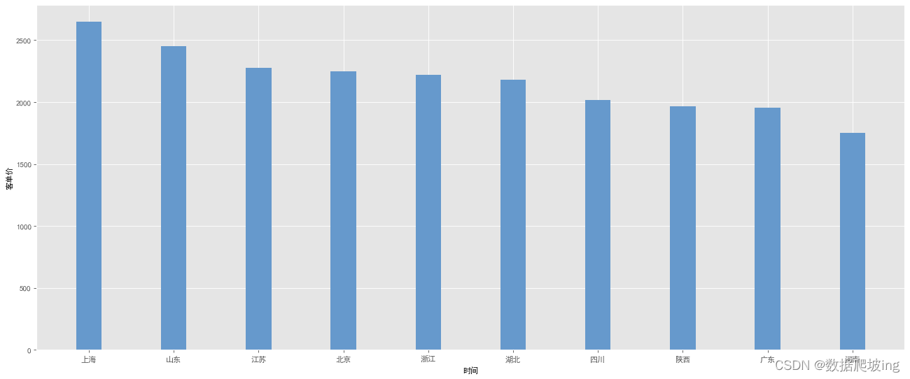
可能客單價大的訂單數小,可能客單價小的訂單數多,氣泡圖顯示
import matplotlib.pyplot as plt
import seaborn as snsplt.figure(figsize=(15, 10))x = cust_price_df['cust_price']
y = cust_price_df['order_num']# Calculate the minimum and maximum sizes based on your data
min_size = min(cust_price_df['cust_price']) * 3
max_size = max(cust_price_df['cust_price']) * 3# Use the calculated sizes for the scatterplot
ax = sns.scatterplot(x=x, y=y, hue=cust_price_df['dim_province_name'], palette=['#6699CC'], sizes=(min_size, max_size), size=x*3, legend=False)ax.set_xlabel("客單價", fontsize=12)
ax.set_ylabel("訂單數量", fontsize=12)province_list = [3, 5, 2, 1, 6, 7, 4, 9, 0, 11]# Adding text on top of the bubbles
for line in province_list:ax.text(x[line], y[line], cust_price_df['dim_province_name'][line], horizontalalignment='center', size='large', color='black', weight='semibold')plt.show()
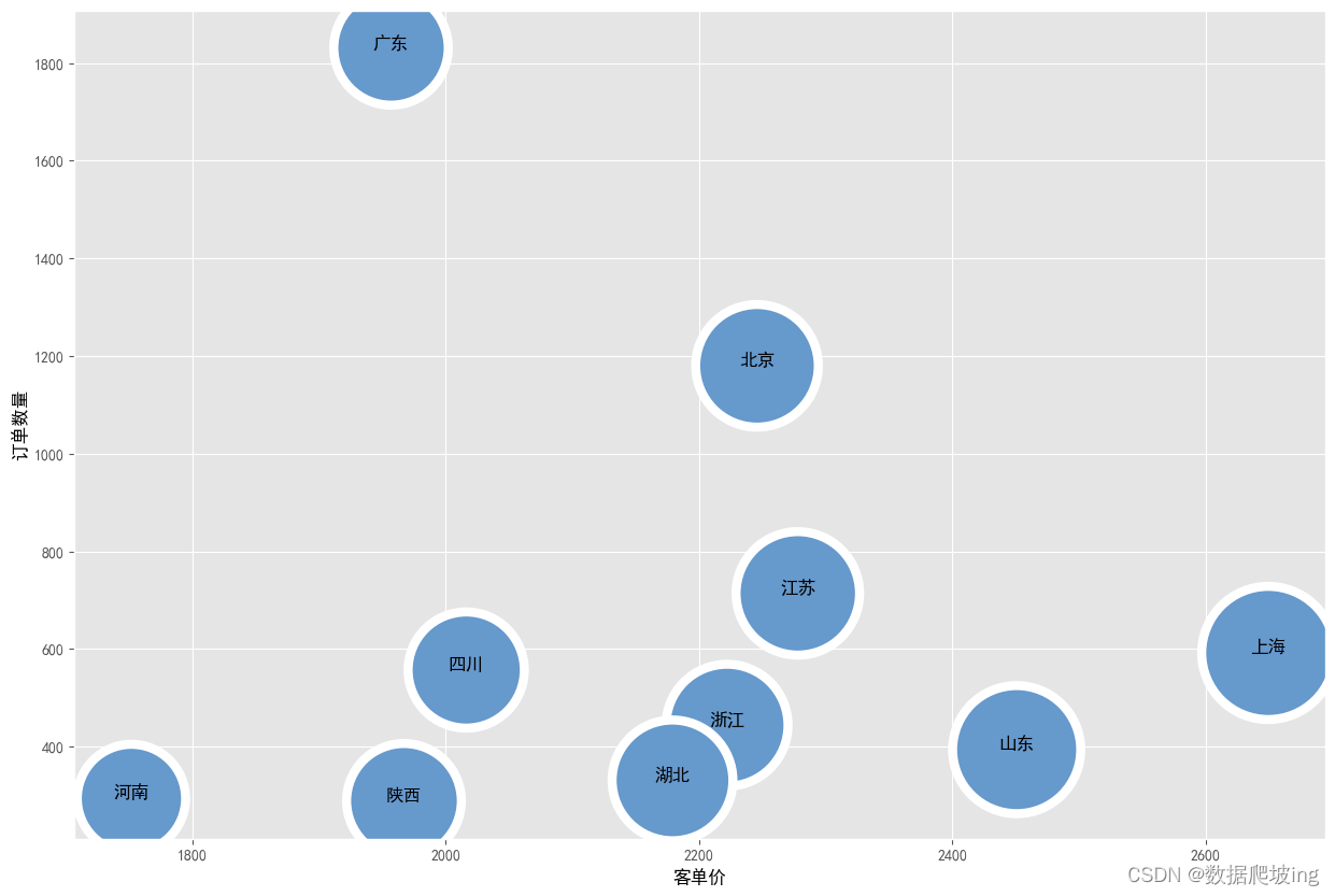
知道上海雖然客單價高2600左右,但是訂單數量少600左右
廣東訂單數量多1800左右,客單價在2000左右
下一步,看頭部省份的四個品牌的滲透率
#不同品牌的產品單價
df7 = df2.copy()brand_sale_df=df7.groupby('brandname',as_index=False).agg({'total_actual_pay':'sum','sale_qtty':'sum'}).sort_values(by='total_actual_pay',ascending=False)
brand_sale_dfdf8 = df7.copy()df8 = df8[df8['user_site_province_id'] == '1'] # 省份取北京,數字是省份idbrand_sale_df_bj = df8.groupby('brandname', as_index=False).agg({'total_actual_pay':'sum', 'sale_qtty':'sum'}).sort_values(by='total_actual_pay', ascending=False)
brand_sale_df_bj = brand_sale_df_bj[(brand_sale_df_bj['brandname'] == '海爾(Haier)')|(brand_sale_df_bj['brandname'] == '容聲(Ronshen)')|(brand_sale_df_bj['brandname'] == '西門子(SIEMENS)')|(brand_sale_df_bj['brandname'] == '美的(Midea)')]
brand_sale_df_bjdf8=df7.copy()
df8=df8[df8['brandname']=='海爾(Haier)']brand_sale_df_haier=df8.groupby('user_site_province_id',as_index=False).agg({'total_actual_pay':'sum','sale_qtty':'sum'}).sort_values(by='total_actual_pay',ascending=False)
brand_sale_df_haier = brand_sale_df_haier[(brand_sale_df_haier['user_site_province_id'] == '1')|(brand_sale_df_haier['user_site_province_id'] == '2')|(brand_sale_df_haier['user_site_province_id'] == '12')|(brand_sale_df_haier['user_site_province_id'] == '22')|(brand_sale_df_haier['user_site_province_id'] == '19')]
brand_sale_df_haier['user_site_province_id'] = brand_sale_df_haier['user_site_province_id'].astype('int')
brand_sale_df_haier.columns = ['province_id','total_actual_pay', 'sale_qtty']
brand_sale_df_haier.sort_values(by='province_id')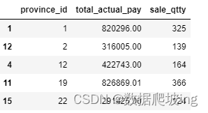
cust_price_df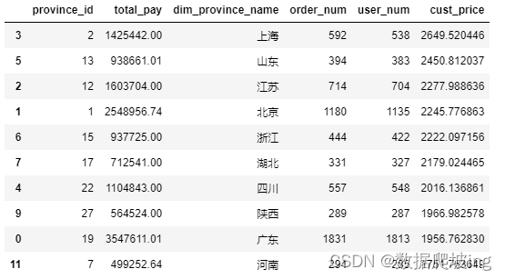
order_num_df = cust_price_df[['province_id', 'order_num']][(cust_price_df['province_id'] == 1)|(cust_price_df['province_id'] == 12)|(cust_price_df['province_id'] == 19)|(cust_price_df['province_id'] == 2)|(cust_price_df['province_id'] == 22)]
order_num_df = order_num_df.sort_values(by='province_id')
order_num_df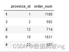
滲透率
def province_shentou(df, brandname, cust_price_df):df = df[df['brandname'] == brandname]brand_sale_df = df.groupby('user_site_province_id', as_index=False).agg({'total_actual_pay':'sum', 'sale_qtty':'sum'}).sort_values(by='total_actual_pay', ascending=False)brand_sale_df = brand_sale_df[(brand_sale_df['user_site_province_id'] == '1')|(brand_sale_df['user_site_province_id'] == '2')|(brand_sale_df['user_site_province_id'] == '12')|(brand_sale_df['user_site_province_id'] == '22')|(brand_sale_df['user_site_province_id'] == '19')]brand_sale_df['user_site_province_id'] = brand_sale_df['user_site_province_id'].astype('int')brand_sale_df.columns = ['province_id','total_actual_pay', 'sale_qtty']brand_sale_df.sort_values(by='province_id')order_num = cust_price_df[['province_id', 'order_num']][(cust_price_df['province_id'] == 1)|(cust_price_df['province_id'] == 12)|(cust_price_df['province_id'] == 19)|(cust_price_df['province_id'] == 2)|(cust_price_df['province_id'] == 22)]order_num = order_num.sort_values(by='province_id')brand_sale_df = pd.merge(brand_sale_df, order_num_df, on='province_id')brand_sale_df['滲透率'] = brand_sale_df['sale_qtty'] / brand_sale_df['order_num']#銷售數量/訂單數量brand_sale_df = brand_sale_df.sort_values(by='province_id')return brand_sale_dfdf9 = df7.copy()brand_sale_df_rs = province_shentou(df9, '容聲(Ronshen)', cust_price_df)
brand_sale_df_siem = province_shentou(df9, '西門子(SIEMENS)', cust_price_df)
brand_sale_df_mi = province_shentou(df9, '美的(Midea)', cust_price_df)
brand_sale_df_haier = province_shentou(df9, '海爾(Haier)', cust_price_df)brand_sale_df_siem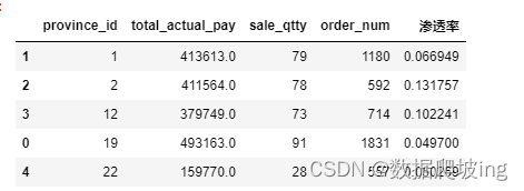
plt.style.use('ggplot')x = np.arange(5)y1 = brand_sale_df_siem['滲透率']
y2 = brand_sale_df_rs['滲透率']
y3 = brand_sale_df_haier['滲透率']
y4 = brand_sale_df_mi['滲透率']tick_label=['北京', '上海', '江蘇', '廣東', '四川']total_width, n = 0.8, 4
width = total_width / n
x = x - (total_width - width) / 2plt.figure(figsize=(20,8),dpi=80)
plt.style.use('ggplot')
plt.ylabel("滲透率")bar_width = 0.2
plt.bar(x, y1, width=bar_width, color=['red'])
plt.bar(x+width, y2, width=bar_width, color=['yellow'])
plt.bar(x+2*width, y3, width=bar_width, color=['green'])
plt.bar(x+3*width, y4, width=bar_width, color=['blue'])plt.xticks(x+bar_width/2, tick_label) # 顯示x坐標軸的標簽,即tick_label,調整位置,使其落在兩個直方圖中間位置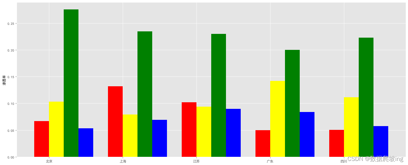
求各個品牌的客單價
plt.style.use('ggplot')brand_sale_df['單價'] = brand_sale_df['total_actual_pay'] / brand_sale_df['sale_qtty']
brand_sale_df = brand_sale_df.sort_values(by='單價', ascending=False)x = brand_sale_df['brandname']
y = brand_sale_df['單價']plt.figure(figsize=(20,8),dpi=80)
plt.style.use('ggplot')
plt.xlabel('品牌')
plt.ylabel("客單價")plt.xticks(range(len(x)), x, rotation=90)
rect = plt.bar(x, y, width=0.6, color=['#6699CC'])plt.show()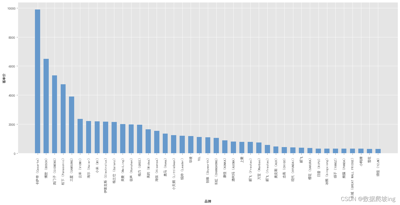
4,總結

(交個朋友/技術接單/ai辦公/性價比資源)

?


學法)


