Bootstrap V4系列 學習入門教程之 組件-折疊(Collapse)
- 折疊(Collapse)
- How it works
- 一、Example
- 二、Horizontal 水平的
- 三、Multiple targets 多個目標
- 四、Accordion example 手風琴示例
折疊(Collapse)
通過幾個類和我們的JavaScript插件來切換項目中內容的可見性。
How it works
collapse JavaScript插件用于顯示和隱藏內容。按鈕或錨點用作觸發器,映射到您切換的特定元素。折疊元素將使height 高度從其當前值動畫化為0。考慮到CSS處理動畫的方式,您不能在.collapse 元素上使用padding填充。相反,將類用作獨立的包裝元素。
一、Example
單擊下面的按鈕,通過類更改顯示和隱藏另一個元素:
.collapsehides content (隱藏內容).collapsingis applied during transitions (在轉換過程中應用折疊).collapse.showshows content (顯示內容)
通常,我們建議使用帶有data-target屬性的按鈕。雖然從語義角度來看不建議使用,但您也可以使用帶有href屬性的鏈接(以及role=“button”)。在這兩種情況下,都需要數據切換data-toggle="collapse"。
<!--Example-->
<!--單擊下面的按鈕,通過類更改顯示和隱藏另一個元素-->
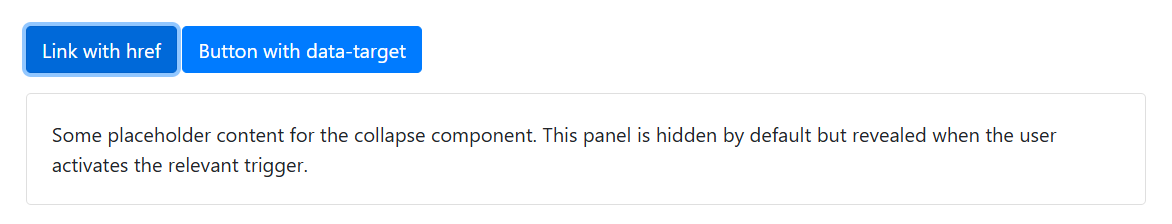
<p><a class="btn btn-primary" data-toggle="collapse" href="#collapseExample" role="button" aria-expanded="false" aria-controls="collapseExample">Link with href</a><button class="btn btn-primary" type="button" data-toggle="collapse" data-target="#collapseExample" aria-expanded="false" aria-controls="collapseExample">Button with data-target</button>
</p>
<div class="collapse" id="collapseExample"><div class="card card-body">Some placeholder content for the collapse component. This panel is hidden by default but revealed when the user activates the relevant trigger.</div>
</div>
頁面展示效果:

點擊展開(顯示內容)后的效果:
二、Horizontal 水平的
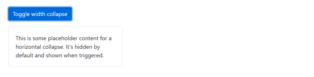
折疊插件還支持水平折疊。添加.width修飾符類以轉換寬度而不是高度,并在直接的子元素上設置寬度。
請注意,雖然下面的示例設置了最小高度以避免在我們的文檔中過度重新繪制,但這并不是明確要求的。只需要子元素上的寬度。
<!--水平的 Horizontal-->
<p><button class="btn btn-primary" type="button" data-toggle="collapse" data-target="#collapseWidthExample" aria-expanded="false" aria-controls="collapseWidthExample">Toggle width collapse</button>
</p>
<div style="min-height: 120px;"><div class="collapse width" id="collapseWidthExample"><div class="card card-body" style="width: 320px;">This is some placeholder content for a horizontal collapse. It's hidden by default and shown when triggered.</div></div>
</div>
頁面展示效果:

點擊展開(顯示內容)后的效果:
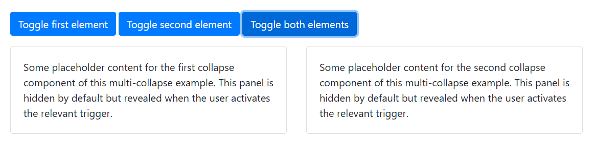
三、Multiple targets 多個目標
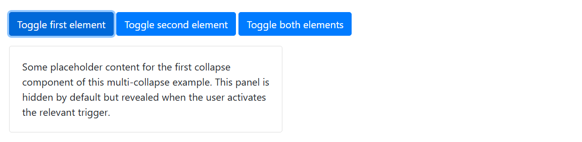
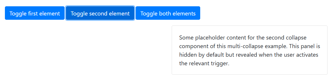
<button>或<a>可以通過在其href或data-target屬性中使用JQuery選擇器引用多個元素來顯示和隱藏它們。多個<button>或<a>可以顯示和隱藏一個元素,如果它們各自用href或data-target屬性引用它
<!--Multiple targets-->
<p><a class="btn btn-primary" data-toggle="collapse" href="#multiCollapseExample1" role="button" aria-expanded="false" aria-controls="multiCollapseExample1">Toggle first element</a><button class="btn btn-primary" type="button" data-toggle="collapse" data-target="#multiCollapseExample2" aria-expanded="false" aria-controls="multiCollapseExample2">Toggle second element</button><button class="btn btn-primary" type="button" data-toggle="collapse" data-target=".multi-collapse" aria-expanded="false" aria-controls="multiCollapseExample1 multiCollapseExample2">Toggle both elements</button>
</p>
<div class="row"><div class="col"><div class="collapse multi-collapse" id="multiCollapseExample1"><div class="card card-body">Some placeholder content for the first collapse component of this multi-collapse example. This panel is hidden by default but revealed when the user activates the relevant trigger.</div></div></div><div class="col"><div class="collapse multi-collapse" id="multiCollapseExample2"><div class="card card-body">Some placeholder content for the second collapse component of this multi-collapse example. This panel is hidden by default but revealed when the user activates the relevant trigger.</div></div></div>
</div>
頁面展示效果:

點擊展開1(顯示內容)后的效果:
點擊展開2(顯示內容)后的效果:
點擊展開1和2(顯示內容)后的效果:
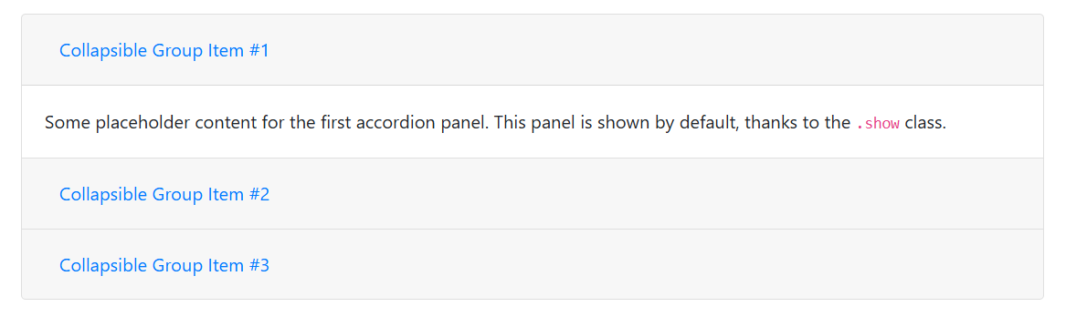
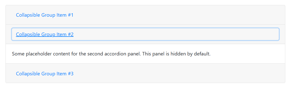
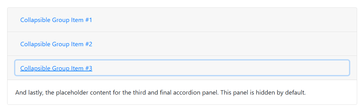
四、Accordion example 手風琴示例
使用卡片組件,可以擴展默認折疊行為以創建手風琴。要正確實現手風琴風格,一定要使用.accordion作為包裝。
<!--手風琴示例 Accordion example-->
<div class="accordion" id="accordionExample"><div class="card"><div class="card-header" id="headingOne"><h2 class="mb-0"><button class="btn btn-link btn-block text-left" type="button" data-toggle="collapse" data-target="#collapseOne" aria-expanded="true" aria-controls="collapseOne">Collapsible Group Item #1</button></h2></div><div id="collapseOne" class="collapse show" aria-labelledby="headingOne" data-parent="#accordionExample"><div class="card-body">Some placeholder content for the first accordion panel. This panel is shown by default, thanks to the <code>.show</code> class.</div></div></div><div class="card"><div class="card-header" id="headingTwo"><h2 class="mb-0"><button class="btn btn-link btn-block text-left collapsed" type="button" data-toggle="collapse" data-target="#collapseTwo" aria-expanded="false" aria-controls="collapseTwo">Collapsible Group Item #2</button></h2></div><div id="collapseTwo" class="collapse" aria-labelledby="headingTwo" data-parent="#accordionExample"><div class="card-body">Some placeholder content for the second accordion panel. This panel is hidden by default.</div></div></div><div class="card"><div class="card-header" id="headingThree"><h2 class="mb-0"><button class="btn btn-link btn-block text-left collapsed" type="button" data-toggle="collapse" data-target="#collapseThree" aria-expanded="false" aria-controls="collapseThree">Collapsible Group Item #3</button></h2></div><div id="collapseThree" class="collapse" aria-labelledby="headingThree" data-parent="#accordionExample"><div class="card-body">And lastly, the placeholder content for the third and final accordion panel. This panel is hidden by default.</div></div></div>
</div>
頁面展示效果:
點擊展開2(顯示內容)后的效果:
點擊展開3(顯示內容)后的效果:


:主板芯片組FCH和PCH的區別)

的數據)

:從理論到實踐)
)


)