頂部
頁面最頂部要獲取到手機設備狀態欄的高度,避免與狀態欄重疊或者被狀態欄擋住
// 這是最頂部的父級容器
<view :style="{ paddingTop: `${statusBarHeight + extraPadding}px` }">....
</view>
export default {data() {return {statusBarHeight: 0,extraPadding: 20}},onReady() {uni.getSystemInfo({success: res => {this.statusBarHeight = res.statusBarHeight;}})}
}
使用uni-app自帶的uni.getSystemInfo方法獲取設備的狀態欄高度,除去設備的狀態欄高度再額外加上一點高度,這樣就避免頁面最頂部的內容會被狀態欄蓋住或者與狀態欄重疊.

頁面整體高度
當頁面出現可滑動區域的時候使用動態計算高度值
// 使用 <scroll-view />
<view><scroll-view scroll-y="true" :style="{ height: scrollHeight + 'px' }">...</scroll-view>
</view>
export default {data() {return {scrollHeight: 0,navBarHeight: 0}},mounted() {const query = uni.createSelectorQuery().in(this);query.select('.ngb').boundingClientRect(data => {if(data) {this.navBarHeight = data.height}}).exec()},onReady() {uni.getSystemInfo({success: res => {this.scrollHeight= res.windowHeight - this.navBarHeight ;}})}
}
獲取導航欄的高度,括號里面填的就是你導航欄的CSS名稱
res.windowHeight 是這個設備除去底下的ToBar欄的高度 當你有導航欄的時候你要減去導航欄的高度才是你剩下的頁面實際高度 只有當你超出scroll-view的高度的時候才會觸發滾動,這個樣子就可以做到這個頁面在每個設備下都可以適配
如果想要隱藏滾動條
<style>/* 取消滾動條 *//deep/ ::-webkit-scrollbar {display: block;width: 0px !important;height: 0px !important;}
</style>
圓角效果
border-radius: 10px; // 大小增加 圓角效果越明顯
如果是給圖片增加圓角效果但是不生效
overflow: hidden
border-radius: 10px;


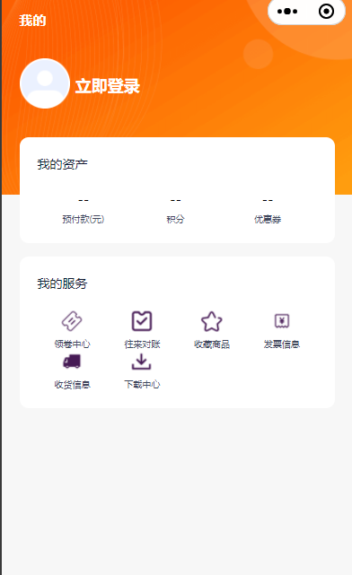
層疊關系
像一些我的頁面或者登錄頁面會遇到這個情況

// 圖片的容器
<view class="background-box"><image class="background-image" src="/static/mine-photo/background1.png" mode="widthFix" />
</view>
// 頭像與我的資產的容器
<view class="content" :style="{ paddingTop: `${statusBarHeight + extraPadding}px` }"><view class="box-c"><view class="box1"><text>我的</text></view><view class="box2"><view class="box2-1"><image class="box2-image" src="/static/mine-photo/user-not-login.png" mode="widthFix" /></view><view class="box2-2"><text>立即登錄</text></view></view><view class="box3-c"><view class="box3-1"><view class="box3-1--1"><text>我的資產</text></view><view class="box3-1--2"><view class="box3-1--box" v-for="(item, index) in zcList" :key="index"><text class="box3-1--box-text1">{{item.text1}}</text><text class="box3-1--box-text2">{{item.text2}}</text></view></view></view></view>
</view>
.background-box {position: relative;width: 100%;
}.content {position: absolute;top: 0;left: 0;width: 100%;display: flex;justify-content: center;
}
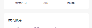
內邊距
一些卡片或者展示數據的一些容器記得給一點內邊距不要讓數據貼著容器
padding: 10px 20px 10px 10px;
關系為 上 右 下 左(margin bord-redius 都是同理)
對齊
width: 90%;
margin: 0 auto;
不要將寬度設為100% 兩邊要留一點 會更美觀一點 使用 0 auto 方法來讓元素居中顯示
或者給 padding: 一個值也可以
padding: 20rpx;
或者使用flex布局, 這個要在元素外面的父容器設置
display: flex;
width: 100%;
justify-content: center;
使用這個方法讓元素橫向居中顯示

詳解)


)

安裝之后,快速搭建Docker環境)


的定制)