seaborn是基于matplotlib的python數據可視化庫,提供更高層次的API封裝,包括一些高級圖表可視化等工具。
使用seaborn需要先安裝改模塊pip3 install seaborn 。
?
一、風格style
包括set() / set_style() / axes_style() / despine() / set_context()
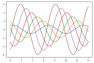
創建正弦函數并顯示圖表
import numpy as np
import pandas as pd
import matplotlib.pyplot as plt
import seaborn as sns
%matplotlib inline
def sinplot(flip = 1):x = np.linspace(0,14,100)for i in range(1,7):plt.plot(x,np.sin(x+i)*i)      # 6個正弦函數
sinplot()
1.set(),設置整體為默認風格
sns.set()  #默認風格為darkgrid
sinplot()

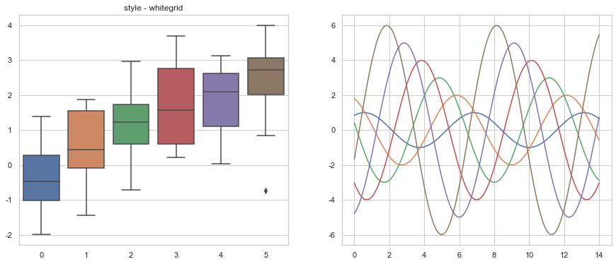
2.set_style(),自定義整體風格
參數為"white"、"dark"、 "whitegrid"、 "darkgrid"、 "ticks"或者None,默認為darkgrid
fig = plt.figure(figsize=(15,6))ax1 = fig.add_subplot(121)
sns.set_style('whitegrid')
data = np.random.normal(size=(20, 6)) + np.arange(6) / 2
sns.boxplot(data=data)
plt.title('style - whitegrid')# 仍然可以使用matplotlib的參數

ax2 = fig.add_subplot(122)
# sns.set_style("dark")
sinplot()
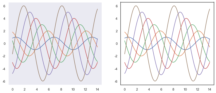
3.axes_style(),設置子圖風格
可與with搭配使用,設置with代碼塊內的圖表風格,不影響整體圖表風格。
fig = plt.figure(figsize=(15,6))
with sns.axes_style("dark"): #只對with代碼塊內的圖表風格生效,即只對第一個子圖生效plt.subplot(121)       sinplot()sns.set_style("white")       #整體風格為white
plt.subplot(122)
sinplot()
 ?
?
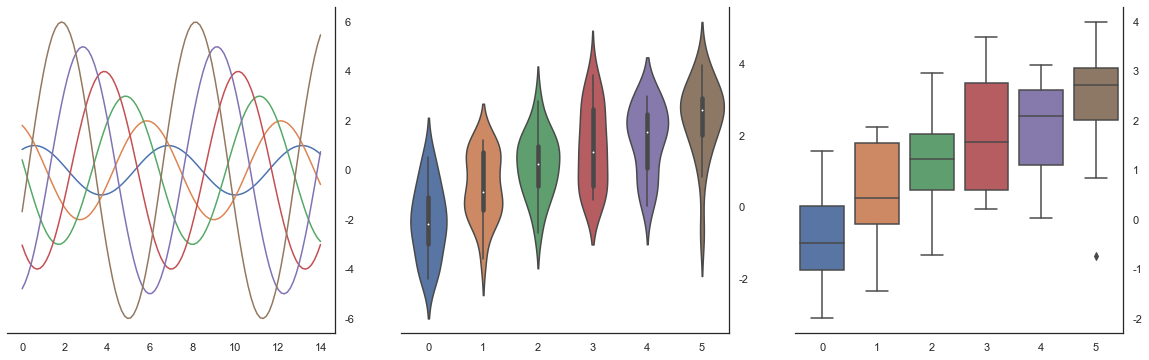
4.despine()移除軸線
despine(fig=None, ax=None, top=True, right=True, left=False,?bottom=False, offset=None, trim=False)
top、right、left、bottom:上、右、左、下方軸線,默認移除上方和右側軸線
offset:xy軸和y軸的起點相對原始位置的偏移量
trim:默認坐標軸長度沒有限制,會延伸到圖表內容結束,True表示將坐標軸的顯示的長度在最小值和最大值之間
fig = plt.figure(figsize=(20,6))
ax1 = fig.add_subplot(131)
sinplot()
sns.despine()# 默認刪除上、右坐標軸

ax2 = fig.add_subplot(132)
sns.violinplot(data=data) #小提琴圖
# sns.despine(offset=1, trim=True)

ax3 = fig.add_subplot(133)
sns.boxplot(data=data, palette="deep")
sns.despine(left=True, right = False) #最終是該despine設置生效
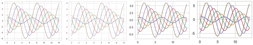
5.set_context()顯示比例
可選參數為'paper'、 'notebook'、'talk'、'poster',默認為notebook,設置標簽、線等的大小。
sns.set_context("notebook")
sinplot()
下面分別為設置為notebook、paper、talk和poster的顯示結果。
?
二、 調色盤
1.color_palette()
默認取當前調色盤的顏色,返回結果是一個seaborn.palette的類,形式類似一個列表,列表中每一個元素為元組,元組用3個數值表示rgb顏色。
current_palette = sns.color_palette()  # 讀取當前調色盤顏色,可添加參數n表示取幾個色塊
print(current_pallette,type(current_palette))
sns.palplot(current_palette)
#<class 'seaborn.palettes._ColorPalette'> [(0.9913725490196079, 0.7913725490196079, 0.7082352941176471)...]
seaborn可用調色盤有6種,deep、 muted、bright、 pastel、dark、colorblind,默認顯示bright。
 ?
?
其他調色盤
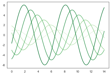
sns.color_palette('Reds', 10),第一個參數表示色系,第二個參數表示取幾個色塊。
顏色默認是由淺到深,帶r表示反轉即顏色由深到淺,不是所有顏色都可以翻轉哦。
#其他可用調色盤
#Accent, Accent_r, Blues, Blues_r, BrBG, BrBG_r, BuGn, BuGn_r, BuPu, BuPu_r, CMRmap, CMRmap_r, Dark2, Dark2_r, GnBu, GnBu_r,
#Greens, Greens_r, Greys, Greys_r, OrRd, OrRd_r, Oranges, Oranges_r, PRGn, PRGn_r, Paired, Paired_r, Pastel1, Pastel1_r,
#Pastel2, Pastel2_r, PiYG, PiYG_r, PuBu, PuBuGn, PuBuGn_r, PuBu_r, PuOr, PuOr_r, PuRd, PuRd_r, Purples, Purples_r,RdBu, RdBu_r,
#RdGy, RdGy_r, RdPu, RdPu_r, RdYlBu, RdYlBu_r, RdYlGn, RdYlGn_r, Reds, Reds_r, Set1, Set1_r, Set2, Set2_r, Set3, Set3_r, spectral
#Spectral_r, Wistia, Wistia_r, YlGn, YlGnBu, YlGnBu_r, YlGn_r, YlOrBr, YlOrBr_r, YlOrRd, YlOrRd_r, afmhot, afmhot_r, autumn, autumn_r
#binary, binary_r, bone, bone_r, brg, brg_r, bwr, bwr_r, cividis, cividis_r, cool, cool_r, coolwarm, coolwarm_r, copper, copper_r,
#cubehelix, cubehelix_r, flag, flag_r, gist_earth, gist_earth_r, gist_gray, gist_gray_r, gist_heat, gist_heat_r, gist_ncar, gist_ncar_r,
#gist_rainbow, gist_rainbow_r, gist_stern, gist_stern_r, gist_yarg, gist_yarg_r, gnuplot, gnuplot2, gnuplot2_r, gnuplot_r,
#gray, gray_r, hot, hot_r, hsv, hsv_r, icefire, icefire_r, inferno, inferno_r, jet, jet_r, magma, magma_r, mako, mako_r,
#nipy_spectral, nipy_spectral_r, ocean, ocean_r, pink, pink_r, plasma, plasma_r, prism, prism_r, rainbow, rainbow_r, rocket, rocket_r,
#seismic, seismic_r, spring, spring_r, summer, summer_r, tab10, tab10_r, tab20, tab20_r, tab20b, tab20b_r, tab20c, tab20c_r,
#terrain, terrain_r, twilight, twilight_r, twilight_shifted, twilight_shifted_r, viridis, viridis_r, vlag, vlag_r, winter, winter_r

sns.palplot(sns.color_palette('Reds', 10))
sns.palplot(sns.color_palette('Greens_r', 7))  #

?
# 分組顏色,同一個顏色成對出現
sns.palplot(sns.color_palette('Paired',7))  #參數可以為奇數
sns.palplot(sns.color_palette('Paired', 18))

?
2.設置調色盤
set_palette(palette, n_colors=None, desat=None, color_codes=False),使用Seaborn調色盤設置Matplotlib顏色循環
palette參數可設置為seaborn color paltte | matplotlib colormap | hls | husl
sns.set_palette('Greens')
sinplot()
3.亮度和飽和度
sns.hls_palette(n_colors=6, h=.01, l=.6, s=.65)
sns.husl_palette(n_colors=6, h=.01, s=.9, l=.65),兩者表示亮度和飽和度的參數位置相反。
參數n_colors表示取幾個色塊,h表示第一個色塊的顏色,l表示亮度,s表示飽和度,h、l、s取值[0,1]。
sns.palplot(sns.hls_palette(8,0.01,0.5,0.5))
sns.palplot(sns.husl_palette(8,0.03,0.8,0.8)) 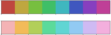
?
4.按線性增長設置顏色
cubehelix_palette(n_colors=6, start=0, rot=.4, gamma=1.0, hue=0.8,light=.85, dark=.15, reverse=False, as_cmap=False)
c_colors:色塊個數
start:色塊的起點顏色,[0,3]之間
rot:顏色的旋轉角度
gamma:顏色的伽馬值,值越大顏色越深
hue:飽和度,[0,1]之間
light和dark:亮度和深度,[0,1]之間
reverse:默認為False顏色由淺到深,True表示由深到淺
as_cmp:If True, return a matplotlib colormap instead of a list of colors
sns.palplot(sns.cubehelix_palette(8, gamma=1.5))
sns.palplot(sns.cubehelix_palette(8, start=1, rot=-0.75))
sns.palplot(sns.cubehelix_palette(8, start=2, rot=0, dark=0.5,light=0.9, reverse=True))

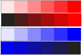
5.按顏色深淺設置顏色
light_palette(color, n_colors=6, reverse=False, as_cmap=False,input="rgb")和dark_palette(color, n_colors=6, reverse=False, as_cmap=False, input="rgb")
color_palette()中的顏色參數為調色盤,而light_palette()和dark_palette()中的color顏色參數就是單純的顏色,例如對于藍色,color_palette()需設置Blues,后兩者參數為blue。
sns.palplot(sns.light_palette("red"))
sns.palplot(sns.dark_palette("red"))
sns.palplot(sns.light_palette("blue"))
sns.palplot(sns.dark_palette("blue", reverse=True))
6.設置分散顏色
diverging_palette(h_neg, h_pos, s=75, l=50, sep=10, n=6,?center="light", as_cmap=False)
h_neg, h_pos:起始和終止顏色,[0,359]之間
s、l:飽和度和亮度,[0,100]之間
n:色塊個數
center: 最中間顏色為淺色或者深色,{'light','dark'},默認為淺色
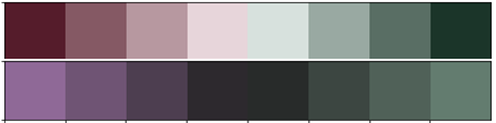
sns.palplot(sns.diverging_palette(0,150, s=60, l=20, n=8))
sns.palplot(sns.diverging_palette(300, 150, s=30, l=50, n=8,center='dark'))
?
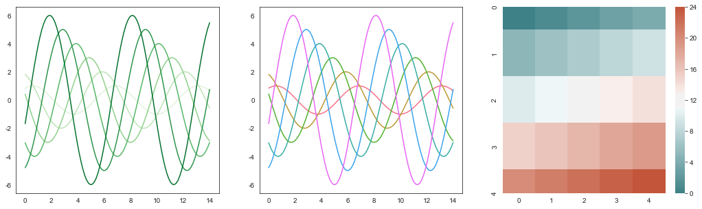
sns.set_style("white")# 設置風格
fig = plt.figure(figsize=(18,5))with sns.color_palette("Greens"): #設置局部調色盤plt.subplot(131)sinplot()sns.set_palette("husl")   #對于多系列的圖表,用不同顏色區分系列
plt.subplot(132)
sinplot()x = np.arange(25).reshape(5, 5)
cmap = sns.diverging_palette(200, 20, sep=20, as_cmap=True)
plt.subplot(133)
sns.heatmap(x, cmap=cmap)  #顯示熱力圖效果
?
)
)


)


)


)