系統自帶的數據表格(存放在github上https://github.com/mwaskom/seaborn-data),使用時通過sns.load_dataset('表名稱')即可,結果為一個DataFrame。
print(sns.get_dataset_names())   #獲取所有數據表名稱
# ['anscombe', 'attention', 'brain_networks', 'car_crashes', 'diamonds', 'dots', 'exercise', 'flights',
# 'fmri', 'gammas', 'iris', 'mpg', 'planets', 'tips', 'titanic']
tips = sns.load_dataset('tips')  #導入小費tips數據表,返回一個DataFrame
tips.head()

?
一、直方圖distplot()
distplot(a, bins=None, hist=True, kde=True, rug=False, fit=None,hist_kws=None, kde_kws=None, rug_kws=None, fit_kws=None,color=None, vertical=False,? ? ?
? ? ? ? ? ? ?norm_hist=False, axlabel=None,label=None, ax=None)
- a 數據源
- bins 箱數
- hist、kde、rug 是否顯示箱數、密度曲線、數據分布,默認顯示箱數和密度曲線不顯示數據分析
- {hist,kde,rug}_kws 通過字典形式設置箱數、密度曲線、數據分布的各個特征
- norm_hist 直方圖的高度是否顯示密度,默認顯示計數,如果kde設置為True高度也會顯示為密度
- color 顏色
- vertical 是否在y軸上顯示圖標,默認為False即在x軸顯示,即豎直顯示
- axlabel 坐標軸標簽
- label 直方圖標簽
fig = plt.figure(figsize=(12,5))
ax1 = plt.subplot(121)
rs = np.random.RandomState(10)  # 設定隨機數種子
s = pd.Series(rs.randn(100) * 100)
sns.distplot(s,bins = 10,hist = True,kde = True,rug = True,norm_hist=False,color = 'y',label = 'distplot',axlabel = 'x')
plt.legend()ax1 = plt.subplot(122)
sns.distplot(s,rug = True, hist_kws={"histtype": "step", "linewidth": 1,"alpha": 1, "color": "g"},  # 設置箱子的風格、線寬、透明度、顏色,風格包括:'bar', 'barstacked', 'step', 'stepfilled'        kde_kws={"color": "r", "linewidth": 1, "label": "KDE",'linestyle':'--'},   # 設置密度曲線顏色,線寬,標注、線形rug_kws = {'color':'r'} )  # 設置數據頻率分布顏色

二、密度圖
密度曲線kdeplot(data, data2=None, shade=False, vertical=False, kernel="gau",bw="scott", gridsize=100, cut=3, clip=None,? ? ? ? ? ? ? ? ?
legend=True,cumulative=False,shade_lowest=True,cbar=False, cbar_ax=None,cbar_kws=None, ax=None, **kwargs)
- shade 是否填充與坐標軸之間的
- bw 取值'scott' 、'silverman'或一個數值標量,控制擬合的程度,類似直方圖的箱數,設置的數量越大越平滑,越小越容易過度擬合
- shade_lowest 主要是對兩個變量分析時起作用,是否顯示最外側填充顏色,默認顯示
- cbar 是否顯示顏色圖例
- n_levels 主要對兩個變量分析起作用,數據線的個數
數據分布rugplot(a, height=.05, axis="x", ax=None, **kwargs)
- height 分布線高度
- axis {'x','y'},在x軸還是y軸顯示數據分布
1.單個樣本數據分布密度圖?
sns.kdeplot(s,shade = False, color = 'r',vertical = False)# 是否填充、設置顏色、是否水平
sns.kdeplot(s,bw=0.2, label="bw: 0.2",linestyle = '-',linewidth = 1.2,alpha = 0.5)
sns.kdeplot(s,bw=2, label="bw: 2",linestyle = '-',linewidth = 1.2,alpha = 0.5,shade=True)
sns.rugplot(s,height = 0.1,color = 'k',alpha = 0.5)  #數據分布

2.兩個樣本數據分布密度圖
兩個維度數據生成曲線密度圖,以顏色作為密度衰減顯示。
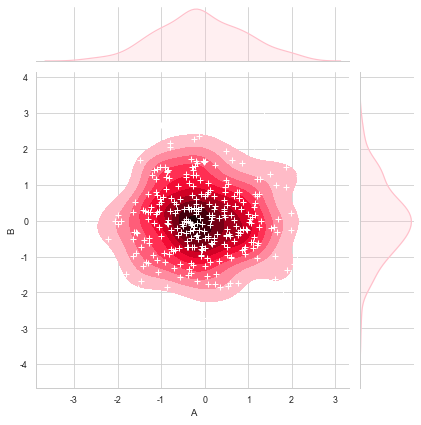
rs = np.random.RandomState(2)  # 設定隨機數種子
df = pd.DataFrame(rs.randn(100,2),columns = ['A','B'])
sns.kdeplot(df['A'],df['B'],shade = True,cbar = True,cmap = 'Reds',shade_lowest=True, n_levels = 8)# 曲線個數(如果非常多,則會越平滑)
plt.grid(linestyle = '--')
plt.scatter(df['A'], df['B'], s=5, alpha = 0.5, color = 'k') #散點
sns.rugplot(df['A'], color="g", axis='x',alpha = 0.5) #x軸數據分布
sns.rugplot(df['B'], color="r", axis='y',alpha = 0.5) #y軸數據分布

rs1 = np.random.RandomState(2)
rs2 = np.random.RandomState(5)
df1 = pd.DataFrame(rs1.randn(100,2)+2,columns = ['A','B'])
df2 = pd.DataFrame(rs2.randn(100,2)-2,columns = ['A','B'])
sns.set_style('darkgrid')
sns.set_context('talk')
sns.kdeplot(df1['A'],df1['B'],cmap = 'Greens',shade = True,shade_lowest=False)
sns.kdeplot(df2['A'],df2['B'],cmap = 'Blues', shade = True,shade_lowest=False)

三、散點圖
jointplot() /?JointGrid() /?pairplot() /pairgrid()
1.jointplot()綜合散點圖
rs = np.random.RandomState(2)
df = pd.DataFrame(rs.randn(200,2),columns = ['A','B'])sns.jointplot(x=df['A'], y=df['B'],  # 設置x軸和y軸,顯示columns名稱data=df,   # 設置數據color = 'k',   # 設置顏色s = 50, edgecolor="w",linewidth=1,  # 設置散點大小、邊緣線顏色及寬度(只針對scatter)kind = 'scatter',   # 設置類型:“scatter”、“reg”、“resid”、“kde”、“hex”space = 0.1,  # 設置散點圖和上方、右側直方圖圖的間距size = 6,   # 圖表大小(自動調整為正方形)ratio = 3,  # 散點圖與直方圖高度比,整型marginal_kws=dict(bins=15, rug=True,color='green')  # 設置直方圖箱數以及是否顯示rug)

當kind分別設置為其他4種“reg”、“resid”、“kde”、“hex”時,圖表如下。
sns.jointplot(x=df['A'], y=df['B'],data=df,kind='reg',size=5)  #
sns.jointplot(x=df['A'], y=df['B'],data=df,kind='resid',size=5) #
sns.jointplot(x=df['A'], y=df['B'],data=df,kind='kde',size=5) #
sns.jointplot(x=df['A'], y=df['B'],data=df,kind='hex',size=5) #蜂窩圖

?
在密度圖中添加散點圖,先通過sns.jointplot()創建密度圖并賦值給變量,再通過變量.plot_joint()在密度圖中添加散點圖。
rs = np.random.RandomState(15)
df = pd.DataFrame(rs.randn(300,2),columns = ['A','B'])
g = sns.jointplot(x=df['A'], y=df['B'],data = df, kind="kde", color="pink",shade_lowest=False) #密度圖,并賦值給一個變量
g.plot_joint(plt.scatter,c="w", s=30, linewidth=1, marker="+")  #在密度圖中添加散點圖
2.拆分綜合散點圖JointGrid()?
上述綜合散點圖可分為上、右、中間三部分,設置屬性時對這三個參數都生效,JointGrid()可將這三部分拆開分別設置屬性。
①拆分為中間+上&右 兩部分設置
# plot_joint() + plot_marginals()
g = sns.JointGrid(x="total_bill", y="tip", data=tips)# 創建一個繪圖區域,并設置好x、y對應數據
g = g.plot_joint(plt.scatter,color="g", s=40, edgecolor="white")   # 中間區域通過g.plot_joint繪制散點圖
plt.grid('--')g.plot_marginals(sns.distplot, kde=True, color="y")     #

h = sns.JointGrid(x="total_bill", y="tip", data=tips)# 創建一個繪圖區域,并設置好x、y對應數據
h = h.plot_joint(sns.kdeplot,cmap = 'Reds_r')   # 中間區域通過g.plot_joint繪制散點圖
plt.grid('--')
h.plot_marginals(sns.kdeplot, color="b")

?
②拆分為中間+上+右三個部分分別設置
# plot_joint() + ax_marg_x.hist() + ax_marg_y.hist()

sns.set_style("white")# 設置風格
tips = sns.load_dataset("tips") # 導入系統的小費數據
print(tips.head())g = sns.JointGrid(x="total_bill", y="tip", data=tips)# 創建繪圖區域,設置好x、y對應數據

g.plot_joint(plt.scatter, color ='y', edgecolor = 'white')  # 設置內部散點圖scatter
g.ax_marg_x.hist(tips["total_bill"], color="b", alpha=.6,bins=np.arange(0, 60, 3))  # 設置x軸直方圖,注意bins是數組
g.ax_marg_y.hist(tips["tip"], color="r", alpha=.6, orientation="horizontal", bins=np.arange(0, 12, 1)) # 設置y軸直方圖,需要orientation參數from scipy import stats
g.annotate(stats.pearsonr)  # 設置標注,可以為pearsonr,spearmanr

plt.grid(linestyle = '--')


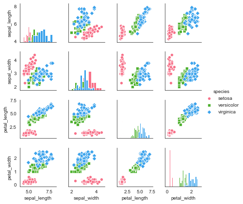
3.pairplot()矩陣散點圖
矩陣散點圖類似pandas的pd.plotting.scatter_matrix(...),將數據從多個維度進行兩兩對比。
對角線默認顯示密度圖,非對角線默認顯示散點圖。
sns.set_style("white")
iris = sns.load_dataset("iris")
print(iris.head())
sns.pairplot(iris,kind = 'scatter',  # 散點圖/回歸分布圖 {‘scatter’, ‘reg’}  diag_kind="hist",  # 對角線處直方圖/密度圖 {‘hist’, ‘kde’}hue="species",   # 按照某一字段進行分類palette="husl",  # 設置調色板markers=["o", "s", "D"],  # 設置不同系列的點樣式(個數與hue分類的個數一致)height = 1.5,   # 圖表大小)
?
對原數據的局部變量進行分析,可添加參數vars
sns.pairplot(iris,vars=["sepal_width", "sepal_length"], kind = 'reg', diag_kind="kde", hue="species", palette="husl")

?
plot_kws()和diag_kws()可分別設置對角線和非對角線的顯示
sns.pairplot(iris, vars=["sepal_length", "petal_length"],diag_kind="kde", markers="+",plot_kws=dict(s=50, edgecolor="b", linewidth=1),# 設置非對角線點樣式diag_kws=dict(shade=True,color='r',linewidth=1)# 設置對角線密度圖樣式)

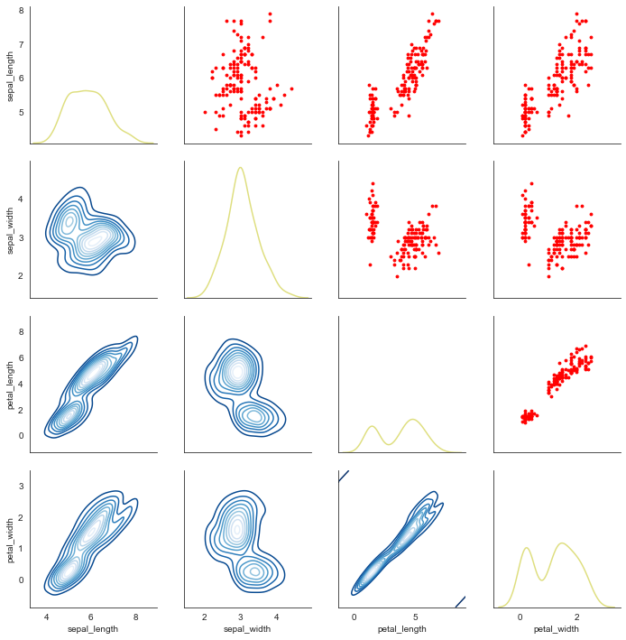
4..拆分綜合散點圖JointGrid()?
類似JointGrid()的功能,將矩陣散點圖拆分為對角線和非對角線圖表分別設置顯示屬性。
①拆分為對角線和非對角線
# map_diag() + map_offdiag()

g = sns.PairGrid(iris,hue="species",palette = 'hls',vars=["sepal_width", "sepal_length"])
g.map_diag(plt.hist, # 對角線圖表,plt.hist/sns.kdeplothisttype = 'barstacked',   # 可選:'bar', 'barstacked', 'step', 'stepfilled'linewidth = 1, edgecolor = 'gray')
g.map_offdiag(plt.scatter, # f非對角線其他圖表,plt.scatter/plt.bar...edgecolor="yellow", s=20, linewidth = 1,   # 設置點顏色、大小、描邊寬度)
?
 ? ??
? ??
?
②拆分為對角線+對角線上+對角線下 3部分設置
# map_diag() + map_lower() + map_upper()
g = sns.PairGrid(iris)
g.map_diag(sns.kdeplot, lw=1.5,color='y',alpha=0.5)   # 設置對角線圖表
g.map_upper(plt.scatter, color = 'r',s=8)     # 設置對角線上端圖表顯示為散點圖
g.map_lower(sns.kdeplot,cmap='Blues_r') # 設置對角線下端圖表顯示為多密度分布圖
 ? ? ? ?
?


)


)


)


