棒棒糖 宏
AKA: lollipop plot
又名:棒棒糖情節
WHY: a lollipop chart (LC) is a handy variation of a bar chart where the bar is replaced with a line and a dot at the end. Just like bar graphs, lollipop plots are used to make comparisons between different items or categories. They are also used for ranking or for showing trends over time. We compare only one numerical variable per item or category. They are not suitable for relationships, distribution, or composition analysis.
為什么 :棒棒糖圖(LC)是條形圖的一種方便的變體,其中條形圖的末尾用線和點代替。 就像條形圖一樣,棒棒糖圖用于在不同項目或類別之間進行比較 。 它們還用于排名或顯示一段時間內的趨勢 。 每個項目或類別我們僅比較一個數值變量。 它們不適用于關系,分布或組成分析。
LCs are preferred to bar charts when you have to display a large number of similar high values. In that case with a standard bar plot, you may get a cluttered chart and experience an optical effect called a Moiré pattern (#1). Fig. 1 shows a bar chart on the left and a lollipop chart on the right side. Both are based on the same data but it is evident that the minimalist alternative of the lollipop results in a more attractive and clear visualization.
當您必須顯示大量相似的高值時,LC優于條形圖。 在這種情況下,使用標準條形圖,您可能會得到混亂的圖表并體驗到一種稱為莫爾圖案 (#1)的光學效果。 圖1在左側顯示條形圖,在右側顯示棒棒糖圖。 兩者都是基于相同的數據,但是很明顯,棒棒糖的極簡主義替代方案可以使視覺效果更具吸引力和清晰感。
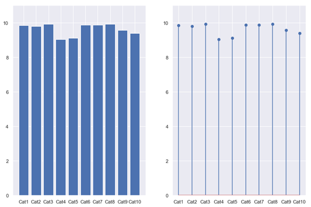
The Moiré effect is a visual perception that occurs when viewing a set of lines or bars that is superimposed on another set of lines or bars, where the sets differ in relative size, angle, or spacing. Moiré patterns are those dark bands you see when looking through layered fences or when taking a picture of a TV or a computer screen. Even though the Moiré effect can produce interesting and beautiful geometric patterns, they should be avoided in data visualization tasks so as not to confuse the audience.
莫爾效應是一種視覺效果,當查看重疊在另一組線或條上的一組線或條時,該組線或條的相對大小,角度或間距不同。 莫爾條紋是通過分層的柵欄或電視機或計算機屏幕拍照時看到的暗帶。 盡管莫爾效應可以產生有趣而美麗的幾何圖案,但在數據可視化任務中應避免使用它們,以免引起聽眾的困惑。
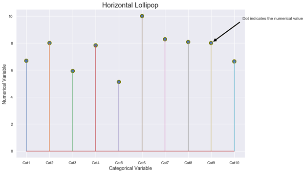
HOW: lollipop charts are two-dimensional with two axes: one axis shows categories or a time series, the other axis shows numerical values. Those numerical values are indicated by the position of the dot at the end of the line. A vertically oriented LC displays the categorical variable on the y-axis whilst a horizontally oriented LC displays it on the x-axis. Figure 2 shows a schematic diagram of a horizontal LC where the dots at the end of the thin lines indicate the numerical value for each category. With Matplotlib, you must use the stem function to draw a horizontal lollipop. The stem function plots vertical lines from a baseline to the y-coordinate and places a marker at the top (#2).
HOW:棒棒糖圖表是帶有兩個軸的二維圖:一個軸顯示類別或時間序列,另一個軸顯示數值。 這些數值由點在行尾的位置表示。 垂直方向的LC在y軸上顯示類別變量,而水平方向的LC在x軸上顯示類別變量。 圖2顯示了水平LC的示意圖,其中細線末端的點表示每個類別的數值。 使用Matplotlib時 ,必須使用主干功能繪制水平棒棒糖。 干功能繪制從基線到y坐標的垂直線,并將標記放在頂部(#2)。
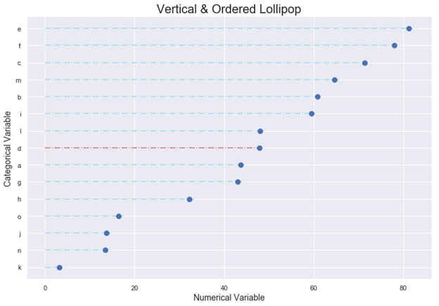
LCs are a nice alternative for rankings. The standard procedure is to arrange the categories in decreasing order and represent them vertically. With Matplotlib, you must use in combination the functions hlines and plot to draw a vertical lollipop. hlines draw horizontal lines at each y from the scalars xmin to xmax (#3). There are several possible markers for the function plot but we suggest using the classic circle symbol, as shown in the figures of this article.
LC是排名的不錯選擇。 標準程序是按降序排列類別并垂直表示它們。 使用Matplotlib時 ,必須結合使用hlines和plot功能繪制垂直棒棒糖。 hlines在標量xmin到xmax (#3)的每個y處繪制水平線。 該功能圖可能有幾種標記,但是我們建議使用經典的圓形符號,如本文中的圖所示。
You must always start the numerical axis at 0: if the lines are truncated, the actual value is not properly reflected. Remember that our sight is very sensitive to differences in length when trying to compare data. We inevitably distort the visual if we modify the baseline. If one of the variables is time (years, months, days, hours), always set it on the horizontal axis. Time always runs from left to right and never from top to bottom.
您必須始終將數字軸從0開始:如果直線被截斷,則不能正確反映實際值。 請記住,在嘗試比較數據時,我們的視線對長度的差異非常敏感。 如果我們修改基線,不可避免地會扭曲視覺效果。 如果變量之一是時間(年,月,日,小時),請始終在水平軸上進行設置。 時間總是從左到右,而不是從上到下。
LCs are equivalent to bar charts, but this equivalence is only valid for standard bar charts; do not try to extend it to Stacked, Clustered, or Overlapping Bar Graphs (#4, #5).
LC等效于條形圖,但是這種等效僅對標準條形圖有效; 不要嘗試將其擴展到堆積,聚集或重疊的條形圖(#4,#5)。
LCs were the subject of an interesting debate, both on a theoretical and conceptual level, between two data visualization heavyweights: Stephen Few and Albert Cairo (#6). Few through the sarcastic title “Lollipop Charts: “Who Loves You, Baby?” claimed that “LCs were inspired by the same thing that has inspired so many silly graphs: a desire for cuteness and novelty”. He added that the main problem with LCs was that: “The center of the circle at the end of the lollipop marks the value, but the location of the center is difficult to judge, making it imprecise compared to the straight edge of a bar, and half of the circle extends beyond the value that it represents, making it inaccurate”.
在兩個數據可視化重量級人物: Stephen Few和Albert Cairo (#6)之間,LC在理論和概念上都引起了有趣的爭論。 諷刺的標題“棒棒糖排行榜:“誰愛你,寶貝?” 聲稱“ LC的靈感來自啟發了許多愚蠢圖表的同一事物:對可愛和新穎的渴望”。 他補充說,液相色譜的主要問題是:“棒棒糖末端的圓心標記了該值,但是中心位置很難判斷,與條形的直邊相比,它不精確,圓的一半超出了它所代表的值,因此不準確。”
For his part, Cairo came out in defense of the charts indicating that: “I believe that lollipops have their uses. Bar graphs with more than, say, 8 or 9 bars, often look busy and clunky. Lollipop graphs may solve that problem by increasing the amount of white space in between bars significantly.” He proposed as a solution to reduce the size of the circles or even mark the numerical value with the upper point of the circle instead.
就開羅而言,他捍衛了圖表,表明:“我相信棒棒糖有其用途。 條形圖超過8個或9個,通常看起來很忙且笨拙。 棒棒糖圖可以通過大大增加條形圖之間的空白空間來解決該問題。” 他提出了一種解決方案,以減小圓的大小,甚至用圓的上點標記數值。
Eli Holder in a very interesting article published in Nightingale (#7) with the title: “Settling the Debate: Bars vs. Lollipops (vs. Dot Plots)” described an experiment to shed some light about: “How do lollipop charts affect readers’ comprehension? How much of our epistemic responsibility are we sacrificing for a playful aesthetic?” Finally, he concluded that the results of the experiments show no significant differences between Bar and Lollipop graphs and they led to roughly equal accuracy and equal response times. In the end, LCs provide a nice minimalistic visualization of the data and they should be used exactly in the same situation than a bar graph.
Eli Holder在Nightingale(#7)上發表的一篇非常有趣的文章中,標題為:“解決辯論:酒吧與棒棒糖(vs.點圖)”,該實驗揭示了一些有關以下內容的實驗:“棒棒糖圖表如何影響讀者理解力? 為了一種有趣的審美觀,我們犧牲了多少認知責任?” 最后,他得出結論,實驗結果表明Bar和Lollipop圖之間沒有顯著差異,并且導致大致相等的精度和相等的響應時間。 最后,LC提供了很好的數據的簡約可視化,應該在與條形圖完全相同的情況下使用它們。
棒棒糖講故事 (Storytelling with Lollipops)
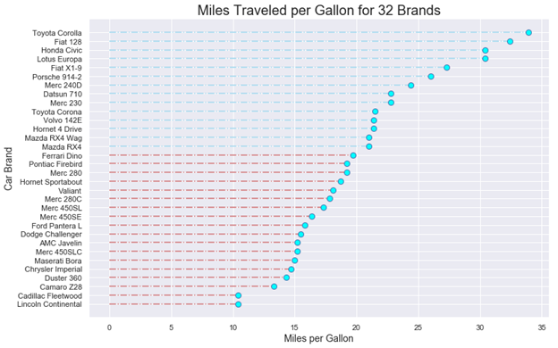
1.- Fuel Consumption with the mtcars dataset: Human activities have increased carbon dioxide emissions (CO2) and other greenhouse gases (GHC), driving up temperatures. Most man-made emissions of CO2 come from burning fossil fuels. GHG emissions from transportation account for about 28 percent of total U.S. greenhouse gas emissions, making it the largest contributor of the USA (#8). The United States Environmental Protection Agency had developed a national program for GHG and fuel economy standards for light-duty vehicles (passenger cars and trucks).
1.- mtcars數據集的燃料消耗 :人類活動增加了二氧化碳排放量(CO2)和其他溫室氣體(GHC),從而提高了溫度。 大多數人為排放的二氧化碳來自燃燒化石燃料。 運輸產生的溫室氣體排放量約占美國溫室氣體總排放量的28%,是美國的最大貢獻者(排名第8)。 美國環境保護署已經制定了一項針對輕型車輛(客車和卡車)的溫室氣體和燃油經濟性標準的國家計劃。
Previous studies on fuel consumption were based on Motor Trend Car Road Tests through the mtcars dataset. Data were extracted from the 1974 Motor Trend US magazine, and comprises fuel consumption and 10 aspects of automobile design and performance for 32 automobiles (1973–74 models). The following LC indicates miles traveled per gallon consumed for 32 car brands. Blue dash-dotted lines on the top correspond to those vehicles whose consumption was lower than the average (20.09 mpg) while the red dash-dotted lines correspond to those vehicles whose consumption was higher than the average. Clearly, a lollipop chart is better than a bar graph for comparing such a large number of different categories.
先前的油耗研究基于mtcars數據集的Motor Trend汽車路測 。 數據摘自1974年《美國汽車趨勢》雜志,其中包括油耗以及32輛汽車(1973–74年型號)的汽車設計和性能的10個方面。 以下LC表示32個汽車品牌每加侖消耗的行駛里程。 頂部的藍色虛線表示那些消耗量低于平均值(20.09 mpg)的車輛,而紅色虛線表示那些消耗量高于平均值的車輛。 顯然,棒棒糖圖表比條形圖更好地比較了如此眾多的不同類別。
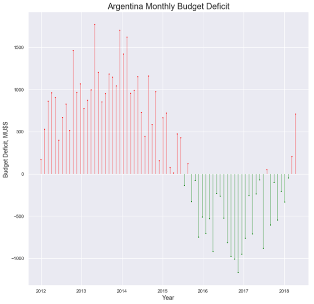
2.Argentina′s Government Budget: A Government Budget is an itemized accounting of the payments received by government (taxes and other fees) and the payments made by government (purchases and transfer payments). A budget deficit occurs when a government spends more money than it takes in. The opposite of a budget deficit is a budget surplus.
2. 阿根廷政府預算 :政府預算是對政府收到的付款(稅款和其他費用)和政府付款(購買和轉移付款)的逐項核算。 當政府的支出超過收入時,就會出現預算赤字。與預算赤字相反的是預算盈余。
Argentina grapples with one of the world’s highest inflation rates due to its recurrent government budget deficit. The next figure shows the country′s monthly budget deficit for the 2012–2018 period. Now, a lollipop chart allows us to follow the budget pattern over an extended period of time in an aesthetically pleasing way. As stated above, time runs from left to right on the horizontal axis.
由于政府經常性預算赤字,阿根廷努力應對世界上通貨膨脹率最高的國家之一。 下圖顯示了該國2012-2018年期間的每月預算赤字。 現在,棒棒糖圖表可讓我們以美觀的方式在很長一段時間內遵循預算模式。 如上所述,時間在水平軸上從左到右。
IN SUMMARY: used exactly in the same situation than a standard bar chart, lollipop charts encode numerical values in the same way: the length of the lines and the location of the dots at the end of the lines are equivalent to the length or height of horizontal or vertical rectangular bars. Lollipop Charts are preferred to bar charts when you are dealing with a large number of similar numerical values.
總結:在與標準條形圖完全相同的情況下使用,棒棒糖圖以相同的方式對數值進行編碼:線條的長度和線條末端的點的位置等于線條的長度或高度水平或垂直矩形條。 當您處理大量相似的數值時,棒棒糖圖表優于條形圖。
If you find this article of interest, please read my previous:
如果您發現這篇文章感興趣,請閱讀我以前的文章:
“Bubble Charts, Why & How, Storytelling with Bubbles”
“氣泡圖,為什么和如何,用氣泡講故事”
“Parallel Coordinates Plots, Why & How, Storytelling with Parallels”
“平行坐標圖,為什么和如何,平行講故事”
#1: https://en.wikipedia.org/wiki/Moir%C3%A9_pattern
#1: https : //en.wikipedia.org/wiki/Moir%C3%A9_pattern
#2: https://matplotlib.org/3.1.1/gallery/lines_bars_and_markers/stem_plot.html
#2: https : //matplotlib.org/3.1.1/gallery/lines_bars_and_markers/stem_plot.html
#3: https://matplotlib.org/3.1.1/api/_as_gen/matplotlib.pyplot.hlines.html
#3: https : //matplotlib.org/3.1.1/api/_as_gen/matplotlib.pyplot.hlines.html
#4: Darío Weitz, “Stacked Bar Graphs, Why & How, Storytelling & Warnings”https://towardsdatascience.com/stacked-bar-graphs-why-how-f1b68a7454b7
#4:DaríoWeitz,“堆疊條形圖,為什么和如何操作,講故事和警告” https://towardsdatascience.com/stacked-bar-graphs-why-how-f1b68a7454b7
#5: Darío Weitz, “Clustered & Overlapped Bar Charts, Why & How”https://towardsdatascience.com/clustered-overlapped-bar-charts-94f1db93778e
#5:DaríoWeitz,“成組的和重疊的條形圖,為什么和如何做”, https://towardsdatascience.com/clustered-overlapped-bar-charts-94f1db93778e
#6: Stephen Few, “Lollipop Charts: “Who Loves You, Baby?https://www.perceptualedge.com/blog/?p=2642
#6:Stephen Few,“棒棒糖排行榜:”誰愛你,寶貝? https://www.perceptualedge.com/blog/?p=2642
#7: Eli Holder, https://medium.com/nightingale/bar-graphs-vs-lollipop-charts-vs-dot-plots-experiment-ba0bd8aad5d6
#7:Eli Holder, https ://medium.com/nightingale/bar-graphs-vs-lollipop-charts-vs-dot-plots-experiment-ba0bd8aad5d6
#8: https://www.epa.gov/transportation-air-pollution-and-climate-change/carbon-pollution-transportation
#8: https : //www.epa.gov/transportation-air-pollution-and-climate-change/carbon-pollution-transportation
翻譯自: https://towardsdatascience.com/lollipop-charts-2f748b90f6f0
棒棒糖 宏
本文來自互聯網用戶投稿,該文觀點僅代表作者本人,不代表本站立場。本站僅提供信息存儲空間服務,不擁有所有權,不承擔相關法律責任。 如若轉載,請注明出處:http://www.pswp.cn/news/391066.shtml 繁體地址,請注明出處:http://hk.pswp.cn/news/391066.shtml 英文地址,請注明出處:http://en.pswp.cn/news/391066.shtml
如若內容造成侵權/違法違規/事實不符,請聯系多彩編程網進行投訴反饋email:809451989@qq.com,一經查實,立即刪除!相關文章

ubuntu上如何安裝tomcat
)
leetcode 1734. 解碼異或后的排列(位運算)

ZooKeeper3.4.5-最基本API開發

字符串轉換整數python_將Python字符串轉換為Int:如何在Python中將字符串轉換為整數

理解Java里面的必檢異常和非必檢異常

使用vim打開文件的16進制形式,編輯和全文替換

nlp自然語言處理_不要被NLP Research淹沒


js打開飛行模式_什么是飛行模式? 它有什么作用?什么時候應該打開它?

在Java 里面怎么比較字符串
)
中小型研發團隊架構實踐三要點(轉自原攜程架構師張輝清)

時間序列預測 預測時間段_應用時間序列預測:美國住宅

zabbix之web監控

如何使用Webpack在HTML,CSS和JavaScript之間共享變量

Java中獲得了方法名稱的字符串,怎么樣調用該方法

經驗主義 保守主義_為什么我們需要行動主義-始終如此。


redis介紹以及安裝

java python算法_用Java,Python和C ++示例解釋的搜索算法
