數據科學 (Data Science)
CitiBike is New York City’s famous bike rental company and the largest in the USA. CitiBike launched in May 2013 and has become an essential part of the transportation network. They make commute fun, efficient, and affordable — not to mention healthy and good for the environment.
CitiBike是紐約市著名的自行車租賃公司,也是美國最大的自行車租賃公司。 花旗自行車(CitiBike)于2013年5月推出,現已成為交通網絡的重要組成部分。 它們使通勤變得有趣,高效且負擔得起,更不用說健康且對環境有益。
I have got the data of CityBike riders of June 2013 from Kaggle. I will walk you through the complete exploratory data analysis answering some of the questions like:
我從Kaggle獲得了2013年6月的CityBike騎手數據。 我將引導您完成完整的探索性數據分析,回答一些問題,例如:
- Where do CitiBikers ride? CitiBikers騎在哪里?
- When do they ride? 他們什么時候騎?
- How far do they go? 他們走了多遠?
- Which stations are most popular? 哪個電臺最受歡迎?
- What days of the week are most rides taken on? 大多數游樂設施在一周的哪幾天?
- And many more 還有很多
Key learning:
重點學習:
I have used many parameters to tweak the plotting functions of Matplotlib and Seaborn. It will be a good read to learn them practically.
我使用了許多參數來調整Matplotlib和Seaborn的繪圖功能。 實際學習它們將是一本好書。
Note:
注意:
This article is best viewed on a larger screen like a tablet or desktop. At any point of time if you find difficulty in understanding anything I will be dropping the link to my Kaggle notebook at the end of this article, you can drop your quaries in the comment section.
最好在平板電腦或臺式機等較大的屏幕上查看本文。 在任何時候,如果您發現難以理解任何內容,那么在本文結尾處,我都會刪除指向我的Kaggle筆記本的鏈接,您可以在評論部分中刪除您的查詢。
讓我們開始吧 (Let’s get?started)
Importing necessary libraries and reading data.
導入必要的庫并讀取數據。
#importing necessary libraries
import numpy as np
import pandas as pd
import matplotlib.pyplot as plt
import seaborn as sns#setting plot style to seaborn
plt.style.use('seaborn')#reading data
df = pd.read_csv('../input/citibike-system-data/201306-citibike-tripdata.csv')
df.head()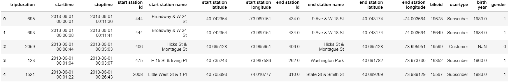
Let’s get some more information on the data.
讓我們獲取有關數據的更多信息。
df.info()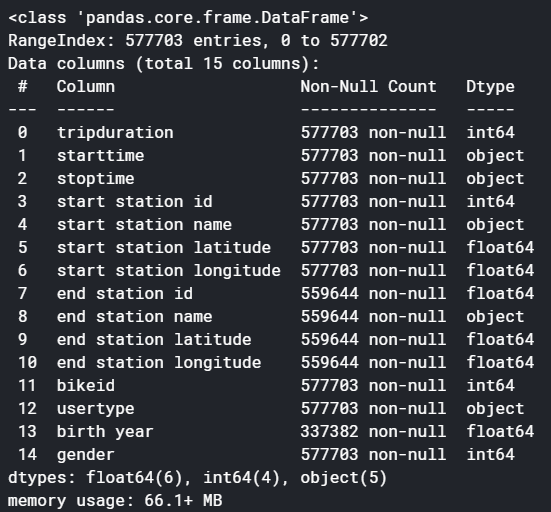
#sum of missing values in each column
df.isna().sum()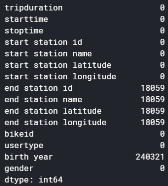
We have whooping 5,77,703 rows to crunch and 15 columns. Also, quite a bit of missing values. Let’s deal with missing values first.
我們有多達5,77,703行要緊縮和15列。 此外,還有很多缺失值。 讓我們先處理缺失值。
處理缺失值 (Handling missing values)
Let’s first see the percentage of missing values which will help us decide whether to drop them or no.
首先讓我們看看缺失值的百分比,這將有助于我們決定是否刪除它們。
#calculating the percentage of missing values
#sum of missing value is the column divided by total number of rows in the dataset multiplied by 100data_loss1 = round((df['end station id'].isna().sum()/df.shape[0])*100)
data_loss2 = round((df['birth year'].isna().sum()/df.shape[0])*100)print(data_loss1, '% of data loss if NaN rows of end station id, \nend station name, end station latitude and end station longitude dropped.\n')
print(data_loss2, '% of data loss if NaN rows of birth year dropped.')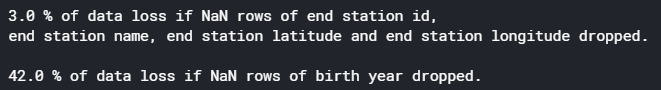
We can not afford to drop the missing valued rows of ‘birth year’. Hence, drop the entire column ‘birth year’ and drop missing valued rows of ‘end station id’,‘ end station name’,‘ end station latitude’, and ‘end station longitude’. Fortunately, all the missing values in these four rows (end station id, end station name, end station latitude, and end station longitude) are on the exact same row, so dropping NaN rows from all four rows will still result in only 3% data loss.
我們不能舍棄丟失的“出生年份”有價值的行。 因此,刪除整列“出生年”并刪除“終端站ID”,“終端站名稱”,“終端站緯度”和“終端站經度”的缺失值行。 幸運的是,這四行中的所有缺失值(終端站ID,終端站名稱,終端站緯度和終端站經度)都在同一行上,因此從所有四行中刪除NaN行仍將僅導致3%數據丟失。
#dropping NaN values
rows_before_dropping = df.shape[0]
#drop entire birth year column.
df.drop(’birth year’,axis=1, inplace=True)#Now left with end station id, end station name, end station latitude and end station longitude
#these four columns have missing values in exact same row,
#so dropping NaN from all four columns will still result in only 3% data loss
df.dropna(axis=0, inplace=True)
rows_after_dropping = df.shape[0]#total data loss
print('% of data lost: ',((rows_before_dropping-rows_after_dropping)/rows_before_dropping)*100)#checking for NaN
df.isna().sum()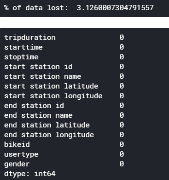
讓我們看看性別在談論我們的數據 (Let’s see what gender talks about our data)
#plotting total no.of males and females
splot = sns.countplot('gender', data=df)#adding value above each bar:Annotation
for p in splot.patches:
    an = splot.annotate(format(p.get_height(), '.2f'),
               #bar value is nothing but height of the bar
               (p.get_x() + p.get_width() / 2., p.get_height()),
                ha = 'center',
                va = 'center',
                xytext = (0, 10),
                textcoords = 'offset points')
    an.set_size(20)#test size
splot.axes.set_title("Gender distribution",fontsize=30)
splot.axes.set_xlabel("Gender",fontsize=20)
splot.axes.set_ylabel("Count",fontsize=20)#adding x tick values
splot.axes.set_xticklabels(['Unknown', 'Male', 'Female'])
plt.show()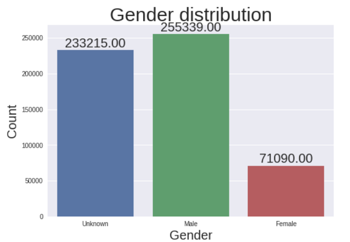
We can see more male riders than females in New York City but due to a large number of unknown gender, we cannot get to any concrete conclusion. Filling unknown gender values is possible but we are not going to do it considering riders did not choose to disclose their gender.
在紐約市,我們看到男性騎手的人數多于女性騎手,但由于性別眾多,我們無法得出任何具體結論。 可以填寫未知的性別值,但考慮到車手沒有選擇公開性別,我們不會這樣做。
訂戶與客戶 (Subscribers vs Customers)
Subscribers are the users who bought the annual pass and customers are the once who bought either a 24-hour pass or a 3-day pass. Let’s see what the riders choose the most.
訂戶是購買年度通行證的用戶,客戶是購買24小時通行證或3天通行證的用戶。 讓我們來看看騎手最喜歡的東西。
user_type_count = df[’usertype’].value_counts()
plt.pie(user_type_count.values,
       labels=user_type_count.index,
       autopct=’%1.2f%%’,
       textprops={’fontsize’: 15} )
plt.title(’Subcribers vs Customers’, fontsize=20)
plt.show()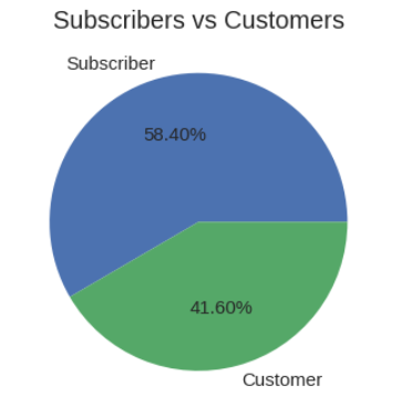
We can see there is more number of yearly subscribers than 1-3day customers. But the difference is not much, the company has to focus on converting customers to subscribers with some offers or sale.
我們可以看到,每年訂閱者的數量超過1-3天的客戶。 但是差異并不大,該公司必須專注于將客戶轉換為具有某些要約或銷售的訂戶。
騎自行車通常需要花費幾個小時 (How many hours do rides use the bike typically)
We have a column called ‘timeduration’ which talks about the duration each trip covered which is in seconds. Firstly, we will convert it to minutes, then create bins to group the trips into 0–30min, 30–60min, 60–120min, 120min, and above ride time. Then, let’s plot a graph to see how many hours do rides ride the bike typically.
我們有一個名為“ timeduration”的列,它討論了每次旅行的持續時間,以秒為單位。 首先,我們將其轉換為分鐘,然后創建垃圾箱,將行程分為0–30分鐘,30–60分鐘,60–120分鐘,120分鐘及以上行駛時間。 然后,讓我們繪制一個圖表,看看騎車通常需要騎幾個小時。
#converting trip duration from seconds to minuits
df['tripduration'] = df['tripduration']/60#creating bins (0-30min, 30-60min, 60-120min, 120 and above)
max_limit = df['tripduration'].max()
df['tripduration_bins'] = pd.cut(df['tripduration'], [0, 30, 60, 120, max_limit])sns.barplot(x='tripduration_bins', y='tripduration', data=df, estimator=np.size)
plt.title('Usual riding time', fontsize=30)
plt.xlabel('Trip duration group', fontsize=20)
plt.ylabel('Trip Duration', fontsize=20)
plt.show()
There are a large number of riders who ride for less than half an hour per trip and most less than 1 hour.
有大量的騎手每次騎行少于半小時,最多少于1小時。
相同的開始和結束位置VS不同的開始和結束位置 (Same start and end location VS different start and end location)
We see in the data there are some trips that start and end at the same location. Let’s see how many.
我們在數據中看到一些行程在同一位置開始和結束。 讓我們看看有多少。
#number of trips that started and ended at same station
start_end_same = df[df['start station name'] == df['end station name']].shape[0]#number of trips that started and ended at different station
start_end_diff = df.shape[0]-start_end_sameplt.pie([start_end_same,start_end_diff],
        labels=['Same start and end location',
        'Different start and end location'],
        autopct='%1.2f%%',
        textprops={'fontsize': 15})
plt.title('Same start and end location vs Different start and end location', fontsize=20)
plt.show()
本月的騎行方式 (Riding pattern of the month)
This part is where I have spent a lot of time and effort. The below graph talks a lot. Technically there is a lot of coding. Before looking at the code I will give an overview of what we are doing here. Basically, we are plotting a time series graph to see the trend of the number of rides taken per day and the trend of the total number of duration the bikes were in use per day. Let’s look at the code first then I will break it down for you.
這是我花費大量時間和精力的地方。 下圖很講究。 從技術上講,有很多編碼。 在查看代碼之前,我將概述我們在這里所做的事情。 基本上,我們正在繪制一個時間序列圖,以查看每天騎行次數的趨勢以及每天使用自行車的持續時間總數的趨勢。 讓我們先看一下代碼,然后我將為您分解代碼。
#converting string to datetime object
df['starttime']= pd.to_datetime(df['starttime'])#since we are dealing with single month, we grouping by days
#using count aggregation to get number of occurances i.e, total trips per day
start_time_count = df.set_index('starttime').groupby(pd.Grouper(freq='D')).count()#we have data from July month for only one day which is at last row, lets drop it
start_time_count.drop(start_time_count.tail(1).index, axis=0, inplace=True)#again grouping by day and aggregating with sum to get total trip duration per day
#which will used while plotting
trip_duration_count = df.set_index('starttime').groupby(pd.Grouper(freq='D')).sum()#again dropping the last row for same reason
trip_duration_count.drop(trip_duration_count.tail(1).index, axis=0, inplace=True)#plotting total rides per day
#using start station id to get the count
fig,ax=plt.subplots(figsize=(25,10))
ax.bar(start_time_count.index, 'start station id', data=start_time_count, label='Total riders')
#bbox_to_anchor is to position the legend box
ax.legend(loc ="lower left", bbox_to_anchor=(0.01, 0.89), fontsize='20')
ax.set_xlabel('Days of the month June 2013', fontsize=30)
ax.set_ylabel('Riders',  fontsize=40)
ax.set_title('Bikers trend for the month June', fontsize=50)#creating twin x axis to plot line chart is same figure
ax2=ax.twinx()
#plotting total trip duration of all user per day
ax2.plot('tripduration', data=trip_duration_count, color='y', label='Total trip duration', marker='o', linewidth=5, markersize=12)
ax2.set_ylabel('Time duration',  fontsize=40)
ax2.legend(loc ="upper left", bbox_to_anchor=(0.01, 0.9), fontsize='20')ax.set_xticks(trip_duration_count.index)
ax.set_xticklabels([i for i in range(1,31)])#tweeking x and y ticks labels of axes1
ax.tick_params(labelsize=30, labelcolor='#eb4034')
#tweeking x and y ticks labels of axes2
ax2.tick_params(labelsize=30, labelcolor='#eb4034')plt.show()
You might have understood the basic idea by reading the comments but let me explain the process step-by-step:
您可能通過閱讀評論已經了解了基本思想,但讓我逐步解釋了該過程:
- The date-time is in the string, we will convert it into DateTime object. 日期時間在字符串中,我們將其轉換為DateTime對象。
- Grouping the data by days of the month and counting the number of occurrences to plot rides per day. 將數據按每月的天數進行分組,并計算每天的出行次數。
- We have only one row with the information for the month of July. This is an outlier, drop it. 我們只有一行包含7月份的信息。 這是一個離群值,將其刪除。
- Repeat steps 2 and 3 but the only difference this time is we sum the data instead of counting to get the total time duration of the trips per day. 重復第2步和第3步,但是這次唯一的區別是我們對數據求和而不是進行計數以獲得每天行程的總持續時間。
- Plot both the data on a single graph using the twin axis method. 使用雙軸方法將兩個數據繪制在一個圖形上。
I have used a lot of tweaking methods on matplotlib, make sure to go through each of them. If any doubts drop a comment on the Kaggle notebook for which the link will be dropped at the end of this article.
我在matplotlib上使用了很多調整方法,請確保每種方法都要經過。 如果有任何疑問,請在Kaggle筆記本上發表評論,其鏈接將在本文結尾處刪除。
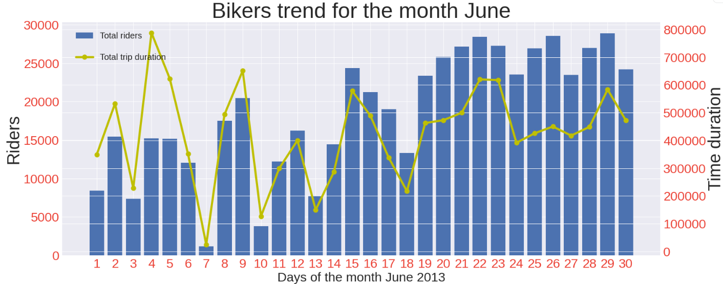
The number of riders increases considerably closing to the end of the month. There are negligible riders on the 1st Sunday of the month. The amount of time the bikers ride the bike decreases closing to the end of the month.
到月底,車手的數量大大增加。 每個月的第一個星期日的車手微不足道。 騎自行車的人騎自行車的時間減少到月底接近。
前10個出發站 (Top 10 start stations)
This is pretty straightforward, we get the occurrences of each start station using value_counts() and slice to get the first 10 values from it then plot the same.
這非常簡單,我們使用value_counts()和slice來獲取每個起始站點的出現,然后從中獲取前10個值,然后對其進行繪制。
#adding value above each bar:Annotation
for p in ax.patches:
    an = ax.annotate(format(p.get_height(), '.2f'),
                   (p.get_x() + p.get_width() / 2., p.get_height()),
                   ha = 'center',
                   va = 'center',
                   xytext = (0, 10),
                   textcoords = 'offset points')
    an.set_size(20)
ax.set_title("Top 10 start locations in NY",fontsize=30)
ax.set_xlabel("Station name",fontsize=20)#rotating the x tick labels to 45 degrees
ax.set_xticklabels(top_start_station.index, rotation = 45, ha="right")
ax.set_ylabel("Count",fontsize=20)
#tweeking x and y tick labels
ax.tick_params(labelsize=15)
plt.show()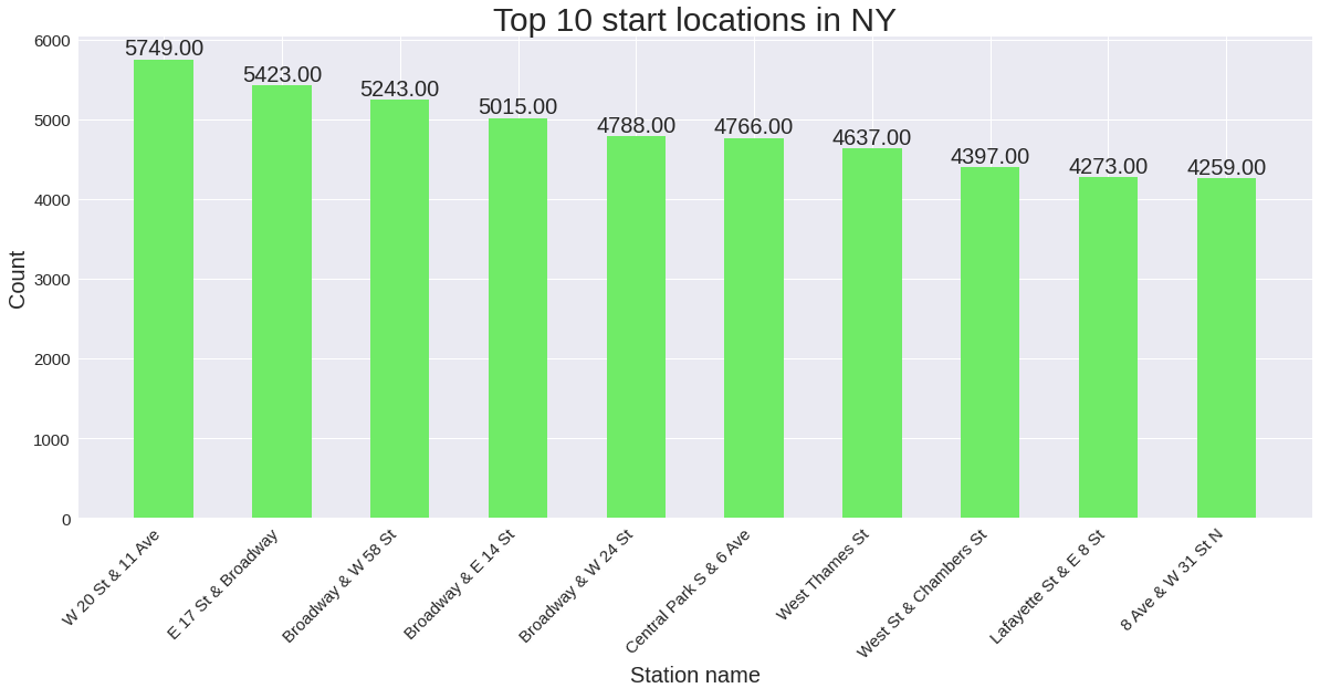
十佳終端站 (Top 10 end stations)
#top 10 end station
top_end_station = df['end station name'].value_counts()[:10]fig,ax=plt.subplots(figsize=(20,8))
ax.bar(x=top_end_station.index, height=top_end_station.values, color='#edde68', width=0.5)#adding value above each bar:Annotation
for p in ax.patches:
    an = ax.annotate(format(p.get_height(), '.2f'),
                   (p.get_x() + p.get_width() / 2., p.get_height()),
                   ha = 'center',
                   va = 'center',
                   xytext = (0, 10),
                   textcoords = 'offset points')
    an.set_size(20)
ax.set_title("Top 10 end locations in NY",fontsize=30)
ax.set_xlabel("Street name",fontsize=20)#rotating the x tick labels to 45 degrees
ax.set_xticklabels(top_end_station.index, rotation = 45, ha="right")
ax.set_ylabel("Count",fontsize=20)
#tweeking x and y tick labels
ax.tick_params(labelsize=15)
plt.show()
翻譯自: https://medium.com/towards-artificial-intelligence/analyzing-citibike-data-eda-e657409f007a
本文來自互聯網用戶投稿,該文觀點僅代表作者本人,不代表本站立場。本站僅提供信息存儲空間服務,不擁有所有權,不承擔相關法律責任。 如若轉載,請注明出處:http://www.pswp.cn/news/389397.shtml 繁體地址,請注明出處:http://hk.pswp.cn/news/389397.shtml 英文地址,請注明出處:http://en.pswp.cn/news/389397.shtml
如若內容造成侵權/違法違規/事實不符,請聯系多彩編程網進行投訴反饋email:809451989@qq.com,一經查實,立即刪除!相關文章

jvm感知docker容器參數

Flask之flask-script 指定端口
和下采樣(縮小圖像)(最鄰近插值和雙線性插值的理解和實現))
上采樣(放大圖像)和下采樣(縮小圖像)(最鄰近插值和雙線性插值的理解和實現)

r語言繪制雷達圖_用r繪制雷達蜘蛛圖

java 分裂數字_分裂的補充:超越數字,打印物理可視化

Java 集合 之 Vector

前端電子書單大分享~~~
)
結構化數據建模——titanic數據集的模型建立和訓練(Pytorch版)

比賽,幸福度_幸福與生活滿意度

帶有postgres和jupyter筆記本的Titanic數據集

Django學習--數據庫同步操作技巧

《20天吃透Pytorch》Pytorch自動微分機制學習

React 新 Context API 在前端狀態管理的實踐

機器學習模型 非線性模型_機器學習模型說明

5分鐘內完成胸部CT掃描機器學習

Pytorch高階API示范——線性回歸模型

vue 上傳圖片限制大小和格式

作業要求 20181023-3 每周例行報告

算命數據_未來的數據科學家或算命精神向導
