uber 數據可視化
Perhaps, dear reader, you are too young to remember that before, the only way to request a particular transport service such as a taxi was to raise a hand to make a signal to an available driver, who upon seeing you would stop if he was not busy to transport you to your destination, not without first asking how far you go, to assess whether or not to take the task. And without stars with which to let the driver know your satisfaction as a passenger with the trip.
親愛的讀者,也許您還太年輕,以至于您以前還不記得要求出租車之類的特殊運輸服務的唯一方法是舉手向可用的駕駛員發出信號,如果您看到他,他會停下來。不忙于將您運送到目的地,而不是首先詢問您要走多遠,以評估是否要執行任務。 而且沒有星星,可以讓駕駛員知道您對這次旅行的滿意程度。
Just seven years ago, at least in Mexico before Uber’s arrival, that’s how things were. The arrival of the most famous Mobility-as-a-service App in the world changed many of our habits, opening the market, and great opportunities for many.
就在七年前,至少在Uber到達墨西哥之前,情況就是這樣。 世界上最著名的移動即服務應用程序的到來改變了我們的許多習慣,打開了市場,并為許多人帶來了巨大的機會。
Rarely do we stop for a moment to analyze our consumption habits and answer questions such as How much have I spent? What places do I go to on Uber are the most frequent? With the distance traveled until today, could I have reached China? Uber, like many other applications, offers you the possibility of requesting a copy of your data, which includes the complete history of your trips. We will take advantage of this to analyze and visualize some interesting personal data.
我們很少停下來分析一下我們的消費習慣并回答一些問題,例如我花了多少錢? 我在Uber上最常去哪些地方? 到今天為止,我能到達中國嗎? 與許多其他應用程序一樣,Uber為您提供了請求數據副本的可能性,其中包括行程的完整歷史記錄。 我們將利用此優勢來分析和可視化一些有趣的個人數據。
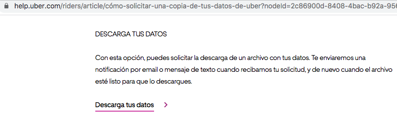
從哪里獲得我的數據的副本? (Where to get a copy of my data?)
You can request your copy from this URL which is the section of the official Uber help center and that talks about it: https://help.uber.com/riders/article/request-a-copy-of-your-uber-data?nodeId=2c86900d-8408–4bac-b92a-956d793acd11. At the bottom of that page, you have to click on the link that says “Download your data”
您可以從該URL(這是Uber官方幫助中心的一部分)中獲取有關副本的信息,該URL涉及該內容: https : //help.uber.com/riders/article/request-a-copy-of-your-uber- data?nodeId = 2c86900d-8408–4bac-b92a-956d793acd11 。 在該頁面底部,您必須點擊顯示“下載數據”的鏈接
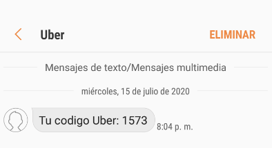
Clicking will redirect you to a new window to log in with your account. Also, Uber to make sure that you are requesting the data will send you an SMS to the phone number associated with your account, with a 4-digit code that you must enter to authenticate yourself. Once successfully authenticated you will now find a new button with the title “Request data” to which you must click.
單擊會將您重定向到新窗口,以使用您的帳戶登錄。 此外,Uber要確保您正在請求數據,將向您的帳戶關聯的電話號碼發送一條SMS,其中包含您必須輸入的4位數字以進行身份??驗證。 成功通過身份驗證后,您現在將找到一個標題為“請求數據”的新按鈕,您必須單擊該按鈕。

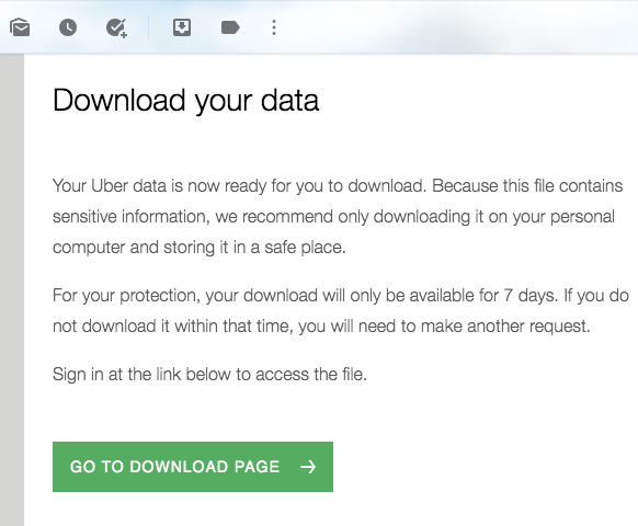
By clicking, Uber will be sending you an email notifying you that a copy of your data is being prepared and will be sent to you as requested. Approximately 12 to 24 hours later, a new email should be arriving inviting you to log in again to download your copy, in .zip format.
通過單擊,Uber將向您發送一封電子郵件,通知您正在準備數據副本,并將按要求發送給您。 大約12到24小時后,將會收到一封新電子郵件,邀請您再次登錄以下載.zip格式的副本。
資料讀取 (Data Reading)
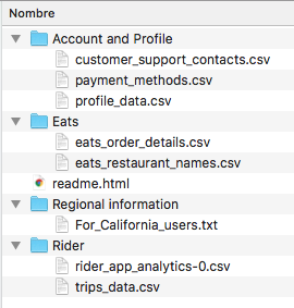
By unzipping the .zip file you will find a structure of files and folders. We are interested in the CSV file named “trips_data.csv”, contained in the “Rider” folder. This CSV file contains the data of your trips made since your first trip, until your last trip today. It will provide you with information such as the type of product (UberX VIP, UberX, Uber Eats, etc.), order status (Completed, Canceled, etc.), the fee paid, dates, latitudes and longitudes, distance traveled, among other data.
通過解壓縮.zip文件,您將找到文件和文件夾的結構。 我們對“ Rider”文件夾中包含的名為“ trips_data.csv”的CSV文件感興趣。 該CSV文件包含自您的第一次旅行到今天的最后一次旅行之間的旅行數據。 它將為您提供信息,例如產品類型(UberX VIP,UberX,Uber Eats等),訂單狀態(已完成,已取消等),所支付的費用,日期,緯度和經度,旅行距離,其他數據。
Now, you can create a new script in R to import and read the CSV file and work it to analyze and visualize some interesting data.
現在,您可以在R中創建一個新腳本,以導入和讀取CSV文件并對其進行分析和可視化一些有趣的數據。
# REQUIRED LIBRARIES
library(dygraphs)
library(tidyquant)
library(tidyverse)
library(dygraphs)
library(plyr)
library(quantmod)
library(ggthemes)
library(ggplot2)
library(RColorBrewer)
library(sp)
library(ggmap)
library(lubridate)
library(leaflet)
library(plotly)
library(dplyr)
library(mgsub)
library(xts)# DATA READING
myTrips <- read.csv("my_trips_uber_history.csv", stringsAsFactors = FALSE)myTrips$Request.Time <- as.Date(myTrips$Request.Time, "%Y-%m-%d")
myTrips$Year <- as.Date(cut(myTrips$Request.Time, breaks="month"))
各城市旅行時間表 (Trips timeline by City)
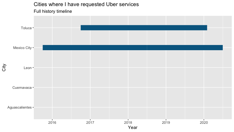
You can take a first look at the cities you’ve used Uber in, and explore how much you’ve traveled with Uber over time in each city, given the availability of the “City” variable in the CSV data file.
您可以首先查看使用過Uber的城市,并在CSV數據文件中提供“城市”變量的情況下,探索每個城市隨時間推移使用Uber的旅行次數。
# TRIPS TIMELINE BY CITY
timeline <- ggplot(myTrips, aes(Year, City))+
  geom_line(color = "#006790", size = 6) +
  labs(x= "Year", y= "City") +
  ggtitle("Cities where I have requested Uber services", "Full history timeline")
timeline
In my case, I can see that since 2015, when I started using the Uber app, the trips made in Mexico City (where I live) and Toluca (a place where I visit family regularly) stand out, compared to the rest of cities where I haven’t done more than a couple of trips.
以我為例,自2015年以來,當我開始使用Uber應用程序時,與其他城市相比,在墨西哥城(我居住的地方)和托盧卡(我經常拜訪家人的地方)進行的旅行脫穎而出在這里我只做了幾次旅行。
按城市劃分的Uber請求的最終狀態 (Final Status of Uber requests by City)
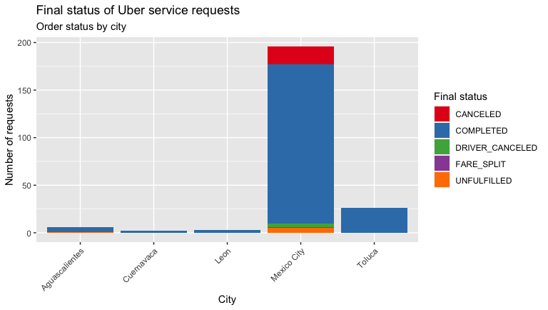
Another variable that we can collect is the final status of the requested order to Uber, identified as “Trip.or.Order.Status”. That is if it was canceled by you, or canceled by the driver, or the fare was divided, or the trip was completed. With which you can see if the number of times that the driver cancels is related to the city of origin, for example.
我們可以收集的另一個變量是向Uber請求的訂單的最終狀態,標識為“ Trip.or.Order.Status” 。 那是如果您取消了它,或者被駕駛員取消了,或者票價被分割了,或者旅程已經完成了。 例如,通過它您可以查看駕駛員取消的次數是否與原籍城市有關。
# FINAL STATUS OF THE ORDER
orderStatus<-ggplot(myTrips, aes(City,fill = Trip.or.Order.Status)) +
  labs(x = "City", y = "Number of requests") +
  ggtitle("Final status of Uber service requests", "Order status by city") +
  geom_bar() +
  theme(axis.text.x = element_text(angle = 45, hjust = 1)) +
  scale_fill_brewer(name = "Final status", palette="Set1")
orderStatus
You will get a plot similar to the following. From the outset in my case, I could not be very objective answering the previous question, because as you can see I don’t have at least a comparable quantity of trips per city.
您將獲得類似于以下內容的圖。 從我的案例開始,我就不能很客觀地回答上一個問題,因為如您所見,我每個城市的出行次數至少沒有可比性。
與產品類型相關的Uber請求的最終狀態 (The final status of Uber requests related to Product type)
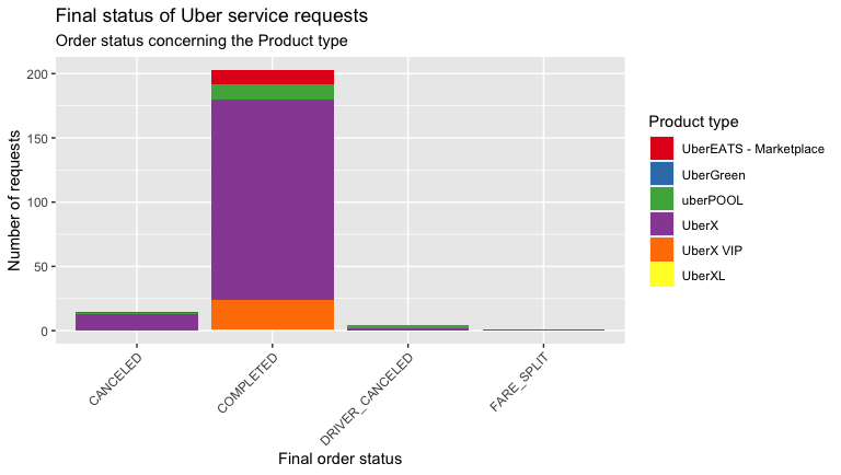
Uber, as you know, is characterized by having different product categories (UberX, VIP, Eats, etc.). You can also see the relationship between the final status of the service with the Product Type you requested. If your history is older than 4 years, you will surely find some inconsistencies in the column “Product.Type” as null, empty, or described as “All”. Or that the category “Pool” or others were named at some point with other variations. You have to regularize and homogenize this type of inconsistency first, before visualizing the data.
如您所知,Uber具有不同的產品類別(UberX,VIP,Eats等)。 您還可以查看服務的最終狀態與您請求的產品類型之間的關系。 如果您的歷史記錄已經超過4年,那么您肯定會在“ Product.Type”列中發現一些不一致的地方,它們為空,空或描述為“全部”。 或者,“ Pool”或其他類別在某些時候以其他變體命名。 在可視化數據之前,您必須首先對這種類型的不一致進行規范化和均質化。
# FINAL STATUS OF THE ORDER CONCERNING THE PRODUCT TYPE
productType =
  myTrips %>%
# HOMOGENIZING INCONSISTENCIES IN PRODUCT TYPE NAMES
  filter(Product.Type != "All" & Product.Type != "" )productType <- mgsub::mgsub(productType, c("uberX", "UberEATS Marketplace", "Pool"), c("UberX", "UberEATS - Marketplace", "uberPOOL"))
productType <- mgsub::mgsub(productType, c("uberPOOL: MATCHED"), c("uberPOOL"))orderProductType <- qplot(Trip.or.Order.Status, data=productType, geom="bar", fill= Product.Type) +
  scale_fill_brewer(name = "Product type", palette="Set1")+
  labs(x = "Final order status", y = "Number of requests") +
  ggtitle("Final status of Uber service requests", "Order status concerning the Product type") +
  theme(axis.text.x = element_text(angle = 45, hjust = 1))
orderProductType
In my case, it’s visible that I mostly travel on UberX, so I had more cancellations of my own. And that drivers have canceled more times in Uber Pool than in UberX. Does Uber Green still exist in your cities? In Mexico City, this category spent a short time operating. Having an eco-friendly category was not a bad idea.
就我而言,可見我大部分時間都是在UberX上旅行,所以我有更多的取消訂單。 與UberX相比,該司機在Uber Pool中取消的次數更多。 您的城市中仍然存在Uber Green嗎? 在墨西哥城,該類別花費??了很短的時間。 擁有環保類別并不是一個壞主意。
請求Uber的地點地圖 (Map of locations where Uber was requested)
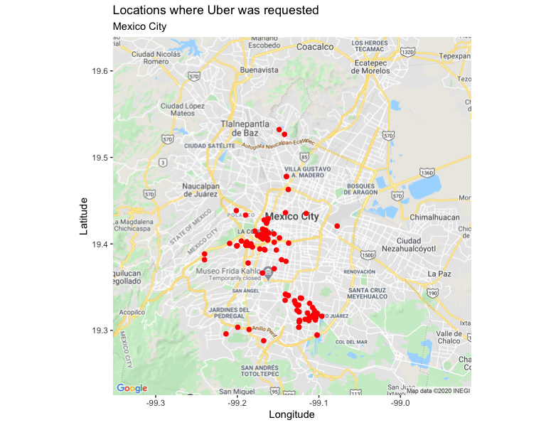
As I mentioned at the beginning, other variables that our history gives us are the longitudes and latitudes of each trip from where the service was requested. (identified as “Begin.Trip.Lng” and “Begin.Trip.Lat”). We can plot a map with “ggmap” to view locations by city. I will take my trips made in Mexico City, which is where I have a greater record of trips.
正如我在開始時提到的,我們的歷史記錄給我們的其他變量是請求服務的每次行程的經度和緯度。 (標識為“ Begin.Trip.Lng”和“ Begin.Trip.Lat” ))。 我們可以使用“ ggmap”繪制地圖,以按城市查看位置。 我將去墨西哥城旅行,那里是我旅行的最好記錄。
# MAP OF UBER REQUESTS IN MEXICO CITY
register_google(key = "YOUR_API_KEY")
MexicoCity <- subset(myTrips, City=="Mexico City")
ggmap(get_map(location = "Mexico City", zoom=11, maptype = "roadmap")) +
  geom_point(aes(Begin.Trip.Lng, Begin.Trip.Lat), data=MexicoCity, color = I('Red'), size = I(2), zoom=11) +
  labs(x = "Longitude", y = "Latitude") +
  ggtitle("Locations where Uber was requested", "Mexico City")
It’s important to register a Maps API Key as a string and replace the text “YOUR_API_KEY” in the code snippet, otherwise, you will encounter an error message like the following, which will not allow you to view the map:
將Maps API密鑰注冊為字符串并替換代碼段中的文本“ YOUR_API_KEY”非常重要,否則,您將遇到類似以下的錯誤消息,該錯誤消息將不允許您查看地圖:
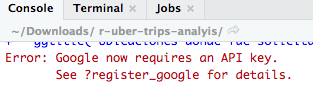
It’s very simple, you can obtain a Maps API Key by following the instructions that you will find in the official documentation: https://developers.google.com/maps/documentation/javascript/get-api-key
非常簡單,您可以按照官方文檔中的說明獲取Maps API密鑰: https : //developers.google.com/maps/documentation/javascript/get-api-key
Once you have added your Maps API Key and executed the code, you will then get a map like the following. In my case, it’s notable that I do not move much in the north of Mexico City.
添加了Maps API密鑰并執行了代碼后,您將獲得類似以下的地圖。 就我而言,值得注意的是,我在墨西哥城北部的移動不多。
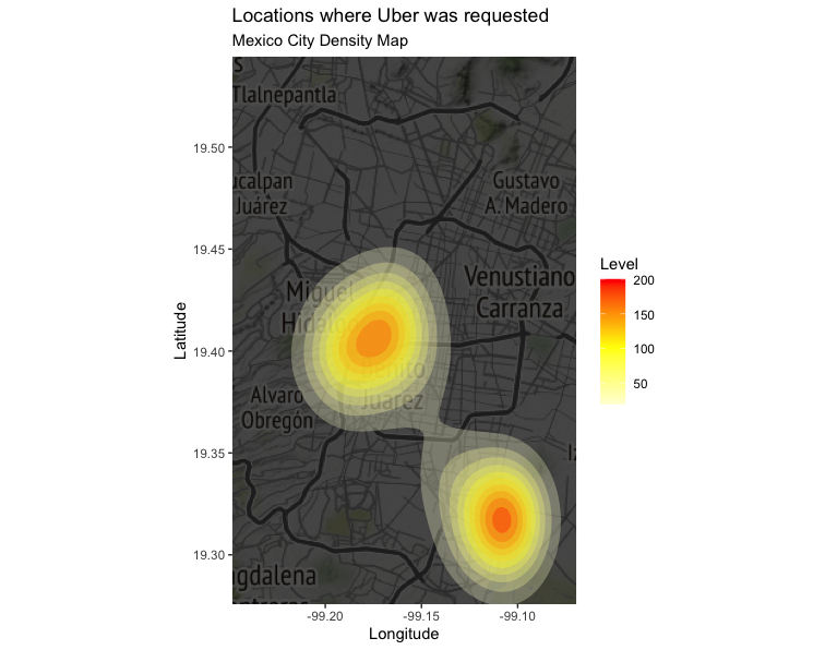
請求Uber的位置的密度圖 (Density map of locations from where Uber was requested)
Complementing the previously created map, we can also create a density map with “qmplot”.
作為對先前創建的貼圖的補充,我們還可以使用“ qmplot”創建一個密度貼圖。
# DENSITY MAP OF UBER REQUESTS IN MEXICO CITY
qmplot(Begin.Trip.Lng, Begin.Trip.Lat, data = MexicoCity, geom = "blank",
  zoom = 11, extent = "panel", maptype = "toner-background", darken = .7, legend = "right") +
  stat_density_2d(aes(fill = ..level..), geom = "polygon", alpha = .3, color = NA) +
  scale_fill_gradient2("Level", low = "white", mid = "yellow", high = "red", midpoint = 100) +
  labs(x = "Longitude", y = "Latitude") +
  ggtitle("Locations where Uber was requested", "Mexico City Density Map")
You will get the following plot. For example, in my case, it reflects a trend regarding the location of the place where I live and the office where I work.
您將獲得以下圖解。 例如,就我而言,它反映了我所居住的地方和我的辦公室位置的趨勢。
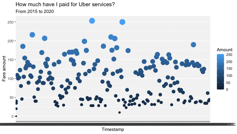
您使用Uber花了多少錢? (How much money have you spent using Uber?)
Perhaps this is another of the questions that you are asking yourself at the moment. You will find that you have the variable “Fare.Amount” with the rate paid for each service, in your local currency (in my case, in Mexican Pesos). You’ll also find the variable “Dropoff.Time” that indicates the exact timestamp the service ended at. We can visualize with a scatter graph how much of your valuable money you have paid Uber to bring you to and from your destinations.
也許這是您目前正在問自己的另一個問題。 您會發現,您有一個變量“ Fare.Amount”,其中包含為每種服務支付的費率,以您當地的貨幣(在我的情況下是墨西哥比索)。 您還將找到變量“ Dropoff.Time” ,該變量指示服務結束的確切時間戳。 我們可以通過散點圖直觀地顯示您已經付給Uber多少錢來帶您往返目的地。
# HOW MUCH I PAID TO UBER FROM 2015 TO 2020
totalPaid <- ggplot(myTrips, aes(x=Dropoff.Time, y=Fare.Amount, Fare.Currency = Fare.Currency)) +
  geom_point(aes(col=Fare.Amount, size=Fare.Amount)) +
  labs(col="Amount", size="size")+
  labs(x = "Timestamp", y = "Fare amount") +
  ggtitle("?How much have I paid for Uber services?", "From 2015 to 2020")+
  guides(size=FALSE)
totalPaid
Then you will get a plot like the following, wherein my case I can see that the maximum I have paid for a service is around $ 250 pesos, and the minimum is the large amount of $ 0 pesos, ha! (of course, the first time is free).
然后,您將得到如下圖所示的情節,在我的案例中,我可以看到我為一項服務支付的最高金額約為250比索,而最低金額為0美元比索,哈哈! (當然,第一次是免費的)。
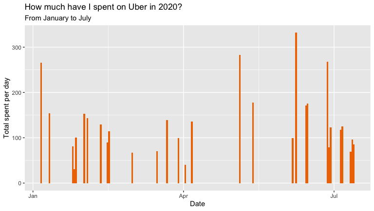
2020年您在Uber上花了多少錢? (How much money have you spent on Uber this 2020?)
This 2020 gave us a good punch with the arrival of the COVID-19, modifying our consumption habits of many things, and Uber is no exception. With the possibility of doing home office, you may see it reflected if, as in my case, and without a car, you avoided going out during the lockdown as much as possible. You can use a bar graph, to see in detail how much you have spent per day, so far this year.
2020年是COVID-19到來的一年,這改變了我們很多事情的消費習慣,Uber也不例外。 有可能進行家庭辦公,就像我的情況一樣,如果沒有汽車,您會盡可能地避免出門,這就像我的情況一樣。 您可以使用條形圖詳細了解今年到目前為止每天的花費。
# HOW MUCH I SPENT ON UBER IN 2020
myTrips2020 <- myTrips %>%
  filter(Request.Time >= as.Date("2020-01-01") & Request.Time <= as.Date("2020-07-13"))min(myTrips2020$Request.Time)
max(myTrips2020$Request.Time)paid2020 <- ggplot(myTrips2020, aes(Request.Time, Fare.Amount))+
  geom_bar(stat = 'identity', fill = 'darkorange2', width=1) +
  labs(x = "Date", y = "Total spent per day") +
  ggtitle("How much have I spent on Uber in 2020?", "From January to July")
paid2020
This year it’s visible that mainly in April when the health emergency was determined in the country where I live, I stopped using Uber mostly. You will get a plot like the following.
今年可見,主要是在4月,在我所居住的國家確定了醫療緊急情況后,我大部分時間停止使用Uber。 您將得到如下圖。
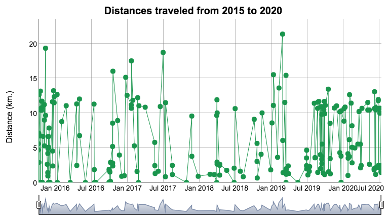
可視化您的行進距離 (Visualizing your traveled distances)
Finally, you can also view your distances traveled per trip. You will find for this the variable “Distance..miles”, which is responsible for recording the distance of the trip based on the local measurement system, that is, in my case, for example, where we operate with the decimal metric system, the distances are recorded in kilometers (km.). You can create a “dygraph” to look at the details.
最后,您還可以查看每次旅行的距離。 您會為此找到變量“ Distance..miles” ,該變量負責記錄基于本地測量系統的行程距離,例如,在我的情況下,例如,我們使用十進制度量系統,距離以公里(公里)記錄。 您可以創建一個“圖表”以查看詳細信息。
# TRAVELED DISTANCE
distanceRides <- read.csv("my_trips_uber_history.csv")
distanceRides$Request.Time <- ymd_hms(distanceRides$Request.Time)
distanceRides$Dropoff.Time <- ymd_hms(distanceRides$Dropoff.Time)
rides = xts(x=distanceRides$Distance..miles., order.by = distanceRides$Request.Time)dygraph(rides, main = "Distances traveled from 2015 to 2020") %>%
  dyOptions(drawPoints = TRUE, pointSize = 5, colors="#1a954d") %>%
  dyRangeSelector() %>%
  dyAxis("y", label= "Distance (km.)") %>%
  dyHighlight(highlightCircleSize = 0.5,
              highlightSeriesBackgroundAlpha = 1)
You will get an interactive plot like the following, wherein my case, I can see that the maximum distance in a single trip has been 21 km.
您將獲得如下所示的交互式圖表,在我的案例中,我可以看到單程最大距離為21 km。
Thanks for your kind reading. In the same way, as with all my articles, I share the plots generated with “plotly” in a “flexdashboard” that I put together: https://rpubs.com/cosmoduende/uber-trips-analyisis
感謝您的閱讀。 以同樣的方式,就像我所有的文章一樣,我在“ flexdashboard”中共享由“ plotly”生成的圖: https : //rpubs.com/cosmoduende/uber-trips-analyisis
And here you can also find the complete code: https://github.com/cosmoduende/r-uber-trips-analyisis
在這里您還可以找到完整的代碼: https : //github.com/cosmoduende/r-uber-trips-analyisis
I thank you for having come this far, I wish you have a happy analysis, that you can put it into practice, and be as surprised and amused as I am with the results!
感謝您所做的一切,祝您分析愉快,您可以將它付諸實踐,并對結果感到驚訝和高興!
翻譯自: https://medium.com/swlh/explore-your-activity-on-uber-with-r-how-to-analyze-and-visualize-your-personal-data-history-f3f04fc9338c
uber 數據可視化
本文來自互聯網用戶投稿,該文觀點僅代表作者本人,不代表本站立場。本站僅提供信息存儲空間服務,不擁有所有權,不承擔相關法律責任。 如若轉載,請注明出處:http://www.pswp.cn/news/388527.shtml 繁體地址,請注明出處:http://hk.pswp.cn/news/388527.shtml 英文地址,請注明出處:http://en.pswp.cn/news/388527.shtml
如若內容造成侵權/違法違規/事實不符,請聯系多彩編程網進行投訴反饋email:809451989@qq.com,一經查實,立即刪除!相關文章
Ribbon)
java B2B2C springmvc mybatis電子商城系統(四)Ribbon

c語言函數的形參有幾個,C中子函數最多有幾個形參

Linux上Libevent的安裝

Win7安裝oracle 10 g
![基于plotly數據可視化_[Plotly + Datashader]可視化大型地理空間數據集](http://pic.xiahunao.cn/基于plotly數據可視化_[Plotly + Datashader]可視化大型地理空間數據集)
基于plotly數據可視化_[Plotly + Datashader]可視化大型地理空間數據集

Centos用戶和用戶組管理

吹氣球問題的C語言編程,C語言怎樣給一個數組中的數從大到小排序


劃痕實驗 遷移面積自動統計_從Jupyter遷移到合作實驗室
)
英法德三門語言同時達到c1,【分享】插翅而飛的孩子(轉載)

數據庫建表賦予權限語句

day03 基本數據類型

美國移民局的I797表原件和I129表是什么呢

數據開放 數據集_除開放式清洗之外:敘述是開放數據門戶的未來嗎?

單選按鈕android服務器,android – 如何在radiogroup中將單選按鈕設置...


string 轉化 xml,并找到指定節點及節點值

ios android 交互 區別,很多人不承認:iOS的返回交互,對比Android就是反人類。

Servlet+JSP
