基于plotly數據可視化
簡介(我們將創建的內容): (Introduction (what we’ll create):)
Unlike the previous tutorials in this map-based visualization series, we will be dealing with a very large dataset in this tutorial (about 2GB of lat, lon coordinates). We will learn how to use the Datashader library to convert this data into a pixel-density raster, which can be superimposed on a Mapbox base-map to create cool visualizations. The image below shows what you will create by the end of this tutorial.
與本基于地圖的可視化系列文章中的先前教程不同,本教程將處理非常大的數據集(約2GB的經緯度坐標)。 我們將學習如何使用Datashader庫將該數據轉換為像素密度柵格,該柵格可以疊加在Mapbox底圖上以創建出色的可視化效果。 下圖顯示了本教程結束時將創建的內容。
本教程的結構: (Structure of the tutorial:)
The tutorial is structured into the following sections:
本教程分為以下幾節:
Pre-requisites
先決條件
About Datashader
關于Datashader
Getting started with the tutorial
教程入門
When to use this library
何時使用此庫
先決條件: (Pre-requisites:)
This tutorial assumes that you are familiar with python and that you have python downloaded and installed in your machine. If you are not familiar with python but have some experience of programming in some other languages, you may still be able to follow this tutorial, depending on your proficiency.
本教程假定您熟悉python,并且已在計算機中下載并安裝了python。 如果您不熟悉python,但有一些使用其他語言進行編程的經驗,那么您仍然可以根據自己的熟練程度來學習本教程。
It is very strongly recommended that you go through the Plotly tutorial before going through this tutorial. In this tutorial, the installation of plotly and the concepts covered in the Plotly tutorial will not be repeated.
強烈建議您先閱讀Plotly教程,然后再進行本教程。 在本教程中,不會重復安裝plotly和Plotly教程中涵蓋的概念。
Also, you are strongly encouraged to go through the ‘About Mapbox’ section in the [Plotly + Mapbox] Interactive Choropleth visualization tutorial. We will not repeat that section here, but it is very much a part of this tutorial.
另外,強烈建議您閱讀[Plotly + Mapbox] Interactive Choropleth可視化教程中的“關于Mapbox”部分。 我們不會在這里重復該部分,但這是本教程的大部分內容。
關于Datashader: (About Datashader:)
Quoting the official Datashader website,
引用Datashader官方網站 ,
Datashader is a graphics pipeline system for creating meaningful representations of large datasets quickly and flexibly
Datashader是一個圖形管道系統,用于快速,靈活地創建大型數據集的有意義的表示形式
In layman terms, datashader converts the millions of lat-lon coordinates into a pixel-density map. Say you have a million lat-lon coordinates bound between latitudes [x,y] and longitudes [a,b]. Now, you create a 100x100 pixels image with the corners corresponding to the extreme lat-lon pairs. So you now have a total of 10,000 pixels. Each pixel corresponds to a physical tile of say 100 sq. km. (actual area will depend on the values of x,y,a,b). Now, if tile1 has 100 lat-lon coordinates within it and tile2 has 1000 coordinates, tile2 has a coordinate density 10 times higher than tile 1. Thus, the pixel corresponding to tile2 will be 10 times brighter than the pixel corresponding to tile1. So essentially, a million lat-lon coordinates now get converted into 10,000 pixel-density mappings. Essentially, the coordinates have been converted into a raster image. This is what makes datashader so powerful.
用外行術語來說,數據著色器將數百萬個緯度坐標轉換為像素密度圖。 假設您在緯度[x,y]和經度[a,b]之間綁定了一百萬個緯度坐標。 現在,您創建一個100x100像素的圖像,其角對應于極端緯度對。 因此,您現在總共有10,000個像素。 每個像素對應于例如100平方公里的物理圖塊。 (實際面積取決于x,y,a,b的值)。 現在,如果tile1中具有100個緯度坐標,而tile2中具有1000個坐標,則tile2的坐標密度將比tile 1高10倍。因此,與tile2對應的像素將比與tile1對應的像素亮10倍。 因此從本質上講,現在可以將一百萬個緯度坐標轉換為10,000個像素密度映射。 實質上,坐標已轉換為光柵圖像。 這就是使datashader如此強大的原因。
安裝數據著色器: (Installing datashader:)
If you are using Anaconda,
如果您正在使用Anaconda,
conda install datashaderElse, you can use the pip installer:
另外,您可以使用pip安裝程序:
pip install datashaderSee the Getting Started guide on the datashader website for more information.
有關更多信息,請參見datashader網站上的《 入門指南》 。
教程入門: (Getting started with the tutorial:)
GitHub repo: https://github.com/carnot-technologies/MapVisualizations
GitHub回購: https : //github.com/carnot-technologies/MapVisualizations
Relevant notebook: DatashaderDemo.ipynb
相關筆記本: DatashaderDemo.ipynb
View notebook on NBViewer: Click Here
在NBViewer上查看筆記本: 單擊此處
導入相關軟件包: (Import relevant packages:)
import dask.dataframe as dd
import datashader as ds
import plotly.express as px
Note the import of dask.dataframe instead of pandas. Because we are dealing with a large dataset, dask will be much faster than pandas. For perspective, the .read_csv() operation takes 19 seconds with pandas and less than a second with dask. Click here to know more about why dask is preferred for large datasets. The gist is that dask utilizes all the cores on your machine, which pandas is unable to do.
注意dask.dataframe而不是pandas的導入。 由于我們要處理的是大型數據集,因此dask的速度將比pandas快得多。 出于透視考慮,.read_csv()操作使用熊貓需要19秒,而使用dask則不到一秒。 單擊此處以了解更多關于為什么dask是大型數據集首選的原因。 要點是,dask可以利用計算機上的所有內核,而pandas則無法做到。
導入和清除數據: (Import and clean data:)
Since the relevant CSV for this tutorial is about 2 GB large (74 million + coordinates), it was not possible to host this on GitHub. It can be downloaded from this Google Drive link. It is recommended that you download this file and save it into your data folder. Once that is done, you can simply import it like any other CSV.
由于本教程的相關CSV大小約為2 GB(7400萬個+坐標),因此無法在GitHub上托管。 可以從此Google云端硬盤鏈接下載。 建議您下載此文件并將其保存到數據文件夾中。 完成后,您可以像導入其他CSV一樣簡單地導入它。
Note: Make sure that you don’t have any other heavy software open when you are loading this dataset, especially if your RAM is comparable to the file size.
注意:加載此數據集時,請確保沒有打開任何其他繁瑣的軟件,尤其是在您的RAM與文件大小相當的情況下。
df = dd.read_csv('data/lat_lon_data.csv')Now, we will perform some basic cleaning of the data. Since our region of interest is India, we will make sure that all coordinates outside the lat-lon bounds of India are excluded.
現在,我們將對數據進行一些基本清理。 由于我們的關注區域是印度,因此我們將確保排除印度經緯度范圍以外的所有坐標。
#Remove any unwanted columns
df = df[['latitude','longitude']]#Clean data, remove any out of bounds points
df = df[df['latitude'] > 6]
df = df[df['latitude'] < 38]
df = df[df['longitude'] > 68]
df = df[df['longitude'] < 98]
創建數據著色器畫布: (Creating the datashader canvas:)
cvs = ds.Canvas(plot_width=1000, plot_height=1000)
agg = cvs.points(df, x='longitude', y='latitude')
# agg is an xarray object, see http://xarray.pydata.org/en/stable/coords_lat, coords_lon = agg.coords['latitude'].values, agg.coords['longitude'].values# Corners of the image, which need to be passed to mapbox
coordinates = [[coords_lon[0], coords_lat[0]],
               [coords_lon[-1], coords_lat[0]],
               [coords_lon[-1], coords_lat[-1]],
               [coords_lon[0], coords_lat[-1]]]
We have created a 1000 x 1000 canvas cvs . Next, we projected the longitude and latitude from the dataframe onto the canvas, using cvs.points. Then we fetch the projected coordinates and determine the corner points for the image.
我們創建了一個1000 x 1000的畫布cvs 。 接下來,我們使用cvs.points將數據cvs.points的經度和緯度投影到畫布上。 然后,我們獲取投影坐標并確定圖像的角點。
Now that we have the canvas ready, let us define the colormap for the visualization. We will use the hot colormap. You can use other alternatives, like fire, or any other color map of your choice.
現在我們已經準備好畫布,讓我們為可視化定義顏色圖。 我們將使用hot表。 您可以使用其他替代方法,例如火或您選擇的任何其他顏色圖。
from matplotlib.cm import hot
import datashader.transfer_functions as tf
img=(tf.shade(agg, cmap = hot, how='log'))[::-1].to_pil()#pil stands for Python Image Library
A couple of things to note here. We are using a transfer function to shade the projected coordinates, using the hot colormap. We have specified the mapping methodology as log. This is to ensure that even the low-intensity points get represented adequately in the visualization. If we chose the linear mapping, then the high intensity points completely overshadow the low-intensity points.
這里有幾件事要注意。 我們正在使用傳遞函數,通過hot色圖來陰影投影坐標。 我們已將映射方法指定為log 。 這是為了確保即使是低強度的點也可以在可視化中得到充分的體現。 如果我們選擇linear映射,則高強度點將完全覆蓋低強度點。
Another mapping option is eq_hist , which produces a result similar to the log transformation. You can read more about it here. A comparison of the outputs of the 3 transformations in shown below.
另一個映射選項是eq_hist ,它產生的結果類似于對數轉換。 您可以在此處了解更多信息。 下面顯示了3個轉換的輸出的比較。
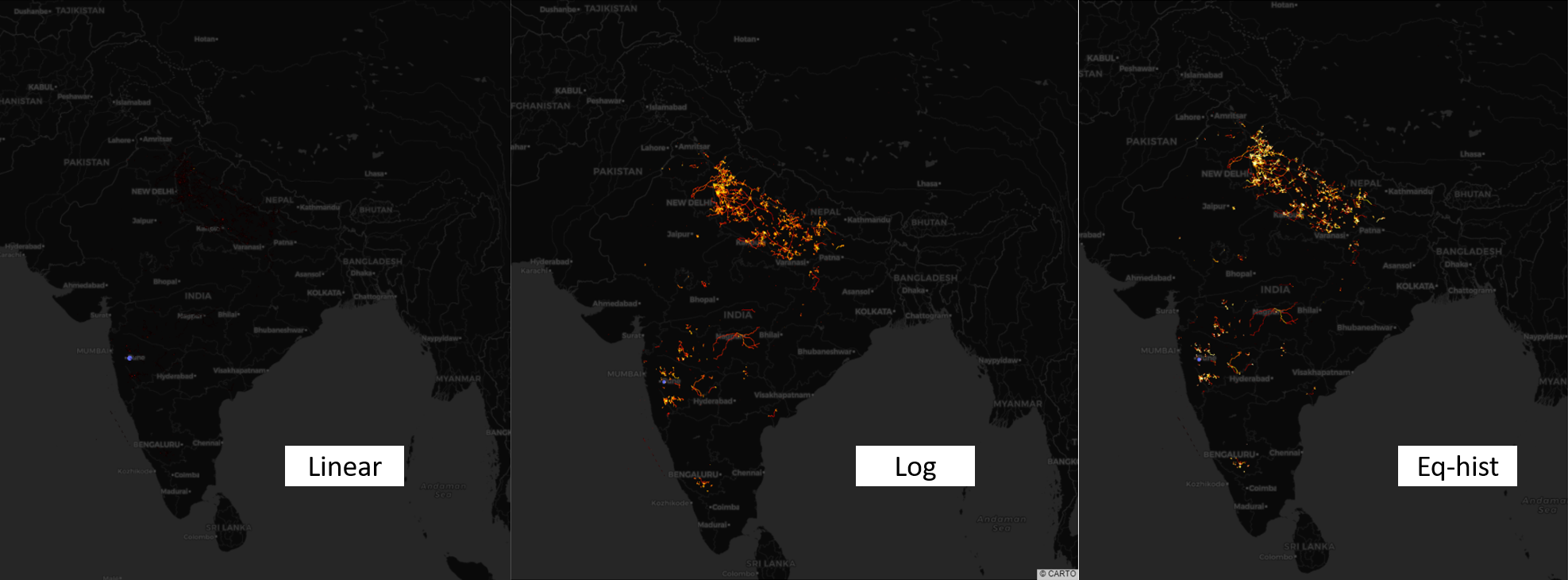
As you can see, almost nothing is visible with the linear transformation. This is because a couple of pixels with extremely high intensity have overshadowed all others. You will need to zoom-in to identify those hotspots.
如您所見,線性變換幾乎看不到任何東西。 這是因為幾個具有極高強度的像素使所有其他像素都黯淡了。 您將需要放大以識別那些熱點。
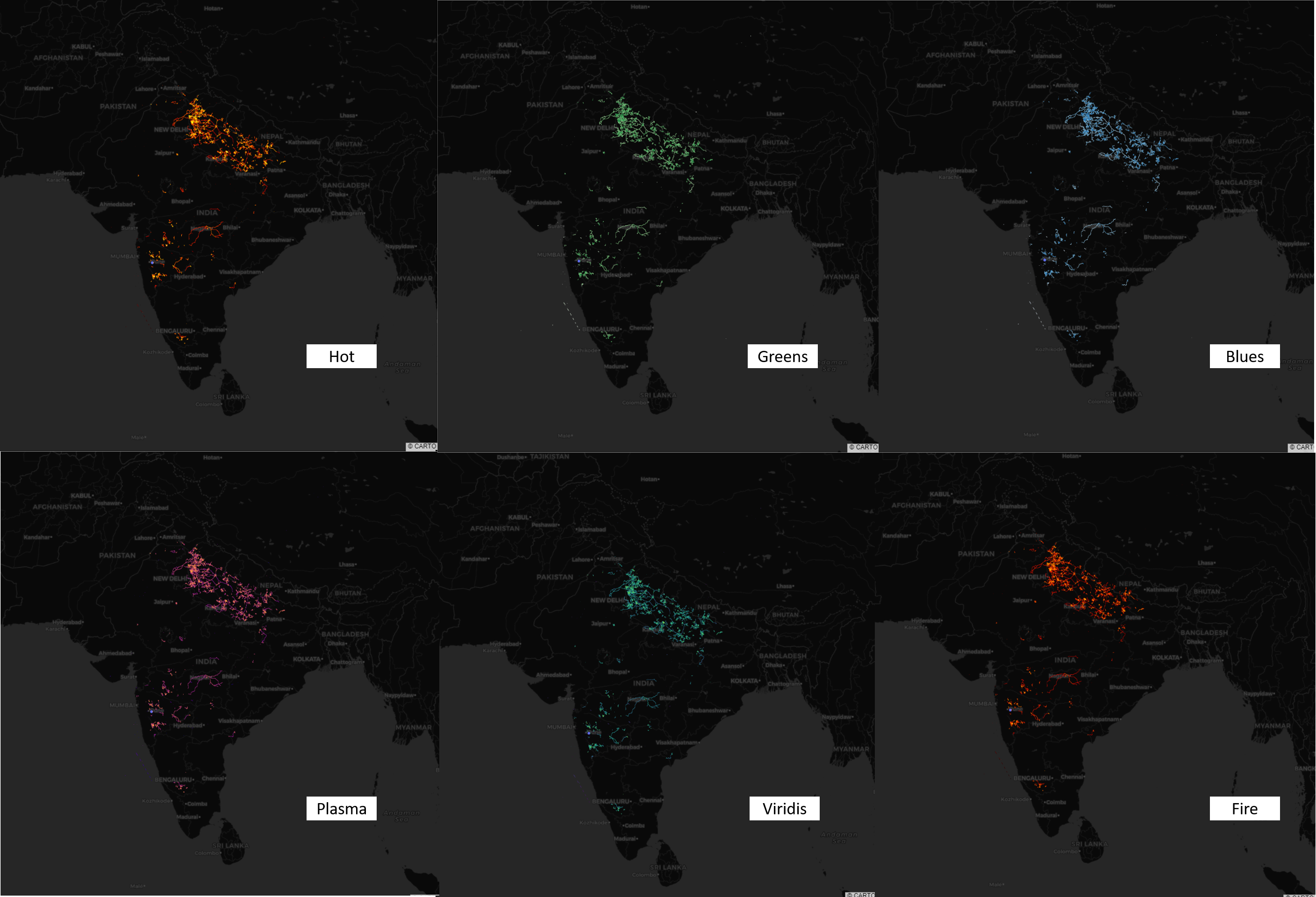
Similar to the transformation, different color map options are also available. To get the list of all color maps, click here. Below, the examples with a few different color maps are shown.
與轉換類似,也可以使用不同的顏色圖選項。 要獲取所有顏色圖的列表, 請單擊此處 。 下面顯示了帶有一些不同顏色映射的示例。
創建可視化: (Creating the visualization:)
fig = px.scatter_mapbox(df.tail(1),
                        lat='latitude',
                        lon='longitude',
                        zoom=4,width=1000, height=1000)# Add the datashader image as a mapbox layer image
fig.update_layout(mapbox_style="carto-darkmatter",
                 mapbox_layers = [
                {
                    "sourcetype": "image",
                    "source": img,
                    "coordinates": coordinates
                }]
)
fig.show()
Here, we are plotting just one point from the dataframe (the last one), so that plotly can create the scatter visualization. We are using the carto-darkmatter style from Mapbox and overlaying the image output of datashader as a layer on top of the visualization. Congratulations!! Your visualization is ready!
在這里,我們僅繪制了數據框中的一個點(最后一個),以便可以通過散點圖創建散點圖。 我們正在使用Mapbox中的carto-darkmatter樣式,并將datashader的圖像輸出覆蓋為可視化之上的一層。 恭喜!! 您的可視化已準備就緒!
何時使用此庫: (When to use this library:)
The answer is perhaps the simplest for this library. Use this when you have a very large data set. If you find this visualization aesthetically appealing as I do, then you can use this for smaller datasets as well, but the results will depend on the density distribution of your data. You won’t get high interactivity, because datashader essentially overlays an image on the Mapbox base-map. But you can still zoom and pan the visualization.
對于這個庫,答案也許是最簡單的。 如果數據集非常大,請使用此選項。 如果您發現這種可視化效果像我一樣美觀,那么您也可以將其用于較小的數據集,但結果將取決于數據的密度分布。 您不會獲得很高的交互性,因為datashader本質上會將圖像疊加在Mapbox底圖上。 但是您仍然可以縮放和平移可視化效果。
We are trying to fix some broken benches in the Indian agriculture ecosystem through technology, to improve farmers’ income. If you share the same passion join us in the pursuit, or simply drop us a line on report@carnot.co.in
我們正在嘗試通過技術修復印度農業生態系統中一些破爛的長凳 ,以提高農民的收入。 如果您有同樣的熱情,請加入我們的行列,或者直接給我們寫信至report@carnot.co.in
翻譯自: https://medium.com/tech-carnot/plotly-datashader-visualizing-large-geospatial-datasets-bea27b9d7824
基于plotly數據可視化
本文來自互聯網用戶投稿,該文觀點僅代表作者本人,不代表本站立場。本站僅提供信息存儲空間服務,不擁有所有權,不承擔相關法律責任。 如若轉載,請注明出處:http://www.pswp.cn/news/388522.shtml 繁體地址,請注明出處:http://hk.pswp.cn/news/388522.shtml 英文地址,請注明出處:http://en.pswp.cn/news/388522.shtml
如若內容造成侵權/違法違規/事實不符,請聯系多彩編程網進行投訴反饋email:809451989@qq.com,一經查實,立即刪除!相關文章

Centos用戶和用戶組管理

吹氣球問題的C語言編程,C語言怎樣給一個數組中的數從大到小排序


劃痕實驗 遷移面積自動統計_從Jupyter遷移到合作實驗室
)
英法德三門語言同時達到c1,【分享】插翅而飛的孩子(轉載)

數據庫建表賦予權限語句

day03 基本數據類型

美國移民局的I797表原件和I129表是什么呢

數據開放 數據集_除開放式清洗之外:敘述是開放數據門戶的未來嗎?

單選按鈕android服務器,android – 如何在radiogroup中將單選按鈕設置...


string 轉化 xml,并找到指定節點及節點值

ios android 交互 區別,很多人不承認:iOS的返回交互,對比Android就是反人類。

Servlet+JSP

正態分布高斯分布泊松分布_正態分布:將數據轉換為高斯分布

BABOK - 開篇:業務分析知識體系介紹


黑蘋果 wifi android,動動手指零負擔讓你的黑蘋果連上Wifi

洛谷——P2018 消息傳遞
