文章目錄
- 1 前言
- 2 知識點
- 2.1 matplotlib.pyplot.barh
- 2.2 matplotlib.legend的handles參數
- 3 代碼實現
- 4 繪制效果
- 5 總結
- 參考
1 前言
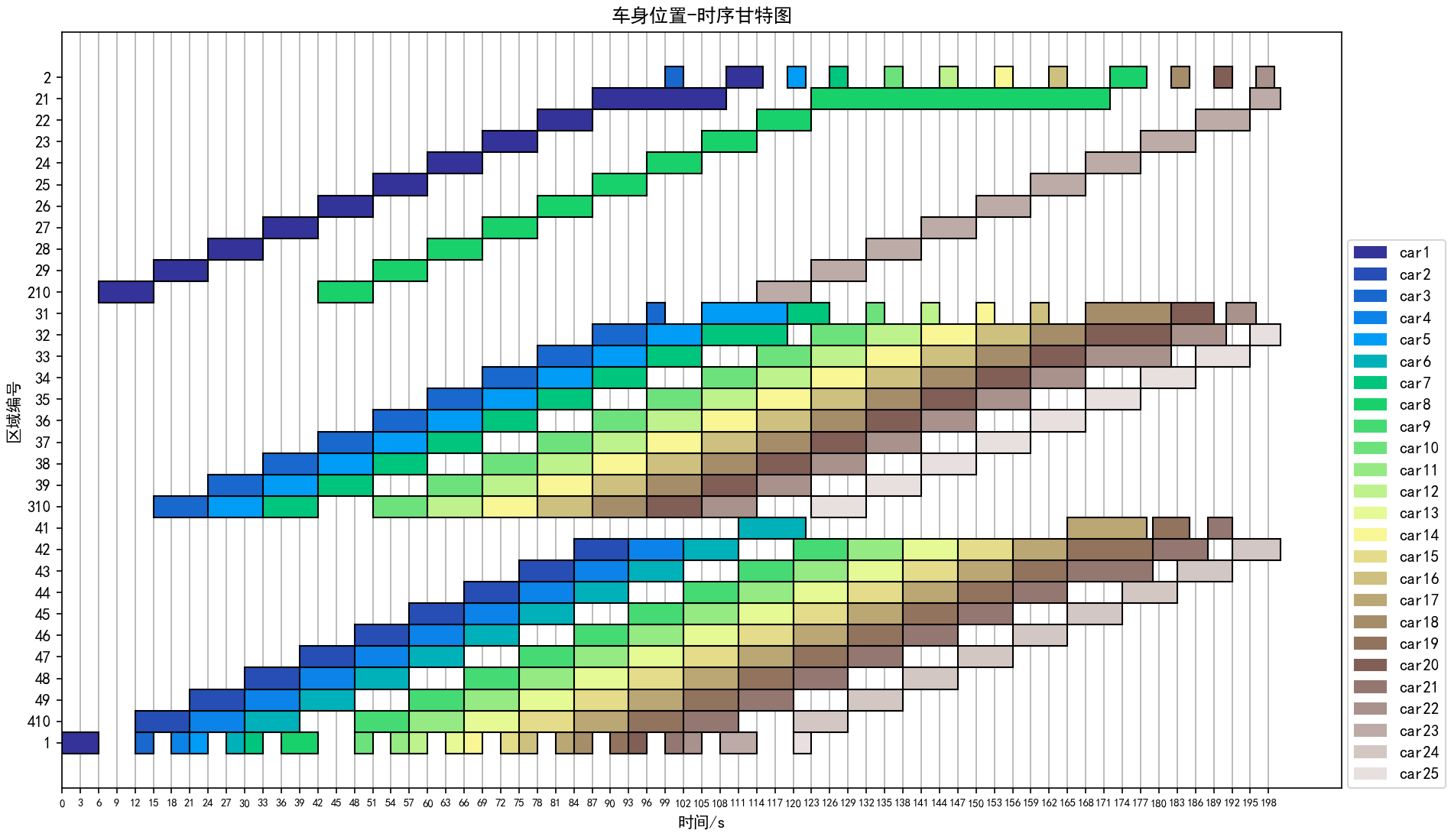
這篇文章的目的是,總結記錄一次使用matplotlib繪制時序甘特圖的經歷。之所以要繪制這個時序甘特圖,是因為22年數模研賽C題需要用到,用于更好地呈現求解的車身緩沖區調序優化結果。
首先,我們覺得在這篇博客中出現的下面這張圖展示效果很好,于是也想繪制一張。
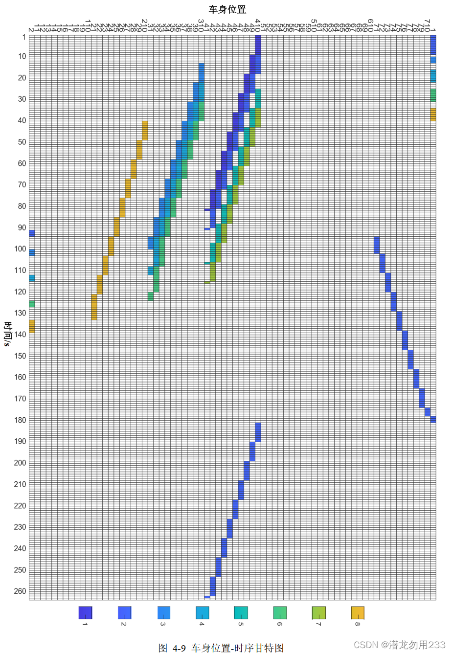
這張圖中,橫坐標是遞增變化的時間,縱坐標是PBS中的區域編號,其中不同的顏色代表不同的車身,如果某個時間段車身達到了某個區域,那么圖中所對應的矩形區塊將填充為該車身對應的顏色。
在知道上述信息后,我們開始在網上查找甘特圖的繪制方法,因為我個人習慣用python的matplotlib庫繪制圖表,于是根據關鍵詞搜索到了如下的文章: Python實現生產過程可視化(甘特圖)。看著比較像我們想要的那種效果,于是琢磨了一下代碼怎么寫的。
2 知識點
拜讀完代碼后,我總結了使用matplotlib繪制甘特圖的一些知識點。
2.1 matplotlib.pyplot.barh
該函數的作用是繪制橫向的柱狀圖。
官方文檔函數定義如下:
matplotlib.pyplot.barh(y, width, height=0.8, left=None, *, align='center', data=None, **kwargs)
使用到的參數詳解:
| 參數名稱 | 解釋 |
|---|---|
| y | 可傳入float類型,決定柱狀圖的y軸坐標 |
| width | 可傳入float類型,決定柱狀圖的寬帶(可以理解為橫跨x軸的長度) |
| height | 可傳入float類型,默認0.8,決定柱狀圖的高度(可以理解為橫跨y軸的長度) |
| left | 可傳入float類型,默認0,決定柱狀圖最左側與y軸的距離 |
| align | 可選’center’或’edge’, 默認 ‘center’,柱狀圖與y坐標的對齊方式,默認居中 |
| color | 柱狀圖的顏色 |
| edgecolor | 柱狀圖邊緣的顏色 |
| linewidth | 柱狀圖邊緣的寬度,如果為0則不繪制邊緣 |
| zorder | float類型,控制artist對象的繪制順序,zorder越小越先繪制(有點圖層的意思) |
2.2 matplotlib.legend的handles參數
我也是第一次見往plt.legend函數中傳入handles參數的(沒有系統學過matplotlib庫😭),這里也不詳細解釋了,直接說怎么用吧。當我們想要自定義圖例時,使用下面代碼:
patches = [mpatches.Patch(color = m_colors[i], label = m_labels[i]) for i in range(m)]
plt.legend(handles = patches)
其中,color參數是圖例(matplotlib.patches對象)對應的顏色,label為圖例對應的標簽。
3 代碼實現
繪制代碼如下:
import numpy as np
import matplotlib.pyplot as plt
import matplotlib.patches as mpatchesplt.rcParams['font.sans-serif'] = ['SimHei']  # 用來正常顯示中文標簽
plt.rcParams['axes.unicode_minus'] = False  # 用來正常顯示負號def gantt_chart(wt, x_labels, y_labels, m_labels):"""wt: 工作矩陣,大小為mxnx2,m為車身數,n為區域編號數,第三維中第1個元素為車身進入區域的時間,第2個元素為停留時間。color_list:代表各車身的顏色矩陣,大小為nx4。"""m, n = wt.shape[0], wt.shape[1]m_colors = plt.colormaps['terrain'](np.linspace(0, 0.95, m))for i in range(n):for j in range(m):if wt[j, i, 1] != 0:plt.barh(y = i, width = wt[j, i, 1], left = wt[j, i, 0], height = 1, edgecolor = (0, 0, 0),color = m_colors[j], zorder = 10)# 圖例繪制patches = [mpatches.Patch(color = m_colors[i], label = m_labels[i]) for i in range(m)]plt.legend(handles = patches, bbox_to_anchor = (1.005, 0), loc = 3, borderaxespad = 0)plt.xticks(x_labels, fontsize = 7)plt.yticks(list(range(n)), y_labels)plt.xlabel("時間/s")plt.ylabel("區域編號")plt.title('車身位置-時序甘特圖')plt.grid(axis = 'x', zorder = 0)# plt.savefig('result21_車身位置-時序甘特圖.jpg', dpi = 200)plt.show()def custom_gantt_chart(path = 'result21.csv', car_num = 25, T = 180):data = np.loadtxt(open(path, "rb"), delimiter = ",", encoding = 'utf-8-sig', dtype = object)[1:car_num + 1, 1:T + 1]car_label = [f'car{i}' for i in range(1, 26)]region_code = ['1', '410', '49', '48', '47', '46', '45', '44', '43', '42', '41','310', '39', '38', '37', '36', '35', '34', '33', '32', '31','210', '29', '28', '27', '26', '25', '24', '23', '22', '21', '2']car_num, T_num, region_num = data.shape[0], data.shape[1], len(region_code)T_range = [t for t in range(0, T_num + 1, 3)]Wt = np.zeros((car_num, region_num, 2))Wt[:, :, 0] = -1for i in range(car_num):for j in range(T_num):if data[i, j] == '' or data[i, j] == '3':continueidx = region_code.index(data[i, j])if Wt[i, idx, 0] == -1:Wt[i, idx, 0] = jWt[i, idx, 1] += 1gantt_chart(Wt, T_range, region_code, car_label)if __name__ == '__main__':custom_gantt_chart('result21.csv', car_num = 25, T = 200)
4 繪制效果
5 總結
可以從繪制效果中看到,有些柱狀圖的顏色兩兩之間不仔細看根本分不出來。對于這個問題,主要是這條代碼m_colors = plt.colormaps['terrain'](np.linspace(0, 0.95, m))在色條上均勻取色時,因為色條顏色數量太少(即使是漸變色條,隨著取色數量增多也不容易分辨)造成的。terrain顏色條包含的顏色如下圖:

關于更多的顏色條種類及使用方法參見:https://matplotlib.org/stable/tutorials/colors/colormaps.html
參考
[1] https://zhuanlan.zhihu.com/p/106787569
[2] https://matplotlib.org/stable/api/_as_gen/matplotlib.pyplot.barh.html
[3] https://matplotlib.org/stable/api/legend_api.html
[4] https://matplotlib.org/stable/tutorials/colors/colormaps.html


 一文讀懂 Stable Diffusion 工作原理)

—— 速算技巧 - 高照)


)


模式)
嵌套列表,Xpath路徑表達式,XML增刪查改,Implicit,Operator,Xml序列化,淺拷貝與深拷貝)