三級菜單頁面布局
重點 (Top highlight)
When users navigate an interface, there’s a need for speed. The faster it is for them to find what they’re looking for, the more time they’ll save on their task.
用戶導航界面時,需要提高速度。 他們找到所需內容的速度越快,他們將在工作上節省的時間就越多。
Speed is essential for menus that contain multiple levels. The more levels a menu has, the longer it takes to navigate. A common navigation pattern is a three-level menu. You’ll often find it on dashboard interfaces and desktop applications. The easiest way to optimize the navigation speed of a three-level menu is to design for the fastest layout.
速度對于包含多個級別的菜單至關重要。 菜單級別越高,導航所需的時間就越長。 常見的導航模式是三級菜單。 您通常會在儀表板界面和桌面應用程序上找到它。 優化三級菜單的導航速度的最簡單方法是設計最快的布局。
A research study ( A comparison of three-level menu navigation structures for web design) has shed some light on which layout is fastest to navigate. They evaluated various three-level menu layouts based on several criteria categories.
一項研究研究( 用于Web設計的三級菜單導航結構的比較 )揭示了哪種布局導航最快。 他們根據幾個標準類別評估了各種三級菜單布局。
The navigation layouts include top-top-top, top-left-left, top-top-left, top-left-top, left-left-left, left-top-top, left-left-top, and left-top-left. The level notations are ordered by priority and hierarchy (i.e., primary[1]-secondary[2]-tertiary[3]). The criteria categories include navigation time, user hesitation, cursor movement, selection errors, and user preference.
導航布局包括頂部-頂部-頂部,頂部-左側-左側,頂部-頂部-左側,頂部-左側-頂部,左側-左側-左側,左側-頂部-頂部,左側-左側-頂部和左側-頂部-剩下。 級別標記按優先級和層次結構排序(即,primary [1] -secondary [2] -tertiary [3])。 標準類別包括導航時間,用戶猶豫,光標移動,選擇錯誤和用戶偏好。
導航時間 (Navigation Time)
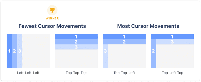
The study discovered that a left primary is faster to navigate than a top primary. This effect also applies to left secondary menu levels. It also found that navigation is faster when the primary level is separate from the secondary and tertiary levels. Overall, left-top-top and top-left-left were the fastest, and top-top-top and top-top-left were the slowest.
研究發現,左側的主要對象比頂部的主要對象導航更快。 此效果也適用于左側輔助菜單級別。 還發現,當初級與次級和第三級分開時,導航速度更快。 總體而言,左上-頂和左上-左是最快的,頂-頂-頂和左上-左是最慢的。
用戶猶豫 (User Hesitation)
A hesitation is when the user hesitates to move their cursor from one menu level to another. The left-top-top had the least hesitation out of all the layouts, and the top-left-left had the most. There was a significant decrease in hesitation when the secondary and tertiary levels were on the same plane.
猶豫是指用戶猶豫將其光標從一個菜單級別移至另一菜單級別。 在所有布局中,左上角的猶豫最少,而左上角至左數最多。 當二級和三級在同一平面上時,猶豫明顯減少。

光標移動 (Cursor Movement)
The frequency of cursor movements to the incorrect plane represented a cursor movement. There were fewer cursor movements when the primary menu was on the left. Fewer cursor movements also occurred when the secondary level was split from the primary. Many cursor movements occurred when secondary and tertiary menus were on different planes. But when they were on the same plane, users performed better.
光標移動到錯誤平面的頻率表示光標移動。 當主菜單在左側時,光標移動較少。 當次要級別與主要級別分開時,光標移動也較少。 當二級菜單和三級菜單位于不同的平面上時,會發生許多光標移動。 但是,當他們在同一架飛機上時,用戶表現會更好。
Left-left-left and top-top-top had the fewest cursor movements, while top-top-left and top-left-top had the most. This effect makes sense because when all menu levels are on the same plane, it’s harder for users to move their cursor to the wrong plane.
左-左-左和上-頂-上的光標移動最少,而左上-左上和左上-頂最多。 這種效果是有道理的,因為當所有菜單級別都在同一平面上時,用戶很難將光標移動到錯誤的平面上。
選擇錯誤 (Selection Errors)
The number of excessive clicks represented a selection error. When the primary level was on the left plane, the least amount of selection errors occurred. A left primary reduced selection errors by 80% compared to a top primary.
點擊次數過多表示選擇錯誤。 當主要水平位于左側平面上時,發生的選擇錯誤最少。 左主數據庫比頂級主數據庫減少了80%的選擇錯誤。
A significant number of selection errors occurred when both the primary and secondary were on the top plane. Top-top-top and top-top-left performed the worst. Fewer selection errors occurred when the secondary and tertiary levels were on a separate plane from the primary. Left-top-left and left-left-left performed the best.
當主要和次要都在頂面上時,會發生大量選擇錯誤。 頂部-頂部-頂部和頂部-左上方的效果最差。 當第二級和第三級位于與第一級不同的平面上時,選擇錯誤的發生率會降低。 左上左和左上左表現最佳。

用戶偏好 (User Preference)
The majority of users preferred using a left primary than a top one. Left-top-top and left-left-left were most preferred. There was a strong preference for grouping the primary and secondary levels and secondary and tertiary levels. Top-left-top and left-top-left were the least preferred. This effect implies that users don’t like jumping back and forth between planes.
大多數用戶更喜歡使用左主數據庫而不是頂主數據庫。 最優選左上-上和左-左-左。 強烈希望將小學和中學層次以及中學和高等教育層次進行分組。 最不喜歡左上角和左上角。 這種效果意味著用戶不喜歡在飛機之間來回跳躍。

最佳與最差的整體表現 (Best vs. Worst Overall Performance)
An overall score was given to each layout based on their performance for all criteria categories combined. The best performing navigation layout was left-top-top, followed by left-left-left. The two worst-performing ones were top-top-left and top-left-top. Out of the two best, left-top-top was faster than left-left-left by approximately 17 seconds.
根據每種布局在所有標準類別中的綜合表現,對它們進行總體評分。 效果最佳的導航布局是從左上到上,然后是從左到左,從左到左。 表現最差的兩個是左上角和左上角。 在這兩種最好的方法中,“左上-頂”比“左-左-左”快約17秒。

Left-left-left is slower than left-top-top because when all the menus are on the left, it requires users to scroll through the list of items. As the levels expand and go deeper, users have to scroll more and can no longer view all the primary items on a single screen. However, the benefit left-left-left has is that users can consume more content per screen view. Users spend less time navigating the content screen, but it’s a tradeoff for more time navigating the menu.
從左到左,從左到左比從左上到下慢,因為當所有菜單都在左側時,它要求用戶滾動瀏覽項目列表。 隨著級別的擴展和深入,用戶必須滾動更多內容,并且無法再在一個屏幕上查看所有主要項目。 但是,left-left-left的好處是用戶可以在每個屏幕視圖中消費更多內容。 用戶花費在導航內容屏幕上的時間更少,但是這是在導航菜單上花費更多時間的折衷方案。
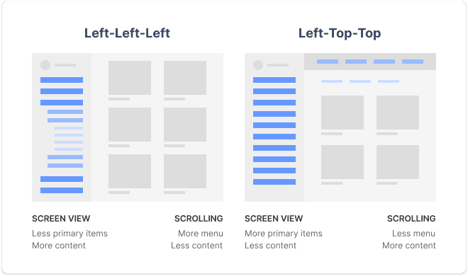
The screen view advantage for left-top-top allows users to view more primary items at a time no matter how deep they navigate. However, they see less content per screen due to the top navigation bars. As a result, users experience less menu scrolling but more content scrolling.
左上角的屏幕視圖優勢允許用戶一次瀏覽更多主要項目,無論他們導航的深度如何。 但是,由于頂部的導航欄,他們在每個屏幕上看到的內容更少。 結果,用戶體驗較少的菜單滾動,但是體驗了更多的內容滾動。
作者推薦 (Author’s Recommendation)
No matter which navigation layout you choose, left-left-left and left-top-top are both winners. There are give-and-takes between screen view and scrolling, so it’s important to evaluate what’s more important for your UX.
無論您選擇哪種導航布局,左-左-左和左上-頂部都是贏家。 屏幕視圖和滾動之間存在取舍,因此評估對用戶體驗更重要的一點很重要。
If your users navigate between different primary categories a lot, go with left-top-top to minimize menu scrolling, and maximize menu viewing. If your interface displays a lot of content with large and heavy visuals (e.g., photos, videos, graphics), go with left-left-left to minimize content scrolling and maximize screen view.
如果您的用戶經常在不同的主要類別之間導航,請使用左上角以最小化菜單滾動并最大化菜單查看。 如果您的界面顯示了大量帶有大而沉重的視覺效果的內容(例如,照片,視頻,圖形),請使用left-left-left來最小化內容滾動并最大化屏幕視圖。
It’s possible you can increase the content screen view for left-top-top and still reap the benefits of less menu scrolling. By temporarily hiding the top navigation bar when users scroll down the screen, they can get a full content view. When they scroll up, the bar will reappear. The assumption is that users are viewing content when they’re scrolling down. When they scroll up, their intention to navigate is more likely.
您可以增加左上角的內容屏幕視圖,并仍然獲得較少菜單滾動的好處。 當用戶向下滾動屏幕時,通過暫時隱藏頂部導航欄,他們可以獲得完整的內容視圖。 當他們向上滾動時,該欄將重新出現。 假定用戶向下滾動時正在查看內容。 當他們向上滾動時,他們導航的意圖更有可能。
In my opinion, left-top-top is the winning navigation layout. Not only is it a few seconds faster than left-left-left, but it allows users to recognize which primary category they’re on. When you have multiple menu levels expanded in the left sidebar, it takes more effort to recognize which level you’re on. It’s also easier to mix up secondary and tertiary items since they’re so near each other.
在我看來,左上方是導航的布局。 它不僅比left-left-left-left快幾秒鐘,而且還使用戶能夠識別他們所在的主要類別。 如果左側欄中展開了多個菜單級別,則需要花費更多的精力來識別您所處的級別。 混合二級和三級項目也很容易,因為它們彼此非常接近。
A left-top-top layout makes scanning primary categories easy. It distinguishes secondary and tertiary categories from primary and places them on different vertical levels. Therefore, users are less likely to mix up secondary and tertiary items when scanning horizontally.
左上角的布局使掃描主要類別變得容易。 它區分了第二和第三類與主要類別,并將它們置于不同的垂直級別。 因此,在水平掃描時,用戶不太可能混淆第二和第三項。
Of course, left-top-top isn’t the best choice for every use case and interface context because there are exceptions to every rule. But overall, it appears to perform superiorly to all other three-level menus.
當然,對于每種用例和接口上下文,左上角并不是最佳選擇,因為每條規則都有例外。 但總的來說,它的性能似乎要優于所有其他三級菜單。
UX設計的含義 (UX Design Implications)
There are three significant design implications from this study that will dramatically optimize the navigation speed of your three-level menu.
這項研究具有三個重要的設計含義,它們將極大地優化三級菜單的導航速度。
1: The primary menu should be on the left instead of the top. (~17 seconds saved)
1:主菜單應位于左側而不是頂部。 (節省約17秒)
This conclusion makes sense because organizing menu items in the form of a columned list makes them easier to scan. The user can see a cluster of items in a single view when they’re in a column instead of a row. With a top primary, the user can only view items individually as they scan across the row.
該結論之所以有意義,是因為以列列表的形式組織菜單項使它們更易于掃描。 當用戶位于列而不是行中時,他們可以在單個視圖中看到一組項目。 使用最高級的主要對象時,用戶只能在掃描整個行時單獨查看它們。
2: The primary menu should be on a different plane than the secondary and tertiary menus. (~23 seconds saved)
2:主菜單應該與第二和第三菜單不在同一平面上。 (節省約23秒)
This conclusion makes sense because the primary menu is the parent category, which has higher priority over child categories. When the secondary and tertiary levels are separate from the primary, it clearly distinguishes the hierarchy and prevents visual clutter on the same plane.
由于主菜單是父類別,因此其優先級高于子類別,因此此結論很有意義。 當第二級和第三級與第一級分開時,它可以清楚地區分層次結構并防止在同一平面上出現視覺混亂。
3: Secondary and tertiary menus should be on the same plane. (~9 seconds saved)
3:第二菜單和第三菜單應位于同一平面上。 (節省約9秒)
This conclusion makes sense because the secondary and tertiary levels are both child categories of the parent category, making them more related. Placing them on the same plane makes navigating from child to child more intuitive and easier to follow.
該結論之所以有意義,是因為中學和高等教育水平都是父類別的子類別,因此它們之間的關聯性更高。 將它們放置在同一平面上可使從一個孩子到另一個孩子的導航更加直觀且易于遵循。
If you’re designing a three-level menu for a desktop application, keep these UX insights in mind. They’ll especially apply to dashboard interfaces where efficiency is crucial. If you currently have a three-level menu that uses a slow navigation layout, consider redesigning it. A fast navigation layout will give your users the speed they need to accomplish tasks with greater satisfaction.
如果要為桌面應用程序設計三級菜單,請牢記這些UX見解。 它們尤其適用于效率至關重要的儀表板界面。 如果當前有一個使用慢速導航布局的三級菜單,請考慮重新設計它。 快速的導航布局將使您的用戶更快地完成任務所需的速度。
Originally published at https://uxmovement.com on July 8, 2020.
最初于 2020年7月8日 發布在 https://uxmovement.com 。
翻譯自: https://medium.com/@uxmovement/the-fastest-navigation-layout-for-a-three-level-menu-b0480e2f11a2
三級菜單頁面布局
本文來自互聯網用戶投稿,該文觀點僅代表作者本人,不代表本站立場。本站僅提供信息存儲空間服務,不擁有所有權,不承擔相關法律責任。 如若轉載,請注明出處:http://www.pswp.cn/news/275792.shtml 繁體地址,請注明出處:http://hk.pswp.cn/news/275792.shtml 英文地址,請注明出處:http://en.pswp.cn/news/275792.shtml
如若內容造成侵權/違法違規/事實不符,請聯系多彩編程網進行投訴反饋email:809451989@qq.com,一經查實,立即刪除!相關文章

java contains 通配符_java刪除文件支持通配符


ux體驗網站 英國_定義網站圖像時的UX注意事項

iconfont 支持全新的彩色字體圖標

回文算法java實現_java算法題:最長回文串

Spring校驗@RequestParams和@PathVariables參數

出色的社區網站_《最后的我們》中出色的制作系統

入坑 Electron 開發跨平臺桌面應用

Google 拼音會導致卡 Ctrl 鍵?

java 接口編程_JAVA面向接口編程

不僅僅是手機,MWC現全球首例 5G NR 商用部署

小程序 顯示細線_精心設計:高密度顯示器上的細線

React 入門手冊

函數04 - 零基礎入門學習C語言35
》...)
java數據結構與算法_清華大學出版社-圖書詳情-《數據結構與算法分析(Java版)》...

根號 巴比倫_建立巴比倫衛生設計系統

《Migrating to Cloud-Native Application Architectures》學習筆記之Chapter 2. Changes Needed

前端,你要知道的SEO知識

編制網站首頁的基本原則
