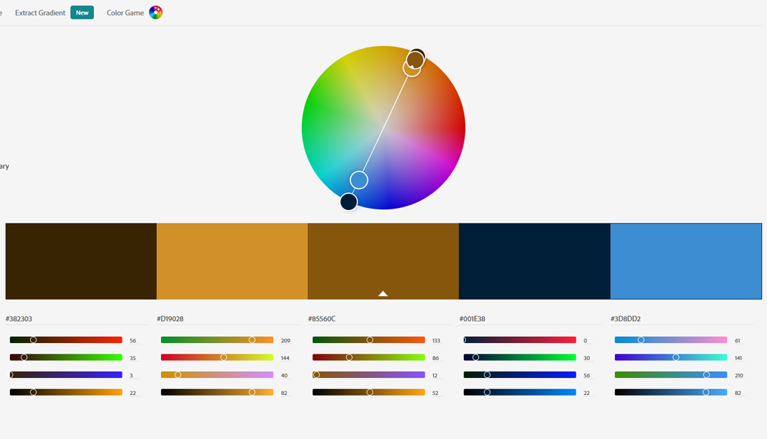
根據圖片獲得配色方案
前言 (Foreword)
When we start designing mobile web pages, we always need to determine the color scheme of the web page first. Well, at this time, unless the customer proposes a color scheme, most of the situations we have to face is to create a color scheme based on the customer’s needs. Here, I want to teach you how to get inspiration from the “picture” source and create a color scheme.
當我們開始設計移動網頁時,我們總是需要首先確定網頁的配色方案。 好吧,目前,除非客戶提出顏色方案,否則我們必須面對的大多數情況是根據客戶的需求創建顏色方案。 在這里,我想教您如何從“圖片”來源中獲得靈感并創建配色方案。
1.選擇圖片 (1. Select the picture)
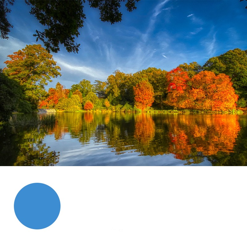
First of all, go to the major websites to search for your favorite pictures. The choice of pictures should try to choose a color tone that changes and the contrast between light and dark is also more obvious, because black and white or low contrast tones will only make your final color scheme look less vivid.
首先,轉到主要網站以搜索您喜歡的圖片。 圖片的選擇應嘗試選擇變化的色調,并且明暗之間的對比度也更加明顯,因為黑白或低對比度色調只會使最終的配色方案看起來不那么生動。
It is good to choose the pictures to go to the following websites:https://unsplash.comhttp://500px.com/https://www.flickr.com
最好選擇圖片訪問以下網站: https: //unsplash.com http://500px.com/ https://www.flickr.com
Choose from pictures that appeal to yourself in terms of color matching.
從色彩匹配方面吸引自己的圖片中選擇。
二,吸收色彩 (Second, absorb color)
Open this picture in PS and absorb the colors. To absorb color is not to choose the color you like arbitrarily. According to the color distribution of the entire picture, first find the main color of the picture.
在PS中打開此圖片并吸收顏色。 吸收色彩不是隨意選擇自己喜歡的色彩。 根據整個圖片的顏色分布,首先找到圖片的主要顏色。
The selection of the main color depends on the most widely distributed color in the entire image. In this picture, we can see that the most widely distributed is blue. These blues show different levels of light and dark levels. Therefore, from dark blue to light In Blue, I chose a medium blue with the most balanced transition. This blue color shows the colors of clouds.
主色的選擇取決于整個圖像中分布最廣泛的顏色。 在這張照片中,我們可以看到分布最廣的是藍色。 這些藍色表示明暗級別不同。 因此,從深藍色到淺藍色,我選擇了過渡最平衡的中等藍色。 此藍色顯示云的顏色。
3.建立自己的配色方案 (3. Build your own color scheme)
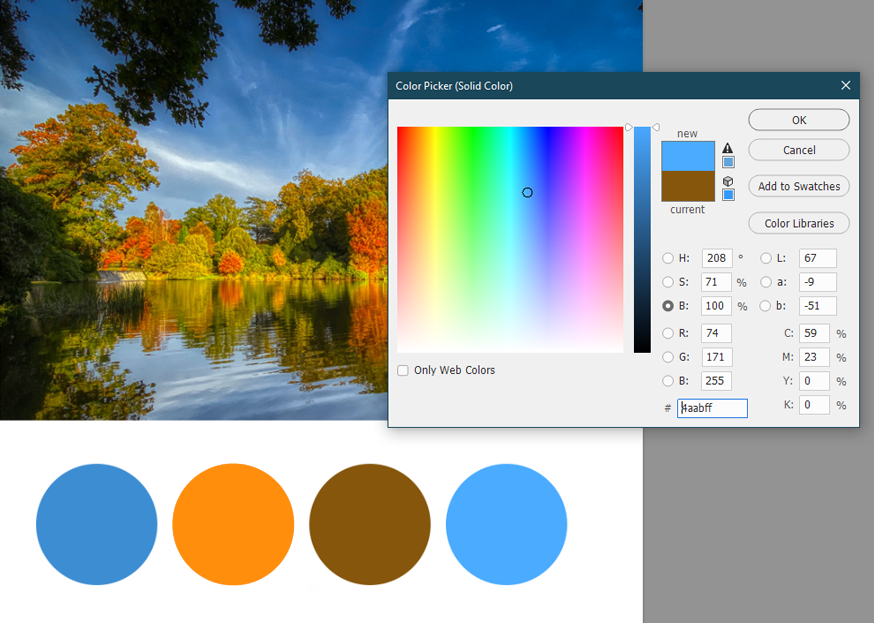
Choose to create a new file, draw a circle with a white background and the selected color in the picture as the foreground color. This circle is also the first color in your color scheme: the main color.
選擇創建一個新文件,畫一個帶有白色背景的圓,并將圖片中的選定顏色作為前景色。 這個圓圈也是配色方案中的第一種顏色:主色。
1.主要色彩的應用范圍 (1. The application range of main colors)
When designing a web page, the main color is used in the area where the color area of ??the entire web page is large, for example, on the background or shape elements of the web page. Of course, one color cannot be designed, so we will choose the second color next.
設計網頁時,主要顏色用于整個網頁的色彩區域較大的區域,例如網頁的背景或形狀元素上。 當然,不能設計一種顏色,因此我們接下來將選擇第二種顏色。
Auxiliary color selection The auxiliary color is usually a color that can be contrasted and echoed with it. If the main color is a cool color, then the auxiliary color tends to be a warm color. Because a color-rich picture must have colors that are both warm and cold, you will then choose between the main color and the opposite color temperature.
輔助顏色選擇輔助顏色通常是可以與之形成對比和回顯的顏色。 如果主色是冷色,則輔助色往往是暖色。 因為色彩豐富的圖片必須同時具有冷暖色彩,所以您將在主要色彩和相反的色溫之間進行選擇。
Here I chose the warm orange from the trees and balanced it with the blue cold feeling.
在這里,我從樹木中選擇了溫暖的橙色,并與藍色的寒冷感覺保持了平衡。

2.輔助色的應用范圍 (2. Application range of auxiliary colors)
Auxiliary colors are usually used for fonts and small area elements in web design. If the auxiliary color forms a complementary color with the main color, it will produce a strong contrast. At this time, the contrast color will also have an emphasis. When you want to highlight an element on a web page, you can try accent color.
輔助顏色通常用于網頁設計中的字體和小區域元素。 如果輔助色與主色形成互補色,則會產生強烈的對比度。 此時,對比色也將受到重視。 當您要突出顯示網頁上的元素時,可以嘗試強調顏色。
So what is contrasting color? It is just the relative colors on the color circle, for example: red and green, purple and orange, blue and yellow.
那么什么是對比色? 它只是色環上的相對顏色,例如:紅色和綠色,紫色和橙色,藍色和黃色。
If you feel that your choice of secondary color emphasis is not strong enough, you can additionally choose the contrasting color of the primary color from the color circle on the basis of the primary color as the third color scheme.
如果您覺得對次要色彩強調的選擇不夠強烈,則可以基于原色作為第三種配色方案,從色環中另外選擇原色的對比色。
3.高光和陰影 (3. Highlights and shadows)
This usually refers to the highlights and shadows shown in the main tone of the picture. At this time, it is no longer necessary to completely rely on pictures. Three colors have been selected in our color scheme, and the remaining colors are adjusted based on the main color.
這通常是指圖片主色調中顯示的高光和陰影。 此時,不再需要完全依賴圖片。 在我們的配色方案中選擇了三種顏色,其余的顏色則根據主要顏色進行調整。
When the main color is increased, the white color will be changed into the highlight part as the fourth color.
當增加主色時,白色將變為第四部分的高光部分。
If your design color is heavy, you can add black to the main color as the fifth color choice.
如果您的設計顏色很重,則可以在主色上添加黑色,作為第五種顏色選擇。
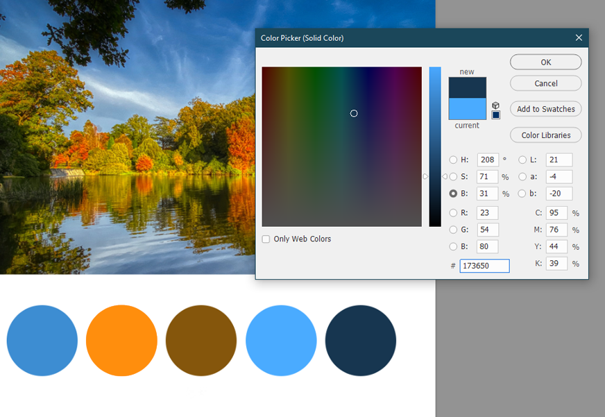
The highlight and shadow colors are also used as a decoration color choice on the web page, please use it with caution. One of the highlight and shadow colors can be selected as the neutral color. Because of the rich color gradation using black and white changes, there will be a lot of choices here. This requires you to adjust according to the actual situation in the final color scheme.
高亮和陰影顏色也用作網頁上的裝飾顏色選擇,請謹慎使用。 可以選擇高亮和陰影顏色之一作為中性色。 由于使用了黑白變化的色彩層次豐富,因此這里有很多選擇。 這要求您根據最終配色方案中的實際情況進行調整。
4.確定配色方案 (4. Determine the color scheme)
After the color scheme is selected, it is best to ensure that the overall color does not exceed 3 colors: primary color, auxiliary color, highlight / shadow color. Even with three colors, the hue will not deviate from the overall blue tone.
選擇配色方案后,最好確保整體顏色不超過3種顏色:原色,輔助色,突出顯示/陰影色。 即使使用三種顏色,色相也不會偏離整體藍色調。
四,使用配色方案 (Fourth, the use of color schemes)
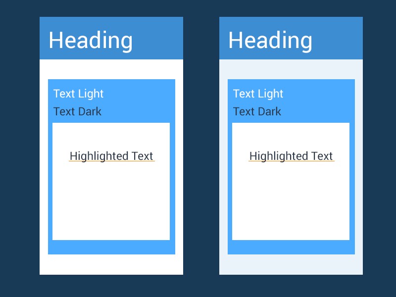
When using colors, there will also be flexible use of black, white, and gray, but make sure that the appearance of these colors does not interfere with the overall sense of color harmony (left).
使用顏色時,也可以靈活使用黑色,白色和灰色,但是請確保這些顏色的外觀不會干擾整體的顏色和諧感(左圖)。
Most of the time, we do n’t necessarily want pure white as our undertone. To make the overall look elegant, it is essential to add a bit of the main color with very low transparency as the background (right).
大多數時候,我們不一定要把純白色作為我們的底色。 為了使整體外觀優雅,必須添加一些主色(透明度很低)作為背景(右)。
翻譯自: https://medium.com/swlh/color-matching-series-1-get-color-matching-inspiration-from-pictures-25e8e816200e
根據圖片獲得配色方案
本文來自互聯網用戶投稿,該文觀點僅代表作者本人,不代表本站立場。本站僅提供信息存儲空間服務,不擁有所有權,不承擔相關法律責任。 如若轉載,請注明出處:http://www.pswp.cn/news/274146.shtml 繁體地址,請注明出處:http://hk.pswp.cn/news/274146.shtml 英文地址,請注明出處:http://en.pswp.cn/news/274146.shtml
如若內容造成侵權/違法違規/事實不符,請聯系多彩編程網進行投訴反饋email:809451989@qq.com,一經查實,立即刪除!相關文章


HA2795Billboard 可用線段樹

axure下拉列表框單選框_如何在Axure中創建下拉菜單和組合框

Android 第一課 Activity

figma設計_一種在Figma中跟蹤設計迭代的簡單方法

Android 第二課 Intent


latex 插圖 上下放_專輯插圖中上下文中的文本

亡羊補牢,為時不晚?

2013年7月份第4周51Aspx源碼發布詳情

視覺感知_產品設計中的視覺感知

Android 第三課 Activity的生命周期

轉載:Apache commons開源工具簡介
![pb 插入報列在此處不_獲取有關[在此處插入問題]的事實](http://pic.xiahunao.cn/pb 插入報列在此處不_獲取有關[在此處插入問題]的事實)
pb 插入報列在此處不_獲取有關[在此處插入問題]的事實

設計模式_單實體模式

Android 第四課 活動的啟動模式

c++編寫托管dll_教程:如何編寫簡單的網站并免費托管

淺述WinForm多線程編程與Control.Invoke的應用
)
Android 第五課 常用控件的使用方法(TextView、Button、EditView、 ImageView、 ProgressBar、 ProgressDialog等)
