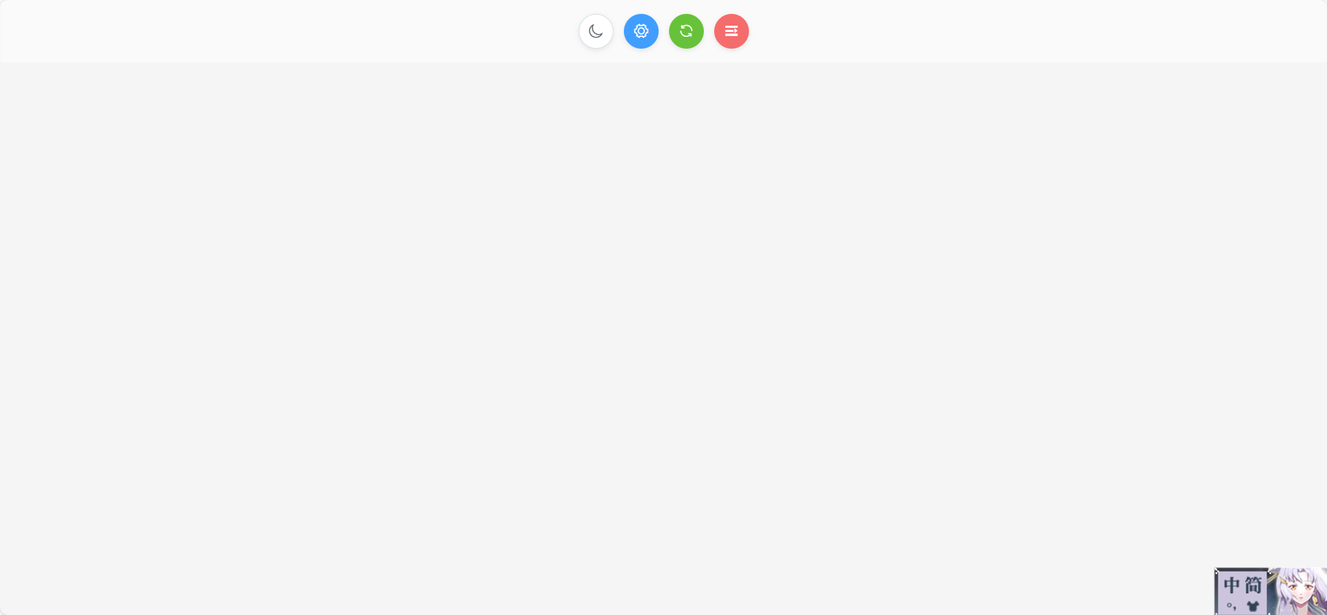
圖標按鈕示例一
<template><div class="icon-button-group"><button class="icon-btn icon-btn--default"><i class="el-icon-moon"></i></button><button class="icon-btn icon-btn--primary"><i class="el-icon-setting"></i></button><button class="icon-btn icon-btn--success"><i class="el-icon-refresh"></i></button><button class="icon-btn icon-btn--danger"><i class="el-icon-s-unfold"></i></button>
</div></template><script>
export default {name: "SliderVerify",data() {return {};},methods: {},
};
</script><style scoped>
.icon-button-group {display: flex;gap: 12px;align-items: center;justify-content: center;padding: 16px;background: #fafafa;
}.icon-btn {display: inline-flex;align-items: center;justify-content: center;width: 40px;height: 40px;font-size: 18px;border-radius: 50%;border: none;cursor: pointer;transition: background-color 0.3s, color 0.3s, box-shadow 0.3s;box-shadow: 0 2px 6px rgba(0, 0, 0, 0.1);color: #606266;
}/* 默認按鈕風格 */
.icon-btn--default {background-color: #ffffff;border: 1px solid #dcdfe6;
}
.icon-btn--default:hover {background-color: #f5f7fa;
}/* 主要按鈕風格 */
.icon-btn--primary {background-color: #409eff;color: #ffffff;
}
.icon-btn--primary:hover {background-color: #66b1ff;
}/* 成功按鈕風格 */
.icon-btn--success {background-color: #67c23a;color: #ffffff;
}
.icon-btn--success:hover {background-color: #85ce61;
}/* 危險按鈕風格 */
.icon-btn--danger {background-color: #f56c6c;color: #ffffff;
}
.icon-btn--danger:hover {background-color: #f78989;
}/* 焦點態和按下態 */
.icon-btn:focus {outline: none;box-shadow: 0 0 0 3px rgba(64, 158, 255, 0.3);
}
.icon-btn:active {transform: translateY(1px);box-shadow: 0 1px 3px rgba(0, 0, 0, 0.15);
}</style>
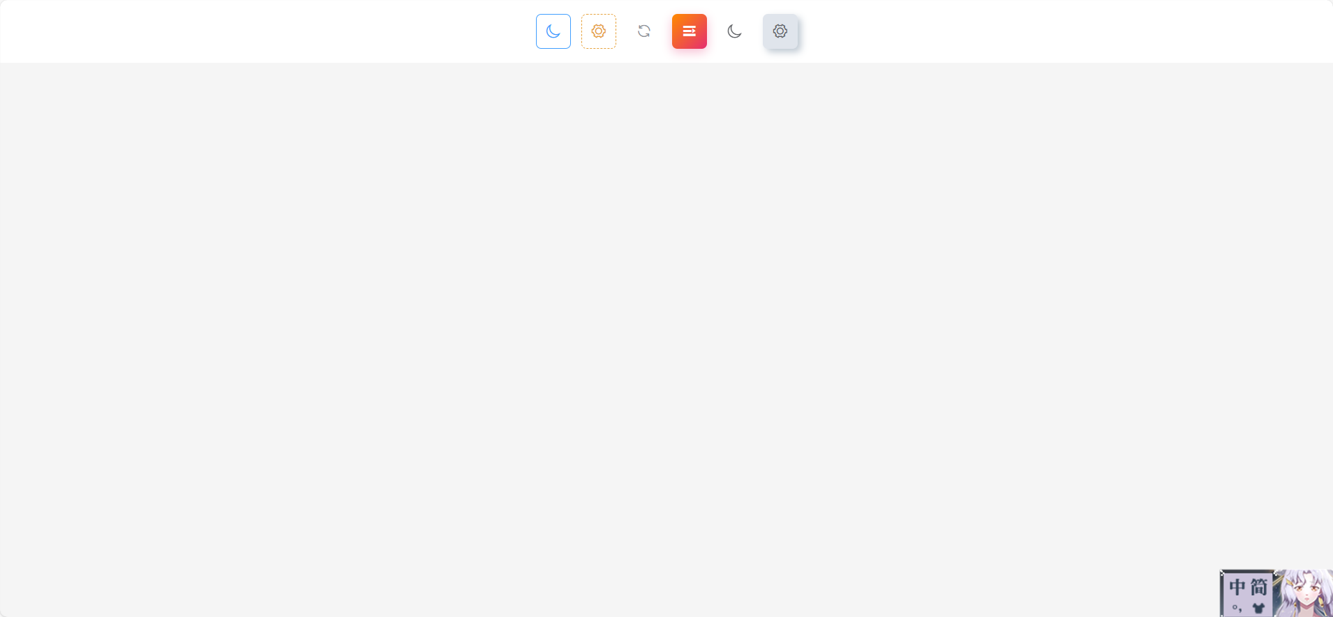
圖標按鈕示例二
<template><div class="icon-button-group icon-button-group--more"><button class="icon-btn icon-btn--outline"><i class="el-icon-moon"></i></button><button class="icon-btn icon-btn--dashed"><i class="el-icon-setting"></i></button><button class="icon-btn icon-btn--text"><i class="el-icon-refresh"></i></button><button class="icon-btn icon-btn--gradient"><i class="el-icon-s-unfold"></i></button><button class="icon-btn icon-btn--glass"><i class="el-icon-moon"></i></button><button class="icon-btn icon-btn--neumorphism"><i class="el-icon-setting"></i></button>
</div></template><script>
export default {name: "SliderVerify",data() {return {};},methods: {},
};
</script><style scoped>
.icon-button-group--more {display: flex;gap: 12px;align-items: center;justify-content: center;padding: 16px;background: #ffffff;
}/* 基礎通用 */
.icon-btn {display: inline-flex;align-items: center;justify-content: center;width: 40px;height: 40px;font-size: 18px;border-radius: 6px;border: none;cursor: pointer;transition: all 0.3s;
}/* 描邊風 */
.icon-btn--outline {background: transparent;color: #409eff;border: 1px solid #409eff;
}
.icon-btn--outline:hover {background: rgba(64, 158, 255, 0.1);
}/* 虛線風 */
.icon-btn--dashed {background: transparent;color: #e6a23c;border: 1px dashed #e6a23c;
}
.icon-btn--dashed:hover {background: rgba(230, 162, 60, 0.1);
}/* 文字風 */
.icon-btn--text {background: transparent;color: #909399;box-shadow: none;
}
.icon-btn--text:hover {color: #409eff;
}/* 漸變風 */
.icon-btn--gradient {background: linear-gradient(135deg, #ff8a00 0%, #e52e71 100%);color: #ffffff;box-shadow: 0 4px 12px rgba(229, 46, 113, 0.3);
}
.icon-btn--gradient:hover {transform: translateY(-2px) scale(1.05);
}/* 玻璃質感 */
.icon-btn--glass {background: rgba(255, 255, 255, 0.2);color: #606266;backdrop-filter: blur(8px);border: 1px solid rgba(255, 255, 255, 0.4);
}
.icon-btn--glass:hover {background: rgba(255, 255, 255, 0.3);
}/* 新擬物風 */
.icon-btn--neumorphism {background: #e0e5ec;color: #606266;box-shadow:4px 4px 8px #bec8d2,-4px -4px 8px #ffffff;
}
.icon-btn--neumorphism:hover {background: #d8dde4;
}</style>
圖標按鈕示例三
<template><!-- 圖標按鈕容器 -->
<div class="icon-btn-container"><!-- 常規色彩風格 --><button class="icon-btn btn-default"><i class="el-icon-moon"></i></button><button class="icon-btn btn-primary"><i class="el-icon-setting"></i></button><button class="icon-btn btn-success"><i class="el-icon-refresh"></i></button><button class="icon-btn btn-warning"><i class="el-icon-s-unfold"></i></button>
</div></template><script>
export default {name: "SliderVerify",data() {return {};},methods: {},
};
</script><style scoped>
/* 容器:響應式 Grid 布局,居中,背景和內邊距 */
.icon-btn-container {display: grid;grid-template-columns: repeat(auto-fit, minmax(48px, 1fr));gap: 16px;max-width: 320px;margin: 24px auto;padding: 16px;background: #f5f7fa;border-radius: 8px;
}/* 按鈕通用樣式 */
.icon-btn {display: inline-flex;align-items: center;justify-content: center;width: 48px;height: 48px;font-size: 20px;border-radius: 8px;border: none;cursor: pointer;transition: all 0.2s ease;
}/* 焦點和按下態 */
.icon-btn:focus {outline: none;box-shadow: 0 0 0 3px rgba(64, 158, 255, 0.3);
}
.icon-btn:active {transform: translateY(1px);
}/* 常規色彩風格 */
.btn-default {background: #ffffff;color: #606266;border: 1px solid #dcdfe6;
}
.btn-default:hover {background: #f2f6fc;
}.btn-primary {background: #409eff;color: #ffffff;
}
.btn-primary:hover {background: #66b1ff;
}.btn-success {background: #67c23a;color: #ffffff;
}
.btn-success:hover {background: #85ce61;
}.btn-warning {background: #e6a23c;color: #ffffff;
}
.btn-warning:hover {background: #f2d749;
}
</style>
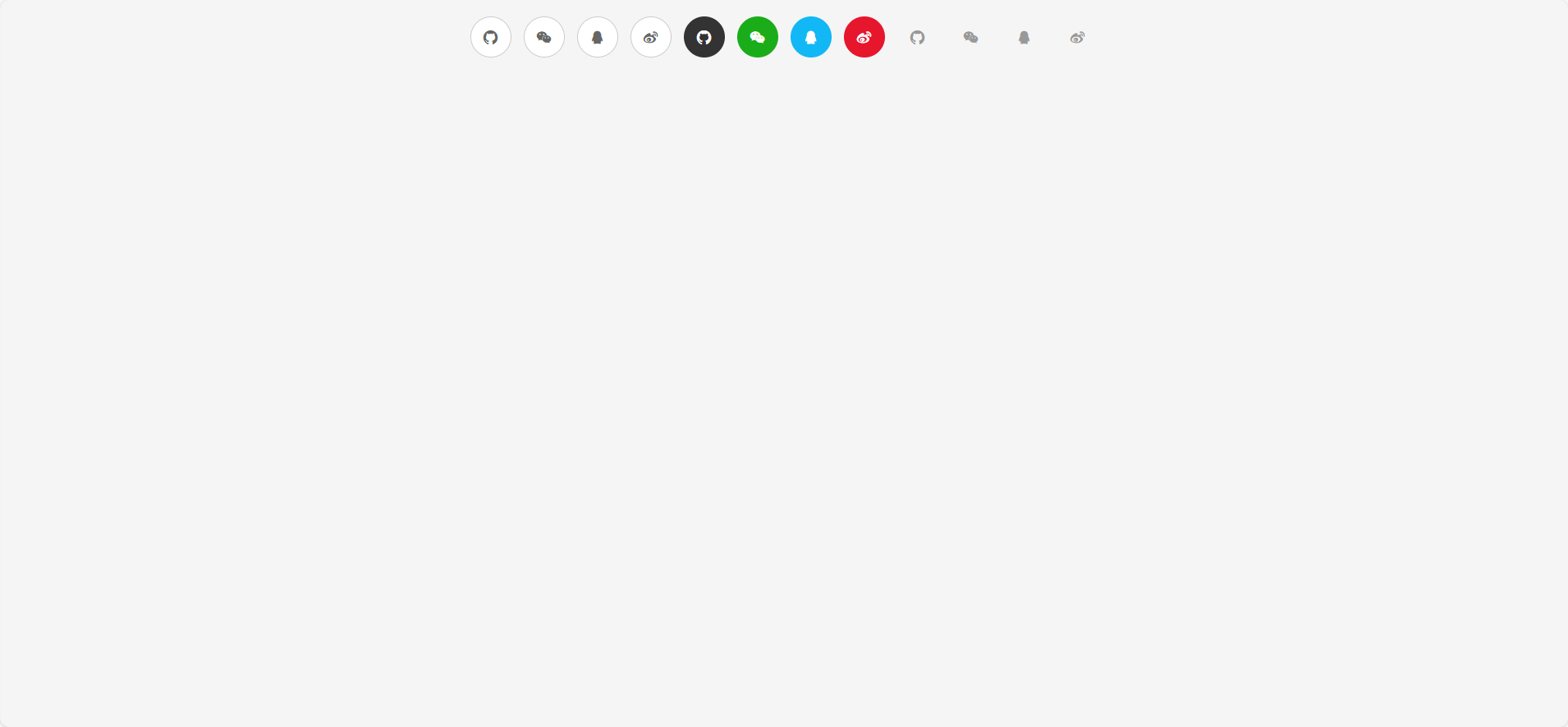
適用于充當其他登錄方式的圖標按鈕
<template><div class="social-login-container"><!-- Outline 圓形圖標按鈕 --><button class="social-btn outline"><i class="iconfont icon-github-fill"></i></button><button class="social-btn outline"><i class="iconfont icon-weixin"></i></button><button class="social-btn outline"><i class="iconfont icon-QQ"></i></button><button class="social-btn outline"><i class="iconfont icon-weibo"></i></button><!-- Fill 圓形填充圖標按鈕 --><button class="social-btn fill"><i class="iconfont icon-github-fill"></i></button><button class="social-btn fill wechat"><i class="iconfont icon-weixin"></i></button><button class="social-btn fill qq"><i class="iconfont icon-QQ"></i></button><button class="social-btn fill weibo"><i class="iconfont icon-weibo"></i></button><!-- Ghost 純圖標無邊框按鈕 --><button class="social-btn ghost"><i class="iconfont icon-github-fill"></i></button><button class="social-btn ghost"><i class="iconfont icon-weixin"></i></button><button class="social-btn ghost"><i class="iconfont icon-QQ"></i></button><button class="social-btn ghost"><i class="iconfont icon-weibo"></i></button></div>
</template><script>
export default {name: "SocialLoginButtons",
};
</script><style scoped>
/* 容器:Flex 布局,響應式居中 */
.social-login-container {display: flex;flex-wrap: wrap;gap: 12px;justify-content: center;align-items: center;padding: 16px;
}/* 公共樣式——圓形、居中、交互 */
.social-btn {width: 40px;height: 40px;border-radius: 50%;font-size: 20px;display: flex;align-items: center;justify-content: center;cursor: pointer;transition: all 0.2s ease;
}/* 1. Outline:白底+細邊 */
.social-btn.outline {background: #fff;border: 1px solid #ccc;color: #666;
}
.social-btn.outline:hover {background: #f5f5f5;
}/* 2. Fill:品牌色填充 */
.social-btn.fill {border: none;color: #fff;background: #333;
}
.social-btn.fill:hover {filter: brightness(1.1);
}
/* 特定品牌色例子 */
.social-btn.fill.wechat {background: #1aad19;
}
.social-btn.fill.qq {background: #12b7f5;
}
.social-btn.fill.weibo {background: #e6162d;
}/* 3. Ghost:僅圖標,無背景無邊框 */
.social-btn.ghost {background: transparent;border: none;color: #999;
}
.social-btn.ghost:hover {color: #409eff;
}
</style>
—— Web 核心概念、HTTP/HTTPS協議 與 Nginx 安裝)


)
)


 --- 多表連接查詢篇)


---出現interactive_timeout/wait_timeout)


)
