文章目錄
- 前言
- 一、準備工作
- 二、實現餅圖組件
- 三、關鍵點解析
- 四、實現效果
- 總結
前言
在現代 Web 應用中,數據可視化是不可或缺的一部分。無論是展示統計信息還是監控關鍵指標,圖表都能幫助用戶更直觀地理解數據。在 Vue 3 項目中,我們可以使用 Chart.js 這個強大且靈活的庫來創建各種類型的圖表。本文將介紹如何在 Vue 3 中使用 Chart.js 實現一個簡單的餅圖,展示人員出勤情況。
一、準備工作
首先,確保你的 Vue 3 項目已經初始化。如果還沒有,可以使用 Vue CLI 快速創建一個新項目:
npm install -g @vue/cli
vue create my-vue-app
cd my-vue-app
接下來,安裝 Chart.js:
npm install chart.js
二、實現餅圖組件
我們將創建一個組件來展示人員出勤情況的餅圖。以下是一個完整的實現示例:
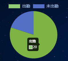
<template><div class="app-container home"><!-- 人員信息模塊 --><div class="module personnel-info"><h3>人員信息</h3><div class="content"><div class="chart-place"><canvas id="attendanceChart" width="300" height="300"></canvas></div><div class="personnel-stats"><div class="stat-item"><span>出勤人數</span><strong>20</strong></div><div class="stat-item"><span>總人數</span><strong>25</strong></div><div class="stat-item"><span>出勤率</span><strong>80%</strong></div></div></div></div></div>
</template><script setup>
import { onMounted } from 'vue';
import Chart from 'chart.js/auto';onMounted(() => {const ctx = document.getElementById('attendanceChart').getContext('2d');new Chart(ctx, {type: 'pie',data: {labels: ['出勤', '未出勤'],datasets: [{data: [20, 5],backgroundColor: ['#5470C6', '#91CC75'], // 使用轉換后的十六進制顏色hoverBackgroundColor: ['#3A8EFD', '#7CB342'],borderWidth: 0 // 去掉白色邊框}]},options: {responsive: false, // 禁用響應式,以便手動設置大小maintainAspectRatio: false, // 禁用寬高比保持plugins: {legend: {position: 'top', // 將圖例放置在餅圖上方labels: {color: '#A6CAF4', // 圖例文字顏色font: {size: 14 // 設置圖例文字的大小}}}}}});
});
</script><style scoped lang="scss">
.app-container {padding: 20px;background-color: transparent;color: #fff;
}.module {background-color: transparent;border-radius: 5px;padding-top: 5px;padding-left: 45px;padding-right: 30px;flex: 1;h3 {color: #A6CAF4;padding-bottom: 8px;margin-bottom: 8px;font-size: 22px;font-weight: bold;display: inline-block;background-image: url('@/assets/images/光環2.png');background-size: contain;background-repeat: no-repeat;padding-left: 5px;background-position: left 20px;}
}.personnel-info {background-image: url('@/assets/images/組合 64.png');background-size: 100% 100%;background-repeat: no-repeat;background-position: center;position: absolute;top: 70px;left: 30px;width: 500px;height: 365px;.content {display: flex;}.chart-place {display: flex;height: 250px;width: 60%;justify-content: center;align-items: center;}.personnel-stats {display: flex;flex-wrap: wrap;width: 40%;flex-direction: column;justify-content: center;align-items: stretch;.stat-item {width: 100%;margin-bottom: 20px;background-color: rgba(0, 51, 102, 0.5);border-radius: 8px;padding: 9px;span {display: block;color: #A6CAF4;font-size: 17px;margin-bottom: 5px;text-align: center;}strong {display: block;font-size: 25px;color: #00b7ee;text-align: center;}}}
}
</style>
三、關鍵點解析
-
安裝和導入 Chart.js:
- 使用
npm install chart.js安裝庫。 - 在組件中使用
import Chart from 'chart.js/auto';導入。
- 使用
-
設置餅圖的基本配置:
- 使用
type: 'pie'指定圖表類型為餅圖。 - 在
data中定義labels和datasets,其中datasets包含數據值和樣式配置。
- 使用
-
調整餅圖外觀:
- 使用
backgroundColor設置每個部分的背景顏色。 - 設置
borderWidth: 0去掉數據項之間的白色邊框。
- 使用
-
配置圖例:
- 使用
plugins.legend.position: 'top'將圖例放置在餅圖上方。 - 使用
labels.font.size調整圖例文字的大小。
- 使用
-
樣式和布局:
- 使用 SCSS 定義組件的樣式,確保圖表和統計信息的布局合理。
四、實現效果
總結
在 Vue 3 中使用 Chart.js 創建餅圖是一個簡單而有效的方法來可視化數據。通過配置選項,你可以輕松調整圖表的外觀和行為,以滿足你的需求。希望本文能幫助你更好地理解如何在 Vue 3 項目中集成和使用 Chart.js。
如果你對 Chart.js 的更多功能和配置選項感興趣,可以查閱 Chart.js 官方文檔。

--加載配置文件)
)

)

——診斷、DCM)
)


)

