這是接著上一篇css基礎的第二篇:主要開始對頁面的布局進行學習
顯示模式:
塊級模式(Block)
-
特點 :
-
元素會獨占一行,在其前后會自動換行,與其他塊級元素在垂直方向上排列。
-
寬度默認為所在容器的 100%,可以通過設置
width屬性來改變。 -
可以通過
margin和padding來控制元素與其他元素之間的間距以及內部內容與邊框之間的間距。 -
常見的塊級元素如
<div>、<p>、<h1>-<h6>等。
-
<!DOCTYPE html>
<html lang="en">
<head><meta charset="UTF-8"><meta name="viewport" content="width=device-width, initial-scale=1.0"><title>塊級模式</title><style>.block-demo {display: block; /* 塊級顯示 */width: 400px; /* 設置寬度 */height: 200px; /* 設置高度 */background-color: #f0f0f0; /* 背景顏色 */margin: 10px; /* 外邊距 */padding: 10px; /* 內邊距 */border: 1px solid #ccc; /* 邊框 */}</style>
</head>
<body><h1>塊級模式展示</h1><div class="block-demo">這是一個塊級元素,它獨占一行,寬度默認是容器的 100%(這里設置為 200px),可以通過設置 width 屬性來改變寬度,還可以通過 margin 和 padding 控制間距。</div><div class="block-demo">這是另一個塊級元素,它會自動換行到下一行,與前面的塊級元素垂直排列。</div>
</body>
</html>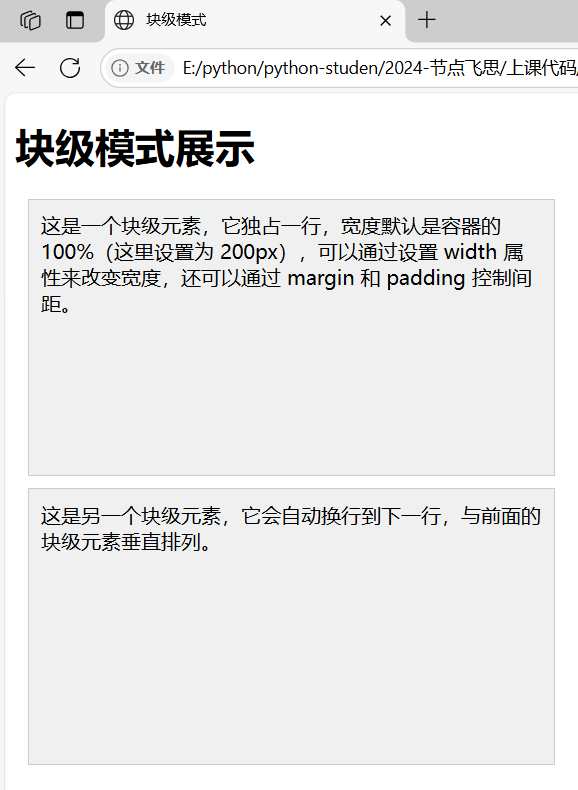
-
應用場景 :用于構建頁面的整體布局結構,比如頁面的主要內容區域、標題塊等。
行內模式(Inline)
-
特點 :
-
元素不會獨占一行,會與相鄰的行內元素在同一行顯示,直到一行排滿才會換行。
-
寬度由其內容決定,不能通過設置
width屬性來改變寬度。 -
只能通過
margin和padding的左右方向來設置間距,上下方向的設置一般不會產生預期效果(在標準盒模型下)。 -
常見的行內元素如
<span>、<a>、<img>等。
-
<!DOCTYPE html>
<html lang="en">
<head><meta charset="UTF-8"><meta name="viewport" content="width=device-width, initial-scale=1.0"><title>行內模式</title><style>.inline-demo {display: inline; /* 行內顯示 */width: 100px; /* 嘗試設置寬度,但在標準盒模型下無效 */height: 50px; /* 嘗試設置高度,但在標準盒模型下無效 */background-color: #e0e0e0; /* 背景顏色 */margin: 5px; /* 外邊距 */padding: 5px; /* 內邊距 */border: 1px solid #ccc; /* 邊框 */}</style>
</head>
<body><h1>行內模式展示</h1><div><span class="inline-demo">這是一個行內元素,它不會獨占一行,寬度由內容決定,不能通過 width 改變寬度,只能設置左右方向的間距。</span><span class="inline-demo">這是另一個行內元素,它會和前面的行內元素在同一行顯示,直到一行排滿才會換行。</span></div>
</body>
</html>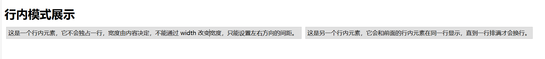
-
應用場景 :適合用于頁面中一些較小的、連續性的內容,如文本中的超鏈接、圖片插入在文字中間等。
行內塊模式(Inline - Block)
-
特點 :
-
兼具了行內和塊級的特點,在水平方向上像行內元素一樣可以與其他元素并排顯示,但在垂直方向上又像塊級元素,可以設置自己的寬度和高度。
-
可以通過
margin和padding的所有方向來控制間距。 -
常見的可以通過設置
display為 inline - block 的元素應用此模式,比如讓某些原本是行內或塊級的元素以這種方式顯示。
-
<!DOCTYPE html>
<html lang="en">
<head><meta charset="UTF-8"><meta name="viewport" content="width=device-width, initial-scale=1.0"><title>行內塊模式</title><style>.inline-block-demo {display: inline-block; /* 行內塊顯示 */width: 300px; /* 設置寬度 */height: 170px; /* 設置高度 */background-color: #d0d0d0; /* 背景顏色 */margin: 8px; /* 外邊距 */padding: 8px; /* 內邊距 */border: 1px solid #ccc; /* 邊框 */}</style>
</head>
<body><h1>行內塊模式展示</h1><div><span class="inline-block-demo">這是一個行內塊元素,它像行內元素一樣可以和其他元素并排顯示,但又能像塊級元素一樣設置寬度和高度。</span><span class="inline-block-demo">這是另一個行內塊元素,可以通過設置所有方向的 margin 和 padding 來控制間距,適用于需要在一行中排列但又能控制自身尺寸的場景。</span></div>
</body>
</html>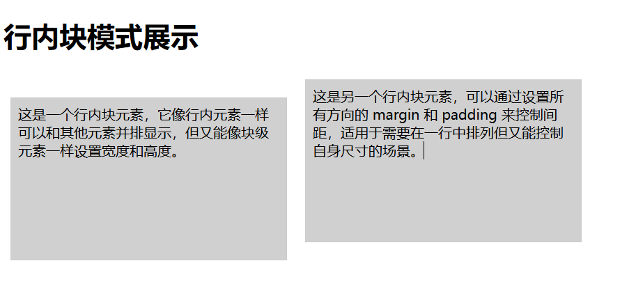
-
應用場景 :當需要元素既能在一行中排列又需要能控制自身的寬度高度時使用,例如一排導航按鈕、一些排列緊密的小圖標等。
| 顯示模式 | 特點 | 布局表現 | 默認寬度 | 間距設置 | 常見應用元素 |
|---|---|---|---|---|---|
| 塊級模式 | 元素獨占一行,在前后自動換行,與其他塊級元素垂直排列 | 寬度默認 100% ,通過設置 width 可改變,可通過 margin 和 padding 控制與其它元素間距及內部內容與邊框間距 | 所在容器的 100% | 可通過 margin 和 padding 的所有方向設置間距 | <div>、<p>、<h1>?-?<h6>?等用于頁面整體布局結構構建,如頁面主要內容區域、標題塊等 |
| 行內模式 | 不獨占一行,與相鄰行內元素在同一行顯示,直到一行排滿換行 | 寬度由內容決定,不能通過 width 改變寬度,只能通過 margin 和 padding 左右方向設置間距,上下方向設置一般無預期效果(標準盒模型下) | 由內容決定 | 僅能設置左右方向的 margin 和 padding | <span>、<a>、<img>?等用于頁面較小、連續性內容,如文本中超鏈接、圖片插入文字中間等 |
| 行內塊模式 | 兼具行內和塊級特點,水平方向像行內元素并排顯示,垂直方向像塊級元素可設置寬度高度 | 可通過 margin 和 padding 所有方向設置間距 | 可設置的寬度和高度 | 可設置所有方向的 margin 和 padding | 可通過設置 display 為 inline - block 的元素應用此模式用于元素需要在一行排列又能控制自身寬度高度的場景,如一排導航按鈕、排列緊密的小圖標等 |
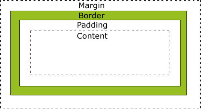
盒子模型:
1.簡介
盒子模型是網頁布局的基礎,將頁面中所有元素都看作是一個盒子,盒子都包含以下幾個屬性:
width 寬度? ? ? ? ? height高度? ? ? ? ? ?border邊框? ? ? ? ? padding內邊距? ? ? ? ? ? margin 外邊距
2.盒子模型
分為四個方向:
上top、右right、下bottom、左left
border-top、border-right、border-bottom、border-left
每個邊框包含三種樣式:
border-top-color、border-top-width、border-top-style
border-right-color、border-right-width、border-right-style
border-bottom-color、border-bottom-width、border-bottom-style
border-left-color、border-left-width、border-left-style
div {width: 220px;padding: 10px;border: 5px solid gray;margin: 0;
}
最終元素的總寬度計算公式是這樣的:
總元素的寬度=寬度+左填充+右填充+左邊框+右邊框+左邊距+右邊距
元素的總高度最終計算公式是這樣的:
總元素的高度=高度+頂部填充+底部填充+上邊框+下邊框+上邊距+下邊距
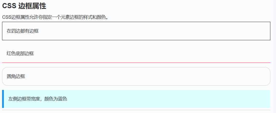
3.邊框(border)
-
定義 :邊框位于內邊距和外邊距之間,是一個圍繞在內邊距和內容周圍的邊框,用于分隔元素與其他元素。
-
特點 :
-
可以通過
border-width(寬度)、border-style(樣式,如實線、虛線等)、border-color(顏色)等屬性來設置。 -
邊框的寬度會增加元素的總尺寸,即元素的總寬度 = 內容寬度 + 內邊距左右值 + 邊框左右值 + 外邊距左右值,總高度同理。
-
邊框樣式
邊框樣式屬性指定要顯示什么樣的邊界。
border-style?屬性用于指定要顯示的邊框類型。
允許的值如下:
- dotted:定義點狀邊框。
- dashed:定義虛線邊框。
- solid:定義實線邊框。
- double:定義雙線邊框。
- groove:定義三維溝槽邊框。效果取決于 border-color 的值。
- ridge:定義三維脊狀邊框。效果取決于 border-color 的值。
- inset:定義三維嵌入邊框。效果取決于 border-color 的值。
- outset:定義三維突出邊框。效果取決于 border-color 的值。
- none:定義無邊框。
- hidden:定義隱藏邊框。
邊框顏色
border-color屬性用于設置邊框的顏色。可以設置的顏色:
- name - 指定顏色的名稱,如 "red"
- RGB - 指定 RGB 值, 如 "rgb(255,0,0)"
- Hex - 指定16進制值, 如 "#ff0000"
您還可以設置邊框的顏色為"transparent"。
注意:?border-color單獨使用是不起作用的,必須得先使用border-style來設置邊框樣式。
<!DOCTYPE html>
<html lang="en">
<head><meta charset="UTF-8"><meta name="viewport" content="width=device-width, initial-scale=1.0"><title>邊框示例</title><style>.border-demo {width: 200px;height: 100px;border-style: solid; /* 實線邊框樣式 */border-width: 5px; /* 邊框寬度 */border-color: #ff0000; /* 邊框顏色 */padding: 20px; /* 內邊距 */background-color: #f0f0f0; /* 背景顏色 */margin: 20px; /* 外邊距 */}</style>
</head>
<body><div class="border-demo">這是一個帶有邊框的元素</div>
</body>
</html>
border-style屬性可以有1-4個值:
- border-style:dotted solid double dashed;
- 上邊框是 dotted
- 右邊框是 solid
- 底邊框是 double
- 左邊框是 dashed
- border-style:dotted solid double;
- 上邊框是 dotted
- 左、右邊框是 solid
- 底邊框是 double
- border-style:dotted solid;
- 上、底邊框是 dotted
- 右、左邊框是 solid
- border-style:dotted;
- 四面邊框是 dotted
上面的例子用了border-style。然而,它也可以和border-width 、 border-color一起使用。
p
{border-top-style:dotted;border-right-style:solid;border-bottom-style:dotted;border-left-style:solid;
}
4.內邊距(padding)
-
定義 :內邊距位于元素內容和邊框之間,是元素內容與邊框之間的空白區域。
-
特點 :
-
可以通過
padding-top(上內邊距)、padding-right(右內邊距)、padding-bottom(下內邊距)、padding-left(左內邊距)等屬性單獨設置,也可以通過padding屬性一次性設置上下左右的內邊距。 -
內邊距的設置會影響元素內容的顯示區域大小,增加內邊距會使內容顯示區域變大,但元素的總尺寸也會相應增加。
-
<!DOCTYPE html>
<html lang="en">
<head><meta charset="UTF-8"><meta name="viewport" content="width=device-width, initial-scale=1.0"><title>內邊距示例</title><style>.padding-demo {width: 200px;height: 100px;padding-top: 20px;padding-right: 30px;padding-bottom: 20px;padding-left: 30px;border: 1px solid #ccc; /* 邊框 */background-color: #f0f0f0; /* 背景顏色 */margin: 20px; /* 外邊距 */}</style>
</head>
<body><div class="padding-demo">這是一個帶有內邊距的元素</div>
</body>
</html>
5.外邊距(margin)
margin 清除周圍的(外邊框)元素區域。margin 沒有背景顏色,是完全透明的。
margin 可以單獨改變元素的上,下,左,右邊距,也可以一次改變所有的屬性。
-
定義 :外邊距位于元素邊框之外,是元素與其他元素之間的空白區域,用于控制元素之間的間距。
-
特點 :
-
可以通過
margin-top(上外邊距)、margin-right(右外邊距)、margin-bottom(下外邊距)、margin-left(左外邊距)等屬性單獨設置,也可以通過margin屬性一次性設置上下左右的外邊距。 -
外邊距具有塌陷現象,即相鄰兩個元素的垂直外邊距會重疊,取最大值。可以通過設置元素的
overflow屬性為hidden或其他值來清除外邊距塌陷。
-
| 值 | 說明 |
|---|---|
| auto | 設置瀏覽器邊距。 這樣做的結果會依賴于瀏覽器 |
| length | 定義一個固定的margin(使用像素,pt,em等) |
| % | 定義一個使用百分比的邊距 |
<!DOCTYPE html>
<html lang="en">
<head><meta charset="UTF-8"><meta name="viewport" content="width=device-width, initial-scale=1.0"><title>外邊距示例</title><style>.margin-demo {width: 200px;height: 100px;padding: 20px;border: 1px solid #ccc;background-color: #f0f0f0;margin-top: 30px;margin-right: 40px;margin-bottom: 30px;margin-left: 40px;}</style>
</head>
<body><div class="margin-demo">這是一個帶有外邊距的元素</div>
</body>
</html>
margin屬性可以有一到四個值。
- margin:25px 50px 75px 100px;
- 上邊距為25px
- 右邊距為50px
- 下邊距為75px
- 左邊距為100px
- margin:25px 50px 75px;
- 上邊距為25px
- 左右邊距為50px
- 下邊距為75px
- margin:25px 50px;
- 上下邊距為25px
- 左右邊距為50px
- margin:25px;
- 所有的4個邊距都是25px
浮動和清除:
概念
浮動(float)是 CSS 中一種重要的布局方式,它可以使元素向左(left)或向右(right)移動,直到它的外邊緣碰到包含框或另一個浮動框的邊框為止。浮動元素會脫離正常的文檔流,但仍然會影響頁面上其他元素的布局。
語法:
selector {float: none | left | right | inherit;
}-
none:默認值,元素不浮動。 -
left:元素向左浮動。 -
right:元素向右浮動。 -
inherit:元素從父元素繼承float屬性值。
浮動的作用
-
圖像環繞文本 :可以讓文本圍繞圖像或其他元素顯示。
-
創建多列布局 :通過浮動多個元素可以創建多列布局。
-
導航菜單 :可以用來水平排列導航菜單項。
| 屬性 | 描述 | 值 |
|---|---|---|
| clear | 指定不允許元素周圍有浮動元素。 | left right both none inherit |
| float | 指定一個盒子(元素)是否可以浮動。 | left right none inherit |
1.圖像圍繞文本:
<!DOCTYPE html>
<html lang="en">
<head><meta charset="UTF-8"><meta name="viewport" content="width=device-width, initial-scale=1.0"><title>圖像環繞文本</title><style>.container {width: 500px;border: 1px solid #ccc;padding: 20px;}.image {float: left;width: 150px;height: 100px;margin-right: 20px;background-color: #f0f0f0;}.text {font-size: 16px;line-height: 1.5;}</style>
</head>
<body><div class="container"><div class="image"></div><div class="text">這是一段環繞圖像的文本。111111111111111111111111111111111
11111111111111111111111111111111111111111111111111111111111111111111111111
11111111111111111111111111111111111111111111111111111</div></div>
</body>
</html>2.創建多列布局:
<!DOCTYPE html>
<html lang="en">
<head><meta charset="UTF-8"><meta name="viewport" content="width=device-width, initial-scale==1.0"><title>多列布局</title><style>.container {width: 800px;border: 1px solid #ccc;overflow: hidden; /* 清除浮動 */}.column {float: left;width: 200px;padding: 15px;background-color: #f0f0f0;margin: 10px;border: 1px solid #ccc;}</style>
</head>
<body><div class="container"><div class="column"><h3>第一列</h3><p>這是第一列的內容。這是第一列的內容。</p></div><div class="column"><h3>第二列</h3><p>這是第二列的內容。這是第二列的內容。</p></div><div class="column"><h3>第三列</h3><p>這是第三列的內容。這是第三列的內容。</p></div><div class="column"><h3>第四列</h3><p>這是第四列的內容。這是第四列的內容。</p></div></div>
</body>
</html>
3.導航菜單:
<!DOCTYPE html>
<html lang="en">
<head><meta charset="UTF-8"><meta name="viewport" content="width=device-width, initial-scale=1.0"><title>導航菜單</title><style>.nav {border: 1px solid #ccc;padding: 10px;background-color: #f0f0f0;height: 30px;}.nav-item {float: left;margin-right: 20px;padding: 5px 10px;background-color: #000000;border-radius: 5px;color: white;}</style>
</head>
<body><div class="nav"><div class="nav-item">首頁</div><div class="nav-item">關于我們</div><div class="nav-item">產品</div><div class="nav-item">服務</div><div class="nav-item">聯系我們</div></div>
</body>
</html>
清除浮動屬性:
浮動會使父元素的高度塌陷(即父元素的高度可能無法正確包含浮動子元素),可以通過清除浮動來解決這個問題。
<!DOCTYPE html>
<html lang="en">
<head><meta charset="UTF-8"><title>浮動</title><style>.box{width: 200px;height: 200px;background-color: red;float: left;}.box1{width: 200px;height: 200px;background-color: blue;float: right;}h1{width: 1000px;height: 300px;background-color: green;}.box2{background-color: #ffa500;/*height: 250px;*//*overflow: hidden;*//*display: flex;*/}/*清除浮動干擾的方法*/.clearfix:after{content: '';display: block;clear: both;}</style>
</head>
<body>
<!--看浮動-->
<!--    <div class="box"></div>-->
<!--    <div class="box1"></div>--><!--用clear: both清除浮動的效果-->
<!--    <div class="box2">-->
<!--          <div class="box"></div>-->
<!--          <div class="box1"></div>-->
<!--          <div style="clear: both"></div>-->
<!--    </div>--><!--用clearfix清除浮動的效果-->
<!--    <div class="box2 clearfix">-->
<!--          <div class="box"></div>-->
<!--          <div class="box1"></div>-->
<!--    </div>--><!--用overflow: hidden清除浮動的效果-->
<!--    <div class="box2">-->
<!--          <div class="box"></div>-->
<!--          <div class="box1"></div>-->
<!--    </div>-->用display 清除浮動的效果<div class="box2"><div class="box"></div><div class="box1"></div>  </div><h1>浮動</h1>
</body>
</html>
以上包含了多種清除浮動效果的方法。
清除浮動的原理
清除浮動主要是為了防止父元素的高度塌陷,確保父元素能夠正確地包含所有浮動子元素。clear 屬性可以取以下值:
-
none:默認值,允許浮動元素位于左右兩側。 -
left:不允許左側有浮動元素。 -
right:不允許右側有浮動元素。 -
both:不允許左右兩側有浮動元素。 -
inherit:從父元素繼承clear屬性值。
通過清除浮動,可以有效地控制布局,避免因浮動引起的各種問題。
定位:
定位的概念
CSS 定位機制有三種:標準文檔流、浮動和定位(position)。定位(position)屬性允許我們精確地控制元素在頁面上的位置,使元素可以相對于其正常位置、父元素、頁面或其他元素進行定位。
定位的類型
-
static(靜態定位)-
這是元素的默認定位方式,元素按照標準文檔流進行布局,不會以任何特殊的方式進行定位。
-
不會受到
left、right、top、bottom、z-index等定位屬性的影響。<!DOCTYPE html> <html lang="en"> <head><meta charset="UTF-8"><meta name="viewport" content="width=device-width, initial-scale=1.0"><title>靜態定位</title><style>.static-demo {position: static;margin: 20px;padding: 15px;border: 1px solid #ccc;background-color: #f0f0f0;}</style> </head> <body><div class="static-demo">這是一個靜態定位的元素</div> </body> </html>
-
-
relative(相對定位)-
元素相對于其正常位置進行定位,即在元素的原始位置上進行偏移。
-
可以通過
left、right、top、bottom屬性來設置元素的偏移量。 -
元素的定位不會影響文檔流中其他元素的位置,它只是在視覺上發生了偏移,原來的空間仍然被保留。
<!DOCTYPE html>
<html lang="en">
<head><meta charset="UTF-8"><meta name="viewport" content="width=device-width, initial-scale=1.0"><title>相對定位</title><style>.relative-demo {position: relative;width: 200px;height: 100px;margin: 20px;padding: 15px;border: 1px solid #ccc;background-color: #f0f0f0;top: 20px;left: 20px;}</style>
</head>
<body><div class="relative-demo">這是一個相對定位的元素,它相對于原始位置向右偏移了 20 像素,向下偏移了 20 像素。</div>
</body>
</html>
-
-
absolute(絕對定位)-
元素脫離標準文檔流,相對于最近的已定位祖先元素進行定位。
-
如果元素沒有已定位的祖先元素,則相對于初始包含框(通常是瀏覽器窗口)進行定位。
-
元素的定位會通過
left、right、top、bottom屬性來精確指定位置。 -
絕對定位的元素不會影響文檔流中其他元素的布局,其他元素會像它不存在一樣進行排列。
<!DOCTYPE html>
<html lang="en">
<head><meta charset="UTF-8"><meta name="viewport" content="width=device-width, initial-scale=1.0"><title>絕對定位</title><style>.container {position: relative;width: 500px;height: 300px;border: 1px solid #ccc;margin: 20px;padding: 10px;background-color: #f0f0f0;}.absolute-demo {position: absolute;width: 100px;height: 50px;border: 1px solid #ccc;background-color: #e0e0e0;top: 50px;left: 100px;}</style>
</head>
<body><div class="container"><div class="absolute-demo">這是一個絕對定位的元素</div></div>
</body>
</html>
-
-
fixed(固定定位)-
元素脫離標準文檔流,相對于瀏覽器窗口進行定位。
-
無論頁面如何滾動,元素都會固定在瀏覽器窗口的某個位置。
-
元素的定位通過
left、right、top、bottom屬性來設置位置。 -
與絕對定位類似,固定定位的元素也不會影響文檔流中其他元素的布局。
<!DOCTYPE html>
<html lang="en">
<head><meta charset="UTF-8"><meta name="viewport" content="width=device-width, initial-scale=1.0"><title>固定定位</title><style>.fixed-demo {position: fixed;width: 200px;height: 100px;border: 1px solid #ccc;background-color: #f0f0f0;padding: 10px;top: 20px;right: 20px;}.content {height: 1000px;padding: 20px;border: 1px solid #ccc;}</style>
</head>
<body><div class="fixed-demo">這是一個固定定位的元素,無論頁面如何滾動,它都會固定在瀏覽器窗口的右上角。</div><div class="content">這是頁面的內容區域,可以滾動查看。</div>
</body>
</html>
-
-
sticky(粘性定位)-
粘性定位是一種特殊的定位方式,它在滾動超出目標區域時會切換回相對定位。
-
元素在跨越特定閾值前表現為相對定位,之后表現為固定定位。
-
需要結合
left、right、top、bottom屬性來設置位置。<!DOCTYPE html> <html lang="en"> <head><meta charset="UTF-8"><meta name="viewport" content="width=device-width, initial-scale=1.0"><title>粘性定位</title><style>.container {width: 500px;height: 300px;border: 1px solid #ccc;margin: 20px;padding: 10px;background-color: #f0f0f0;overflow: auto;}.sticky-demo {position: sticky;top: 20px;width: 200px;height: 50px;border: 1px solid #ccc;background-color: #e0e0e0;margin: 10px;padding: 10px;}</style> </head> <body><div class="container"><div class="sticky-demo">這是一個粘性定位的元素,當滾動到特定位置時會固定在瀏覽器窗口的頂部。</div><div style="height: 500px;"></div></div> </body> </html>
-
?定位中的?z-index?屬性
z-index 屬性用于控制重疊元素的堆疊順序,取值為整數(可以是正數、負數或零)。z-index 只對定位元素(position 值不為 static 的元素)有效。
-
正值會使元素位于其他元素之上。
-
負值會使元素位于其他元素之下。
<!DOCTYPE html>
<html lang="en">
<head><meta charset="UTF-8"><meta name="viewport" content="width=device-width, initial-scale=1.0"><title>z-index 示例</title><style>.container {position: relative;width: 300px;height: 200px;border: 1px solid #ccc;margin: 20px;padding: 10px;background-color: #f0f0f0;}.box1 {position: absolute;width: 100px;height: 100px;background-color: red;top: 50px;left: 50px;z-index: 2;}.box2 {position: absolute;width: 100px;height: 100px;background-color: blue;top: 80px;left: 80px;z-index: 1;}</style>
</head>
<body><div class="container"><div class="box1"></div><div class="box2"></div></div>
</body>
</html>
總結:
| 定位方式 | 特點 | 常見用途 | z-index |
|---|---|---|---|
static(靜態定位) | 元素按照標準文檔流進行布局,不會以任何特殊的方式進行定位。left、right、top、bottom、z-index?等屬性對其無效。 | 適用于不需要特殊定位的普通文檔流元素。 | 無,z-index?對其無效 |
relative(相對定位) | 元素相對于其正常位置進行偏移,可通過?left、right、top、bottom?設置偏移量。元素仍保留原始文檔流中的空間。 | 適用于需要在原始位置上微調元素位置的場景。 | 可設置,控制元素的堆疊順序 |
absolute(絕對定位) | 元素脫離標準文檔流,相對于最近的已定位祖先元素進行定位。若無已定位祖先,則相對于瀏覽器窗口。通過?left、right、top、bottom?精確設置位置。 | 適用于需要精確控制元素位置,且不影響其他元素布局的場景,如彈出框、懸浮按鈕等。 | 可設置,控制元素的堆疊順序 |
fixed(固定定位) | 元素脫離標準文檔流,相對于瀏覽器窗口進行定位。無論頁面如何滾動,元素都保持固定位置。通過?left、right、top、bottom?設置位置。 | 適用于需要固定在頁面可視區域的元素,如固定的導航欄、回到頂部按鈕等。 | 可設置,控制元素的堆疊順序 |
sticky(粘性定位) | 元素在跨越特定閾值前表現為相對定位,之后表現為固定定位。需結合?left、right、top、bottom?設置位置。 | 適用于需要在滾動到特定位置時固定元素的場景,如表格標題固定等。 | 可設置,控制元素的堆疊順序 |
z-index | 控制定位元素的堆疊順序,取值為整數(正數、負數或零)。僅對定位元素(position?值不為?static?的元素)有效。 | 用于控制重疊元素的前后順序,正值使元素位于上方,負值使元素位于下方。 | - |
這是對定位的一份總結的代碼:?
<!DOCTYPE html>
<html lang="en">
<head><meta charset="UTF-8"><meta name="viewport" content="width=device-width, initial-scale=1.0"><title>CSS 定位方式示例</title><style>body {font-family: Arial, sans-serif;margin: 0;padding: 20px;}.container {width: 800px;margin: 0 auto;border: 2px solid #333;padding: 20px;background-color: #f9f9f9;}h1 {text-align: center;}.section {margin-bottom: 40px;}.section-title {color: #333;border-bottom: 1px solid #ccc;padding-bottom: 10px;}.demo-box {border: 1px solid #ccc;margin: 10px 0;padding: 15px;background-color: #fff;min-height: 100px;}.code-example {background-color: #f4f4f4;padding: 10px;margin: 10px 0;border-left: 3px solid #333;font-family: monospace;}/* Static Positioning */.static-demo {position: static;background-color: #ffeaea;}/* Relative Positioning */.relative-demo {position: relative;background-color: #eaf1fe;width: 200px;height: 100px;}.relative-demo span {position: relative;top: 20px;left: 20px;background-color: #d4e6ff;padding: 5px;}/* Absolute Positioning */.absolute-demo {position: relative;background-color: #e6f7ea;height: 150px;}.absolute-child {position: absolute;top: 20px;right: 20px;background-color: #d4efd9;padding: 10px;}/* Fixed Positioning */.fixed-demo {position: fixed;top: 20px;right: 20px;background-color: #fefae6;padding: 10px;border: 1px solid #e6db55;z-index: 1000;}/* Sticky Positioning */.sticky-demo {position: sticky;top: 10px;background-color: #fefae6;padding: 10px;border: 1px solid #e6db55;}/* z-index Example */.z-index-demo {position: relative;height: 200px;background-color: #f0f0f0;}.box1 {position: absolute;top: 50px;left: 50px;width: 100px;height: 100px;background-color: rgba(255, 0, 0, 0.5);z-index: 2;}.box2 {position: absolute;top: 80px;left: 80px;width: 100px;height: 100px;background-color: rgba(0, 0, 255, 0.5);z-index: 1;}</style>
</head>
<body><div class="container"><h1>CSS 定位方式示例</h1><div class="section" id="static"><h2 class="section-title">1. static(靜態定位)</h2><div class="demo-box static-demo"><p>這是靜態定位的元素,默認的定位方式,遵循標準文檔流。</p><p class="code-example">.static-demo {<br> position: static;<br>}</p></div></div><div class="section" id="relative"><h2 class="section-title">2. relative(相對定位)</h2><div class="demo-box"><p>這是相對定位的容器。</p><div class="relative-demo"><span>這是相對定位的元素,相對于原始位置偏移了 20px。</span></div><p class="code-example">.relative-demo span {<br> position: relative;<br> top: 20px;<br> left: 20px;<br>}</p></div></div><div class="section" id="absolute"><h2 class="section-title">3. absolute(絕對定位)</h2><div class="demo-box absolute-demo"><p>這是絕對定位的容器。</p><div class="absolute-child">這是絕對定位的元素,相對于最近的已定位祖先元素。</div><p class="code-example">.absolute-child {<br> position: absolute;<br> top: 20px;<br> right: 20px;<br>}</p></div></div><div class="section" id="fixed"><h2 class="section-title">4. fixed(固定定位)</h2><div class="demo-box"><p>這是固定定位的元素,固定在瀏覽器窗口的右上角。</p><div class="fixed-demo">這是固定定位的元素</div><p class="code-example">.fixed-demo {<br> position: fixed;<br> top: 20px;<br> right: 20px;<br> z-index: 1000;<br>}</p></div></div><div class="section" id="sticky"><h2 class="section-title">5. sticky(粘性定位)</h2><div class="demo-box"><p>滾動以下內容區域,查看粘性定位的效果。</p><div style="height: 300px; overflow: auto; background-color: #f0f0f0;"><div class="sticky-demo">這是粘性定位的元素,滾動時會固定在頂部。</div><div style="height: 600px;"></div></div><p class="code-example">.sticky-demo {<br> position: sticky;<br> top: 10px;<br>}</p></div></div><div class="section" id="z-index"><h2 class="section-title">6. z-index 示例</h2><div class="demo-box"><p>這是 z-index 屬性的示例。</p><div class="z-index-demo"><div class="box1">box1 (z-index: 2)</div><div class="box2">box2 (z-index: 1)</div></div><p class="code-example">.box1 {<br> position: absolute;<br> top: 50px;<br> left: 50px;<br> z-index: 2;<br>}<br><br>.box2 {<br> position: absolute;<br> top: 80px;<br> left: 80px;<br> z-index: 1;<br>}</p></div></div></div>
</body>
</html>css樣式基礎就到這里啦


![【洛谷P9303題解】AC- [CCC 2023 J5] CCC Word Hunt](http://pic.xiahunao.cn/【洛谷P9303題解】AC- [CCC 2023 J5] CCC Word Hunt)


)


)


