1、data1.csv中的B、C、D和E列數據分別是日期、權重、A企業的銷售額、B企業的銷售額。讀取C、D、E列數據,并統計E列數據的算術平均數、加權平均值(權值為C列數據)、方差、中位數、最小值、最大值。并繪制E列數據的直方圖。
(1)源代碼:
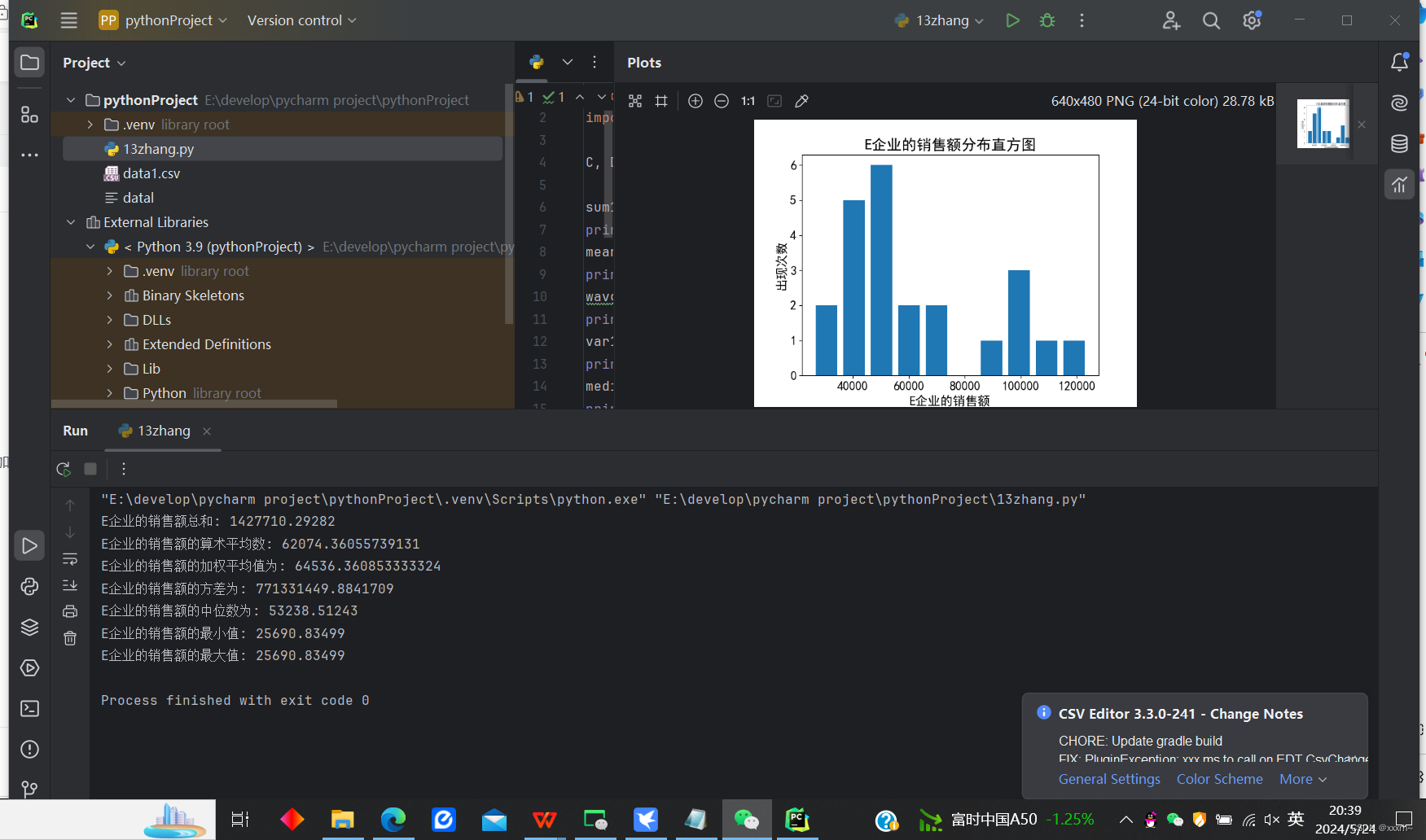
import numpy as npimport matplotlib.pyplot as pltC, D, E = np.loadtxt("data1.csv", delimiter=',', usecols=(2, 3, 4), unpack=True, skiprows=1)sum1 = np.sum(E)print("E企業的銷售額總和:", sum1)mean1 = np.mean(E)print("E企業的銷售額的算術平均數:", mean1)wavg1 = np.average(E, weights=C)print("E企業的銷售額的加權平均值為:", wavg1)var1 = np.var(E)print("E企業的銷售額的方差為:", var1)media1 = np.median(E)print("E企業的銷售額的中位數為:", media1)min1 = np.min(E)print("E企業的銷售額的最小值:", min1)max1 = np.max(E)print("E企業的銷售額的最大值:", min1)plt.hist(E, bins=10, rwidth=0.8)plt.rcParams['font.sans-serif'] = ['SimHei']plt.xticks(fontsize=15)plt.yticks(fontsize=15)plt.xlabel('E企業的銷售額', fontsize=15)plt.ylabel('出現次數', fontsize=15)plt.title('E企業的銷售額分布直方圖', fontsize=18)plt.show()(2)運行結果截圖 :
2、讀取data1.csv文件中的A企業銷售額與B企業銷售額數據,并計算這些企業數據的協方差矩陣和相關系數矩陣。
(1)源代碼:
import numpy as npA, B = np.loadtxt('data1.csv', delimiter=',', usecols=(3, 4), unpack=True, skiprows=1)covAB = np.cov([A, B])relAB = np.corrcoef([A, B])print('A,B企業數據的協方差矩陣為:')print(covAB)print('A,B企業數據的相關系數矩陣為:')print(relAB)(2)?運行結果截圖 :

3、讀取 datal.csv文件中A、B、C、D、E,繪制由A列和D列數據關聯,以及由A列和E列數據(請將該列值除以120后繪圖)關聯的兩條折線圖,并分別賦以不同的顏色和線型,添加圖例。
(1)源代碼
import numpy as npimport matplotlib.pyplot as plts, a, b = np.loadtxt('data1.csv' , delimiter=',' ,usecols=(0 , 3 , 4), unpack=True , skiprows=1)plt.plot(s, a,'r*--',alpha=0.5,linewidth=1,label='A企業')plt.plot(s,b/120,'go--',alpha=0.5,linewidth=1, label='B企業')plt.rcParams['font.sans-serif']=['SimHei']plt.legend()plt.xlabel('時間')plt.ylabel('銷售額')plt.title('A企業與B企業銷售額走勢圖')plt.show()(2)運行結果截圖

4、針對data1.csv中A企業的銷售額,使用簡單移動平均方法估計各月的銷售額。移動平均間隔為3,即用1、2、3三周的數據預測第4周的數據。
(1)源代碼
import numpy as npimport matplotlib.pyplot as plta= np.loadtxt('data1.csv',delimiter=',',usecols=3, unpack=True , skiprows=1)winwide =3weight = np.ones(winwide)/winwideplt.rcParams['font.sans-serif']=['simHei']aM = np.convolve(weight,a)t = np.arange(winwide-1,len(a))plt.figure(figsize=(15,10))plt.subplot(1,2,1)plt.plot(t,a[winwide-1:],lw=1.0,label='實際A企業的銷售額')plt.plot(t, aM[winwide-1:1-winwide],lw=3.0, label='A企業銷售額的移動平均值')plt.xticks(fontsize=15)plt.yticks(fontsize=15)plt.grid()plt.title('A企業銷售額',fontsize=18)plt.legend(fontsize=10)plt.subplots_adjust(wspace=0.2)plt.show()(2)運行結果截圖

5.使用指數移動平均方法估計上題的A企業的銷售額。移動平均間隔為3。并請添加圖、坐標軸標題和圖例。
(1)源代碼
import numpy as npimport matplotlib.pyplot as pltplt.rcParams['font.sans-serif']=['SimHei']volume = np.loadtxt('data1.csv',delimiter=',',usecols=3, unpack=True, skiprows=1)winwide = 3print('0bservation:\n',volume)t= np.arange(winwide-1,len(volume))print('time:\n',t)weights = np.exp(np.linspace(-1,0,winwide))weights /= weights.sum()print('weights:\n',weights)weightMovingAVG =np.convolve(weights,volume)print('Prediction:\n',weightMovingAVG)plot1 = plt.plot(t,volume[winwide-1:],lw=1.0)plot2 = plt.plot(t, weightMovingAVG[winwide-1:1-winwide], lw=2.0)plt.title('A銷售額指數移動平均',fontsize=18)plt.xticks(fontsize=15)plt.yticks(fontsize=15)plt.xlabel('時間順序',fontsize=15)plt.ylabel('A企業銷售額',fontsize=15)plt.legend((plot1[0],plot2[0]),('真實值','指數移動平均值'),loc='upper right',fontsize=13,numpoints=1)plt.show()(2)運行結果截圖


)


回歸預測)


