在ArcGIS Pro二次開發中,SDK提供了一種工具界面【ArcGIS Pro ProWindow】。
關于ProWindow的用法,之前寫過一篇基礎的教程:
【ArcGIS Pro二次開發】(13):ProWindow的用法_arcgispro二次開發教程-CSDN博客
主要是對幾個常用控件的簡單使用進行介紹。
這一篇通過ProWindow講一些WPF的技巧。
一、要實現的效果
?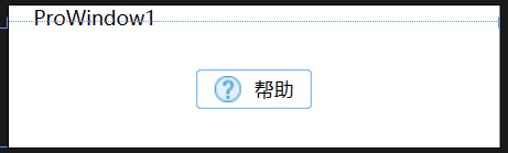
要實現的效果比較簡單,就是一個帶圖標的幫助鍵。
看著比較容易,但這里是想通過這個例子講一下WPF的實現邏輯和樣式定制,做的過程中感覺很有意思,就記錄下來。
二、實現流程
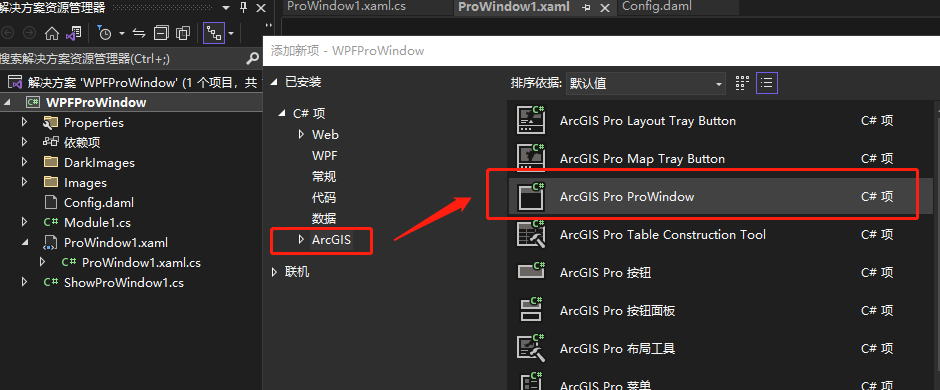
首先在解決方案中右鍵點【添加】——【新建項】,選擇【ArcGIS Pro ProWindow】,如下圖所示:
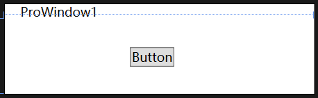
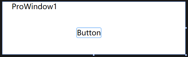
從工具箱拖1個Button控件到主界面中,樣式是系統默認的,比較丑:
修改樣式。在下方的XAML界面中找到Button的代碼,直接修改:
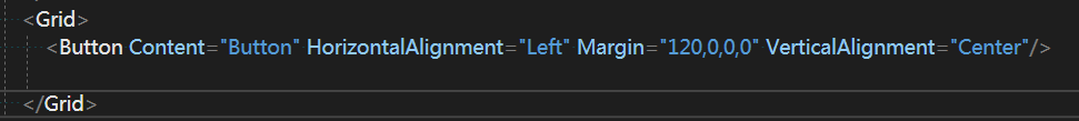
在屬性行中修改邊框(BorderBrush),背景色(Background):
<Grid><Button Content="Button" BorderBrush="#FF81BAF9" Background="White" HorizontalAlignment="Left" Margin="120,0,0,0" VerticalAlignment="Center"/></Grid>修改圓角的話就比較麻煩一點,需要修改Template,邊框,背景色等屬性也要在Template中重寫:
<Grid><Button Content="Button" HorizontalAlignment="Left" Margin="120,0,0,0" VerticalAlignment="Center"><Button.Template><ControlTemplate TargetType="{x:Type Button}"><Border BorderThickness="1" BorderBrush="#FF81BAF9" CornerRadius="2" Background="White"><ContentPresenter VerticalAlignment="Center" HorizontalAlignment="Center"/></Border></ControlTemplate></Button.Template></Button></Grid>效果如下:
對比最開始給的效果圖,按鈕內部有一個圖片和一個文本,顯示這不是用屬性可以直接設置的,而是在內容放了2個控件【Image和TextBlock】。2個控件水平排列,就再加個StackPanel:
<Grid><Button HorizontalAlignment="Center" VerticalAlignment="Center" Height="23" Width="70"><StackPanel Orientation="Horizontal" HorizontalAlignment="Center"><Image Source="/CCTool;component/Data/Icons/help.png" Height="16"/><TextBlock Text="幫助" Margin="8,0,0,0" VerticalAlignment="Center"/></StackPanel><Button.Template><ControlTemplate TargetType="{x:Type Button}"><Border BorderThickness="1" BorderBrush="#FF81BAF9" CornerRadius="2" Background="White"><ContentPresenter VerticalAlignment="Center" HorizontalAlignment="Center"/></Border></ControlTemplate></Button.Template></Button></Grid>需要注意這里Image的源圖片,需要設置生成操作為【資源】,如果是英文版的話,就是【Resource】,不然是不會正常顯示的。
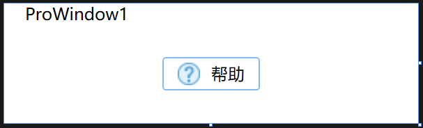
生成結果如下:

至此已經實現了我們想要達到的效果。
三、樣式【Style】的妙用
如果只是實現上面的效果,并不值得專門寫一篇文,本文最主要的是想說一下樣式的用法。
如果每一個按鈕都要寫上面一大段代碼實在很繁瑣,這時候樣式【Style】就顯得很有用了。
首先把Grid上方那塊Resources代碼刪掉:
然后在這個位置輸入Window.Resources,里面放Style,給它個key【btn_xx】,名字隨意,主要是將來控件調用的時候會用到。
把剛才寫的那段內容給放在Style里,不過需要注意幾個控件的內容要用【Grid】給包起來:
<Window.Resources><Style x:Key="btn_xx" TargetType="{x:Type Button}"><Setter Property="Background" Value="White"/><Setter Property="BorderBrush" Value="#FF81BAF9"/><Setter Property="Template"><Setter.Value><ControlTemplate TargetType="{x:Type Button}"><Grid><Border x:Name="border" CornerRadius="2" Background="White" BorderBrush="#FF81BAF9" BorderThickness="{TemplateBinding BorderThickness}" SnapsToDevicePixels="true"><ContentPresenter x:Name="contentPresenter" Focusable="False" HorizontalAlignment="{TemplateBinding HorizontalContentAlignment}" Margin="{TemplateBinding Padding}" RecognizesAccessKey="True" SnapsToDevicePixels="{TemplateBinding SnapsToDevicePixels}" VerticalAlignment="{TemplateBinding VerticalContentAlignment}"/></Border><StackPanel Orientation="Horizontal" HorizontalAlignment="Center"><Image Source="/CCTool;component/Data/Icons/help.png" Height="16"/><TextBlock Text="幫助" Margin="8,0,0,0" VerticalAlignment="Center"/></StackPanel></Grid></ControlTemplate></Setter.Value></Setter></Style></Window.Resources>然后button在調用的時候,就不用寫那么多代碼了,一行就夠:
<Grid><Button Style="{StaticResource btn_xx}" Height="24" Width="70"/></Grid>這里就加了一個Style=,調用剛才寫的Style的key即可。
實現的效果不變,下次再添加按鈕就方便多了:
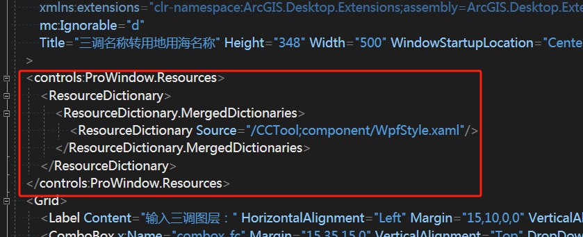
到這里還沒有完,雖然Style被提取出去,簡化了很多,但還有更好的解決思路,就是【資源詞典】。
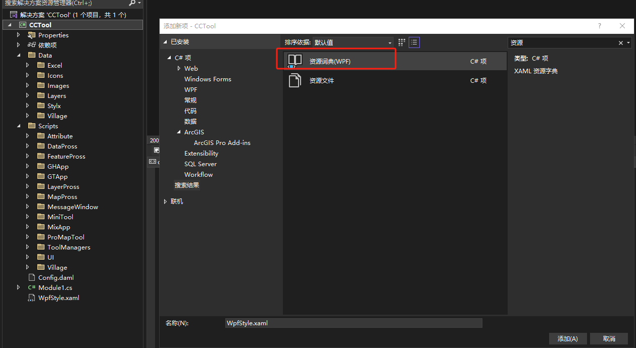
在項目中添加一個【資源詞典(WPF)】:
然后也不用重新寫那一大段,可以在資源詞典中直接生成。
但是首先,要先把剛才寫的那一大段【樣式】刪除,改成這樣一段:
<controls:ProWindow.Resources><ResourceDictionary><ResourceDictionary.MergedDictionaries><ResourceDictionary Source="/CCTool;component/WpfStyle.xaml"/></ResourceDictionary.MergedDictionaries></ResourceDictionary></controls:ProWindow.Resources>是中間一行引用的就是剛才新建的資源詞典,注意路徑,我的是新建在根目錄下,所以component后面直接跟著WpfStyle.xaml。
然后拖一個button控件過來,右鍵點擊【編輯模板】—【編輯副本】:

定義位置到剛才新建的資源字典中:
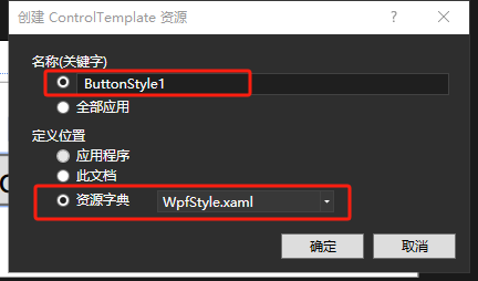
這時候再打開WpfStyle.xaml就會發現里面多了一長串代碼:
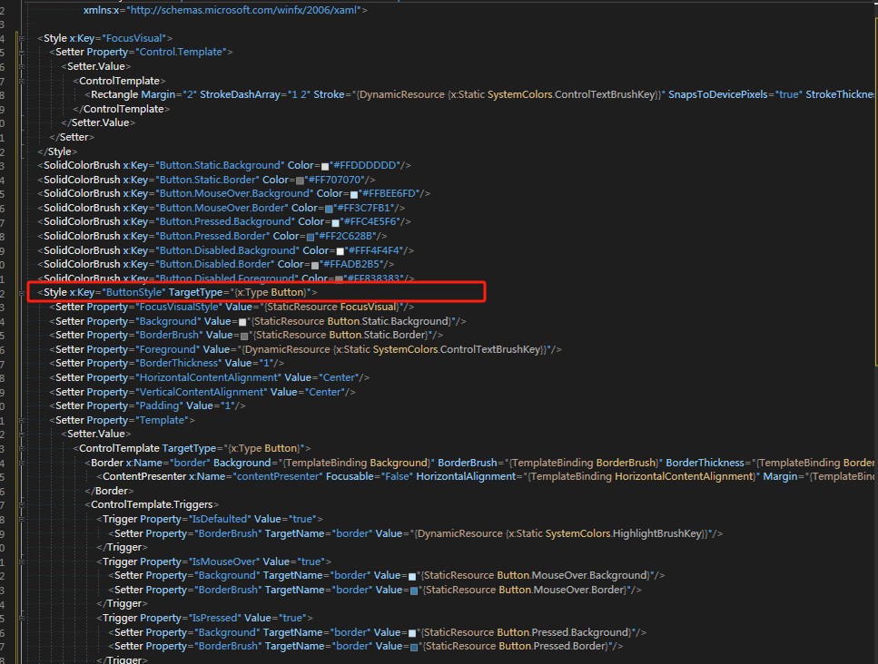
注意這里的這個【x:Key = ButtonStyle】就是剛剛生成的樣式。
下面就是一個很完整的樣式,可以在這里面隨意更改,修改好后,同樣的在button里調用Style="{StaticResource ButtonStyle}"即可。
資源字典的好處是可以跨項目使用。自己積累下來的樣式,可以在以后的項目中調用,而不局限于當前項目,因此是很有用的。
樣式還有一些其它有意思的內容,如繼承等,等后面研究透了再來吧。


)

)

Vue環境搭建第一個項目)

(一)-CNN的基本原理與結構)


)


運行時間)
