設置組件的對齊方式、布局方向和顯示位置。
說明:
從API Version 7開始支持。后續版本如有新增內容,則采用上角標單獨標記該內容的起始版本。
align
align(value: Alignment)
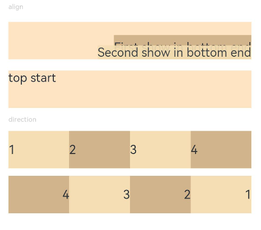
設置容器元素繪制區域內的子元素的對齊方式。
卡片能力:?從API version 9開始,該接口支持在ArkTS卡片中使用。
系統能力:?SystemCapability.ArkUI.ArkUI.Full
參數:
| 參數名 | 類型 | 必填 | 說明 |
|---|---|---|---|
| value | Alignment | 是 | 設置容器元素繪制區域內的子元素的對齊方式。 只在Stack、Button、Marquee、StepperItem、text、TextArea、TextInput、FolderStack中生效,其中和文本相關的組件Marquee、text、TextArea、TextInput的align結果參考textAlign。 不支持textAlign屬性的組件則無法設置水平方向的文字對齊。 默認值:Alignment.Center |
direction
direction(value: Direction)
設置容器元素內主軸方向上的布局。
卡片能力:?從API version 9開始,該接口支持在ArkTS卡片中使用。
系統能力:?SystemCapability.ArkUI.ArkUI.Full
參數:
| 參數名 | 類型 | 必填 | 說明 |
|---|---|---|---|
| value | Direction | 是 | 設置容器元素內主軸方向上的布局。 例:Column組件的主軸為縱軸。 默認值:Direction.Auto |
position
position(value: Position)
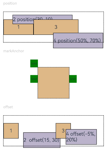
絕對定位,設置子元素左上角相對于父容器左上角偏移位置。
卡片能力:?從API version 9開始,該接口支持在ArkTS卡片中使用。
系統能力:?SystemCapability.ArkUI.ArkUI.Full
參數:
| 參數名 | 類型 | 必填 | 說明 |
|---|---|---|---|
| value | Position | 是 | 絕對定位,設置子元素左上角相對于父容器左上角偏移位置。在布局容器中,設置該屬性不參與父容器布局,即不占位,僅在繪制時進行位置調整。 適用于置頂顯示、懸浮按鈕等組件在父容器中位置固定的場景。 |
markAnchor
markAnchor(value: Position)
設置子元素在位置定位時的錨點。
卡片能力:?從API version 9開始,該接口支持在ArkTS卡片中使用。
系統能力:?SystemCapability.ArkUI.ArkUI.Full
參數:
| 參數名 | 類型 | 必填 | 說明 |
|---|---|---|---|
| value | Position | 是 | 設置子元素在位置定位時的錨點,以元素左上角作為基準點進行偏移。通常配合position和offset屬性使用,單獨使用時,效果類似offset API version 9及以前,默認值為: { x: 0, y: 0 } API version 10:無默認值。 |
offset
offset(value: Position)
相對定位,設置子元素相對于自身的額外偏移量。
卡片能力:?從API version 9開始,該接口支持在ArkTS卡片中使用。
系統能力:?SystemCapability.ArkUI.ArkUI.Full
參數:
| 參數名 | 類型 | 必填 | 說明 |
|---|---|---|---|
| value | Position | 是 | 相對定位,設置子元素相對于自身的額外偏移量。設置該屬性后,子組件正常參與父容器布局,依然會占位,在繪制時基于父容器給予的offset做一次額外的偏移。 API version 9及以前,默認值為: { x: 0, y: 0 } API version 10:無默認值。 |
alignRules9+
alignRules(value: AlignRuleOption)
指定設置在相對容器中子組件的對齊規則,僅當父容器為RelativeContainer時生效。
卡片能力:?從API version 9開始,該接口支持在ArkTS卡片中使用。
系統能力:?SystemCapability.ArkUI.ArkUI.Full
參數:
| 參數名 | 類型 | 必填 | 說明 |
|---|---|---|---|
| value | AlignRuleOption | 是 | 指定設置在相對容器中子組件的對齊規則。 |
AlignRuleOption對象說明
從API version 9開始,該接口支持在ArkTS卡片中使用。
| 名稱 | 類型 | 描述 |
|---|---|---|
| left | { anchor: string, align:?HorizontalAlign?} | 設置左對齊參數。 -?anchor:設置作為錨點的組件的id值。 -?align:設置相對于錨點組件的對齊方式。 |
| right | { anchor: string, align:?HorizontalAlign?} | 設置右對齊參數。 -?anchor:設置作為錨點的組件的id值。 -?align:設置相對于錨點組件的對齊方式。 |
| middle | { anchor: string, align:?HorizontalAlign?} | 設置橫向居中對齊方式的參數。 -?anchor:設置作為錨點的組件的id值。 -?align:設置相對于錨點組件的對齊方式。 |
| top | { anchor: string, align:?VerticalAlign?} | 設置頂部對齊的參數。 -?anchor:設置作為錨點的組件的id值。 -?align:設置相對于錨點組件的對齊方式。 |
| bottom | { anchor: string, align:?VerticalAlign?} | 設置底部對齊的參數。 -?anchor:設置作為錨點的組件的id值。 -?align:設置相對于錨點組件的對齊方式。 |
| center | { anchor: string, align:?VerticalAlign?} | 設置縱向居中對齊方式的參數。 |
| bias | { horizontal: number, vertical: number } | 設置組件在錨點約束下的偏移參數,其值為到左/上側錨點的距離與錨點間總距離的比值。 -?horizontal:水平方向上的bias值。 -?vertical:垂直方向上的bias值。 -?當子組件的width可以確定并且有2個水平方向的錨點時生效。 -?當子組件的height可以確定并且有2個垂直方向的錨點時生效。 默認值:{ horizontal:?0.5, vertical:?0.5 }。 |
示例
示例1
// xxx.ets
@Entry
@Component
struct PositionExample1 {build() {Column() {Column({ space: 10 }) {// 元素內容<元素寬高,設置內容在與元素內的對齊方式Text('align').fontSize(9).fontColor(0xCCCCCC).width('90%')Stack() {Text('First show in bottom end').height('65%').backgroundColor(0xD2B48C)Text('Second show in bottom end').backgroundColor(0xF5DEB3).opacity(0.9)}.width('90%').height(50).margin({ top: 5 }).backgroundColor(0xFFE4C4).align(Alignment.BottomEnd)Stack() {Text('top start')}.width('90%').height(50).margin({ top: 5 }).backgroundColor(0xFFE4C4).align(Alignment.TopStart)// 父容器設置direction為Direction.Ltr,子元素從左到右排列Text('direction').fontSize(9).fontColor(0xCCCCCC).width('90%')Row() {Text('1').height(50).width('25%').fontSize(16).backgroundColor(0xF5DEB3)Text('2').height(50).width('25%').fontSize(16).backgroundColor(0xD2B48C)Text('3').height(50).width('25%').fontSize(16).backgroundColor(0xF5DEB3)Text('4').height(50).width('25%').fontSize(16).backgroundColor(0xD2B48C)}.width('90%').direction(Direction.Ltr)// 父容器設置direction為Direction.Rtl,子元素從右到左排列Row() {Text('1').height(50).width('25%').fontSize(16).backgroundColor(0xF5DEB3).textAlign(TextAlign.End)Text('2').height(50).width('25%').fontSize(16).backgroundColor(0xD2B48C).textAlign(TextAlign.End)Text('3').height(50).width('25%').fontSize(16).backgroundColor(0xF5DEB3).textAlign(TextAlign.End)Text('4').height(50).width('25%').fontSize(16).backgroundColor(0xD2B48C).textAlign(TextAlign.End)}.width('90%').direction(Direction.Rtl)}}.width('100%').margin({ top: 5 })}
}
示例2
// xxx.ets
@Entry
@Component
struct PositionExample2 {build() {Column({ space: 20 }) {// 設置子組件左上角相對于父組件左上角的偏移位置Text('position').fontSize(12).fontColor(0xCCCCCC).width('90%')Row() {Text('1').size({ width: '30%', height: '50' }).backgroundColor(0xdeb887).border({ width: 1 }).fontSize(16).textAlign(TextAlign.Center)Text('2 position(30, 10)').size({ width: '60%', height: '30' }).backgroundColor(0xbbb2cb).border({ width: 1 }).fontSize(16).align(Alignment.Start).position({ x: 30, y: 10 })Text('3').size({ width: '45%', height: '50' }).backgroundColor(0xdeb887).border({ width: 1 }).fontSize(16).textAlign(TextAlign.Center)Text('4 position(50%, 70%)').size({ width: '50%', height: '50' }).backgroundColor(0xbbb2cb).border({ width: 1 }).fontSize(16).position({ x: '50%', y: '70%' })}.width('90%').height(100).border({ width: 1, style: BorderStyle.Dashed })// 相對于起點偏移,其中x為最終定位點距離起點水平方向間距,x>0往左,反之向右。// y為最終定位點距離起點垂直方向間距,y>0向上,反之向下Text('markAnchor').fontSize(12).fontColor(0xCCCCCC).width('90%')Stack({ alignContent: Alignment.TopStart }) {Row().size({ width: '100', height: '100' }).backgroundColor(0xdeb887)Text('text').fontSize('30px').textAlign(TextAlign.Center).size({ width: 25, height: 25 }).backgroundColor(Color.Green).markAnchor({ x: 25, y: 25 })Text('text').fontSize('30px').textAlign(TextAlign.Center).size({ width: 25, height: 25 }).backgroundColor(Color.Green).markAnchor({ x: -100, y: -25 })Text('text').fontSize('30px').textAlign(TextAlign.Center).size({ width: 25, height: 25 }).backgroundColor(Color.Green).markAnchor({ x: 25, y: -25 })}.margin({ top: 25 }).border({ width: 1, style: BorderStyle.Dashed })// 相對定位,x>0向右偏移,反之向左,y>0向下偏移,反之向上Text('offset').fontSize(12).fontColor(0xCCCCCC).width('90%')Row() {Text('1').size({ width: '15%', height: '50' }).backgroundColor(0xdeb887).border({ width: 1 }).fontSize(16).textAlign(TextAlign.Center)Text('2  offset(15, 30)').size({ width: 120, height: '50' }).backgroundColor(0xbbb2cb).border({ width: 1 }).fontSize(16).align(Alignment.Start).offset({ x: 15, y: 30 })Text('3').size({ width: '15%', height: '50' }).backgroundColor(0xdeb887).border({ width: 1 }).fontSize(16).textAlign(TextAlign.Center)Text('4 offset(-5%, 20%)').size({ width: 100, height: '50' }).backgroundColor(0xbbb2cb).border({ width: 1 }).fontSize(16).offset({ x: '-5%', y: '20%' })}.width('90%').height(100).border({ width: 1, style: BorderStyle.Dashed })}.width('100%').margin({ top: 25 })}
}
最后,有很多小伙伴不知道學習哪些鴻蒙開發技術?不知道需要重點掌握哪些鴻蒙應用開發知識點?而且學習時頻繁踩坑,最終浪費大量時間。所以有一份實用的鴻蒙(Harmony NEXT)資料用來跟著學習是非常有必要的。?
這份鴻蒙(Harmony NEXT)資料包含了鴻蒙開發必掌握的核心知識要點,內容包含了(ArkTS、ArkUI開發組件、Stage模型、多端部署、分布式應用開發、音頻、視頻、WebGL、OpenHarmony多媒體技術、Napi組件、OpenHarmony內核、Harmony南向開發、鴻蒙項目實戰等等)鴻蒙(Harmony NEXT)技術知識點。
希望這一份鴻蒙學習資料能夠給大家帶來幫助,有需要的小伙伴自行領取,限時開源,先到先得~無套路領取!!
?獲取這份完整版高清學習路線,請點擊→純血版全套鴻蒙HarmonyOS學習資料
鴻蒙(Harmony NEXT)最新學習路線
-
?HarmonOS基礎技能
- HarmonOS就業必備技能?
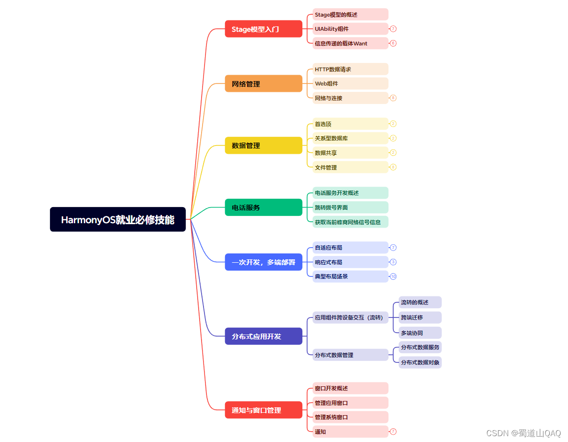
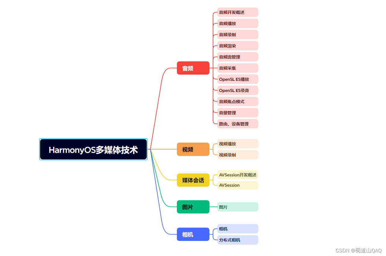
- ?HarmonOS多媒體技術
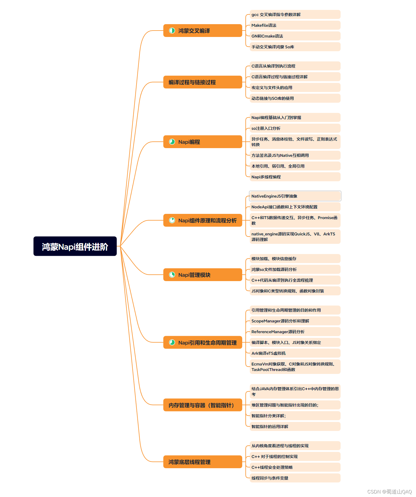
- 鴻蒙NaPi組件進階
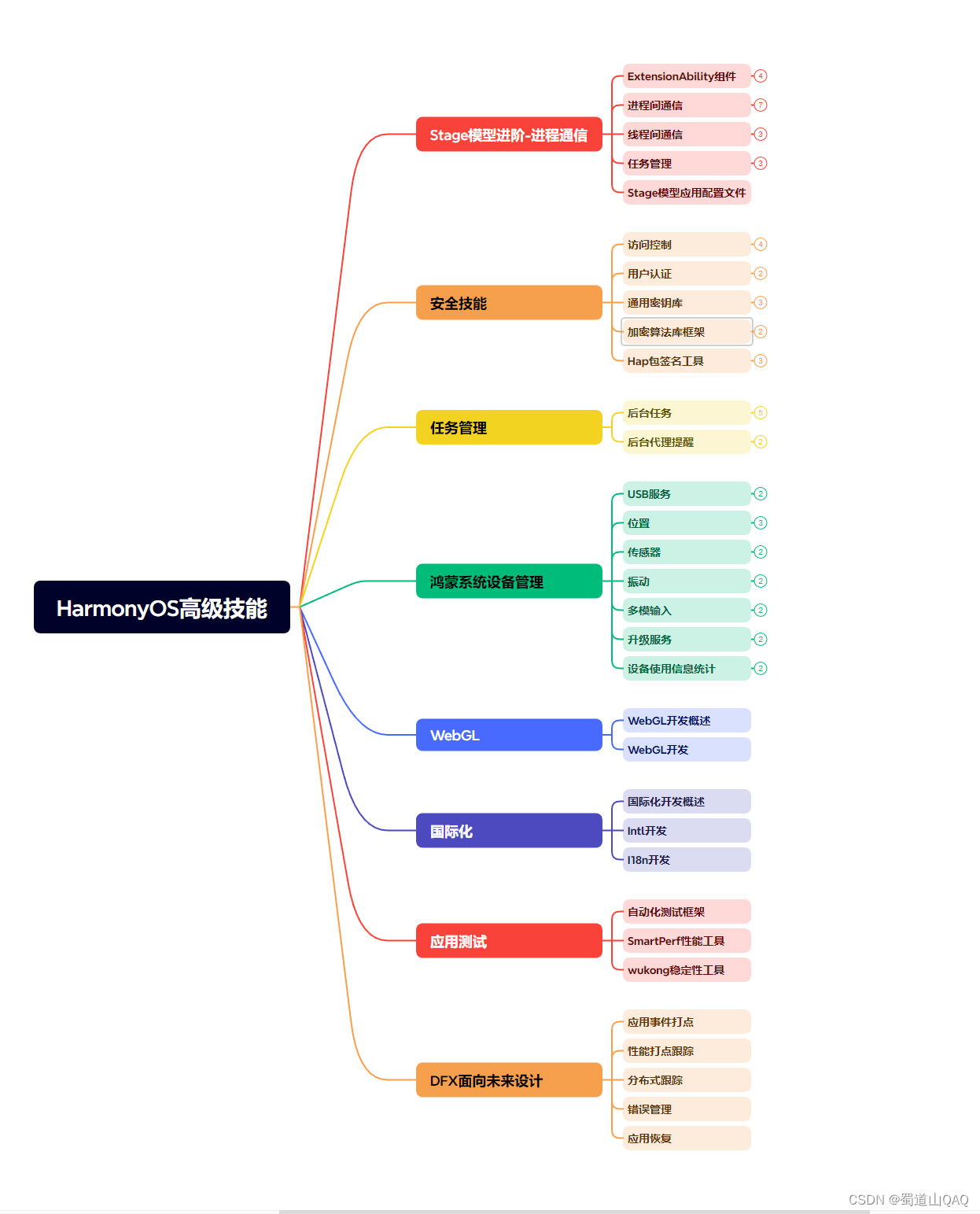
- HarmonOS高級技能
- 初識HarmonOS內核?
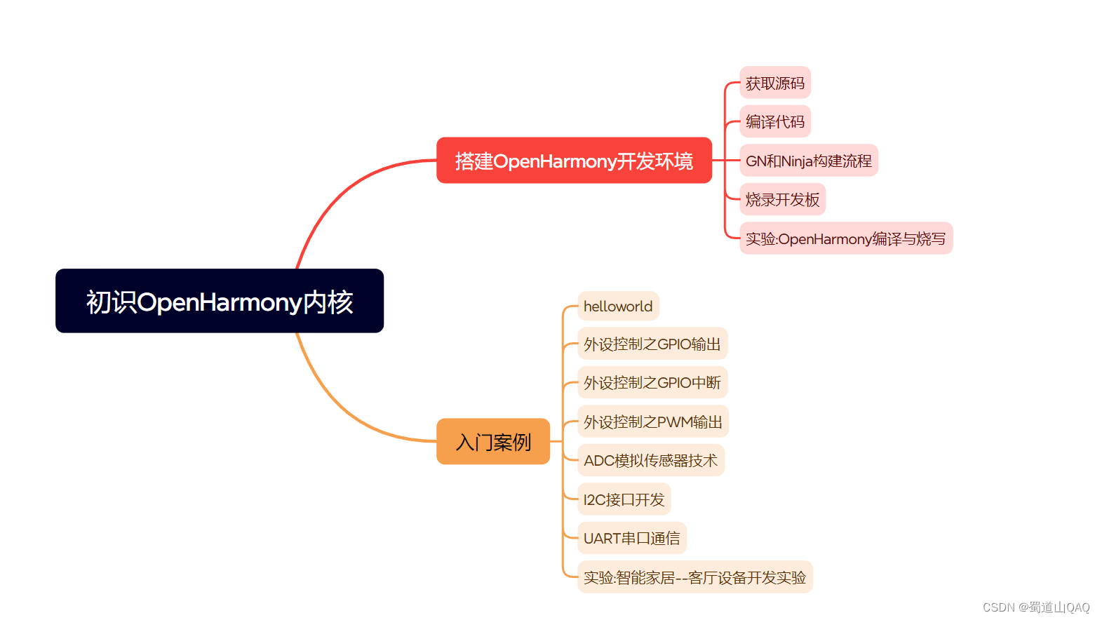
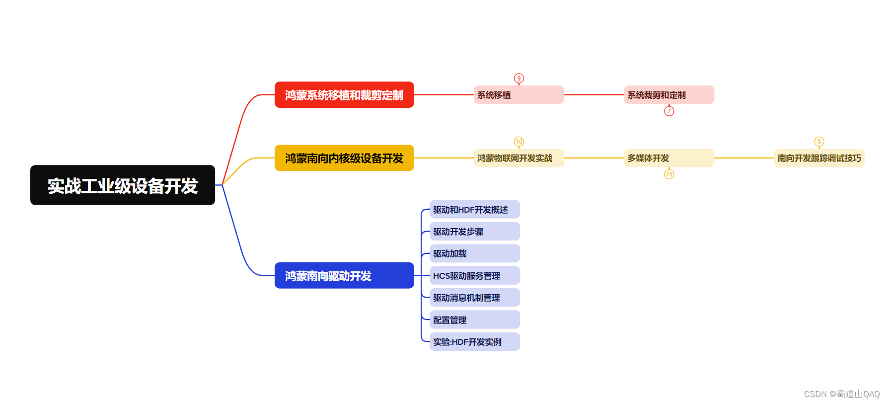
- 實戰就業級設備開發
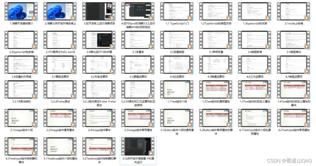
有了路線圖,怎么能沒有學習資料呢,小編也準備了一份聯合鴻蒙官方發布筆記整理收納的一套系統性的鴻蒙(OpenHarmony )學習手冊(共計1236頁)與鴻蒙(OpenHarmony )開發入門教學視頻,內容包含:ArkTS、ArkUI、Web開發、應用模型、資源分類…等知識點。
獲取以上完整版高清學習路線,請點擊→純血版全套鴻蒙HarmonyOS學習資料
《鴻蒙 (OpenHarmony)開發入門教學視頻》
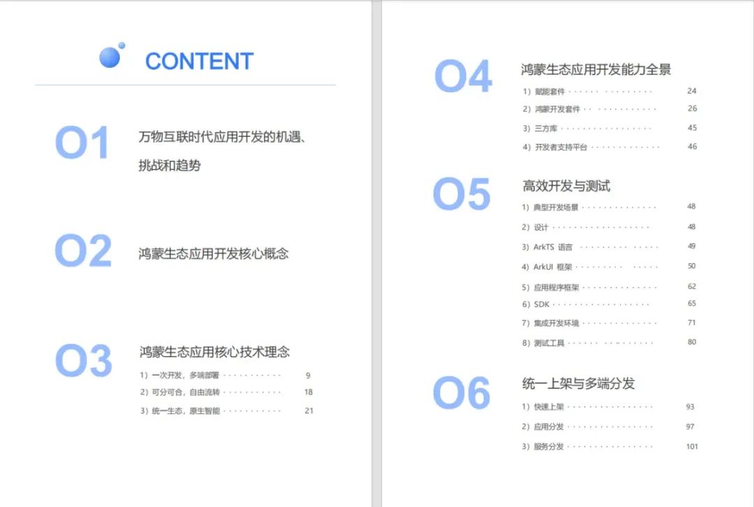
《鴻蒙生態應用開發V2.0白皮書》
《鴻蒙 (OpenHarmony)開發基礎到實戰手冊》
OpenHarmony北向、南向開發環境搭建
?《鴻蒙開發基礎》
- ArkTS語言
- 安裝DevEco Studio
- 運用你的第一個ArkTS應用
- ArkUI聲明式UI開發
- .……
?《鴻蒙開發進階》
- Stage模型入門
- 網絡管理
- 數據管理
- 電話服務
- 分布式應用開發
- 通知與窗口管理
- 多媒體技術
- 安全技能
- 任務管理
- WebGL
- 國際化開發
- 應用測試
- DFX面向未來設計
- 鴻蒙系統移植和裁剪定制
- ……
《鴻蒙進階實戰》
- ArkTS實踐
- UIAbility應用
- 網絡案例
- ……
?獲取以上完整鴻蒙HarmonyOS學習資料,請點擊→純血版全套鴻蒙HarmonyOS學習資料
總結
總的來說,華為鴻蒙不再兼容安卓,對中年程序員來說是一個挑戰,也是一個機會。只有積極應對變化,不斷學習和提升自己,他們才能在這個變革的時代中立于不敗之地。?


)

)

![Siemens-NXUG二次開發-獲取prt中體與類型、實體面與類型、實體邊與類型、邊上點的Tag標識[Python UF][20240302]](http://pic.xiahunao.cn/Siemens-NXUG二次開發-獲取prt中體與類型、實體面與類型、實體邊與類型、邊上點的Tag標識[Python UF][20240302])


)


