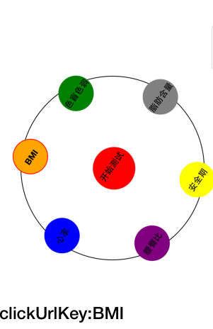
html:其實就是根據table標簽把幾個實心圓div進行等邊六角形的排布,并放入一個div容器中,然后利用CSS3的循環旋轉的動畫效果對最外層的div容器進行自轉實現,當然不要忘了把div容器的外邊框設置圓形弧度的。
clickUrlKey:{{clickUrlKey}}
css:因為在圓形的軌跡中有6個實心圓,分別設置了不同的類以方便自定義,所以當中實心圓的樣式設置有重復的地方,還可以進行優化,在這就先不處理了
/*定義動畫*/
@-webkit-keyframes round_animation {
0%{
-webkit-transform:rotate(0deg);
width:260px;
height:260px;
}
100%{
-webkit-transform:rotate(360deg);
width:260px;
height:260px;
left:0px;
top:0px;
}
}
/*定義外框的樣式*/
/*調用動畫并設置動畫的參數*/
.animation_div {
-webkit-transform-origin:center center; /*定義旋轉中心點*/
-webkit-animation:round_animation 15s infinite alternate; /*infinite alternate表示循環播放動畫*/
margin: 60px auto;
width:260px;
height:260px;
border: 1px solid black;
border-radius: 130px;
left:0px;
top:0px;
}
.animation_div strong {
font-size: 12px;
}
.BMI {
width: 50px;
height: 50px;
background-color: orange;
border-radius: 100px;
text-align: center;
/*文字垂直居中*/
vertical-align: middle;
line-height: 50px;
}
.color_blind {
width: 50px;
height: 50px;
background-color: green;
border-radius: 100px;
text-align: center;
/*文字垂直居中*/
vertical-align: middle;
line-height: 50px;
}
.HR{
margin-left: -15px;
width: 50px;
height: 50px;
background-color: blue;
border-radius: 100px;
text-align: center;
/*文字垂直居中*/
vertical-align: middle;
line-height: 50px;
}
.start_test {
width: 60px;
height: 60px;
background-color: red;
border-radius: 100px;
text-align: center;
/*文字垂直居中*/
vertical-align: middle;
line-height: 50px;
}
.fat_content {
margin-left: 15px;
width: 50px;
height: 50px;
background-color: gray;
border-radius: 100px;
text-align: center;
/*文字垂直居中*/
vertical-align: middle;
line-height: 50px;
}
.WHR {
width: 50px;
height: 50px;
background-color: purple;
border-radius: 100px;
text-align: center;
/*文字垂直居中*/
vertical-align: middle;
line-height: 50px;
}
.safe_period {
width: 50px;
height: 50px;
background-color: yellow;
border-radius: 100px;
text-align: center;
/*文字垂直居中*/
vertical-align: middle;
line-height: 50px;
}
.space_div {
width: 50px;
height: 50px;
background-color: clear;
border-radius: 100px;
}
.rightmenu_btn {
height: 60px;
float: none;
}
.rightmenu_btn button {
margin-top: 50px;
width: 20px;
height: 60px;
border: 1px solid rgb(221, 221, 221);
border-right: 0px;
float: right;
}
.isSelected {
border: 1px solid red;
}
JS:這里的代碼可以不實現,因為這跟動畫的效果無關,是一個點擊的響應事件
angular.module('starter.controllers', [])
.controller('healthCtrl', function($scope, $location) {
$scope.clickUrlKey = "BMI";
$scope.compriseClicked = function(clickUrlKey) {
$scope.clickUrlKey = clickUrlKey;
};
})
效果圖如下:
以上就是本文的全部內容,希望對大家的學習有所幫助,也希望大家多多支持腳本之家。


判斷勝負)


