文章目錄
- perspective 3d透視效果
- preserve-3d 3d嵌套效果
- 例子 奧運五環
- backface-visibility 背面效果
perspective 3d透視效果
perspective 指定了觀察者與 z=0 平面的距離,使具有三維位置變換的元素產生透視效果。z>0 的三維元素比正常大,而 z<0 時則比正常小,大小程度由該屬性的值決定。
作用于在父級上。
preserve-3d 3d嵌套效果
相互可以視覺上 插入 和 覆蓋
transform-style: preserve-3d; 也是用在父級上
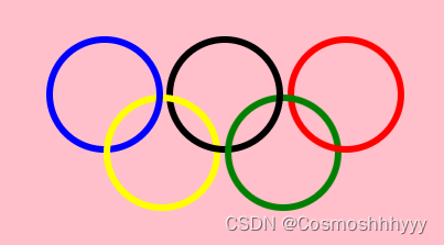
例子 奧運五環
通過每個環細微的旋轉角度實現。
主要看各環之間的覆蓋關系,這就是3d嵌套的效果。
<!DOCTYPE html>
<html lang="en">
<head><meta charset="UTF-8"><meta name="viewport" content="width=device-width, initial-scale=1.0"><title>Document</title><style>.mb{background: pink;height:600px;display: flex;justify-content: center;}.m{padding-top: 200px;width:360px;height: 200px;display: flex;flex-wrap: wrap;transform-style: preserve-3d;}.l{margin: 2px;}.l:nth-child(1){width:100px;height: 100px;border:7px solid blue;border-radius: 100%;transform: rotateX(-1deg) rotateY(-2deg);}.l:nth-child(2){width:100px;height: 100px;border:7px solid black;border-radius: 100%;transform: rotateX(-1deg) rotateY(-2deg);}.l:nth-child(3){width:100px;height: 100px;border:7px solid red;border-radius: 100%;transform: rotateX(-3deg) rotateY(-3deg);}.l:nth-child(4){width:100px;height: 100px;border:7px solid yellow;border-radius: 100%;position: relative;left:56px;bottom: 60px;transform: rotateX(0deg) rotateY(2deg);}.l:nth-child(5){width:100px;height: 100px;border:7px solid green;border-radius: 100%;position: relative;left:56px;bottom: 60px;transform: rotateX(2deg) rotateY(4deg);}</style>
</head>
<body><div class="mb"><div class="m"><div class="l"></div><div class="l"></div><div class="l"></div><div class="l"></div><div class="l"></div></div></div>
</body>
</html>
backface-visibility 背面效果
backface-visibility: hidden; 背面不可見


)


)
)


)

