seaborn添加數據標簽
In the course of my data exploration adventures, I find myself looking at such plots (below), which is great for observing trend but it makes it difficult to make out where and what each data point is.
在進行數據探索的過程中,我發現自己正在查看此類圖(如下),這對于觀察趨勢非常有用,但是很難確定每個數據點的位置和位置。
The purpose of this piece of writing is to provide a quick guide in labelling common data exploration seaborn graphs. All the code used can be found here.
本文的目的是提供一個快速指南,以標記常見的數據探索海洋圖。 所有使用的代碼都可以在這里找到。
建立 (Set-Up)
Seaborn’s flights dataset will be used for the purposes of demonstration.
Seaborn的航班數據集將用于演示。
import pandas as pd
import seaborn as sns
import matplotlib.pyplot as plt
%matplotlib inline# load dataset
flights = sns.load_dataset(‘flights’)
flights.head()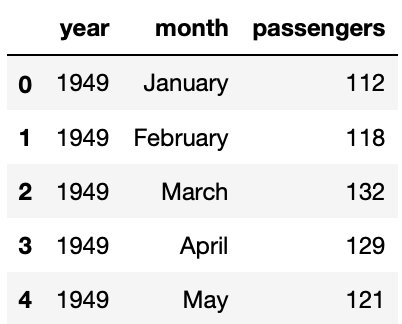
For increased ease and convenience in creating some plots, some additional data frames can be created.
為了增加創建某些繪圖的便利性和便利性,可以創建一些其他數據框。
# set up flights by year dataframe
year_flights = flights.groupby(‘year’).sum().reset_index()
year_flights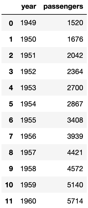
# set up average number of passengers by month dataframe
month_flights = flights.groupby(‘month’).agg({‘passengers’: ‘mean’}).reset_index()
month_flights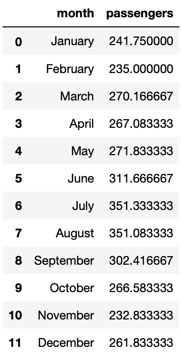
線圖 (Line Plot)
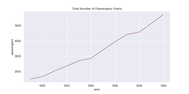
Plotting a graph of passengers per year:
繪制每年的乘客圖:
# plot line graph
sns.set(rc={‘figure.figsize’:(10,5)})
ax = sns.lineplot(x=’year’, y=’passengers’, data=year_flights, marker=’*’, color=’#965786')
ax.set(title=’Total Number of Passengers Yearly’)# label points on the plot
for x, y in zip(year_flights[‘year’], year_flights[‘passengers’]):
 # the position of the data label relative to the data point can be adjusted by adding/subtracting a value from the x &/ y coordinates
 plt.text(x = x, # x-coordinate position of data label
 y = y-150, # y-coordinate position of data label, adjusted to be 150 below the data point
 s = ‘{:.0f}’.format(y), # data label, formatted to ignore decimals
 color = ‘purple’) # set colour of line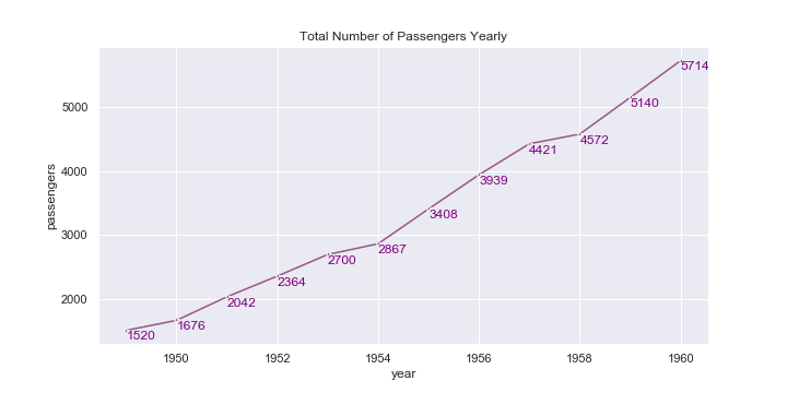
At times, it would be preferable for the data label to be more visible, which can be achieved by adding a background colour to the data labels:
有時,最好使數據標簽更可見,這可以通過向數據標簽添加背景色來實現:
# add set_backgroundcolor(‘color’) after plt.text(‘…’)
plt.text(x, y-150, ‘{:.0f}’.format(y), color=’white’).set_backgroundcolor(‘#965786’)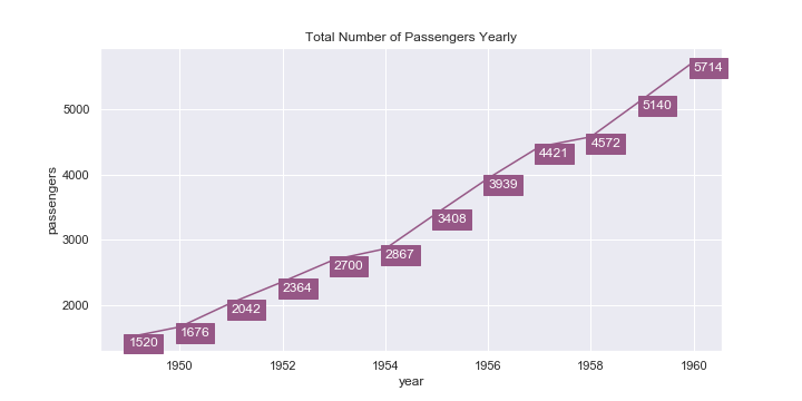
直方圖 (Histogram)
Plotting a histogram of the frequency of passengers on each flight:
繪制每次航班上乘客頻率的直方圖:
# plot histogram
ax = sns.distplot(flights[‘passengers’], color=’#9d94ba’, bins=10, kde=False)
ax.set(title=’Distribution of Passengers’)# label each bar in histogram
for p in ax.patches:
 height = p.get_height() # get the height of each bar
 # adding text to each bar
 ax.text(x = p.get_x()+(p.get_width()/2), # x-coordinate position of data label, padded to be in the middle of the bar
 y = height+0.2, # y-coordinate position of data label, padded 0.2 above bar
 s = ‘{:.0f}’.format(height), # data label, formatted to ignore decimals
 ha = ‘center’) # sets horizontal alignment (ha) to center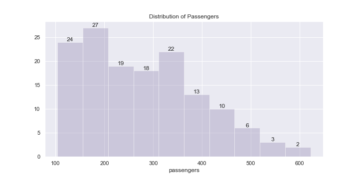
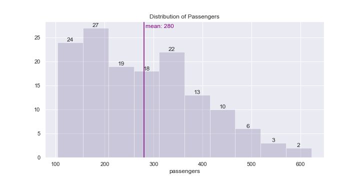
An additional information that might be beneficial to reflect in the graph as well is the mean line of the dataset:
可能也有益于在圖中反映的其他信息是數據集的平均線:
# plot histogram
# …# adding a vertical line for the average passengers per flight
plt.axvline(flights[‘passengers’].mean(), color=’purple’, label=’mean’)# adding data label to mean line
plt.text(x = flights[‘passengers’].mean()+3, # x-coordinate position of data label, adjusted to be 3 right of the data point
 y = max([h.get_height() for h in ax.patches]), # y-coordinate position of data label, to take max height
 s = ‘mean: {:.0f}’.format(flights[‘passengers’].mean()), # data label
 color = ‘purple’) # colour of the vertical mean line# label each bar in histogram
# …
條形圖 (Bar Plot)
Vertical Bar Plot
垂直條形圖
Plotting the total number of passengers for each year:
繪制每年的乘客總數:
# plot vertical barplot
sns.set(rc={‘figure.figsize’:(10,5)})
ax = sns.barplot(x=’year’, y=’passengers’, data=year_flights)
ax.set(title=’Total Number of Passengers Yearly’) # title barplot# label each bar in barplot
for p in ax.patches:
 # get the height of each bar
 height = p.get_height()
 # adding text to each bar
 ax.text(x = p.get_x()+(p.get_width()/2), # x-coordinate position of data label, padded to be in the middle of the bar
 y = height+100, # y-coordinate position of data label, padded 100 above bar
 s = ‘{:.0f}’.format(height), # data label, formatted to ignore decimals
 ha = ‘center’) # sets horizontal alignment (ha) to center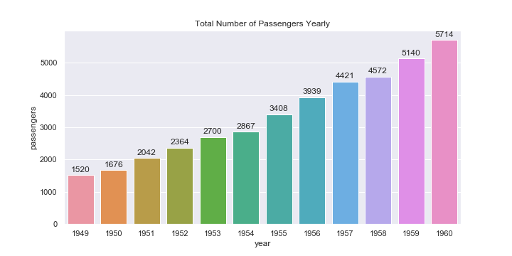
Horizontal Bar Plot
水平條形圖
Plotting the average number of passengers on flights each month:
繪制每月航班的平均乘客數:
# plot horizontal barplot
sns.set(rc={‘figure.figsize’:(10,5)})
ax = sns.barplot(x=’passengers’, y=’month’, data=month_flights, orient=’h’)
ax.set(title=’Average Number of Flight Passengers Monthly’) # title barplot# label each bar in barplot
for p in ax.patches:
 height = p.get_height() # height of each horizontal bar is the same
 width = p.get_width() # width (average number of passengers)
 # adding text to each bar
 ax.text(x = width+3, # x-coordinate position of data label, padded 3 to right of bar
 y = p.get_y()+(height/2), # # y-coordinate position of data label, padded to be in the middle of the bar
 s = ‘{:.0f}’.format(width), # data label, formatted to ignore decimals
 va = ‘center’) # sets vertical alignment (va) to center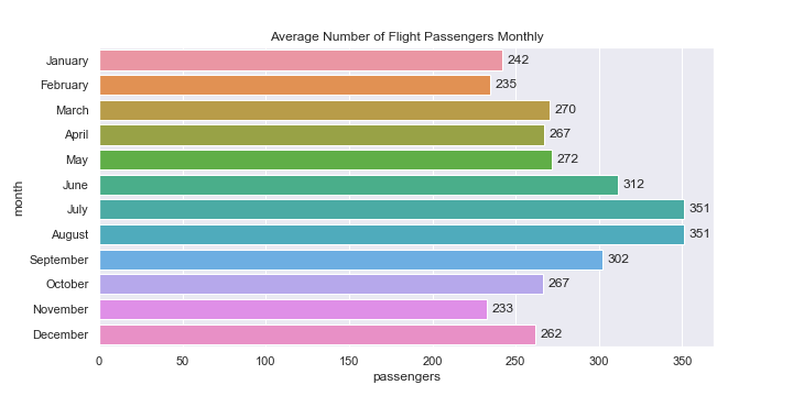
使用注意事項 (Notes on Usage)
It might be beneficial to add data labels to some plots (especially bar plots), it would be good to experiment and test out different configurations (such as using labels only for certain meaningful points, instead of labelling everything) and not overdo the labelling, especially if there are many points. A clean and informative graph is usually more preferable than a cluttered one.
將數據標簽添加到某些圖(尤其是條形圖)可能是有益的,嘗試并測試不同的配置(例如僅對某些有意義的點使用標簽,而不是對所有內容進行標簽),并且不要過度標注,特別是如果有很多要點的話。 通常,干凈整潔的圖表比混亂的圖表更可取。
# only labelling some points on graph# plot line graph
sns.set(rc={‘figure.figsize’:(10,5)})
ax = sns.lineplot(x=’year’, y=’passengers’, data=year_flights, marker=’*’, color=’#965786')# title the plot
ax.set(title=’Total Number of Passengers Yearly’)mean = year_flights[‘passengers’].mean()# label points on the plot only if they are higher than the mean
for x, y in zip(year_flights[‘year’], year_flights[‘passengers’]):
 if y > mean:
 plt.text(x = x, # x-coordinate position of data label
 y = y-150, # y-coordinate position of data label, adjusted to be 150 below the data point
 s = ‘{:.0f}’.format(y), # data label, formatted to ignore decimals
 color = ‘purple’) # set colour of line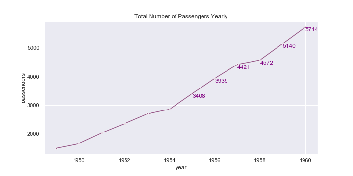
翻譯自: https://medium.com/swlh/quick-guide-to-labelling-data-for-common-seaborn-plots-736e10bf14a9
seaborn添加數據標簽
本文來自互聯網用戶投稿,該文觀點僅代表作者本人,不代表本站立場。本站僅提供信息存儲空間服務,不擁有所有權,不承擔相關法律責任。 如若轉載,請注明出處:http://www.pswp.cn/news/389210.shtml 繁體地址,請注明出處:http://hk.pswp.cn/news/389210.shtml 英文地址,請注明出處:http://en.pswp.cn/news/389210.shtml
如若內容造成侵權/違法違規/事實不符,請聯系多彩編程網進行投訴反饋email:809451989@qq.com,一經查實,立即刪除!相關文章

使用python pandas dataframe學習數據分析

實現TcpIp簡單傳送

SQLServer之函數簡介

無向圖g的鄰接矩陣一定是_矩陣是圖

移動pc常用Meta標簽

前端繪制繪制圖表_繪制我的文學風景


android 字符串特殊字符轉義

如何描繪一個vue的項目_描繪了一個被忽視的幽默來源

數據存儲加密和傳輸加密_將時間存儲網絡應用于加密預測


熊貓分發_熊貓新手:第一部分

多線程 進度條 C# .net

window 10 多版本激活工具

android 動畫總結筆記 一

《Linux內核原理與分析》第六周作業

使用C#調用外部Ping命令獲取網絡連接情況

Codeforces Round 493

android動畫筆記二
