皮爾遜相關系數 相似系數
數據科學和機器學習統計 (STATISTICS FOR DATA SCIENCE AND MACHINE LEARNING)
In the last post, we analyzed the relationship between categorical variables and categorical and continuous variables. In this case, we will analyze the relation between two ratio level or continuous variables.
在上一篇文章中,我們分析了類別變量與類別變量和連續變量之間的關系。 在這種情況下,我們將分析兩個比率級別或連續變量之間的關系。
Peason’s Correlation, sometimes just called correlation, is the most used metric for this purpose, it searches the data for a linear relationship between two variables.
Peason的相關性 (有時也稱為相關性 )是為此目的最常用的度量標準,它在數據中搜索兩個變量之間的線性關系。
Analyzing the correlations is one of the first steps to take in any statistics, data analysis, or machine learning process, it allows data scientists to early detect patterns and possible outcomes of the machine learning algorithms, so it guides us to choose better models.
分析相關性是進行任何統計,數據分析或機器學習過程的第一步之一,它使數據科學家能夠及早發現機器學習算法的模式和可能的結果,從而指導我們選擇更好的模型。
Correlation is a measure of relation between variables, but cannot prove causality between them.
相關性是變量之間關系的度量,但不能證明變量之間的因果關系。
Some examples of random correlations that exist in the world are found un this website.
在此網站上可以找到世界上存在的隨機相關性的一些示例。
In the case of the last graph, it’s clearly not true that one of these variables implies the other one, even having a correlation of 99.79%
在最后一張圖的情況下,顯然這些變量中的一個隱含了另一個變量,即使相關性為99.79%
散點圖 (Scatterplots)
To take the first look to our dataset, a good way to start is to plot pairs of continuous variables, one in each coordinate. Each point on the graph corresponds to a row of the dataset.
首先看一下我們的數據集,一個好的開始方法是繪制成對的連續變量,每個坐標中一個。 圖上的每個點都對應于數據集的一行。
Scatterplots give us a sense of the overall relationship between two variables:
散點圖使我們大致了解兩個變量之間的整體關系:
- Direction: positive or negative relation, when one variable increases the second one increases or decreases? 方向:正向或負向關系,當一個變量增加時,第二個變量增加或減少?
- Strength: how much a variable increases when the second one increases. 強度:第二個變量增加時變量增加多少。
- Shape: The relation is linear, quadratic, exponential…? 形狀:該關系是線性,二次方,指數...?
Using scatterplots is a fast technique for detecting outliers if a value is widely separated from the rest, checking the values for this individual will be useful.
如果值與其他值之間的距離較遠,則使用散點圖是檢測異常值的快速技術,檢查該個人的值將非常有用。
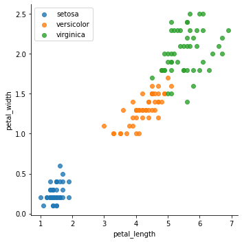
We will go with the most used data frame when studying machine learning, Iris, a dataset that contains information about iris plant flowers, and the objective of this one is to classify the flowers into three groups: (setosa, versicolor, virginica).
在研究機器學習時,我們將使用最常用的數據框架Iris,該數據集包含有關鳶尾花的信息,而該數據集的目的是將花分為三類:(setosa,versicolor,virginica)。
The objective of the iris dataset is to classify the distinct types of iris with the data that we have, to deliver the best approach to this problem, we want to analyze all the variables that we have available and their relations.
虹膜數據集的目的是用我們擁有的數據對虹膜的不同類型進行分類,以提供解決此問題的最佳方法,我們要分析所有可用變量及其關系。
In the last plot we have the petal length and width variables, and separate the distinct classes of iris in colors, what we can extract from this plot is:
在最后一個繪圖中,我們具有花瓣的長度和寬度變量,并用顏色分隔了虹膜的不同類別,我們可以從該繪圖中提取出以下內容:
- There’s a positive linear relationship between both variables. 這兩個變量之間存在正線性關系。
- Petal length increases approximately 3 times faster than the petal width. 花瓣長度的增加速度大約是花瓣寬度的3倍。
- Using these 2 variables the groups are visually differentiable. 使用這兩個變量,這些組在視覺上是可區分的。
散點圖矩陣 (Scatter Plot Matrix)
To plot all relations at the same time and on the same graph, the best approach is to deliver a pair plot, it’s just a matrix of all variables containing all the possible scatterplots.
要同時在同一張圖上繪制所有關系,最好的方法是繪制一對圖,它只是包含所有可能的散點圖的所有變量的矩陣。
As you can see, the plot of the last section is in the last row and third column of this matrix.
如您所見,最后一部分的圖形位于此矩陣的最后一行和第三列中。
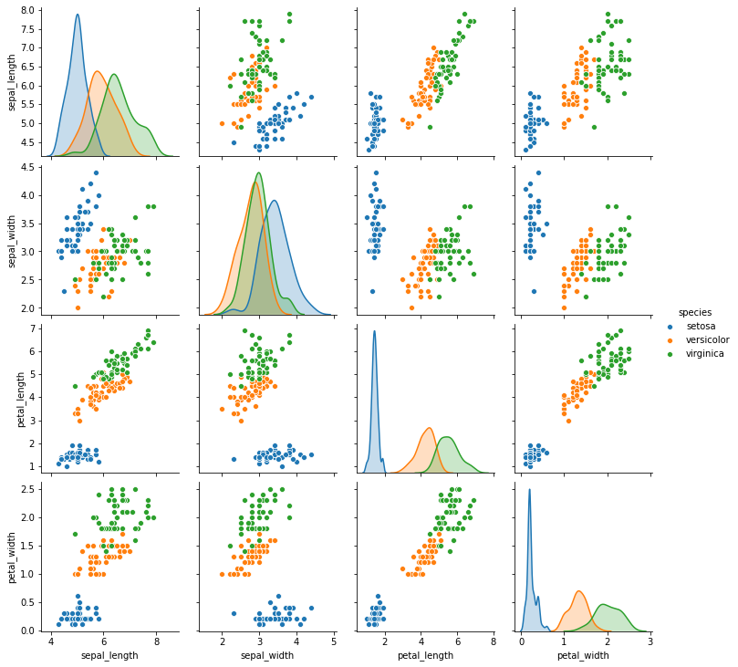
In this matrix, the diagonal can show distinct plots, in this case, we used the distributions of each one of the iris classes.
在此矩陣中,對角線可以顯示不同的圖,在這種情況下,我們使用了每個虹膜類別的分布。
Being a matrix, we have two plots for each combination of variables, there’s always a plot combining the same variables inverse of the (column, row), the other side of the diagonal.
作為一個矩陣,對于每種變量組合,我們都有兩個圖,總有一個圖將(列,行)的反變量(對角線的另一側)的相同變量組合在一起。
Using this matrix we can obtain all the information about all the continuous variables in the dataset easily.
使用此矩陣,我們可以輕松獲取有關數據集中所有連續變量的所有信息。
皮爾遜相關系數 (Pearson Correlation Coefficient)
Scatter plots are an important tool for analyzing relations, but we need to check if the relation between variables is significant, to check the lineal correlation between variables we can use the Person’s r, or Pearson correlation coefficient.
散點圖是分析關系的重要工具,但是我們需要檢查變量之間的關系是否顯著,要檢查變量之間的線性相關性,可以使用Person的r或Pearson相關系數。
The range of the possible results of this coefficient is (-1,1), where:
該系數可能的結果范圍是(-1,1) ,其中:
- 0 indicates no correlation. 0表示沒有相關性。
- 1 indicates a perfect positive correlation. 1表示完全正相關。
- -1 indicates a perfect negative correlation. -1表示完美的負相關。
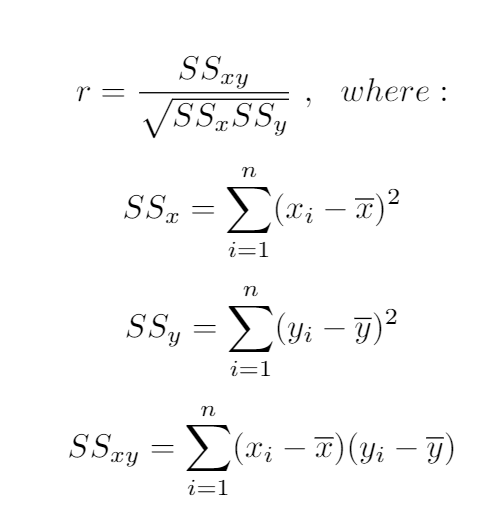
To calculate this statistic we use the following formula:
要計算此統計信息,我們使用以下公式:
相關系數的檢驗顯著性 (Test significance of correlation coefficient)
We need to check if the correlation is significant for our data, as we already talked about hypothesis testing, in this case:
我們已經討論過假設檢驗,在這種情況下,我們需要檢查相關性對我們的數據是否有意義:
H0 = The variables are unrelated, r = 0
H0 =變量無關,r = 0
Ha = The variables are related, r ≠ 0
Ha =變量相關,r≠0
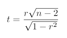
This statistic has a t-student distribution with (n-2) degrees of significance, being n the number of values.
此統計信息的t學生分布的有意義度為(n-2)個,值為n個值。
The formula for the t value is the following, and we need to compare the result with the t-student table.
t值的公式如下,我們需要將結果與t學生表進行比較。
If our result is bigger than the table value we reject the null hypothesis and say that the variables are related.
如果我們的結果大于表值,則我們拒絕原假設,并說變量是相關的。
確定系數 (Coefficient of determination)
To calculate how much the variation of a variable can affect the variation of the other one, we can use the coefficient of determination, calculated as the r2. This measure will be very important in regression models.
為了計算一個變量的變化能對另一個變量的變化產生多大的影響,我們可以使用確定系數 ,計算為r2 。 該度量在回歸模型中將非常重要。
摘要 (Summary)
In the last post, we talked about correlation for categorical data and mentioned that the correlation for continuous variables is easier, in this case, we explained how to perform this correlation analysis and how to check if it’s statistically significant.
在上一篇文章中,我們討論了分類數據的相關性,并提到了連續變量的相關性更容易,在這種情況下,我們說明了如何執行此相關性分析以及如何檢查其是否具有統計意義。
Adding to the typical analysis of the statistical significance will give a better understanding about how to use each variable.
除了對統計意義進行典型分析之外,還將對如何使用每個變量有更好的理解。
This is the eleventh post of my particular #100daysofML, I will be publishing the advances of this challenge at GitHub, Twitter, and Medium (Adrià Serra).
這是我特別#100daysofML第十一屆文章中,我將出版在GitHub上,Twitter和中型企業(這一挑戰的進步阿德里亞塞拉 )。
https://twitter.com/CrunchyML
https://twitter.com/CrunchyML
https://github.com/CrunchyPistacho/100DaysOfML
https://github.com/CrunchyPistacho/100DaysOfML
翻譯自: https://medium.com/ai-in-plain-english/pearson-correlation-coefficient-14c55d32c1bb
皮爾遜相關系數 相似系數
本文來自互聯網用戶投稿,該文觀點僅代表作者本人,不代表本站立場。本站僅提供信息存儲空間服務,不擁有所有權,不承擔相關法律責任。 如若轉載,請注明出處:http://www.pswp.cn/news/388853.shtml 繁體地址,請注明出處:http://hk.pswp.cn/news/388853.shtml 英文地址,請注明出處:http://en.pswp.cn/news/388853.shtml
如若內容造成侵權/違法違規/事實不符,請聯系多彩編程網進行投訴反饋email:809451989@qq.com,一經查實,立即刪除!相關文章
![【洛谷】P1641 [SCOI2010]生成字符串(思維+組合+逆元)](http://pic.xiahunao.cn/【洛谷】P1641 [SCOI2010]生成字符串(思維+組合+逆元))
【洛谷】P1641 [SCOI2010]生成字符串(思維+組合+逆元)

Kubernetes持續交付-Jenkins X的Helm部署
暑期集訓--二進制(BZOJ5294)【線段樹】)
中國石油大學(華東)暑期集訓--二進制(BZOJ5294)【線段樹】

2018年10個最佳項目管理工具及鏈接

Java 8 新特性之Stream API
![[Python設計模式] 第17章 程序中的翻譯官——適配器模式](http://pic.xiahunao.cn/[Python設計模式] 第17章 程序中的翻譯官——適配器模式)
[Python設計模式] 第17章 程序中的翻譯官——適配器模式

Ubuntu中NS2安裝詳細教程


帶你利用一句話完成轉場動畫

14.vue路由腳手架

工程師、產品經理、數據工程師是如何一起工作的?

linux-buff/cache過大導致內存不足-程序異常
)
Android 適配(一)
)
Source Insight 創建工程(linux-2.6.22.6內核源碼)

課時20:內嵌函數和閉包

從零開始學產品第六篇:更強大的測試,自動化測試和性能測試

Get 了濾鏡、動畫、AR 特效,速來炫出你的短視頻開發特技!

匿名函數、冒泡排序,二分法, 遞歸

