css網格
The case for using one CSS grid for your entire website
在整個網站上使用一個CSS網格的情況
CSS網格與Flexbox (CSS Grid vs Flexbox)
In the dark ages, we used table, a few years ago we used float and before today most of us used flex . Of course, these older technologies still serve a purpose but when it comes to good old fashioned layout, CSS grid is where it’s at.
在黑暗時代,我們使用table ,幾年前我們使用float而在今天之前,我們大多數人都使用flex 。 當然,這些較舊的技術仍然可以達到目的,但是當涉及到良好的老式布局時,CSS grid就是它的用武之地。
范例(JSX) (Examples (JSX))
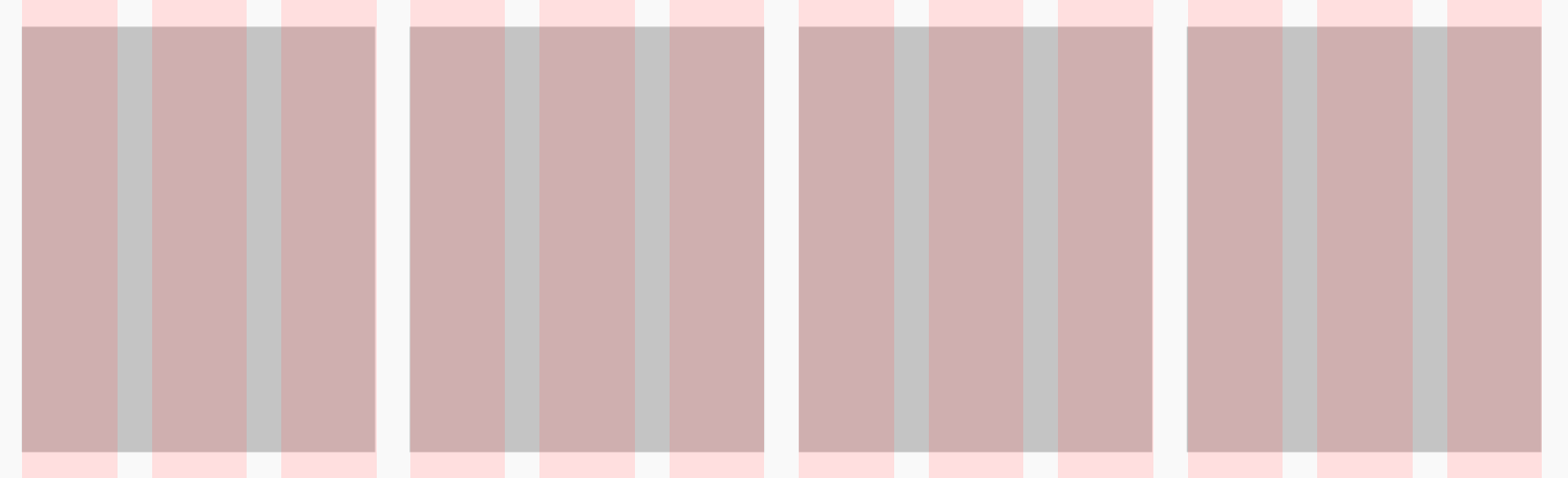
A simple three-column grid in flexbox with 20px gap and 30px of gutter on the left and right:
flexbox一個簡單的三列網格, flexbox有20px間距和30px的裝訂線:
There are a few annoying things that we have to do to accomplish this. Do you see them?
為此,我們需要做一些煩人的事情。 你看到他們了嗎?
- Negative margins on the parent to account for the padding on the left/right of the first/last columns. 父級上的負邊距用于說明第一列/最后一列的左側/右側的填充。
- Half padding on left/right of each column to form the column gutters. 在每列的左側/右側填充一半以形成列裝訂線。
Let’s do the same thing with CSS Grid:
讓我們對CSS Grid做同樣的事情:
Easy peasy! Just define the number of columns (three, filling an equal amount of space) and the gap size and then sit back and relax. The benefits of CSS grid over the other layout techniques become even more apparent as grids get more complex but hopefully, you get the picture.
十分簡單! 只需定義列數(三列,填充相等的空間)和gap大小,然后坐下來放松即可。 隨著網格變得越來越復雜,CSS網格相對于其他布局技術的優勢變得更加明顯,但希望您能理解。
多個網格與單個網格 (Multiple Grids vs a Single Grid)
多個網格可能是個好主意,但這就是為什么它們不是這樣的原因 (Multiple grids may feel like a good idea, but here’s why they aren’t)
Once you start using CSS grids, I can almost guarantee that you’ll want to create a new grid for each component. At least I did! However, it turns out this could easily result in inconsistencies all over the place, causing your code to never match up with the designer’s intention (assuming they designed on a grid). A designer typically creates a single grid and lays out the entire site on that grid. Sure, a component might be a 2 column component, but it still fits on their 12 column grid. Here’s an example of the wrong way to do things:
一旦開始使用CSS網格,我幾乎可以保證您將要為每個組件創建一個新的網格。 至少我做到了! 但是,事實證明,這很容易導致整個地方的不一致,從而導致您的代碼永遠不會與設計者的意圖相符(假設他們是在網格上進行設計的)。 設計人員通常創建單個網格,然后在該網格上布置整個站點。 當然,一個組件可能是2列的組件,但仍適合其12列的網格。 這是做事方法錯誤的一個示例:

While coding the component above, you may be tempted to create a very simple grid:
在對上面的組件進行編碼時,您可能會想創建一個非常簡單的網格:
<div style={{ display: 'grid', gridTemplateColumns: 'repeat(2, 1fr)', gap: 30 }} />Intuitively, this makes sense! After all, this is just a 2 column grid with each column spanning half of the parent. This is actually not the right approach but let's look at one more example before going on.
憑直覺,這是有道理的! 畢竟,這只是一個2列網格,每列跨越父對象的一半。 這實際上不是正確的方法,但在繼續之前讓我們再看一個示例。
In this example from the same project, we might be tempted to create the following 4 column grid:
在同一項目的此示例中,我們可能很想創建以下4列網格:
<div style={{ display: 'grid', gridTemplateColumns: 'repeat(4, 1fr)', gap: 30 }} />Wrong again!
又錯了!
單格圖案 (The single grid pattern)
I advise that we follow the designer’s workflow and use a single grid for the entire webpage, and follow that same grid for every component. In the case of the examples above, both grids would be a 12 column grid:
我建議我們遵循設計者的工作流程,對整個網頁使用單個網格,并對每個組件使用相同的網格。 在上面的示例中,兩個網格均為12列網格:
<div style={{ display: 'grid', gridTemplateColumns: 'repeat(12, 1fr)', gap: 30 }} />Now let’s take a look at the components above built for the 12 column grid:
現在,讓我們看一下上面為12列網格構建的組件:
And here’s the 4 column layout:
這是4列的布局:
By sharing a single 12 column grid between both components and simply spanning the appropriate amount of columns, we ensure that both of these components actually line up with each other on the global grid as the designer intended. If you choose to use different grids for each component, your components will no longer fit on the global grid and the designer will let you know about it.
通過在兩個組件之間共享單個12列網格并簡單地跨適當數量的列,我們可以確保這兩個組件確實按照設計者的意圖在全局網格上彼此對齊。 如果您為每個組件選擇使用不同的網格,則您的組件將不再適合全局網格,設計人員將讓您知道。
React全球網格 (React Global Grid)
To aid with this, I’ve created a very simple collection of components for React called react-global-grid.
為了幫助這一點,我為React創建了一個非常簡單的組件集合,稱為react-global-grid 。
安裝 (Installation)
npm i react-global-grid用法 (Usage)
At the moment, this library requires the following peer dependencies:
目前,該庫需要以下對等依賴項:
- React React
Styled Components
樣式化的組件
Rebass
里巴斯
If you’re already using those then you’re set. If not, don’t fret! Just create a Grid component and define some global styles for it. Then make sure to use that component all over the place and just span the number of columns necessary for each module.
如果您已經在使用這些功能,則可以開始使用。 如果沒有,請不要擔心! 只需創建一個Grid組件并為其定義一些全局樣式即可。 然后,請確保在各處使用該組件,并且僅跨每個模塊所需的列數。
翻譯自: https://medium.com/swlh/one-css-grid-to-rule-them-all-3e3386ad6155
css網格
本文來自互聯網用戶投稿,該文觀點僅代表作者本人,不代表本站立場。本站僅提供信息存儲空間服務,不擁有所有權,不承擔相關法律責任。 如若轉載,請注明出處:http://www.pswp.cn/news/275822.shtml 繁體地址,請注明出處:http://hk.pswp.cn/news/275822.shtml 英文地址,請注明出處:http://en.pswp.cn/news/275822.shtml
如若內容造成侵權/違法違規/事實不符,請聯系多彩編程網進行投訴反饋email:809451989@qq.com,一經查實,立即刪除!相關文章

java 高級泛型_Java 泛型高級

做Web前端開發的你必須會這幾點!

PDA開發系列:GPS模塊的調用

2021 年最值得使用的 Node.js 框架

面試被拒絕如何爭取_爭取反饋

highgui java opencv_java – OpenCV 3.0.0 JAR缺少HighGUI
:為什么業務架構存在20多年,技術人員還覺得它有點虛?)
中臺之上(二):為什么業務架構存在20多年,技術人員還覺得它有點虛?

你對webpack了解多少?

轉:數據庫關系模式的范式詳解

紋理對象紋理單元紋理目標_網頁設計理論:紋理

javascript-高級用法

java dao層和base層_詳解Javaee Dao層的抽取

暢銷書《深入淺出Vue.js》作者,在阿里淘系1年的收獲成長

GrideView屬性的學習

插圖 引用 同一行兩個插圖_將圖標變成插圖的五個簡單步驟


java dateutil 獲取時間戳_java DateUtil工具類時間戳類型轉換詳解

fluorinefx C# 版的開源rtmp服務器

web登錄界面設計_出色的Web界面設計的7條規則
