基本UI描述
ArkTS通過裝飾器@Component和@Entry裝飾struct關鍵字聲明的數據結構,構成一個自定義組件。自定義組件中提供了一個build函數,開發者需在該函數內以鏈式調用的方式進行基本的UI描述,UI描述的方法請參考UI描述規范。
基本概念
- struct:自定義組件可以基于struct實現,不能有繼承關系,對于struct的實例化,可以省略new。
- 裝飾器:裝飾器給被裝飾的對象賦予某一種能力,其不僅可以裝飾類或結構體,還可以裝飾類的屬性。多個裝飾器可以疊加到目標元素上,定義在同一行中或者分開多行,推薦分開多行定義。
less復制代碼@Entry
@Component
struct MyComponent {
}
- build函數:自定義組件必須定義build函數,并且禁止自定義構造函數。build函數滿足Builder構造器接口定義,用于定義組件的聲明式UI描述。
typescript復制代碼interface Builder {build: () => void
}
- @Component:裝飾struct,結構體在裝飾后具有基于組件的能力,需要實現build方法來創建UI。
- @Entry: 裝飾struct,組件被裝飾后作為頁面的入口,頁面加載時將被渲染顯示。
- @Preview:裝飾struct, 用@Preview裝飾的自定義組件可以在DevEco Studio的預覽器上進行實時預覽,加載頁面時,將創建并顯示@Preview裝飾的自定義組件。
說明: 在單個源文件中,最多可以使用10個@Preview裝飾自定義組件,更多說明請參考查看ArkTS組件預覽效果。
- 鏈式調用:以 “.” 鏈式調用的方式配置UI組件的屬性方法、事件方法等。
UI描述規范
無參數構造配置
如果組件的接口定義中不包含必選構造參數,組件后面的“()”中不需要配置任何內容。例如,Divider組件不包含構造參數:
scss復制代碼Column() {Text('item 1')Divider()Text('item 2')
}
有參數構造配置
如果組件的接口定義中包含構造參數,則在組件后面的“()”中可配置相應參數,參數可以使用常量進行賦值。
例如:
- Image組件的必選參數src:
rust
復制代碼Image('https://xyz/test.jpg')
- Text組件的參數content,該參數非必選,即配置或不配置均可:
scss
復制代碼Text('test')
變量或表達式也可以用于參數賦值,其中表達式返回的結果類型必須滿足參數類型要求,變量的定義詳見頁面級變量的狀態管理與應用級變量的狀態管理。例如,設置變量或表達式來構造Image和Text組件的參數:
kotlin復制代碼Image(this.imagePath)
Image('https://' + this.imageUrl)
Text(`count: ${this.count}`)
屬性配置
使用屬性方法配置組件的屬性,屬性方法緊隨組件,并用"."運算符連接。
- 配置Text組件的字體大小屬性:
scss復制代碼Text('test').fontSize(12)
- 使用"."運算符進行鏈式調用并同時配置組件的多個屬性,如下所示:
scss復制代碼Image('test.jpg').alt('error.jpg') .width(100) .height(100)
- 除了直接傳遞常量參數外,還可以傳遞變量或表達式,如下所示:
kotlin復制代碼Text('hello').fontSize(this.size)
Image('test.jpg').width(this.count % 2 === 0 ? 100 : 200)    .height(this.offset + 100)
- 對于系統內置組件,框架還為其屬性預定義了一些枚舉類型供開發人員調用,枚舉類型可以作為參數傳遞,且必須滿足參數類型要求。例如,可以按以下方式配置Text組件的顏色和字體屬性:
scss復制代碼Text('hello').fontSize(20).fontColor(Color.Red).fontWeight(FontWeight.Bold)
事件配置
通過事件方法可以配置組件支持的事件,事件方法緊隨組件,并用"."運算符連接。
- 使用lambda表達式配置組件的事件方法:
javascript復制代碼Button('add counter').onClick(() => {this.counter += 2})
- 使用匿名函數表達式配置組件的事件方法,要求使用bind,以確保函數體中的this引用包含的組件:
javascript復制代碼Button('add counter').onClick(function () {this.counter += 2}.bind(this))
- 使用組件的成員函數配置組件的事件方法:
kotlin復制代碼myClickHandler(): void {this.counter += 2
}
?
...
?
Button('add counter').onClick(this.myClickHandler.bind(this))
子組件配置
對于支持子組件配置的組件,例如容器組件,在"{ … }"里為組件添加子組件的UI描述。Column、Row、Stack、Grid、List等組件都是容器組件。
- 以下是簡單的Column示例:
scss復制代碼Column() {Text('Hello').fontSize(100)Divider()Text(this.myText).fontSize(100).fontColor(Color.Red)
}
- 容器組件之間也可以互相嵌套,實現相對復雜的多級嵌套效果:
scss復制代碼Column() {Row() {Image('test1.jpg').width(100).height(100)Button('click +1').onClick(() => {console.info('+1 clicked!')})}
?Divider()Row() {Image('test2.jpg').width(100).height(100)Button('click +2').onClick(() => {console.info('+2 clicked!')})}
?Divider()Row() {Image('test3.jpg').width(100).height(100)Button('click +3').onClick(() => {console.info('+3 clicked!')})}
}
動態構建UI元素
基本UI描述介紹的是如何創建一個內部UI結構固定的自定義組件,為了滿足開發者自定義組件內部UI結構的需求,ArkTS同時提供了動態構建UI元素的能力。
@Builder
可通過@Builder裝飾器進行描述,該裝飾器可以修飾一個函數,此函數可以在build函數之外聲明,并在build函數中或其他@Builder修飾的函數中使用,從而實現在一個自定義組件內快速生成多個布局內容。使用方式如下面示例所示。
kotlin復制代碼// xxx.ets
@Component
struct CompB {@State CompValue: string = ''
?aboutToAppear() {console.info('CompB aboutToAppear.')}
?aboutToDisappear() {console.info('CompB aboutToDisappear.')}
?build() {Column() {Button(this.CompValue).margin(5)}}
}
?
@Entry
@Component
struct CompA {size1: number = 100@State CompValue1: string = "Hello,CompValue1"@State CompValue2: string = "Hello,CompValue2"@State CompValue3: string = "Hello,CompValue3"
?// @Builder裝飾的函數CompC內使用自定義組件CompB@Builder CompC(value: string) {CompB({ CompValue: value })}
?@Builder SquareText(label: string) {Text(label).fontSize(18).width(1 * this.size1).height(1 * this.size1)}
?// @Builder裝飾的函數RowOfSquareTexts內使用@Builder裝飾的函數SquareText@Builder RowOfSquareTexts(label1: string, label2: string) {Row() {this.SquareText(label1)this.SquareText(label2)}.width(2 * this.size1).height(1 * this.size1)}
?build() {Column() {Row() {this.SquareText("A")this.SquareText("B")}.width(2 * this.size1).height(1 * this.size1)
?this.RowOfSquareTexts("C", "D")Column() {// 使用三次@Builder裝飾的自定義組件this.CompC(this.CompValue1)this.CompC(this.CompValue2)this.CompC(this.CompValue3)}.width(2 * this.size1).height(2 * this.size1)}.width(2 * this.size1).height(2 * this.size1)}
}

@BuilderParam8+
@BuilderParam裝飾器用于修飾自定義組件內函數類型的屬性(例如:@BuilderParam noParam: () => void),并且在初始化自定義組件時被@BuilderParam修飾的屬性必須賦值。
引入動機 當開發者創建自定義組件,并想對該組件添加特定功能時(例如在自定義組件中添加一個點擊跳轉操作)。若直接在組件內嵌入事件方法,將會導致所有引入該自定義組件的地方均增加了該功能。為解決此問題,引入了@BuilderParam裝飾器,此裝飾器修飾的屬性值可為@Builder裝飾的函數,開發者可在初始化自定義組件時對此屬性進行賦值,為自定義組件增加特定的功能。
參數初始化組件
通過參數初始化組件時,將@Builder裝飾的函數賦值給@BuilderParam修飾的屬性,并在自定義組件內調用該屬性值。若@BuilderParam修飾的屬性在進行賦值時不帶參數(如:noParam: this.specificNoParam),則此屬性的類型需定義為無返回值的函數(如:@BuilderParam noParam: () => void);若帶參數(如:withParam: this.SpecificWithParam(‘WithParamA’)),則此屬性的類型需定義成any(如:@BuilderParam withParam: any)。
scss復制代碼// xxx.ets
@Component
struct CustomContainer {header: string = ''@BuilderParam noParam: () => void@BuilderParam withParam: anyfooter: string = ''
?build() {Column() {Text(this.header).fontSize(30)this.noParam()this.withParam()Text(this.footer).fontSize(30)}}
}
?
@Entry
@Component
struct CustomContainerUser {@Builder specificNoParam() {Column() {Text('noParam').fontSize(30)}}
?@Builder SpecificWithParam(label: string) {Column() {Text(label).fontSize(30)}}
?build() {Column() {CustomContainer({header: 'HeaderA',noParam: this.specificNoParam,withParam: this.SpecificWithParam('WithParamA'),footer: 'FooterA'})Divider().strokeWidth(3).margin(10)CustomContainer({header: 'HeaderB',noParam: this.specificNoParam,withParam: this.SpecificWithParam('WithParamB'),footer: 'FooterB'})}}
}

尾隨閉包初始化組件
在自定義組件中使用@BuilderParam修飾的屬性時也可通過尾隨閉包進行初始化(在初始化自定義組件時,組件后緊跟一個大括號“{}”形成尾隨閉包場景(CustomContainer(){})。開發者可把尾隨閉包看做一個容器,向其中填充內容,如在閉包內增加組件({Column(){…}),閉包內語法規范與build函數一致。此場景下自定義組件內有且僅有一個使用@BuilderParam修飾的屬性。
示例:在閉包內添加Column組件并設置點擊事件,在Column組件內調用@Builder修飾的specificParam函數,點擊Column組件后將自定義組件CustomContainer中header的屬性值由“header”改變為“changeHeader”。在初始化自定義組件CustomContainer時,尾隨閉包的內容會被賦值給@BuilderParam修飾的closer屬性。
scss復制代碼// xxx.ets
@Component
struct CustomContainer {header: string = ''@BuilderParam closer: () => void
?build() {Column() {Text(this.header).fontSize(30)this.closer()}}
}
?
@Builder function specificParam(label1: string, label2: string) {Column() {Text(label1).fontSize(30)Text(label2).fontSize(30)}
}
?
@Entry
@Component
struct CustomContainerUser {@State text: string = 'header'
?build() {Column() {CustomContainer({header: this.text,}) {Column() {specificParam('testA', 'testB')}.backgroundColor(Color.Yellow).onClick(() => {this.text = 'changeHeader'})}}}
}

@Styles
ArkTS為了避免開發者對重復樣式的設置,通過@Styles裝飾器可以將多個樣式設置提煉成一個方法,直接在組件聲明時調用,通過@Styles裝飾器可以快速定義并復用自定義樣式。當前@Styles僅支持通用屬性。
@Styles可以定義在組件內或組件外,在組件外定義時需在方法名前面添加function關鍵字,組件內定義時則不需要添加function關鍵字。
scss復制代碼// xxx.ets
@Styles function globalFancy () {.width(150).height(100).backgroundColor(Color.Pink)
}
?
@Entry
@Component
struct FancyUse {@Styles componentFancy() {.width(100).height(200).backgroundColor(Color.Yellow)}
?build() {Column({ space: 10 }) {Text('FancyA').globalFancy().fontSize(30)Text('FancyB').globalFancy().fontSize(20)Text('FancyC').componentFancy().fontSize(30)Text('FancyD').componentFancy().fontSize(20)}}
}

@Styles還可以在StateStyles屬性內部使用,在組件處于不同的狀態時賦予相應的屬性。
在StateStyles內可以直接調用組件外定義的@Styles方法,但需要通過this關鍵字調用組件內定義的@Styles方法。
less復制代碼// xxx.ets
@Styles function globalFancy () {.width(120).height(120).backgroundColor(Color.Green)
}
?
@Entry
@Component
struct FancyUse {@Styles componentFancy() {.width(80).height(80).backgroundColor(Color.Red)}
?build() {Row({ space: 10 }) {Button('Fancy').stateStyles({normal: {.width(100).height(100).backgroundColor(Color.Blue)},disabled: this.componentFancy,pressed: globalFancy})}}
}

@Extend
@Extend裝飾器將新的屬性方法添加到Text、Column、Button等內置組件上,通過@Extend裝飾器可以快速地擴展原生組件。@Extend不能定義在自定義組件struct內。
less復制代碼// xxx.ets
@Extend(Text) function fancy (fontSize: number) {.fontColor(Color.Red).fontSize(fontSize).fontStyle(FontStyle.Italic).fontWeight(600)
}
?
@Entry
@Component
struct FancyUse {build() {Row({ space: 10 }) {Text("Fancy").fancy(16)Text("Fancy").fancy(24)Text("Fancy").fancy(32)}}
}
說明:
- @Extend裝飾器不能定義在自定義組件struct內。
- @Extend裝飾器內僅支持屬性方法設置。

@CustomDialog
@CustomDialog裝飾器用于裝飾自定義彈窗組件,使得彈窗可以動態設置內容及樣式。
scss復制代碼// xxx.ets
@CustomDialog
struct DialogExample {controller: CustomDialogControlleraction: () => void
?build() {Row() {Button('Close CustomDialog').onClick(() => {this.controller.close()this.action()})}.padding(20)}
}
?
@Entry
@Component
struct CustomDialogUser {dialogController: CustomDialogController = new CustomDialogController({builder: DialogExample({ action: this.onAccept }),cancel: this.existApp,autoCancel: true});
?onAccept() {console.info('onAccept');}
?existApp() {console.info('Cancel dialog!');}
?build() {Column() {Button('Click to open Dialog').onClick(() => {this.dialogController.open()})}}
}

插件分享
1.Chinese
漢化插件,讓國人開發者更加如魚得水
2.Atom Material File Icons
提供文件和文件夾圖標支持,讓你的項目看的更加賞心悅目

3.One Dark theme
一款暗色系主題插件,非常適合在晚上偷偷卷代碼

4.Material Theme UI
一款多色系主題插件,自2021年后需要收費使用,本節文末提供下載鏈接

5.Rainbow Brackets
括號匹配彩虹色

6.Indent Rainbow
代碼縮進提供色彩支持,非常適合控制代碼格式

本文主要簡單解析了在鴻蒙開發當中,聲明式UI講解。有更多的鴻蒙開發學習,可以查看《鴻蒙開發者進階》點擊可以查看詳細的內容板塊。
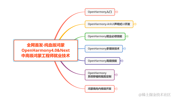
以上為一張學習路線略縮圖,高清完整版請移至主業查看獲取。


)


)

)


-------連載(45))


