語雀知識庫地址:語雀HarmonyOS知識庫
飛書知識庫地址:飛書HarmonyOS知識庫
本文示例代碼地址:Gitee 倉庫地址
嗨,各位好呀,我是小白
上一篇文章我為大家介紹了如何使用 ArkTS 開發鴻蒙應用,對 HarmonyOS 項目代碼結構做了初步的介紹
還沒看過的小伙伴可以先復習一下,對接下來的內容會有很大的幫助
淺析HarmonyOS開發語言ArkTS
從上面的案例中,很容易就能看出,開發一個鴻蒙應用實際上就是使用 ArkTS 提供的各個組件來組合成一個頁面
那么,要熟練的使用 ArkTS 提供的組件就顯得尤為重要
這篇文章就向大家介紹一些 ArkTS 常用的基礎組件
Image——圖片組件
Image 為圖片組件,常用于在應用中顯示圖片
Image 支持加載 PixelMap、ResourceStr 和 DrawableDescriptor 類型的數據源,支持 png、jpg、bmp、svg 和 gif 類型的圖片格式
定義方式
Image(src: string | Resource | media.PixelMap)
其入參需要傳入一個圖片源,參數名為 src ,參數類型是 union 聯合類型,支持字符串地址、像素圖以及本地圖片
參數使用
- string:該方式通常用來加載網絡圖片,也可以加載本地資源,比如下面這種寫法
// 加載網絡資源
Image('https://developer.huawei.com/images/logo-developer-header.svg')
// 加載本地資源 創建文件夾,將本地圖片放入ets文件夾下的任意位置,Image組件引入本地圖片路徑,即可顯示圖片(根目錄為ets文件夾)
Image('images/view.jpg')
效果如下

在這里需要注意的是,當使用該方式獲取網絡上的圖片資源時,在本地預覽是可以進行展示的,但是當使用模擬器進行調試時,使用該方式獲取的網絡資源是無法展示的,這是因為該方式需要使用網絡權限,所以我們可以在當前模塊的 module.json5 配置文件的 module 標簽下加入以下代碼即可
"requestPermissions": [{"name": "ohos.permission.INTERNET"}
]
- PixelMap:這種方式可以用來加載像素圖,常用于圖片編輯的場景
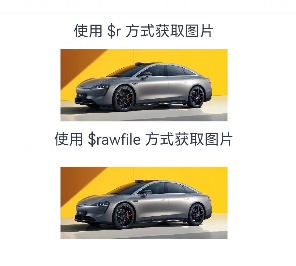
- Resource:加載本地圖片,使用資源格式可以跨包/跨模塊引入圖片,resources文件夾下的圖片都可以通過 $r 資源接口讀取到并轉換到 Resource 格式,推薦使用
Image($r('app.media.icon'))
Image($rawfile('icon.png'))
可以看到,使用 Resource 類型加載圖片時,有兩種寫法,這兩種寫法所讀取的文件目錄是不同的
- 使用
$r()方式所讀取的目錄是src/main/resources/base/media該目錄下的文件,這種方式不需要寫文件的后綴名 - 使用
$rawfile()方式讀取的目錄是src/main/resources/rawfile該目錄下的文件,這種方式必須將文件的后綴名寫上,否則就會報錯 (如果沒有這個文件夾,手動創建即可)
- 媒體庫文件:即手機內部文件,支持file://路徑前綴的字符串,用于訪問通過媒體庫提供的圖片路徑
- base64:路徑格式為
data:image/[png | jpeg | bmp | webp]; base64,[base64 data],其中[base64 data]為 Base64 字符串數據。Base64 格式字符串可用于存儲圖片的像素數據,在網頁上使用較為廣泛
效果如下
設置屬性
Image 作為基本組件,除了有通用屬性 width()、height()、padding() 等,還有其自身所擁有的屬性
Image($r('app.media.car')).alt($r('app.media.icon')).width('50%').height(70).borderRadius(10).interpolation(ImageInterpolation.High)
其中
- alt 為圖片加載時顯示的占位圖,支持本地圖片(png、jpg、bmp、svg 和 gif 類型),不支持網絡圖片
- borderRadius 為圖片設置圓角,數值越大,圖片的圓角就越大
- interpolation 設置圖片的插值效果,即減輕低清晰度圖片在放大顯示時出現的鋸齒問題,可以為數值,也可以使用枚舉值

設置事件
onComplete:圖片數據加載成功和解碼成功時均觸發該回調,返回成功加載的圖片尺寸
onComplete(callback: (event?: { width: number, height: number, componentWidth: number, componentHeight: number, loadingStatus: number }) => void)
- loadingStatus 參數用于返回圖片加載成功的狀態值。返回的狀態值為0時,表示圖片數據加載成功。返回的狀態值為1時,表示圖片解碼成功
onError:圖片加載異常時觸發該回調
onError(callback: (event?: { componentWidth: number, componentHeight: number , message: string }) => void)
onFinish:當加載的源文件為帶動效的 svg 格式圖片時,svg 動效播放完成時會觸發這個回調。如果動效為無限循環動效,則不會觸發這個回調。僅支持svg格式的圖片
onFinish(event: () => void)
Text/Span——文本組件
定義方式
Text(content?: string | Resource)
Span(value: string | Resource)
在 Text 中套用 Span 組件時,Span 的內容會覆蓋掉 Text 的內容
參數使用
- string:傳入的內容即為所顯示的內容
Text('Hello World')

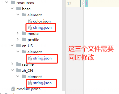
- Resource:該方式傳入的內容為當前系統語言所對應文件中的數據值
Text($r('app.string.module_desc'))

這里需要注意的是,$r 方式默認是根據系統的語言來匹配讀取對應語言文件夾下 /element/string.json 文件中對應的值,如果都匹配不到的話,則讀取的是 /resources/base/element/string.json,因此,在使用此方式讀取值的時候,需要在每種系統語言對應的目錄文件中都添加相同 key 的數據,否則會報錯
設置屬性
Text 除了通用的屬性外,其自身也有許多屬性可以設置
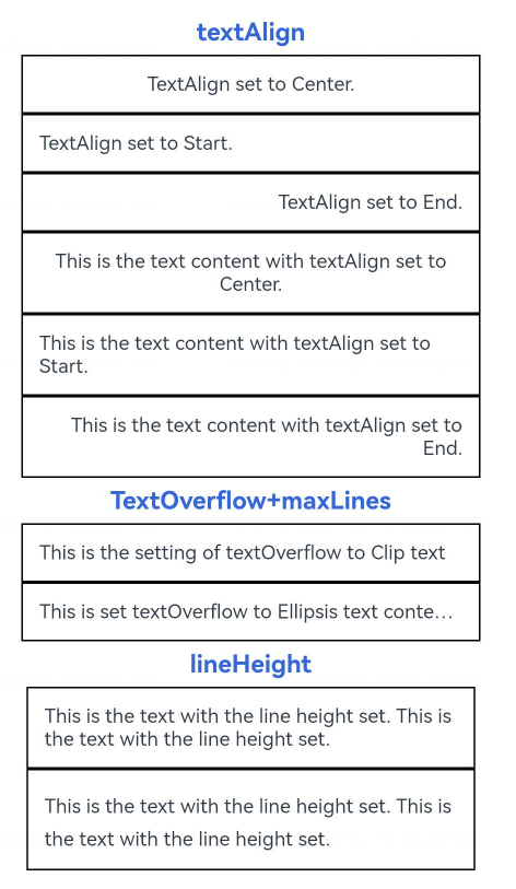
示例 1
// 單行文本
Text('textAlign').fontSize(15).fontColor('#36D').fontWeight(FontWeight.Bold).padding({top:5, bottom:5})
Text('TextAlign set to Center.').textAlign(TextAlign.Center).fontSize(12).border({ width: 1 }).padding(10).width('100%')
Text('TextAlign set to Start.').textAlign(TextAlign.Start).fontSize(12).border({ width: 1 }).padding(10).width('100%')
Text('TextAlign set to End.').textAlign(TextAlign.End).fontSize(12).border({ width: 1 }).padding(10).width('100%')// 多行文本
Text('This is the text content with textAlign set to Center.').textAlign(TextAlign.Center).fontSize(12).border({ width: 1 }).padding(10).width('100%')
Text('This is the text content with textAlign set to Start.').textAlign(TextAlign.Start).fontSize(12).border({ width: 1 }).padding(10).width('100%')
Text('This is the text content with textAlign set to End.').textAlign(TextAlign.End).fontSize(12).border({ width: 1 }).padding(10).width('100%')// 文本超長時顯示方式
Text('TextOverflow+maxLines').fontSize(15).fontColor('#36D').fontWeight(FontWeight.Bold).padding({top:5, bottom:5})
// 超出maxLines截斷內容展示
Text('This is the setting of textOverflow to Clip text content This is the setting of textOverflow to None text content. This is the setting of textOverflow to Clip text content This is the setting of textOverflow to None text content.').textOverflow({ overflow: TextOverflow.Clip }).maxLines(1).fontSize(12).border({ width: 1 }).padding(10)// 超出maxLines展示省略號
Text('This is set textOverflow to Ellipsis text content This is set textOverflow to Ellipsis text content.'.split('').join('\u200B')).textOverflow({ overflow: TextOverflow.Ellipsis }).maxLines(1).fontSize(12).border({ width: 1 }).padding(10)Text('lineHeight').fontSize(15).fontColor('#36D').fontWeight(FontWeight.Bold).padding({top:5, bottom:5})
Text('This is the text with the line height set. This is the text with the line height set.').fontSize(12).border({ width: 1 }).padding(10)
Text('This is the text with the line height set. This is the text with the line height set.').fontSize(12).border({ width: 1 }).padding(10).lineHeight(20)
效果如下:
其中:
- textAlign:設置文本段落在水平方向的對齊方式,默認值:TextAlign.Start,可選值:TextAlign.Start、TextAlign.Center、TextAlign.End
- textOverflow:設置文本超長時的顯示方式。默認值:
{overflow: TextOverflow.Clip} - lineHeight:設置文本的文本行高,設置值不大于 0 時,不限制文本行高,自適應字體大小,Length 為 number 類型時單位為fp
示例 2
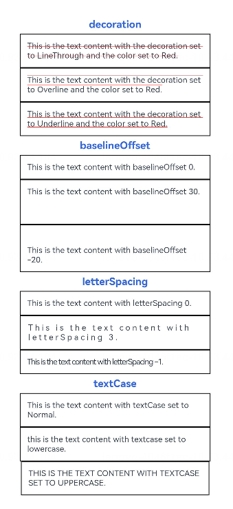
Text('decoration').fontSize(15).fontColor('#36D').fontWeight(FontWeight.Bold).padding({top:5, bottom:5})Text('This is the text content with the decoration set to LineThrough and the color set to Red.').decoration({type: TextDecorationType.LineThrough,color: Color.Red}).fontSize(12).border({ width: 1 }).padding(10).width('100%')Text('This is the text content with the decoration set to Overline and the color set to Red.').decoration({type: TextDecorationType.Overline,color: Color.Red}).fontSize(12).border({ width: 1 }).padding(10).width('100%')Text('This is the text content with the decoration set to Underline and the color set to Red.').decoration({type: TextDecorationType.Underline,color: Color.Red}).fontSize(12).border({ width: 1 }).padding(10).width('100%')// 文本基線偏移Text('baselineOffset').fontSize(15).fontColor('#36D').fontWeight(FontWeight.Bold).padding({top:5, bottom:5})Text('This is the text content with baselineOffset 0.').baselineOffset(0).fontSize(12).border({ width: 1 }).padding(10).width('100%')Text('This is the text content with baselineOffset 30.').baselineOffset(30).fontSize(12).border({ width: 1 }).padding(10).width('100%')Text('This is the text content with baselineOffset -20.').baselineOffset(-20).fontSize(12).border({ width: 1 }).padding(10).width('100%')// 文本字符間距Text('letterSpacing').fontSize(15).fontColor('#36D').fontWeight(FontWeight.Bold).padding({top:5, bottom:5})Text('This is the text content with letterSpacing 0.').letterSpacing(0).fontSize(12).border({ width: 1 }).padding(10).width('100%')Text('This is the text content with letterSpacing 3.').letterSpacing(3).fontSize(12).border({ width: 1 }).padding(10).width('100%')Text('This is the text content with letterSpacing -1.').letterSpacing(-1).fontSize(12).border({ width: 1 }).padding(10).width('100%')Text('textCase').fontSize(15).fontColor('#36D').fontWeight(FontWeight.Bold).padding({top:5, bottom:5})Text('This is the text content with textCase set to Normal.').textCase(TextCase.Normal).fontSize(12).border({ width: 1 }).padding(10).width('100%')// 文本全小寫展示Text('This is the text content with textCase set to LowerCase.').textCase(TextCase.LowerCase).fontSize(12).border({ width: 1 }).padding(10).width('100%')// 文本全大寫展示Text('This is the text content with textCase set to UpperCase.').textCase(TextCase.UpperCase).fontSize(12).border({ width: 1 }).padding(10)
效果如下
其中:
- decoration:設置文本裝飾線樣式及其顏色。默認值:
{type: TextDecorationType.None,color:Color.Black} - baselineOffset:設置文本基線的偏移量,默認值0。設置該值為百分比時,按默認值顯示
- letterSpacing:設置文本字符間距。默認值0。設置該值為百分比時,按默認值顯示
- textCase:設置文本大小寫。默認值:TextCase.Normal
TextInput/TextArea——文本輸入
定義方式
TextArea(value?:{placeholder?: ResourceStr, text?: ResourceStr, controller?: TextAreaController})
TextInput(value?:{placeholder?: ResourceStr, text?: ResourceStr, controller?: TextInputController})
參數使用
- placeholder:
TextInput({placeholder:'placeholder 占位語'})
TextArea({placeholder:'placeholder占位語placeholder占位語placeholder占位語'})

- text:
TextInput({text:'為TextInput設置默認值'})
TextArea({text:'我是TextArea我是TextArea我是TextArea我是TextArea'})

當 placeholder 與 text 同時存在時,placeholder 的值將會被 text 的內容所覆蓋
設置屬性
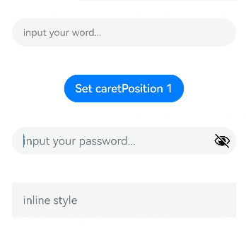
TextInput({ text: this.text, placeholder: 'input your word...', controller: this.controller }).placeholderColor(Color.Grey).placeholderFont({ size: 14, weight: 400 }).caretColor(Color.Blue).width(400).height(40).margin(20).fontSize(14).fontColor(Color.Black).inputFilter('[a-z]', (e) => {console.log(JSON.stringify(e))}).onChange((value: string) => {this.text = value})
Text(this.text)
Button('Set caretPosition 1').margin(15).onClick(() => {// 將光標移動至第一個字符后this.controller.caretPosition(1)})
// 密碼輸入框
TextInput({ placeholder: 'input your password...' }).width(400).height(40).margin(20).type(InputType.Password).maxLength(9).showPasswordIcon(true)
// 內聯風格輸入框
TextInput({ placeholder: 'inline style' }).width(400).height(50).margin(20).borderRadius(0).style(TextInputStyle.Inline).copyOption(CopyOptions.LocalDevice).textAlign(TextAlign.Start)
其中:
- placeholderColor:設置placeholder文本顏色
- placeholderFont:設置placeholder文本樣式
- caretColor:設置輸入框光標顏色
- inputFilter:正則表達式,匹配表達式的輸入允許顯示,不匹配的輸入將被過濾。目前僅支持單個字符匹配,不支持字符串匹配。其中 value 設置正則表達式,error 設置正則匹配失敗時,返回被過濾的內容
- type:輸入框的類型,默認是
InputType.Normal - maxLength:設置文本的最大輸入字符數
- showPasswordIcon:當 type 屬性為
InputType.Password時,輸入框末尾的圖標是否顯示 - style:設置輸入框為默認風格或內聯輸入風格
- copyOption:設置輸入的文本是否可復制
- textAlign:設置輸入文本在輸入框中的對齊方式
設置事件
- onChange(callback: (value: string) => void):輸入內容發生變化時的回調函數
- onSubmit(callback: (enterKey: EnterKeyType) => void):按下輸入法回車鍵觸發該回調,返回值為當前輸入法回車鍵的類型
- onCopy(callback:(value: string) => void):長按輸入框內部區域彈出剪貼板后,點擊剪切板復制按鈕,觸發該回調
Button——按鈕
定義方式
Button(options?: {type?: ButtonType, stateEffect?: boolean})
Button(label?: string, options?: { type?: ButtonType, stateEffect?: boolean })
參數使用
- label:按鈕文本內容
Button('按鈕文本內容 label')

Button('這是一個按鈕-正常', { type: ButtonType.Normal, stateEffect: true })
Button('這是一個按鈕-膠囊', { type: ButtonType.Capsule, stateEffect: true })
Button('Ok-圓', { type: ButtonType.Circle, stateEffect: true })
- options-type:描述按鈕顯示樣式
- options-stateEffect:按鈕按下時是否開啟按壓態顯示效果,當設置為 false 時,按壓效果關閉。當開啟按壓態顯示效果,設置狀態樣式時,會基于狀態樣式設置完成后的背景色再進行顏色疊加

設置屬性
Button 組件的屬性在通用屬性中均已支持
設置事件
Button 組件的事件在通用事件中均已支持
結語
除了以上所列舉的 Image、Text/Span、TextInput/TextArea、Button 組件外,ArkTS 還支持了 Menu(菜單)、Slider(滑塊)、Radio(單選)、CheckBox(復選框)、Progress(進度條) 等我們在手機上所能看到的組件,這些組件的使用方式大同小異,無需特殊記憶,在需要使用時查閱官方文檔即可


分析】合同矩陣A B有PTAP=B,求可逆陣P的策略)

實驗報告【出租車計價器】)


)


Docker簡介)
:擴展正則表達式)
-窗口函數等)


