1、Column&Row組件
1.1、概述
一個頁面由很多組件組成,如果需要把這些組件組織起來布局好,需要借助容器組件來實現。
容器組件是一種特殊的組件,它可以包含其他組件,而且按照一定的規律布局,一個容器組件中可以放置基礎組件,也可以放置容器組件,通過多層布局的嵌套,可以布局出更豐富的頁面。
1.2、組件介紹
1.2.1、布局容器概念
線性布局容器表示按照垂直方向或水平方向排列子組件的容器,ArkTS中使用Column和Row來實現線性布局
Column:垂直方向的布局容器
Row:水平方向的布局容器
1.2.2、主軸與交叉軸
主軸與交叉軸是默認存在的兩個軸,它們是相互垂直的。在不同的容器中主軸的方向不一樣。
主軸
在Column容器中按從上到下垂直方向布局,主軸是垂直方向
在Row容器中按從左到右水平方向布局,主軸是水平方向
交叉軸
與主軸垂直相交的軸
組件在主軸與交叉軸上的排列方式
Column和Row容器有丙個屬性justifyContent,alignItems
justifyContent:在主軸上的對齊方式
其設置的參數是FlexAlign,它有如下幾個可選值
- Start:元素在主軸方向首端對齊,第一個元素與行首對齊,同時后續的元素與前一個對齊。
- Cener:元素在主軸方向中心對齊,第一個元素與行首的距離以及最后一個元素與行尾距離相同
- End:元素在主軸方向尾部對齊,最后一個元素與行尾對齊,其他元素與后一個對齊
- SpaceBetween:元素在主軸方向均勻分配彈性元素,相鄰元素之間距離相同。 第一個元素與行首對齊,最后一個元素與行尾對齊。
- SpaceAround:元素在主軸方向均勻分配彈性元素,相鄰元素之間距離相同。 第一個元素到行首的距離和最后一個元素到行尾的距離是相鄰元素之間距離的一半
- SpaceEvenly:元素在主軸方向等間距布局,無論是相鄰元素還是邊界元素到容器的間距都一樣
alignItem:在交叉軸上的對齊方式
Column容器設置的參數類型HorizontalAlign,它有如上幾種可選值
- Start:設置子組件在水平方向上按照起始端對齊
- Center:默認值,設置子組件在水平方向上居中對齊
- End:設置子組件在水平方向上按照末端對齊
Row容器設置的參數類型是VerticalAlign,它有如下幾種可選值
- Top:設置子組件在垂直方向上居頂部對齊
- Center:默認值,設置子組件在豎直方向上居中對齊
- Bottom:設置子組件在豎直方向上居底部對齊
1.3、Column&Row容器的接口介紹
| 容器組件 | 接口 |
| Column | Column(value?:{space?:string | number}) |
| Row | Row(value?:{space?:string | number}) |
接口中有一個可選參數space表示子組件在主軸上的間距
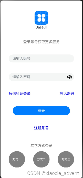
實現如下頁面:
@Entry
@Component
struct Login {build() {Column(){// 圖片Image($r('app.media.icon')).width(60).height(60).margin({bottom:-45})// appnameText($r('app.string.app_name'))// 提示語Text('登錄賬號獲取更多服務').fontColor(Color.Gray)// 賬號,密碼輸入區TextInput({placeholder: '請輸入賬號'}).width('80%')TextInput({placeholder: '請輸入密碼'}).width('80%').type(InputType.Password)// 兩個鏈接信息放在一行上Row(){Text('短信驗證登錄').fontColor(Color.Blue)Text('忘記密碼').fontColor(Color.Blue)}.width('80%').justifyContent(FlexAlign.SpaceBetween)// 登錄按鈕Button($r('app.string.login_text'),{type: ButtonType.Capsule, stateEffect: true}).width('70%')// 注冊賬號Text('注冊賬號').fontColor(Color.Blue)Text('其它方式登錄').fontColor(Color.Gray).margin({bottom:-45})// 多種方式登錄放在一行Row(){Button('方式一',{type: ButtonType.Circle,stateEffect: true}).width('20%').fontColor(Color.White).backgroundColor(Color.Gray)Button('方式二',{type: ButtonType.Circle,stateEffect: true}).width('20%').fontColor(Color.White).backgroundColor(Color.Gray)Button('方式三',{type: ButtonType.Circle,stateEffect: true}).width('20%').fontColor(Color.White).backgroundColor(Color.Gray)}.width('100%').justifyContent(FlexAlign.SpaceEvenly)}.height('100%').justifyContent(FlexAlign.SpaceEvenly).alignItems(HorizontalAlign.Center) // 默認就是這種對齊方式可以不用配置}
}
2、List&Grid組件
2.1、組件介紹
在手機應用中通常會看到一些數據列表,組成這些列表的常用布局就是使用網絡布局和列表布局。
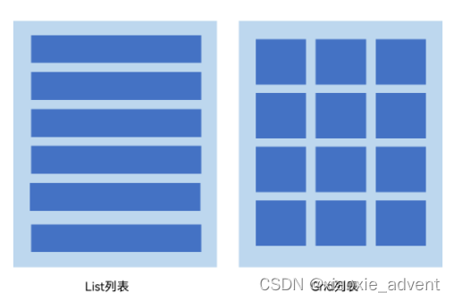
2.2、List組件
它是最常用的滾動類容器組件,一般和子組件ListItem一起使用,List列表中的每一個列表項則對應一個ListItem組件。
2.2.1、使用ForEach渲染列表
列表往往由多個列表項組成,在List組件中使用多個ListItem組件來構建列表,但這樣操作會導致代碼冗余,此時可以使用循環渲染(ForEach)遍歷數組的方式來構建。
@Entry
@Component
struct ListTest {private arr: number[] = [0,1,2,3,4,5,6,7,8,9]build() {Column() {List({space: 10}){ForEach(this.arr, (item: number) => {ListItem(){Text(`${item}`).width('100%').height(100).fontSize(20).fontColor(Color.White).textAlign(TextAlign.Center).borderRadius(10).backgroundColor(0x007DFF)}}, item => item)}}.padding(12).height('100%').backgroundColor(0xF1F3F5)}
}
List組件子組件ListItem之間默認是不會有分隔線的,如果需要在各子組件之間設置分隔線需要在List組件上使用divider屬性,屬性包含以下四個參數
- strokeWidth:分割線的線寬
- color:分割線的顏色
- startMargin:分割線距離列表側邊起始端的距離
- endMargin:分割線距離列表側邊結束端的距離
注意:設置這個之后會在各個ListItem組件之間加上一個分隔線,最后一個ListItem后不會加。
2.2.2、List列表滾動事件監聽
List組件提供了一系列事件方法用來監聽列表的滾動,可根據需求監聽這些事件來做一些操作
- onScroll:列表滑動時觸發,返回值scrollOffset為滑動偏移量,scrollState為當前滑動狀態
- onScrollIndex:列表滑動時觸發,返回值分別為滑動起始位置索引值與滑動結束位置索引值
- onReachStart:列表到達起始位置時觸發
- onReachEnd:列表到達結束位置時觸發
- onScrollStop:列表滑動停止時觸發
@Entry
@Component
struct ListTest {private arr: number[] = [0,1,2,3,4,5,6,7,8,9];// 滑動起始索引與滑動結束過引@State firstIndex: number = -1;@State lastIndex: number = -1;// 滑動偏移量與狀態@State scrollOffset: number = -1;@State scrollState: ScrollState = undefined;build() {Column() {Row(){Text(`滑動起始索引:${this.firstIndex === -1? '' : this.firstIndex}`)Text(`滑動結束索引:${this.lastIndex === -1? '' : this.lastIndex}`)}.width('90%').justifyContent(FlexAlign.SpaceBetween)Row(){Text(`滑動偏移量:${this.scrollOffset === -1? '' : this.scrollOffset}`)Text(`滑動狀態:${this.scrollState == undefined? '' : this.scrollState.toString()}`)}.width('90%').justifyContent(FlexAlign.SpaceBetween)List({space: 10}){  // 這里{space: 10}設置了每個ListItem之間的距離ForEach(this.arr, (item: number) => {ListItem(){Text(`${item}`).width('100%').height(100).fontSize(20).fontColor(Color.White).textAlign(TextAlign.Center).borderRadius(10).backgroundColor(0x007DFF)}}, item => item)}.divider({strokeWidth: 2,color: Color.Gray, startMargin: 10, endMargin: 10})// 滑動相關事件.onScrollIndex((firstIndex: number, lastIndex: number) => {this.firstIndex = -1;this.lastIndex = -1;this.scrollOffset = -1;this.scrollState = undefined;this.firstIndex = firstIndex;this.lastIndex = lastIndex;}).onScroll((scrollOffset: number, scrollState: ScrollState) =>{this.scrollOffset = Number(scrollOffset.toFixed(2))this.scrollState = scrollState;}).onReachStart(() => {console.info('觸發List組件的onReachStart事件');}).onReachEnd(() => {console.info('觸發List組件的onReachEnd事件');}).onScrollStop(() => {console.info('觸發List組件的onScrollStop事件');})}.padding(12).height('100%').backgroundColor(0xF1F3F5)}
}
2.2.3、設置List排列方向
在List組件中的列表默認是按垂直方向排列的。
如果我們需要改變這個默認的排列方向可以把List組件的listDirection屬性設置為Axis.Horizontal
listDirection的參數類型是Axis,它支持兩種選項
- Vertical:默認值,子組件ListItem在List容器組件中呈縱向排列
- Horizontal:子組件ListItem在List容器組件中呈橫向排列
2.3、Grid組件的使用
Grid組件又稱為網絡容器,是一種網絡列表,由“行”與“列”分隔單元格所組成。
Grid組件一般與子組件GridItem一起使用,其中的每一個條目則對應一個GridItem組件。
2.3.1、使用ForEach渲染網格
@Entry
@Component
struct GridTest {// 定義一個數組private arr: string[] = new Array(16).fill('').map((_,index) => `item_${index}`)build() {Column(){Grid(){ForEach(this.arr,(item: string) => {GridItem(){Text(item).fontSize(16).fontColor(Color.White).backgroundColor(0x007DFF).width('100%').height('100%').textAlign(TextAlign.Center)}}, item => item)}.columnsTemplate('1fr 1fr 1fr 1fr').rowsTemplate('1fr 1fr 1fr 1fr').columnsGap(10).rowsGap(10).height(300)}.width('100%').padding(12)}
}
上面創建了16個GridItem列表項。
columnsTemplate的值設置為'1fr 1fr 1fr 1fr',表示網絡是一個四列網絡
rowsTemplate的值為’1fr 1fr 1fr 1fr‘,表示這個網格為四行網絡
columnsGap設置列間距為10vp,rowsGap設置行間距為10vp
上面構建的網格布局就是一個4 * 4的網格布局,固定的是行列數,如果我們內容較多,可以通過滾動方式來顯示更多內容,則需要一個可以滾動的網絡布局。只需要設置rowsTemplate和columnsTemplate中的一個即可。
3、Tabs組件
3.1、概述
在我們常用的應用中,經常會有視圖內容的切換需求。比如底部有一個商城、購物車兩個Tab標簽頁面,分別點擊進入商城和購物車頁面。
ArkUI開發框架提供了一種頁簽容器組件Tabs,使用這個組件可以很容易實現內容視圖的切換。
頁簽容器Tabs的形式多種多樣,不同的頁面設計頁簽不一樣,可以把頁簽放在底部、頂部或者側邊
@Entry
@Component
struct TabsTest {private controller: TabsController = new TabsController();build() {Column() {Tabs({barPosition: BarPosition.Start, controller: this.controller}){TabContent(){// 內容部分Column().width('100%').height('100%').backgroundColor(Color.Green)}.tabBar('green')  // 標簽名稱TabContent(){// 內容部分Column().width('100%').height('100%').backgroundColor(Color.Blue)}.tabBar('blue')  // 標簽名稱TabContent(){// 內容部分Column().width('100%').height('100%').backgroundColor(Color.Yellow)}.tabBar('yellow')  // 標簽名稱TabContent(){// 內容部分Column().width('100%').height('100%').backgroundColor(Color.Pink)}.tabBar('pink')  // 標簽名稱}.barWidth('100%') // TabBar寬度.barHeight(60)  // TabBar高度.width('100%')  // Tabs組件寬度.height('100%') // Tabs組件的高度.backgroundColor(0xF5F5F5)  // Tabs組件背景顏色}// .width('100%')}
}
Tabs組件包含多個TabContent,通過TabContent的tabBar屬性設置TabBar的顯示內容。
Tabs組件中使用width和height設置Tabs組件的寬高,而barWidth和barHeight設置TabBar的寬度和高度。
3.2、設置TabBar布局模式
Tabs默認是Fixed的,所以默認情況下Tabs頁簽是不可滑動的。在這種模式下如果頁簽比較多則可能會導致頁簽顯示不全。如果把布局模式設置為Scrollable則可以實現頁簽的滾動。
Tabs的布局模式有如現兩種
- BarMode.Fixed:默認,所有TabBar平均分配barWidth寬度(縱向時平均分配barHeight高度),頁簽不可滾動
- BarMode.Scrollable:每一個TabBar均使用實際布局寬度,超過總長度(橫向Tabs的barWidth,縱向Tabs的barHeight)后可滑動
@Entry
@Component
struct TabsTest {private controller: TabsController = new TabsController();build() {Column() {Tabs({barPosition: BarPosition.Start, controller: this.controller}){TabContent(){// 內容部分Column().width('100%').height('100%').backgroundColor(Color.Green)}.tabBar('green')  // 標簽名稱TabContent(){// 內容部分Column().width('100%').height('100%').backgroundColor(Color.Blue)}.tabBar('blue')  // 標簽名稱TabContent(){// 內容部分Column().width('100%').height('100%').backgroundColor(Color.Yellow)}.tabBar('yellow')  // 標簽名稱TabContent(){// 內容部分Column().width('100%').height('100%').backgroundColor(Color.Pink)}.tabBar('pink')  // 標簽名稱}.barMode(BarMode.Scrollable)  // 設置布局模式,這里默認是BarMode.Fixed.barWidth('100%') // TabBar寬度.barHeight(60)  // TabBar高度.width('100%')  // Tabs組件寬度.height('100%') // Tabs組件的高度.backgroundColor(0xF5F5F5)  // Tabs組件背景顏色}// .width('100%')}
}
3.3、設置TabBar位置和排列方向
Tabs組件頁簽默認顯示在頂部,可以使用Tabs組件接口中參數barPosititon設置標簽位置。
頁簽顯示位置還與vertical屬性相關聯,vertical屬性用于設置頁面的排列方向,當vertical的屬性值為false(默認值)時頁簽橫向排列,當為true時表示縱向排列
@Entry
@Component
struct TabsTest {private controller: TabsController = new TabsController();build() {Column() {Tabs({barPosition: /*BarPosition.Start*/ BarPosition.End, controller: this.controller}){TabContent(){// 內容部分Column().width('100%').height('100%').backgroundColor(Color.Green)}.tabBar('green')  // 標簽名稱TabContent(){// 內容部分Column().width('100%').height('100%').backgroundColor(Color.Blue)}.tabBar('blue')  // 標簽名稱TabContent(){// 內容部分Column().width('100%').height('100%').backgroundColor(Color.Yellow)}.tabBar('yellow')  // 標簽名稱TabContent(){// 內容部分Column().width('100%').height('100%').backgroundColor(Color.Pink)}.tabBar('pink')  // 標簽名稱}.vertical(true)// .barMode(BarMode.Scrollable)  // 設置布局模式,這里默認是BarMode.Fixed.barWidth(100) // TabBar寬度.barHeight(200)  // TabBar高度.width('100%')  // Tabs組件寬度.height('100%') // Tabs組件的高度.backgroundColor(0xF5F5F5)  // Tabs組件背景顏色}// .width('100%')}
}
Tabs組件接口中參數barPosititon加上他的屬性vertical組合則可以讓Tabs定位到頂部?底部?左側?右側。
@Entry
@Component
struct TabsTest2 {@State currentIndex: number = 0;private tabsController: TabsController = new TabsController();@Builder TabBuilder(title: string, targetIndex: number, selectedImg: Resource, normalImg: Resource){Column() {Image(this.currentIndex === targetIndex ? selectedImg : normalImg).size({width: 32,height:32})Text(title).fontColor(this.currentIndex === targetIndex ? '#1698CE' : '#6B6B6B')}.width('100%').height(50).justifyContent(FlexAlign.Center).onClick(() => {this.currentIndex = targetIndex;this.tabsController.changeIndex(this.currentIndex);})}build() {Tabs({barPosition:BarPosition.End, controller: this.tabsController}){TabContent(){Column().width('100%').height('100%').backgroundColor('#00CB87')}.tabBar(this.TabBuilder('首頁',0,$r('app.media.index2'),$r('app.media.index1')))TabContent(){Column().width('100%').height('100%').backgroundColor('#007DFF')}.tabBar(this.TabBuilder('我的',1,$r('app.media.my2'),$r('app.media.my1')))}.barWidth('100%').barHeight(50).onChange((index: number) => {this.currentIndex = index;})}
})


)


——4.6.存儲過程和函數(Procedure和Function))


)


