溫馨提示:本篇博客的詳細代碼已發布到 git : https://gitcode.com/nutpi/HarmonyosNext 可以下載運行哦!
文章目錄
- 前言
- 1. 響應式設計
- 1.1 屏幕適配
- 1.2 彈性布局
- 2. 數據展示與交互
- 2.1 數據卡片渲染
- 2.2 圖表區域
- 3. 事件處理機制
- 3.1 點擊事件處理
- 3.2 手勢交互
- 4. 性能優化技巧
- 4.1 懶加載與按需渲染
- 4.2 狀態管理優化
- 5. 數據流管理
- 5.1 單向數據流
- 5.2 響應式數據綁定
- 6. 最佳實踐
- 6.1 組件化開發
- 6.2 樣式與邏輯分離
- 7. 總結
前言
關于HarmonyOS NEXT 的儀表盤 從
-
- HarmonyOS應用開發實踐與技術解析
-
- HarmonyOS Next儀表盤案例詳解(一):基礎篇
再到本章節 就已經全部講完了, 接下來我們先展示一下其運行的效果
- HarmonyOS Next儀表盤案例詳解(一):基礎篇
首頁List
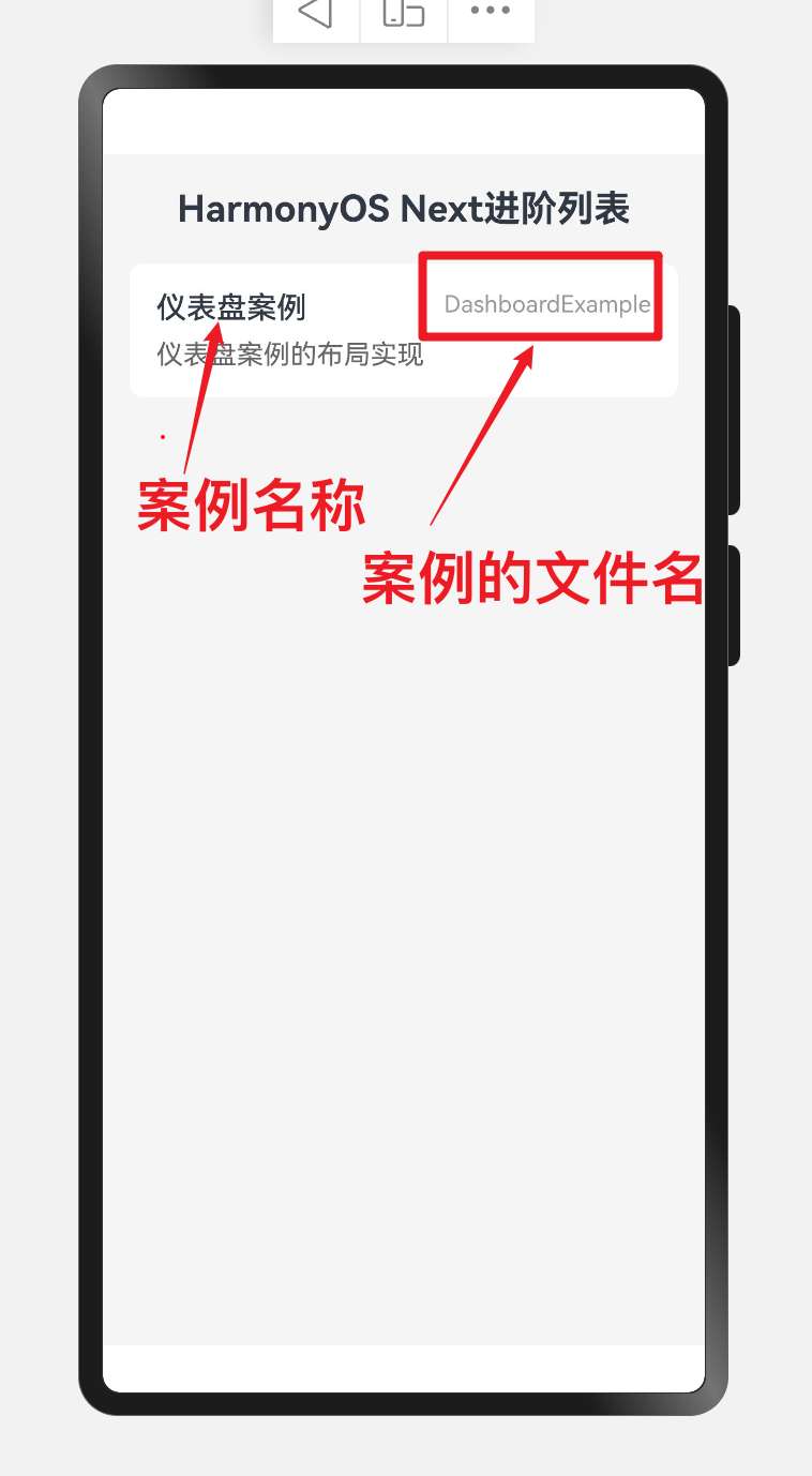
效果演示
1. 響應式設計
1.1 屏幕適配
// 獲取屏幕寬度
this.screenWidth = px2vp(AppStorage.Get<number>('windowWidth') || 720)// 根據屏幕寬度決定每行顯示的卡片數量
Flex({ wrap: FlexWrap.Wrap, justifyContent: this.screenWidth > 600 ? FlexAlign.Start : FlexAlign.SpaceAround })// 卡片寬度自適應
.width(this.screenWidth > 600 ? '22%' : '45%')
案例中通過檢測屏幕寬度實現響應式布局:
- 當屏幕寬度大于600像素時,每行顯示4個卡片,寬度為22%
- 當屏幕寬度小于等于600像素時,每行顯示2個卡片,寬度為45%
這種響應式設計使應用能夠在不同尺寸的設備上提供良好的用戶體驗。
1.2 彈性布局
Flex({ wrap: FlexWrap.Wrap, justifyContent: this.screenWidth > 600 ? FlexAlign.Start : FlexAlign.SpaceAround })
使用Flex組件的wrap屬性實現卡片的自動換行,并根據屏幕寬度動態調整對齊方式:
- 寬屏設備:左對齊(FlexAlign.Start)
- 窄屏設備:均勻分布(FlexAlign.SpaceAround)
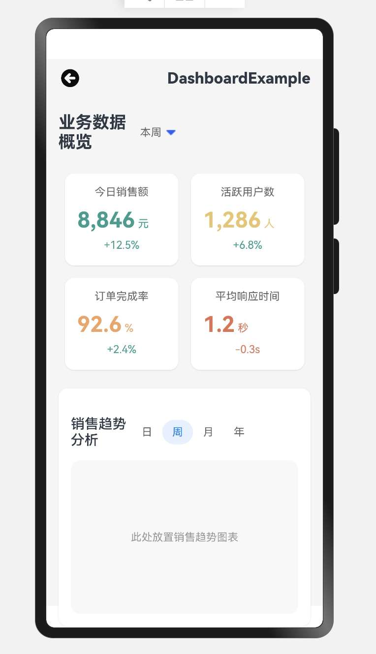
2. 數據展示與交互
2.1 數據卡片渲染
ForEach(this.dataCards, (card: DashboardCardItem) => {// 數據卡片Column() {// 卡片標題Text(card.title).fontSize(14).fontColor('#666').margin({bottom: 12})// 數據值和單位Flex({alignItems: ItemAlign.Baseline}) {Text(card.value).fontSize(28).fontWeight(FontWeight.Bold).fontColor(card.color)Text(card.unit).fontSize(14).fontColor(card.color).margin({left: 4})}.margin({bottom: 8})// 趨勢指標Text(card.trend).fontSize(14).fontColor(card.trend.includes('+') ? '#2A9D8F' : '#E76F51')}// 卡片樣式...
})
使用ForEach循環渲染數據卡片,每個卡片包含標題、數值、單位和趨勢指標。根據趨勢的正負動態設置顏色:
- 正向趨勢(+):綠色(#2A9D8F)
- 負向趨勢(-):紅色(#E76F51)
2.2 圖表區域
// 圖表區域(示意)
Column() {Flex({ justifyContent: FlexAlign.SpaceBetween, alignItems: ItemAlign.Center }) {Text('銷售趨勢分析').fontSize(18).fontWeight(FontWeight.Medium)Flex() {ForEach(['日', '周', '月', '年'], (item: string) => {Text(item).fontSize(14).fontColor(item === '周' ? '#007DFF' : '#666').backgroundColor(item === '周' ? '#E6F1FF' : 'transparent').height(32).width(40).textAlign(TextAlign.Center).borderRadius(16)})}}// ...// 圖表占位區域Column() {Text('此處放置銷售趨勢圖表').fontSize(14).fontColor('#999')}// ...
}
圖表區域包含標題欄和時間篩選器,通過ForEach循環渲染日、周、月、年四個選項,并高亮顯示當前選中的"周"選項。這種設計允許用戶快速切換不同時間維度的數據視圖。
3. 事件處理機制
3.1 點擊事件處理
ForEach(['日', '周', '月', '年'], (item: string) => {Text(item).fontSize(14).fontColor(item === this.timeRange ? '#007DFF' : '#666').backgroundColor(item === this.timeRange ? '#E6F1FF' : 'transparent').height(32).width(40).textAlign(TextAlign.Center).borderRadius(16).onClick(() => {// 更新選中的時間范圍this.timeRange = item// 根據新的時間范圍更新圖表數據this.updateChartData()})
})
通過onClick事件處理器實現交互功能,當用戶點擊不同的時間選項時:
- 更新當前選中的時間范圍狀態變量
- 調用更新圖表數據的方法,刷新圖表顯示
3.2 手勢交互
// 圖表區域手勢交互
GestureGroup({// 同時識別多種手勢type: GestureType.Parallel,// 手勢之間的關系gestures: [PanGesture({ direction: PanDirection.Horizontal }).onActionStart((event: GestureEvent) => {// 記錄起始位置this.startX = event.offsetX}).onActionUpdate((event: GestureEvent) => {// 計算拖動距離,更新圖表顯示范圍let offsetX = event.offsetX - this.startXthis.updateChartViewport(offsetX)}),PinchGesture().onActionUpdate((event: GestureEvent) => {// 根據縮放比例調整圖表顯示范圍this.updateChartScale(event.scale)})]
})
實現了兩種手勢交互:
- 平移手勢(PanGesture):允許用戶左右滑動查看不同時間段的數據
- 捏合手勢(PinchGesture):允許用戶通過捏合操作放大或縮小圖表視圖
4. 性能優化技巧
4.1 懶加載與按需渲染
LazyForEach(this.dataSource, (item: DataItem) => {// 數據項渲染邏輯DataItemComponent({ data: item })
})
使用LazyForEach代替ForEach進行大量數據的渲染,實現按需加載,提高應用性能:
- 只渲染可見區域的數據項
- 當用戶滾動時,動態加載新的數據項
- 釋放不可見區域的資源
4.2 狀態管理優化
// 使用AppStorage全局狀態管理
aboutToAppear() {// 訂閱全局狀態變化this.dashboardDataSubscriber = AppStorage.Subscribe('dashboardData', (data: DashboardData) => {// 僅在數據變化時更新UIif (JSON.stringify(data) !== JSON.stringify(this.localData)) {this.localData = datathis.updateUI()}})
}aboutToDisappear() {// 取消訂閱,避免內存泄漏this.dashboardDataSubscriber.unsubscribe()
}
通過狀態管理優化提高應用性能:
- 使用AppStorage進行全局狀態管理
- 實現數據變化的細粒度檢測,避免不必要的UI更新
- 組件銷毀時取消訂閱,防止內存泄漏
5. 數據流管理
5.1 單向數據流
// 父組件
@State dashboardData: DashboardData = initialDatabuild() {Column() {// 將數據通過屬性傳遞給子組件DataCards({ data: this.dashboardData.cards })ChartSection({ data: this.dashboardData.chartData,// 傳遞回調函數處理子組件事件onTimeRangeChange: (range) => this.updateTimeRange(range)})}
}// 子組件
@Component
struct DataCards {// 使用@Prop接收父組件傳遞的數據@Prop data: CardData[]build() {// 渲染邏輯}
}
實現單向數據流模式:
- 父組件維護應用狀態
- 通過屬性將數據傳遞給子組件
- 子組件通過回調函數將事件傳遞給父組件
- 父組件處理事件并更新狀態,觸發UI更新
5.2 響應式數據綁定
// 定義響應式狀態
@State selectedTimeRange: string = '周'
@State chartData: ChartDataPoint[] = []// 計算屬性
@Computed get filteredData(): ChartDataPoint[] {return this.chartData.filter(item => {// 根據選中的時間范圍過濾數據if (this.selectedTimeRange === '日') {return item.date.startsWith(this.currentDay)} else if (this.selectedTimeRange === '周') {return this.isInCurrentWeek(item.date)}// 其他條件...})
}build() {Column() {// 使用計算屬性自動更新UIChartComponent({ data: this.filteredData })}
}
利用ArkTS的響應式特性:
- 使用@State聲明響應式狀態
- 使用@Computed定義計算屬性,自動響應狀態變化
- 狀態變化時自動觸發UI更新,無需手動干預
6. 最佳實踐
6.1 組件化開發
// 抽取數據卡片為獨立組件
@Component
struct DataCard {@Prop cardData: DashboardCardItembuild() {Column() {Text(this.cardData.title).fontSize(14).fontColor('#666').margin({bottom: 12})Flex({alignItems: ItemAlign.Baseline}) {Text(this.cardData.value).fontSize(28).fontWeight(FontWeight.Bold).fontColor(this.cardData.color)Text(this.cardData.unit).fontSize(14).fontColor(this.cardData.color).margin({left: 4})}.margin({bottom: 8})Text(this.cardData.trend).fontSize(14).fontColor(this.cardData.trend.includes('+') ? '#2A9D8F' : '#E76F51')}.width('100%').padding(16).backgroundColor('#FFFFFF').borderRadius(12)}
}// 在主組件中使用
ForEach(this.dataCards, (card: DashboardCardItem) => {DataCard({ cardData: card })
})
組件化開發的優勢:
- 提高代碼復用率
- 簡化主組件邏輯
- 便于維護和測試
- 支持團隊協作開發
6.2 樣式與邏輯分離
// 樣式常量
const CARD_STYLES = {container: {width: '100%',padding: 16,borderRadius: 12,backgroundColor: '#FFFFFF'},title: {fontSize: 14,fontColor: '#666',marginBottom: 12},// 其他樣式...
}// 在組件中使用
@Component
struct StyledCard {@Prop data: CardDatabuild() {Column() {Text(this.data.title).fontSize(CARD_STYLES.title.fontSize).fontColor(CARD_STYLES.title.fontColor).margin({bottom: CARD_STYLES.title.marginBottom})// 其他UI元素...}.width(CARD_STYLES.container.width).padding(CARD_STYLES.container.padding).backgroundColor(CARD_STYLES.container.backgroundColor).borderRadius(CARD_STYLES.container.borderRadius)}
}
樣式與邏輯分離的好處:
- 提高代碼可讀性
- 便于統一管理和修改樣式
- 支持主題切換
- 減少重復代碼
7. 總結
本文詳細介紹了HarmonyOS儀表盤應用的進階開發技巧,包括:
- 響應式設計:通過屏幕適配和彈性布局實現多設備適配
- 數據展示與交互:實現數據卡片渲染和圖表區域的交互功能
- 事件處理機制:通過點擊事件和手勢交互增強用戶體驗
- 性能優化技巧:使用懶加載和狀態管理優化提高應用性能
- 數據流管理:實現單向數據流和響應式數據綁定
- 最佳實踐:采用組件化開發和樣式與邏輯分離的開發模式
通過這些技巧,開發者可以構建出高性能、易維護且用戶體驗良好的HarmonyOS儀表盤應用。


![題海拾貝:P9241 [藍橋杯 2023 省 B] 飛機降落](http://pic.xiahunao.cn/題海拾貝:P9241 [藍橋杯 2023 省 B] 飛機降落)
)
)


)
設備端使用)
)
(echarts助手.yml)(文檔表格轉圖表、根據表格繪制圖表、Excel繪制圖表))


還沒更新完...)


)

)
