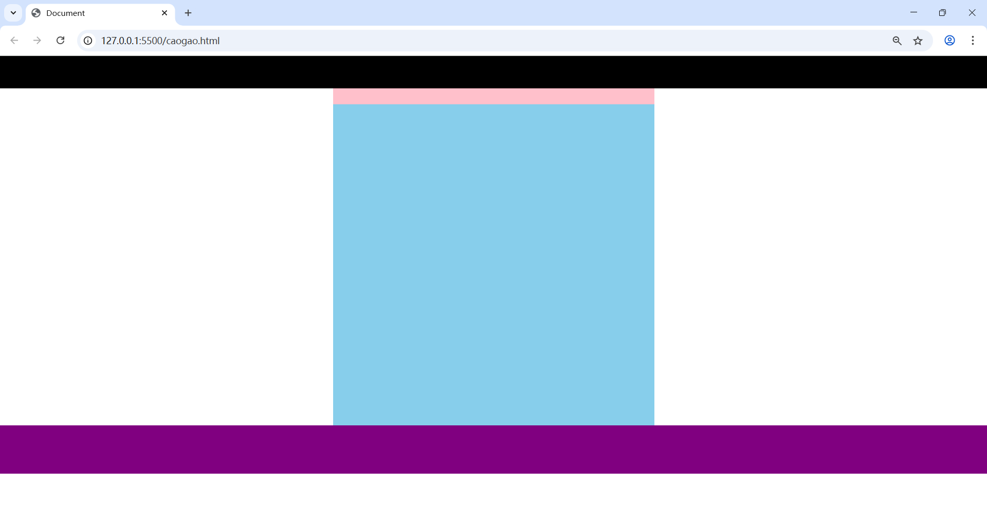
【1】樣例:
首先,觀察到,幾個元素豎著排列的,所以使用塊級元素,而不是行內元素。
【2】代碼演示
<head><meta charset="UTF-8"><meta name="viewport" content="width=device-width, initial-scale=1.0"><title>Document</title><style>/* 緊緊貼著瀏覽器 無縫隙 *//* 清除所有元素的默認邊距 */* {/* 清除所有元素的默認外邊距 */margin: 0;/* 清除所有元素的默認內邊距 */padding: 0;}/* 設置 寬 高 背景色 */.header {height: 100px;background-color: black;}.nav {width: 1000px;height: 50px;background-color: pink;}.main {width: 1000px;height: 1000px;background-color: skyblue;}.footer {height: 150px;background-color: purple;}/* 讓塊級盒子在瀏覽器中水平居中對齊 */.center {margin: auto;}</style>
</head><body><!-- 頭部內容 --><div class="header"></div><!-- 導航欄 --><div class="nav center"></div><!-- 主體部分 --><div class="main center"></div><!-- 底部內容 --><div class="footer"></div>
</body>
【3】實際效果


 --- 高級查詢與函數篇)


![[數據結構——lesson3.單鏈表]](http://pic.xiahunao.cn/[數據結構——lesson3.單鏈表])