一、邊框效果
| 屬性 | 功能 | 示例值 | 說明 |
|---|---|---|---|
border-radius | 創建圓角 | border-radius: 20px; | 設置元素的圓角半徑,支持像素(px)或百分比(%)。值為?50%?時可變為圓形。 |
box-shadow | 添加陰影 | box-shadow: 5px 5px 15px rgba(0, 0, 0, 0.5); | 為元素添加外部或內部陰影,支持顏色、模糊半徑等。 |
1、border-radius語法:
border-radius: [水平半徑] [垂直半徑]
? 按左上→右上→右下→左下順時針排列,省略時對角復制
(如?
border-radius: 10px 20px;?表示左上/右下為?10px,右上/左下為?20px)
? 使用 border-radius 制作特殊圖形
<!DOCTYPE html>
<html lang="zh-cn">
<head><meta charset="UTF-8"><meta name="viewport" content="width=device-width, initial-scale=1.0"><title>使用 border-radius 制作特殊圖形</title><style>body {font-family: Arial, sans-serif;text-align: center;margin: 20px;}.container {display: flex;justify-content: center;flex-wrap: wrap;gap: 20px;}.shape {background-color: #25c447;display: flex;justify-content: center;align-items: center;color: #fff;font-size: 14px;font-weight: bold;}/* 圓形 *//* 元素的寬度和高度必須相同,圓角的半徑為元素寬度的一半,或者直接設置圓角半徑值為50% */.circle {width: 100px;height: 100px;border-radius: 50%;}/* 橢圓 *//* 元素的寬度和高度不相同,圓角的半徑為元素寬度的一半,或者直接設置圓角半徑值為50% */.ellipse {width: 150px;height: 100px;border-radius: 50%;}/* 半圓: *//* 制作左半圓或右半圓時,元素的高度是寬度的2倍,而且圓角半徑為元素的寬度值 */.half-circle {width: 50px;height: 100px;border-radius: 0 50px 50px 0 ;}/* 半圓: *//* 制作上半圓或下半圓時,元素的寬度是高度的2倍,而且圓角半徑為元素的高度值*/.half-circle2 {width: 100px;height: 50px;border-radius: 50px 50px 0 0;}/* 水滴形 */.water-drop {width: 50px;height: 100px;border-radius: 50% 50% 50% 50% / 70% 70% 20% 20%;}/* 扇形 *//* "三同"是元素寬度、高度、圓角半徑相同,一不同"是圓角取值位置不同 */.fan {width: 100px;height: 100px;border-radius: 100px 0 0 0;}/* 矩形 */.li {width: 100px;height: 100px;border-radius:0%; /*矩形有無角*/}</style>
</head>
<body><h1>使用 border-radius 制作特殊圖形</h1><div class="container"><div class="shape circle">圓形</div><div class="shape ellipse">橢圓</div><div class="shape half-circle">右半圓</div><div class="shape half-circle2">上半圓</div><div class="shape water-drop">水滴</div><div class="shape fan">扇形</div><div class="shape li">矩形</div></div>
</body>
</html>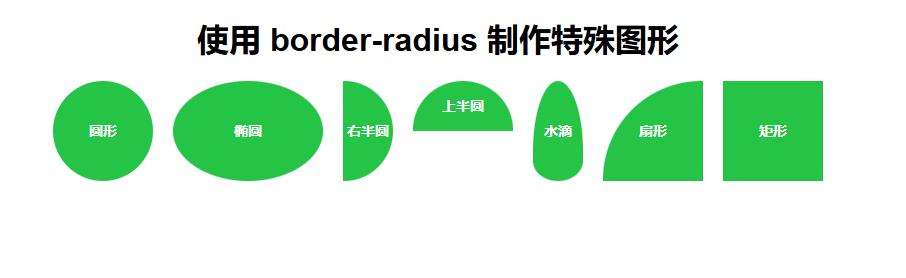 ?2、box-shadow 盒子陰影
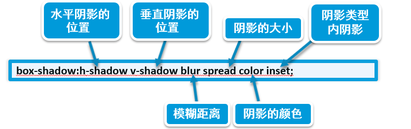
box-shadow: [水平偏移量] [垂直偏移量] [模糊半徑] [擴展半徑] [顏色] [inset];
- ?水平偏移量?:陰影水平方向的距離(正值為右,負值為左)。
- ?垂直偏移量?:陰影垂直方向的距離(正值為下,負值為上)。
- ?模糊半徑?:陰影的模糊程度(值越大越模糊,0 為無模糊)。
- ?擴展半徑?:陰影的擴展范圍(正值擴大,負值縮小)。
- ?顏色?:陰影顏色(支持 HEX、RGB、RGBA 等格式)。
- ?inset?:可選關鍵字,表示陰影在元素內部(默認是外部)。
<!DOCTYPE html>
<html lang="zh-CN">
<head><meta charset="UTF-8"><meta name="viewport" content="width=device-width, initial-scale=1.0"><title>Box-Shadow </title><style>body {font-family: Arial, sans-serif;background-color: #ebecd5;margin: 0;padding: 20px;display: flex;justify-content: space-around;align-items: center;height: 100vh;flex-wrap: wrap;}/* 外陰影 */.box-outer-shadow {width: 300px;height: 200px;background-color: #fff;border-radius: 10px;box-shadow: 0 8px 16px rgba(0, 0, 0, 0.4); /* 增加偏移量和透明度 */display: flex;justify-content: center;align-items: center;text-align: center;}/* 內陰影 */.box-inner-shadow {width: 300px;height: 200px;background-color: #fff;border-radius: 10px;box-shadow: inset 0 8px 16px rgba(0, 0, 0, 0.3); /* 增加模糊半徑和透明度 */display: flex;justify-content: center;align-items: center;text-align: center;}/* 多層陰影 */.box-multi-shadow {width: 300px;height: 200px;background-color: #fff;border-radius: 10px;box-shadow: 0 8px 16px rgba(0, 0, 0, 0.4), 0 16px 32px rgba(0, 0, 0, 0.2); /* 增加層次感 */display: flex;justify-content: center;align-items: center;text-align: center;}/* 擴展陰影 */.box-extended-shadow {width: 300px;height: 200px;background-color: #fff;border-radius: 10px;box-shadow: 0 30px 60px rgba(0, 0, 0, 0.4); /* 增加偏移量和模糊半徑 */display: flex;justify-content: center;align-items: center;text-align: center;}.box p {font-size: 18px;color: #333;}</style>
</head>
<body><div class="box-outer-shadow"><p>外陰影</p></div><div class="box-inner-shadow"><p>內陰影</p></div><div class="box-multi-shadow"><p>多層陰影</p></div><div class="box-extended-shadow"><p>擴展陰影</p></div>
</body>
</html>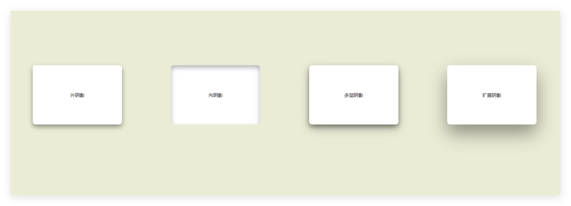
外陰影
- 向下方偏移 8px,模糊半徑 16px,顏色為半透明黑色。
內陰影(inset)
- 在元素內部添加模糊陰影,常用于按鈕按下效果。
多層陰影
- 疊加兩層陰影,實現更立體的層次感。
?擴展陰影
- 陰影不模糊,擴展 5px,常用于高亮邊框效果。


)


)


進行程序調試保姆級教程(2萬字長文))
