目錄
- 引言
- 示例簡介
- 示例代碼與關鍵點
- 示例1:基礎樣式定制
- 示例2:添加圖標
- 示例3:交互式元素(清除按鈕)
- 實現要點
- 總結
- 完整工程下載
引言
在Qt Quick應用程序開發中,文本輸入是最常見的用戶交互方式之一。TextField控件提供了基礎的文本輸入功能,但默認樣式往往不能滿足現代應用的設計需求。本文將詳細介紹如何通過QML自定義TextField的樣式,使其更加美觀且符合應用的設計語言。
示例簡介
本文將通過三個遞進式的示例,展示如何從基礎到高級逐步定制TextField的樣式:
- 基礎樣式定制:自定義邊框、顏色和圓角
- 添加圖標:在文本框中集成搜索圖標
- 交互式元素:添加清除按鈕實現一鍵清空功能
這三個示例展示了從簡單到復雜的TextField樣式定制過程,可以作為實際開發中的參考模板。
示例代碼與關鍵點
示例1:基礎樣式定制
import QtQuick
import QtQuick.ControlsWindow {width: 400height: 400visible: truetitle: qsTr("TextField - Style1")TextField {id: styledTextFieldwidth: 250height: 40anchors.centerIn: parentplaceholderText: "自定義樣式文本框"// 背景樣式background: Rectangle {implicitWidth: 250implicitHeight: 40color: styledTextField.enabled ? "white" : "#f5f5f5"border.color: styledTextField.activeFocus ? "#21be2b" :styledTextField.hovered ? "#808080" : "#c0c0c0"border.width: styledTextField.activeFocus ? 2 : 1radius: 4}// 文本樣式color: "black"selectionColor: "#21be2b"selectedTextColor: "white"font.pixelSize: 14leftPadding: 10rightPadding: 10topPadding: 10}
}
關鍵點:
- 背景自定義:通過替換默認的
background屬性,使用Rectangle實現自定義背景 - 狀態響應:
- 使用
enabled屬性控制啟用/禁用狀態下的背景顏色 - 使用
activeFocus屬性檢測焦點狀態改變邊框顏色 - 使用
hovered屬性檢測鼠標懸停狀態
- 使用
- 圓角設計:通過radius屬性設置圓角大小
- 文本樣式:
- 設置文本顏色、選中文本顏色和選中背景色
- 通過
padding相關屬性控制文本內邊距
運行效果:

示例2:添加圖標
基于示例1修改,核心是增加了Image屬性:
TextField {id: styledTextFieldwidth: 250height: 40placeholderText: "自定義樣式文本框"// 背景樣式代碼與示例1類似,省略...background: Rectangle {// ...類似示例1radius: 8  // 更大的圓角}Image {source: "/icons/search2.png"anchors.left: parent.leftanchors.leftMargin: 8anchors.verticalCenter: parent.verticalCenterwidth: 24height: 24}// 文本樣式color: "black"selectionColor: "#21be2b"selectedTextColor: "white"font.pixelSize: 14leftPadding: 40  // 增大左內邊距,為圖標留出空間rightPadding: 10topPadding: 10
}
關鍵點:
- 圖標集成:
- 使用
Image元素在TextField內添加搜索圖標 - 通過anchors屬性控制圖標位置
- 使用
- 文本位置調整:
- 增大
leftPadding為圖標留出空間,避免文本與圖標重疊
- 增大
- 視覺一致性:
- 圖標垂直居中,確保與文本垂直對齊
運行效果:

示例3:交互式元素(清除按鈕)
基于示例2之上進行修改,增加了Button控件:
TextField {id: styledTextFieldwidth: 250height: 40placeholderText: "自定義樣式文本框"// 背景和圖標代碼類似示例2,省略...// 文本樣式color: "black"selectionColor: "#21be2b"selectedTextColor: "white"font.pixelSize: 14leftPadding: 40topPadding: 10rightPadding: clearButton.width + 10  // 為清除按鈕留出空間Button {id: clearButtonanchors.right: parent.rightanchors.rightMargin: 5anchors.verticalCenter: parent.verticalCenterwidth: 30height: 30flat: truevisible: styledTextField.text !== ""  // 只在有文本時顯示contentItem: Image {source: "/icons/clear.png"anchors.centerIn: parentwidth: 16height: 16}onClicked: {styledTextField.text = ""styledTextField.forceActiveFocus()}}
}
關鍵點:
- 交互式清除按鈕:
- 添加
Button組件作為清除按鈕 - 使用
flat: true創建無邊框按鈕 - 用Image作為按鈕內容
- 添加
- 條件顯示:
- 通過
visible: styledTextField.text !== ""僅在文本框有內容時顯示清除按鈕
- 通過
- 點擊事件處理:
- 在
onClicked中清空文本并保持焦點
- 在
- 布局適配:
- 調整
rightPadding為清除按鈕預留空間 - 確保清除按鈕垂直居中對齊
- 調整
運行效果:

實現要點
-
樣式分層設計
- 背景樣式:通過自定義
background實現 - 文本樣式:通過TextField本身的屬性控制
- 附加元素:通過子元素(如圖標、按鈕)添加
- 背景樣式:通過自定義
-
狀態響應機制
- 利用QML的狀態屬性(
enabled,activeFocus,hovered)實現不同狀態下的樣式變化 - 通過綁定表達式實現樣式的動態變化
- 利用QML的狀態屬性(
-
交互體驗優化
- 視覺反饋:不同狀態下的邊框顏色和寬度變化
- 功能增強:添加圖標和清除按鈕
- 智能顯示:根據內容自動顯示/隱藏清除按鈕
-
布局技巧
- 使用padding控制內部布局
- 使用anchors定位子元素
- 確保各元素對齊和間距合理
總結
通過自定義TextField的樣式,我們可以大幅提升應用的視覺效果和用戶體驗。從基礎的顏色和邊框定制,到添加圖標和交互式按鈕,QML提供了靈活的樣式定制能力。在實際開發中,可以根據應用需求,在這些示例的基礎上進行擴展和調整,創造出既美觀又實用的文本輸入控件。
完整工程下載
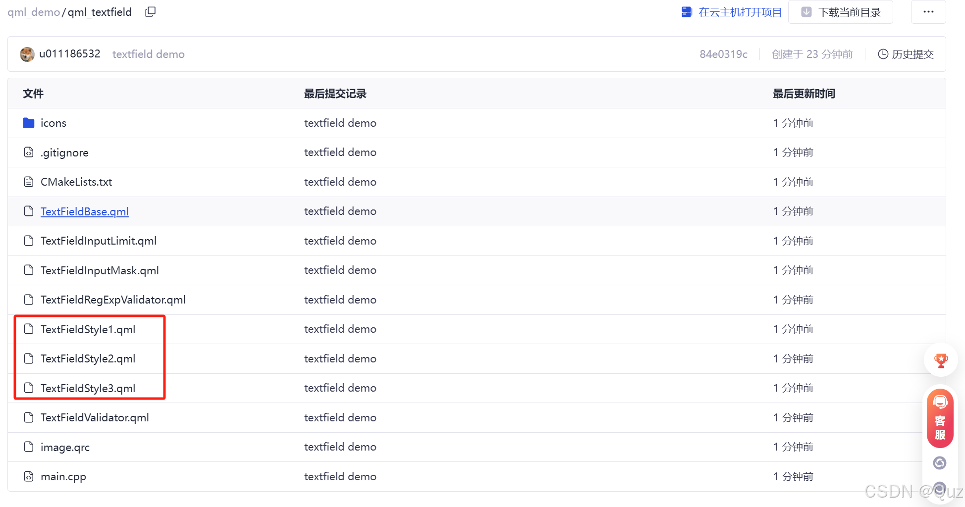
鏈接: https://gitcode.com/u011186532/qml_demo/tree/main/qml_textfield


![[C++] : C++11 右值引用的理解](http://pic.xiahunao.cn/[C++] : C++11 右值引用的理解)


)


:請求體)


-第一部分)