1 Stage模型應用程序包結構
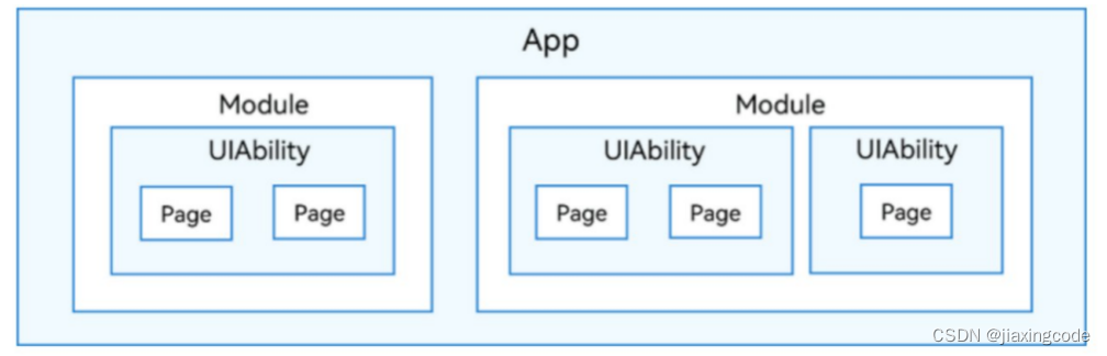
在開發態,一個應用包含一個或者多個Module,可以在DevEco Studio工程中創建一個或者多個Module。Module是HarmonyOS應用/服務的基本功能單元,包含了源代碼、資源文件、第三方庫及應用/服務配置文件,每一個Module都可以獨立進行編譯和運行。Module分為“Ability”和“Library”兩種類型,“Ability”類型的Module對應于編譯后的HAP(Harmony Ability Package);“Library”類型的Module對應于HAR(Harmony Archive),或者HSP(Harmony Shared Package),HAR相當于Android中的lib下的jar或者aar。HSP相當于通過gradle引入第三方包。一個Module可以包含一個或多個UIAbility組件。
?Module與UIAbility組件關系示意圖
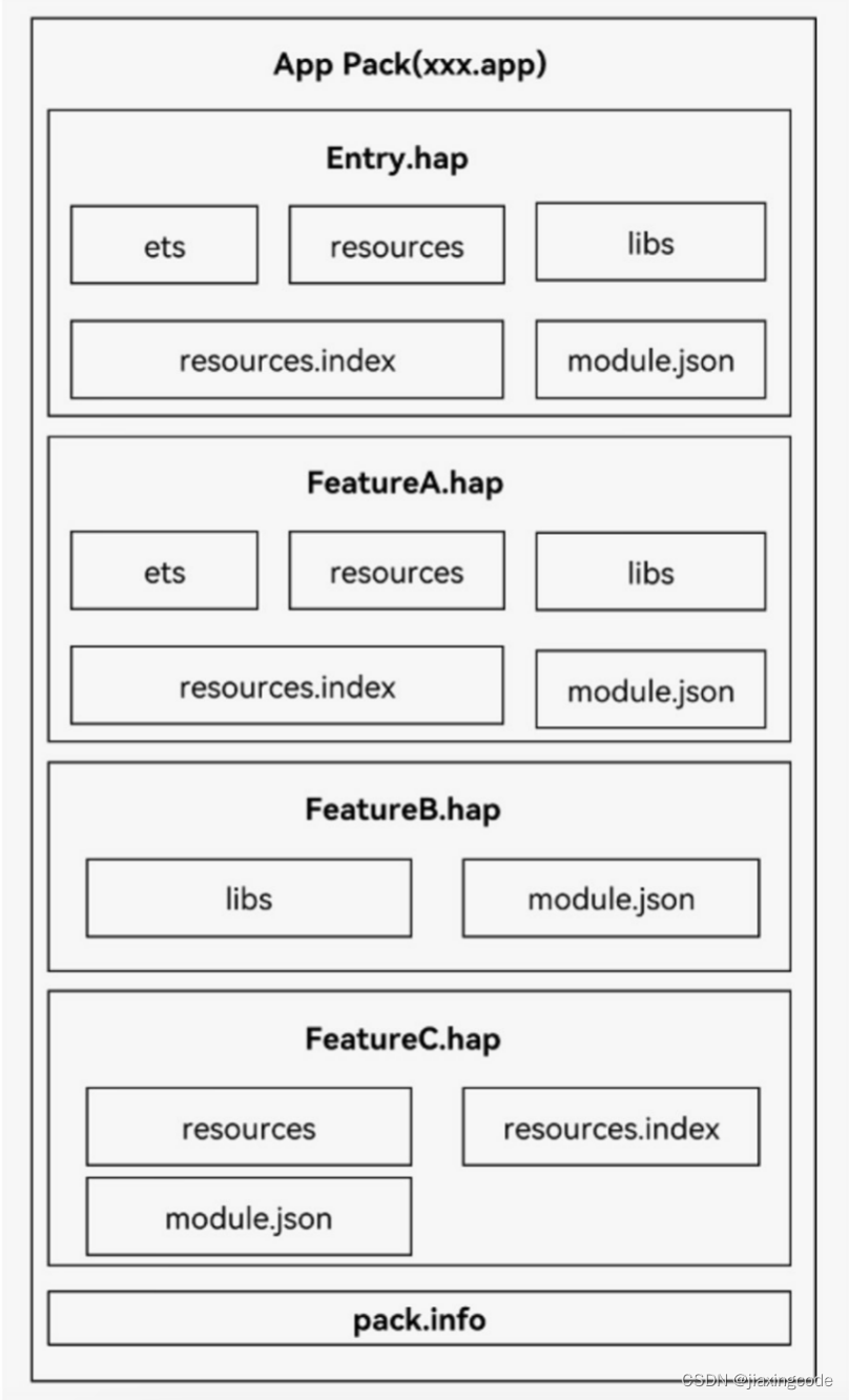
開發者通過DevEco Studio把應用程序編譯為一個或者多個.hap后綴的文件,即HAP。HAP是HarmonyOS應用安裝的基本單位,包含了編譯后的代碼、資源、三方庫及配置文件。HAP可分為Entry和Feature兩種類型。
- Entry類型的HAP:是應用的主模塊,在module.json5配置文件中的type標簽配置為“entry”類型。在同一個應用中,同一設備類型只支持一個Entry類型的HAP,通常用于實現應用的入口界面、入口圖標、主特性功能等。
- Feature類型的HAP:是應用的動態特性模塊,在module.json5配置文件中的type標簽配置為“feature”類型。一個應用程序包可以包含一個或多個Feature類型的HAP,也可以不包含;Feature類型的HAP通常用于實現應用的特性功能,可以配置成按需下載安裝,也可以配置成隨Entry類型的HAP一起下載安裝(請參見module對象內部結構中的“deliveryWithInstall”)。
每個HarmonyOS應用可以包含多個.hap文件,一個應用中的.hap文件合在一起稱為一個Bundle,而bundleName就是應用的唯一標識,在應用上架到應用市場時,需要把應用包含的所有.hap文件(即Bundle)打包為一個.app后綴的文件用于上架,這個.app文件稱為App Pack(Application Package),其中同時包含了描述App Pack屬性的pack.info文件;在云端(服務器)分發和終端設備安裝時,都是以HAP為單位進行分發和安裝的。打包后的HAP包結構包括ets、libs、resources等文件夾和resources.index、module.json、pack.info等文件。
- ets目錄用于存放應用代碼編譯后的字節碼文件。
- libs目錄用于存放庫文件。庫文件是HarmonyOS應用依賴的第三方代碼(.so二進制文件)。
- resources目錄用于存放應用的資源文件(字符串、圖片等),便于開發者使用和維護,詳見資源分類與訪問。
- resources.index是資源索引表,由IDE編譯工程時生成。
- module.json是HAP的配置文件,內容由工程配置中的module.json5和app.json5組成,該文件是HAP中必不可少的文件。IDE會自動生成一部分默認配置,開發者按需修改其中的配置。詳細字段請參見應用配置文件。
- pack.info是Bundle中用于描述每個HAP屬性的文件,例如app中的bundleName和versionCode信息、module中的name、type和abilities等信息,由IDE工具生成Bundle包時自動生成。
應用程序包結構(Stage模型)
資源訪問
?
應用開發過程中,經常需要用到顏色、字體、間距、圖片等資源,在不同的設備或配置中,這些資源的值可能不同。
1、應用資源:借助資源文件能力,開發者在應用中自定義資源,自行管理這些資源在不同的設備或配置中的表現。
2、系統資源:開發者直接使用系統預置的資源定義(即分層參數,同一資源ID在設備類型、深淺色等不同配置下有不同的取值)
base目錄
base目錄是默認存在的目錄,二級子目錄element用于存放字符串、顏色、布爾值等基礎元素,media、profile存放媒體、動畫、布局等資源文件。
目錄中的資源文件會被編譯成二進制文件,并賦予資源文件ID。通過指定資源類型(type)和資源名稱(name)引用。
限定詞目錄
en_US和zh_CN是默認存在的兩個限定詞目錄,其余限定詞目錄需要開發者根據開發需要自行創建。二級子目錄element、media、profile用于存放字符串、顏色、布爾值等基礎元素,以及媒體、動畫、布局等資源文件。
同樣,目錄中的資源文件會被編譯成二進制文件,并賦予資源文件ID。通過指定資源類型(type)和資源名稱(name)來引用。
限定詞目錄的命名要求
限定詞目錄可以由一個或多個表征應用場景或設備特征的限定詞組合而成,包括移動國家碼和移動網絡碼、語言、文字、國家或地區、橫豎屏、設備類型、顏色模式和屏幕密度等維度,限定詞之間通過下劃線(_)或者中劃線(-)連接。開發者在創建限定詞目錄時,需要遵守限定詞目錄的命名規則。
限定詞的組合順序:
_移動國家碼_移動網絡碼-語言_文字_國家或地區-橫豎屏-設備類型-顏色模式-屏幕密度_。開發者可以根據應用的使用場景和設備特征,選擇其中的一類或幾類限定詞組成目錄名稱。
限定詞的連接方式:
語言、文字、國家或地區之間采用下劃線(_)連接,移動國家碼和移動網絡碼之間也采用下劃線(_)連接,除此之外的其他限定詞之間均采用中劃線(-)連接。例如:zh_Hant_CN、zh_CN-car-ldpi。
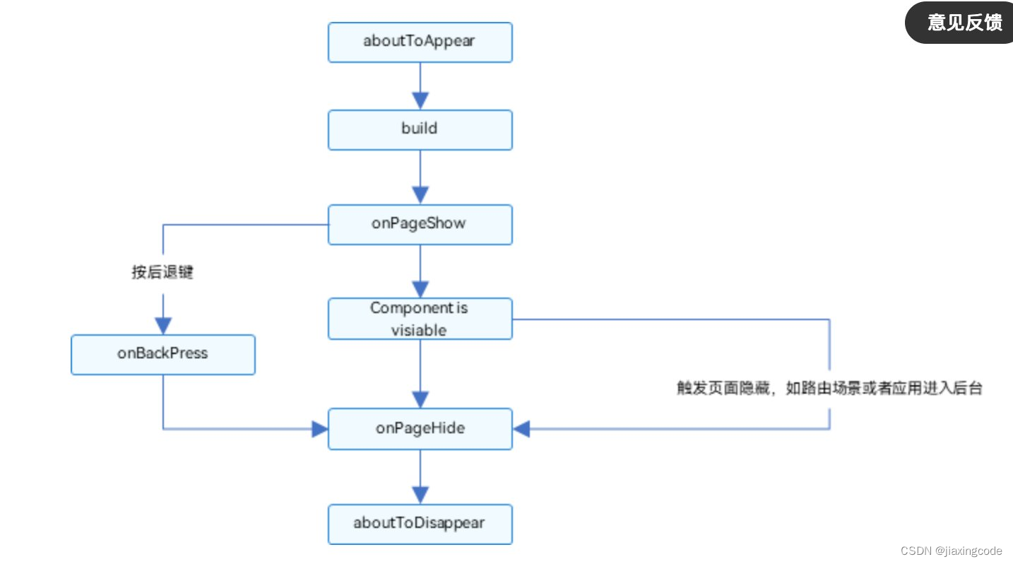
頁面和自定義組件生命周期
自定義組件:@Component裝飾的UI單元,可以組合多個系統組件實現UI的復用,可以調用組件的生命周期。
頁面:即應用的UI頁面。可以由一個或者多個自定義組件組成,@Entry裝飾的自定義組件為頁面的入口組件,即頁面的根節點,一個頁面有且僅能有一個@Entry。只有被@Entry裝飾的組件才可以調用頁面的生命周期。
頁面生命周期,即被@Entry裝飾的組件生命周期,提供以下生命周期接口:
- onPageShow:頁面每次顯示時觸發一次,包括路由過程、應用進入前臺等場景。
- onPageHide:頁面每次隱藏時觸發一次,包括路由過程、應用進入后臺等場景。
- onBackPress:當用戶點擊返回按鈕時觸發。
組件生命周期,即一般用@Component裝飾的自定義組件的生命周期,提供以下生命周期接口:
- aboutToAppear:組件即將出現時回調該接口,具體時機為在創建自定義組件的新實例后,在執行其build()函數之前執行。
- aboutToDisappear:在自定義組件析構銷毀之前執行。不允許在aboutToDisappear函數中改變狀態變量,特別是@Link變量的修改可能會導致應用程序行為不穩定。
生命周期流程如下圖所示,下圖展示的是被@Entry裝飾的組件(頁面)生命周期。
應用程序包更新流程
HarmonyOS包管理服務提供了應用程序包更新能力,更新方式如下。
- 應用市場內更新:新版本應用通過應用市場上架后,應用市場通知終端用戶該應用有新版本,終端用戶可以根據通知到應用市場(客戶端)進行應用升級。
- 應用內檢測升級:終端用戶啟動應用時,應用市場檢測到該應用有新版本會通知終端用戶,可以到應用市場進行應用的下載更新。
您正在瀏覽HarmonyOS開發者3.1/4.0版本配套的開發者文檔,對應API能力級別為API 9 Release,詳細版本配套關系請參考版本說明。
創建自定義組件
在ArkUI中,UI顯示的內容均為組件,由框架直接提供的稱為系統組件,由開發者定義的稱為自定義組件。只有@entry聲明的組件才有頁面生命周期
@Entry
@Component
struct ParentComponent {build() {Column() {Text('ArkUI message')HelloComponent({ message: 'Hello, World!' });Divider()HelloComponent({ message: '你好!' });}}
}
2 H5和鴻蒙通信
為了兼容當前H5使用的dsbridge框架,鴻蒙端使用DSBridge-HarmonyOS庫和H5進行通信
3 裝飾器
全局的裝飾器需要使用function關鍵字,組件內的裝飾器不需要使用function
3.1?@Builder裝飾器
又叫自定義構建函數,將重復使用的UI元素抽象成一個方法,在build方法里調用。自定義構建函數的參數傳遞有按值傳遞和按引用傳遞兩種(默認按值傳遞)。如果一個變量用@state修飾,變量值改變需要刷新UI,那么需要使用按引用傳遞。如果不需要刷新UI可以使用按值傳遞
按值傳遞
@Builder function overBuilder(paramA1: string) {
??Row() {
?? ?Text(`UseStateVarByValue: ${paramA1} `)
??}
}
@Entry
@Component
struct Parent {
??@State label: string = 'Hello';
??build() {
?? ?Column() {
?? ? ?overBuilder(this.label)
?? ?}
??}
}
按引用傳遞
@Builder function overBuilder($$: { paramA1: string }) {
??Row() {
?? ?Text(`UseStateVarByReference: ${$$.paramA1} `)
??}
}
@Entry
@Component
struct Parent {
??@State label: string = 'Hello';
??build() {
?? ?Column() {
?? ? ?// 在Parent組件中調用ABuilder的時候,將this.label引用傳遞給ABuilder
?? ? ?overBuilder({ paramA1: this.label })
?? ? ?Button('Click me').onClick(() => {
?? ? ? ?// 點擊“Click me”后,UI從“Hello”刷新為“ArkUI”
?? ? ? ?this.label = 'ArkUI';
?? ? ?})
?? ?}
??}
}
3.2 @BuilderParam裝飾器
用來裝飾指向@Builder方法的變量,開發者可在初始化自定義組件時對此屬性進行賦值,為自定義組件增加特定的功能。@BuilderParam裝飾的方法只能被自定義構建函數(@Builder裝飾的方法)初始化
@Builder function overBuilder($$ : {label: string }) {
??Text($$.label)
?? ?.width(400)
?? ?.height(50)
?? ?.backgroundColor(Color.Green)
}
@Component
struct Child {
??label: string = 'Child'
??// 無參數類型,指向的componentBuilder也是無參數類型
??@BuilderParam customBuilderParam: () => void;
??// 有參數類型,指向的GlobalBuilder1也是有參數類型的方法
??@BuilderParam customOverBuilderParam: ($$ : { label : string}) => void;
??build() {
?? ?Column() {
?? ? ?this.customBuilderParam()
?? ? ?this.customOverBuilderParam({label: 'global Builder label' } )
?? ?}
??}
}
@Entry
@Component
struct Parent {
??label: string = 'Parent'
??@Builder componentBuilder() {
?? ?Text(`${this.label}`)
??}
??build() {
?? ?Column() {
?? ? ?this.componentBuilder()
?? ? ?Child({ customBuilderParam: this.componentBuilder, customOverBuilderParam: overBuilder })
?? ?}
??}
}
3.3 @Styles裝飾器
定義組件重用樣式。@Styles裝飾器可以將多條樣式設置提煉成一個方法,直接在組件聲明的位置調用。通過@Styles裝飾器可以快速定義并復用自定義樣式。
- 組件內@Styles的優先級高于全局@Styles。
- 框架優先找當前組件內的@Styles,如果找不到,則會全局查找
// 全局
@Styles function functionName() { ... }
// 在組件內
@Component
struct FancyUse {
??@Styles fancy() {
?? ?.height(100)
??}
}
使用場景
// 定義在全局的@Styles封裝的樣式
@Styles function globalFancy ?() {
??.width(150)
??.height(100)
??.backgroundColor(Color.Pink)
}
@Entry
@Component
struct FancyUse {
??@State heightValue: number = 100
??// 定義在組件內的@Styles封裝的樣式
??@Styles fancy() {
?? ?.width(200)
?? ?.height(this.heightValue)
?? ?.backgroundColor(Color.Yellow)
?? ?.onClick(() => {
?? ? ?this.heightValue = 200
?? ?})
??}
??build() {
?? ?Column({ space: 10 }) {
?? ? ?// 使用全局的@Styles封裝的樣式
?? ? ?Text('FancyA')
?? ? ? ?.globalFancy()
?? ? ? ?.fontSize(30)
?? ? ?// 使用組件內的@Styles封裝的樣式
?? ? ?Text('FancyB')
?? ? ? ?.fancy()
?? ? ? ?.fontSize(30)
?? ?}
??}
}
3.4 @Extend裝飾器
用于擴展原生組件樣式,僅支持定義在全局
// @Extend(Text)可以支持Text的私有屬性fontColor
@Extend(Text) function fancy () {
??.fontColor(Color.Red)
}
// superFancyText可以調用預定義的fancy。組件內的fancy在“3.3 @Styles裝飾器”里聲明過
@Extend(Text) function superFancyText(size:number) {
?? ?.fontSize(size)
?? ?.fancy()
}
使用場景
以下示例聲明了3個Text組件,每個Text組件均設置了fontStyle、fontWeight和backgroundColor樣式
@Entry
@Component
struct FancyUse {
??@State label: string = 'Hello World'
??build() {
?? ?Row({ space: 10 }) {
?? ? ?Text(`${this.label}`)
?? ? ? ?.fontStyle(FontStyle.Italic)
?? ? ? ?.fontWeight(100)
?? ? ? ?.backgroundColor(Color.Blue)
?? ? ?Text(`${this.label}`)
?? ? ? ?.fontStyle(FontStyle.Italic)
?? ? ? ?.fontWeight(200)
?? ? ? ?.backgroundColor(Color.Pink)
?? ? ?Text(`${this.label}`)
?? ? ? ?.fontStyle(FontStyle.Italic)
?? ? ? ?.fontWeight(300)
?? ? ? ?.backgroundColor(Color.Orange)
?? ?}.margin('20%')
??}
}
@Extend將樣式組合復用
@Extend(Text) function fancyText(weightValue: number, color: Color) {
??.fontStyle(FontStyle.Italic)
??.fontWeight(weightValue)
??.backgroundColor(color)
}
通過@Extend組合樣式
@Entry
@Component
struct FancyUse {
??@State label: string = 'Hello World'
??build() {
?? ?Row({ space: 10 }) {
?? ? ?Text(`${this.label}`)
?? ? ? ?.fancyText(100, Color.Blue)
?? ? ?Text(`${this.label}`)
?? ? ? ?.fancyText(200, Color.Pink)
?? ? ?Text(`${this.label}`)
?? ? ? ?.fancyText(300, Color.Orange)
?? ?}.margin('20%')
??}
}
4 stateStyles
多態樣式。@Styles和@Extend僅僅應用于靜態頁面的樣式復用,stateStyles可以依據組件的內部狀態的不同,快速設置不同樣式。組件狀態分為?
- focused:獲焦態。
- normal:正常態。
- pressed:按壓態。
- disabled:不可用態
使用場景
@Entry
@Component
struct StateStylesSample {
??build() {
?? ?Column() {
?? ? ?Button('Button1')
?? ? ? ?.stateStyles({
?? ? ? ? ?focused: {
?? ? ? ? ? ?.backgroundColor(Color.Pink)
?? ? ? ? ?},
?? ? ? ? ?pressed: {
?? ? ? ? ? ?.backgroundColor(Color.Black)
?? ? ? ? ?},
?? ? ? ? ?normal: {
?? ? ? ? ? ?.backgroundColor(Color.Red)
?? ? ? ? ?}
?? ? ? ?})
?? ? ? ?.margin(20)
?? ? ?Button('Button2')
?? ? ? ?.stateStyles({
?? ? ? ? ?focused: {
?? ? ? ? ? ?.backgroundColor(Color.Pink)
?? ? ? ? ?},
?? ? ? ? ?pressed: {
?? ? ? ? ? ?.backgroundColor(Color.Black)
?? ? ? ? ?},
?? ? ? ? ?normal: {
?? ? ? ? ? ?.backgroundColor(Color.Red)
?? ? ? ? ?}
?? ? ? ?})
?? ?}.margin('30%')
??}
}
5 狀態管理
5.1?@State裝飾器
- 組件內狀態同步,當狀態改變時UI會發生對應的渲染改變。@State裝飾的變量叫做狀態變量,必須初始化。
- 不管是基本數據類型還是引用類型,只能觀察到一層數據的變化
- 父組件中常規變量、@State、@Link、@Prop、@Provide、@Consume、@ObjectLink、@StorageLink、@StorageProp、@LocalStorageLink和@LocalStorageProp裝飾的變量,可以初始化子組件中@State裝飾的變量
- 父組件中@State裝飾的變量,可以初始化子組件中常規變量、@State、@Link、@Prop和@Provide裝飾的變量
使用場景
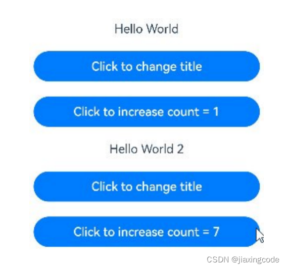
- 自定義組件MyComponent定義了被@State裝飾的狀態變量count和title,其中title的類型為自定義類Model。如果count或title的值發生變化,則查詢MyComponent中使用該狀態變量的UI組件,并進行重新渲染。
? - EntryComponent中有多個MyComponent組件實例,第一個MyComponent內部狀態的更改不會影響第二個MyComponent。
class Model {
??public value: string;
??constructor(value: string) {
?? ?this.value = value;
??}
}
@Entry
@Component
struct EntryComponent {
??build() {
?? ?Column() {
?? ? ?// 此處指定的參數都將在初始渲染時覆蓋本地定義的默認值,并不是所有的參數都需要從父組件初始化
?? ? ?MyComponent({ count: 1, increaseBy: 2 })
?? ? ? ?.width(300)
?? ? ?MyComponent({ title: new Model('Hello World 2'), count: 7 })
?? ?}
??}
}
@Component
struct MyComponent {
??@State title: Model = new Model('Hello World');
??@State count: number = 0;
??private increaseBy: number = 1;
??build() {
?? ?Column() {
?? ? ?Text(`${this.title.value}`)
?? ? ? ?.margin(10)
?? ? ?Button(`Click to change title`)
?? ? ? ?.onClick(() => {
?? ? ? ? ?// @State變量的更新將觸發上面的Text組件內容更新
?? ? ? ? ?this.title.value = this.title.value === 'Hello ArkUI' ? 'Hello World' : 'Hello ArkUI';
?? ? ? ?})
?? ? ? ?.width(300)
?? ? ? ?.margin(10)
?? ? ?Button(`Click to increase count = ${this.count}`)
?? ? ? ?.onClick(() => {
?? ? ? ? ?// @State變量的更新將觸發該Button組件的內容更新
?? ? ? ? ?this.count += this.increaseBy;
?? ? ? ?})
?? ? ? ?.width(300)
?? ? ? ?.margin(10)
?? ?}
??}
}
5.2 @Prop裝飾器
- 父向子單向同步,當狀態改變時UI會發生對應的渲染改變。@Prop裝飾器不能在@Entry裝飾的自定義組件中使用。不可以在子組件中初始化(文檔說可以,編譯器說不可以)
- 不管是基本數據類型還是引用類型,只能觀察到一層數據的變化
- 父組件中常規變量、@State、@Link、@Prop、@Provide、@Consume、@ObjectLink、@StorageLink、@StorageProp、@LocalStorageLink和@LocalStorageProp裝飾的變量,可以初始化子組件中@Prop裝飾的變量
- 父組件中@Prop裝飾的變量,可以初始化子組件中常規變量、@State、@Link、@Prop、@Provide裝飾的變量
使用場景
如果圖書館有一本圖書和兩位用戶,每位用戶都可以將圖書標記為已讀,此標記行為不會影響其它讀者用戶。從代碼角度講,對@Prop圖書對象的本地更改不會同步給圖書館組件中的@State圖書對象。
class Book {
??public title: string;
??public pages: number;
??public readIt: boolean = false;
??constructor(title: string, pages: number) {
?? ?this.title = title;
?? ?this.pages = pages;
??}
}
@Component
struct ReaderComp {
??@Prop title: string;
??@Prop readIt: boolean;
??build() {
?? ?Row() {
?? ? ?Text(this.title)
?? ? ?Text(`... ${this.readIt ? 'I have read' : 'I have not read it'}`)
?? ? ? ?.onClick(() => this.readIt = true)
?? ?}
??}
}
@Entry
@Component
struct Library {
??@State book: Book = new Book('100 secrets of C++', 765);
??build() {
?? ?Column() {
?? ? ?ReaderComp({ title: this.book.title, readIt: this.book.readIt })
?? ? ?ReaderComp({ title: this.book.title, readIt: this.book.readIt })
?? ?}
??}
}
5.3 @Link裝飾器
- 父向子雙向同步,當狀態改變時UI會發生對應的渲染改變。@Link裝飾器不能在@Entry裝飾的自定義組件中使用。不可以在子組件中初始化(文檔說可以,編譯器說不可以)
- 不管是基本數據類型還是引用類型,只能觀察到一層數據的變化
- 父組件中常規變量、@State、@Link、@Prop、@Provide、@Consume、@ObjectLink、@StorageLink、@StorageProp、@LocalStorageLink和@LocalStorageProp裝飾的變量,可以初始化子組件中@Link裝飾的變量
- 父組件中@Link裝飾的變量,可以初始化子組件中常規變量、@State、@Link、@Prop、@Provide裝飾的變量
使用場景
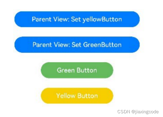
1.點擊子組件GreenButton和YellowButton中的Button,子組件會發生相應變化,將變化同步給父組件。因為@Link是雙向同步,會將變化同步給@State。
2.當點擊父組件ShufflingContainer中的Button時,@State變化,也會同步給@Link,子組件也會發生對應的刷新。
class GreenButtonState {
??width: number = 0;
??constructor(width: number) {
?? ?this.width = width;
??}
}
@Component
struct GreenButton {
??@Link greenButtonState: GreenButtonState;
??build() {
?? ?Button('Green Button')
?? ? ?.width(this.greenButtonState.width)
?? ? ?.height(40)
?? ? ?.backgroundColor('#64bb5c')
?? ? ?.fontColor('#FFFFFF,90%')
?? ? ?.onClick(() => {
?? ? ? ?if (this.greenButtonState.width < 700) {
?? ? ? ? ?// 更新class的屬性,變化可以被觀察到同步回父組件
?? ? ? ? ?this.greenButtonState.width += 60;
?? ? ? ?} else {
?? ? ? ? ?// 更新class,變化可以被觀察到同步回父組件
?? ? ? ? ?this.greenButtonState = new GreenButtonState(180);
?? ? ? ?}
?? ? ?})
??}
}
@Component
struct YellowButton {
??@Link yellowButtonState: number;
??build() {
?? ?Button('Yellow Button')
?? ? ?.width(this.yellowButtonState)
?? ? ?.height(40)
?? ? ?.backgroundColor('#f7ce00')
?? ? ?.fontColor('#FFFFFF,90%')
?? ? ?.onClick(() => {
?? ? ? ?// 子組件的簡單類型可以同步回父組件
?? ? ? ?this.yellowButtonState += 40.0;
?? ? ?})
??}
}
@Entry
@Component
struct ShufflingContainer {
??@State greenButtonState: GreenButtonState = new GreenButtonState(180);
??@State yellowButtonProp: number = 180;
??build() {
?? ?Column() {
?? ? ?Flex({ direction: FlexDirection.Column, alignItems: ItemAlign.Center }) {
?? ? ? ?// 簡單類型從父組件@State向子組件@Link數據同步
?? ? ? ?Button('Parent View: Set yellowButton')
?? ? ? ? ?.width(312)
?? ? ? ? ?.height(40)
?? ? ? ? ?.margin(12)
?? ? ? ? ?.fontColor('#FFFFFF,90%')
?? ? ? ? ?.onClick(() => {
?? ? ? ? ? ?this.yellowButtonProp = (this.yellowButtonProp < 700) ? this.yellowButtonProp + 40 : 100;
?? ? ? ? ?})
?? ? ? ?// class類型從父組件@State向子組件@Link數據同步
?? ? ? ?Button('Parent View: Set GreenButton')
?? ? ? ? ?.width(312)
?? ? ? ? ?.height(40)
?? ? ? ? ?.margin(12)
?? ? ? ? ?.fontColor('#FFFFFF,90%')
?? ? ? ? ?.onClick(() => {
?? ? ? ? ? ?this.greenButtonState.width = (this.greenButtonState.width < 700) ? this.greenButtonState.width + 100 : 100;
?? ? ? ? ?})
?? ? ? ?// class類型初始化@Link
?? ? ? ?GreenButton({ greenButtonState: $greenButtonState }).margin(12)
?? ? ? ?// 簡單類型初始化@Link
?? ? ? ?YellowButton({ yellowButtonState: $yellowButtonProp }).margin(12)
?? ? ?}
?? ?}
??}
}
5.4 @Provide裝飾器和@Consume裝飾器
- 與后代組件雙向同步,可以跨層級傳遞
- @Provide裝飾的狀態變量自動對其所有后代組件可用,即該變量被“provide”給他的后代組件。由此可見,@Provide的方便之處在于,開發者不需要多次在組件之間傳遞變量。
- 后代通過使用@Consume去獲取@Provide提供的變量,建立在@Provide和@Consume之間的雙向數據同步,與@State/@Link不同的是,前者可以在多層級的父子組件之間傳遞。
- @Provide和@Consume可以通過相同的變量名或者相同的變量別名綁定,變量類型必須相同。
// 通過相同的變量名綁定
@Provide a: number = 0;
@Consume a: number;
// 通過相同的變量別名綁定
@Provide('a') b: number = 0;
@Consume('a') c: number;
@Provide和@Consume通過相同的變量名或者相同的變量別名綁定時,@Provide修飾的變量和@Consume修飾的變量是一對多的關系。不允許在同一個自定義組件內,包括其子組件中聲明多個同名或者同別名的@Provide裝飾的變量。
使用場景
在下面的示例是與后代組件雙向同步狀態@Provide和@Consume場景。當分別點擊CompA和CompD組件內Button時,reviewVotes 的更改會雙向同步在CompA和CompD中。
@Component
struct CompD {
??// @Consume裝飾的變量通過相同的屬性名綁定其祖先組件CompA內的@Provide裝飾的變量
??@Consume reviewVotes: number;
??build() {
?? ?Column() {
?? ? ?Text(`reviewVotes(${this.reviewVotes})`)
?? ? ?Button(`reviewVotes(${this.reviewVotes}), give +1`)
?? ? ? ?.onClick(() => this.reviewVotes += 1)
?? ?}
?? ?.width('50%')
??}
}
@Component
struct CompC {
??build() {
?? ?Row({ space: 5 }) {
?? ? ?CompD()
?? ? ?CompD()
?? ?}
??}
}
@Component
struct CompB {
??build() {
?? ?CompC()
??}
}
@Entry
@Component
struct CompA {
??// @Provide裝飾的變量reviewVotes由入口組件CompA提供其后代組件
??@Provide reviewVotes: number = 0;
??build() {
?? ?Column() {
?? ? ?Button(`reviewVotes(${this.reviewVotes}), give +1`)
?? ? ? ?.onClick(() => this.reviewVotes += 1)
?? ? ?CompB()
?? ?}
??}
}
5.5 @Observed裝飾器和@ObjectLink裝飾器
- @ObjectLink和@Observed類裝飾器用于在涉及嵌套對象或數組的場景中進行雙向數據同步:
- 被@Observed裝飾的類,可以被觀察到屬性的變化;
- 子組件中@ObjectLink裝飾器裝飾的狀態變量用于接收@Observed裝飾的類的實例,和父組件中對應的狀態變量建立雙向數據綁定。這個實例可以是數組中的被@Observed裝飾的項,或者是class object中的屬性,這個屬性同樣也需要被@Observed裝飾。
- 單獨使用@Observed是沒有任何作用的,需要搭配@ObjectLink或者@Prop使用。
- @ObjectLink裝飾的成員變量僅能監聽到其子屬性的變化,再深入嵌套的屬性便無法觀測到了
總結 ?? @state? 組件內同步,單層
@prop 父子單向同步,單層
@Link 父子雙向同步,單層
@provide/@consume 父子子子雙向同步,單層
@observed/@objectLink父子雙向同步,多層
5.6 LocalStorage
- 頁面級UI狀態存儲(存儲在內存中)
- 頁面內共享,通過@Entry接收一個LocalStorage實例,這個實例可以在頁面內共享
- 頁面間共享,在UIAbility實例內創建LocalStorage實例,實現頁面間共享
使用步驟
①使用構造函數創建LocalStorage實例storage;
②使用@Entry裝飾器將storage添加到LocalStoragePage頂層組件中;
③建立數據同步
@LocalStorageLink綁定LocalStorage對給定的屬性,建立雙向數據同步。
@LocalStorageProp綁定LocalStorage對給定的屬性,建立單向數據同步
// 創建新實例并使用給定對象初始化
let storage = new LocalStorage({ name:'Tom' });
// 使LocalStorage可從@Component組件訪問
@Entry(storage)
@Component
struct LocalStoragePage {
??// @LocalStorageProp變量裝飾器與LocalStorage中的'name'屬性建立單向綁定
??@LocalStorageProp('name') myName:string = ''
?
??build() {
?? ?Row() {
?? ? ?Column() {
?? ? ? ?Text(this.myName)
?? ? ? ? ?.fontSize(50)
?? ? ? ? ?.fontWeight(FontWeight.Bold)
?? ? ? ?//點擊按鈕后,只改變當前組件顯示的myName,不會同步到LocalStorage中
?? ? ? ?Button('更改名字').onClick(()=>{
?? ? ? ? ?this.myName = 'jack'
?? ? ? ?})
?? ? ? ?//子組件Child
?? ? ? ?Child()
?? ? ?}
?? ? ?.width('100%')
?? ?}
?? ?.height('100%')
??}
}
?
@Component
struct Child {
??// @LocalStorageProp變量裝飾器與LocalStorage中的'name'屬性建立單向綁定
??@LocalStorageProp('name') myName:string = ''
??build() {
?? ?Row(){
?? ? ?//當父組件改變時,子組件不會改變,myName顯示 'Tom'
?? ? ?Text(`Child-${this.myName}`).fontSize(30)
?? ?}
??}
}
5.7 AppStorage
- 特殊的單例LocalStorage對象。由UI框架在應用程序啟動時創建,為應用程序UI狀態屬性提供中央存儲(存儲在內存中)
- @StorageProp(key)是和AppStorage中key對應的屬性建立單向數據同步
- @StorageLink(key)是和AppStorage中key對應的屬性建立雙向數據同步
?
AppStorage.SetOrCreate('money', 50);
?
@Entry
@Component
struct AppStoragePage {
??@StorageLink('money') storLink: number = 1;
?
??build() {
?? ?Row() {
?? ? ?Column() {
?? ? ? ?Text(`AppStorage ${this.storLink}`)
?? ? ? ? ?.fontSize(30)
?? ? ? ? ?.onClick(() => this.storLink += 1)
?? ? ?}
?? ? ?.width('100%')
?? ?}
?? ?.height('100%')
??}
}
5.8 PersistentStorage
- 持久化存儲UI狀態,通常和AppStorage配合使用,選擇AppStorage存儲的數據寫入磁盤,以確保這些屬性在應用程序重新啟動時的值與應用程序關閉時的值相同。類似于安卓的SP,建議存儲數據不超過2KB,同步操作(存儲在磁盤中)
- 如果需要存儲大量的數據,建議使用數據庫api。
- 支持number, string, boolean, enum ,可以被JSON.stringify()和JSON.parse()重構的對象
- 不支持嵌套對象(對象數組,對象的屬性是對象等)。因為目前框架無法檢測AppStorage中嵌套對象(包括數組)值的變化,所以無法寫回到PersistentStorage中。
- 不支持undefined 和 null
5.8.1 PersistProp
static PersistProp<T>(key: string, defaultValue: T): void
將AppStorage中key對應的屬性持久化到文件中。該接口的調用通常在訪問AppStorage之前。
PersistentStorage.PersistProp('money',50)
1、PersistentStorage中沒有money屬性,使用AppStorag中的money屬性持久化,如果AppStorage
中沒有money屬性則使用默認值(50)持久化
2、PersistentStorage中有money屬性,則將money屬性的值寫入AppStorag的money屬性里
PersistentStorage.PersistProp('money',50)
?
@Entry
@Component
struct PersistentStoragePage {
??@State message: string = 'Hello PersistentStoragePage'
??@StorageLink('money') money:number = 10
??build() {
?? ?Row() {
?? ? ?Column({space:10}) {
?? ? ? ?Text(this.message).fontSize(30)
?? ? ? ?// 應用退出時會保存當前結果。重新啟動后,會顯示上一次的保存結果
?? ? ? ?Text(`money:${this.money}`).fontSize(30).fontWeight(FontWeight.Bold)
?? ? ? ? ?.onClick(()=>{
?? ? ? ? ? ?this.money += 1
?? ? ? ? ?})
?? ? ?}
?? ? ?.width('100%')
?? ?}
?? ?.height('100%')
??}
}
5.9?Environment
- 設備環境查詢。開發者如果需要應用程序運行的設備的環境參數,以此來作出不同的場景判斷,比如多語言,暗黑模式等,需要用到Environment設備環境查詢。
- Environment是ArkUI框架在應用程序啟動時創建的單例對象。它為AppStorage提供了一系列描述應用程序運行狀態的屬性。Environment的所有屬性都是不可變的(即應用不可寫入),所有的屬性都是簡單類型。
// 將設備languageCode存入AppStorage中
Environment.EnvProp('languageCode', 'en');
@Entry
@Component
struct Index {
??@StorageProp('languageCode') languageCode: string = 'en';
??build() {
?? ?Row() {
?? ? ?Column() {
?? ? ? ?// 輸出當前設備的languageCode
?? ? ? ?Text(this.languageCode)
?? ? ?}
?? ?}
??}
}
5.10?@Watch裝飾器
- 狀態變量更改通知。@Watch用于監聽狀態變量的變化,當狀態變量變化時,@Watch的回調方法將被調用
@Component
struct TotalView {
??@Prop @Watch('onCountUpdated') count: number;
??@State total: number = 0;
??// @Watch 回調
??onCountUpdated(propName: string): void {
?? ?this.total += this.count;
??}
??build() {
?? ?Text(`Total: ${this.total}`)
??}
}
@Entry
@Component
struct CountModifier {
??@State count: number = 0;
??build() {
?? ?Column() {
?? ? ?Button('add to basket')
?? ? ? ?.onClick(() => {
?? ? ? ? ?this.count++
?? ? ? ?})
?? ? ?TotalView({ count: this.count })
?? ?}
??}
}
初步總結
- 頁面內,頁面間共享變量可以使用??AppStroage/LocalStorage/globalThis
- UIAbility與頁面之間共享變量可以使用? EventHub(監聽數據改變)/AppStroage/LocalStorage/globalThis
- 類似安卓中的sp存儲數據使用首選項。
- 類似安卓中的room存儲數據使用關系型數據庫
6 渲染控制
6.1 if/else:條件渲染
- 每當if或else if條件語句中使用的狀態變量發生變化時,條件語句都會更新并重新評估新的條件值。如果條件值評估發生了變化,這意味著需要構建另一個條件分支。此時ArkUI框架將:
- 刪除所有以前渲染的(早期分支的)組件。
- 執行新分支的構造函數,將生成的子組件添加到其父組件中。
- 在以下示例中,如果count從0增加到1,那么if語句更新,條件count > 0將重新評估,評估結果將從false更改為true。因此,將執行條件為真分支的構造函數,創建一個Text組件,并將它添加到父組件Column中。如果后續count更改為0,則Text組件將從Column組件中刪除。由于沒有else分支,因此不會執行新的構造函數
@Entry
@Component
struct ViewA {
??@State count: number = 0;
??build() {
?? ?Column() {
?? ? ?Text(`count=${this.count}`)
?? ? ?if (this.count > 0) {
?? ? ? ?Text(`count is positive`)
?? ? ? ? ?.fontColor(Color.Green)
?? ? ?}
?? ? ?Button('increase count')
?? ? ? ?.onClick(() => {
?? ? ? ? ?this.count++;
?? ? ? ?})
?? ? ?Button('decrease count')
?? ? ? ?.onClick(() => {
?? ? ? ? ?this.count--;
?? ? ? ?})
?? ?}
??}
}
6.2 ForEach:循環渲染
@Entry
@Component
struct Parent {
??@State simpleList: Array<string> = ['one', 'two', 'three'];
??build() {
?? ?Row() {
?? ? ?Column() {
?? ? ? ?ForEach(this.simpleList, (item: string) => {
?? ? ? ? ?ChildItem({ 'item': item } as Record<string, string>)
?? ? ? ?}, (item: string) => item)
?? ? ?}
?? ? ?.width('100%')
?? ? ?.height('100%')
?? ?}
?? ?.height('100%')
?? ?.backgroundColor(0xF1F3F5)
??}
}
@Component
struct ChildItem {
??@Prop item: string;
??build() {
?? ?Text(this.item)
?? ? ?.fontSize(50)
??}
}
6.3 LazyForEach:數據懶加載
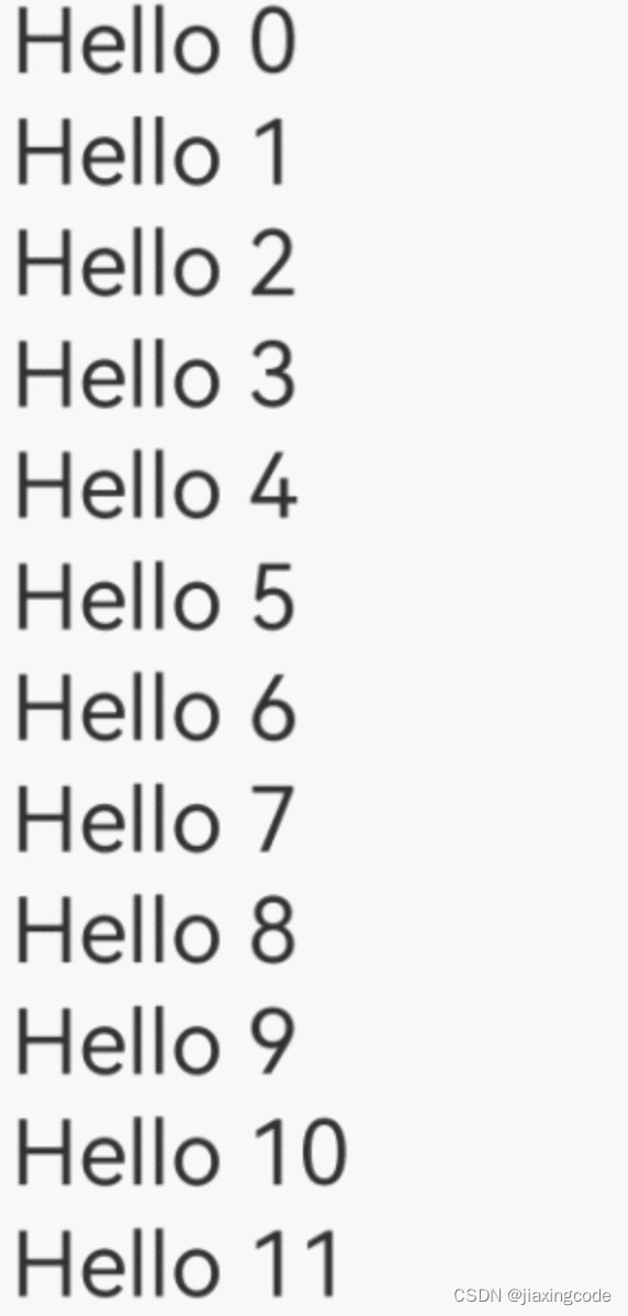
- LazyForEach從提供的數據源中按需迭代數據,并在每次迭代過程中創建相應的組件。當在滾動容器中使用了LazyForEach,框架會根據滾動容器可視區域按需創建組件,當組件滑出可視區域外時,框架會進行組件銷毀回收以降低內存占用
- 在LazyForEach首次渲染時,會根據上述鍵值生成規則為數據源的每個數組項生成唯一鍵值,并創建相應的組件。
// Basic implementation of IDataSource to handle data listener
class BasicDataSource implements IDataSource {
??private listeners: DataChangeListener[] = [];
??private originDataArray: string[] = [];
??public totalCount(): number {
?? ?return 0;
??}
??public getData(index: number): string {
?? ?return this.originDataArray[index];
??}
??// 該方法為框架側調用,為LazyForEach組件向其數據源處添加listener監聽
??registerDataChangeListener(listener: DataChangeListener): void {
?? ?if (this.listeners.indexOf(listener) < 0) {
?? ? ?console.info('add listener');
?? ? ?this.listeners.push(listener);
?? ?}
??}
??// 該方法為框架側調用,為對應的LazyForEach組件在數據源處去除listener監聽
??unregisterDataChangeListener(listener: DataChangeListener): void {
?? ?const pos = this.listeners.indexOf(listener);
?? ?if (pos >= 0) {
?? ? ?console.info('remove listener');
?? ? ?this.listeners.splice(pos, 1);
?? ?}
??}
??// 通知LazyForEach組件需要重載所有子組件
??notifyDataReload(): void {
?? ?this.listeners.forEach(listener => {
?? ? ?listener.onDataReloaded();
?? ?})
??}
??// 通知LazyForEach組件需要在index對應索引處添加子組件
??notifyDataAdd(index: number): void {
?? ?this.listeners.forEach(listener => {
?? ? ?listener.onDataAdd(index);
?? ?})
??}
??// 通知LazyForEach組件在index對應索引處數據有變化,需要重建該子組件
??notifyDataChange(index: number): void {
?? ?this.listeners.forEach(listener => {
?? ? ?listener.onDataChange(index);
?? ?})
??}
??// 通知LazyForEach組件需要在index對應索引處刪除該子組件
??notifyDataDelete(index: number): void {
?? ?this.listeners.forEach(listener => {
?? ? ?listener.onDataDelete(index);
?? ?})
??}
}
class MyDataSource extends BasicDataSource {
??private dataArray: string[] = [];
??public totalCount(): number {
?? ?return this.dataArray.length;
??}
??public getData(index: number): string {
?? ?return this.dataArray[index];
??}
??public addData(index: number, data: string): void {
?? ?this.dataArray.splice(index, 0, data);
?? ?this.notifyDataAdd(index);
??}
??public pushData(data: string): void {
?? ?this.dataArray.push(data);
?? ?this.notifyDataAdd(this.dataArray.length - 1);
??}
}
@Entry
@Component
struct MyComponent {
??private data: MyDataSource = new MyDataSource();
??
??aboutToAppear() {
?? ?for (let i = 0; i <= 20; i++) {
?? ? ?this.data.pushData(`Hello ${i}`)
?? ?}
??}
??build() {
?? ?List({ space: 3 }) {
?? ? ?LazyForEach(this.data, (item: string) => {
?? ? ? ?ListItem() {
?? ? ? ? ?Row() {
?? ? ? ? ? ?Text(item).fontSize(50)
?? ? ? ? ? ? ?.onAppear(() => {
?? ? ? ? ? ? ? ?console.info("appear:" + item)
?? ? ? ? ? ? ?})
?? ? ? ? ?}.margin({ left: 10, right: 10 })
?? ? ? ?}
?? ? ?}, (item: string) => item)
?? ?}.cachedCount(5)
??}
}
7 應用模型
7.1 UIAbility組件
- UIAbility組件是一種包含UI界面的應用組件,主要用于和用戶交互。
- UIAbility組件是系統調度的基本單元,為應用提供繪制界面的窗口;一個UIAbility組件中可以通過多個頁面來實現一個功能模塊。每一個UIAbility組件實例,都對應于一個最近任務列表中的任務。
使用代碼
為使應用能夠正常使用UIAbility,需要在module.json5配置文件的abilities標簽中聲明UIAbility的名稱、入口、標簽等相關信息。
{
??"module": {
?? ?// ...
?? ?"abilities": [
?? ? ?{
?? ? ? ?"name": "EntryAbility", // UIAbility組件的名稱
?? ? ? ?"srcEntry": "./ets/entryability/EntryAbility.ts", // UIAbility組件的代碼路徑
?? ? ? ?"description": "$string:EntryAbility_desc", // UIAbility組件的描述信息
?? ? ? ?"icon": "$media:icon", // UIAbility組件的圖標
?? ? ? ?"label": "$string:EntryAbility_label", // UIAbility組件的標簽
?? ? ? ?"startWindowIcon": "$media:icon", // UIAbility組件啟動頁面圖標資源文件的索引
?? ? ? ?"startWindowBackground": "$color:start_window_background", // UIAbility組件啟動頁面背景顏色資源文件的索引
?? ? ? ?// ...
?? ? ?}
?? ?]
??}
}
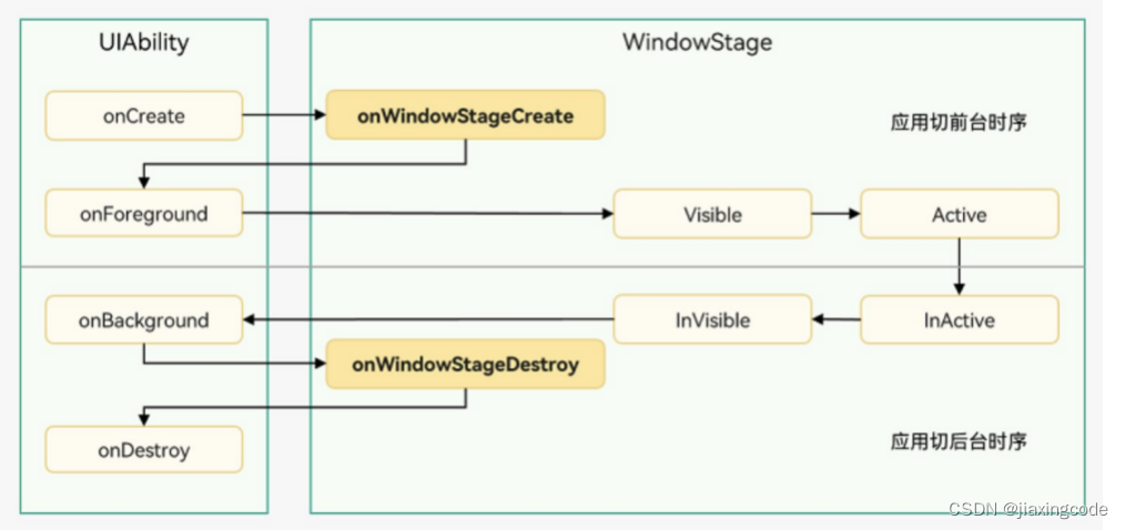
生命周期
UIAbility實例創建完成之后,在進入Foreground之前,系統會創建一個WindowStage。WindowStage創建完成后會進入onWindowStageCreate()回調,可以在該回調中設置UI界面加載、設置WindowStage的事件訂閱
啟動模式
UIAbility的啟動模式是指UIAbility實例在啟動時的不同呈現狀態。針對不同的業務場景,系統提供了三種啟動模式:
- singleton(單實例模式)
- multiton(多實例模式)
- specified(指定實例模式)
8 開發工具
下載地址
DevEco Studio-HarmonyOS SDK下載和升級-華為開發者聯盟
注意:開發工具默認從美國站點下載SDK,需要更改配置文件改為從中國站點下載SDK
window:
C:\Users\username\AppData\Roaming\Huawei\DevEcoStudio3.0\options,open country.region.xml ,modify countryregion name為“CN”
mac
/Users/username/Library/Application Support/Huawei/DevEcoStudio3.0/options,open country.region.xml ,modify countryregion name為“CN”
9 環境配置
hdc,nodejs,ohpm在初次安裝DevEco Studio 3.1的時候會提示下載,記住安裝路徑
9.1? HDC
hdc對應安卓中的adb,調試的命令行工具
- 配置環境變量
export PATH=$PATH:/Users/zjiaxind/Library/Huawei/Sdk/hmscore/3.1.0/toolchains
export CLASSPATH
HDC_SERVER_PORT=7035
launchctl setenv HDC_SERVER_PORT $HDC_SERVER_PORT
export HDC_SERVER_PORT
9.2? Node.js
ohpm依賴nodejs執行,JavaScript語言的服務器運行環境,JavaScript可以脫離瀏覽器直接運行
- 配置環境變量
export NODE_HOME=/Users/zjiaxind/Library/NodejsHuawei16.19.1
export PATH=$NODE_HOME/bin:$PATH
9.3? Ohpm
鴻蒙生態三方庫的包管理工具,支持OpenHarmony共享包的發布、安裝和依賴管理
- 進入“ohpm/bin”目錄,打開命令行工具,執行如下指令初始化ohpm。
Windows環境下執行:init.bat
Linux/macOS環境下執行:./init
- 配置環境變量
export OHPM_HOME=/Users/zjiaxind/Library/Huawei/ohpm
export PATH=$OHPM_HOME/bin:$PATH

-全文解析器-MeCab)


)
)


)


