昨天學習了使用輪播顯示圖片和文字,輪播方式縱向和橫向。今天使用擴展組件和scroll-view顯示圖片,使用scroll-view的grid方式、插槽slot、自定義組件、磨砂背景定位布局做專題組件
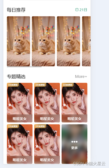
這就是需要做成的效果,下面將一步一步的完成。
首先,這里的每日推薦和專題精選都是相同的組件,這里使用自定義組件進行,
第一步:在項目根目錄創建文件夾,components文件夾,創建組件,
看這個布局,是文字不同,后面的顯示不同,這里使用slot
<template><view class="common-title"><view class="name"><slot name="name"></slot></view><view class="custom"><slot name="custom"></slot></view></view>
</template><script setup></script><style lang="scss" scoped>.common-title{display: flex;justify-content: space-between;//這是讓兩端對齊align-items: center;padding: 0 30rpx;.name{font-size: 40rpx}}</style>
這里就是用slot了,定義一個slot的名稱,在父組件中直接傳參就能顯示不同的效果
<common-title><template v-slot:name>每日推薦</template><template #custom><view class="date"><uni-icons type="calendar" size="18" color="#309877"></uni-icons><view class="text"><uni-dateformat :date="Date.now()" format="dd日"></uni-dateformat></view></view></template>
</common-title>
<view class="content"><scroll-view scroll-x><view class="box" v-for="item in 8"><image src="../../common/images/preview_small.webp" mode="aspectFill"></image></view></scroll-view>
</view>
這就是拓展組件和插槽的使用,這里也使用了擴展組件,順便復習下,擴展組件的使用:找到需要的組件,點擊下載導入,使用的時候,只用引入需要的組件名稱,就可以使用了,至于組件的屬性,查看文檔有詳細說明。
以上是每日推薦模塊,但是出來后顯示的布局方式是縱向顯示的,這里需要修改樣式,讓橫向顯示,
.select {margin-top: 50rpx;.content {width: 720rpx;margin-left: 30rpx;margin-top: 30rpx;scroll-view {white-space: nowrap;.box {width: 200rpx;height: 430rpx;display: inline-block;margin-right: 15rpx;image {width: 100%;height: 100%;border-radius: 10rpx;}}.box:last-child {margin-right: 30rpx;}}}.date {color: #309877;display: flex;align-items: center;.text {margin-left: 5rpx;}}}
這就把每日推薦這個模塊的全部顯示出來了。
下來是要做專題精選,這里文字模塊,使用的和每日推薦使用的是相同的布局,直接使用同樣的組件就好。下面的圖片顯示,使用的是scroll-view的grid方式,因為布局后面,還有個模糊的更多,點擊圖片進入的是圖片詳情,點擊更多進入的是其他頁面,兩個顯示的不同,點擊后進入的方式也不同,這里就用到grid了,
<view class="theme"><common-title><template v-slot:name>專題精選</template><template #custom><navigator url="" class="more">More+</navigator></template></common-title><view class="content"><theme-item v-for="item in 5"></theme-item><theme-item :isMore="true"></theme-item></view></view>
<!-- style -->
.theme{margin: 50rpx 0;.more{font-size: 32rpx;color: #888;}.content{margin-top: 30rpx;padding: 0 30rpx;display: grid;gap: 15rpx;//屬性是用來設置網格行與列之間的間隙,該屬性是 row-gap 和 column-gap 的簡寫形式grid-template-columns: repeat(3,1fr);//display:grid 是轉為網格布局,這個是必須的// grid-template-columns:1fr | px 這是將網格分為幾列,1fr是自適配單位,可以當成柵格,這里也可以是用repeat(3,1fr),是平分成三列,然后自適應寬度,這里看自己需求需要分成幾列//grid-template-columns: repeat(auto-fill, minmax(255px, 1fr)); 這種寫法可以用來做響應式布局,auto-fill主軸上指定的寬度或者重復次數是最大可能的正整數,minmax最小值255px、最大值1fr代表剩余空間的比例。注意:實現這種響應式布局,一定要注意父容器不能使用固定寬度,可以將父容器改為如:80%,這樣就能根據屏幕的寬度,自動展示一行展示幾個了。// gap:30px 這是網格四周的間隔// 注意:這三個屬性是給父容器添加的,子元素,可以不用設置寬度,也不用設置margin間距即可完成如下布局。// grid-row和grid-column可以控制某個元素占領幾份// 以grid-row行為例,從第幾列開始 / 第幾列+想占幾個;// grid-row: 1/3;// grid-column: 1/3;}}
上面是設置grid顯示的不同的樣式,是不是看的云里霧里的,沒事,老師有專門的課程,grid網格布局,比flex方便太多了,介紹幾種常用的grid布局屬性,這里有詳細的解釋和案例,
磨砂背景定位布局,在列表中,圖片上特定區域,有文字和磨砂背景的,這里也是使用自定義組件的方式
<template><view class="theme-item"><navigator url="" class="box" v-if="!isMore"><image class="pic" src="../../common/images/classify1.jpg" mode="aspectFill"></image><view class="mack">明星美女</view><view class="tabMack">3天前更新</view></navigator><navigator url="" class="box more" v-else><image class="pic" src="../../common/images/more.jpg" mode="aspectFill"></image><view class="mack"><uni-icons type="more-filled" size="34" color="#fff"></uni-icons><text class="text">更多</text></view></navigator></view>
</template><script setup>
defineProps({isMore:{type:Boolean,default:false}
})
</script><style lang="scss" scoped>.theme-item {.box {height: 340rpx;border-radius: 10rpx;overflow: hidden;position: relative;.pic {width: 100%;height: 100%;}.mack {width: 100%;height: 70rpx;position: absolute;bottom: 0;left: 0;font-size: 30rpx;background: rgba(0, 0, 0, 0.2);color: #fff;display: flex;align-items: center;justify-content: center;backdrop-filter: blur(20rpx);font-weight: 600;}.tabMack {position: absolute; //指定一個元素在文檔中的定位方式left: 0;top: 0;background: rgba(250, 190, 90, 0.7);backdrop-filter: blur(20rpx); //backdrop-filter CSS 屬性可以讓你為一個元素后面區域添加圖形效果(如模糊或顏色偏移)font-size: 22rpx;color: #fff;padding: 6rpx 14rpx;border-radius: 0 0 20rpx 0;transform: scale(0.8); //屬性允許你旋轉,縮放,傾斜或平移給定元素。這是通過修改 CSS 視覺格式化模型的坐標空間來實現的。transform-origin: left top; //更改一個元素變形的原點}}.box.more{.mack{width: 100%;height: 100%;flex-direction: column;}.text{font-size: 28rpx;}}}
</style>
下面是整頁的詳細代碼
<template><view class="homeLayout"><view class="banner"><swiper indicator-dots autoplay circular :interval="3000" :duration="1000"indicator-color="rgba(255,255,255,0.5)" indicator-active-color="#ffffff"><swiper-item v-for="(item,index) in picArr" :key="item.id"><image :src="item.src" mode="aspectFill"></image></swiper-item></swiper></view><view class="notice"><view class="letf"><uni-icons type="sound-filled" size="20" color="#309877"></uni-icons><text class="text">公告</text></view><view class="center"><swiper vertical circular autoplay interval="1500" duration="300"><swiper-item v-for="item in 4">內容文字內容文字內容文字內容文字內容文字</swiper-item></swiper></view><view class="rigth"><uni-icons type="right" size="16" color="#333"></uni-icons></view></view><view class="select"><common-title><template v-slot:name>每日推薦</template><template #custom><view class="date"><uni-icons type="calendar" size="18" color="#309877"></uni-icons><view class="text"><uni-dateformat :date="Date.now()" format="dd日"></uni-dateformat></view></view></template></common-title><view class="content"><scroll-view scroll-x><view class="box" v-for="item in 8"><image src="../../common/images/preview_small.webp" mode="aspectFill"></image></view></scroll-view></view></view><view class="theme"><common-title><template v-slot:name>專題精選</template><template #custom><navigator url="" class="more">More+</navigator></template></common-title><view class="content"><theme-item v-for="item in 5"></theme-item><theme-item :isMore="true"></theme-item></view></view></view>
</template><script setup>import {ref} from 'vue';const picArr = ref([{id: 1,src: "../common/images/banner1.jpg"},{id: 2,src: "../../common/images/banner2.jpg"},{id: 3,src: "../../common/images/banner3.jpg"}])
</script><style lang="scss" scoped>.homeLayout {.banner {width: 750rpx;padding: 30rpx 0; //padding:當是一個值的時候:是周圍四邊,兩個值:第一個是:上下;第二個是左右;當三個值:第一是上。第二個是左右,第三個是下;當是四個值:第一個是上,第二個右,第三個下,第四個左swiper {width: 750rpx;height: 340rpx;&-item {width: 100%;height: 100%;padding: 0 30rpx;image {width: 100%;height: 100%;border-radius: 10rpx;}}}}.notice {width: 690rpx;height: 80rpx;line-height: 80rpx;background: #f9f9f9;margin: 0 auto;border-radius: 80rpx;display: flex;.letf {width: 140rpx;display: flex;justify-content: center;align-items: center;.text {font-weight: 600; //指定了字體的粗細程度, 詳細查看:https://developer.mozilla.org/zh-CN/docs/Web/CSS/font-weightfont-size: 28rpx;color: #309877;}}.center {flex: 1;swiper {height: 100%;&-item {height: 100%;font-size: 30rpx;color: #666;overflow: hidden; //設置了元素溢出時所需的行為——即當元素的內容太大而無法適應它的區塊格式化上下文時。white-space: nowrap; //用于設置如何處理元素內的空白字符,nowrap是不讓換行顯示text-overflow: ellipsis; // 用于確定如何提示用戶存在隱藏的溢出內容 ellipsis:超出文本部分使用省略號}}}.rigth {width: 70rpx;display: flex;justify-content: center;align-items: center;}}.select {margin-top: 50rpx;.content {width: 720rpx;margin-left: 30rpx;margin-top: 30rpx;scroll-view {white-space: nowrap;.box {width: 200rpx;height: 430rpx;display: inline-block;margin-right: 15rpx;image {width: 100%;height: 100%;border-radius: 10rpx;}}.box:last-child {margin-right: 30rpx;}}}.date {color: #309877;display: flex;align-items: center;.text {margin-left: 5rpx;}}}.theme{margin: 50rpx 0;.more{font-size: 32rpx;color: #888;}.content{margin-top: 30rpx;padding: 0 30rpx;display: grid;gap: 15rpx;//屬性是用來設置網格行與列之間的間隙,該屬性是 row-gap 和 column-gap 的簡寫形式grid-template-columns: repeat(3,1fr);//display:grid 是轉為網格布局,這個是必須的// grid-template-columns:1fr | px 這是將網格分為幾列,1fr是自適配單位,可以當成柵格,這里也可以是用repeat(3,1fr),是平分成三列,然后自適應寬度,這里看自己需求需要分成幾列//grid-template-columns: repeat(auto-fill, minmax(255px, 1fr)); 這種寫法可以用來做響應式布局,auto-fill主軸上指定的寬度或者重復次數是最大可能的正整數,minmax最小值255px、最大值1fr代表剩余空間的比例。注意:實現這種響應式布局,一定要注意父容器不能使用固定寬度,可以將父容器改為如:80%,這樣就能根據屏幕的寬度,自動展示一行展示幾個了。// gap:30px 這是網格四周的間隔// 注意:這三個屬性是給父容器添加的,子元素,可以不用設置寬度,也不用設置margin間距即可完成如下布局。// grid-row和grid-column可以控制某個元素占領幾份// 以grid-row行為例,從第幾列開始 / 第幾列+想占幾個;// grid-row: 1/3;// grid-column: 1/3;}}}
</style>
這里提下,如果圖片放在common下,這個是在打包的時候,只有用到的才會打包,沒有用到的是不打包的,我這里在弄輪播圖的時候,就使用的是common下的圖片了,把這些圖片放在數組中,然后在頁面上使用,在H5的時候,是沒問題的,因此就沒多看,今天在小程序中,輪播圖片不顯示,原因是沒有在小程序中找到,試了各種辦法,還是不行,但把圖片地址直接引用common下的圖片,又可以了,這不清楚原因,這里記錄下,后期知道了在補充。
為什么要專門說下這個,從這里看出,各個平臺存在差異化,目前是以微信小程序為主的,所以在做完一個小功能后,還是要在小程序中查看下是不是可以使用,不然到后期出現問題更改起來會很繁瑣的。
加油,學無止境!


:配置中心基礎和代碼樣例)


 基于字符設備驅動的I/O操作)
 - 三語言AC題解(Python/Java/Cpp))


)