利用徑向條形圖探索華盛頓的徒步旅行
import matplotlib as mpl
import matplotlib.pyplot as plt
import numpy as np
import pandas as pdfrom matplotlib.cm import ScalarMappable
from matplotlib.lines import Line2D
from mpl_toolkits.axes_grid1.inset_locator import inset_axes
from textwrap import wrap
數據探索
以下數據如果有需要的同學可關注公眾號HsuHeinrich,回復【數據可視化】自動獲取~
data = pd.read_csv("https://raw.githubusercontent.com/HsuHeinrich/data-collection/master/graph/hike_data.txt", sep='\t')
data.head()
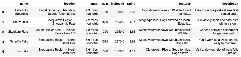
華盛頓徒步旅行數據集:
name:徒步名稱
location:地理位置
length:路線的全程距離,通常會以英里或者公里作為單位
gain:爬升高度,即徒步路線起點至終點之間的海拔上升量(Elevation Gain)
highpoint:最高點
rating:徒步路線的評分,一般是由用戶或者專家進行評價
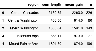
# 提取地區
data["region"] = data["location"].str.split("--", n=1, expand=True)[0]
data["region"] = data["region"].str.strip() # 提取英里
data["length_num"] = data["length"].str.split(" ", n=1, expand=True)[0].astype(float)# 計算每個區域的累積長度和平均爬升高度
summary_stats = data.groupby(["region"]).agg(sum_length = ("length_num", "sum"),mean_gain = ("gain", "mean")
).reset_index()
# 四舍五入取整
summary_stats["mean_gain"] = summary_stats["mean_gain"].round(0)# 計算每個區域數量
trackNrs = data.groupby("region").size().to_frame('n').reset_index()# 合并數據
summary_all = pd.merge(summary_stats, trackNrs, "left", on = "region")
summary_all.head()
繪制基本的雷達圖
# 按sum_length排序,獲得排序后的bar
df_sorted = summary_all.sort_values("sum_length", ascending=False)# x取值
ANGLES = np.linspace(0.05, 2 * np.pi - 0.05, len(df_sorted), endpoint=False)# 長度
LENGTHS = df_sorted["sum_length"].values# 平均爬升高度
MEAN_GAIN = df_sorted["mean_gain"].values# 區域
REGION = df_sorted["region"].values# 每個區域數量
TRACKS_N = df_sorted["n"].values
GREY12 = "#1f1f1f"# 設置默認字體
plt.rcParams.update({"font.family": "Bell MT"})# 字體顏色
plt.rcParams["text.color"] = GREY12# Bell MT字體不支持minus,禁用
plt.rc("axes", unicode_minus=False)# 顏色
COLORS = ["#6C5B7B","#C06C84","#F67280","#F8B195"]# 顏色調色盤
cmap = mpl.colors.LinearSegmentedColormap.from_list("my color", COLORS, N=256)# 標準化(顏色)
norm = mpl.colors.Normalize(vmin=TRACKS_N.min(), vmax=TRACKS_N.max())# 標準化顏色并進行調色
COLORS = cmap(norm(TRACKS_N))
# 初始化布局(極坐標)
fig, ax = plt.subplots(figsize=(9, 12.6), subplot_kw={"projection": "polar"})# 背景色
fig.patch.set_facecolor("white")
ax.set_facecolor("white")ax.set_theta_offset(1.2 * np.pi / 2)
ax.set_ylim(-1500, 3500)# 添加bar表示累積長度
ax.bar(ANGLES, LENGTHS, color=COLORS, alpha=0.9, width=0.52, zorder=10)# 添加垂直虛線,作為參考線
ax.vlines(ANGLES, 0, 3000, color=GREY12, ls=(0, (4, 4)), zorder=11)# 添加點表示平均爬升高度
ax.scatter(ANGLES, MEAN_GAIN, s=60, color=GREY12, zorder=11)# 為區域添加文本標簽
# 一個單詞最多需要5個連續字母,但不打斷超過5個字母的單詞
REGION = ["\n".join(wrap(r, 5, break_long_words=False)) for r in REGION] # x軸設置
ax.set_xticks(ANGLES)
ax.set_xticklabels(REGION, size=12);
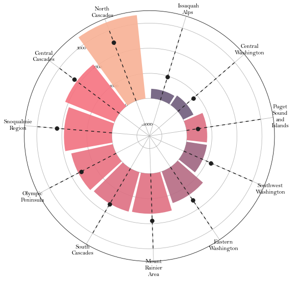
優化軸并添加注釋
# 刪除x軸(極坐標軸)網格線
ax.xaxis.grid(False)# 設置y刻度
ax.set_yticklabels([])
ax.set_yticks([0, 1000, 2000, 3000])# 去除邊框
ax.spines["start"].set_color("none")
ax.spines["polar"].set_color("none")# 調整x標簽內邊距
XTICKS = ax.xaxis.get_major_ticks()
for tick in XTICKS:tick.set_pad(10)# 添加y標簽注釋
PAD = 10
ax.text(-0.2 * np.pi / 2, 1000 + PAD, "1000", ha="center", size=12)
ax.text(-0.2 * np.pi / 2, 2000 + PAD, "2000", ha="center", size=12)
ax.text(-0.2 * np.pi / 2, 3000 + PAD, "3000", ha="center", size=12)# 添加文本解釋高度和點
ax.text(ANGLES[0], 3100, "Cummulative Length [FT]", rotation=21, ha="center", va="center", size=10, zorder=12)
ax.text(ANGLES[0]+ 0.012, 1300, "Mean Elevation Gain\n[FASL]", rotation=-69, ha="center", va="center", size=10, zorder=12)
fig
添加更多的信息
# 調整布局
fig.subplots_adjust(bottom=0.175)# 插入軸(用于構造顏色bar)
cbaxes = inset_axes(ax, width="100%", height="100%", loc="center",bbox_to_anchor=(0.325, 0.1, 0.35, 0.01),bbox_transform=fig.transFigure
) # 創建離散列表,并分配顏色
bounds = [0, 100, 150, 200, 250, 300]
norm = mpl.colors.BoundaryNorm(bounds, cmap.N)# 構造顏色bar
cb = fig.colorbar(ScalarMappable(norm=norm, cmap=cmap), cax=cbaxes, # 使用上面插入的軸orientation = "horizontal",ticks=[100, 150, 200, 250]
)# 刪除顏色bar的輪廓
cb.outline.set_visible(False)# 移除刻度線
cb.ax.xaxis.set_tick_params(size=0)# 設置圖例
cb.set_label("Amount of tracks", size=12, labelpad=-40)# 添加額外的信息
# 調整布局
fig.subplots_adjust(top=0.8)# 標題、副標題、說明信息
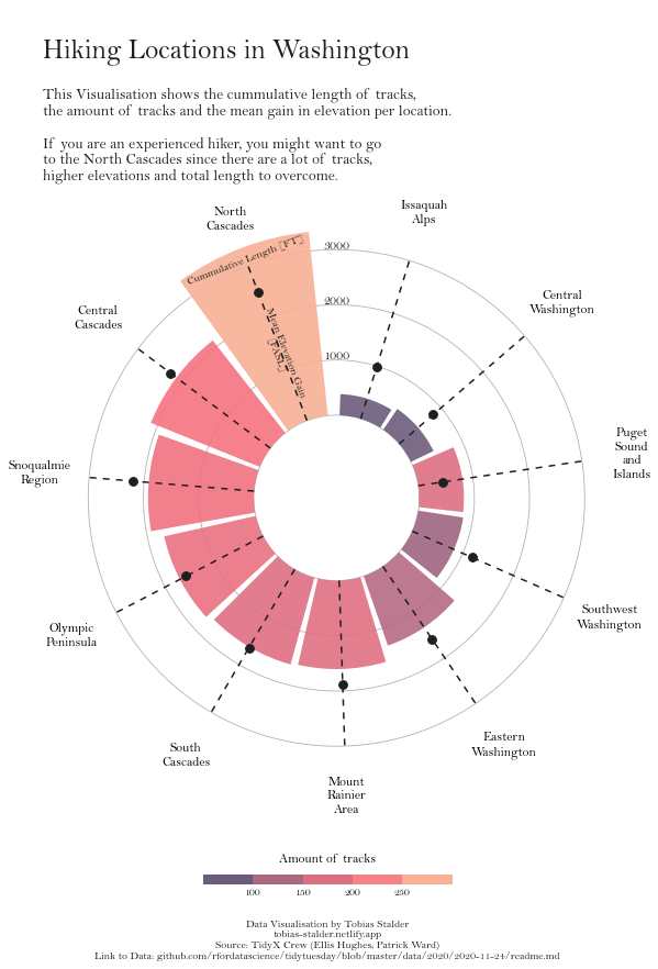
title = "\nHiking Locations in Washington"
subtitle = "\n".join(["This Visualisation shows the cummulative length of tracks,","the amount of tracks and the mean gain in elevation per location.\n","If you are an experienced hiker, you might want to go","to the North Cascades since there are a lot of tracks,","higher elevations and total length to overcome."
])
caption = "Data Visualisation by Tobias Stalder\ntobias-stalder.netlify.app\nSource: TidyX Crew (Ellis Hughes, Patrick Ward)\nLink to Data: github.com/rfordatascience/tidytuesday/blob/master/data/2020/2020-11-24/readme.md"# 添加上面的文本信息
fig.text(0.1, 0.93, title, fontsize=25, weight="bold", ha="left", va="baseline")
fig.text(0.1, 0.9, subtitle, fontsize=14, ha="left", va="top")
fig.text(0.5, 0.025, caption, fontsize=10, ha="center", va="baseline")fig
參考:Circular barplot with Matplotlib
共勉~


